In March 2014, the Baymard Institute, a web research company based in the UK, reported that 67.91% of online shopping carts are abandoned. An abandonment means that a customer has visited a website, browsed around, added one or more products to their cart and then left without completing their purchase. A month later in April 2014, Econsultancy stated that global retailers are losing $3 trillion (USD) in sales every year from abandoned carts.
Clearly, reducing the number of abandoned carts would lead to higher store revenue — the goal of every online retailer. The question then becomes how can we, as designers and developers, help convert these “warm leads” into paying customers for our clients?
Further Reading on SmashingMag:
- Fundamental Guidelines Of E-Commerce Checkout Design
- Local Storage And How To Use It On Websites
- Boost Your Mobile E-Commerce Sales With Mobile Design Patterns
- A Little Journey Through (Small And Big) E-Commerce Websites
Before Cart Abandonment
Let’s begin by looking at recognized improvements we can make to an online store to reduce the number of “before cart” abandonments. These improvements focus on changes that aid the customer’s experience prior to reaching the cart and checkout process, and they include the following:
- Show images of products.. This reinforces what the customer is buying, especially on the cart page.
- Display security logos and compliance information.. This can allay fears related to credit-card and payment security.
- Display contact details.. Showing offline contact details (including a phone number and mailing address) in addition to an email address adds credibility to the website.
- Make editing the cart easier.. Make it as simple as possible for customers to change their order prior to checking out.
- Offer alternative payment methods.. Let people check out with their preferred method of payment (such as PayPal and American Express, in addition to Visa and MasterCard).
- Offer support.. Providing a telephone number and/or online chat functionality on the website and, in particular, on the checkout page will give shoppers confidence and ease any concerns they might have.
- Don’t require registration. This one resonates with me personally. I often click away from websites that require lengthy registration forms to be filled out. By allowing customers to “just” check out, friction is reduced.
- Offer free shipping.. While merchants might include shipping costs in the price, “free shipping” is nevertheless an added enticement to buy.
- Be transparent about shipping costs and time.. Larger than expected shipping costs and unpublished lead times will add unexpected costs and frustration.
- Show testimonials.. Showcasing reviews from happy customers will alleviate concerns any people might have about your service.
- Offer price guarantees and refunds.. Offering a price guarantee gives shoppers the confidence that they have found the best deal. Additionally, a clear refund policy will add peace of mind.
- Optimize for mobile.. Econsultancy reports that sales from mobile devices increased by 63% in 2013. This represents a real business case to move to a “responsive” approach.
- Display product information.. Customers shouldn’t have to dig around a website to get the information they need. Complex navigation and/or a lack of product information make for a frustrating experience.
Unfortunately, even if you follow all of these recommendations, the reality is that customers will still abandon their carts — whether through frustration, bad design or any other reason they see fit.
After Cart Abandonment
The second approach is to look at things we can do once a cart has been abandoned. One tactic is to email the customer with a personalized message and a link to a prepopulated cart containing the items they had selected. This is known as an “abandoned cart email.”
The concept is pretty simple. At the right time, a customizable email is sent, complete with a personalized message and a link to the customer’s abandoned cart. Of course, this approach assumes that the customer has submitted their email address — effectively, they’ve done everything but paid. Abandoned cart emails represent one last attempt by the merchant to convince the buyer to check out.
In September 2013, Econsultancy outlined how an online cookie retailer recaptured 29% of its abandoned shopping carts via email. This is a huge figure and one we might naturally be skeptical of.
To get a more realistic perspective, I asked my colleagues at Shopify to share some of their data on this, and they kindly agreed. Shopify introduced “abandoned cart recovery” (ACR) in mid-September 2013 (just over a year ago at the time of writing). Here’s a summary of its effectiveness:
- In the 12 months since launching automatic ACR, $12.9 million have been recovered through ACR emails in Shopify.
- 4,085,592 emails were sent during this period, of which 147,021 carts were completed as a result. This represents a 3.6% recovery rate.
- Shop owners may choose to send an email 6 or 24 hours after abandonment. Between the two, 6-hour emails convert much better: a 4.1% recovery rate for 6 hours versus 3% for 24 hours.
It’s worth noting that the 3.6% recovery rate is from Shopify’s ACR emails. Many merchants use third-party apps instead of Shopify’s native feature. Given that Shopify is unable to collect data on these services, the number of emails sent and the percentage of recovered carts may well be higher.
Given the statistics, abandoned cart emails are clearly an important part of an online retailer’s marketing strategy. Luckily, most leading e-commerce platforms enable merchants to send custom emails, either in plain text or HTML. Knowing how to implement these notifications is a useful skill if you are designing for e-commerce, and they represent added value to your services.
Creating An HTML Abandoned Cart Email
The implementation of abandoned cart emails varies from platform to platform. Some platforms require third-party plugins, whereas others have the functionality built in. For example, both plain-text and HTML versions are available on Shopify. While the boilerplates are very usable, you might want to create a custom HTML version to complement the branding of your store. We’ll look at options and some quick wins shortly.
In recent years, HTML email newsletters have really flourished. You only have to look at the many galleries to see how far this form of marketing has progressed. Sending an HTML version, while not essential, certainly allows for more flexibility and visual design (although always sending a plain-text version, too, is recommended). However, it’s not without its pain points.
If you’ve been developing and designing for the web since the 1990s, then you will remember, fondly or otherwise, the “fun” of beating browsers into shape. Designing HTML newsletters is in many ways a throwback to this era. Table-based layouts are the norm, and we also have to contend with email clients that render HTML inconsistently.
Luckily for us, the teams at both Campaign Monitor and MailChimp have written extensively on this subject and provide many solutions to common problems. For example, Campaign Monitor maintains a matrix and provides a downloadable poster outlining the CSS support of each major desktop and mobile email client. MailChimp, for its part, provides numerous resources on CSS and email template design. Familiarizing yourself with the basics before tackling your first HTML email is worthwhile — even if you ultimately use a template.
Open-Source Responsive Email Templates
While many of you might wish to “roll your own” template, I often find it easier to build on the great work of others. For example, a number of great open-source projects focus on HTML email templates, including Email Blueprints by MailChimp.
Another example comes from Lee Munroe. His “transactional HTML email templates” differ in that they are not intended for use as newsletters, but rather as “transactional” templates. To clarify the difference, Lee breaks down transactional email into three categories:
- action emails. “Activate your account,” “Reset your password”
- email alerts. “You’ve reached a limit,” “A problem has occurred”
- billing emails monthly receipts and invoices
The templates are purposefully simple yet elegant. They also have the added benefit of having been throughly tested in all major email clients. Finally, because they are responsive, they cater to the 50+% of emails opened via mobile devices.
The Challenge
Lee’s templates are a good option for creating a simple HTML email for abandoned carts. Therefore, let’s move on from the theory and look at how to create an HTML template for the Shopify platform.
Let’s begin by setting some constraints on the challenge:
- make the fewest number of markup changes to Lee’s template;
- make use of the boilerplate text that is set as the default in the abandoned cart HTML template in Shopify;
- inline all CSS (a best practice for HTML email);
- send a test email with dummy data, and review the results in Airmail, Gmail and Apple Mail (on iOS).
1. Create a Local Copy of the Action Email Template
Having looked at the three templates, the “action” version appears to offer the best starting point. You can download the HTML for this template directly from GitHub if you wish to follow along.
The first step is to take the contents of Lee’s template and save it locally as abandoned-cart.html. A quick sanity check in a browser shows that the style sheet isn’t being picked up.
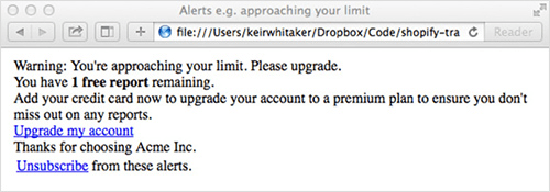
Inlining all CSS is recommended (we’ll look at this in a later step), so add the styles to the <head> section of abandoned-cart.html. You can copy the CSS in its entirety from GitHub and then paste it in a <style> element. Another check in the browser shows that the styles are being applied.
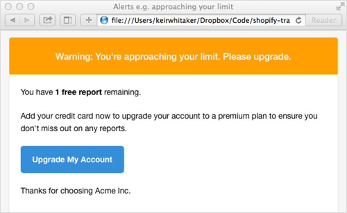
2. Add the Content
Now that the template is working as a standalone document, it’s time to look at integrating Liquid’s boilerplate code from Shopify’s default template. This can be found in the Shopify admin section under “Settings” → “Notifications” → “Abandoned cart.” If you wish to follow along with these code examples, you can set up a free fully featured development store by signing up to Shopify’s Partner Program.
Hey{% if billing_address.name %} {{ billing_address.name }}{% endif %},
Your shopping cart at {{ shop_name }} has been reserved and is waiting for your return!
In your cart, you left:
{% for line in line_items %}{{ line.quantity }}x {{ line.title }}{% endfor %}
But it’s not too late! To complete your purchase, click this link:
{{ url }}
Thanks for shopping!
{{ shop_name }}
All notification emails in Shopify make use of Liquid, the templating language developed by Shopify and now available as an open-source project and found in tools such as Mixture and software such as Jekyll and SiteLeaf. Liquid makes it possible to pull data from the store — in this case, all of the details related to the abandoned cart and the user it belonged to.
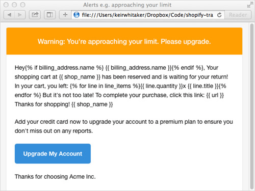
Having studied the markup, I’ve decided to place the boilerplate content in a single table cell, starting on line 27 of Lee’s original document.
After pasting in the boilerplate code, let’s double-check that the template renders as expected in the browser. At this stage, Liquid’s code is appearing “as is.” Only once the template is applied to Shopify’s template will this be replaced with data from the store.
3. Modify the Boilerplate Code
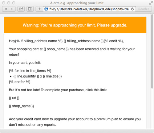
The next stage involves tidying up some of the boilerplate code, including wrapping the boilerplate text in <p> tags. Then, it’s time to work out how best to display the cart’s contents in markup. For speed, I’ve chosen an unordered list. Liquid’s refactored for loop is pretty straightforward:
<ul>
{% for line in line_items %}
<li>{{ line.quantity }} x {{ line.title }}</li>
{% endfor %}
</ul>
After another sanity check, things are looking much more promising. However, we need to make a few final tweaks to make it work:
- remove unwanted table rows,
- add the correct link to the blue call-to-action button,
- change the contents of the footer.
4. Make Final Adjustments
Lee’s template includes markup to create a big blue “Click me” button. You can see this on line 38:
<a href="http://www.mailgun.com" class="btn-primary">Upgrade my account</a>
Let’s turn this into a relevant link by changing the markup to this:
<p><a href="{{ url }}" class="btn-primary">Check out now</a></p>
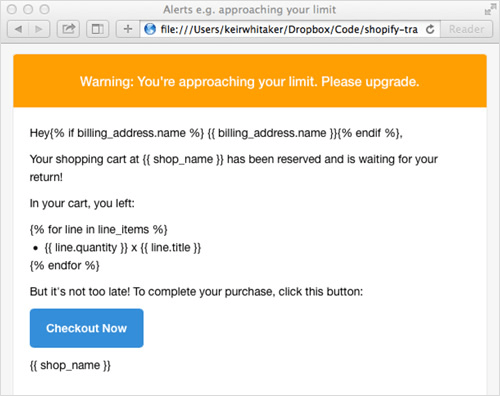
In this case, {{ url }} represents the link to the abandoned (and saved) cart. I’ve enclosed the anchor in a paragraph to ensure consistent spacing when the email is rendered, and I’ve moved it up into the main section.
Finally, we’ve changed the unsubscribe link in the footer to a link to the shop:
<a href="{{ shop.url }}">Visit {{ shop_name }}</a>
After a few minutes of editing, the template looks more than respectable. However, we’ve neglected one section, the text in the yellow highlighted “alert” section. I’ve changed this, along with the title element in the HTML, to this:
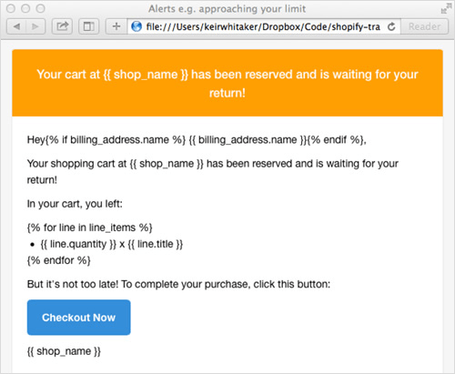
Your cart at {{ shop_name }} has been reserved and is waiting for your return!
Email notifications in Shopify have access to a number of variables that can be accessed via Liquid. A full list is available in Shopify’s documentation.
5. Inline the CSS
To recap, we’ve changed the template’s markup very little, and the CSS is identical to Lee’s original (albeit in the template, rather than in an external file). Shopify’s boilerplate text is also intact, albeit with a very small change to Liquid’s for loop.
The next step is to inline the CSS in the HTML file. Because some email clients remove <head> and <style> tags from email, moving the CSS inline means that our email should render as intended. Chris Coyier penned “Using CSS in HTML Emails: The Real Story” back in November 2007 — the landscape hasn’t changed much since.
Thankfully, taking your CSS inline isn’t a long or difficult process. In fact, it’s surprisingly easy. A number of free services enable you to paste markup and will effectively add your styles inline.
I’ve chosen Premailer principally because it has a few extra features, including the ability to remove native CSS from the <head> section of the HTML document, which saves a few kilobytes from the file’s size. After pasting in the markup and pressing “Submit,” Premailer generates a new HTML version that you can copy and paste back into your document. It also creates a plain-text version of the email, should you need it.
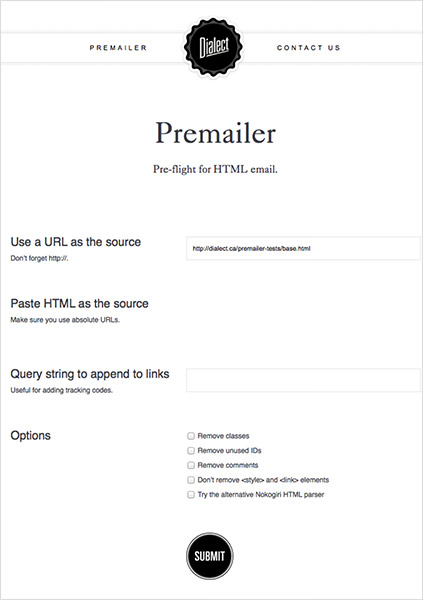
Another great feature of Premailer is that you can view the new markup in the browser. You’ll find a link above the text box containing the new markup, titled “Click to View the HTML Results.” Clicking the link opens a hosted version of the new markup, which you can use to check your sanity or share with colleagues and clients.
If you are keen to automate the creation of e-commerce notification emails, then Premailer also offers an API. A number of libraries that support it are also available on GitHub, including PHP-Premailer.
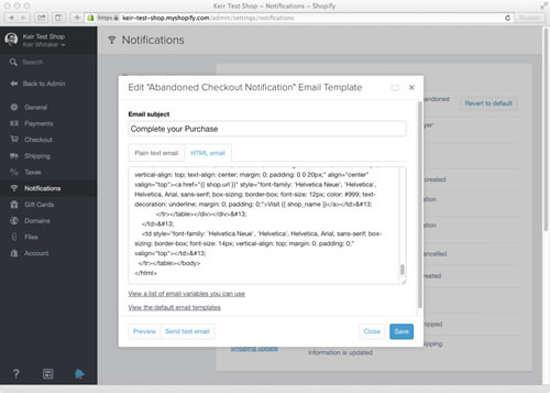
The final task is to copy the new HTML code and paste it in the “HTML” tab of our abandoned cart notification in Shopify’s admin area. Once it’s applied, you can preview the email in the browser, as well as send a dummy copy to an email address.
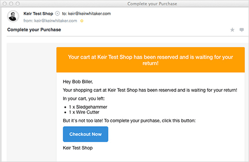
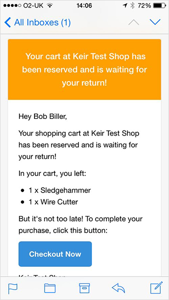
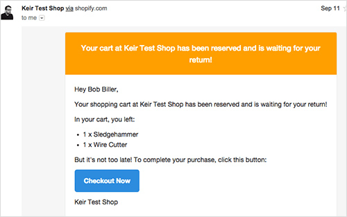
Below are the results in various email clients (both mobile and desktop).
Airmail
Apple Mail
Gmail (Browser)
Apple Mail on iOS

The process of turning Lee’s template into a usable email took around 30 minutes, and I am pretty pleased with the result from such little input.
Of course, this process screams out for automation. For those who are interested, Lee has also posted about his workflow for creating HTML email templates and the toolkit he uses (Sketch, Sublime, Grunt, SCSS, Handlebars, GitHub, Mailgun, Litmus).
Taking It Further
The template produced above is admittedly quite basic and only scratches the surface of what is possible. We could do plenty more to customize our email for abandoned carts, such as:
- consider tone of voice,
- show product images to jog the customer’s memory,
- add a discount code to encourage the user to return and buy,
- add upsells,
- list complementary products.
Dodo Case
Tone of voice is a key consideration and goes a long way to engaging the customer. Dodo Case has a great example:
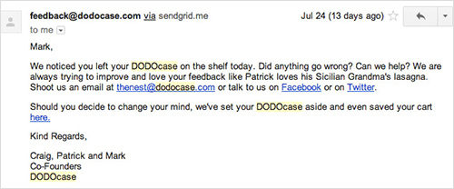
As always, context is very important when it comes to tone of voice. What’s right for Dodo Case might not be right for a company specializing in healthcare equipment.
Let’s review a few examples (taken from Shopify’s blog) to get a taste of what other companies are doing.
Fab
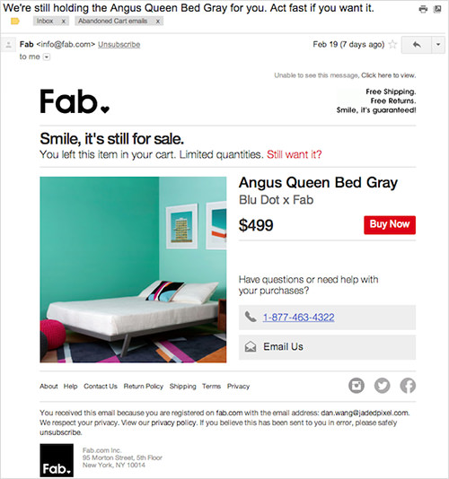
While this email from Fab is pretty standard, the subject line is very attention-grabbing and is a big call to action.
Chubbies
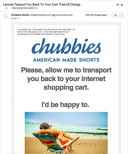
The language and tone used in Chubbies’ email really stands out and is in line with the brand: fun-loving people. There’s also no shortage of links back to the cart, including the title, the main image and the call to action towards the bottom of the email.
Black Milk Clothing
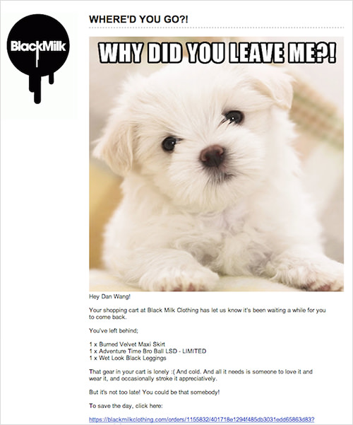
Black Milk Clothing includes a dog photo and employs playful language, such as “Your shopping cart at Black Milk Clothing has let us know it’s been waiting a while for you to come back.”
Holstee
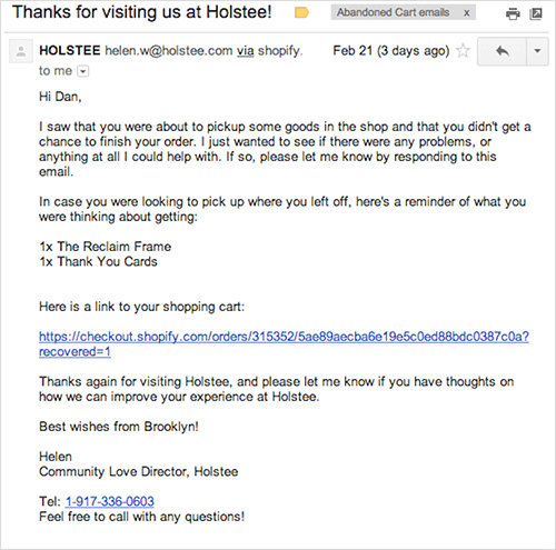
Finally, Holstee asks if there’s a problem they can help with. It even goes so far as to include a direct phone number to its “Community Love Director.” Having worked with Holstee, I can confirm that this is a real position within the company!
Conclusion
While there are many tactics to persuade customers to buy, inevitably some people will get to the payment screen and decide not to continue. Any tactic that helps to seal the deal is certainly worth considering, and given the small amount of work involved in implementing an email to recover abandoned carts, it’s a great place to start. Designers and developers are in a powerful position to help their clients increase their revenue, and being armed with tactics such as the ones outlined in this article will hopefully enable them to offer a wider range of services.
Further Reading
- “Nine Case Studies and Infographics on Cart Abandonment and Email Retargeting,” David Moth, Econsultancy
- “13 Best Practices for Email Cart Abandonment Programs,” Kyle Lacy, Salesforce Marketing Cloud Blog
- “Lost Sales Recovery, Part 2,: Crafting a Perfect Remarketing Message,” Vitaly Gonkov, The MageWorx Blog
- “Why Online Retailers Are Losing 67.45% of Sales and What to Do About It,” Mark Macdonald, Shopify Ecommerce Marketing Blog
Hey{% if billing_address.name %} {{ billing_address.name }}{% endif %},
Your shopping cart at {{ shop_name }} has been reserved and is waiting for your return!
In your cart, you left:
{% for line in line_items %}{{ line.quantity }}x {{ line.title }}{% endfor %}
But it’s not too late! To complete your purchase, click this link:
{{ url }}
Thanks for shopping!
{{ shop_name }}
All notification emails in Shopify make use of Liquid, the templating language developed by Shopify and now available as an open-source project and found in tools such as Mixture and software such as Jekyll and SiteLeaf. Liquid makes it possible to pull data from the store — in this case, all of the details related to the abandoned cart and the user it belonged to.
Having studied the markup, I’ve decided to place the boilerplate content in a single table cell, starting on line 27 of Lee’s original document.
After pasting in the boilerplate code, let’s double-check that the template renders as expected in the browser. At this stage, Liquid’s code is appearing “as is.” Only once the template is applied to Shopify’s template will this be replaced with data from the store.

3. Modify the Boilerplate Code
The next stage involves tidying up some of the boilerplate code, including wrapping the boilerplate text in <p> tags. Then, it’s time to work out how best to display the cart’s contents in markup. For speed, I’ve chosen an unordered list. Liquid’s refactored for loop is pretty straightforward:
<ul>
{% for line in line_items %}
<li>{{ line.quantity }} x {{ line.title }}</li>
{% endfor %}
</ul>
After another sanity check, things are looking much more promising. However, we need to make a few final tweaks to make it work:
- remove unwanted table rows,
- add the correct link to the blue call-to-action button,
- change the contents of the footer.

4. Make Final Adjustments
Lee’s template includes markup to create a big blue “Click me” button. You can see this on line 38:
<a href="http://www.mailgun.com" class="btn-primary">Upgrade my account</a>
Let’s turn this into a relevant link by changing the markup to this:
<p><a href="{{ url }}" class="btn-primary">Check out now</a></p>

In this case, {{ url }} represents the link to the abandoned (and saved) cart. I’ve enclosed the anchor in a paragraph to ensure consistent spacing when the email is rendered, and I’ve moved it up into the main section.
Finally, we’ve changed the unsubscribe link in the footer to a link to the shop:
<a href="{{ shop.url }}">Visit {{ shop_name }}</a>
After a few minutes of editing, the template looks more than respectable. However, we’ve neglected one section, the text in the yellow highlighted “alert” section. I’ve changed this, along with the title element in the HTML, to this:

Your cart at {{ shop_name }} has been reserved and is waiting for your return!
Email notifications in Shopify have access to a number of variables that can be accessed via Liquid. A full list is available in Shopify’s documentation.
5. Inline the CSS
To recap, we’ve changed the template’s markup very little, and the CSS is identical to Lee’s original (albeit in the template, rather than in an external file). Shopify’s boilerplate text is also intact, albeit with a very small change to Liquid’s for loop.
The next step is to inline the CSS in the HTML file. Because some email clients remove <head> and <style> tags from email, moving the CSS inline means that our email should render as intended. Chris Coyier penned “Using CSS in HTML Emails: The Real Story” back in November 2007 — the landscape hasn’t changed much since.
Thankfully, taking your CSS inline isn’t a long or difficult process. In fact, it’s surprisingly easy. A number of free services enable you to paste markup and will effectively add your styles inline.
I’ve chosen Premailer principally because it has a few extra features, including the ability to remove native CSS from the <head> section of the HTML document, which saves a few kilobytes from the file’s size. After pasting in the markup and pressing “Submit,” Premailer generates a new HTML version that you can copy and paste back into your document. It also creates a plain-text version of the email, should you need it.

Another great feature of Premailer is that you can view the new markup in the browser. You’ll find a link above the text box containing the new markup, titled “Click to View the HTML Results.” Clicking the link opens a hosted version of the new markup, which you can use to check your sanity or share with colleagues and clients.
If you are keen to automate the creation of e-commerce notification emails, then Premailer also offers an API. A number of libraries that support it are also available on GitHub, including PHP-Premailer.
The final task is to copy the new HTML code and paste it in the “HTML” tab of our abandoned cart notification in Shopify’s admin area. Once it’s applied, you can preview the email in the browser, as well as send a dummy copy to an email address.

Below are the results in various email clients (both mobile and desktop).
Airmail

Apple Mail

Gmail (Browser)

Apple Mail on iOS

The process of turning Lee’s template into a usable email took around 30 minutes, and I am pretty pleased with the result from such little input.
Of course, this process screams out for automation. For those who are interested, Lee has also posted about his workflow for creating HTML email templates and the toolkit he uses (Sketch, Sublime, Grunt, SCSS, Handlebars, GitHub, Mailgun, Litmus).
Taking It Further
The template produced above is admittedly quite basic and only scratches the surface of what is possible. We could do plenty more to customize our email for abandoned carts, such as:
- consider tone of voice,
- show product images to jog the customer’s memory,
- add a discount code to encourage the user to return and buy,
- add upsells,
- list complementary products.
Dodo Case
Tone of voice is a key consideration and goes a long way to engaging the customer. Dodo Case has a great example:

As always, context is very important when it comes to tone of voice. What’s right for Dodo Case might not be right for a company specializing in healthcare equipment.
Let’s review a few examples (taken from Shopify’s blog) to get a taste of what other companies are doing.
Fab

While this email from Fab is pretty standard, the subject line is very attention-grabbing and is a big call to action.
Chubbies

The language and tone used in Chubbies’ email really stands out and is in line with the brand: fun-loving people. There’s also no shortage of links back to the cart, including the title, the main image and the call to action towards the bottom of the email.
Black Milk Clothing

Black Milk Clothing includes a dog photo and employs playful language, such as “Your shopping cart at Black Milk Clothing has let us know it’s been waiting a while for you to come back.”
Holstee

Finally, Holstee asks if there’s a problem they can help with. It even goes so far as to include a direct phone number to its “Community Love Director.” Having worked with Holstee, I can confirm that this is a real position within the company!
Conclusion
While there are many tactics to persuade customers to buy, inevitably some people will get to the payment screen and decide not to continue. Any tactic that helps to seal the deal is certainly worth considering, and given the small amount of work involved in implementing an email to recover abandoned carts, it’s a great place to start. Designers and developers are in a powerful position to help their clients increase their revenue, and being armed with tactics such as the ones outlined in this article will hopefully enable them to offer a wider range of services.
Further Reading
- “Retargeting Ads,” A Beginner’s Guide that offers actionable steps to set up a successful retargeting campaign
- “Nine Case Studies and Infographics on Cart Abandonment and Email Retargeting,” David Moth, Econsultancy
- “13 Best Practices for Email Cart Abandonment Programs,” Kyle Lacy, Salesforce Marketing Cloud Blog
- “Lost Sales Recovery, Part 2,: Crafting a Perfect Remarketing Message,” Vitaly Gonkov, The MageWorx Blog
- “Why Online Retailers Are Losing 67.45% of Sales and What to Do About It,” Mark Macdonald, Shopify Ecommerce Marketing Blog
 (al, ml)


