Responsive design is a default these days, but we are all still figuring out just the right process and techniques to better craft responsive websites. That’s why we created a new book — to gather practical techniques and strategies from people who have learned how to get things done right, in actual projects with actual real-world challenges.
Hardcover
$.
Gorgeous, printed book. eBook is included. Now available.
eBook
$.
PDF, ePUB, Amazon Kindle.
Lorem ipsum dolor sit amet. Something really nice that has been said about the book goes here. The testimonial helps sell the book quite well.
Jen Simmons
Executive producer and host of The Web Ahead
Neatly packed in a gorgeous hardcover, the book features practical front-end techniques and patterns from well-respected designers and developers. The book isn’t concerned with trens or short-lived workarounds — it should stand the test of time and as such, it’s focused on actual techniques used today in real-life projects. The techniques that you could apply to your websites today, too.
About the Book
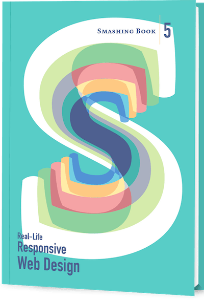
Smashing Book 5: Real-Life Responsive Web Design is our brand new, upcoming book with smar front-end techniques and design patterns derived from real-life responsive projects. With 13 chapters on responsive workflow, SVG, Flexbox, Web fonts, responsive images, responsive email, content strategy, debugging, performance and offline experience, this is just the book you need to master all the tricky facets and hurdles of responsive design.
The illustrations inside the book were crafted by Guillaume Kurkdjian and the cover was designed by Jessica Hische. (View large version)
Once again, the book is going to be quite thick, and both hardcover or digital editions (eBook in PDF, ePUB and Kindle) will be available. So if you want to get your hands on the book, you better not wait too long. We know it — you’ll love the book as much as we do. Free worldwide shipping.
Table of Contents
We invited respected designers and developers who know a thing or two about responsive websites. The chapters have also been reviewed by active members of the community such as Jake Archibald, Dmitry Baranovsky—just to name a few.
Author
Chapter
Design Systems
+
There isn’t a standard definition of “design system” within the web community and people use the term in different ways. In this chapter, we’ll define what a design system is and what it consists of.
Design Principles
+
Solid principles are the foundation for any well-functioning system. In this chapter we’ll discuss the qualities of effective design principles and look at some of the ways of defining them.
Functional Patterns
+
In this chapter we’ll discuss the role of functional patterns and why they should be defined early in the design process.
Perceptual Patterns
+
In this chapter we’ll discuss how perceptual patterns work and their role in a design system.
Shared Language
+
This chapter describes how to establish a shared language, which allows a group of people to create and use patterns cohesively for a particular product.
Parameters of Your System
+
This chapter introduces some of the qualities a design system can have, and the ways in which risks and downsides can be managed.
Planning And Practicalities
+
In this chapter we’ll look at finding support for establishing a design system in your organization, and planning and starting the work.
Systemizing Functional Patterns
+
The exercise in this chapter describes an approach to systemizing functional patterns, starting with a product’s purpose.
Systemizing Perceptual Patterns
+
The exercise in this chapter describes how to conduct an inventory of styles, define perceptual patterns, and integrate them into the system.
Pattern Libraries
+
In this chapter we’ll look some of the practical techniques to set up a simple, useful, and multidisciplinary pattern library.
Technical Details
584 pages, 16.5 × 24.0 cm (6.5 × 9.5 in).
Quality hardcover with stitched binding and ribbon page marker.
If you have any questions, we are right here to answer them. We love our customers, and we’d love to help you in any way or just listen to your story. So please feel free to ask questions via Twitter @smashingmag — we’ll get back to you right away. Just in case: here are answers to some frequently asked questions.
How much does shipping cost to my country?
+
No shipping costs for all orders above $20 — wherever you are in the world! We ship everywhere, worldwide, via Airmail shipping. What you see is what you pay.
Delivery times to my country?
+
All books will be shipped via airmail to keep delivery times as short as possible. You can find the anticipated delivery time for your country in the delivery times overview. Shipping has started mid-July 2015.
Is the eBook included?
+
Yes, the eBook is included when you buy a printed book, so that you can download the eBook right away. For most of our books, we provide PDF, ePub and Amazon Kindle formats.
What payment methods are accepted?
+
We accept PayPal, VISA, MasterCard and American Express. Of course, we use a secure connection, with 256-bit AES encryption and a green GeoTrust Extended Validation SSL CA certificate. And no, we don’t store your credit card data on our servers.
Is there a money-back guarantee?
+
Yes, absolutely! No risk is involved. Our 100-day full money-back guarantee keeps you safe. Don’t hesitate to return your purchase. You’ll get your money back with no ifs, ands, or buts!
I have a question that is not covered here.
+
Please leave a comment below, or get in touch with us via the contact form or via @SmashingSupport on Twitter. We would love to help you in any way we can — you know that!
That’s it, everyone! We sincerely appreciate your support and trust, and we’ll make sure to deliver the book to you as soon as possible. Cheers!
Hardcover
$.
Gorgeous, printed book. eBook is included. Now available.
eBook
$.
PDF, ePUB, Amazon Kindle.
About The Author
Heydon Pickering
is a Lorem ipsum dolor sit amet, consectetur adipiscing elit. Praesent et rutrum tellus, in bibendum sem. Duis velit ante, finibus id neque condimentum, feugiat ullamcorper lectus. Morbi efficitur lobortis lectus, ac condimentum ligula varius dignissim. Sed viverra viverra dui, non pulvinar risus viverra eu. Morbi sed mi libero. Ut eu nisi quis quam fringilla sodales. Nam auctor lectus sit amet nisl pharetra, at convallis purus facilisis. Duis id convallis enim. Sed condimentum, augue quis blandit laoreet, leo turpis egestas nisl, non porttitor lacus dolor sed lorem. Ut vel justo blandit, finibus lectus id, iaculis tortor.