Sometimes we tend to think of our designs as if they are pieces of art. But if we think of them this way, it means they won’t be ready to face the uncertain conditions of the “real world.” However, there is also beauty in designing an interface that is ready for changes — and, let’s admit it, interfaces do change, all the time.
Further Reading on SmashingMag:
- Conversational Interfaces: Where Are We Today? Where Are We Heading?
- Content Prototyping In Responsive Web Design
- Getting Started With VR Interface Design
- How To think Like An App Designer
One of the things I like most about designing a mobile app is that, from the initial concepts to the time when you are fine-tuning and polishing all of the interface details, this is a process with many steps. In this process, I, together with several other members of the team (from researchers to illustrators to developers), am involved as a designer. But this also means that a lot of decisions have to be made in each and every stage — and some of them don’t always seem to be as fun to make as others.
As UX specialists, we have varied and diverse backgrounds, but visual interfaces are what we spend most of our time on (and are what is most often attributed to us). We are visual thinkers with a highly trained eye. That’s why it’s tempting sometimes to jump straight to the visual UI design stage when starting a new project, and one of the reasons why we may be bored by some other tasks.
This also means that we often postpone (or, worse yet, neglect) other important parts of our process and workflow: defining user needs and goals, sketching task flows, working on all the details of the information and interaction design, etc. These are critically important, too, and at the same time, they are more abstract and more difficult for many people to visualize how they will become a tangible part of the final product.
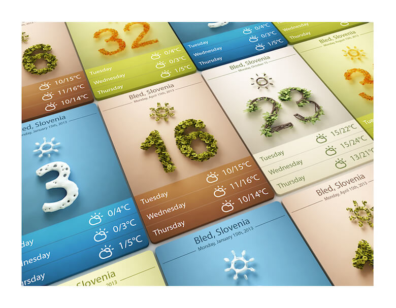
When we’re working on a visual design, the so-called pixel-perfect philosophy could be a trap that makes us spend more time than necessary crafting the little details until even the smallest of them is in the “perfect” place in the interface. This leads to a generation of designers who use Dribbble and Behance mainly to show polished screens of apps and websites and who are more concerned with looks than with how a design actually works. And in the real world, things tend not to go as well as we expect.
Or, as Paul Adams puts it:
I see designer after designer focus on the fourth layer without really considering the others. Working from the bottom up rather than the top down. The grid, font, colour, and aesthetic style are irrelevant if the other three layers haven’t been resolved first. Many designers say they do this, but don’t walk the walk, because sometimes it’s just more fun to draw nice pictures and bury oneself in pixels than deal with complicated business decisions and people with different opinions. That’s fine, stay in the fourth layer, but that’s art not design. You’re a digital artist, not a designer.
Personally, I think the best designs (when speaking about user interface design) are the ones that not only look and feel good, but also respond elegantly to variable conditions and even unpredictable situations.
In the long road of building a product, there are phases when designers need to be more collaborative and less focused on the visual design. And this is precisely where I’m going to focus on for the sake of this article’s length (I don’t want you to fall asleep at the keyboard!). In the next few paragraphs, I’ll give you some hints and tips on how to put that app design you are working on to the test, and to see whether it’s ready to be released into the wild.
Finding Beauty In Imperfection
When I was studying graphic design in college, they taught us about the beauty of balance, alignment, proportion and tension and how to position elements in space in such a way that they are harmonious and pleasing to the eye. With this knowledge, my life changed and I started to look at the world with different eyes. Later on, I started designing interfaces and I tried to put those same principles into action — all of the information on the screen should form a visual composition that’s highly satisfying to look at.
If you apply these principles to mobile app design, then we’d find that we must display just the right amount of information. For example, if a screen has to list people’s names, the designer would usually select a few short and common ones and arrange them together perfectly — leaving no room for an unexpectedly long name that could break the design or make it fall apart later.
This approach is based on the assumption that there is no beauty in chaos and imperfection — even though these two aspects appear frequently in the real world. But visual interfaces are not static pieces of art to be admired; they are dynamic, functional spaces that change and adapt for each person using them. We should not succumb to the temptation to design purely for aesthetics, because we can never control everything an interface must present to (and also do for) people.
Instead, we must design for change! This is what the Japanese call wabi-sabi, a “worldview centered on the acceptance of transience and imperfection.”
Because of this, it’s important to think and design differently:
- try to present data in your design in many ways;
- whenever possible, use real data.
When you try to present data in a few ways, including some unpredictable ones, you will be able to test whether the interface is ready to handle these situations that are beyond the design’s “comfort zone.” Also, be prepared for extreme cases (when none or a lot of information is present, for example), and try to avoid the “centers” (when everything looks good and balanced).
If you have already launched the product, this will be easier because you can pay attention to the real data and use it in your ongoing design process as a reference. But if you are working on something new, then you will have to dig a bit deeper, do some research and try to understand how (and what kind of) information will be presented later on. You can also talk about this with a developer from your back-end team, who will be able to better explain to you what kinds of data will be stored and presented.

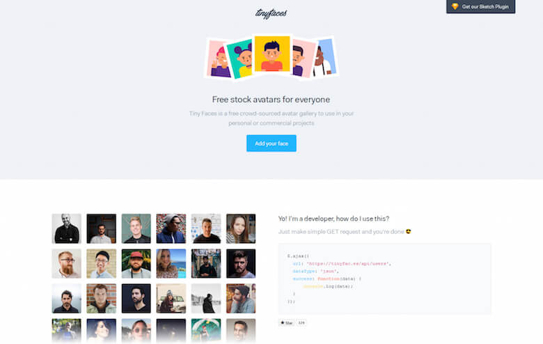
I’ll give you one last, more graphic example with something that a developer friend of mine calls “the pretty friend syndrome.” When we are designing a screen that will contain pictures of people, like user profiles, we tend to use nearly-stock photos of people who look good and fit well within the design. Yet when he sees such designs, my friend says, “I wish I had friends so handsome.”
So, an alternative to “perfect” imagery could be to use more random photos of people with varying colors. That way, you will be able to test how overlaid elements look with different kinds of backgrounds, allowing you to see whether contrast and legibility are still intact.
Don’t Be Too Optimistic
We are optimists by nature on how an app is going to work. We suppose that everything will go quickly and smoothly and without interruption because… why not? That’s why we sometimes forget how to design and handle some of the potentially not-so-good situations that the user might face later on.
Just to name a few, what would happen if suddenly the Internet connection drops? Or what if there’s an error while the browser is trying to connect to the API when executing a task? And if the connection is too slow, will there be a loading indicator (such as a spinner or progress bar), or will there be some placeholders to (temporarily) fill the display blocks while the actual data is being loaded? And what about the possibility of refreshing certain screens of the app? When (and in which cases) would this be possible?
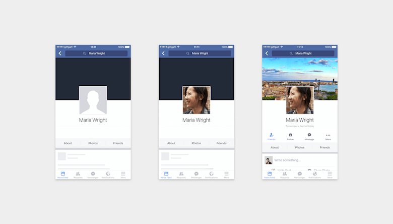
As you can see, I’m not talking about errors made by the user (for example, making a mistake when filling a form), but about errors that are out of their control but that happen nevertheless. In this case, it’s even more important to talk to developers to know and understand what could go wrong on different screens, and then to devise an approach that could get the user out of trouble easily, giving them the option to try again later or to perform a different action.
In any case, it’s always a good idea to identify the specific conditions that trigger each error and to design a helpful error message for each individual case. These helpful messages will help the user to respond appropriately in each case and to know what to do next to fix the problem. Even if it’s somewhat tempting, avoid a generic error message at all costs.
Understand The Flows
An interface comprises many elements that together form the whole layout of the application. However, when we focus on the user interface as a whole, we often forget that some elements also have smaller tasks to perform that contribute to the general goal.
Speaking of goals, this is like football (or soccer, if you happen to live in the US). You see, I’m a big fan of this sport, like most people in Argentina, where I’m from. In order for the team as a whole to win, the coach needs to know what to expect from each player and what task they will perform at different moments — even when the unpredictability of some of them (I’m thinking about the magic of Messi) can make this harder.
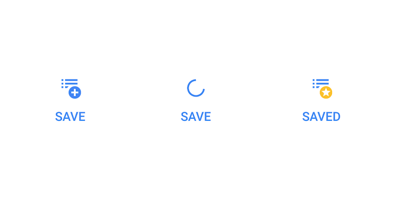
Moving forward and (hopefully) forgetting about my sports analogies, let’s translate this to our design cases. If there is a button or item that triggers some kind of interaction, then look ahead and think about the next step: Will a loading state be displayed while the action is being performed? Could it be disabled for some reason? What if the user is holding down the button for a while; will there be any feedback? Just as there are different states for whole screens, the same should apply to individual elements as well.
In addition, remember to consider how the logic of the product matches the user’s mental model, helping them to accurately and efficiently achieve their goal and to complete their tasks in a meaningful and predictable way.
What I do to address all of these points is to just stop what I’m doing, pause, step back and look at the bigger picture of the entire flow of multiple screens and states over a sequence of steps and actions. I’ll look for the multiple paths that lead to that point, and the multiple paths that lead away from it.
You can do the same while using a prototype, performing the actions slowly, conscientiously and carefully. If this is too challenging for you — because you have probably done this several times before and it’s become kind of an automated task now — borrow some fresh eyes (not literally, of course!) and simply ask a colleague, friend or active user to look at the design or prototype. Seeing someone else use and interact with your design can be illuminating, because we are often too close to and too familiar with it and, so, can overlook things.
Designing For Your Screen
When I’m designing, I usually have my phone next to me, so that I can preview my work and make adjustments in real time. To do this, I use Mira, Crystal or Sketch Mirror, depending on whether I’m designing for Android or iOS.
I think this is a good practice, but this way it’s also easy to forget about all of the other phones different from yours that people may be using. A lot of different screen sizes are out there (especially on the Android platform); try to consider all possible variations.
One way of knowing where to start is to check what kinds of devices your actual users have.
And when preparing your design for those various screen sizes and orientations, it’s not just about stretching boxes and repositioning elements. Carefully consider how to make the most of each situation and, furthermore, how to make the necessary adjustments even when it means deviating a bit from the original design.
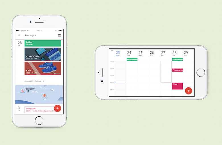
In these cases, the same principles that we’ve discussed before still apply: unpredictable situations, different kinds of content, variable amounts of information, missing data and so on — you have to design for all kinds of possible scenarios. Don’t fall into the trap of designing screens as separate, individual parts of the product — they are all connected.
This will be helpful not only to you, but also to your developer friend, who will need to know many of the possible scenarios in order to write the code and prepare the interface to tackle these situations.
What You Need Today, You May Need Tomorrow
You may have noticed that the goal of many of the points in this article is to reduce the unexpected. Even so, there will be many situations in which you won’t have a clear answer. Developers will often ask, “So, what would happen if I do this instead of that?” — pointing to a potential outcome that you hadn’t considered before.
If this happens, then you will have to solve that particular issue for only one case and only one screen. But always try to think globally, and consider how the answer to that particular problem could be designed to work in a flexible way so that you could potentially reuse it later on.
After all, this is what we, UX designers, do — we design and define flexible systems that adapt to unanticipated states, conditions and flows. Think of your interface as a living ecosystem of moving, changing smart parts, instead of a collection of individual blocks of pixels.
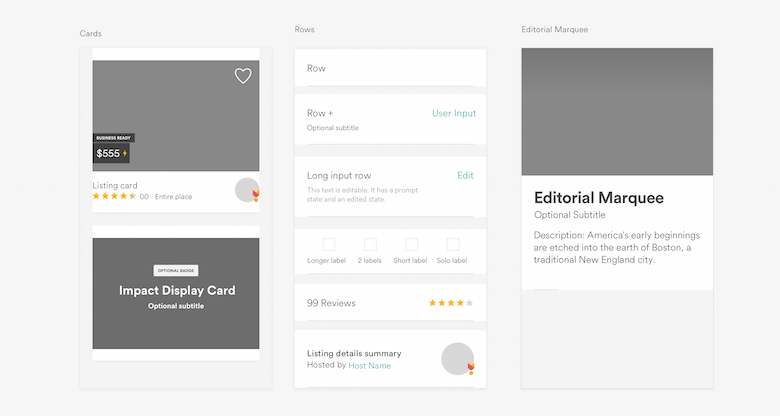
During this part of the process, you’ll need to work very closely with developers on your team, mostly to define a set of rules of behaviors for many different situations. But keep a good balance — try not to over-design things. Set your own limits with a dash of common sense. You need to strike a good balance between functionality and consistency. Remember that a good design system is flexible and is prepared for some exceptions to the rules on certain occasions.
On the other hand, think of how elements you have already designed could be tweaked to fit new situations. You will see this better if you make a library of design components, so that, with just a quick overview of the library, you will know whether you need to design something from scratch or you can use something readymade.
Final Tips And Tricks
If you want to prepare your designs to face the unpredictable and the unknown — and if you want to also, hopefully, get along better with your lead developer by providing them with everything they will need beforehand — here are some final tips.
Work More Closely With the Developer
One of my best experiences with a developer so far (hi, Pier!) came about simply from sitting right next to him. This is very important, and it will make a huge difference because it will improve communication. Talk often in order to better understand the product and how it works and what they will need to learn from you. Ask, and ask over and over again, in order to see the bigger picture of all possible outcomes.
Get Involved in Your Own Design
Get involved in your own design in a conscious, critical way, paying attention to details and small interactions. Get involved and commit yourself. At every step, think of the purpose of each element, which interactions define it and what would happen if something either goes well or goes wrong.
Test in Different Scenarios
See how things behave in circumstances different from the ones you have while working on the design, beyond the design’s comfort zone. Leave your desk and speak with the actual people who are using (or will be using) the app. And, if possible, bring along others from your team with you. This is also very important — everybody has to be in touch with the real world, so that you all understand better the situations of real users.
Avoid Nonsense Buzzwords, Communicate Well
The key to good communication is to understand each other well. We sometimes use fancy words to sound “smarter” or to justify our work, but more important is for everybody on the team to be on the same page. Mutual understanding is key here.
Developers have jargon of their own, but most of the time you will be talking about the same things, only with different words. For example, what you call a “screen” is a “view” to them, and what you call a “button” is a “control,” and so on. So, try to align and agree on the terminology that you will be using, to make the exchange of information easier.
This is just as important when you’re talking to product managers and business partners. Designers need to be “multilingual” and understand everyone.
Use Components, Rules and Internal Patterns
Did I mention that I am a big advocate of design systems? Using a component library, I can design a new screen in literally five minutes (don’t tell my boss!), because I already have what I need to make it. Sometimes you will need to define those components the first time they arise, but they can be reused later for similar cases, not just to save the day in an emergency. Even though it might look like a waste of time in the beginning, it really will pay off in the long run.
Note: This article is not focused on components or pattern libraries, but here’s an excellent (and very detailed) read that I recommend in case you would like to learn more: “Taking Pattern Libraries to the Next Level.”
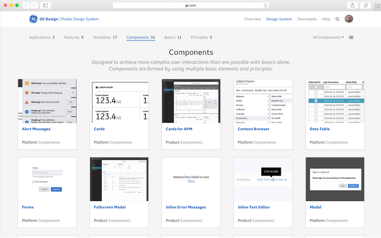
Last but not least, don’t reinvent the wheel unless you have to. By taking advantage of common patterns and elements of the operating system and the app itself, you will design faster, the developers will build the screens more easily and, finally, the user’s learning curve will be less steep.
Discussion Is Better When Something’s on the Table
Do some design and prototyping even before you know whether the idea is feasible. It’s always better to show what you have in mind with a (hopefully) working live prototype as a means of communication.
Responding to a tangible proposal is always easier for people than imagining something theoretical. Don’t fall in love with your idea too early because it could be easily dismissed, but at least the prototype will help everyone to see what you’re talking about. (I wrote a little something about prototyping and prototyping tools not long ago: “Choosing the Right Prototyping Tool”.)
Conclusion
Having a clearly defined problem with an elegant solution based on a design system will make the visual design part of our work even more fun, because we can focus on the refinements, polish and delight of the interface, without having to iterate endlessly. When we jump to the visuals too soon, we have to solve the problem and craft the interface at the same time, which often leads to frustration and burnout.
Changing your workflow might be challenging in the beginning, but after a while you will enjoy working within the constraints. This will also transform the way you think, and hopefully help you to move away from focusing on the visual details. You will become a more complete and capable UX designer, using the appropriate deliverables, and not just churning out an endless stream of visual mockups and compositions.
Good luck, dear reader! Do tell me what your thoughts are in the comments below, or ping me on Twitter, I’d like to hear your feedback!
Further Reading
- “Modern Design Tools: Using Real Data,” Josh Puckett, Medium
- Craft, InVision A plugin for the Sketch app that enables you to use real data in a design.
- “The Dribbblisation of Design,” Paul Adams, Intercom
- “Taking Pattern Libraries to the Next Level,” Vitaly Friedman, Smashing Magazine
- “How to Fix a Bad User Interface,” Scott Hurff
- “Building a Visual Language,” Karri Saarinen, Airbnb
 (mb, al)


