Many criticize gestural controls as being unintuitive and unnecessary. Despite this, widespread adoption is underway already, and the UI design world is burning the candle at both ends to develop solutions that are instinctively tactile. The challenges here are those of novelty.
Even though gestural controls have been around since the early 1980s and have enjoyed a level of ubiquity since the early 2000s, designers are still in the beta-testing phase of making gestural controls intuitive for everyday use.
This article will explore the benefits and drawbacks of gestural controls for mobile UIs, as well as offer advice on effective implementation that avoids the gap in user familiarity.
Further Reading on SmashingMag:
- The Thumb Zone: Designing For Mobile Users
- Finger-Friendly Design: Ideal Mobile Touchscreen Target Sizes
- Beyond The Button: Embracing The Gesture-Driven Interface
- A Guide To Designing Touch Keyboards (With Cheat Sheet)
General Gestures
Gestures come in all shapes and sizes. The most common are listed in the graphic below. These are the conventional controls to which most active mobile device users are accustomed. These are the most used across platforms and, in that regard, the most intuitive. At least that’s the case with people who have significant experience using gestural controls.
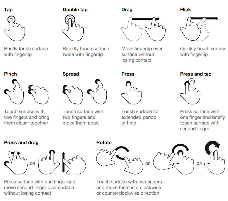
This level of intuition can’t be applied, however, to the diminishing population who are flying blind when confronted with a mobile interface. According to an oft-cited study by Dan Mauney, there are a great deal of similarities in the way people expect a mobile interface to work. This study asked participants from nine countries to create a set of 28 actions using a gestural interface.
The results were stunningly similar. There wasn’t a ton of variability between actions. Most people expected certain actions to work the same. Deleting, for example, was most often accomplished by dragging an element off of the screen. Menus were constantly consulted — despite warnings not to do this. People often drew a question mark to indicate help functionality.
Oddly enough, the standard set of controls used across most apps were these:
- tap,
- double-tap,
- drag,
- flick,
- pinch,
- spread,
- press,
- press and tap,
- press and drag,
- rotate.
These didn’t always account for the intuitive gestures most people in the study created when left to their own devices. This presents a big question: How intuitive are gestural interfaces? Not only that, but what are the pros and cons of implementing a gestural interface?
Regardless of the drawbacks, one thing is clear: Gestural interfaces aren’t going anywhere. That’s why it’s vital for today’s designers to firmly grasp the underlying concepts that make gestural controls effective. Otherwise, the chance that the usability of their work will suffer increases dramatically.
Benefits Of Gestural Controls
Gestural controls are popular because of two major factors:
- the meteoric rise of mobile devices with touchscreens,
- the movie Minority Report.
Kidding. It’s just about the mobile devices. The Minority Report HUD display is such a fantastic example, however, that it’s become somewhat of a trope to discuss it in conversations about touch interfaces, but we’re still a ways off from interacting with holographic projections.

Even so, this foreboding Tom Cruise vehicle did a great job of showing what will eventually be possible with UI design. And the important part of that is getting something that’s usable and intuitive. Let’s examine how that’s possible in our first tangible benefit of gestural control.
Gestures Are Easy to Learn
Touch UIs only feel intuitive when they approximate interaction with a physical object. This means that tactile feedback, and the ability to manipulate the UI elements, has to work as an abstraction of a real object in order to be truly intuitive.
Even poorly designed interfaces only take a little experimentation to figure out, at least for power users. Think about how often you’ve skipped a tutorial to just interact with an app’s interface. You might miss some fine details, but it’s fairly easy to discover the primary controls for most interfaces within a few minutes of unguided interaction. Still, there’s a serious limiter on user delight if there’s no subtle guidance from the designer. So, how do you teach your users without distracting them from the application?
The best approach to creating intuitive touch-based interaction is through a process called progressive disclosure. This is a process by which a user is introduced to controls and gestures as they proceed through an interface’s flow. Start by showing users only the most important options for interaction. You can do this with visual cues, or through a tutorial-like “get started” process. I favor the former, because many users (myself included) will usually skip a tutorial to start interacting with an app right away.
Slight visual cues and animations that give instant feedback in response to touch are the perfect delivery method for progressive disclosure. A fantastic example of this is visible in Apple products’ “slide to unlock” commands, although the feature has since been removed.

The interface guides you with text, indicates the direction with an arrow and offers immediate feedback action with animation. You can take this same concept and draw it out further with more multifaceted applications.
In his 2013 article about gestural interfaces, Thomas Joos, contributor to Smashing Magazine, covers this process thoroughly, pointing to YouTube’s Capture application as an example.
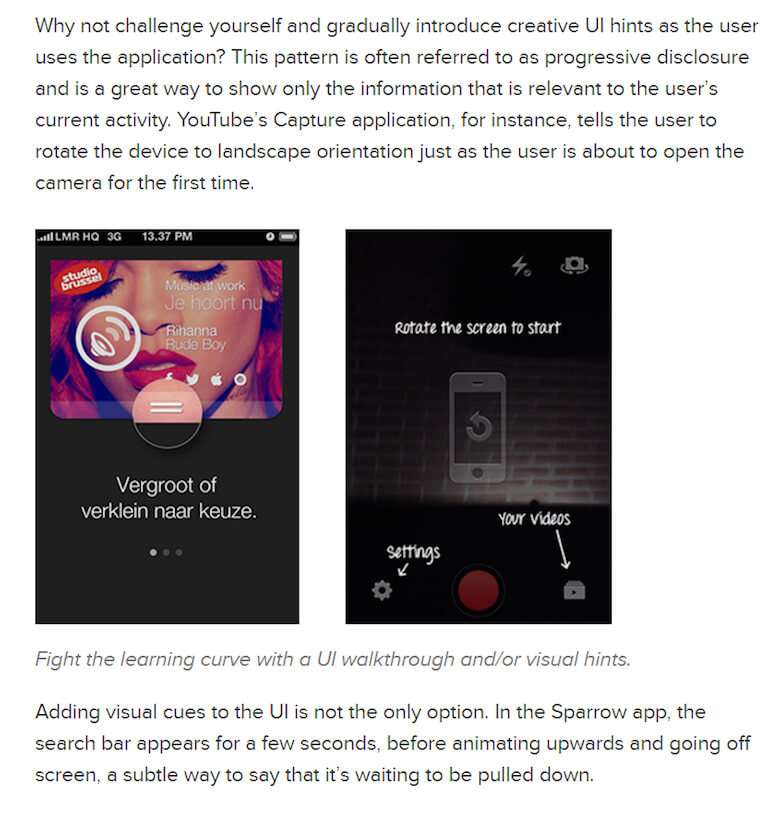
Both progressive disclosure and the tutorial techniques offer guidance should a user require it. The disclosure method, however, has the added benefit of respecting the user enough to expect they can figure out a process.
Because they’re completing a task with minimal guidance (achieving goals, as it were), they feel a sense of accomplishment. The design is adding to their delight in interacting with the app. This can help to create habits and obviously makes it much easier to learn related or increasingly complex operations within the application. You’ve established a pattern of minimal guidance; all you have to do is repeat it as the functions layer on in complexity.
The important thing to remember when teaching users how to use your interface is the three-part process of habit formation:
- trigger,
- action,
- feedback.
The trigger is the inciting action, such as a push notification reminding a user to interact with the app. The action is where you leave your subtle clue as to how the user should gesticulate in order to complete the goal. Then comes the feedback, which works as a sort of reward for a job well done.
This habit-formation process is a form of user onboarding, or a way of ensuring that new users are successful when they start using your application, and then converting casual visitors into enthusiastic fans. A great example of this process (specifically, the third step) can be seen in the Lumosity app.
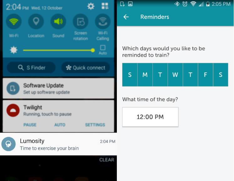
The Lumosity app is a game-based brain-training application. It allows users to set up their own triggers, which manifest as push notifications.
It then progresses to the actions, the games themselves. These games are gesture-based, and each is introduced by a quick, easy, simple tutorial.
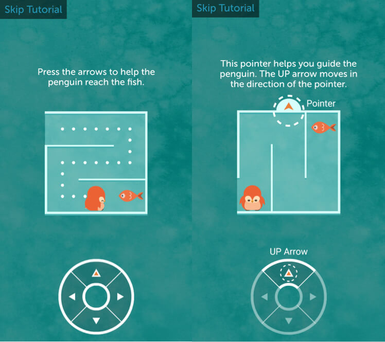
Note the succinct instructions. A quick read and the performance of the instructions provide instant feedback on user actions.
Finally, after the user has finished each exercise, the feedback is offered — then again, when they’ve finished a set number of exercises in a given day.
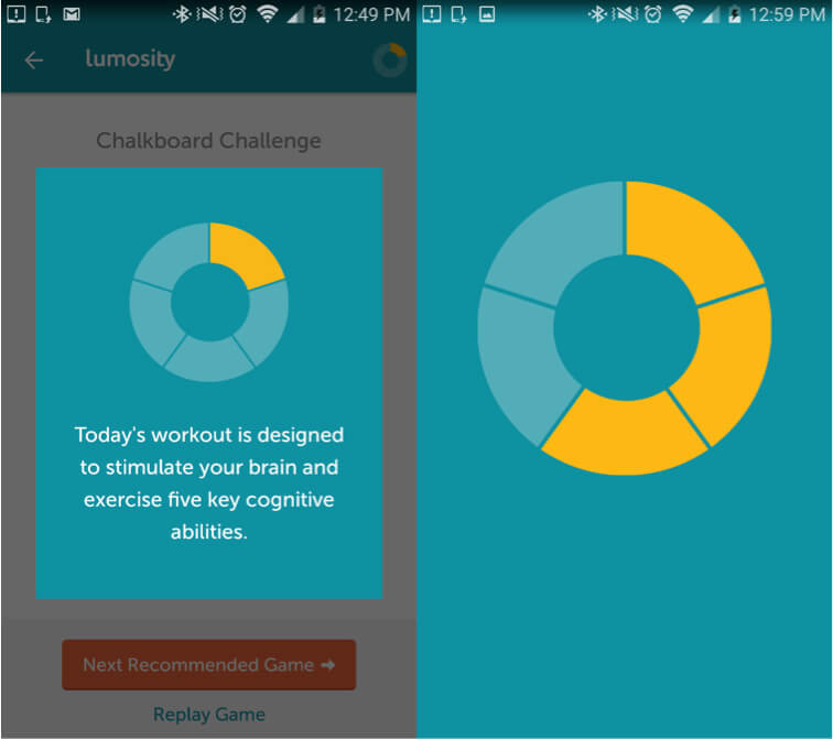
Providing these stimuli to the user reinforces their satisfaction from performing their tasks, as well as their memory of how to perform them. Gestural controls are a skill, like any other. If you can make learning them fun, then the curve for retention will decrease significantly.
Of course, easy learning is only one benefit of a gestural UI. Another big one is the fact that it promotes a minimalist aesthetic.
Touch UIs Free Up Screen Space
Screen real estate on a mobile device is a big deal. Your space is limited, and you have to use it wisely — especially if you have an abundance of features. That’s why so many interfaces are resorting to the hamburger menu icon to hide navigation controls.

Using gestures for navigation of a website might be a bit of a tradeoff in usability, but it makes an app look pretty slick. Just take a look at the Solar app, which is highly minimalist and offers those subtle cues we talked about earlier.
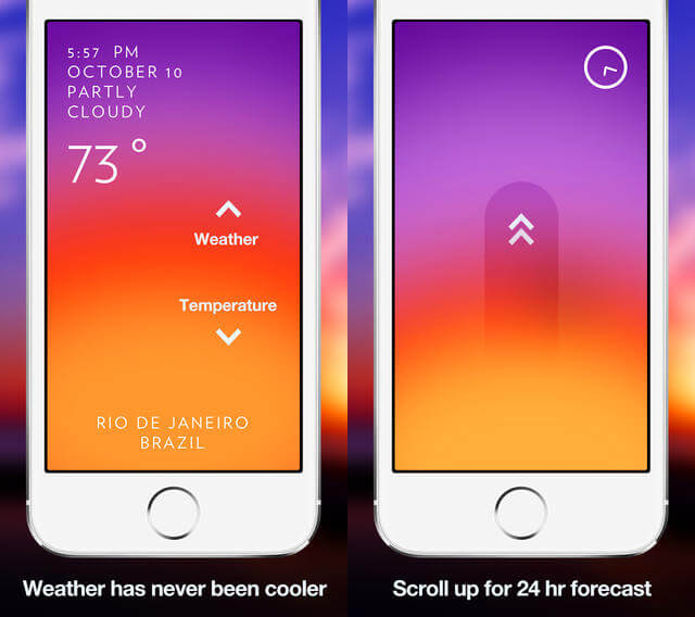
Though the clarity of the actions a user is meant to take is decreased slightly, the look and feel of the app are boosted in a tangible way. Plus, delight is increased because the user is given more autonomy to figure out what to do on their own. Speaking of delight…
User Delight
Something that’s easy to use and easy on the eyes is also easy to enjoy. Gestural controls enable a tactile experience for users, and that’s downright enjoyable. Using haptic feedback to indicate a successful interaction, for example, can give users a subtle sense of accomplishment. This could be as simple as a confirmative vibration upon muting the phone (as in the case of both Apple and Android products).
Basically, in addition to the visual and audio appeal of a product, designers can now begin incorporating touch sensations as a way to engage users. The folks over at Disney are exploring this concept with no lack of zeal.
Room to Explore
That brings us to our final point. This is unexplored territory — a whole new world of interaction for designers to bring to life in living color! While usability and industry best practices should always be considered and consulted, this is a chance to break creatively from convention. While it might not always work out to be revolutionary, experimentation in this field can’t help but be exciting.
Disadvantages Of Gestural Controls
Oddly enough, with all of the futuristic appeal and hype paid to gestural controls, the trend isn’t universally beloved. In fact, there’s a sizeable camp in the design world that considers gestural controls to be a step back in usability.
Thoughtless Gesticulation
At least part of this pushback is due to the rush to implement. Many designers working on gestural interfaces are ignoring the standard UX caveats that have been shown to measurably improve a product’s usability. Moreover, the inclination towards conformity in design is always pretty high. You’re reading what is essentially a “best practices” article, after all. And it’s one of thousands.
This means that people are using the same techniques and design patterns across any number of applications and interfaces, even when they don’t make sense, due to “conventional wisdom.”
Designers sometimes duplicate the same usability problems in their work that you find in other popular gestural interfaces employed by industry big boys, such as Google and Facebook — for example, the preference for icons over text-based links. In an effort to save space, designers use pictures rather than text. This, in itself, isn’t exactly a cardinal sin, and it can be very helpful in moderation.
The problem is that it isn’t exactly super-intuitive. Pictures are subjective. They can mean different things to different people, and assuming that your users will know what an obscure icon is supposed to do is quite the gamble.
Check the interface of music app Bloom.fm.
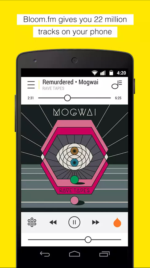
There’s a lot going on here. What’s the raindrop supposed to be? Is that a warning for a snowstorm in the bottom left? A musical note overlaying a hamburger menu in the top right, right across the screen from a regular hamburger menu? What am I looking at?
Granted, some users can hit the ground running with these interfaces and learn a lot as they go. But the point is that nothing about this interface gives you a sense of immediate apprehension. It’s not intuitive.
To address this, Bloom.fm might be better served by removing these dissonant symbols from the main screen entirely. Put these functions (whatever they are) in the hidden menu. After all, if you’re on a music player screen, what more do you really need than play, pause, fast forward and rewind?
Unfamiliarity Breeds Discontent
This brings us to my next point, which is the overarching problem with gestural interfaces: All of the controls and gestural functions are always hidden. You’re depending on a user’s prior familiarity with basic gestural concepts to get along.
This means that any departure from convention will be seen as unfamiliar. Even more problematic is that there’s no industry standard for gestural controls. It’s like the Wild West, but with more tapping and less shooting. Double-tapping might mean one thing in one app and something completely different in another.
Gestural controls can even change between iterations of an application. For instance, the image-sharing application Imgur used the double-tap gesture for zooming in an old version, but an update to the interface changed the gesture to something different entirely. Now it’s used to “upvote” a post (i.e. increasing its popularity and giving the poster fake Internet points).
Which leads to another problem: The learning curve, depending on your attention to usability detail, can be quite steep. While picking up gestural skills is usually pretty easy, as discussed above, the greater room to explore and implement new design patterns means that touch UIs can be highly variable. Variability is roughly equivalent to unpredictability, and that’s the opposite of intuitive.
To combat this, well-designed touch UIs stay in their lane for the most part, relying on visual cues (particularly animations) and text-based explanations in some cases, to establish a connection between a gesture and a function in the user’s mind.
The Bottom Line
As stated at the beginning of this article, despite any deficiencies that may or may not be innate in the basic concepts of gestural interfaces, the touch UI is here to stay. Its flexibility and mild learning curve (for the basics anyway) practically ensure it.
The bottom line of this whole thing is that, regardless of the benefits and disadvantages, touch is the dominant interface of the future. In other words, you’ll have to find a way to make it work. Proceed with caution, and stick with the familiar whenever possible. The best advice I can give is to keep it simple and test with users above and beyond what’s required. It’s in your best interest to figure out how and when to introduce new controls, to make sure you’re not an example in someone else’s article about UI usability.
If you’d like to learn more about the implementation of touch gestures, check out these helpful resources:
- “How to Implement Gestures Into Your Mobile Design,” Carrie Cousins, The Next Web
- “Touch Gestures and Events,” Mozilla Developer Network
- “Multi-Touch Web Development,” Boris Smus, HTML5 Rocks
- “Touch Events: W3C Editor’s Draft,” W3C
- “Gesture Navigation-Multitouch Gestures for Above Android 4.0.3+,” Xposed Module Repository
 (da, vf, al, il)


