Since humans are visually driven creatures, the impact of imagery only increases with the help of animation. Our eyes innately pay attention to moving objects, and animation is like eye candy — catchy and bright elements that call attention to and help differentiate an app from its competitors. As of late, more and more designers are incorporating animation as a functional element that enhances the user experience. Animation is no longer just for delight; it is one of the most important tools for successful interaction.
However, animation in design can only enhance user experience if it’s incorporated at the right time as well as the right place. Good UI animations have a purpose; they are meaningful, and functional. In this article, we’ll talk about the role of functional animation in UX design and see when to incorporate motion into a design. If you’d like to follow along and spice up your designs with animations, Adobe introduced Experience Design CC (also known as Adobe XD) which you can download and test for free, and get started right away.
Further Reading on SmashingMag:
- Animated Microinteractions In Mobile Apps
- Best Practices For Animated Progress Indicators
- How To Design Error States For Mobile Apps
What Is Functional Animation?
Functional animation is a subtle animation embedded in the UI design as a part of the functionality of that design. It reinforces the design and has very clear and logical purposes including:
- Reduce cognitive load
- Prevent change blindness
- Establish better recall in spatial relationships
Animation brings user interfaces to life. In a human-centered design approach, where the user is the prime focus, a user interface needs to be intuitive, responsive, and human. Functional animation helps you achieve these goals.
The Role Of Functional Animations In User Interface Design
Well thought-out and tested functional animation has the potential to fulfill multiple functions.
Visual Feedback on User Actions
Good interaction design provides feedback. Feedback makes you feel like you’re interacting with real elements on the screen and demonstrates the result of this interaction (whether it was successful or not).
User interface elements such as buttons and controls should appear tangible, even though they are behind a layer of glass. Visual and motion cues can bridge this gap by acknowledging input immediately and animating in ways that look and feel like direct manipulation.
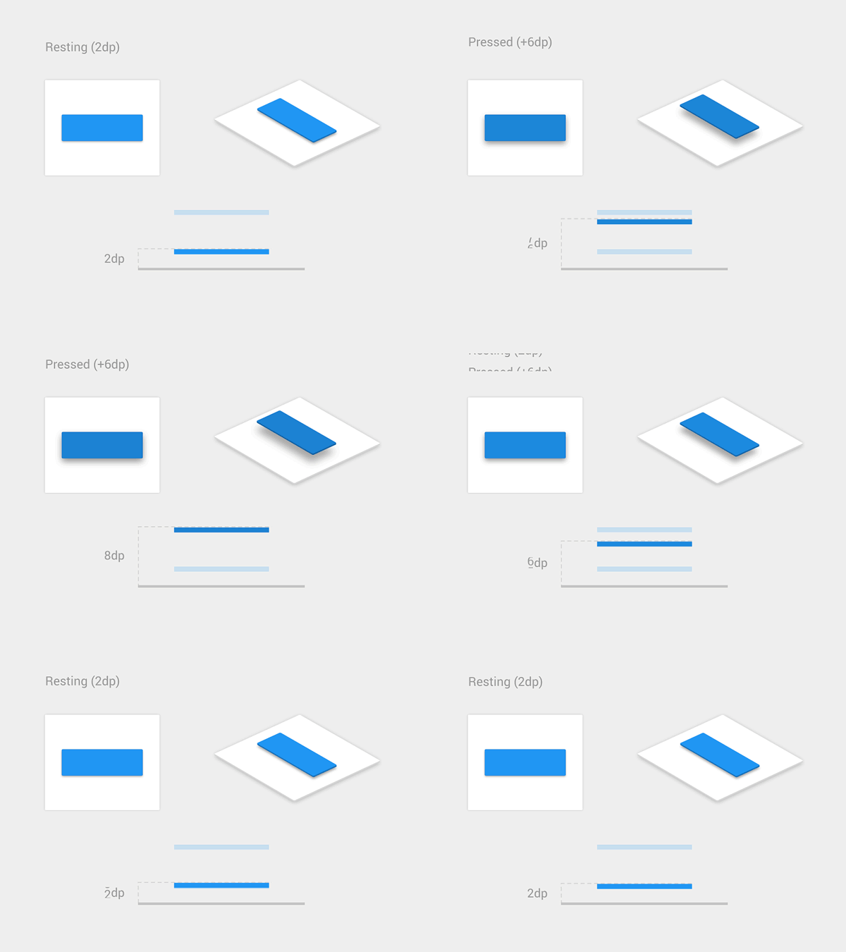
Visual feedback is also helpful when you need to inform users about results of an operation. Cases in which operations aren’t done successfully, functional animation provides information about the problem in a fast and easy way. For example, a shake animation can be used when a wrong password is entered. It’s easy to see why the shake is a fairly universal gesture to communicate the word “no,” since a simple head shake is how people give feedback to each other.

Purpose:
- Acknowledge that the system has received a user’s action.
- Confirm (or deny) a user’s action.
Visibility of System Status
As one of the original 10 Jakob Nielsen’s heuristics for usability, visibility of system status remains among the most important principles in user-interface design. Users want to know their current context in a system at any given time and apps shouldn’t keep them guessing — they should tell the user what’s happening via appropriate visual feedback.
Data uploading and downloading processes are great opportunities for a functional animation. For example, animated loading bars shows how fast a process goes and sets an expectation for how fast the action will be processed.
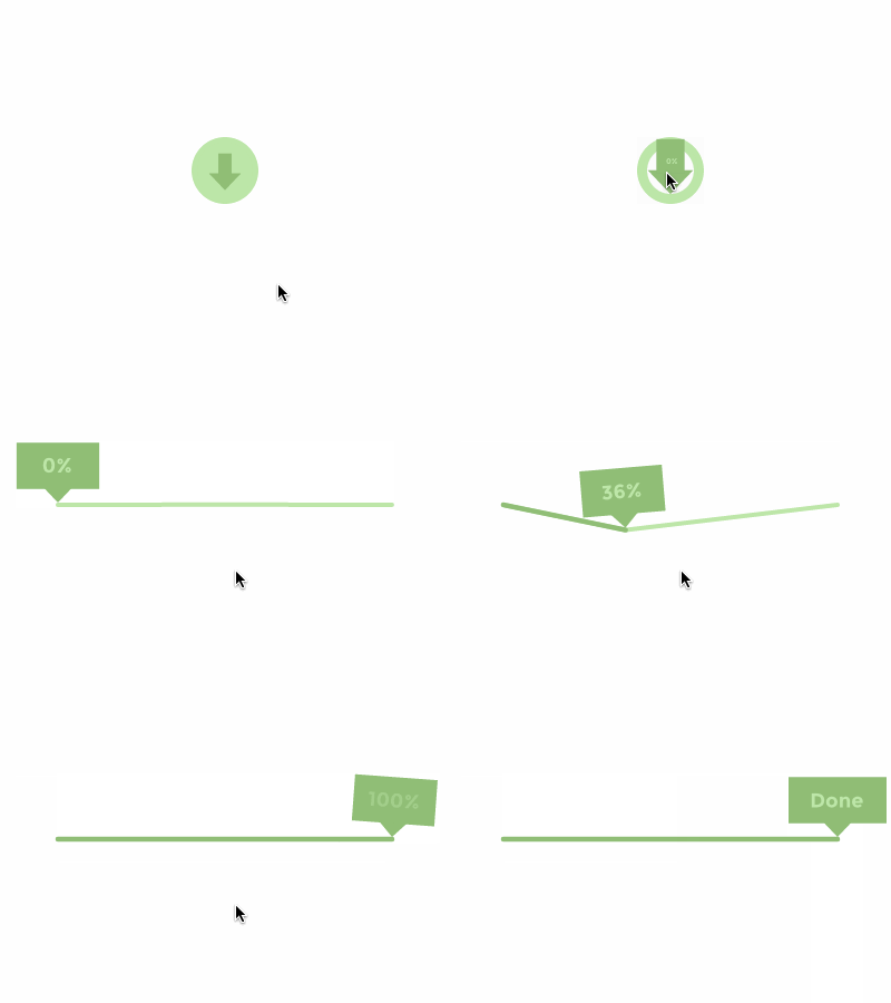
This type of functional animation can also be used to attract a user’s attention to important status changes in an app (or even in a system), such as an incoming call:

Or a new email in the inbox.

Purpose:Provide real-time notification of a system status, and enable the user to understand what is going on quickly.
Visual Hints
First-time users often need help to understand how to use an app interface. This is especially true for interfaces which contain unfamiliar or unique interactions (such as gesture-driven interfaces). Without help, users may be confused on how to interact with an app.
When it comes to teaching users to use your UI, you should provide a set of visual hints which convey what interactions are possible. This kind of functional animation drives a user’s attention to the possible interactions.
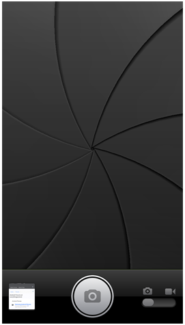
Visual hints can give the user insights into what is about to happen. For example, functional animation which prepares the user for the action of taking a photograph can be found in the iOS camera app (before iOS 7).
Or, visual hints can engage users to take further steps (which aren’t as obvious at first glance) by demonstrating how certain functionality in the design operates:
Visual hints can increase the level of usability and therefore the desirability of the product.
Purposes:
- Create necessary expectations by giving the user a clue of what is about to happen
- Help users orient themselves to the interface
- Tell users how they can and should interact with elements on the screen
Navigational Transitions
Navigational transitions are movements between states in an app, for instance, from a high-level view to a detailed view. State changes often involve hard cuts by default which can make them difficult to follow. Functional animation ease users through these moments of change; it smoothly transports users between navigational contexts and explains changes on a screen by creating visual connections between transition states.
Navigational transitions can be hierarchical (parent to child) or sibling transitions. Hierarchical transitions are used when users explore deeper levels or screens of an app, which are children to the current (parent screen). Motion highlights movement away from the parent towards a destination (a child element).
Sibling transitions occur between elements at the same level of the hierarchy. For example, this animation is used when a user navigates through tabs.
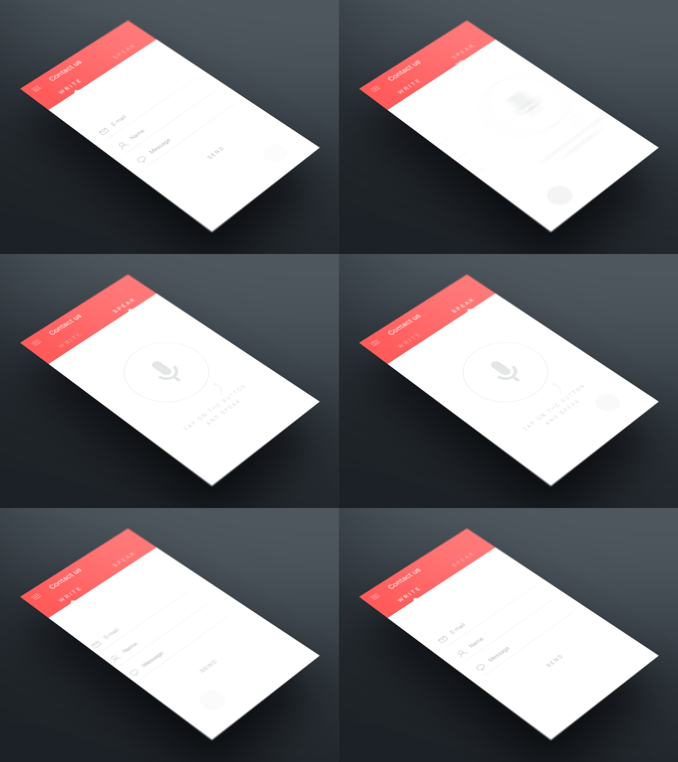
In both cases, functional animation helps the eye see where a new object comes from upon its reveal and where a hidden object goes (and can be found again). It provides visual cues, making the interaction easier to follow and reinforcing what has occurred.
Purposes:
- Define the spatial relationship between screens and elements
- Avoid a surprising transition by helping users comprehend the change that has just happened in the page’s layout
Branding
Whereas the previous roles of animations are quite logical, this one is full of emotions. Often, there are dozens of apps that have same exact features and accomplish the same tasks. They might all have a good user experience, but the ones that people love offer something more than just a good user experience. They establish emotional engagement with users.
Branding animation is responsible for this engagement. It can be used as marketing tool — support a company’s brand values or highlight a product’s strengths — at the same time make user experience truly delightful and memorable. The approach might not be clearly user-centered, but it has a functional purpose. In order to be successful, branding animation should support continuity of the experience. For example, fine animation from Lo-Flo Records website has a power to encourage users to interact more — people look forward to what they are will see next.
People do notice the details. Attention to animations can convey an emotion and can make the experience feel crafted. A fine animated waiting indicator, which demonstrates a unique style, can create a truly enjoyable experience.
Purposes:
- Entertain users, bring empathy and fun to design
- Create a signature of the product; help users relate to the product, increase a brand perception
How To Find A Balance
Where is the balance between useful and pure eye candy? It’s really important to take time and consider when an animation is and isn’t appropriate.
Animate With Purpose
Animations should always serve a purpose. They should never be done for animation’s sake. When an animation doesn’t fit a functional purpose, it can feel awkward or annoying, especially when it is slowing down a process that could be faster without any animation. For example, below you can see an animated concept for a PayPal email receipt. This animation looks great, but at the same time it’s excessive and obstructs the app flow because it takes almost 4 seconds to see transaction details. A simple fade-in animation of the receipt would be more suitable for this purpose, (simply because it takes up less time).
Keep in mind that users come to sites or launch the apps for a purpose — we need to show them what they are after in a short space and time-frame. Thus, when deciding to use animation in your app, incorporate animation only when it has a meaning and won’t distract the user from successfully completing what they intended to do.
Keep Longevity in Mind
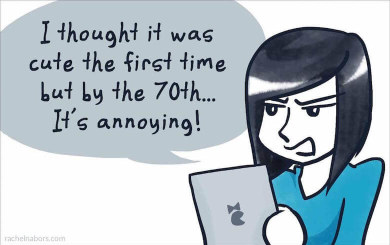
Even good animation can be annoying when it’s overused. When designing an animation, ask yourself a question: “Will the animation get annoying on the 100th use, or is it universally clear and unobtrusive?”
Prototype and Test Your Animation
When adding UI animations to your own work, iterative prototyping and testing with actual users are the right things to do. Prototyping is the absolute best way to convey how you intend to use animation in your design. If you use interactive prototypes, you will get a clear picture as to what works and where the flaws in your app are hiding. Very often, this leads to a complete rework because the look of your animation differs from how it feels. Thus, iterate often and iterate fast! Iterating numerous times on even the tiniest detail will make your animation great.
Conclusion
Identifying the places where animation has utility is only half the story. If you’re going to use animations in your designs, they should be built well, and that is only possible when an animation is a natural part of the design process. When done correctly, animation can turn a digital product from a sequence of screens into carefully choreographed memorable experiences.
This article is part of the UX design series sponsored by Adobe. The newly introduced Experience Design app is made for a fast and fluid UX design process, creating interactive navigation prototypes, as well as testing and sharing them — all in one place.
You can check out more inspiring projects created with Adobe XD on Behance, and also visit the Adobe XD blog to stay updated and informed. Adobe XD is being updated with new features frequently, and since it's in public Beta, you can download and test it for free.
 (ms, vf, aa, il)


