A viral app is the highest achievement on iTunes and Google Play. It’s an app that customers eagerly share across the Internet, through social networks, email, chat and word of mouth. It’s like rocket fuel, and it is the best case scenario for an app developer because word of mouth is far more powerful than any paid advertising. Ad clutter is everywhere, and people just ignore it.
No one trusts ads, and they cost too much for developers anyway. But humans have shared stories since we’ve been using rocks as tools. We’re naturally built for viral sharing.
But getting your app to spread faster than celebrity gossip takes a lot more than bolting on some Twitter and Facebook buttons. It requires strategizing a world of social interaction inside your app.
Further Reading on SmashingMag:
- How To Succeed With Your Mobile App
- Elements Of A Viral Launch Page
- Smart, Effective Strategies To Design Marketing Campaigns
- Lessons Learned After Shutting My Startup
What Is Viral?
Virality is about interacting with people and enticing them to participate. Virality isn’t a marketing strategy that can be executed once you launch. It has to be thought through and built into your app from the beginning.
To succeed, your app must pass these four tests:
- It must have something valuable to share.
- It must make it easy for users to share and for friends to join.
- It must reward users for sharing and offer them incentives to come back.
- The more people use the app, the more value must be created for them.
First and foremost, your app has to have a gem — something valuable to share. That something could be a photo, a great wine, a turn-based game, an article, a playlist or a five-mile run. It’s your customer’s little pride and joy, and it has to be shareable.
When users share their little gem, they’ll get a warm fuzzy feeling that keeps them checking into the app over and over. The more they check into the app, the more praise and delight they will get from it. And when the app’s audience grows, the value just keeps going up.
To figure out whether your app has any gems, ask yourself these few questions:
- Does my app offer something valuable to share?
- Is it worth being shared?
- How will users be rewarded when they share?
- Why will users want to share?
- Why would they want their friends to share?
- How will my app motivate users to keep sharing over the long term?
Old-School Viral Models
The typical viral flow starts when the user creates something and then shares it, leading friends to discover the gem and download the app so that they can get in on the action:

The typical viral flow strategy of apps.
With this approach, the most obvious way to offer social interaction in your app is to add buttons so that users can share their creations (or actions) on Twitter, Facebook, email and SMS. For example, the Faces app enables users to design silly faces of friends that can be shared on Facebook, Twitter and email.
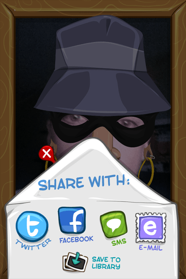
Social interaction in the Faces app has a typical viral flow, because it only lets users share images.
Unfortunately, this approach misses a lot of opportunities, because only some of the users will share, and only a small percentage of their friends will actually see what they’ve shared, let alone click on the link and download the app themselves.
To go truly viral, you need to engage your audience. Every time they use your app should build on the previous experience, so that they get more value out of your app. And as the audience grows, that value should just go up.
Think of Facebook, Twitter and Pinterest. No one sees the true value of these apps the first time they use them. But the more you put into Twitter, the more you get out of it.
Five Principles Of A Viral Strategy
You don’t have to dig too deep into viral principles before you come across something called the viral coefficient. In The Lean Startup, Eric Ries defines it as “how many new customers will use the product as a consequence of each new customer who signs up.” He claims that a viral coefficient greater than 1 will lead to exponential growth, and a viral coefficient less than 1 will lead to hardly any growth at all. I won’t get into the details, but the math looks like this:
viral coefficient = (average number of users invited by each active user who invites someone) × (proportion of invited users who actually join or become active) × (proportion of active users who invite others)
One important element missing from this formula is the time it takes for a customer to try the app and share it with their friends. The key is to get your users to invite their friends in the shortest amount of time possible. How do you do that?
The quick and dirty method is to just tap into their address book and spam their friends. But then you’d be abusing your customers rather than caring for them, and it will backfire in the end. Instead, try the five principles outlined below. (Most of the examples shown are iOS apps, but the principles apply to all platforms.)
Principle 1: Make It Effortless
The best apps appear so effortless that the design fades into the background, making the task at hand surprisingly easy. This is “flow,” and it has nothing to do with processes or charts. It’s about being completely absorbed in doing something you love and not being distracted by confusing or burdensome steps. The user loses a sense of time and self and becomes completely immersed. It’s why you can’t stop playing Minecraft and why your friend just spent three hours on Pinterest.
To create flow in your app, you’ll need to remove all obstacles and doubts that users might have about using your app and sharing it with friends. Let’s go through a few examples of how your app can do that.
Offer one-click sign-in via Facebook or Twitter, rather than with a dedicated user name and password. This not only gets users registered quickly, but lets you tap into important data to grow the network.
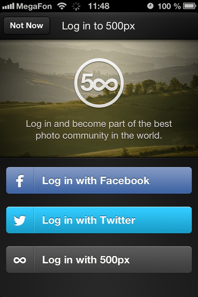
500px offers one-click sign-in via Facebook or Twitter.
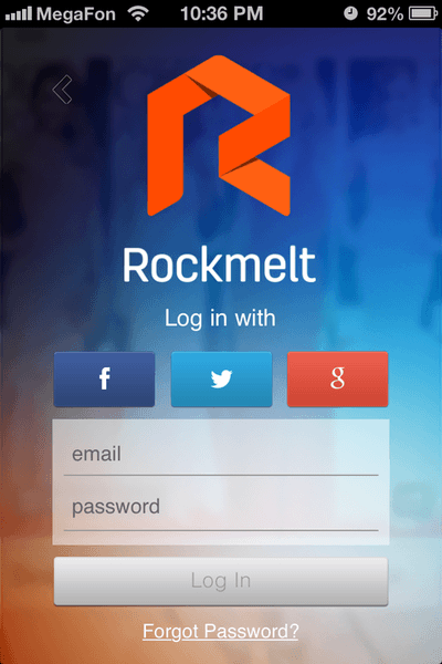
Rockmelt offers one-click sign-in via Facebook, Twitter or Google.

Snapguide offers one-click sign-in via Facebook or Twitter.
Display profile pictures of friends during authentication to increase their audience as well as yours.

Foursquare displays profile pictures of the user’s friends during authentication.

Vine displays profile pictures of the user’s friends during authentication.
Motivate users on the first screen to get started by clearly showing how they can grow their network and start sharing.

The first screen of Foursquare offers a clear path for users to get started.

The first screen of Hipvite (now defunct) encourages users to get started.
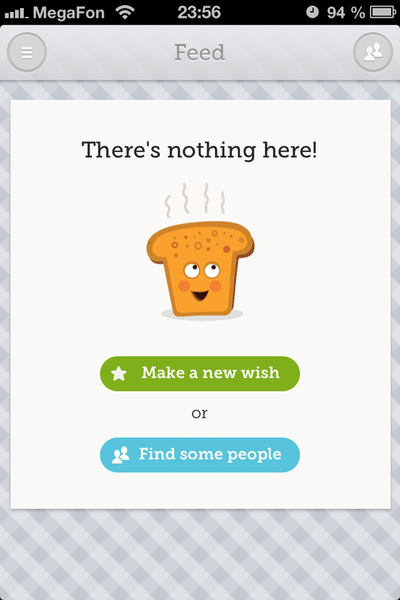
The first screen of Toast encourages users to get started.
Prioritize what is on the screen, and show top actions right in view. Users need to know what they can do.
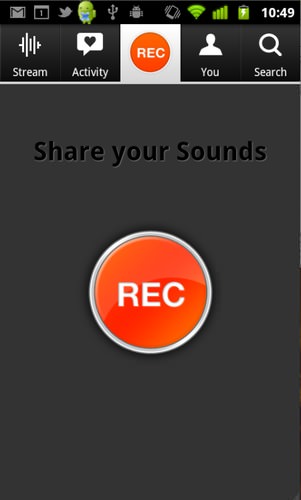
SoundCloud puts the top action right in front of you.

Wrappit has top actions right in view.

Snapguide has top actions right on hand.
Enable users to easily post to multiple social platforms with just one tap. Always make sharing part of the creation process, and let users post to multiple websites at once. One big advantage of the Android framework over iOS is that it allows apps to share anything with virtually any other app (as long as that other app can receive the “share” intent). This opens up all sorts of interesting viral potential.

Krop Circle lets users post to Instagram, Twitter and Facebook all at once.

Glmps lets users post to several websites with just one tap.

Rexly lets users post to Twitter or Facebook or send by email, all in one action.
Principle 2: Reward Often
If you want to encourage a certain behavior, reward it. This basic psychological tactic has been used on us since we were toddlers, and it will motivate your customers to share your app with friends. Give them a gift for each friend they get to use your app.
Best of all, when someone gives a gift, the recipient naturally has the urge to give one in return.
Inviting friends and connecting with others should be a part of their daily usage. Daniel Tenner, founder of Swombat, suggests that the number of users who each of your active users invites will determine your success. Therefore, inviting friends should be a core process in your app, rather than an afterthought. Experiment with ways to encourage customers to invite friends at different points in the app.
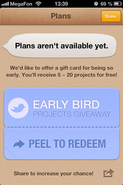
POP’s prototyping app rewards users for signing up early and telling friends.
Reward the friend, too. Rewarding customers for their referrals can make them feel guilty that they are making money off of their friends. The best way around that problem is to also reward the friends who receive their invitations. Voila! Now your customers feel like they’re doing their friends a favor. Everyone wins.
Rewards could be:
- extra storage,
- free themes,
- a character,
- a free upgrade,
- discounts,
- sample sizes.
To create a sense of urgency in the invitation, offer a limited-time promotion. This can get people out of their holding pattern by giving them an incentive to take action before the offer expires. It costs you nothing and could be just the push your customers need to convince their friends to download the app.
Sneak in secret rewards and surprise people, then watch as the app goes viral. Clear unlocks hidden themes when you follow some of the app’s developers on Twitter or if you complete a task at 2:00 am (I discovered that one the hard way). These hidden gifts create a storm on Twitter each time a new one is found, giving the app all sorts of wonderful free publicity.
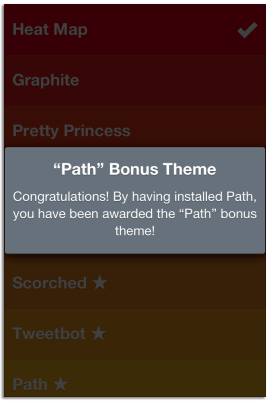
Clear rewards users with free themes based on other apps installed on their device and based on when they use them.

Each time a new theme is discovered, a Twitter storm happens, making the Clear app more viral.
Some apps even pay people to use them. Not that you’ll need to go to such length, but apps like Shopkick, GymPact and Viggle let users earn real cash and rewards by using them.
With Shopkick, users earn rewards, or “kicks,” simply by walking into participating stores and checking in via the app. They can earn more kicks by scanning items and purchasing them. As a reward, users get a first look at new items in the store, and they can use their kicks to unlock gift cards and products.

Users earn points on Shopkick by going into certain stores. (Image: Hongkiat)
GymPact entices users — non-exercisers, in fact — to go to the gym, work out and earn cash. Users start by making a pact with their friends, promising to work out at the gym a certain number of days, and they set the stakes of how much they’ll pay if they skip a day. Those who go to the gym claim cash from those who don’t!
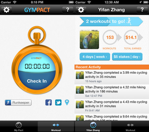
GymPact rewards people for going to the gym. (Image: Hongkiat)
Viggle is for TV junkies. It practically pays users just to watch the tube. Users earn points by checking into any TV show on the air. Users just tap the “Check-in” button, and their device listens to the TV, earning them points. More points are earned by answering trivia questions. The more points accumulated, the bigger the prizes, which vary from Starbucks gift cards to MacBook Airs.

Viggle rewards users for watching TV.
Principle 3: Give Users Control
Because virality and privacy are polar opposites, transparency is a must. Be up front about what your app is sharing, and give users full control over whether to share. If users don’t trust the app or suddenly see content appear on social networks that they don’t want to be shared, they’ll stop using your app or, worse, leave negative reviews on iTunes.
Be transparent about what is being shared. The social fitness app Teemo tells users what will be shared before they even log into the app. Sonar (iTunes link) reminds users that it won’t post to their accounts unless explicitly told to.

This nice little message in Teemo gives users confidence in the app.

Sonar reminds users of what will be shared.
Always allow users to control what is shared. This can easily be done by including a settings screen with toggles for controlling the sharing options, like in Pinterest’s app.

The settings screen in Pinterest lets users turn off publishing to their Facebook timeline.
Principle 4: Keep Pulling Them Back In
The more people use your app, the longer you’ll stick around. The longer you stick around, the more that customers and onlookers will say good things about you, spreading word of mouth and increasing your profits. So, think about people downloading your app as a springboard to achieving more, rather than as the finish line.
Send users useful notifications that motivate them to return. Don’t wait for them to start using your app. Keep sending them useful messages, as well as showing them tips to encourage them to use your app. This should be a part of your core features.
Also, keep sending friendly reminders and rewards to invite more friends, but be careful not to send out notifications that are worthless and annoying. That’s called spamming. Give users control over what notifications they receive and how they receive them, as We Heart Pics does.

The settings screen in We Heart Pics lets users turn off any notifications.
Create challenges in which users can partake. When Diamond Dash introduced weekly tournaments, users went ballistic. When a player beats a friend’s score, the victory is posted to the winner’s Facebook timeline. When they reach a new level, win a medal or unlock a feature, Diamond Dash announces it to their entire Facebook network. This dynamic has created a friendly competition, pulling users back to the game a stunning 18.5 million times in just one month.
Let users create exclusive groups and invite others to participate, as in the case of a team of supporters in a weight loss or training app.
Promote users with exceptional content or activities. Target power users who have the most connections — these are the mavens who will create the best content. Reward them with freebies and promote them to be managers so that they can set up special groups, create high-end invitations and keep the conversations going. And set them as an example by suggesting that others follow them.

Viddy suggests following the most popular users, helping those users grow their audience.
Let users promote each other. This will help you discover trendsetters. These people might not have the largest following, but they are using your app in new and exciting ways.
Principle 5: Be Useful to a Lone Person
Your app should be of benefit to users, even without the social aspect. This isn’t a requirement, but it does make your chances of going viral much higher. It gives people a chance to kick the tires first. Most people won’t invite others to join the app unless they already know it’s good. To find that out, they have to road test it a few times first.
Your app must have something meaningful for the user to do right away, without inviting friends. When your user base increases, the value of the app’s main function increases as well.
Conclusion
You can’t make your app viral as an afterthought, like pixie dust that magically gives you a ton of users. It has to be designed into the app’s core functionality and features.
You can do these things to improve your app’s chances of going viral:
- Offer something meaningful to share.
- Be transparent about what your app is sharing and whom it is contacting.
- Connecting with friends and inviting new users should be at the core of your app.
- Reward both your users and their invited friends for signing up.
- Keep pulling users back with meaningful notifications, competitions, rewards and promotions.
- Be useful even to the lone user. This is the start of your viral circle.
Unlike the Snuggie Blanket, there is no one-size-fits-all viral strategy; some apps simply won’t benefit from viral tactics. While adding viral features to your app might increase its virality, to really make your app spread, you’ll need to start with a clever idea and a good design. Combined with a fantastic viral strategy, these will surely make your app go Gangnam style.
(cp al ea)


