According to Brandweek, “brands are the express checkout for people living their lives at ever increasing speed. This article shows you how, and why, to add “app”-like icons to your sites for several mobile and desktop browser displays, to clearly and elegantly identify your site with an icon that stands out from the crowd.
Logo Presentation And The Nine Basic Ballet Movements
When I was a lad growing up in rural America, we only got four channels on television, all local affiliates of the four national networks (yes, four; you’re forgetting PBS, which I only watched when they did dinosaur specials). The ABC and CBS stations came in fairly clear if you adjusted the “rabbit ears” antennae just right, and wrapped tinfoil on ’em.

Not too far off from what sat in our living room. (Photo credit: David E. Bowman, used by permission.)
NBC’s station came in over the new-fangled and somewhat unfathomable UHF channels — we had to actually twiddle a dial that looked like an old radio selector to tune it in. That channel was always static-laden, and required not only tinfoil on the rabbit ears, but sometimes needed my brother or me to stand next to the TV, carefully grab one of the rabbit ears, and, in my wife’s words years later, assume one of the nine basic ballet positions. (Her dad did the same thing to her, until he got angry at something President Johnson said and kicked out the picture tube. True story.) If we did the grand plié just right, the NBC channel would come in nice and clear, at least until Don Meredith dropped back for the touchdown pass and the signal would go out.
The television was also a black-and-white job.
So, given all of that static and lack of color, the lack of a screen display and the inability of anyone who lacked sniper-quality vision to discern what the number was on the little plastic channel dial from across the room, how were we to know what channel we were watching at a glance?
Short answer, we didn’t. Longer answer, we depended on the networks, or the local station, to tell us. That involved the use of a logo, on the networks’ choice of identifying themselves — part of their branding.

The 1960s version of the ABC Network logo. (Photo credit: Kris Trexler, used by permission.)
In those days of low, low-resolution black-and-white signals, we sometimes had to depend on the network logos to determine what station we were watching. I wasn’t old enough to see the logo ABC used in the 1950s (the letters stenciled in light gray on the side of a television camera, very unreadable), but I do remember the 1960s version: three smaller-case letters in RGB colors (they looked like different shades of gray to us) in a black circle. Easy to see and understand. ABC still uses a variant of this logo.

The 1960s version of the NBC Network logo. (Photo credit: Fanpop.)
NBC flaunted its embrace of color by pasting a color-bedazzled peacock on screen. It gave us a rather undistinctive text block at the bottom of the screen, and we couldn’t see the colors, so it didn’t convey quite as strongly (besides, no one wanted to watch NBC programs if it meant you got to stand by the antennae in allongé position for more than a few minutes). The peacock survives, in a much more stylized form, today.

The 1960s version of the CBS Network logo. (Photo credit: Solar Navigator.)
CBS used the “Eye of Horus” (they still use a version of it) flanked by three nicely serifed letters in a different RGB arrangement of colors — again, easily identifiable.
Self-Identification And Browser Speed Dials
This blast from the static-riddled past came to mind when I installed Opera 11.10 (code-named Barracuda in Opera’s best double-naught spy naming tradition) on my machine the other week. I didn’t install it the day, or the week, it came out, in part because I’m lazy and in part because I like to read up a bit on how the new browser iterations are doing before I throw my doors open and invite them in. I installed it today, or more accurately Opera got tired of me ignoring it and installed it itself, and I instantly noticed a change.
I use Opera’s Speed Dial facility for my home page, and two things were different. One, there were more (and smaller) icon docks, requiring me to fill up the screen with a few more bookmarked sites (can’t have spots unfilled, it’s asymmetrical and my OCD wouldn’t like it). Moreover, I noticed that some sites didn’t use the usual half-random screenshots to serve as their icons. Instead, some of them, like SitePoint and Google Images, seemed to now sport spiffy, iPad-like icons (minus the glossy overlay). Previous iterations of Opera merely gave screen capture “icons.”

A portion of my current desktop in Opera 11. The variances in the icon displays are obvious.
It was obvious how useful the little icons are. The chunky SitePoint blue/orange stylized “S” for example, is instantly discernible, as is the colorful Google Images “logo” (like CBS, they use a tastefully subdued serif font along with an array of bright Crayola colors). On the other hand, some sites not using the icons didn’t fare so well. Mine, for example. I got a nearly-random screenshot of my LinkedIn and Twitter contact icons, nearly useless for identifying anything. A Facebook page I visit regularly got turned into a blurry mush, as the program squished the entire page down into a barely discernible thumbnail shot. The screengrabs for Six Revisions and Smashing Magazine didn’t do so hot, either; without the text blocks on the bottom of those icons, I couldn’t easily tell what page it was (though Smashing’s logo is more discernible than Six Revisions’s). And who wants to rely on a text block to identify something?
So, with a few minutes’ Googling, I found out that the icons are completely controllable from the client end — in other words, just like the Apple iPad/iPod/iPhone icons that we can also use on our websites (Apple calls them Webpage Icons; Android’s mobile browser uses something similar), we can add an icon that will stand out on Opera users’ Speed Dial. I also found that if we prefer, we can use Speed Dial-specific CSS or content, and even add a soupçon of HTML 5 goodness.
In other words, we control the appearance. I don’t know about you, but in this day and age of not rationally being able to design sites that appear pixel-identical from browser to browser, I’ll take a bit of control over appearance and presentation any time I can get it. And, as we’ll see shortly, the effect isn’t limited to Opera’s desktop Speed Dial, but translates to many mobile displays as well. And doesn’t it look like a mobile desktop display? More on that later. (Not sure how to get Opera to display Speed Dial as the home page? Online How To gives a quick and easy walkthrough, though as the article notes, Opera 11 uses Speed Dial as its default for the home page selection. Here’s how to change Speed Dial icons on your, and only your, browser. And if you are new to the whole idea of Speed Dial, Opera’s given us a slick, short YouTube video to peruse.)  Chrome with Speed Dial extension, in a screenshot from December 2009. (Photo credit: Technobuzz.) Firefox has a Speed Dial extension that I started using after I got spoiled by Opera’s own feature. Firefox also offers a similar extension called Fast Dial, but it seems to have some workability issues. Chrome also has an extension that gives its users a Speed Dial, and in a fashion somewhat similar to Opera, it allows for the use of site logos as dial icons, though without the customizability. Internet Explorer 9 has its own built-in Speed Dial feature that is similar to Chrome’s, though it doesn’t seem particularly customizable (I don’t use IE9, so I can’t say with any authority). Mac users have a reason to preen, as Safari has done Speed Dial for years, perhaps as far back as 2003, though I understand it’s an online app and not necessarily a browser inclusion (I don’t use Macs, either, so someone here can correct me). PCMag’s Michael Muchmore claims Opera did the Speed Dial first, for what that’s worth.
Going Mobile: Stealing A March On The Future
The question of “why bother?” is valid. After all, Opera’s desktop browser has less than a 5% market share no matter whose numbers you accept, and I’m certain most users of other browsers don’t use their Speed Dial facilities. But that’s not the entire deal. Opera is well known as a cutting-edge browser whose best features often find their way into other, more popular browsers down the road. (A list of Opera innovations going back to 1994 is available on Opera’s Wiki, if you’re interested. Opera has introduced such features as screen zooming, user-defined CSS, mouse gestures, pop-up blocking, and voice navigation, and it’s had Speed Dial since version 9.20 in 2007.) I’m not going to start trying to sell Opera to you, you use whatever browser you prefer, but if Opera’s doing it today, Firefox and Chrome and the rest will likely do it tomorrow. So making an Speed Dial icon for your site now might only delight the very small percentage of users who use that facility for now, but chances are that icon, or a variant thereof, will come in handy for another browser’s own take on Speed Dial in the near future. Opera’s desktop enhancements often move on to the Opera Mobile and Mini browsers, which at last take have well over 100 million users between them 100 million users”). That’s a significant user share. And, as we’ll see along the way, the same technique can be used for placing your logo on Apple’s mobile touch-screen devices. Speed Dials are nothing new, certainly. But the ability to customize them, now for Opera and almost certainly for other browsers in the near future, is something fairly different.  Apple iPad desktop, in a screenshot from April 2010. (Photo credit: Pat Moorhead.) It’s also becoming axiomatic that if you’re designing for the future (even if that future is next month), you’re designing for mobile. If you’re not designing for mobile, you’re not serving your clients. Author and UI expert Luke Wroblewski points out that the trend towards mobile is already large and growing by leaps and bounds, and cites the stats to back it up.
A research firm made a bold prediction in December 2009 that by some time in 2012, global shipments of smartphones would surpass global shipments of desktops, notebooks, and laptops combined. That happened in late 2010, almost two years early. The gap will continue to increase. Since 2008, home usage of PCs has declined 20%, and will continue to shrink, as consumers increasingly rely on their smartphones to surf the Web. In 2011, worldwide PC shipments fell over 3% and will continue to fall; US shipments fell over 10%. Many buyers who would have purchased a PC are now buying tablets such as the iPad. 22-25% of American and British mobile Internet users don’t bother with a desktop computer at all for Internet surfing. By November 2010, the number of visitors to web-based email sites dropped by 6%, while at the same time the number of users accessing their email by their mobile devices grew 36%. And of the mobile devices out there, Smashing Magazine author Nick Francis tells us that half of the smartphones being sold today run on the iPhone OS, and half of the remainder run on the Android OS. The Apple iPad tablet is selling like crazy. Besides making me feel old (how about you?), these stats tell me that if I’m designing for a client and ignoring their mobile needs — and particularly failing to focus on the need to address their users’ Apple devices — I’m not serving their interests. The client may not even know that you’re not giving them what they need, but it’s on the designer and developer to know that needs exists, not the client. We know that more and more of our clients’ users may still be using a desktop or notebook to access the Internet today, but tomorrow they’ll be using a smartphone, and if not tomorrow, then check back next week, because they’ll have made the switch. Moreover, they think of websites less and less as “sites” and more as “apps” (even though we know the terms aren’t interchangeable). The techniques we’ll learn here apply right now to Opera Speed Dial for the PC and for the Apple touch screens. Tomorrow they’ll apply to more devices, probably the Opera Mobile and perhaps the Mini. And, I believe, other desktop/laptop (think “fixed” computers, though the term isn’t quite accurate) as well: I have a feeling that in a year’s time, or perhaps two, a lot of browsers’ home-page displays will employ some version of a mobile-like Speed Dial facility. Let’s steal a march on the future (and on our competitors) and see how it works.
Step One: How To Customize Your Site For Opera’s Speed Dial
[Y]ou can offer [an icon] that can be displayed on the [Apple touch screen] devices’ Home screen using the web clip feature. — Alexander Dawson, Six Revisions
The new [Opera] implementation also allows site developers to choose what appears in users’ Speed Dial entries for their sites. — Michael Muchmore, PC MagazineDev Opera’s Tiffany Brown wrote a quick and well-detailed how-to guide for whipping out an Opera Speed Dial icon for your browser, or for customizing your dial icon via CSS or other content. Brown verifies that if you don’t do anything special, Opera’s Speed Dial will just use the usual screen capture, and we already know how poorly that can turn out for you. Unsurprisingly, the process started with the idea of the “favicon,” or the bookmark icon. We’ve been incorporating those as far back as 1999, when Microsoft bowled us all over with their inclusion in IE 5. They aren’t part of the HTML 4 specifications, but that didn’t stop many people, and browser vendors not named Microsoft didn’t wait long to add support for
icon as a value for the rel attribute of the link element. Apple built on the idea of the favicon for its touch-device icons through the apple-touch-icon value. And HTML 5 has added icon as a valid and standardized value for the rel attribute, unless they change it next Tuesday.
(Note: Opera will not pick up a favicon for Speed Dial bookmarks. If it doesn’t find some kind of icon dedicated to the purpose — Opera doesn’t require the Opera-specific coding, but it does require link rel coding specifically for an icon. It won’t default to displaying the favicon, but instead will give users a screen capture as an “icon.”)
The Basic Icon Code
It doesn’t take a lot of time or effort to code a new icon for yourself. Brown gives us the dirt-simple code needed for the head of your document:<head>
<title>Spiffy page with Opera Speed Dial icon</title>
<link rel="icon" type="image/png" href="http://path/to/logo.png">
</head>type="image/png", as the PNG MIME type is assumed). You can see the rel difference from the Apple-specific code used for the Apple touch icons:
<link rel="apple-touch-icon" href="http://path/to/applelogo.png">opera:config menu from your browser, but that only works for you and not the Opera user in Katmandu.) The file must be in either PNG, JPG, or GIF format — no SVGs.
(Web developer Mathias Bynens chided Apple for not “implement[ing] the standard <link rel=icon> and [coming] up with a more verbose proprietary link relation instead.” I have to agree.)
Using Multiple Icons
If you use an animated image, only the first frame will be used, so don’t bother. But, you can use multiple icons. What’s the difference? It will let you give users one icon to bookmark a page and a second for their Speed Dial. You’ll have to decide whether this is a nice plus or a source of potential confusion — we usually like some degree of uniformity among our logo presentations, for identification purposes. If you want to go down that road, it’s not much harder than the first one. Here’s how:<head>
<title>Spiffy page with Opera Speed Dial icon</title>
<link rel="icon" type="image/png" href="http://path/to/128x128image.png">
<link rel="icon" type="image/png" href="http://path/to/200x200image.png">
</head>Using view-mode: minimized
Opera’sview-mode media feature lets you specify styles by viewing mode. If you use view-mode: minimized, you can do more than just provide a bigger, splashier favicon for your visitors’ Speed Dial. View-mode works like other media features such as device-width. You probably already knew the media query needs to be within an @media block. Here’s the code:
@media screen and (view-mode: minimized) {
   body {
      color: #fff;
      background: #b20000;
   }
}(view-mode: minimized):
<link rel=stylesheet type="text/css" href="minimizedstyles.css" media="(view-mode:minimized)">(view-mode: minimized), you’ll trigger a Speed Dial viewport that is 256 pixels wide by 160 pixels high. That may not be an issue for you, but it’s something to know.
What you definitely need to know is that if you use view-mode: minimized CSS, Speed Dial will use that as its first priority, over a more generically provided icon.
Other Possibilities
Brown gives examples of several other facilities: serving a different URL via an HTTP request, cycling through a number of pre-selected icons using auto-reload, usingmod_rewrite to redirect Speed Dial requests, and using a server-side language such as PHP to serve different content at the same URL. If you find these interesting, I’ll leave you to review her article if you want to explore those aspects of Speed Dial.
Extras
The visual users among us might appreciate the YouTube walkthrough Opera gives us. Opera Mobile, very popular on Android and Symbian devices, also uses Speed Dial, as does Opera Mini, though neither Mobile nor Mini versions allow for client-side customization just yet. (Firefox and Chrome’s mobile versions have their own versions of Speed Dial, as does the Dolphin mobile browser.) If you’re up for taking a brief stroll into the weeds, the Dev Opera forum has a discussion on Brown’s article. And Opera’s planning on adding extensions to the Speed Dial in the new desktop release.Gallery of Websites’ “App” Icons
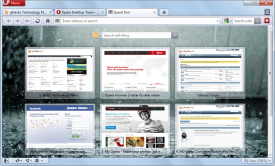
An older Opera Speel Dial screenshot from early 2011. (Photo credit: Martin Brinkmann and Ghacks.net, used by permission.) You saw how my computer looks with the new Speed Dial activated. For comparison purposes, this is how the Opera Speed Dial looked before Opera 11 on a desktop monitor without the use of the spiffy new customized icons. Not bad, but you can see how some of the screen captures don’t stand out very well. Even when I zoom the graphic, I can’t tell what sites all the screengrabs represent. The point? Many websites’ “app icons” still look the same in the upgraded Speed Dial. But, they don’t have to.
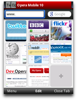
Opera Mobile screenshot from early 2011. Photo credit: Dev.Opera, used under Creative Commons license. For comparison purposes, here’s what the Speed Dial looks like on an Opera Mobile browser. Obviously, all of the “icons” are screen grabs. I expect Opera will upgrade its Mobile Speed Dial facility to be customizable in the near future. Let’s find some icons on the spiffy new Speed Dial and see how they look individually. Here’s a group of them from my desktop:
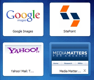
Four not-so-randomly selected Speed Dial icons from my desktop, circa April 2011. I just chose four that represent the idea of the customizable icon or the well-selected screenshot: Google Images, SitePoint, Yahoo Mail, and Media Matters. SitePoint uses the
apple-touch-icon value in its coding, and the others either use more generic coding or just let the browser do its screengrab without any intervention. (The blue border around some of the icons is triggered by mouse hover, and comes from me being a bit sloppy as I selected the icons for screenshotting. I left the borders on some of the shots because I rationalized that we need to see what the icons look like both with and without borders, but mostly because I was too lazy to redo them.)
The visual benefits are apparent. Google Images and Yahoo use their colorful text as their brand identity. The Media Matters logo displays clearly, though it’s apparent that the “icon” is a nicely, and serendipitously, selected chunk of the top left quadrant of their display (you can see the slice of navigation bar in the icon, though I don’t think that detracts from the strong visual impact of the brand presentation). SitePoint, with the usage of their Apple icon displaying on the Speed Dial screen, probably makes the strongest impact. Very clean and strong, and instantly recognizable.
Opera.com’s Speed Dial icon. Here’s a shortcut to Opera’s own Speed Dial icon. Not surprisingly, they go with their big “O” logo, though I do miss the (apparently outdated) slanting shadow behind the letter. As with all the Speed Dial icons, the text is grabbed from the title of the page, explaining why it displays as “Opera brows …” We can, of course, control that with our own sites if we want to truncate or manipulate our titles to give a short, snappy text display, and users can configure their text to say whatever they want for the icon.
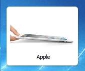
Apple.com’s Speed Dial icon. This is a shot of Apple.com’s Speed Dial icon. Who expected this? I was expecting some version of the “apple” logo. It stands out nicely from the pack, and the title, the single word “Apple,” is effective, though I’m not sure the photo of the iPad does the trick for identification purposes.
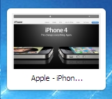
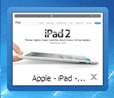
Apple’s iPhone and iPad Speed Dial icons. Surprisingly, neither Apple’s iPhone website nor its iPad site use a dedicated icon and don’t use the
apple-touch-icon coding. The screen capture for the iPhone site is fairly striking; for the iPad, perhaps less so. Perhaps Apple doesn’t expect mobile users to visit these sites?
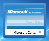
Microsoft.com’s Speed Dial icon. Here’s the Microsoft Speed Dial icon. Or the screengrab that Opera uses for the icon. Obviously Microsoft isn’t trying to comply with Opera’s requirements, or Apple’s for that matter. Like almost everyone’s “icon” out there, it’s a screen capture from the top left of Microsoft’s home page. It’s serviceable, and that’s about all it has going for it.
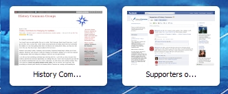
Speed Dial icons from Wordpress.com and Facebook pages. Here are screencaptured “icons” from a Wordpress blog and a Facebook page that I work with. You can see just how unsatisfactorily these serve the purpose of branding icons. They’re just two screenshots of incredibly compressed content. Even the identifying text blocks don’t help much.
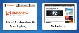
Speed Dial icons from Six Revisions and Smashing Magazine. These are the screencaptured “icons” from my bookmarks for Six Revisions and Smashing Magazine (showing then-current front page content). Although they’re not as bad as the two examples above, and Smashing’s logo is clearly visible, they’re not particularly pleasing. Six Revisions looks like a Wordpress site, because the day I made the bookmark, the site was featuring an article about fine-tuning Wordpress for SEO purposes. And Smashing’s article about achieving pixel perfection in Photoshop has long since gone off the front page, though a slice of the title remains in my icon. These icons don’t show fresh content, and don’t do justice to the sites they represent

NBC.com’s Speed Dial icon. And ending where we started … While the other two major television networks just let Opera do a screengrab for their “icons,” NBC gives us the 21st-century version of the venerable peacock. They code a more widely applicable JPG to serve the purpose.
Step Two: Apple Plus Opera Equals a Sea Change In Browsing

An early version of a homemade “app” home page. (Photo credit: Geniosity, used by permission.) The idea of a home page as a collection of “apps,” or more accurately links to a variety of user-selected websites, was not introduced with either Safari’s or Opera’s first Speed Dial. Computer maven John Dvorak has had a version of his “personal portal home page” available since 1999; all of his iterations use text links only, no icons, for faster loading time. More recently, a developer who blogs at Geniosity wrote about his own handcrafted, text-link driven home page he created for his copy of Firefox (image at left). The author tells me he still uses a version of this for his home page.There are other examples out there for the Googling. I think the idea, lurking as it has on the edges of browser conventions for over a decade, is about to step to the forefront. If it does, it will be because mobile users want their desktop, laptop, and notebook browser displays to function in the same way as their mobile desktops — as a collection of personally selected, icon-based links to sites they use on a regular basis. This will be one of the first instances of mobile browsing conventions effecting a major change in “fixed” computer browsing.
I firmly believe (without any hard evidence, it must be noted) that sometime in the near future, desktop/laptop users will want to move to a Speed Dial-like browser interface that replicates what they have on their mobile devices. I see it as a sea change in browsing: instead of desktop/laptop browsers driving what mobile browsers are able to do, the reverse is going to happen. Instead of the traditional desktop “home page,” users will want a multi-app interface like they use on their phones and tablets.
If this does happen, then designers/developers who get ahead of the curve will be prepared when the changes come down the pike. We’ll already have our sites, and our clients’ sites, ready to display well in the near-future “desktop app interface” browser facility. (And if it doesn’t happen, we’ll have spent a very small amount of time on the preparation, with no harm to our sites. There really is no downside to this, as you can outfit a website for this new function in less time than it takes the local teenager to deliver you a pizza.)
So, if I have no hard evidence to show you, how can I convince you? Maybe I can’t. I may well be wrong. But I don’t think so. Years ago, science-fiction writer Robert Heinlein wrote, “It steamboats when it’s steamboat time.” (The historical reference is simple: while inventor Robert Fulton is credited with “inventing” the steamboat, there were a dozen guys on three continents working simultaneously on one variant of the steamboat or the other. Same thing with the telephone; while you and I learned that Alexander Graham Bell “invented” the contraption, there were a lot of guys working on one aspect or the other of voice-driven communication over a wire. It was the proper time in Western society’s technological development for steamboats and telephones; the need was there, and the devices’ creation and dissemination were inevitable.)
The wave of the future is mobile computing, and one of the most fundamental aspects of mobile computing is the app-laden desktop. The idea of opening a browser to a single home page is rapidly becoming obsolete, I feel. I started using Speed Dial on my browsers (all of them except IE) over a year ago, and I wouldn’t go back for a plateful of Grandma’s brownies. The usefulness and convenience of having (in the case of my Opera “home page”) 25 “apps” on my desktop as soon as I open my browser precludes me ever going back to a single home page again.
Still not convinced? Okay, open your desktop browser and stare at whatever home page you’ve chosen. Now flip open your mobile device and look at the array of apps and websites ready to be accessed. Which one gives you more options? Which one feels more modern? More useful? (There are certainly exceptions, particularly companies which require the employee to have the browser set to the company’s or department’s home page, other organizations such as libraries and community centers which have their home pages hard-set, and users who spend so much of their time working on a single site that for them, it wouldn’t make sense to have a “home page” full of icons to different sites when they will always go to the same site first.)
The Future Is Now
[I]n the coming years, more and more websites will have mobile incarnations that look a lot like applications. [P]eople won’t even realize that in the end, the next generation mobile web won.
— Kim Pimmel, Smashing Magazine
For now, the best way I see to prepare for this predicted oncoming mobile transformation is to combine the requirements of Apple’s touch-screen devices and Opera’s Speed Dial. Apple requires a PNG file of at least 57x57 for conversion to a touch-screen icon. Opera requires an icon at least 114x114. And Opera will recognize Apple’s touch-screen HTML code. I’d say create a PNG icon of 114x114 or larger, not forgetting Opera’s maximum size requirement of 256x160, and use the apple-touch-icon coding:
<head>
   <title>Spiffy page with icon for Apple and Opera</title>
      <link rel="apple-touch-icon" href="http://path/to/appleoperalogo.png">
</head>
Another viable option is to use two strings of code:
<head>
   <title>Spiffy page with icons for Apple and Opera</title>
      <link rel="apple-touch-icon" href="http://path/to/applelogo.png">
      <link rel="icon" href="http://path/to/speeddiallogo.png">
</head>
to ensure full inclusion and forwards compatibility, especially if, as I suspect, Chrome or Firefox will incorporate client-side customization to their own Speed Dial (or dial extensions) in the near future. By doing it this way, you can design separate icons for the touch devices and the browser(s) that take advantage of each one’s individual characteristics.
The 114x114 icon will be scaled down for different devices. The guys at DevDaily remind us that the iPhone 4 uses the 114x114 icon, whereas older iPhones will scale the icons down to 57x57. An iPad (v1) will scale it down to 72x72. The same 114x114 icon will work perfectly nicely on all these devices. (Bynens gives some instructions on forcing Apple’s iOS4.2 to use multiple icons for different device resolutions, if you’re interested.)
Here’s the proof in that particular pot of pudding: a before-and-after pairing of my site’s icon in Opera’s Speed Dial. For the second go-round, I used the apple-touch-icon coding so that the icon will appear on Apple’s touch-screen devices as well as in Opera’s Speed Dial.


Comparison of my site’s old and new Speed Dial icons.
The difference is marked. The first icon presents little more than icon gibberish; since I use text and not a graphic as an <h1> site heading in my site, Opera used some of the first graphics it came across (the three icon buttons) and went from there, providing a screen capture that does nothing whatsoever to identify my site as anything of consequence. It took me maybe ten minutes to whip out the new icon in Photoshop, write and insert the code line, and upload it. And that was with the assistance of tabby cats!
You guys could do it in less, I’m sure. I’m not entirely happy with it; it’s smaller than the bookmark canvas, the corners arent’t rounded, and where the icon canvas is rectangular, the icon itself is square (if the background were white, it wouldn’t matter as much). But whereas the first icon is almost entirely meaningless, the second one conveys.
Side note: There are tutorials out there advising us to create icons for Apple devices in Photoshop that include the rounded edges, drop shadows, and “gel” overlays. Don’t do it. Keep the icon edges sharp and don’t include the glossy overlays. Apple devices add those effects automatically. The icon I created will have the rounded edges, drop shadow, and glossy appearance on Apple devices. If you want to force Apple to use your own icon without modification, you can use this code:
<link rel="apple-touch-icon-precomposed" href="apple-touch-icon-precomposed.png">allowing you to add your own effects as you desire.
Bynens writes: “I’d recommend to always use precomposed icons. It gives you full control over your icon, and it’s the only kind of icon Android 2.1 supports.” He also notes that iOS1 and Blackberry’s OS6 do not support precomposed icons. He gives a somewhat more broad-based, cover-all-your-mobile-bases code snippet, which I’ll pass along:
<!-- For iPhone 4 with high-resolution Retina display: -->
<link rel="apple-touch-icon-precomposed" sizes="114x114" href="apple-touch-icon-114x114-precomposed.png">
<!-- For first-generation iPad: -->
<link rel="apple-touch-icon-precomposed" sizes="72x72" href="apple-touch-icon-72x72-precomposed.png">
<!-- For non-Retina iPhone, iPod Touch, and Android 2.1+ devices: -->
<link rel="apple-touch-icon-precomposed" href="apple-touch-icon-precomposed.png">
Opera 11.10 supports precomposed icons as well as the Apple Touch icons.
Conclusion
Right now this works on Apple’s touch-screen devices and on Opera’s desktop browser. It’s my educated guess that within a matter of months, it will work on Opera’s Mobile browser and at a later time on the Mini as well. It wouldn’t surprise me if, by this time next year, the code string works on new Speed Dial facilities in Webkit and/or Gecko desktop and mobile browsers (be they actual browser inclusions or extensions). We might even see something of the sort in new IE versions; it’s never smart to count Redmond out. So: take a few minutes, steal a march on the competition, and add the feature to your sites right now. You and your clients will be glad you did.
There is a better way to do it. Find it. — Thomas A. Edison, who telephoned when it was telephone time.
Related Links
- Designing For The Future Web
- Smartphone Browser Landscape
- Everything you always wanted to know about touch icons
- Mobile Developer’s Icon & Image Checklist
- A Study of Trends in Mobile Design
- Mobile Web Design: Best Practices
- Making It a Mobile Web App
- Mobile Web Design: Is It Worth It?
- Holistic Web Browsing: Trends Of The Future
- Apps vs. the Web
- Web Development For The iPhone And iPad: Getting Started
- How to Use Your iPad for Real Design Work
- How to Make an HTML5 iPhone App
- How To Use CSS3 Media Queries To Create a Mobile Version of Your Website
- The State of the Mobile App World (infographic)
(vf) (il)


