We might not realize it, but as developers, we build inaccessible websites all the time. It’s not for the lack of care or talent though — it’s a matter of doing things the wrong way. In our new book, Inclusive Design Patterns, we explore how we can craft accessible interfaces without extra effort — and what front-end design patterns we can use to create inclusive experiences.
Gorgeous, printed book. eBook is included. Now available.
PDF, ePUB, Amazon Kindle.
Accessibility has always been a slightly unsettling realm for web developers. Surrounded with myths, misunderstandings and contradicting best practices, it used to be a domain for a small group of experts who would “add” accessibility on top of the finished product. Today, in many simple and complex websites, it’s still unclear what makes up an accessible interface and what developers need to know to get there.
So let’s get to the bottom of it all: accessibility myths and rules of thumbs, WAI-ARIA roles, content accessibility guidelines, landmark roles, keyboard and touch accessibility, accessible markup and interaction patterns, accessible forms and widgets, multimedia accessibility and inclusive prototyping. Everything you need to know about accessibility gathered in one practical, *smashing* book, fully dedicated to building and designing accessible user interfaces.
Written by Heydon Pickering, the book comes with dozens of practical examples of accessible interface components and inclusive design workflow, applicable to your work right away. With this book, you’ll know *exactly* how to keep interfaces accessible from the very start, and how to design and build inclusive websites without hassle and unnecessary code.
If you’re looking for smart accessible design patterns and strategies for building fast, flexible websites efficiently, this book is just for you. It’s a handbook with valuable, time-saving techniques that will help you avoid hacky workarounds and solve common issues effectively. You’ll learn how to:
Accessibility myths and misconceptions as well as common solutions and rules of thumbs,
A library of well-tested accessible HTML/CSS components that you can use right away,
How to properly use WAI-ARIA roles and Content Accessibility Guidelines,
How to tackle common accessibility issues in responsive design,
How to deal with “skip” links and external links, as well as navigation regions and landmarks,
How to keep labels, buttons, tables of contents, dynamic widgets and tabbed interfaces accessible,
How to implement infinite scrolling, grid display and dynamic content accessibly,
How to deal with password validation, error messages, web forms, JavaScript patterns and touch targets,
How to keep an interface accessible in legacy browsers,
How to prototype with accessibility in mind.
You’ve probably guessed it — the book doesn’t deal with theoretical concepts or things that are supposed to work. The book deals with practical design patterns and common interface components, and provides ready-to-use code snippets for applying to your work right away.
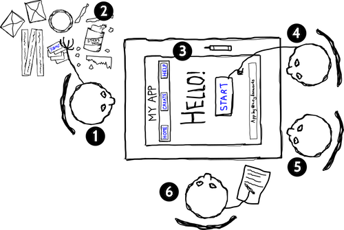
We will look at an interactive element, a button, from the perspective of three types of designers. The purpose of this example is to show you how a little bit of knowledge about the medium can lead to a simpler and (therefore) more inclusive solution.
We will look into discrete interface patterns; modules, components, widgets, conventions, whatever-you-want-to-call-thems. It would be foolhardy not to first acknowledge that each will ultimately belong to a web document. HTML pages vary dramatically in shape and size and can include any combination of patterns, but there are a handful of ‘document level’ best practices to which we should adhere. The aim here is not to go in search of the ultimate ‘boilerplate’ but to configure a parent web page to support inclusive design.
We’ll be looking at typefaces, leading, measure, justification, contrast, focus indication and more, to help you design paragraphs suited for a hugely diverse audience. We’ll also tackle specific issues for folks with limited vision, dyslexia, Irlen syndrome, low literacy and limited technical knowledge.
We’ll show how to incorporate accessible landmarks and a sound section structure to make the content more navigable and interoperable to a diversity of users and parsers. This will be bolstered by giving well-written and context independent structural as well asand context independent structural and navigational cues.
We’ll progressively enhance HTML’s primitives to create the inclusive means to navigate within and between web pages. We will also cover design provisions transferable to many other patterns, including logical source order and the virtue of eliminating redundancy. We will also tackle how to progressively enhance the navigation with JavaScript.
In this chapter, we’ll ensure our menu button and the content it reveals are inclusive of differing user settings, circumstances, devices, and assistive technology software.
By going straight from paper to HTML, we lay the foundations for efficient code and inclusive experiences.
In this chapter, we’ll practice our inclusive design chops. As in previous patterns, the organization and structure of content is paramount. We’ll look deeply into image accessibility, from both the perspectives of alternative text composition and performance. In catering to blind consumers, to those who cannot afford generous data contracts, and anyone accessing your content from outside your interface, this is a chance to really push the limits of inclusive design.
We’ll explore the importance of giving users choice and control over how their content is arranged. We’ll also use some techniques to make sure our design was tolerant of dynamic and fluctuating content. Inclusive design also means a visual design which is not too strict about the nature of the content imparted to it.
This chapter will give you everything you need to develop inclusive forms. By using standard form elements, effective labeling and facilitating the correction of errors, users of all walks are able to access and contribute to your websites and apps. By keeping the form simple and avoiding irritating experiences like disappearing labels and passwords that you cannot check, we’ve made sure using the form isn’t just possible but pleasurable.
Test-driven development allows developers working with frequent iterations to move forward with confidence. By writing tests first, to prescribe outcomes, then creating the functionality to achieve them, you can ensure successful builds behave in a predictable and reliable fashion.
If you have any questions, we are right here to answer them. We love our customers, and we’d love to help you in any way or just listen to your story. So please feel free to ask questions via Twitter @smashingmag — we’ll get back to you right away. Just in case: here are answers to some frequently asked questions.
No shipping costs for all orders above $20 — wherever you are in the world! We ship everywhere, worldwide, via Airmail shipping. What you see is what you pay.
That’s it, everyone! We sincerely appreciate your support and trust, and we’ll make sure to deliver the book to you as soon as possible. Cheers!
Gorgeous, printed book. eBook is included. Now available.
PDF, ePUB, Amazon Kindle.