All Smashing Magazine's articles, sorted chronologically. Over 11 years, we've published 2137 articles, written by 229 hard-working authors. Still counting.
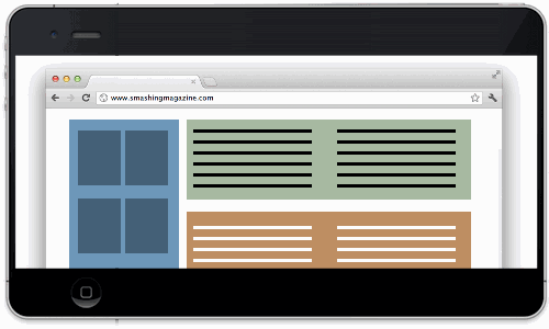
As iOS, Android, and Windows 8 take the Web to smaller screens, designers are adopting techniques to make their websites usable on handheld devices.
Responsive Web designs present different formatting and layout to suit the device on which their pages are displayed. … Read More…
I sincerely believe that the user experience community should add game design to its toolbox of competencies. If we’re truly committed to creating satisfying user experiences, then there’s no reason why games, which can satisfy people so richly, should be excluded. Read More…
For years you have been searching for it. You hear the question being asked in your dreams as you go on an Indiana-Jones-type-crusade to find the answer. When the answer comes to you, you know that the confetti will fall from the ceiling and the band will start playing your … Read More…
This tutorial explains how to create a WordPress bookshelf plugin that displays books on a shelf like Smashing Magazine’s eBook page. Some key WordPress functionality will be showcased throughout the tutorial that could benefit your own project.
The article covers how to … Read More…
This is our sixth article in a series that introduces the latest useful and freely available tools and techniques, developed and released by active members of the Web design community. The first article covered PrefixFree; the second introduced Foundation, a responsive … Read More…
Every now and then, we look around, select fresh free high-quality fonts and present them to you in a brief overview. The choice out there is enormous, so the time you need to find them is usually time you should be investing in your projects. We search for them and find … Read More…
One of the visual effects that is a mainstay in my Web design toolkit is the_letterpress effect. Used properly, it’s a quick way to make text blend better with the layout, as if it were machine-stamped onto the background. Think of what a home appliance marquee or a … Read More…
The term “responsive design” has gathered a lot of well-deserved buzz among Web designers. As you probably know, it refers to an easy way to dynamically customize interfaces for different devices and to serve them all from the same website, with no need for a separate mobile … Read More…
Whenever we set code to screen, we must follow some sort of logic. You may well be the only person who understands that logic, but you still make the effort. The reason we follow standards and practices is to adhere to a common logic, so that we find each other’s code … Read More…
You’ve presented the new website and everyone loves it. The design is crisp, the code is bug-free, and you’re ready to release. Then someone asks, “Does it work in Japanese?”
You break out in a cold sweat: you have no idea. The website works in English, and you … Read More…