This article is part of a series in which I attempt to use the web under various constraints, representing a given demographic of user. I hope to raise the profile of difficulties faced by real people, which are avoidable if we design and develop in a way that is sympathetic to their needs. This week, I’m disabling JavaScript.
Why noscript Matters
Firstly, to clarify, there’s a difference between supporting a noscript experience and using the noscript tag. I don’t generally like the noscript tag, as it fragments your web page into JavaScript and non-JavaScript versions rather than working from the same baseline of content, which is how experiences get messy and things get overlooked.
You may have lots of useful content inside your noscript tags, but if I’m using a JavaScript-enabled browser, I’m not going to see any of that — I’m going to be stuck waiting for the JS experience to download. When I refer to the ‘noscript’ experience, I generally mean the experience of using the web page without JavaScript, rather than the explicit use of the tag.
Web MIDI API: Getting Started
Is it possible to use digital musical instruments as browser inputs? With the Web MIDI API, the answer is yes! The best part is, it’s fairly quick and easy to implement and even create a really fun project. Read article →
So, who cares about users who don’t have JavaScript? Do such noscript users even exist anymore?
Well, they do exist, albeit in small numbers: roughly 0.2% of users in the UK have JavaScript disabled. But looking at the numbers of users who have explicitly disabled JavaScript is missing the point.
I’m reminded of this quote by Jake Archibald:
“All your users are non-JS while they’re downloading your JS.”
Think of those users who have JavaScript enabled but who don’t get the JavaScript experience, for any number of reasons, including corporate or local blocking or stripping of JavaScript elements, existing JavaScript errors in the browser from browser add-ons and toolbars, network errors, and so on. BuzzFeed recently revealed that around 1% of requests for their JavaScript time out, equating to 13 million failed requests per month.
Sometimes the issue isn’t with the user but with the CDN delivering the JavaScript. Remember in February 2017 when Amazon’s servers went down? Millions of sites that rely on JavaScript delivered over Amazon’s CDNs were in major trouble, costing companies in the S&P 500 index $150 million in the four-hour outage.
Think also of the emerging global markets; countries still battling to build a network of fast internet, with populations unable to afford fast hardware to run CPU-intensive JavaScript. Or think of the established markets, where even an iPhone X on a 4G connection is not immune to the effects of a partially loaded webpage interrupted by their train going into a tunnel.
The web is a hostile, unpredictable environment, which is why many developers follow the principle of progressive enhancement to build their sites up from a core experience of semantic HTML, layering CSS and unobtrusive JavaScript on top of that. I wanted to see how many sites apply this in practice. What better way than disabling JavaScript altogether?
How To Disable JavaScript
If you’d like to recreate my experiment for yourself, you can disable JavaScript by digging into the settings in Chrome:
- Open the Developer Tools (Chrome -> View -> Developer Tools, or ⌥⌘I on the keyboard)
- Open the developer submenu (the three dots next to the close icon on the Developer Tools)
- Choose ‘Settings’ from this submenu
- Find the ‘Debugger’ section and check the ‘Disable JavaScript’ box
Or, like me, you can use the excellent Toggle JavaScript Chrome Extension which lets you disable JS in one click.
Creating A WordPress Post With JavaScript Disabled
After disabling JavaScript, my first port of call was to go to my personal portfolio site — which runs on WordPress — with the aim of writing down my experiences in real time.
WordPress is actually very noscript-friendly, so I was able to start writing this post without any difficulty, although it was missing some of the text formatting and media embedding features I’m used to.
Let’s compare WordPress’ post screen with and without JavaScript:

noscript version of WordPress’ post page, which is made up of two basic text inputs.
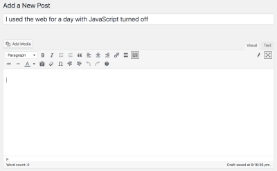
I felt quite comfortable without the toolbars until I needed to embed screenshots in my post. Without the ‘Add Media’ button, I had to go to separate screens to upload my files. This makes sense, as ‘background uploading’ content requires Ajax, which requires JavaScript. But I was quite surprised that the separate media screen also required JavaScript!
Luckily, there was a fallback view:

noscript version of the Media section in the admin backend. I was warned that the grid view was not supported without JavaScript.
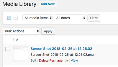
After uploading the image, I had to manually write an HTML img tag in my post and copy and paste the image URL into it. There was no way of determining the thumbnail URL of the uploaded image, and any captions I wrote also had to be manually copied. I soon got fed up of this approach and planned to come back the next day and re-insert all of the images when I allowed myself to use JavaScript again.
I decided to take a look at how the front-end of my site was doing.
Viewing My Site Without JavaScript
I was pleasantly surprised that my site looked largely the same without JS:

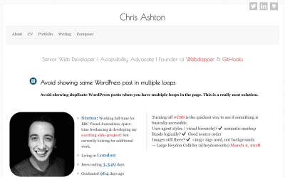
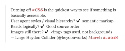
Let’s take a closer look at that Twitter embed:

noscript version. The ‘tick’ is an external PNG. (Source)
Below the fold of my site, I’ve also embedded some Instagram content, which held up well to the noscript experience.


Finally, I have a GitHub embed on my site. GitHub doesn’t offer a native embed, so I use the unofficial GitHub Cards by Hsiaoming Yang.


I was half hoping to shock you with the before and after stats (megabytes of JS for a small embed! End of the world! Let’s ditch JavaScript!), and half hoping there’d by very little difference (progressive enhancement! Leading by example! I’m a good developer!).
Let’s compare page weights with and without JavaScript. Firstly, with JavaScript:

Now without JavaScript:

For the sake of a styled tweet, a GitHub embed and a full-fat Instagram embed, my site grows an extra 600KB. I’ve also got Google analytics tracking and some nerdy hidden interactive features. All things considered, 600KB doesn’t seem over the top — though I am a little surprised by the number of additional requests the browser has to make for all that to happen.
All the content is still there without JavaScript, all the menus are still navigable, and with the exception of the Twitter embed, you’d be hard-pressed to realize that JavaScript is turned off. As a result, my site passes the NOSCRIPT-5 level of validation — the very best non-JavaScript rating possible.
ashton.codes noscript rating: NOSCRIPT-5. ✅
What’s that? You haven’t heard of the noscript classification system? I’d be very surprised if you had because I just made it up. It’s my handy little indicator of a site’s usability without JavaScript, and by extension, it’s a pretty good indicator of how good a site is at progressively enhancing its content.
noscript Classification System
Websites — or more accurately, their individual pages — tend to fall into one of the following categories:
- NOSCRIPT-5
The site is virtually indistinguishable from the JavaScript-enabled version of the site. - NOSCRIPT-4
The site provides functionality parity for noscript, but links to or redirects to a separate version of the site to achieve that. - NOSCRIPT-3
Site largely works without JavaScript, but some non-key features are unsupported or look broken. - NOSCRIPT-2
The site offers message saying their browser is not supported. - NOSCRIPT-1
The site appears to load, but the user is unable to use key functionality at all. - NOSCRIPT-0
The site does not load at all and offers no feedback to the user.
Let’s look at some popular sites and see how they score.
Amazon
I’ve had my eye on a little robotic vacuum cleaner for a while. My lease doesn’t allow any pets, and this is the next best thing once you put some googly eyes on it.
At first glance, Amazon does a cracking job with its non-JavaScript solution, although the main product image is missing.


On closer inspection, quite a few things were a bit broken on the noscript version. I’d like to go through them one by one and suggest a solution for each.
No Gallery Images
I wanted to see some pictures of the products, but clicking on the thumbnails gave me nothing.
Issue

Potential Solution
It would have been nice if these thumbnails were links to the full image, opening in a new tab. They could then be progressively enhanced into the image gallery by using JavaScript:
- Hijack the click event of the thumbnail link;
- Grab the
hrefattribute; - Update the
srcattribute of the main image with thehrefattribute value.
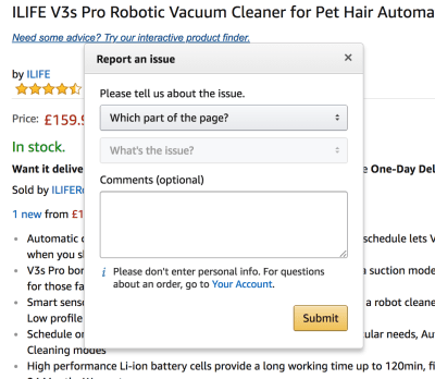
The ‘Report Incorrect Product Information’ Link Is JavaScript-Only
Is this feature really so commonly used that it’s worth downloading extra bytes of JavaScript to all of your users so that it opens as an integrated modal within the page?
Issue

javascript://, which opens an integrated modal form
Potential Solution
The Amazon integrated modal form requires JavaScript to work. I would make the ‘report feature’ a standalone form on a separate URL, e.g. /report-product?product-id=123. This could be progressively enhanced into the integrated modal using Ajax to download the HTML separately.
Reviews Are Only Partially Visible By Default
Issue

Potential Solution
Why not show the whole review by default and then use JavaScript to truncate the review text and add the ‘Read more’ link?
It’s worth pointing out that the review title is a link to the review on a standalone page, so it is at least still possible to read the content.
On the whole, I was actually pleasantly surprised just how well the site worked without JavaScript. It could just as easily have been a blank white page. However, the lack of product images means we’re missing out on a really core feature — I’d argue it’s critical to be able to see what you’re buying! — so it’s a shame we couldn’t put the icing on the cake and award it a NOSCRIPT-5 rating.
Amazon noscript rating: NOSCRIPT-3. 🤷
I still hadn’t decided which product I wanted to buy, so I turned to Camel Camel Camel, the Amazon price tracker.
Camel Camel Camel
I wanted to decide between the iLife V3s Pro versus the iLife A4s, so headed over to https://uk.camelcamelcamel.com/. At first, the site looked indistinguishable from the JavaScript-enabled version.


Unfortunately, the price history chart did not render. It did provide an alt text fallback, but the alt text did not give me any idea of whether or not the price trend has been going up or down.


General suggestion: provide meaningful alt text at all times. I don’t necessarily need to see the chart, but I would appreciate a summary of what it contains. Perhaps, in this case, it might be “Amazon price history chart showing that the price of this item has remained largely unchanged since March 2017.” But automatically generating a summary like that is admittedly difficult and prone to anomalies.
Specific suggestion for this use case: show the image. The chart on the scripted version of the site is actually a standalone image, so there’s no reason why it couldn’t be displayed on the noscript version!
Still, the core content below the chart gave me the information I needed to know.

The table provides the feature parity needed to secure a NOSCRIPT-5 rating. I take my hat off to you, Camel Camel Camel!
Camel Camel Camel noscript rating: NOSCRIPT-5 ✅
Google Products
At this point in my day, I received a phone call out of the blue: A friend phoned me and asked about meeting up this week. So I went to Google Calendar to check my availability. Google had other ideas!

noscript users.
I was disappointed that there wasn’t a noscript fallback — Google is usually pretty good at this sort of thing.
I wouldn’t expect to necessarily be able to add/edit/delete entries to my calendar, but it should be possible to provide a read-only view of my calendar as core content.
Google calendar noscript rating: NOSCRIPT-0 🔥
Interested in seeing how Google manages other products, I had a quick look at Google Spreadsheets:

In this case, the site fails a lot more gracefully. I can at least read the spreadsheet contents, even if I can’t edit them. Why doesn’t the calendar offer the same fallback solution?
I have no suggestions to improve Google Spreadsheets! It does a good job at informing the user if core functionality is missing from the noscript experience.
Google spreadsheets noscript rating: NOSCRIPT-2 😅
This rating isn’t actually that bad! Not all sites are going to be able to offer a noscript experience, but at least if they’re upfront and honest (i.e. they’ll say “yeah, we’re not going to try to give you anything”) that prepares you — the noscript user — for when it fails. You won’t waste a few precious seconds trying to fill in a form that won’t ever submit, or start reading an article that then has to use Ajax to retrieve the rest of its contents.
Now, back to my potential Amazon purchase. I wanted to look at some third-party reviews before making a purchase.
Google search works really well without JavaScript. It just looks a little dated, like those old desktop-only sites at fixed resolutions.
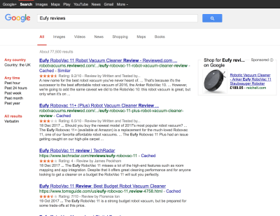
noscript version has extra search options on the left (otherwise tucked away in settings on the JS version) — and no privacy banner (perhaps because ‘tracking’ is not relevant to noscript users?)

The images view looks even more different, and I actually prefer it in a few ways — this version loads super quickly and lists the dimensions and image size in kilobytes underneath each thumbnail:
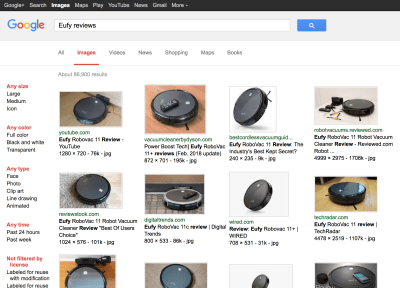
noscript version: notice the image meta information which is not supplied on the scripted version!

noscript version.
Google Search noscript rating: NOSCRIPT-5 ✅
One of the search results took me to a review on YouTube. I clicked, not expecting much. I was right not to get excited:

noscript experience.
I wouldn’t really expect a site like YouTube to work without JavaScript. YouTube requires advanced streaming capabilities, not to mention that it would open itself up to copy theft if it provided a standalone MP4 download as a fallback. In any case, no site should look broken. I stared at this screen for a few seconds before realizing that nothing else was going to happen.
Suggestion: If your site is not able to provide a fallback solution for noscript users, at a minimum you should provide a noscript warning message.
YouTube noscript rating: NOSCRIPT-0 🔥
Which?
I clicked a couple more review links. The Which? advice site failed me completely.
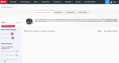
This was a page that looked like it loaded fine, but only when you read the content would you realize you must actually be missing some key information. That key information is absolutely core to the purpose of the page, and I can’t get it. Therefore, unfortunately, that’s a NOSCRIPT-1 violation.
Suggestion: If your site Ajaxes in content, that content exists at another URL. Provide a link to that content for your noscript users. You can always hide the link when you’ve successfully Ajaxed with JavaScript.
Which? review site noscript rating: NOSCRIPT-1 😫
Eventually, I concede that I can’t really afford a vacuum right now. So, I decided to hop onto social media.

Facebook flat-out refuses to load without JavaScript, but it does offer a fallback option. Here’s our first example of a NOSCRIPT-4 — a site which offers a separate version of its content for noscript or feature phone users.

The mobile version loads instantly. It looks ugly, but it seems as though I get the same content as I normally would. Crucially, I have feature parity: I can accomplish the same things here as I can on the main site.
Facebook noscript rating: NOSCRIPT-4 🤔
The page loaded at lightning speed:

I could only see 7 items in the news feed at any one time, but I could click to “See More Stories,” which takes me to a new page, using traditional pagination techniques.
I find myself impressed that I have the option to ‘react’ to a Facebook comment, though this is a multi-screen task:


There’s nothing stopping Facebook building a hover ‘reaction’ menu in non-JavaScript, but to be fair this is aimed at mobile devices that aren’t able to hover.
Suggestion: Get creative with CSS. You may find that you don’t need JavaScript at all.
Before long, a video item came up in my news feed. (At this point, it dawned on me just how much less video content I had seen on the mobile version compared to normal Facebook, meaning I’d actually been seeing peoples’ statuses rather than a random video they ‘liked’ — a major improvement as far as I’m concerned!)

I fully expected the video not to work when I clicked it, but clicking on the thumbnail opened the video in a new tab:

I’m pleasantly surprised that all of the functionality appears to be there on this noscript version of the site. Eventually, however, I found one feature that was just too clunky and cumbersome to see through to the end: album creation.
I wanted to upload a photo album to Facebook, but in noscript-land this is a beast of a task. It involves uploading one photo at a time, going through two or three screens for each upload. I desperately tried and failed to find a bulk-upload option.

The laboriousness of this got to me after photo number three (my album will contain many more), so I decided to call it a day and come back tomorrow when I’ve got JavaScript.
Things got weird when I flew over to Twitter.


I was intrigued by this mechanism, so dug into the source code, which was actually surprisingly simple:
<noscript><meta http-equiv="refresh" content="0; URL=https://mobile.twitter.com/i/nojs_router?path=%2F"></noscript>As beautifully simple as this solution is, I found the experience quite clunky because in the flash before I was redirected, I saw that one of the people I follow on Twitter had got engaged. His tweet didn’t appear at the top of the ‘mobile’ version, so I had to go looking for it.
Suggestion: Build in a grace period into your server-side logic so that redirects and careless refreshes don’t lose interesting tweets before you’ve had a chance to read them.
I couldn’t remember my friend’s Twitter handle. Searching was a little tricky — I started to really miss the autofill suggestions!

Luckily, the search results page brought his account right up, and I was able to find his tweet. I was even able to reply.

Twitter noscript rating: NOSCRIPT-4 🤔
This may seem like a generous score, given the clunky feel, but remember that the key thing here is feature parity. It doesn’t have to look beautiful.
I tried out a couple more social media sites, which, unlike Twitter, didn’t reach the dizzy heights of NOSCRIPT-4 compliance.
Other Social Networks
LinkedIn has a nice, bespoke loading screen. But it never loads, so all I could do was stare at the logo.

LinkedIn noscript rating: NOSCRIPT-0 🔥
Instagram gave me literally nothing. A blank page. A whole other flavor of NOSCRIPT-0.

Instagram noscript rating: NOSCRIPT-0 🔥🔥🔥
I was surprised Instagram failed so spectacularly here, given that the Instagram embed worked flawlessly on my portfolio site. I guess with an embed you never know what the browser support expectations of the third party are, but as I’m visiting the site directly, Instagram is happy making the call to drop support.
BBC News
I headed over to the BBC to get my fix of news.

noscript version, notice the narrow column and the single story with thumbnail.

The menu is a little bit off, and the column is quite narrow (definitely a pattern I’m seeing on a lot of sites — why does “no JavaScript” mean “mobile device”?) but I am able to access the content.
I clicked on the ‘Most Read’ tab, which takes me to another part of the page. With scripting, this anchor link is progressively enhanced to achieve actual tab behavior, which is a lovely example of building up from a solid HTML core.

So far, this is the only example of an anchor link I’ve come across in my experiment, which is a shame as it’s a nice technique that saves an additional page load and saves fragmenting the site into lots of micro pages.
It does look a little odd though, the ordered list CSS meaning we have a double numbering glitch here. I click on one of the stories.

I can’t access the video content, but due to rights issues, I suspect the BBC cannot provide a separate standalone video as Facebook does. A transcript would be nice though — and beneficial to more than just noscript users.
Suggestion: Provide textual fallbacks for audio-visual content.
To be fair, the article content basically sums up the content that appears in the video, so I’m not really missing out on information.
The article and index pages load lightning-fast, at about 300KB (mostly images). I do miss the thumbnail images for the other articles on the page, and the ability to make full use of my screen real estate — but that shouldn’t hamper the rating.
BBC noscript rating: NOSCRIPT-5 ✅
GitHub
GitHub looks almost exactly the same as its JavaScript-enabled counterpart. Wow! But I guess this is a site developed by developers, for developers. 😉


I did a little housekeeping on GitHub, looking around repos and deleting old branches. For a while I genuinely forgot I was on the non-JavaScript version until I came across one little bug:

Then I wondered, “How is GitHub going to handle applying labels to issues?” so I gave that a go.

I was unable to create an issue and add labels to it at the same time. In fact, I couldn’t find any way of adding the label even after creating a blank issue. It’s a shame the site fell at the last hurdle because it was very nearly a seamless comparison with the scripted version.
GitHub noscript rating: NOSCRIPT-3 🤗
While GitHub looks incredible — I would never have known my JavaScript was turned off — not being able to use the same key functionality as the scripted version is a bummer. Even an ugly looking noscript site would get a higher score because functionality is more important than form.
Online Banking
If there’s one place I expected JavaScript to be required, it was on the NatWest bank website. I was wrong.

Not only does it work, but it’s also hard to distinguish from the normal site. The login screen is the same, the only difference being that the focus doesn’t automatically progress through each field as you complete it.
NatWest noscript rating: NOSCRIPT-5 ✅
Miscellaneous
I came across a few more sites throughout my day.
FreeAgent — the tax software site I use for my freelancing — doesn’t even try a noscript fallback. But hey, that’s better than showing a broken website.

FreeAgent noscript rating: NOSCRIPT-2 ⛔
And CodePen, somewhat understandably, has to be a NOSCRIPT-2 too.

CodePen noscript rating: NOSCRIPT-2 ⛔
Tonik, the energy provider, doesn’t let me log in, but this seems like an oversight rather than a deliberate decision:
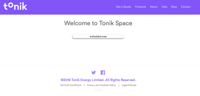
Tonik noscript rating: NOSCRIPT-1 ❌
M&S Energy lets me log in — only to tell me it needs JavaScript to do anything remotely useful.

M&S noscript rating: NOSCRIPT-1 ❌
Now I come to my favorite screenshot of the day.
One of my colleagues once recommended an Accessibility for Web Design course, which I bookmarked. I decided to take a look at it today, and laughed at the irony of the alt text:

With the alt text of “Personas: Accessibility for Web Design,” I’m not too sure what I’m missing here — is it an image? A video? A PDF? The course itself?
Hint: It’s actually a video, though you have to be logged in to watch it.
The alt text isn’t really supporting its purpose, partly because it’s populated automatically. We as a dev community need to get better at this sort of thing. I don’t think I’ve read any useful alt text today.
Summary
I started this experiment with the aim of seeing how many sites are implemented using progressive enhancement. I’ve only visited a tiny handful of sites here, most of them big names with big budgets, so it’s interesting to see the wide variation in no-JavaScript support.
It’s interesting to see that relatively simple sites — Instagram and LinkedIn particularly — have such poor noscript support. I believe this is partly down to the ever-growing popularity of JavaScript frameworks such as React, Angular, and Vue. Developers are now building “web applications” rather than “websites,” with the aim of recreating the look and feel of native apps, and using JavaScript to manage the DOM is the most manageable way of creating such experiences.
There is a danger that more and more sites will require JavaScript to render any content at all. Luckily, it is usually possible to build your content in the same, developer-friendly way but rendered on the server, for example by using Preact instead of React. Making the conscious decision to care about noscript gives the benefits of a core experience as outlined at the beginning of this article, and can make for a faster perceived loading time, too.
It can be quite daunting to think about an application from the ground up, but a decent core experience is usually possible and actually only involves simple tweaks in a lot of cases. A good core experience is indicative of a well-structured web page, which, in turn, is usually a good sign for SEO and for accessibility. It’s usually a well designed web page, as the designer and developer have spent time and effort thinking about what’s truly core to the experience. Progressive enhancement means more robust experiences, with fewer bugs in production and fewer individual browser quirks, because we’re letting the platform do the job rather than trying to write it all from scratch.
What noscript rating does your site conform to? Let us know in the comments!
 (rb, ra, il)


