There’s a trickling line of ones and zeros that disappears behind a large yellow tube. A bear pops out of the tube as a clawed paw starts pointing at my browser’s toolbar, and a headline appears, saying: “Start your bear-owsing!”
Between my awwing and oohing I forget what I wanted to browse.
Products like a VPN service rarely evoke endearment — or any other emotion, for that matter. It’s not their job, not what they were built to do. But because TunnelBear does, I choose it over any other VPN and recommend it to my friends, so they can have some laughs while caught up in routine.

Humans can’t endure boredom for a long time, which is why products that are built for non-exciting, repetitive tasks so often get abandoned and gather dust on computers and phones. But boredom, according to psychologists, is merely lack of stimulation, the unfulfilled desire for satisfying activity. So what if we use the interface to give them that stimulation?
I sat with product designers here at MacPaw, who spend their waking hours designing not-so-sexy things like duplicate finders and encryption apps, and they shared five secrets to more emotional UIs: gamification, humor, animation, illustration, and mascots.
Games People Play
There’s some debate going on around the use of gamification in UIs: 24 empirical studies, for example, arrived at varying conclusions as to how effective it was. But then again, effectiveness depends on what you were trying to accomplish by designing those shiny achievement badges.
For many product creators, including Akar Sumset here, the point of gamification is not letting users have fun per se — it’s gently pushing them towards certain behaviors via said fun. Achievements, ranks, leaderboards tap into the basic human need of esteem, trigger competitiveness, and supposedly urge users to do what you want them to, like make progress, keep coming back to the app, or share it on social media.
Gamification can succeed or fail at that, but what it sure achieves is an emotional response. Our brain is packed full of cells that control the levels of dopamine, one of the major neurochemicals of happiness. When something enjoyable happens, these neurons light up and trigger a release of dopamine into the blood, but what’s even better, if this pleasant event is regular and can be predicted, they’ll light up and release dopamine before it even happens. What does that mean for your interface? That expecting an enjoyable thing such as the next achievement will give the users little shots of happiness throughout their experience with the product.
Gamification in UI: Gemini 2 And Duolingo
When designing Gemini 2, the new version of our duplicate finder for Mac, we had a serious problem at hand. Reviewing gigabytes of files was soul-crushingly boring, and some users complained they quit before they were done. So what we tried to achieve with the achievements system is intensify the feeling of a crossed-out item on a to-do list, which is the only upside of tedious tasks. The space theme, unwittingly set with the app’s name and exploited in the interface, was perfect for gamification. Our audience grew up on Star Wars and Star Trek, so sci-fi inspired ranks would hit home with them.
Within days of the release, we started getting tweets from users asking for clues on the Easter Egg that would unlock the final achievement. A year after the release, Gemini 2 got the Red Dot Award for a design that exhibits “clarity and emotion.” So while it’s hard to measure how motivating our achievement system has been, it sure didn’t leave people cold.

Another product that got it right — and has by far the most gamified interface I’ve seen — is Duolingo, an online service and mobile app for learning languages. Trying to master a foreign tongue from scratch is daunting, especially if it’s just you and your laptop, without the reassurance that comes with having a teacher. Given how quickly people lose interest in their language endeavors (speaking from experience here), Duolingo would have to go out of its way to keep you hooked. And it does.
Whenever you complete a quick 5-minute lesson, you earn 10 points. Take lessons 30 days in a row? Get an achievement. Complete 20 lessons without a single typo? Unlock another. For every baby step you take, your senses are rewarded with triumphant sounds and colorful graphics that trigger the release of that sweet, sweet dopamine. Eventually, you start associating Duolingo with the feeling of accomplishment and pride — the kind of feeling you want to come back to.
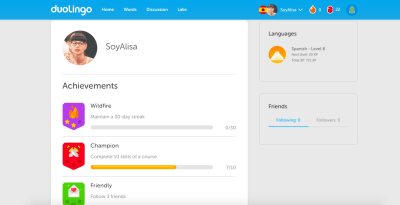
If you’d like to dive deeper into gamification, Gabe Zichermann’s book “Gamification by Design: Implementing Game Mechanics in Web and Mobile Apps” is a great way to start.
You’ve Got To Be Joking
Victor Yocco has made a solid case for using humor in web design as a tool to create memorable experiences, connect with users, and make your work stand out. But the biggest power of jokes is that they’re emotional. While we still don’t fully understand the nature of humor, one thing is clear: it makes humans happy. According to brain imaging research, funny cartoons activate the reward network in the limbic system — the same network that responds to eating, music, sex, and mood-altering drugs. In other words, a good joke gives people a kind of emotional high.
Would you want that kind of reaction to your interface? Of course. But the tricky part is that not only is humor subjective, but the way we respond to it depends a lot on the context. One thing is throwing in a pun on the launch screen; a completely different is goofing around in an error message. And while all humans enjoy humor in this or that form, it’s vital to know your audience: what they find hilarious and what might seem inappropriate, crude, or poorly timed. Not that different from cracking jokes in real life.
Humor in UI: Authentic Weather and Slack
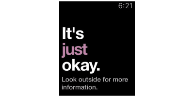
One app that nails the use of humor — and not just as a complementary comic relief, but as a unique selling proposition — is Authentic Weather. Weather apps are a prime example of utilitarian products: they are something people use to get information, period. But with Authentic Weather, you get a lot more than that. No matter the weather, it’s going to crack you up with a snarky comment like “It’s ducking freezing,” “Go home winter,” and my personal favorite “It’s just okay. Look outside for more information.”
What happens when you use Authentic Weather is you don’t just open it for the forecast — you want to see what it comes up with next, and a routine task like checking the weather becomes a thing to look forward to in the morning. Now, the app’s moody commentary, packed full of f-words and scorn, would probably seem less entertaining to my mom. But being the grumpy millennial that I am, I find it hilarious, which proves humor works if you know your audience.
Another interface that puts fun to good use is Slack’s. For an app people associate with work emergencies, Slack does a solid job creating a more humane experience, not least because of its one-liners. From loading screens to the moments when you’re finally caught up with all your chats, it cracks a joke when you don’t see it coming.
With such a diverse demographic, humor is a hit and miss, so Slack plays safe with goofy puns and good-natured banter — the kind of jokes that don’t exactly send you rolling on the floor but don’t annoy or offend either. In the best case scenario, the user will chuckle and share the screenshot in one of their channels; in the worst case scenario, they’ll just roll their eyes.

More on Humor: “Just Kidding: Using Humor Effectively” by Louis R. Franzini.
Get The World Moving
Nearly every interface uses a form of animation. It’s the natural way to transition from one state to another. But animations in UI can serve a lot more purposes than signifying a change of state — they can help you direct attention and communicate what’s going on better than static visuals or copy ever could. The movement stimulates both visual and kinesthetic learning, which means users are more likely to stay focused and figure out how to use the thing.
These are all good reasons to incorporate animation into your design, but why does it elicit emotion, exactly? Simon Grozyan, who worked on our apps Encrypto and Gemini Photos, believes it’s because in the physical world we interpret animated things as alive:
“We are used to seeing things in movement. Everything around us is either moving or changing appearance because of the light. Static equals dead.”
In addition to the relatable, lifelike quality of a moving object, animation has the power of a delightful and unexpected thing that brings us a lot more pleasure than a thing equally delightful but expected. Therefore, by using it in spots less habitual than transitions you can achieve that coveted stimulation that makes your product fun to use.
Animation in UI: Encrypto and Shazam
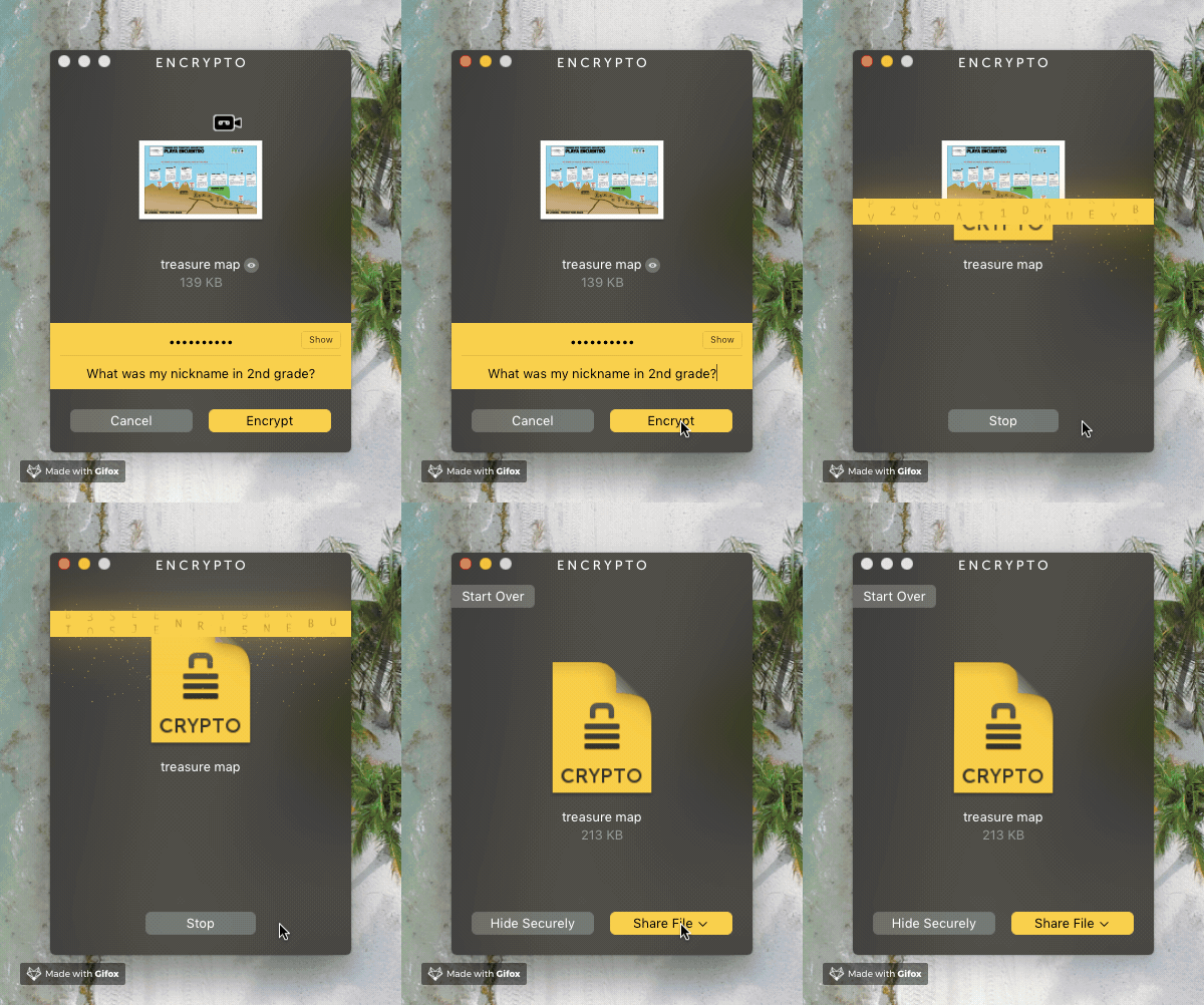
Encrypto is a tiny Mac app that encrypts and decrypts your files so that you can send them to someone securely. It’s an indispensable tool for those who care about data security and privacy, but not the kind of tool you would feel attached to. Nevertheless, Encrypto is by far my favorite MacPaw app as far as design is concerned, thanks to the Matrix-style animated bar that slides over your file and transforms it into a new secured entity. Encryption comes to life; it’s no longer a dull process on your computer — it’s mesmerizing digital magic.
Animation is at the heart of another great UI: that of Shazam, an app you probably have on your phone. When you use Shazam to find out what’s playing, the button you tap starts sending concentric circles outward and inward. This similarity to a throbbing audio speaker makes the interface almost tangible, physical — as if you’re blasting your favorite album on a powerful sound system.

More on Animation: “How Functional Animation Helps Improve User Experience”.
Art Is Everywhere
As Blair Culbreth argues, polished is no longer enough for interfaces. Sleek, professional design is expected, but it’s the personalized, humane details that users smile at and forward to their friends. Custom art can be this detail.
Unlike generic imagery, illustration is emotional, because it communicates more than meaning. It carries positive associations with cartoons every person used to watch as a child, shows things in a more playful, imaginative way, and, most importantly, contains a touch of the artist’s personality.
“I think when an artist creates an illustration they always infuse some of their personal experience, their context, their story into it,” says Max Kukurudziak, one of our product designers. The theory rings true — a human touch is more likely to stir feelings.
Illustration in UI: Gemini Photos and Google Calendar
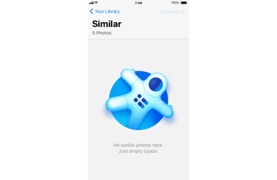
One of our newest products Gemini Photos is an iPhone app that helps you clear unneeded photos. Much like Gemini 2 for desktop, it involves some tedious reviewing for the user, so even with a handy and handsome UI, we’d have a hard time holding their attention and generally making them feel good.
Like in many of our previous apps, we used animations and sounds to enliven the interface, but custom art has become the highlight of the experience. As said above, it’s scientifically proven that surprising pleasurable things cause an influx of that happiness chemical into our blood, so by using quirky illustrations in unexpected spots we didn’t just fill up an empty screen — we added a tad of enjoyment to an otherwise monotonous activity.
One more example of how illustration can make a product more lovable is Google Calendar. Until recently there was a striking difference between the web version and the iOS app. While the former had the appeal of a spreadsheet, the latter instantly won my heart with one killer detail. For many types of events, Google Calendar slips in art that illustrates them, based on the keywords it picks up from event titles. That way, your plans for the week look a lot more exciting, even if all you’ve got going on is the gym and a dentist appointment.
But that’s not even the best thing. I realized that whenever I create a new event, I secretly hope Google Calendar will have art for it and feel genuinely pleased when it does. Just like that, using a calendar stopped being a necessity and became a source of positive emotion. And, apparently, the illustration experiment didn’t work for me alone, because Google recently rolled out the web version of their calendar with the same art.

More on Illustration: “Illustration That Works: Professional Techniques For Artistic And Commercial Success” by Greg Houston.
What A Character
Cute characters that impersonate products have been used in web design and marketing for years (think Ronald McDonald and the Michelin Man). In interfaces — not quite as much. Mascots in UI can be perceived as intrusive and annoying, especially if they distract the user from an important action or obstruct the view. A notorious example of a mascot gone wrong is Microsoft’s Clippy: it evoked nothing but fear and loathing (which, of course, are emotions, but not the kind you’re looking for).
At the same time, studies show that people easily personify things, even if they are merely geometric figures. Lifelike creatures are easier to relate to, understand the behavior of, and generally feel some way about. Moreover, an animated character is easier to attribute a personality to, so you can broadcast the characteristics of your product through that character — make it playful and goofy, eager and helpful, or whatever you need it to be. With that much-untapped potential, mascots are perfect for non-emotional products.
The trick is timing.
Clippy was so obnoxious because he appeared uninvited, interrupted completely unrelated tasks, and was generally in the way. But if the mascot shows up in a relatively idle moment — for example, the user has just completed a task — it will do its endearing job.
Mascots in UI: RememBear and Yelp
TunnelBear Inc. has recently beta launched another utility that’s cute as a button (no pun intended). RememBear is a password manager, and passwords are supposed to be no joke. But the brilliance of bear cartoons in RememBear is that they are nowhere in sight when you do serious, important things like creating a new entry. Instead, you get a bear hug when you’re done with stage one of signing up for the app and haven’t yet proceeded to stage two — saving your first password. By placing the mascot in this spot, RememBear avoided being in the way but made me smile when I least expected it.

Just like RememBear, Yelp — a widely known app for restaurant reviews — has perfect timing for their mascot. The funny hamster first appeared at the bottom of the iOS app’s settings so that the user would discover it like an Easter egg.
“At Yelp we’re always striving to make our product and brand feel fun and delightful,” says Yoni De Beule, Yelp’s Product Design manager. “We reflect Yelp’s personality in everything from our fun poster designs and funny release notes to internal hackathon projects and Yelp Elite parties. When we found our iPhone settings page to be seriously lacking in the fun department, we decided to roll up our sleeves and fix it.”
The hamster in the iOS app later got company, as the team designed a velociraptor for the Android version and a dog for the web. So whenever — and wherever — you use Yelp, you almost want to run out of recommendations, so that you can see another version of the delightful character.
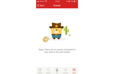
If you’d like to learn how to create your own mascot, there’s a nice tutorial by Sirine (aka ‘Miss ChatZ’) on Envato Tuts+.
To Wrap It Up…
Not all products are inherently fun the way games, or social media apps are, but even utilities don’t have to be merely utilitarian. Apps that deal with repetitive tasks often struggle with retaining users: people abandon them because they feel bored, and boredom is simply lack of stimulation. By using positive stimuli like humor, movement, unique art, elements of game, and relatable characters we can make users feel a different way — more excited, less distracted, and ultimately happier.
Further Reading
- “Emotional Design: Why We Love (Or Hate) Everyday Things,” Don Norman
- “Seductive Interaction Design: Creating Playful, Fun, and Effective User Experiences (Voices That Matter),” Stephen P. Anderson
 (cc, ra, il)


