(This is a sponsored article.) Icons are everywhere. They have been around for a long time, and it’s difficult to imagine a world without icons or symbols today. Only designers will know how much effort and time is needed to not only make them helpful but also simple and expressive.
What makes icons particularly special is perhaps the fact that their meaning can be understood without having to add any text or further details. In this article, I will show you how icons have been one of the first elements used in the first user interfaces, the story behind them, and why they are important to use in today’s screen design.
At the end of the article, you will find a short tutorial that explains how Illustrator and Adobe XD can cooperate. You’ll see that it is very simple to use the XD icons that have been created in Illustrator, thanks to the CC libraries.
So, let’s get started!
What Are Icons?
Icons are simple images used in context to communicate something. They are easily recognizable and easy to remember.
The origin of its name is interesting. It comes from the Greek εἰκόνα (“eikona”), meaning “image,” which in turns derives from eikénai ( an infinitive), which means “to be similar”, “to appear.” The word was used first to indicate a sacred representation painted on a table.
Digital icons appeared when the first GUI operating systems came out, like Macintosh and Microsoft. They were associated with programs or files, which could be opened double-clicking on the icon.
The earliest icons were pictures of objects that users were familiar with, such as office objects and software programs. They are, by definition, language-independent, meaning they can be recognized without text to indicate their meaning.
Dr. David Canfield Smith first coined the term "icon" in his landmark 1975 PhD thesis "Pygmalion: A Creative Programming Environment".[7][8] In his work, Dr. Smith envisioned a scenario in which "visual entities," called icons, could execute lines of programming code, and save the operation for later re-execution.
— Icon (Computing), Wikipedia
Beyond icons, other concepts like windows, menus, and pointers entered our lives and introduced us to a new way of seeing and using an operating system.
The simplicity of use and intuitiveness made icons very popular. Their symbolisms have been recognized all over the world and have set standards we still follow today.
In computing, an icon is a pictogram or ideogram displayed on a computer screen in order to help the user navigate a computer system or mobile device. The icon itself is a quickly comprehensible symbol of a software tool, function, or a data file, accessible on the system and is more like a traffic sign than a detailed illustration of the actual entity it represents.
— Icon (Computing), Wikipedia
I agree with the quote above up to a certain point, because, as an icon designer, I can say that even if icons are born with symbolic intent, they have evolved over time. Regarding their use, icons cover more or less challenging roles, which is the reason why they can be small artistic paintings, too.
So, how have icons developed over the years?
History Of Icons
The first digital icons appeared for consumers in 1981, for Xerox Alto. Xerox Alto was the first computer to support an operating system based on a graphical user interface.

In 1983, the Macintosh came into play with the Apple Lisa, using icons designed by Susan Kare.

We can see how the first icons were simple and easy to recognize. It was the first time a user had to deal with a click-based operating system.
In 1985, Amiga Workbench introduced colored icons:
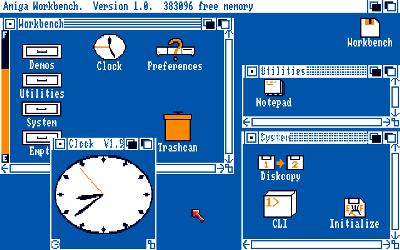
Finally, Macintosh first and then Windows paved the way for the most used operating system in the world mostly made with icons. In 1993, Windows popularity exploded thanks to the release of Windows 3.0. Some years before, in 1988, Apple sued Microsoft for copyright infringement of Apple’s Macintosh GUI.
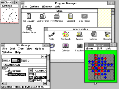
Windows’s GUI system, with its icons and other elements, reigned for years, and designers from all over the world designed and created icons for the most known operating system.

After a decline (when Steve Jobs left Apple, in 1985), Apple began to rise in the early 2000s (when Steve Jobs returned). Since then, Apple design has evolved from year to year, not least in its icons.
This evolution involved not just Apple design, but any kind of medium with a user interface.
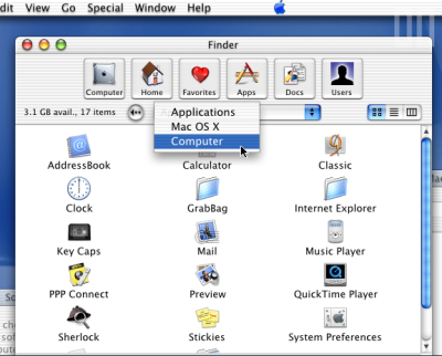

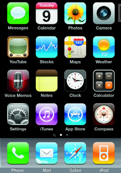
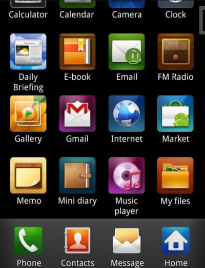

You can see more about icons evolution on History of Icons by Futuramo.
Designing Icons As Visual Elements For Screen Design
Designing UI elements answers user needs by creating something easy to access, easy to understand and easy to use.
Usability.gov tells us:
“An icon is a simplified image serving as an intuitive symbol that is used to help users to navigate the system. Typically, icons are hyperlinked.”
Let’s see what the best practices for designing icons as visual elements are:
- KISS principle
Keep icons as simple as possible, and avoid unnecessary complexity. They must identify simple concepts from the environment in which they will be used (for instance a work bag to indicate business, a bar chart to indicate finance, a shopping cart to indicate e-commerce).

- Consistency
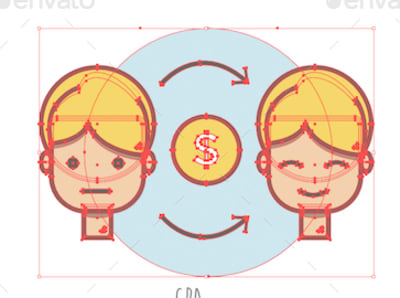
Focus on common elements to use in your icons.- The first thing to consider is definitely the color palette. Using no more than three to four colors keeps the design clean.
- Don’t be afraid to repeat elements throughout your icons. Repetition help users to identify icons and associate them with an action.
White space
Using white or blank space around icons makes them clear and gives them attention. A crowded space does not allow elements to breathe or express their true selves.Communication
The icons must communicate. Their task is to transfer visual information to the user in the simplest way possible.
Importance And Impact Of Effective Icons In UI And UX Design
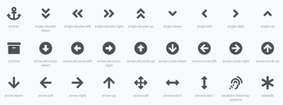
Icons have always been used in web design, but they reached their fullest potential in mobile design, thanks to touch input. In a small space like mobile, icons have to be functional, understandable and intuitive. Icons can overcome language barriers and be understandable for international users, holding universal meaning.
Have you ever considered that icons can affect the user behavior? Like any marketing tool, an icon can add value to an element.
For instance, look at these two images below:

In the second example, the arrow on the right adds value to the button and reinforces the meaning of the text.
Keep in mind, then, another important concept: Make your icons finger-friendly. They should be large enough for users to easily interact with them.
Let’s see some examples of using icons in different screen designs.
Web Design
Buddha Pizza
Buddha Pizza has got navigation on the left containing some linear icons. The icons are big and clear, and they move nicely on hover. Other explicative icons are discovered in the page sections.

Kinsta

Kinsta uses two kind of icons. The first are simple line icons, displayed with labels that explain their role:

Then, we find illustrated icons that move.

HTML Burger

This website makes beautiful use of pictures and simple icons.
Some sections are described with big line icons:

While others present simple and clear icons:

Mobile Apps
Calm
Calm is an app for mindfulness and meditation. On its intro screen, we find line icons at the top and bottom. They are well visible, thanks to the photo background, and are clear and clean.


Movesum
The Movesum app helps you find the motivation to exercise. It shows what kind of food you’re shedding when you burn calories. And guess what it uses to explain it? Icons.

Health
When you open the Health app, the first things you see are three types of icons:
- illustrated,
- linear,
- monocolor.

Every section contains icons for a purpose, and the icons are well organized and beautiful to look at. The four big buttons with illustrated icons look attractive and beckon for touch.
Wearables (Apple Watch)


Icons in Apple Watch tend to take up as much space as possible, because of the little screen space. So, texts, icons, and the user interface are optimized to be well visible in the small space.
Apple’s live introduction shows how the design of Apple Watch works when it’s functioning.
Car Dashboards
Last but not least, let’s see an example of how icons are indispensable in car dashboards. Now they are touchable in cars, too.

Illustrator And XD: In Cooperation
Now, I’ll show you how I work with both Illustrator and Adobe XD on UI design. I often draw my icons in Illustrator and then quickly copy them in XD.
Open your XD app, and choose the iPhone 7⁄8 UI:

Once it’s open, go to “File” → “Get UI Kits” → “Apple IOS.” From the web page, choose “Download for Adobe XD.”

Just choose a template from the ones you find in the file you just downloaded.

Copy and paste it into your new file.

Now, let’s see how to import icons from Illustrator into this XD document.
Let’s assume I created some icons in Adobe Illustrator, and I want to use them in XD. A quick way would be to use Creative Cloud (CC) libraries. CC libraries let you save your assets once, and then open them all from any other app in CC.
With the latest release of Adobe XD, it’s possible now to use vectors in XD that were created in Illustrator.
In Illustrator, be sure your Libraries panel is open. You can activate it by going to “Window” → “Libraries.” With your Libraries panel open, click and drag your icons into it.
Then, go into XD and click on “File” → “Open CC Libraries.” Click and drag icons from the library into XD.
Now let’s add some circle background to our icons in XD.
The last thing is we can change the colors in our icons. Checking in the Layers panel, you’ll see that near our imported icons is a link symbol:

This indicates that the icon is still linked to the library, so you cannot modify it. You can make it modifiable by clicking on “Object” → “Unlink Graphic.”
Your unlinked icon is now on separate levels, and you are now able to modify it — changing its color, for example.
And we’re done!
Here is the list of items we’ve covered in this article:
- What are icons?
- The history of icons
- How to design icons as visual elements for screen design
- The importance and impact of effective icons in UI and UX design
- Illustrator and XD: In Cooperation
I hope you’ve enjoyed my article! Feel free to ask anything in the comments below.
This article is part of a UX design series sponsored by Adobe. Adobe XD is made for a fast and fluid UX design process, as it lets you go from idea to prototype faster. Design, prototype, and share — all in one app. You can check out more inspiring projects created with Adobe XD on Behance, and also sign up for the Adobe experience design newsletter to stay updated and informed on the latest trends and insights for UX/UI design.
 (ra, al, il)


