(This is a sponsored article.) As designers working in an ever-changing field, it’s important that we develop an understanding of the timeless design principles that underpin everything we do. In the second article in my series for Adobe XD, I’ll explore the foundations that enable us to establish some universal principles of UX.
These principles, which should sit at the heart of everything we design and build, are critical and will stand the test of time:
- Visual Grammar
- Language and Typography
- Narrative Design
Collectively, these principles form the firm foundations on which we design great experiences. We can, of course, layer an understanding of other principles: psychology, anthropology, and economics. On top of these, enhancing what we build, but these core principles underpin the experiences we create.
We’re increasingly asked to solve design problems that – as new technologies are imagined and invented – have never been solved before. The good news is that the principles of the past still work. By focusing on acquiring these first principles, you develop skills that stand the test of time and set you apart as a designer.
Of course, to comprehensively cover universal principles of UX design – a vast and complex topic – would be a challenge in just a single article. But rest assured, I’ll provide some additional tips and techniques after each section, and at the close of the article I’ll provide some suggested reading. Consider this article a short primer to set you on the right path.
Visual Grammar
To design effectively, it’s critical to develop an understanding of the principles of visual grammar that underpin the world of visual communication. These principles, which have their roots in the history of graphic design, are still applicable today and form the building blocks of design, lying at the heart of the experiences we create.
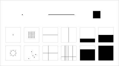
But what exactly do I mean by visual grammar? Put simply, everything we create visually – whether it’s user interface (UI) elements or more complex arrangements of elements on screen – is comprised of a series of core elements: points, lines, and planes. By combining these elements, we can create icons, components, illustrations, diagrams, patterns… in short, everything.
As designers, we work – at the simplest level – with an essential ‘grammar’ of elements: points, lines, and planes. These elements, which were defined at the influential Bauhaus school at the beginning of the twentieth century, remain at the heart of what we do today, and yet, often aren’t taught rigorously.
UX might be a relatively young discipline, but that doesn’t mean that it doesn’t have a rich heritage, drawn from the world of graphic design, from which we can learn. As I’ll explore shortly, if you break apart any design you’ll see at heart that it’s created from points lines and planes.
At Belfast School of Art, the first six weeks of our three-year programme are spent mastering the vocabulary of visual grammar. We focus – as Mr. Miyagi does in The Karate Kid – on developing a deep understanding of principles. Practice makes perfect, or, as Mr. Miyagi stresses repeatedly: “Wax on! Wax off!”
By encouraging our students to focus on just one element at a time – first points; then lines; then planes – we develop their understanding of the underlying visual grammar. This is a tried-and-tested method of learning that traces its lineage back to the world’s leading design schools: Bauhaus, Ulm, and Basel.
It takes time and patience, but if you want to improve as a designer, set aside some time and undertake a series of exercises using just points, lines and planes. Doing so will equip you with a deeper understanding of visual grammar. Rochester Institute of Technology has an excellent Mini-Course in Design Principles that acts as a perfect starting point.
With an understanding of what can be achieved using each of these elements alone, we introduce our students to the idea of combining them. It’s at this point that we see the richness of opportunity and the importance of designing within restraints.
Learning how to distill interfaces down to their core components – focusing on simplicity, and restraint– results in reduced cognitive burden and happier users. A win-win. With these core components defined we can combine them to establish a visual vocabulary for each and every project.

By combining these elements we can create a wealth of components:
- A chart, plotting data using just points,
- A slider, combining a point and a line,
- A series of page elements and form fields, comprised of planes, and
- A visual showing what’s possible when we combine the various elements.
These foundations have served graphic design for hundreds of years and form the backbone of the visual layer of UX we use in the here and now, but very few spend time mastering these essential components.
As Mr. Miyagi stresses, practice makes perfect. Once we start to put together points, lines, and planes in combination and bring color into the equation, we realize that we can create any UI component we need.
A seasoned designer can create delightful user experiences with very minimal means. As Antoine de Saint-Exupery put it: “Perfection is achieved, not when there is nothing more to add, but when there is nothing left to take away.”
Case Studies: Visual Grammar
With a mastery of visual grammar, it becomes clear that these building blocks – at their heart, the essence of simplicity – underpin everything we do as designers when we design user interface components and wider, holistic experiences. By training your eye, it’s possible to break apart complex interfaces, see how they’re constructed and learn from them.
There are many examples of rich, immersive experiences – both web-based and native – that are built using a minimal, distilled visual grammar. If we break apart a couple, we’ll see how we can create complex interfaces using this series of core elements: points, lines, and planes.
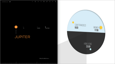
Josh Worth’s beautiful website If the Moon Were Only 1 Pixel is a great example of a site that demonstrates what’s possible when a deep understanding of even the simplest of visual elements is married to an elegant idea. The result is a wonderful and memorable UX.
Josh Worth describes it as: “A tediously accurate scale model of the solar system.” I’d describe it as a tour de force of what’s possible when even the simplest of building blocks – points, lines, and planes – are put to good use. Scroll horizontally, and you’ll see our solar system in all its glory:
- Points, at varying sizes, become planets;
- Lines are used both to pinpoint individual planets and serve as a scale along the base of the page; and
- A plane (the background) extends the length of the page, representing the blackness of space.
If the Moon Were Only 1 Pixel is a lovely example of a what’s possible when the basic building blocks of visual grammar are used sparingly, demonstrating that it’s possible to create an immersive experience with minimal means and a degree of restraint.
Another lovely example is Lunar’s time zone app, Onetime. Time zone apps are ten-a-penny, but Lunar’s is minimal and beautiful. Look closely, and you’ll see points, lines, and planes aplenty — all in the service of UX design:
- A central point represents the world (split in two) half awake in light blue, half asleep in dark grey, giving a sense of time and space;
- Points also represent the cities you add to the app (yellow representing daytime cities, light blue representing nighttime cities); and
- A plane of shadow breaks the globe to subtly indicate sleeping hours.
Where other time zone apps over-complicate their interface, Onetime focuses on simplicity. The result is an app that lets you: “Simply see the time anywhere at a glance.”
Simplicity can, and often does, stand the test of time. Spend some time learning about the building blocks of visual grammar – points, lines, and planes – and you’ll find you can achieve a great deal, even in the absence of color.
Tips And Techniques: Visual Grammar
As Dieter Rams puts it in his Ten Principles for Good Design: “Good design is as little design as possible.” As the sites and applications, we design become increasingly complex our role as designers is to simplify as much as possible, aiding usability in the process. To truly serve our users (and delight them in the process), we need to focus on the essentials. The best interfaces remove as much as possible, removing complexity in the process.
The appeal of If the Moon Were Only 1 Pixel and Onetime lies in their simplicity. When embarking on a new project, ask yourself: What can you do within constraints? The best designs – those that stand the test of time – often use a distilled visual grammar. Returning to de Saint-Exupery: “Perfection is achieved… when there is nothing left to take away.”
When building UI components try and focus on re-using elements and minimizing visual complexity. With a core set of simplified and elegant components built, focus on combining these to create easily understandable interfaces that ease user interactions.
Language And Typography
With a deep understanding of visual grammar mastered, it’s important to consider the underlying fabric of what we design, which is – more often than not – language, given form through typography. Working hand-in-hand, both are incredibly important and are supplemented by other forms of content: illustrations, photography, and video, for example.
Language – the words we choose to communicate – matters, and it’s important we give it thought as designers. When embarking upon any new project it’s important to start by defining the language that underpins your design, it will shape your users’ perceptions. Ask yourself: What’s the message? Then find the right words to communicate that message.
Whether you’re working with external clients as a consultant, internal project stakeholders as an in-house designer, or building a digital product, language matters. Before embarking on any new project set aside some time to spend with your stakeholders to help them define their message.
I follow a systematic process designed to clearly define my clients’ core message:
- Who are you? (As an individual or a business.)
- What are your values?
- What’s your mission and purpose?
- What do you hope to achieve?
- How will we know if you’re successful?
With the answers to these questions defined, it’s important to start to define the language that will underpin the project. The language that you choose shapes your design and needs to be considered from the perspective of both macrocopy and microcopy.
At a macro level, words can help set a tone and voice, as well as establish and reinforce the personality of a brand. At a micro level, words can satisfy a functional requirement by aiding and improving design interactions. At both levels – macro and micro – words can, when used in a considered manner as a part of the design process (indeed as another, core design element), aid and improve the user experience leaving users delighted and happy.
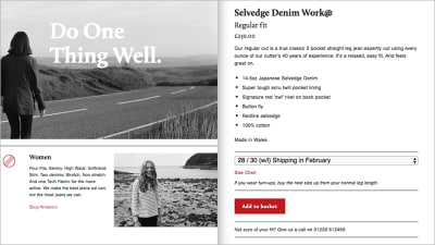
One way of defining macrocopy is to develop a ‘brand dictionary’: a palette of words that defines the brand you’re working on. This helps to ensure that the words you use throughout a project are: clear, concise and consistent, reducing confusion.
Consider two different car brands: smart and Mercedes. smart’s brand dictionary might include: agile, expressive, dynamic, fun and friendly. Mercedes’ brand dictionary might include: precision, luxury, stylish, engineered and efficient. smart and Mercedes are owned by the same parent company, but both have very different brand dictionaries because both are targeted at very different audiences.
With your macrocopy defined it’s important to focus on functional microcopy: the words you use to ease interactions. Microcopy should reflect your brand’s values but is more likely to be consistent from one project to another. Everyone understands what ‘Add to basket’ means, so don’t confuse your users by inventing your own terminology.
Language looks set to increase in importance, as we design for the ‘invisible interfaces’ that lie ahead of us – Amazon’s Echo, Google’s Home and Apple’s HomePod: conversational interfaces that rely on language heavily. In fact, John Maeda’s influential 2017 Design in Tech Report lists writing as a UX ‘unicorn skill’, quoting Nicole Fenton who stresses the importance of considering words as material. Language, however, is only one half of the equation; typography is also critical to amplify the language you have chosen.
As Robert Bringhurst (the author of The Elements of Typographic Style, widely accepted as the ‘bible’ of typography) states: “Typography is the craft of endowing human language with a durable visual form.” Put another way typography is clothing for words. Just as we can dress smartly or dress down, so too, the typographic choices we make fundamentally change how our users interpret the language we’ve crafted.
When our medium is largely focused on language, it stands to reason that an understanding of typography is critical. As Oliver Reichenstein, of digital product studio iA, puts it:
[When] 95% of the information on the web is written language, it is only logical to say that a web designer should get good training in the main discipline of shaping written information, in other words: typography.
Just as we consider language at the macro and micro level, so too, we need to consider typography in a similar manner. Type needs to be designed at: the macro, page-level, considering the overall structure of the page and the typographic hierarchy; and at the micro text-level, considering the details, including leading and spacing.
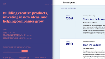
Typography can, of course, be used for decorative effect, but – equally, and more importantly – it can be used to improve UX. With your language clearly defined it’s important to consider how typography can be used to:
- Optimize legibility, through the appropriate choices of typefaces;
- Improve accessibility, by considering contrast between the foreground and background colors; and
- Improve usability, through a considered typographic hierarchy.
Typekit Practice has an excellent series of resources (lessons, references, and even a library) that cover a wide range of typographic fundamentals. Typekit Practice’s lessons include selecting typefaces for body text, advice on OpenType features, and (my favorite) a lovely lesson on using shades for eye-catching emphasis.
There are a wealth of other typographic resources on- and offline. Hoefler and Co.’s informative Discover.typography is a fantastic web-based resource; as is Typewolf, which offers inspiration, guides, and resources. Ellen Lupton’s book Thinking with Type is also essential reading, it’s an excellent primer for all things typographic. Lastly, Bringhurst’s book – mentioned above – deserves pride of place on every self-respecting designer’s book desk.
Case Studies: Language And Typography
When used hand-in-hand, language and typography can deliver more than the sum of their parts, enhancing the user experience. It’s critical to consider both as integral parts of the design process.
In an ideal world, it would be preferable to employ the services of a content designer and a typographer to assist the team. Would that we all lived in that ideal world! In the real world, developing a sound understanding of language and typography will improve your design considerably.
There are many examples of content-driven websites we can learn from. If we break apart a couple, we’ll see how language and typography can be used to deliver memorable user experiences.

GOV.UK is a great example of a website that is, first and foremost, language and content-focused. A winner of a coveted D&AD Black Pencil, the website has been celebrated for its stated intent to create a: “single domain for government.” As D&AD put it, the website has:
Rewritten information and services to be simpler, clearer and faster, **focusing on the needs of users rather than the needs of government**.
As designers, we can learn a great deal from GOV.UK’s approach, which emphasizes the importance of content design, a term – which it’s fair to say – the team at GOV.UK, led by Sarah Richards, helped to position front and centre. The design, which follows the UK government design principles, is focused on:
- Starting with user needs, placing a heavy emphasis on identifying what those needs are and delivering them;
- Focusing on clear and consistent language, ensuring users become familiar with the services offered; and
- Ensuring the site is as simple to use as possible (a difficult task when dealing with complex information).
Just as important as the language we use are they choices of typefaces we make. Rakesh Krishnan’s portfolio site, Rakesh, is a lovely example of a site that combines a minimal color palette with strong, yet restrained typography. Its typography-focused approach offers lessons aplenty:
- Consider typographic pairings, a bold sans-serif typeface for headings catches the eye, coupling this with a classic serif for body copy helps aid legibility;
- A strong typographic hierarchy helps the reader find their way around the page; and
- A contrasting bright red color accent offsets the largely monographic color palette adding a little brightness to the page.
When a considerable proportion of the information on the web is comprised of words, an understanding of language and typography is essential to improve user experience. As designers, our role is to communicate as clearly as possible and to develop our understanding of these principles can enhance our designs considerably.
Tips And Techniques: Language And Typography
As you embark upon a new project spend some time developing a brand dictionary at the beginning of the project. This ensures the words you choose, clearly and consistently communicate the brand. This brand dictionary acts as a guide for both macrocopy and microcopy.
Ensure every page or screen has a clear call-to-action (CTA). Ask yourself, “What is the user trying to achieve?” and design with that in mind. Use clear and concise language, and you’ll improve your design considerably, and your users will be a great deal happier. Even something as simple as a call-to-action button can be broken down into components and designed, as Aurélio Jota’s excellent article, The Anatomy of a CTA Button in 2017, demonstrates in detail.
When considering typography, less is more (as Mies van der Rohe famously put it). Pairing typefaces isn’t easy. If you’re just starting out, find a ‘superfamily’ and build around that. Consider contrasting typefaces for headings and body copy. Generally, serif typefaces work well for body copy, which can be contrasted with sans-serif typefaces for headings and sub-headings.
Narrative Design
A guide to the universal principles of user experience wouldn’t be complete without stressing the importance of narrative design. As designers, we are storytellers at heart, and we need to understand how stories work in order to tell them effectively. Above all as UX designers, we create experiences, and experiences unfold over time.
As UX designers (whether we’re creating experiences for desktop or mobile, web-based or native), everything we create unfolds over a sequence of screens. We rarely design screens in isolation.
As such, an understanding of time, and how it can be used as an integral part of design, is critical. It’s important to consider both: pacing, how quickly or slowly your narrative unfolds; and rhythm, the cadence of a series of screens, or elements on a screen. Both are critical in order to create captivating stories and drawing users into the content.
One of the best places to learn about narrative is from the world of film. Consider Bond, whether its Connery (the one true Bond) or Craig, a Bond film can teach us a great deal. Bear with me! Take the latest two films in the Bond franchise, Skyfall, and Spectre, both directed by Sam Mendes. Both open with lavishly-designed and fast-paced set pieces. These serve an important purpose, they: quicken the pace, heighten the senses, and set expectation.
These set pieces excite you and capture your attention.
Beyond the opening scene, however, Mendes slows the pace down. As a director, Mendes understands that a film – indeed any narrative – cannot sustain an accelerated pace throughout. It’s important to contrast the fast and the slow. This understanding maps neatly onto the world of screens; ours are just slightly smaller screens.
As designers, we need to consider pacing: deliver too much content too fast, and we’ll overwhelm our users; equally, deliver too little content too slowly, and we’ll send them to sleep. It’s important to focus on getting the balance right. You might be building a single-page site or app, or a multi-page site or app; regardless you need to consider how your users move through your content and how it is paced.

Pacing is important, but equally, we need to consider the order in which we structure the content of our stories. We’re living in a world in which information is expanding exponentially, and it can be incredibly hard to keep up. We have a responsibility to our users to deliver what they’re looking for as quickly as possible. Typically stories follow a classic structure, with a beginning, a middle and an end. That structure – tried and tested across millennia – still works, but when we’re time-poor it’s worth turning this structure on its head and getting to the point a little more quickly.
One technique we can use for this, drawn from the world of journalism, is the inverted pyramid. The inverted pyramid is a metaphor used by writers to illustrate how content should be prioritized and structured in text, for example in a newspaper article. Put simply: the inverted pyramid starts with the conclusion first, followed by information that supports that conclusion, followed by additional background details.
The core idea is that readers should be able to grasp the key messages being communicated, even if they don’t make it to the end of a piece of content. Each level down in the pyramid provides additional context, but the key point is delivered up front.

It’s hard to believe, but Jakob Nielsen wrote about the inverted pyramid as applied to the wonderful world of the web over two decades ago, in 1996. Nielsen’s article, charmingly titled ‘Inverted Pyramids in Cyberspace’, is still well worth reading, stressing the need to:
- Start with the information your users absolutely need and ensure this is right up front;
- Provide additional information that’s helpful, but not critical; and
- Close with the ‘nice to have’ information (for those readers who stuck with you until the bitter end!).
Like it or not we’re living in a time-pressured world. As designers, we need to acknowledge that fact by ensuring the user experiences we design to reflect the need to get things done quickly and efficiently. Great narrative designs are about a combination of the visual and the verbal; they marry the two to create well-paced stories that not only draw the reader in but captivate them on their journey through the content.
Without question one of the best books to explore the principles of narrative design is Scott McCloud’s Understanding Comics. It’s a critical and perspective-changing book and should be required reading for any user experience designer. Don’t be misled by its title; it’s about much, much more than comics: it’s about communication and is an informative, entertaining and – as you’d expect – a beautifully designed narrative.
Case Studies: Narrative Design
With an understanding of visual grammar, and language and typography we have all the components we need to create compelling experiences. All we need now is a story to weave these elements around.
Stories are everywhere: we learn through stories, we’re entertained by stories, and – if we want to create great user experiences that draw an audience in – we should build our designs around stories.
There are a wealth of websites that are narrative-driven. If we break apart a couple – which you’ll need to visit and explore to truly get a feel for – we’ll see how pacing can be used to deliver truly memorable user experiences.
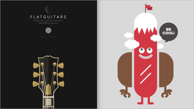
Flat Guitars is a beautifully designed example of a single-page website that’s quite literally dialed to eleven in its loading graphic and in terms of its narrative. An illustration project by David Navarro it takes the reader on a journey through the history of classic electric and acoustic guitars.
By using blocks of differing colors for each guitar the site’s pacing is consistent, and its rhythm is steady. The site offers:
- Alternative routes into the content, via both a scrolling view and a grid view;
- A considered color palette which affords each featured guitar its own distinctive look and feel; and
- Restrained typography, which focuses the story on the illustrations, the real star of the show.
Another example of a site using narrative design is Big Apple Hot Dogs with a narrative design that is bold, colorful and playful. With a cast of ‘hot dog characters’ the site foregrounds the importance of personality and humor in design.
With characters including The Huge Pole (and all-natural Polish sausage!), The Big Dog and The Frank Jr, Big Apple Hot Dogs takes something that could easily be dull – a hot dog site – and creates something playful that delivers a memorable UX. The secret sauce is simple:
- The site doesn’t take itself too seriously;
- Its hot dog characters, which are beautifully illustrated, capture the imagination (who wouldn’t want to get to know these dogs?): and
- By using contrasting colors between sections, it maintains a steady rhythm.
With so much content at our fingertips, it’s easy to see why sites that foreground narrative design hold our attention. They capture our imagination through well-paced stories and, like the stories of old, are shared via word of mouth.
Tips And Techniques: Narrative Design
As you start to wireframe out a new project it’s important to consider the structure and the pacing of your narrative. Put some thought into how your content is structured and grouped logically. Paper prototyping is the quickest way to get a feel for a user’s flow through your narrative. A low-cost medium, paper is perfect for getting the skeleton established before moving towards digital tools, developing lower and higher fidelity visual designs that can be tied together using a tool like Adobe XD.
Remember the inverted pyramid. Ask yourself: What’s the most important message that each page needs to communicate? With that established build your content so that it’s delivered efficiently. Remember, users are often time-poor and – for the most part – would like the critical content delivered quickly.
Everything is a story. When a hot dog site can create a colourful cast of characters to serve as an ensemble, ask yourself: What’s the story you’re telling in the project at hand?
In Closing…
It’s never too late to revisit the fundamental principles that underpin our industry. Timeless principles aren’t called ‘timeless’ for nothing; they stand the test of time.
In a world where everything is constantly changing, developing a deep understanding of visual grammar, language, and typography, and narrative design will last a lifetime.
In Rembrandt’s and others’ studios – in the seventeenth-century – to learn one followed the master-apprentice model, a model underpinned by relentless copying of ‘the master.’ We might not be living in the seventeenth-century, but that doesn’t mean the principles of this method don’t still work.
To improve as a designer, I’d offer one piece of advice (that I offer my students and those I work with in workshops): copy, relentlessly. Here’s an example by one of my students, Martine McGrath, to give you an idea. You don’t need to share your copies – and if you do give credit where it’s due – but copy, copy, copy. As you do, you’ll improve as a designer.
Think of it as a simple program, as if written in BASIC:
- FIND SOMETHING YOU LOVE
- MAKE IT
- GOTO 10
Repeat this process, and your understanding of universal principles will improve and, what’s more, you’ll develop: not just as a designer, but as a thinker, too.
Suggested Reading
There are many great publications, offline and online, that will help you on your adventure. I’ve included a few below to start you on your journey.
Christian Leborg’s 2006 Visual Grammar is, without question, one of the best books to equip you with a fundamental understanding of visual grammar and should be in every self-respecting designer’s library. Of course, there are older books also, not least Armin Hofmann’s 1965 Graphic Design Manual, another book that’s also well worth owning.
MailChimp’s Voice and Tone micro-site has, rightly, garnered considerable praise for its role in shining the spotlight on the powerful role that language plays in design. It places well-chosen words front and centre. Erik Spiekermann’s Stop Stealing Sheep is, rightly, one of the world’s best-selling books on designing with type. Its no-nonsense style will both entertain and inform.
Lastly, when considering narrative design, UX Storytelling For A Better User Experience, by Francisco Inchauste is still every bit as relevant today as it was when it was originally published in 2010.
This article is part of the UX design series sponsored by Adobe. Adobe XD tool is made for a fast and fluid UX design process, as it lets you go from idea to prototype faster. Design, prototype, and share — all in one app. You can check out more inspiring projects created with Adobe XD on Behance, and also sign up for the Adobe experience design newsletter to stay updated and informed on the latest trends and insights for UX/UI design.
 (ra, il)


