Sketch had brought totally new standards for file sizes. You no longer see 10 GB Photoshop files all over the place. Nevertheless, huge Sketch files exist, and they slow down Sketch. As a result, your productivity slows down as well.
Let’s be honest: It's not the design files that become bigger by magic. It’s designers who fill their files with unused, unoptimized and hidden elements that take unnecessary space.
We have faced this problem in our startup, Flawless App. We tend to have a separate Sketch file for each product. By “product”, I mean our core menu-bar application, website, social materials, press kit, illustrations for the articles on our Medium blog, and so on. These files used to grow a lot over time because of constant iterations and testing of different design decisions. As a result, it became harder and harder for Sketch to manage them with proper performance.
As any other engineers would do, we decided to write a small script that cleans and optimizes Sketch files automatically.
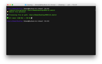
Scripts are great — that is, if you speak the same language as Terminal. Eventually, we decided that we needed a more human-like approach to allow more people from the team to use it. We also wanted to make it free and publicly available later on.
The First Prototype
I had some abstract concepts in mind before drawing any UI. The main goal was to make something that would live right at our fingertips all the time and allow us to optimize files as quickly as possible. A menu bar application was an obvious choice:
- We already had an internal framework for menu bar applications, with a lot of custom functions implemented. To give you some background: our core product, Flawless App, is a menu bar application that compares the expected design with the developer's implementation in real time. This internal framework was built for our core product.
- You can use the menu bar application even when Sketch isn’t open.
- Developing a native macOS app was much faster for us than a Sketch plugin with CocoaScript (because of our previous experience).
It was also crucial to give the user the ability to toggle different optimization options for different files.
Here is the very first wireframe, drawn on an old-fashioned paper, no fancy prototyping tools.

Lesson Learned #1
Before doing any UI, prototypes in fancy tools or even wireframes on paper, think about what goals you need to accomplish with a design. Who would use it, and how would the user interact with the application.
Color Palette And Typography
In discussion with the team, we didn't find any critical UX issues in the wireframes. I started by creating a color palette and choosing a font schema.
I wanted the application to be light and visually different from our core product, Flawless App. So, I came up with following palettes:
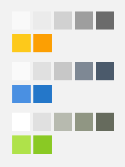
The first row is for the text colors (plus the light background at the beginning). The second row is for the accent colors. All colors were derived from one base accent color by applying simple rules for the HSB color system (H stands for hue, S for saturation and B for brightness).
Let’s say we have a base color of #4A90E2 (blue), which is (212, 67, 89) in HSB. To get a bit darker color, we need to decrease the brightness, increase the saturation and move the hue just a bit. So, we’d get #2477C9, which is (210, 82, 79) in HSB. I used the same approach for all other colors.
Eventually, I had chosen the first color palette (orange). Sketch files and the Sketch logo are orange as well, so our application would look more organic with them.
Lesson Learned #2
Colors were always tricky for me. I usually spend a lot of time finding just the right color. Here are a couple of resources that I use almost daily to help me explore colors:
- Adobe Kuler can help you find a color companion for any color.
- Khroma is an AI-based tool to generate color palettes based on your preferences.
- Erik Kennedy’s article, "Color in UI Design: A (Practical) Framework" is a pure gem. I read it about eight months ago, and since then I’ve used the HSB color system much more than RGB in Sketch.
Regarding typography, in most cases, using the default font for a native macOS application is best, unless you’re building something super-custom. Rendering time is faster, and it’s easier to implement during development. But I was so thrilled to try Montserrat in a native macOS app that I could not resist.
Lesson Learned #3
There are many great resources to explore fonts. Nevertheless, I use old-fashioned Google Fonts to get a sense of a particular font.
First Design Iteration
I started from exactly what I drew in the initial wireframe. Here is the general user flow in the application:
- Drag and drop a Sketch file.
- Choose optimization options.
- Reduce the selected file.
- Save it.
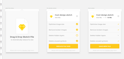
I was making designs in Sketch, and I was completely pleased with the overall UI. Because I had designed a menu bar applications before, the text sizing and margins were quite standard for me. Nevertheless, there were some noticeable issues with the first iteration, which I’ll describe later.
Lesson Learned #4
If you have never designed anything for macOS before, then definitely check out the Facebook Desktop Design Kit. You’ll find all of the common macOS UI elements there. And it will give you a sense of sizes and offsets for UI elements. For a macOS menu bar application, a 12 to 14-point font size is totally normal.
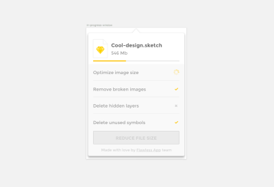
Issue #1: Missed State
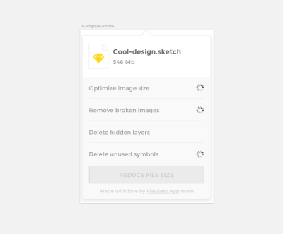
Everything was great except that I forgot to build a state in the middle when the application would be processing the Sketch file. As I know from experience, a missed state at the design stage equals a headache at the development stage.
How often do developers complain that designers design in a vacuum? You know, they’re talking about those problems with missing states in the middle, empty states, using perfect data sets and so on.
Lesson Learned #5
Before sending your design to the developers, make sure you haven't forgotten anything. Make sure you’ve specified all states, so that developers don’t ask you later, “How should this look in [some special condition]?” A good way to find these kinds of missed states is to use a prototyping tool. So far, the Craft plugin for Sketch (created by Invision), with its prototyping feature, is the fastest way to do such testing.
Issue #2: Too Many Custom Elements
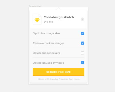
You will almost always be designing for a particular platform. In our case, it was macOS. And macOS has somewhat standard elements already in place. So, unless your product won’t work without a custom solution, use standard elements where they make sense. Developers will also thank you.
With these thoughts in mind, I removed the custom checkboxes and replaced them with the default ones. I also simplified the progress window by removing all unnecessary custom indicators.
Lesson Learned #6
To get a sense of the default elements for each platform, I’d suggest looking at these materials:
- iOS: Apple UI Design Resources, available for Sketch, Photoshop and Adobe XD
- Android: Material Design Kit
- macOS: Facebook Desktop Kit
Issue #3: Not Enough Emphasis At The End
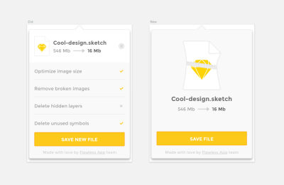
After a couple of feedback sessions with the team, it was clear that the final screen was overloaded. There was no indication of how much a file size had changed from optimization. So, I made a separate screen with a nice illustration of the compressed file and the label with file size information.
Lesson Learned #7
We use Slack as our main place for communication. Send to Slack is a little plugin that shares an artboard from Sketch directly to a Slack channel. It was really handy for team feedback sessions. Share more, share often.
Issue #4: Big Little Details
The issues below were found during development. But I’ll place them here anyway to keep the article’s structure consistent.
I started implementing the design. Right after the first launch, I realized there was no way for the user to Quit the application.
We also wanted to distribute our application via our own channels, instead of the Mac App Store. So, it was critical for us to add an auto-update system to the application. And the user should be able to see the current version and to check for updates. I ended up with a menu that presents this information and secondary actions in one place.

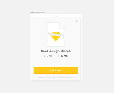
The last missed detail was a function to close an optimized file and return to the main screen without any saving. I added the same “close” button as appears in the “optimizations list” window in the upper-right corner.
Lesson Learned #8
Working closely with developers is always rewarding. Even in my case, with the same person doing design and development, it's challenging to see all issues right away. I had to actually start building in order to see these functional issues. In any case, try to get the developers involved as soon as possible. You can get a lot of valuable insight about functional things.
Prepare The Design For Development
Eventually, the design iterations were over. Well, technically speaking, design iterations are never over. So, let’s say we reached a good enough state, where we could move to development.
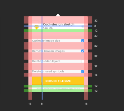
Before implementing the design, I fixed the spacing of elements, making sure all elements aligned to the 4-pixel guides. This guides-driven mindset will pay off at the development stage.
Lesson Learned #9
When all elements are lined up properly, your development time will significantly decrease. Because I was responsible for development as well, I got all of the properties directly from Sketch. But it definitely makes sense to ensure that all elements are in the right spots, that all colors are from the same palette and that the assets are ready for multiple resolutions.
Logo And Name
Last but not least, the name for our application came pretty quickly. Two words came to my mind: “reduce” and ”shrink.” I checked a Product Hunt, and “shrink” was already in use, so we went with “reduce.”
The logo was a real struggle for me. Because it’s a menu bar application, I had to create an icon for the menu bar first.
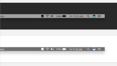
Because the menu bar icon has to be 16 × 16 pixels, it’s better not to use any tiny elements. The icon should be distinctive and legible at the same time.

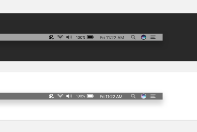
After several days of fighting with simple shapes, I gave up and opened the “Featured” section of Google Fonts. I was looking for a nice curved font that would be a good fit for a logo (as well as for the menu bar icon). Eventually, Pacifico font came into view, and it was perfect for our goals.
Lesson Learned #10
Remember that there are two versions of the menu bar in macOS: dark and light. Prepare your menu bar icon for both. Also, test how your icon works with the default selection background. By default, when the user presses on the menu bar icon, macOS will highlight it with whatever color the user has selected in their general settings. (Apple has a great guide on colors in macOS.) To test it, I created symbols for all of the default colors, so that I could switch between them and see how the icon looks with different backgrounds.
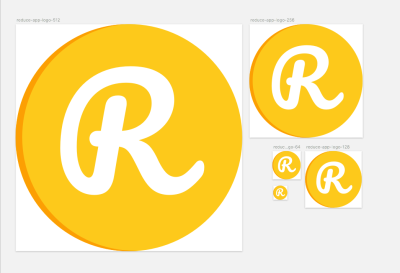
Using accent colors from the initial color palette, I put an “R” in a circle with a tiny curved border. At that point, the logo was good enough for me.
Conclusion
There is still a lot of room for improvement. As I mentioned, design iteration never ends. But if you keep iterating forever, the product will stay as a mockup forever. Shipping fast is better. Short iterations mean faster feedback, and faster feedback means a better product. The Reduce app was made in a week and a half because our main objective was to make it fast and useful.
We received plenty of positive feedback from our team. It turns out that the menu bar application is much faster and more understandable to use than the Terminal script. Also, during our public launch, the community gave us a lot of ideas for features we could implement next and how we can improve the app.
Here is a wrap up of the things we learned in creating the Reduce app:
- Think about the product's goals and use cases before doing any wireframes or prototypes.
- Use a tool such as Adobe Color and Khroma to choose the right color palette faster. A basic understanding of the HSB color system will also help.
- Don't be afraid to experiment with custom fonts.
- Every platform has its own set of standards. Learn them before designing.
- Use a prototyping tool to get a sense of the complete flow.
- Don't overwhelm your design with custom elements. Sometimes it's better to stick to the default controls for the given platform.
- Get feedback on your design as early as possible.
- Get the developers involved as early as possible. You can get a lot of valuable insight about functional elements and about how much time it would take to implement that “little gradient button with the spiral animation.”
- Use a platform-standard grid to line up all elements. The developers will thank you for it later.
- Test your design for different use cases (like a light and dark menu bar) before finalizing the UI.
If you feel that the Reduce app could simplify your life as well (and your Sketch files), you can download it for free. And please give us some feedback. We believe it’s the most valuable thing one can get from users.
 (ra, al, yk, il)


