


Performance matters — we all know it. However, do we actually always know what our performance bottlenecks exactly are? Is it expensive JavaScript, slow web font delivery, heavy images, or sluggish rendering? Is it worth exploring tree-shaking, scope hoisting, code-splitting, and all the fancy loading patterns with intersection observer, clients hints, CSS containment, HTTP/2 and service workers? And, most importantly, where do we even start improving performance and how do we establish a performance culture long-term?
Back in the day, performance was often a mere afterthought. Often deferred till the very end of the project, it would boil down to minification, concatenation, asset optimization and potentially a few fine adjustments on the server's config file. Looking back now, things seem to have changed quite significantly.
Performance isn't just a technical concern: it matters, and when baking it into the workflow, design decisions have to be informed by their performance implications. Performance has to be measured, monitored and refined continually, and the growing complexity of the web poses new challenges that make it hard to keep track of metrics, because metrics will vary significantly depending on the device, browser, protocol, network type and latency (CDNs, ISPs, caches, proxies, firewalls, load balancers and servers all play a role in performance).
So, if we created an overview of all the things we have to keep in mind when improving performance — from the very start of the process until the final release of the website — what would that list look like? Below you'll find a (hopefully unbiased and objective) front-end performance checklist for 2018 — an overview of the issues you might need to consider to ensure that your response times are fast, user interaction is smooth and your sites don't drain user's bandwidth.
(You can also just download the checklist PDF (0.129 MB) or download the checklist in Apple Pages (0.236 MB). Happy optimizing, everyone!)
Getting Ready: Planning And Metrics
Micro-optimizations are great for keeping performance on track, but it's critical to have clearly defined targets in mind — measurable goals that would influence any decisions made throughout the process. There are a couple of different models, and the ones discussed below are quite opinionated — just make sure to set your own priorities early on.
- Establish a performance culture.
In many organizations, front-end developers know exactly what common underlying problems are and what loading patterns should be used to fix them. However, as long as there is no alignment between dev/design and marketing teams, performance isn't going to sustain long-term. Study common complaints coming into customer service and see how improving performance can help relieve some of these common problems.Run performance experiments and measure outcomes — both on mobile and on desktop. It will help you build up a company-tailored case study with real data. Furthermore, using data from case studies and experiments published on WPO Stats can help increase sensitivity for business about why performance matters, and what impact it has on user experience and business metrics. Stating that performance matters alone isn't enough though — you also need to establish some measurable and trackable goals and observe them.
- Goal: Be at least 20% faster than your fastest competitor.
According to psychological research, if you want users to feel that your website is faster than your competitor's website, you need to be at least 20% faster. Study your main competitors, collect metrics on how they perform on mobile and desktop and set thresholds that would help you outpace them. To get accurate results and goals though, first study your analytics to see what your users are on. You can then mimic the 90th percentile's experience for testing. Collect data, set up a spreadsheet, shave off 20%, and set up your goals (i.e. performance budgets) this way. Now you have something measurable to test against.If you're keeping the budget in mind and trying to ship down just the minimal script to get a quick time-to-interactive, then you're on a reasonable path. Lara Hogan's guide on how to approach designs with a performance budget can provide helpful pointers to designers and both Performance Budget Calculator and Browser Calories can aid in creating budgets (thanks to Karolina Szczur for the heads up).
Performance budget builder by Brad Frost Beyond performance budgets, think about critical customer tasks that are most beneficial to your business. Set and discuss acceptable time thresholds for critical actions and establish "UX ready" user timing marks that the entire organization has agreed on. In many cases, user journeys will touch on the work of many different departments, so alignment in terms of acceptable timings will help support or prevent performance discussions down the road. Make sure that additional costs of added resources and features are visible and understood.
Also, as Patrick Meenan suggested, it's worth to plan out a loading sequence and trade-offs during the design process. If you prioritize early on which parts are more critical, and define the order in which they should appear, you will also know what can be delayed. Ideally, that order will also reflect the sequence of your CSS and JavaScript imports, so handling them during the build process will be easier. Also, consider what the visual experience should be in "in-between"-states, while the page is being loaded (e.g. when web fonts aren't loaded yet).
Planning, planning, planning. It might be tempting to get into quick "low-hanging-fruits"-optimizations early on — and eventually it might be a good strategy for quick wins — but it will be very hard to keep performance a priority without planning and setting realistic, company-tailored performance goals.
- Choose the right metrics.
Not all metrics are equally important. Study what metrics matter most to your application: usually it will be related to how fast you can start render most important pixels (and what they are) and how quickly you can provide input responsiveness for these rendered pixels. This knowledge will give you the best optimization target for ongoing efforts. One way or another, rather than focusing on full page loading time (via onLoad and DOMContentLoaded timings, for example), prioritize page loading as perceived by your customers. That means focusing on a slightly different set of metrics. In fact, choosing the right metric is a process without obvious winners.
Below are some of the metrics worth considering:
- First Meaningful Paint (FMP, when primary content appears on the page),
- Hero Rendering Times (when the page's important content has finished rendering),
- Time to Interactive (TTI, the point at which layout has stabilized, key webfonts are visible, and the main thread is available enough to handle user input — basically the time mark when a user can tap on UI and interact with it),
- Input responsiveness (how much time it takes for an interface to respond to user's action),
- Perceptual Speed Index (measures how quickly the page contents are visually populated; the lower the score, the better),
- Your custom metrics, as defined by your business needs and customer experience.
Steve Souders has a detailed explanation of each metrics. While in many cases TTI and Input responsiveness will be most critical, depending on the context of your application, these metrics might differ: e.g. for Netflix TV UI, key input responsiveness, memory usage and TTI are more critical.
- Gather data on a device representative of your audience.
To gather accurate data, we need to thoroughly choose devices to test on. It's a good option to choose a Moto G4, a mid-range Samsung device and a good middle-of-the-road device like a Nexus 5X, perhaps in an open device lab. If you don't have a device at hand, emulate mobile experience on desktop by testing on a throttled network (e.g. 150ms RTT, 1.5 Mbps down, 0.7 Mbps up) with a throttled CPU (5× slowdown). Eventually switch over to regular 3G, 4G and Wi-Fi. To make the performance impact more visible, you could even introduce 2G Tuesdays or set up a throttled 3G network in your office for faster testing. - Passive monitoring tools that simulate user interaction on request (synthetic testing, e.g. Lighthouse, WebPageTest) and
- Active monitoring tools that record and evaluate user interactions continuously (Real User Monitoring, e.g. SpeedCurve, New Relic — both tools provide synthetic testing, too).
- Share the checklist with your colleagues.
Make sure that the checklist is familiar to every member of your team to avoid misunderstandings down the line. Every decision has performance implications, and the project would hugely benefit from front-end developers properly communicating performance values to the whole team, so that everybody would feel responsibility for it, not just front-end developers. Map design decisions against performance budget and the priorities defined in the checklist.

Luckily, there are many great options that help you automate the collection of data and measure how your website performs over time according to these metrics. Keep in mind that a good performance metrics is a combination of passive and active monitoring tools:
The former is particularly useful during development as it will help you stay on track while working on the product. The latter is useful for long-term maintenance as it will help you understand your performance bottlenecks as they are happening live — when users actually access the site. By tapping into built-in RUM APIs such as Navigation Timing, Resource Timing, Paint Timing, Long Tasks, etc., both passive and active performance monitoring tools together provide a complete picture of performance in your application. For instance, you could use PWMetrics, Calibre, SpeedCurve, mPulse and Boomerang, Sitespeed.io, which all are fantastic options for performance monitoring.
Note: It's always a safer bet to choose network-level throttlers, external to the browser, as, for example, DevTools has issues interacting with HTTP/2 push, due to the way it's implemented (thanks, Yoav!).


Setting Realistic Goals
- 100-millisecond response time, 60 fps.
For an interaction to feel smooth, the interface has 100ms to respond to user's input. Any longer than that, and the user perceives the app as laggy. The RAIL, a user-centered performance model gives you healthy targets: To allow for <100 milliseconds response, the page must yield control back to main thread at latest after every <50 milliseconds. Estimated Input Latency tells us if we are hitting that threshold, and ideally, it should be below 50ms. For high pressure points like animation, it's best to do nothing else where you can and the absolute minimum where you can't.Also, each frame of animation should be completed in less than 16 milliseconds, thereby achieving 60 frames per second (1 second ÷ 60 = 16.6 milliseconds) — preferably under 10 milliseconds. Because the browser needs time to paint the new frame to the screen your code should finish executing before hitting the 16.6 milliseconds mark. Be optimistic and use idle time wisely. Obviously, these targets apply to runtime performance, rather than loading performance.
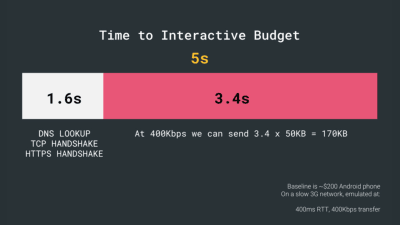
- SpeedIndex < 1250, TTI < 5s on 3G, Critical file size budget < 170Kb.
Although it might be very difficult to achieve, a good ultimate goal would be First Meaningful Paint under 1 second and a SpeedIndex value under 1250. Considering the baseline being a $200 Android phone (e.g. Moto G4) on a slow 3G network, emulated at 400ms RTT and 400kbps transfer speed, aim for Time to Interactive under 5s, and for repeat visits, aim for under 2s.Notice that, when speaking about Time To Interactive, it's a good idea to distinguish between First Interactive and Consistency Interactive to avoid misunderstandings down the line. The former is the earliest point after the main content has rendered (where there is at least a 5-second window where the page is responsive). The latter is the point where the page can be expected to always be responsive to input.
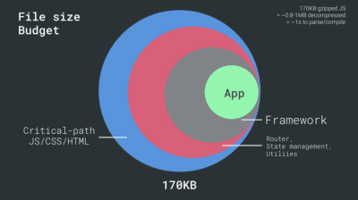
The first 14~15Kb of the HTML is the most critical payload chunk — and the only part of the budget that can be delivered in the first roundtrip (which is all you get in 1 second at 400ms RTT). In more general terms, to achieve the goals stated above, we have have to operate within a critical file size budget of max. 170Kb gzipped (0.8-1MB decompressed) which already would take up to 1s (depending on the resource type) to parse and compile on an average phone. Being slightly above that is fine, but push to get these values as low as possible.
You could also go beyond bundle size budget though. For example, you could set performance budgets on the activities of the browser's main thread, i.e. paint time before start render, or track down front-end CPU hogs. Tools such as Calibre, SpeedCurve and Bundlesize can help you keep your budgets in check, and can be integrated into your build process.
Defining The Environment
- Choose and set up your build tools.
Don't pay too much attention to what's supposedly cool these days. Stick to your environment for building, be it Grunt, Gulp, Webpack, Parcel, or a combination of tools. As long as you are getting results you need fast and you have no issues maintaining your build process, you're doing just fine. - Progressive enhancement.
Keeping progressive enhancement as the guiding principle of your front-end architecture and deployment is a safe bet. Design and build the core experience first, and then enhance the experience with advanced features for capable browsers, creating resilient experiences. If your website runs fast on a slow machine with a poor screen in a poor browser on a suboptimal network, then it will only run faster on a fast machine with a good browser on a decent network. - Choose a strong performance baseline.
With so many unknowns impacting loading — the network, thermal throttling, cache eviction, third-party scripts, parser blocking patterns, disk I/O, IPC jank, installed extensions, CPU, hardware and memory constraints, differences in L2/L3 caching, RTTS, images, web fonts loading behavior — JavaScript has the heaviest cost of the experience, next to web fonts blocking rendering by default and images often consuming too much memory. With the performance bottlenecks moving away from the server to the client, as developers, we have to consider all of these unknowns in much more detail.With a 170KB budget that already contains the critical-path HTML/CSS/JavaScript, router, state management, utilities, framework and the application logic, we have to thoroughly examine network transfer cost, the parse/compile time and the runtime cost of the framework of our choice.
From Fast By Default: Modern Loading Best Practices by Addy Osmani (Slides 18, 19). As noted by Seb Markbåge, a good way to measure start-up costs for frameworks is to first render a view, then delete it and then render again as it can tell you how the framework scales.
The first render tends to warm up a bunch of lazily compiled code, which a larger tree can benefit from when it scales. The second render is basically an emulation of how code reuse on a page affects the performance characteristics as the page grows in complexity.
Not every project needs a framework. In fact, some projects can benefit from removing an existing framework altogether. Once a framework is chosen, you'll be staying with it for at least a few years, so if you need to use one, make sure your choice is informed and well considered. It's a good idea to consider at least the total cost on size + initial parse times before choosing an option; lightweight options such as Preact, Inferno, Vue, Svelte or Polymer can get the job done just fine. The size of your baseline will define the constraints for your application's code.
Keep in mind that on a mobile device, you should be expecting a 4×–5× slowdown compared to desktop machines. Mobile devices have different GPUs, CPU, different memory, different battery characteristics. Parse times on mobile are 36% higher than on desktop. So always test on an average device — a device that is most representative of your audience.
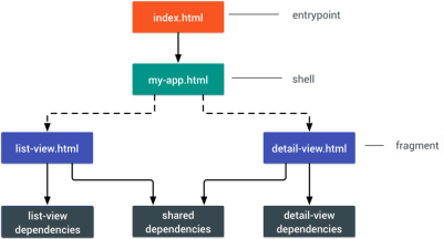
Different frameworks will have different effects on performance and will require different strategies of optimization, so you have to clearly understand all of the nuts and bolts of the framework you'll be relying on. When building a web app, look into the PRPL pattern and application shell architecture. The idea is quite straightforward: Push the minimal code needed to get interactive for the initial route to render quickly, then use service worker for caching and pre-caching resources and then lazy-load routes that you need, asynchronously.
- Will you be using AMP or Instant Articles?
Depending on the priorities and strategy of your organization, you might want to consider using Google's AMP or Facebook's Instant Articles or Apple's Apple News. You can achieve good performance without them, but AMP does provide a solid performance framework with a free content delivery network (CDN), while Instant Articles will boost your visibility and performance on Facebook.The main benefit of these technologies for users is guaranteed performance, so at times they might even prefer AMP-/Apple News/Instant Pages-links over "regular" and potentially bloated pages. For content-heavy websites that are dealing with a lot of third-party content, these options could help speed up render times dramatically.
A benefit for the website owner is obvious: discoverability of these formats on their respective platforms and increased visibility in search engines. You could build progressive web AMPs, too, by reusing AMPs as a data source for your PWA. Downside? Obviously, a presence in a walled garden places developers in a position to produce and maintain a separate version of their content, and in case of Instant Articles and Apple News without actual URLs. (thanks Addy, Jeremy!)
- Choose your CDN wisely.
Depending on how much dynamic data you have, you might be able to "outsource" some part of the content to a static site generator, pushing it to a CDN and serving a static version from it, thus avoiding database requests. You could even choose a static-hosting platform based on a CDN, enriching your pages with interactive components as enhancements (JAMStack).Notice that CDNs can serve (and offload) dynamic content as well. So, restricting your CDN to static assets is not necessary. Double-check whether your CDN performs compression and conversion (e.g. image optimization in terms of formats, compression and resizing at the edge), smart HTTP/2 delivery, edge-side includes, which assemble static and dynamic parts of pages at the CDN's edge (i.e. the server closest to the user), and other tasks.
Build Optimizations
- Set your priorities straight.
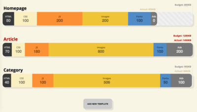
It's a good idea to know what you are dealing with first. Run an inventory of all of your assets (JavaScript, images, fonts, third-party scripts and "expensive" modules on the page, such as carousels, complex infographics and multimedia content), and break them down in groups.Set up a spreadsheet. Define the basic core experience for legacy browsers (i.e. fully accessible core content), the enhanced experience for capable browsers (i.e. the enriched, full experience) and the extras (assets that aren't absolutely required and can be lazy-loaded, such as web fonts, unnecessary styles, carousel scripts, video players, social media buttons, large images). We published an article on "Improving Smashing Magazine's Performance," which describes this approach in detail.
- Consider using the "cutting-the-mustard" pattern.
Albeit quite old, we can still use the cutting-the-mustard technique to send the core experience to legacy browsers and an enhanced experience to modern browsers. Be strict in loading your assets: Load the core experience immediately, then enhancements, and then the extras. Note that the technique deduces device capability from browser version, which is no longer something we can do these days.For example, cheap Android phones in developing countries mostly run Chrome and will cut the mustard despite their limited memory and CPU capabilities. That's where PRPL pattern could serve as a good alternative. Eventually, using the Device Memory Client Hints Header, we'll be able to target low-end devices more reliably. At the moment of writing, the header is supported only in Blink (it goes for client hints in general). Since Device Memory also has a JavaScript API which is already available in Chrome, one option could be to feature detect based on the API, and fallback to "cutting the mustard" technique only if it's not supported (thanks, Yoav!)
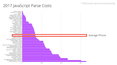
- Parsing JavaScript is expensive, so keep it small.
When dealing with single-page applications, you might need some time to initialize the app before you can render the page. Look for modules and techniques to speed up the initial rendering time (for example, here's how to debug React performance, and here's how to improve performance in Angular), because most performance issues come from the initial parsing time to bootstrap the app.JavaScript has a cost, but it's not necessarily the file size that drains on performance. Parsing and executing times vary significantly depending on the hardware of a device. On an average phone (Moto G4), a parsing time alone for 1MB of (uncompressed) JavaScript will be around 1.3–1.4s, with 15–20% of all time on mobile spent on parsing. With compiling in play, just prep work on JavaScript takes 4s on average, with around 11s before First Meaningful Paint on mobile. Reason: parse and execution times can easily be 2–5x times higher on low-end mobile devices.
An interesting way of avoiding parsing costs is to use binary templates that Ember has recently introduced for experimentation. These templates don't need to be parsed. (Thanks, Leonardo!)
That's why it's critical to examine every single JavaScript dependency, and tools like webpack-bundle-analyzer, Source Map Explorer and Bundle Buddy can help you achieve just that. Measure JavaScript parse and compile times. Etsy's DeviceTiming, a little tool allowing you to instruct your JavaScript to measure parse and execution time on any device or browser. Bottom line: while size matters, it isn't everything. Parse and compiling times don't necessarily increase linearly when the script size increases.
- Are you using an ahead-of-time compiler?
Use an ahead-of-time compiler to offload some of the client-side rendering to the server and, hence, output usable results quickly. Finally, consider using Optimize.js for faster initial loading by wrapping eagerly invoked functions (it might not be necessary any longer, though). - Are you using tree-shaking, scope hoisting and code-splitting?
Tree-shaking is a way to clean up your build process by only including code that is actually used in production and eliminate unused exports in Webpack. With Webpack 3 and Rollup, we also have scope hoisting that allows both tools to detect whereimportchaining can be flattened and converted into one inlined function without compromising the code. With Webpack 4, you can now use JSON Tree Shaking as well. UnCSS or Helium can help you remove unused styles from CSS.Also, you might want to consider learning how to write efficient CSS selectors as well as how to avoid bloat and expensive styles. Feeling like going beyond that? You can also use Webpack to shorten the class names and use scope isolation to rename CSS class names dynamically at the compilation time.
Code-splitting is another Webpack feature that splits your code base into "chunks" that are loaded on demand. Not all of the JavaScript has to be downloaded, parsed and compiled right away. Once you define split points in your code, Webpack can take care of the dependencies and outputted files. It enables you to keep the initial download small and to request code on demand, when requested by the application. Also, consider using preload-webpack-plugin that takes routes you code-split and then prompts browser to preload them using
<link rel="preload">or<link rel="prefetch">.Where to define split points? By tracking which chunks of CSS/JavaScript are used, and which aren't used. Umar Hansa explains how you can use Code Coverage from Devtools to achieve it.
If you aren't using Webpack, note that Rollup shows significantly better results than Browserify exports. While we're at it, you might want to check out Rollupify, which converts ECMAScript 2015 modules into one big CommonJS module — because small modules can have a surprisingly high performance cost depending on your choice of bundler and module system.
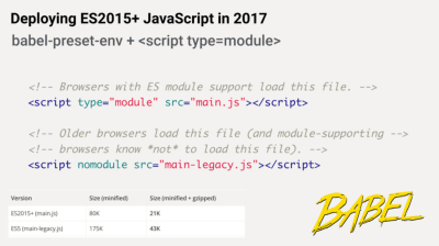
From Fast By Default: Modern Loading Best Practices by the one-and-only Addy Osmani. Slide 76. Finally, with ES2015 being remarkably well supported in modern browsers, consider using
babel-preset-envto only transpile ES2015+ features unsupported by the modern browsers you are targeting. Then set up two builds, one in ES6 and one in ES5. We can usescript type="module"to let browsers with ES module support loading the file, while older browser could load legacy builds withscript nomodule.For lodash, use
babel-plugin-lodashthat will load only modules that you are using in your source. This might save you quite a bit of JavaScript payload. - Take advantage of optimizations for your target JavaScript engine.
Study what JavaScript engines dominate in your user base, then explore ways of optimizing for them. For example, when optimizing for V8 which is used in Blink-browsers, Node.js runtime and Electron, make use of script streaming for monolithic scripts. It allowsasyncordefer scriptsto be parsed on a separate background thread once downloading begins, hence in some cases improving page loading times by up to 10%. Practically, use<script defer>in the<head>, so that the browsers can discover the resource early and then parse it on the background thread.Caveat: Opera Mini doesn't support script deferment, so if you are developing for India or Africa,
deferwill be ignored, resulting in blocking rendering until the script has been evaluated (thanks Jeremy!).
- Client-side rendering or server-side rendering?
In both scenarios, our goal should be to set up progressive booting: Use server-side rendering to get a quick first meaningful paint, but also include some minimal necessary JavaScript to keep the time-to-interactive close to the first meaningful paint. If JavaScript is coming too late after the First Meaningful Paint, the browser might lock up the main thread while parsing, compiling and executing late-discovered JavaScript, hence handcuffing the interactivity of site or application.To avoid it, always break up the execution of functions into separate, asynchronous tasks, and where possible use
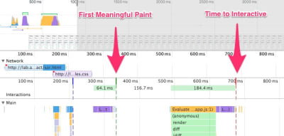
requestIdleCallback. Consider lazy loading parts of the UI using WebPack's dynamicimport()support, avoiding the load, parse, and compile cost until the users really need them (thanks Addy!).In its essence, Time to Interactive (TTI) tells us how the length of time between navigation and interactivity. The metric is defined by looking at the first five second window after the initial content is rendered, in which no JavaScript tasks take longer than 50ms. If a task over 50ms occurs, the search for a five second window starts over. As a result, the browser will first assume that it reached Interactive, just to switch to Frozen, just to eventually switch back to Interactive.
Once we reached Interactive, we can then, either on demand or as time allows, boot non-essential parts of the app. Unfortunately, as Paul Lewis noticed, frameworks typically have no concept of priority that can be surfaced to developers, and hence progressive booting is difficult to implement with most libraries and frameworks. If you have the time and resources, use this strategy to ultimately boost performance.
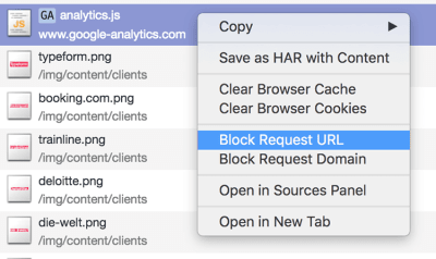
- Do you constrain the impact of third-party scripts?
With all performance optimizations in place, often we can't control third-party scripts coming from business requirements. Third-party-scripts metrics aren't influenced by end user experience, so too often one single script ends up calling a long tail of obnoxious third-party scripts, hence ruining a dedicated performance effort. To contain and mitigate performance penalties that these scripts bring along, it's not enough to just load them asynchronously (probably via defer) and accelerate them via resource hints such asdns-prefetchorpreconnect.As Yoav Weiss explained in his must-watch talk on third-party scripts, in many cases these scripts download resources that are dynamic. The resources change between page loads, so we don't necessarily know which hosts the resources will be downloaded from and what resources they would be.
What options do we have then? Consider using service workers by racing the resource download with a timeout and if the resource hasn't responded within a certain timeout, return an empty response to tell the browser to carry on with parsing of the page. You can also log or block third-party requests that aren't successful or don't fulfill certain criteria.
Another option is to establish a Content Security Policy (CSP) to restrict the impact of third-party scripts, e.g. disallowing the download of audio or video. The best option is to embed scripts via
<iframe>so that the scripts are running in the context of the iframe and hence don't have access to the DOM of the page, and can't run arbitrary code on your domain. Iframes can be further constrained using thesandboxattribute, so you can disable any functionality that iframe may do, e.g. prevent scripts from running, prevent alerts, form submission, plugins, access to the top navigation, and so on.For example, it's probably going to be necessary to allow scripts to run with
<iframe sandbox="allow-scripts">. Each of the limitations can be lifted via variousallowvalues on thesandboxattribute (supported almost everywhere), so constrain them to the bare minimum of what they should be allowed to do. Consider using Safeframe and Intersection Observer; that would enable ads to be iframed while still dispatching events or getting the information that they need from the DOM (e.g. ad visibility). Watch out for new policies such as Feature policy, resource size limits and CPU/Bandwidth priority to limit harmful web features and scripts that would slow down the browser, e.g. synchronous scripts, synchronous XHR requests, document.write and outdated implementations.To stress-test third parties, examine bottom-up summaries in Performance profile page in DevTools, test what happens if a request is blocked or it has timed out — for the latter, you can use WebPageTest's Blackhole server
72.66.115.13that you can point specific domains to in yourhostsfile. Preferably self-host and use a single hostname, but also generate a request map that exposes fourth-party calls and detect when the scripts change.
- Are HTTP cache headers set properly?
Double-check thatexpires,cache-control,max-ageand other HTTP cache headers have been set properly. In general, resources should be cacheable either for a very short time (if they are likely to change) or indefinitely (if they are static) — you can just change their version in the URL when needed. Disable theLast-Modifiedheader as any asset with it will result in a conditional request with anIf-Modified-Since-header even if the resource is in cache. Same withEtag, though it has its uses.Use
Cache-control: immutable, designed for fingerprinted static resources, to avoid revalidation (as of December 2017, supported in Firefox, Edge and Safari; in Firefox only onhttps://transactions). You can use Heroku's primer on HTTP caching headers, Jake Archibald's "Caching Best Practices" and Ilya Grigorik's HTTP caching primer as guides. Also, be wary of the vary header, especially in relation to CDNs, and watch out for the Key header which helps avoiding an additional round trip for validation whenever a new request differs slightly, but not significantly, from prior requests (thanks, Guy!).
Assets Optimizations
- Is Brotli or Zopfli plain text compression in use?
In 2015, Google introduced Brotli, a new open-source lossless data format, which is now supported in all modern browsers. In practice, Brotli appears to be more effective than Gzip and Deflate. It might be (very) slow to compress, depending on the settings, but slower compression will ultimately lead to higher compression rates. Still, it decompresses fast.Browsers will accept it only if the user is visiting a website over HTTPS though. What's the catch? Brotli still doesn't come preinstalled on some servers today, and it's not straightforward to set up without self-compiling NGINX or Ubuntu. Still, it's not that difficult. In fact, some CDNs support it and you can even enable Brotli even on CDNs that don't support it yet (with a service worker).
At the highest level of compression, Brotli is so slow that any potential gains in file size could be nullified by the amount of time it takes for the server to begin sending the response as it waits to dynamically compress the asset. With static compression, however, higher compression settings are preferred — thanks Jeremy!).
Alternatively, you could look into using Zopfli's compression algorithm, which encodes data to Deflate, Gzip and Zlib formats. Any regular Gzip-compressed resource would benefit from Zopfli's improved Deflate encoding, because the files will be 3 to 8% smaller than Zlib's maximum compression. The catch is that files will take around 80 times longer to compress. That's why it's a good idea to use Zopfli on resources that don't change much, files that are designed to be compressed once and downloaded many times.
If you can bypass the cost of dynamically compressing static assets, it's worth the effort. Both Brotli and Zopfli can be used for any plaintext payload — HTML, CSS, SVG, JavaScript, and so on.
The strategy? Pre-compress static assets with Brotli+Gzip at the highest level and compress (dynamic) HTML on the fly with Brotli at level 1–4. Also, check for Brotli support on CDNs (e.g. KeyCDN, CDN77, Fastly). Make sure that the server handles content negotiation for Brotli or gzip properly. If you can't install/maintain Brotli on the server, use Zopfli.
- Are images properly optimized?
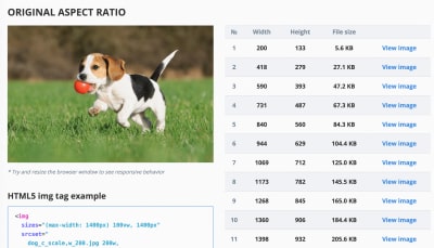
As far as possible, use responsive images withsrcset,sizesand the<picture>element. While you're at it, you could also make use of the WebP format (supported in Chrome, Opera, Firefox soon) by serving WebP images with the<picture>element and a JPEG fallback (see Andreas Bovens' code snippet) or by using content negotiation (usingAcceptheaders).Sketch natively supports WebP, and WebP images can be exported from Photoshop using a WebP plugin for Photoshop. Other options are available, too. If you're using WordPress or Joomla, there are extensions to help you easily implement support for WebP, such as Optimus and Cache Enabler for WordPress and Joomla's own supported extension (via Cody Arsenault).
You can also use client hints, which still have to gain some browser support. Not enough resources to bake in sophisticated markup for responsive images? Use the Responsive Image Breakpoints Generator or a service such as Cloudinary to automate image optimization. Also, in many cases, using
srcsetandsizesalone will reap significant benefits.On Smashing Magazine, we use the postfix
-optfor image names — for example,brotli-compression-opt.png; whenever an image contains that postfix, everybody on the team knows that the image has already been optimized.
- Take image optimization to the next level.
When you're working on a landing page on which it's critical that a particular image loads blazingly fast, make sure that JPEGs are progressive and compressed with Adept, mozJPEG (which improves the start rendering time by manipulating scan levels) or Guetzli, Google's new open source encoder focusing on perceptual performance, and utilizing learnings from Zopfli and WebP. The only downside: slow processing times (a minute of CPU per megapixel). For PNG, we can use Pingo, and SVGO or SVGOMG for SVG.Every single image optimization article would state it, but keeping vector assets clean and tight is always worth reminding. Make sure to clean up unused assets, remove unnecessary metadata and reduces the amount of path points in artwork (and thus SVG code). (Thanks, Jeremy!)
These optimizations so far cover just the basics. Addy Osmani has published a very detailed guide on Essential Image Optimization that goes very deep into details of image compression and color management. For example, you could blur out unnecessary parts of the image (by applying a Gaussian blur filter to them) to reduce the file size, and eventually you might even start removing colors or turn the picture into black and white to reduce the size even further. For background images, exporting photos from Photoshop with 0 to 10% quality can be absolutely acceptable as well.
What about GIFs? Well, instead of loading heavy animated GIFs which impact both rendering performance and bandwidth, we could potentially use looping HTML5 videos, yet browser performance is slow with
<video>and, unlike with images, browsers do not preload<video>content. At least we can add lossy compression to GIFs with Lossy GIF, gifsicleor giflossy.Good news: hopefully soon we'll be able to use
<img src=".mp4">to load videos, and early tests show thatimgtags display 20× faster and decode 7× faster than the GIF equivalent, in addition to being a fraction in file size.Not good enough? Well, you can also improve perceived performance for images with the multiple background images technique. Keep in mind that playing with contrast and blurring out unnecessary details (or removing colors) can reduce file size as well. Ah, you need to enlarge a small photo without losing quality? Consider using Letsenhance.io.
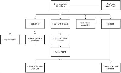
- Are web fonts optimized?
The first question that's worth asking if you can get away with using UI system fonts in the first place. If it's not the case, chances are high that the web fonts you are serving include glyphs and extra features and weights that aren't being used. You can ask your type foundry to subset web fonts or subset them yourself if you are using open-source fonts (for example, by including only Latin with some special accent glyphs) to minimize their file sizes.WOFF2 support is great, and you can use WOFF and OTF as fallbacks for browsers that don't support it. Also, choose one of the strategies from Zach Leatherman's "Comprehensive Guide to Font-Loading Strategies," (code snippets also available as Web font loading recipes) and use a service worker cache to cache fonts persistently. Need a quick win? Pixel Ambacht has a quick tutorial and case study to get your fonts in order.
If you can't serve fonts from your server and are relying on third-party hosts, make sure to use Font Load Events (or Web Font Loader for browsers not supporting it). FOUT is better than FOIT; start rendering text in the fallback right away, and load fonts asynchronously — you could also use loadCSS for that. You might be able to get away with locally installed OS fonts as well, or use variable fonts that are gaining traction, too.
What would make a bulletproof font loading strategy? Start with
font-display, then fall back to the Font Loading API, then fall back to Bram Stein's Font Face Observer. (thanks Jeremy!) And if you're interested in measuring the performance of font loading from the user's perspective, Andreas Marschke explores performance tracking with Font API and UserTiming API.Also, don't forget to include the
font-display: optionaldescriptor for resilient and fast font fallbacks,unicode-rangeto break down a large font into smaller language-specific fonts, and Monica Dinculescu's font-style-matcher to minimize a jarring shift in layout, due to sizing discrepancies between the two fonts.
Delivery Optimizations
- Do you limit the impact of JavaScript libraries, and load them asynchronously?
When the user requests a page, the browser fetches the HTML and constructs the DOM, then fetches the CSS and constructs the CSSOM, and then generates a rendering tree by matching the DOM and CSSOM. If any JavaScript needs to be resolved, the browser won't start rendering the page until it's resolved, thus delaying rendering. As developers, we have to explicitly tell the browser not to wait and to start rendering the page. The way to do this for scripts is with thedeferandasyncattributes in HTML.In practice, it turns out we should prefer
defertoasync(at a cost to users of Internet Explorer up to and including version 9, because you're likely to break scripts for them). Also, as mentioned above, limit the impact of third-party libraries and scripts, especially with social sharing buttons and<iframe>embeds (such as maps). Size Limit helps you prevent JavaScript libraries bloat: If you accidentally add a large dependency, the tool will inform you and throw an error. You can use static social sharing buttons (such as by SSBG) and static links to interactive maps instead. - Are you lazy-loading expensive scripts with Intersection Observer?
If you need to lazy-load images, videos, ad scripts, A/B testing scripts or any other resources, you can use the shiny new Intersection Observer API that provides a way to asynchronously observe changes in the intersection of a target element with an ancestor element or with a top-level document's viewport. Basically, you need to create a new IntersectionObserver object, which receives a callback function and a set of options. Then we add a target to observe.The callback function executes when the target becomes visible or invisible, so when it intercepts the viewport, you can start taking some actions before the element becomes visible. In fact, we have a granular control over when the observer's callback should be invoked, with
rootMargin(margin around the root) andthreshold(a single number or an array of numbers which indicate at what percentage of the target's visibility we are aiming). Alejandro Garcia Anglada has published a handy tutorial on how to actually implement it.You could even take it to the next level by adding progressive image loading to your pages. Similarly to Facebook, Pinterest and Medium, you could load low quality or even blurry images first, and then as the page continues to load, replace them with the full quality versions, using the LQIP (Low Quality Image Placeholders) technique proposed by Guy Podjarny.
Opinions differ if the technique improves user experience or not, but it definitely improves time to first meaningful paint. We can even automate it by using SQIP that creates a low quality version of an image as an SVG placeholder. These placeholders could be embedded within HTML as they naturally compress well with text compression methods. In his article, Dean Hume has described how this technique can be implemented using Intersection Observer.
Browser support? Decent, with Chrome, Firefox, Edge and Samsung Internet being on board. WebKit status is currently in development. Fallback? If we don't have support for intersection observer, we can still lazy load a polyfill or load the images immediately. And there is even a library for it.
In general, it's a good idea to lazy-load all expensive components, such as fonts, JavaScript, carousels, videos and iframes. You could even adapt content serving based on effective network quality. Network Information API and specifically
navigator.connection.effectiveType(Chrome 62+) use RTT and downlink values to provide a slightly more accurate representation of the connection and the data that users can handle. You can use it to remove video autoplay, background images or web fonts entirely for connections that are too slow. - Do you push critical CSS quickly?
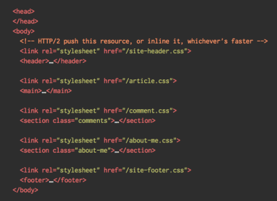
To ensure that browsers start rendering your page as quickly as possible, it's become a common practice to collect all of the CSS required to start rendering the first visible portion of the page (known as "critical CSS" or "above-the-fold CSS") and add it inline in the<head>of the page, thus reducing roundtrips. Due to the limited size of packages exchanged during the slow start phase, your budget for critical CSS is around 14 KB.If you go beyond that, the browser will need additional roundtrips to fetch more styles. CriticalCSS and Critical enable you to do just that. You might need to do it for every template you're using. If possible, consider using the conditional inlining approach used by the Filament Group.
With HTTP/2, critical CSS could be stored in a separate CSS file and delivered via a server push without bloating the HTML. The catch is that server pushing is troublesome with many gotchas and race conditions across browsers. It isn't supported consistently and has some caching issues (see slide 114 onwards of Hooman Beheshti's presentation). The effect could, in fact, be negative and bloat the network buffers, preventing genuine frames in the document from being delivered. Also, it appears that server pushing is much more effective on warm connections due to the TCP slow start.
Even with HTTP/1, putting critical CSS in a separate file on the root domain has benefits, sometimes even more than inlining due to caching. Chrome speculatively opens a second HTTP connection to the root domain when requesting the page, which removes the need for a TCP connection to fetch this CSS (thanks, Philip!)
A few gotchas to keep in mind: unlike
preloadthat can trigger preload from any domain, you can only push resources from your own domain or domains you are authoritative for. It can be initiated as soon as the server gets the very first request from the client. Server pushed resources land in the Push cache and are removed when the connection is terminated. However, since an HTTP/2 connection can be re-used across multiple tabs, pushed resources can be claimed by requests from other tabs as well (thanks, Inian!).At the moment, there is no simple way for the server to know if pushed resources are already in one of user's caches, so resources will keep being pushed with every user's visit. So, you might need to create a cache-aware HTTP/2 server push mechanism. If fetched, you could try to get them from a cache based on the index of what's already in the cache, avoiding secondary server pushes altogether.
Keep in mind, though, that the new
cache-digestspecification negates the need to manually build such "cache-aware" servers, basically declaring a new frame type in HTTP/2 to communicate what's already in the cache for that hostname. As such, it could be particularly useful for CDNs as well.For dynamic content, when a server needs some time to generate a response, the browser isn't able to make any requests since it's not aware of any sub-resources that the page might reference. For that case, we can warm up the connection and increase the TCP congestion window size, so that future requests can be completed faster. Also, all inlined assets are usually good candidates for server pushing. In fact, Inian Parameshwaran did a remarkable research comparing HTTP/2 Push vs. HTTP Preload, and it's a fantastic read with all the details you might need. Server Push or Not Server Push? Colin Bendell's Should I Push? might point you in the right direction.
Bottom line: As Sam Saccone said,
preloadis good for moving the start download time of an asset closer to the initial request, while Server Push is good for cutting out a full RTT (or more, depending on your server think time) — if you have a service worker to prevent unnecessary pushing, that is.
- Do you stream responses?
Often forgotten and neglected, streams provide an interface for reading or writing asynchronous chunks of data, only a subset of which might be available in memory at any given time. Basically, they allow the page that made the original request to start working with the response as soon as the first chunk of data is available, and use parsers that are optimized for streaming to progressively display the content.We could create one stream from multiple sources. For example, instead of serving an empty UI shell and letting JavaScript populate it, you can let the service worker construct a stream where the shell comes from a cache, but the body comes from the network. As Jeff Posnick noted, if your web app is powered by a CMS that server-renders HTML by stitching together partial templates, that model translates directly into using streaming responses, with the templating logic replicated in the service worker instead of your server. Jake Archibald's The Year of Web Streams article highlights how exactly you could build it. Performance boost is quite noticeable.
One important advantage of streaming the entire HTML response is that HTML rendered during the initial navigation request can take full advantage of the browser's streaming HTML parser. Chunks of HTML that are inserted into a document after the page has loaded (as is common with content populated via JavaScript) can't take advantage of this optimization.
Browser support? Getting there with Chrome 52+, Firefox 57+ (behind flag), Safari and Edge supporting the API and Service Workers being supported in all modern browsers.
- Are you saving data with
Save-Data?
Especially when working in emerging markets, you might need to consider optimizing experience for users who choose to opt into data savings. The Save-Data client hint request header allows us to customize the application and the payload to cost- and performance-constrained users. In fact, you could rewrite requests for high DPI images to low DPI images, remove web fonts and fancy parallax effects, turn off video autoplay, server pushes or even change how you deliver markup.The header is currently supported only in Chromium, on the Android version of Chrome or via the Data Saver extension on a desktop device. Finally, you can also use service workers and the Network Information API to deliver low/high resolution images based on the network type.
- Do you warm up the connection to speed up delivery?
Use resource hints to save time ondns-prefetch(which performs a DNS lookup in the background),preconnect(which asks the browser to start the connection handshake (DNS, TCP, TLS) in the background),prefetch(which asks the browser to request a resource) andpreload(which prefetches resources without executing them, among other things).Most of the time these days, we'll be using at least
preconnectanddns-prefetch, and we'll be cautious with usingprefetchandpreload; the former should only be used if you are very confident about what assets the user will need next (for example, in a purchasing funnel). Notice thatprerenderhas been deprecated and is no longer supported.Note that even with
preconnectanddns-prefetch, the browser has a limit on the number of hosts it will look up/connect to in parallel, so it's a safe bet to order them based on priority (thanks Philip!).In fact, using resource hints is probably the easiest way to boost performance, and it works well indeed. When to use what? As Addy Osmani has explained, we should preload resources that we have high-confidence will be used in the current page. Prefetch resources likely to be used for future navigations across multiple navigation boundaries, e.g. Webpack bundles needed for pages the user hasn't visited yet.
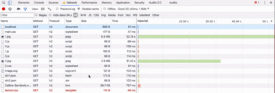
Addy's article on Loading Priorities in Chrome shows how exactly Chrome interprets resource hints, so once you've decided which assets are critical for rendering, you can assign high priority to them. To see how your requests are prioritized, you can enable a "priority" column in the Chrome DevTools network request table (as well as Safari Technology Preview).
For example, since fonts usually are important assets on a page, it's always a good idea to request the browser to download fonts with preload. You could also load JavaScript dynamically, effectively lazy-loading execution. Also, since <link rel="preload"> accepts a media attribute, you could choose to selectively prioritize resources based on @media query rules.
A few gotchas to keep in mind: preload is good for moving the start download time of an asset closer to the initial request, but preloaded assets land in the memory cache which is tied to the page making the request. It means that preloaded requests cannot be shared across pages. Also, preload plays well with the HTTP cache: a network request is never sent if the item is already there in the HTTP cache.
Hence, it's useful for late-discovered resources, a hero image loaded via background-image, inlining critical CSS (or JavaScript) and pre-loading the rest of the CSS (or JavaScript). Also, a preload tag can initiate a preload only after the browser has received the HTML from the server and the lookahead parser has found the preload tag. Preloading via the HTTP header is a bit faster since we don't to wait for the browser to parse the HTML to start the request. Early Hints will help even further, enabling preload to kick in even before the response headers for the HTML are sent.
Beware: if you're using preload, as must be defined or nothing loads, plus Preloaded fonts without the crossorigin attribute will double fetch.
- Have you optimized rendering performance?
Isolate expensive components with CSS containment — for example, to limit the scope of the browser's styles, of layout and paint work for off-canvas navigation, or of third-party widgets. Make sure that there is no lag when scrolling the page or when an element is animated, and that you're consistently hitting 60 frames per second. If that's not possible, then at least making the frames per second consistent is preferable to a mixed range of 60 to 15. Use CSS'will-changeto inform the browser of which elements and properties will change.Also, measure runtime rendering performance (for example, in DevTools). To get started, check Paul Lewis' free Udacity course on browser-rendering optimization and Emily Hayman's article on Performant Web Animations and Interactions.
We also have a lil' article by Sergey Chikuyonok on how to get GPU animation right. Quick note: changes to GPU-composited layers are the least expensive, so if you can get away by triggering only compositing via
opacityandtransform, you'll be on the right track. - Have you optimized rendering experience?
While the sequence of how components appear on the page, and the strategy of how we serve assets to the browser matter, we shouldn't underestimate the role of perceived performance, too. The concept deals with psychological aspects of waiting, basically keeping customers busy or engaged while something else is happening. That's where perception management, preemptive start, early completion and tolerance management come into play.What does it all mean? While loading assets, we can try to always be one step ahead of the customer, so the experience feels swift while there is quite a lot happening in the background. To keep the customer engaged, we can use skeleton screens (implementation demo) instead of loading indicators, add transitions/animations and basically cheat the UX when there is nothing more to optimize.
HTTP/2
- Migrate to HTTPS, then turn on HTTP/2.
With Google moving towards a more secure web and eventual treatment of all HTTP pages in Chrome as being "not secure," a switch to HTTP/2 environment is unavoidable. HTTP/2 is supported very well; it isn't going anywhere; and, in most cases, you're better off with it. Once running on HTTPS already, you can get a major performance boost with service workers and server push (at least long term).
Eventually, Google plans to label all HTTP pages as non-secure, and change the HTTP security indicator to the red triangle that Chrome uses for broken HTTPS. (Image source) The most time-consuming task will be to migrate to HTTPS, and depending on how large your HTTP/1.1 user base is (that is, users on legacy operating systems or with legacy browsers), you'll have to send a different build for legacy browsers performance optimizations, which would require you to adapt a different build process. Beware: Setting up both migration and a new build process might be tricky and time-consuming. For the rest of this article, I'll assume that you're either switching to or have already switched to HTTP/2.
- Properly deploy HTTP/2.
Again, serving assets over HTTP/2 requires a partial overhaul of how you've been serving assets so far. You'll need to find a fine balance between packaging modules and loading many small modules in parallel. In the end of the day, still the best request is no request, however the goal is to find a fine balance between quick first delivery of assets and caching.On the one hand, you might want to avoid concatenating assets altogether, instead breaking down your entire interface into many small modules, compressing them as a part of the build process, referencing them via the "scout" approach and loading them in parallel. A change in one file won't require the entire style sheet or JavaScript to be re-downloaded. It also minimizes parsing time and keeps the payloads of individual pages low.
On the other hand, packaging still matters. First, compression will suffer. The compression of a large package will benefit from dictionary reuse, whereas small separate packages will not. There's standard work to address that, but it's far out for now. Secondly, browsers have not yet been optimized for such workflows. For example, Chrome will trigger inter-process communications (IPCs) linear to the number of resources, so including hundreds of resources will have browser runtime costs.
To achieve best results with HTTP/2, consider to load CSS progressively, as suggested by Chrome's Jake Archibald. Still, you can try to load CSS progressively. Obviously, by doing so, you are actively penalizing HTTP/1.1 users, so you might need to generate and serve different builds to different browsers as part of your deployment process, which is where things get slightly more complicated. You could get away with HTTP/2 connection coalescing, which allows you to use domain sharding while benefiting from HTTP/2, but achieving this in practice is difficult.
What to do? If you're running over HTTP/2, sending around 6–10 packages seems like a decent compromise (and isn't too bad for legacy browsers). Experiment and measure to find the right balance for your website.
- Do your servers and CDNs support HTTP/2?
Different servers and CDNs are probably going to support HTTP/2 differently. Use Is TLS Fast Yet? to check your options, or quickly look up how your servers are performing and which features you can expect to be supported.

- Is OCSP stapling enabled?
By enabling OCSP stapling on your server, you can speed up your TLS handshakes. The Online Certificate Status Protocol (OCSP) was created as an alternative to the Certificate Revocation List (CRL) protocol. Both protocols are used to check whether an SSL certificate has been revoked. However, the OCSP protocol does not require the browser to spend time downloading and then searching a list for certificate information, hence reducing the time required for a handshake. - Have you adopted IPv6 yet?
Because we're running out of space with IPv4 and major mobile networks are adopting IPv6 rapidly (the US has reached a 50% IPv6 adoption threshold), it's a good idea to update your DNS to IPv6 to stay bulletproof for the future. Just make sure that dual-stack support is provided across the network — it allows IPv6 and IPv4 to run simultaneously alongside each other. After all, IPv6 is not backwards-compatible. Also, studies show that IPv6 made those websites 10 to 15% faster due to neighbor discovery (NDP) and route optimization. - Is HPACK compression in use?
If you're using HTTP/2, double-check that your servers implement HPACK compression for HTTP response headers to reduce unnecessary overhead. Because HTTP/2 servers are relatively new, they may not fully support the specification, with HPACK being an example. H2spec is a great (if very technically detailed) tool to check that. HPACK works.

- Make sure the security on your server is bulletproof.
All browser implementations of HTTP/2 run over TLS, so you will probably want to avoid security warnings or some elements on your page not working. Double-check that your security headers are set properly, eliminate known vulnerabilities, and check your certificate. Also, make sure that all external plugins and tracking scripts are loaded via HTTPS, that cross-site scripting isn't possible and that both HTTP Strict Transport Security headers and Content Security Policy headers are properly set. - Are service workers used for caching and network fallbacks?
No performance optimization over a network can be faster than a locally stored cache on user's machine. If your website is running over HTTPS, use the "Pragmatist's Guide to Service Workers" to cache static assets in a service worker cache and store offline fallbacks (or even offline pages) and retrieve them from the user's machine, rather than going to the network. Also, check Jake's Offline Cookbook and the free Udacity course "Offline Web Applications." Browser support? As stated above, it's widely supported (Chrome, Firefox, Safari TP, Samsung Internet, Edge 17+) and the fallback is the network anyway. Does it help boost performance? Oh yes, it does.
Testing And Monitoring
- Have you tested in proxy browsers and legacy browsers?
Testing in Chrome and Firefox is not enough. Look into how your website works in proxy browsers and legacy browsers. UC Browser and Opera Mini, for instance, have a significant market share in Asia (up to 35% in Asia). Measure average Internet speed in your countries of interest to avoid big surprises down the road. Test with network throttling, and emulate a high-DPI device. BrowserStack is fantastic, but test on real devices as well. - Is continuous monitoring set up?
Having a private instance of WebPagetest is always beneficial for quick and unlimited tests. However, a continuous monitoring tool with automatic alerts will give you a more detailed picture of your performance. Set your own user-timing marks to measure and monitor business-specific metrics. Also, consider adding automated performance regression alerts to monitor changes over time.Look into using RUM-solutions to monitor changes in performance over time. For automated unit-test-alike load testing tools, you can use k6 with its scripting API. Also, look into SpeedTracker, Lighthouse and Calibre.

Quick Wins
This list is quite comprehensive, and completing all of the optimizations might take quite a while. So, if you had just 1 hour to get significant improvements, what would you do? Let's boil it all down to 10 low-hanging fruits. Obviously, before you start and once you finish, measure results, including start rendering time and SpeedIndex on a 3G and cable connection.
- Measure the real world experience and set appropriate goals. A good goal to aim for is First Meaningful Paint < 1 s, a SpeedIndex value < 1250, Time to Interactive < 5s on slow 3G, for repeat visits, TTI < 2s. Optimize for start rendering time and time-to-interactive.
- Prepare critical CSS for your main templates, and include it in the
<head>of the page. (Your budget is 14 KB). For CSS/JS, operate within a critical file size budget of max. 170Kb gzipped (0.8-1MB decompressed). - Defer and lazy-load as many scripts as possible, both your own and third-party scripts — especially social media buttons, video players and expensive JavaScript.
- Add resource hints to speed up delivery with faster
dns-lookup,preconnect,prefetchandpreload. - Subset web fonts and load them asynchronously (or just switch to system fonts instead).
- Optimize images, and consider using WebP for critical pages (such as landing pages).
- Check that HTTP cache headers and security headers are set properly.
- Enable Brotli or Zopfli compression on the server. (If that's not possible, don't forget to enable Gzip compression.)
- If HTTP/2 is available, enable HPACK compression and start monitoring mixed-content warnings. If you're running over TLS, also enable OCSP stapling.
- Cache assets such as fonts, styles, JavaScript and images — actually, as much as possible! — in a service worker cache.
Download The Checklist (PDF, Apple Pages)
With this checklist in mind, you should be prepared for any kind of front-end performance project. Feel free to download the print-ready PDF of the checklist as well as an editable Apple Pages document to customize the checklist for your needs:
- Download the checklist PDF (PDF, 0.129 MB)
- Download the checklist in Apple Pages (.pages, 0.236 MB)
If you need alternatives, you can also check the front-end checklist by Dan Rublic and the "Designer's Web Performance Checklist" by Jon Yablonski.
Off We Go!
Some of the optimizations might be beyond the scope of your work or budget or might just be overkill given the legacy code you have to deal with. That's fine! Use this checklist as a general (and hopefully comprehensive) guide, and create your own list of issues that apply to your context. But most importantly, test and measure your own projects to identify issues before optimizing. Happy performance results in 2018, everyone!
A huge thanks to Guy Podjarny, Yoav Weiss, Addy Osmani, Artem Denysov, Denys Mishunov, Ilya Pukhalski, Jeremy Wagner, Colin Bendell, Mark Zeman, Patrick Meenan, Leonardo Losoviz, Andy Davies, Rachel Andrew, Anselm Hannemann, Patrick Hamann, Andy Davies, Tim Kadlec, Rey Bango, Matthias Ott, Mariana Peralta, Philipp Tellis, Ryan Townsend, Mohamed Hussain S H, Jacob Groß, Tim Swalling, Bob Visser, Kev Adamson, Aleksey Kulikov and Rodney Rehm for reviewing this article, as well as our fantastic community, which has shared techniques and lessons learned from its work in performance optimization for everybody to use. You are truly smashing!
 (ra, il)