Making improvements to your mobile app’s design isn’t necessarily the easiest of tasks. After all, how much can really be accomplished within such a limited space? You recognize that mobile users’ attention spans are waning and that, consequently, they expect a speedy, convenient and engaging experience when using apps.
Realistically, how many other ways can there be to satisfy these expectations that haven’t already been done before?
Let’s take mobile dating apps. I know, I know. They often get a bad rap for turning the dating scene into something superficial, mechanical and impersonal.
Log in through Facebook.
Swipe left. Swipe right.
Open a new message to chat with Alicia/Greg/Cathy/Alex/Elle…
While it’s easy to write off these apps as fun little diversions for people trying to find love, they’re actually quite successful. And I’m not just talking about how they help singletons play the numbers game. Developers of mobile dating apps have done a great job of creating an engaging and almost addictive experience that keep users coming back not just on more than one occasion, but daily.
So, what’s their secret?
In the following rundown on mobile dating apps, I’ll discuss how developers effectively use what they know about their audience to shape a valuable experience through design. If you’ve been spending your time side-eyeing your competition’s mobile apps for tips and tricks for improvement, it might be time to give it a rest and check out what mobile dating app developers are doing.
They’ve unlocked six secret ingredients that you need to pay close attention to.
The Real Value Of Mobile Dating Apps
If you’ve ever built a mobile app before, then you know how difficult it is to get people to download it to their phone, keep it installed and use it regularly.
Localytics conducted a study in 2016 on mobile app abandonment. Two statistics came out of this research that app developers should find worrisome:
- 23% of mobile app users will only use an app once before abandoning it.
- Only 38% of mobile app users will use an app more than 11 times.
Let’s face it: Some mobile app concepts just make more sense than others and will be better received by users. That being said, it’s not as simple as chalking it up to one type of business faring better than another in the mobile app space (for instance, restaurant loyalty apps versus productivity apps).
What it really boils down to is the value you deliver and how well your app’s design and functionality add to that value.
Take mobile dating apps. The concept is similar to what traditional dating websites aim to accomplish: helping people find a mate. While some developers of dating apps have mistakenly tried to put the full experience of a website into mobile app form, others have instead focused on the users’ needs in the context of a mobile device.
This is likely why dating apps continue to be so popular, nearly half a decade after the introduction of Tinder to the mainstream.
On its own, Tinder garners 1.6 billion swipes every day. Its users each spend an average of 35 minutes on the platform every day. Compare that to Bumble, one of the newer yet very popular kids on the block. This app’s users swipe about 220 million times, and each spends around 100 minutes on it every day.
So, what’s the secret to the success of mobile dating apps? In other words, why do so many people flock to and engage so heavily with them?
It’s because developers understand that the value of these apps stems not just from the quality of matches (of course, that matters a lot, too). What differentiates the website experience from the now superior app experience is the speed and convenience with which users can find a match. And this wouldn’t be possible without smart design choices.
Lessons Every Web Developer Can Learn From Mobile Dating Apps
In order to create a truly high-value experience for your mobile app, pay close attention to what dating apps have done. Because Tinder and Bumble are the leaders in the space, I’ll focus on them below. However, some other apps out there are making smart design choices as well, so I’ll include examples from those where applicable.
Here are six lessons that can be learned from studying effective mobile dating app designs.
1. Design for Mobile-First
The last time I was single, I had two options: meet someone in person or meet someone through a dating website. At the time, I remember despising dating websites. They required what I perceived to be too much work, and none of them really looked very good. People’s pictures looked grainy, there were no restrictions on how much or how little someone could write, and I don’t remember the websites being very easy to get around.
In my super-single-Suzy phase, I was really happy to have the mobile dating app at my disposal — and it seems I’m not alone. When Clickz looked at the number of desktop users versus mobile users in 2013, it found that 65% of online daters used desktop and only 35% were on mobile. However, just a year later, those numbers changed significantly, with 60% going the mobile-only route and 40% still relying on desktop.
This isn’t much of a surprise, considering how popular mobile apps have become in terms of the amount of time we spend, in general, on smart devices. As I mentioned, however, not all mobile apps are as well received as mobile dating apps. Much of that has to do with design.
Sure, some dating websites (such as Match and OkCupid) have crossed over into the mobile app space in order to give users flexible options in how they use the service. That being said, apps that are truly making strides in this space are those that are strictly mobile-only and designed with a mobile-first mentality.
Take Clover’s approach to profile setup:

Users aren’t required to fill in dozens or even hundreds of questions about themselves. In fact, many of the answers can be provided simply by clicking on a dropdown option. With limited space for typing and only so much your thumbs can do on a mobile device, contact forms and other input fields need to be simplified.
The same goes for account settings, like in Once:

I’d also suggest that you consider other ways to make it more convenient for users to log in, set up or provide information. The less work they have to do, the better.
Facebook logins are becoming ever more popular with mobile apps, and dating apps in particular have increasingly jumped on the bandwagon. Huggle is one of the many that do this:

If you’re interested in adding this feature, Facebook has made it super-easy through Facebook for Developers.
2. Choose Powerful Colors
Color is an incredibly powerful part of any web design, especially so in mobile apps, which are fighting against waning user interest.
It’s no surprise to see how well dating apps use color.
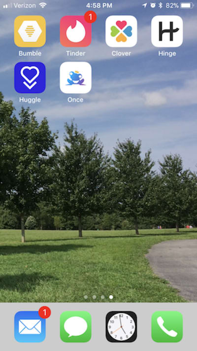
Take a look at the app icons above. Is it any surprise that two of the leading dating apps (Tinder and Bumble) use red and yellow, respectively, as their primary colors? It’s not just because those colors are bright either.
Think about it like this. Tinder has a reputation for giving users an opportunity to find a long-term mate, as well as someone for a night. But the underlying message here? Tinder feeds your passion and does so quickly — two of the common psychological associations with the color red.
Bumble, on the other hand, is supposed to provide a safer environment for dating. While its users are free to swipe left or right on whomever they choose, it’s up to the women to decide whether they want to open communication with potential mates. In essence, Bumble provides a more positive dating experience for its users, which makes yellow — a color synonymous with positivity and happiness — a smart choice.
Outside of branding, you’ll find that mobile dating apps use color wisely. Rather than overwhelm the design with a red background or with splashes of royal blue everywhere, these apps use hints of color to remind users of where to go to interact next.
Take Tinder’s red back button and flag in the chat app:

Or consider Once’s well-chosen colors in this dual call to action:
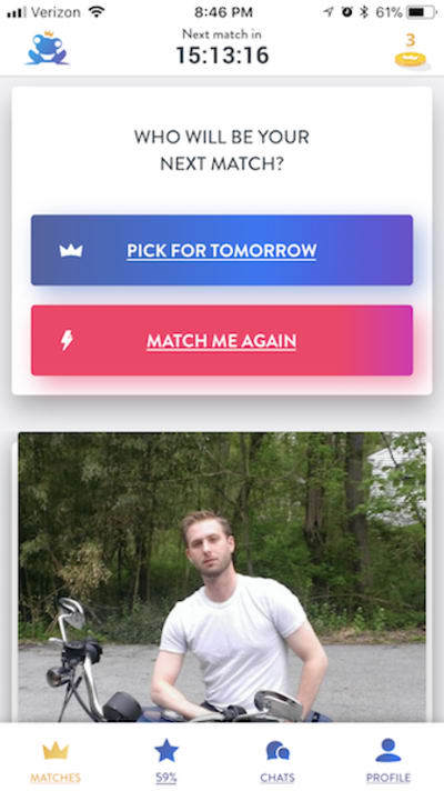
3. Go Easy on Text
Let’s be honest: Smartphones have made us less inclined to read more than maybe a couple lines of text. So, for web developers who think that creating a responsive design for their website is enough to keep mobile users engaged, think again.
Mobile users don’t want a full page describing a service, when they could instead read a sentence here and there that accurately sums it up. Of course, you have to pick your battles. In some cases, a full page of copy makes sense (such as blog posts and case studies). But there are smart ways to keep a mobile interface light on text, while still communicating a lot through sharp design.
Here are some cool things mobile dating apps do in this respect. Let’s start with Tinder because it basically started this whole thing off.

I’d argue that the card-style design of the match interface is no different than the full-width header images we use on websites: very light on text — a name, a job, maybe a school — and beautiful, high-resolution images (so long as that’s what the user uploads) occupying most of the real estate. For anyone who wants more information, they can click the “i” icon to get more. Even then, bios are limited to 500 characters.
Here’s what an expanded profile in Bumble might look like:

Mobile dating apps also make wise choices about how the app and its features are explained. Rather than provide users with long pages that give the history of the company, talk about its goals and explain the ins and outs of the tool, these apps use easily recognizable images, strong colors and sparse text to communicate with users.
Bumble does an especially good job of this in explaining various upgrade options:
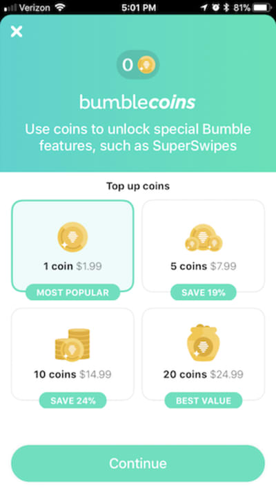
In addition, most of these dating apps use what I like to call “tooltips” (even though they’re not like the standard hover-and-reveal tooltips). Basically, you get a sense of how to interact with the app through a series of brief notes.
Hinge does this through a number of popups that you need to confirm in order to indicate that you understand how its functionality differs from the traditional swiping of other dating apps:


Clover spells this out quite nicely as well:

4. Simplify the Navigation
Nearly half of all mobile users rely on just a single thumb to interact with their device. Unless your app caters to children or to the elderly, who might not have enough agility to navigate a mobile device singlehandedly, you’d be wise to take that statistic to heart.
For web developers, responsive navigation design is a major priority. But how should mobile app developers handle this?
If you look at mobile dating apps, you’ll find that navigation is always bottom-aligned and visible when users interact with the main part of the app (i.e. finding matches), like in this example from Tinder:

Labeling is also worth noting, because dating apps use simple-to-understand icons, instead of bulky labels or custom icons that come with a learning curve. The same goes for the non-match portion of dating apps. As you can see in Bumble, all that’s needed is an arrowhead at the top to let users know where to go (and in a thumb-friendly location, to boot):

This part of the navigation might not be all that different from what your own app does. The true differentiator in navigation between mobile dating apps and most other apps is the swipe-to-navigate gesture.
Most of the dating apps I’ve interacted with use the same directional cues: left if you don’t like him or her, right if you do. Tinder is nice enough to add a reminder the first time you interact with the app as well, just to make sure you understand what your swiping will do:

Some will add a swipe up to scroll through photos (Bumble) or to “super-like” someone (Tinder), but, for the most part, this navigation is simplified and relegated to the two options.
While a swiping function might not make sense for the type of app you intend to create, it’s about understanding and applying the underlying concept for your own needs. In other words, how can you keep users actively engaged with your app without forcing them to wait for new pages, tabs or product images to load? Is there a way to keep them on the same screen but still enable them to move through different parts of the app?
As one of the founders of Tinder, Sean Rad, explained, “With swipes on Tinder, the act of navigating through content is merged with inputting an action on that content.”
5. Gamify Interactions
Some would complain about the over-simplification of dating apps and how they lead to swipe blindness. But if that were true, users wouldn’t continue subscribing to the app and use it as frequently as they do, right?
Gamification is just one method by which mobile dating apps keep users engaged.
In order for gamification to work, there needs to be a system of risk and reward. The risk in this case could come in the form of the following and more:
- logging in to the app every day,
- filling out a profile in its entirety,
- rating other users’ pictures,
- swiping on a certain number of people,
- communicating within a certain timeframe.
Each dating app seems to have its own unique and preferred system of gamification, closely tied to its brand identity.
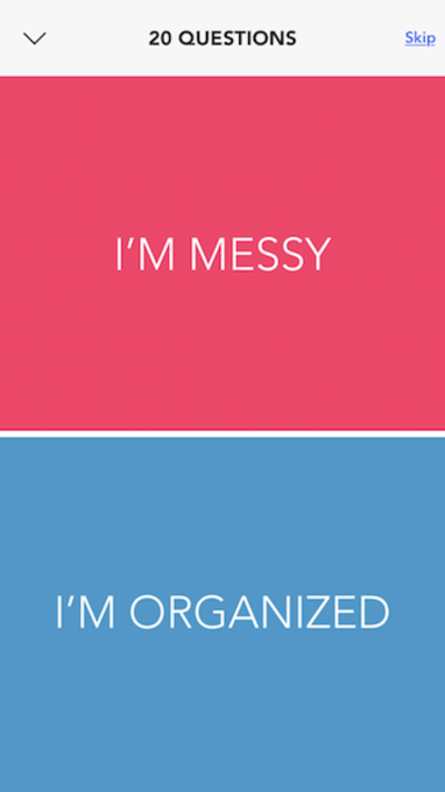
Clover, for example, tries to bridge the gap between dating websites with a comprehensive intake questionnaire and an app built for speed. This is why a game of 20 Questions makes sense for this app.
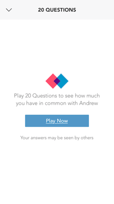

Then, we have Once, an app that sends you only one well-tuned match every day. However, with limited information to work from in the user’s profile, it needs additional input. Rather than force users to answer more questions, it gives them a chance to rate random users’ pictures. This increases the AI’s ability to find appropriate matches, and it also gives users a fun diversion while they wait for their next match.

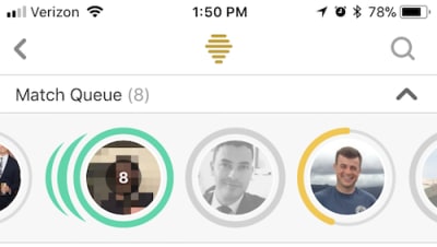
Bumble, on the other hand, uses gamification to play into the sense of urgency we all have when using a mobile device (and when trying to hurry up and find the love of our life!). Although the app grants ladies the power of communication, it also has its limits: 24 hours, to be exact. So, whenever a user logs into their messages and matches queue, they’ll see a yellow timer letting them know when they need to take action.
Ultimately, gamification is not about creating mindless or pointless games or animations that add nothing to the experience. Rather, it’s about motivating users to open the app every day and truly engage with it.
6. Facilitate Communication
With a website, you have a number of opportunities to communicate with users:
- popups,
- hello bars,
- email,
- in-browser notifications,
- remarketing,
- push notifications.
However, most of these communication methods would be cumbersome and unwelcome in a mobile app (in case you hadn’t already noticed). The only form of communication mobile dating apps make use of is the push notification, and for good reason. According to Localytics, 46% of mobile users will return to an app more than 11 times (remember that statistic from earlier?) if they receive in-app messages. This is partially due to the fact that push notifications can deliver timely news and reminders to users, which is part of the whole urgency appeal of using an app in the first place. There’s also the fact that these messages tend to be personalized, which makes them extra valuable.
With dating apps, it makes sense that push notifications would be acceptable. Users want to know right away whether the man or woman of their dreams has liked or messaged them.
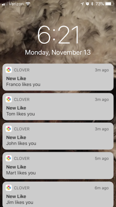
Both Clover and Hinge go the explicit route by letting users know who has interacted with them and when:

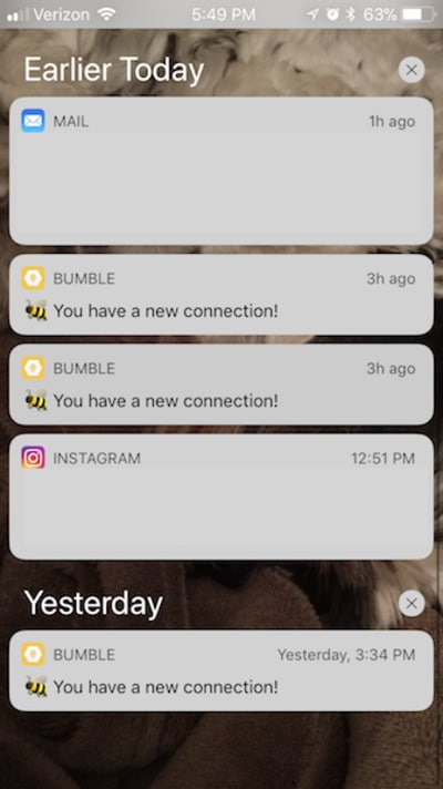
Bumble, on the other hand, takes a more teasing approach by simply letting users know that someone’s out there, waiting and interested:
App developers trying to satisfy other instant gratification-type urges would be wise to use push notifications as well. (Of course, allow them to be switched off, in case the user is part of the 60% who want to opt out.)
Conclusion
There are a number of key lessons that every web developer can learn from mobile dating apps. What it comes down to, however, is knowing your audience, understanding what value the app holds for them and delivering that through a smart and simple design.
While it would be easy to write off mobile dating apps as trite and shallow, we’ve seen that there’s a lot more to the experience than the gamification aspect or the instant gratification of swiping. Dating apps have streamlined the initial process of finding and meeting a mate and are a tool that users find valuable, helpful and worth their time engaging with regularly.
 (da, yk, al, ra, il)


