What happens when we take the web browser out of web browsing? Google’s new "Add to Homescreen" feature delivers fast, focused web experiences that are indistinguishable from those of a native app. What can designers learn from the successes of early adopters such as Twitter, and how can we leverage app-like design patterns to tackle this brand new set of user experience challenges?
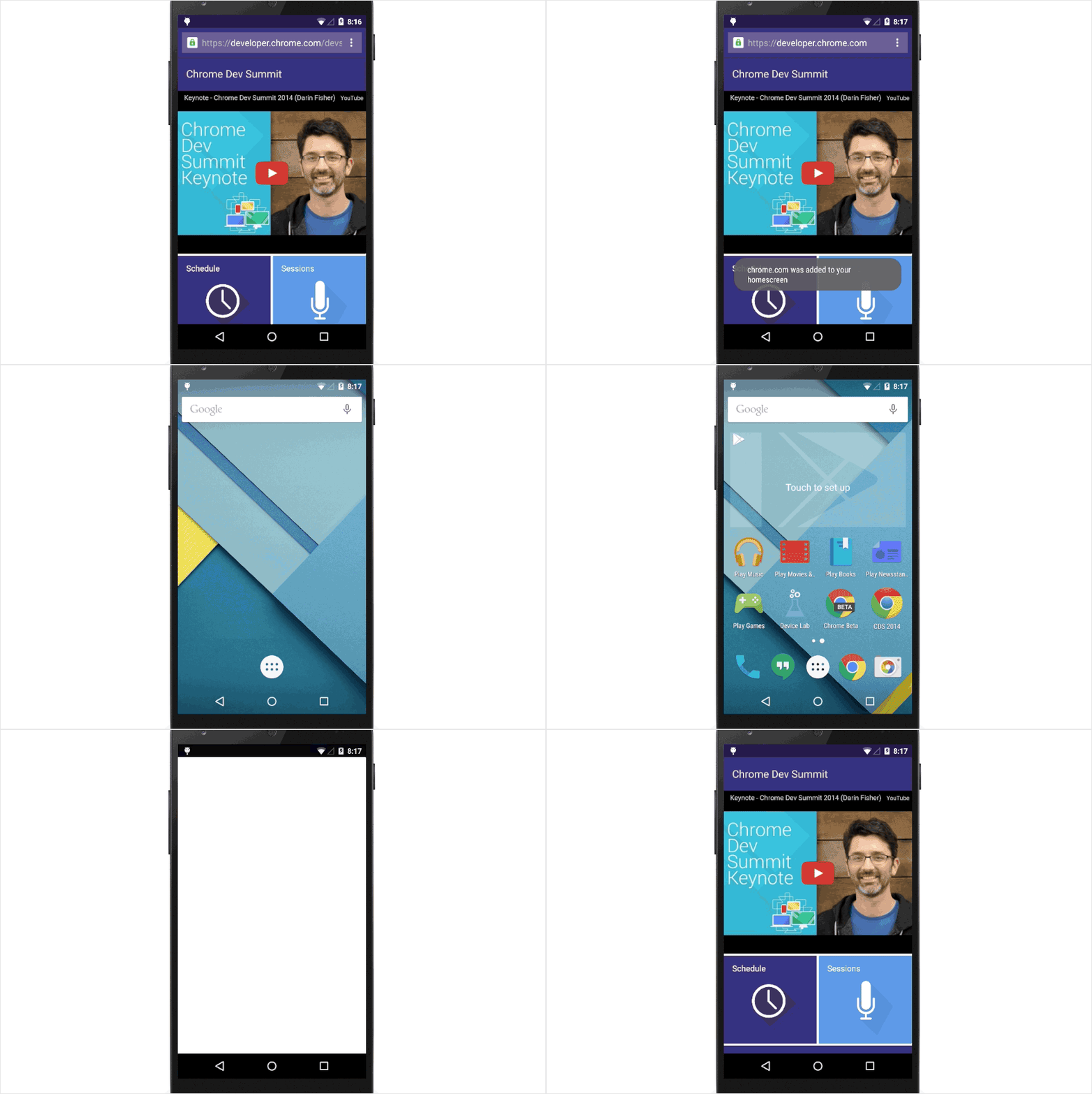
We’ve seen debates on the topic of native versus web experiences. Both have their pros and cons, but very often the biggest downside of the in-browser experience is that it doesn’t feel as reliable, fast and immersive as the native app experience.
In this article, we will cover tips and tricks for designing and developing progressive web applications (PWAs), specifically the ones that are added to the home screen on Android devices. But first, let’s see a couple of examples and make a case for PWAs.
From Web Apps To Desktop Apps
Did you know that you can add “desktop app developer” to your resumé with just a little more effort? All you need to do is look over some API documentation and create your first modern desktop app. Read a related article →
The Rise Of The App-Like Experience
PWAs are, simply put, websites that look and feel like native applications. In his talk at the Google I/O developer conference, Google’s VP of Product, Rahul Roy-Chowdhury, describes them as "a radically better web experience… which users love and are more engaged with."
The numbers back up Rahul’s claims. Forbes has seen its user engagement double since the launch of its PWA. The numbers also continue to show growth in the e-commerce sector, with Lancôme seeing a large increase in conversion rates following the launch of its new PWA.
These kinds of fast, fluid, app-like mobile experiences are what users want and will come to expect as more PWAs emerge in the mainstream market. One feature that will seem to accelerate this wave is "Add to Homescreen," which is basically a PWA installation process. For the end user, adding a PWA to the home screen kicks off that app-like experience.
What Is “Add To Homescreen,” And Is It Worth It?
“Add to Homescreen” is a feature that installs a PWA to Android’s home screen, making the PWA instantly accessible without the user needing to open a browser and type the URL or use a search engine. (Side note: Even though a similar feature has been available on iOS Safari since the earliest iPhones, users were not offered much to simulate the behavior of an app. For this reason, Safari’s version is not a part of this article.)
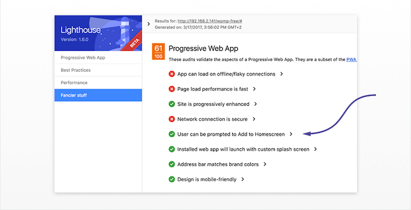
As reflected in Google’s Lighthouse checklist, PWAs with this capability score higher and, as a result, are likely to rank better in search results.
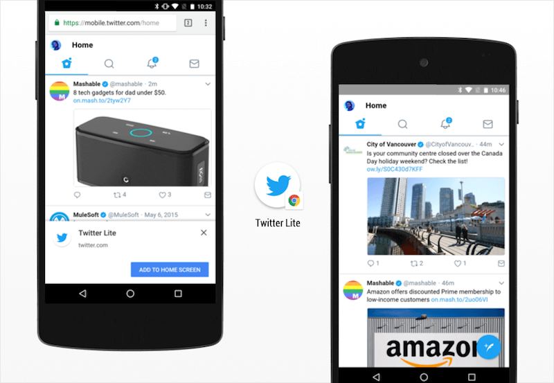
Take Twitter Lite, a PWA. Traditionally, Twitter has found it difficult to re-engage its millions of users on the mobile web. Since introducing the “Add to Homescreen” prompt to its Twitter Lite PWA, it is seeing 250,000 unique daily users launch the web app from the home screen at an average of four times a day.
The retail sector is also seeing success. Alibaba has reported a four-times higher interaction rate after users added the PWA to their device’s home screen, and Flipkart has seen a 70% increase in conversion rate among shoppers who arrived via the home-screen icon.
Although "Add to Homescreen"’s user base is limited to Android Chrome, the feature rewards this highly engaged minority with an immersive, more exclusive experience — a role traditionally played by native apps.
Aren’t Progressive Web Applications Just Websites Wrapped Up As Apps?
Essentially, yes, and why not? 90% of mobile minutes are spent in apps, with 120% better conversion rates in the retail sector.
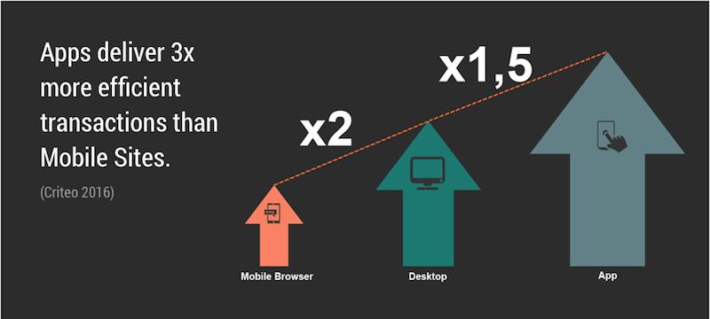
These are the kind of statistics that would lead any retailer down the path of native app development. However, with the average cost of a native app sitting at around $270,000, “Add to Homescreen” offers an attractive financial alternative.
Users couldn’t care less about whether a technology is native, an installed web app or a website. What makes users engage and makes shoppers convert is the experience itself:
- Does it load quickly?
- Does it work offline?
- Is navigation instant?
- Does it integrate seamlessly with the device?
These are the characteristics of app-like design that must be incorporated if "Add to Homescreen" is to deliver the kind of high engagement statistics commonly associated with native apps.
What Makes An Experience App-Like?
"Add to Homescreen" creates an experience focused solely on the app in question. The website is launched via an app icon, without the browser’s URL bar or any navigation toolbar that would otherwise offer links to external websites.
It’s a good starting point, but we must also recognize and meet certain expectations of native app users if the experience is to feel truly app-like, including:
- instant page transitions;
- high perceived performance;
- offline accessibility;
- full device integration;
- app-style navigation;
- back button;
- sharing action;
- copy URL, print, and go forward.
Ready to dive in? Let’s look at each one.
Instant Page Transitions
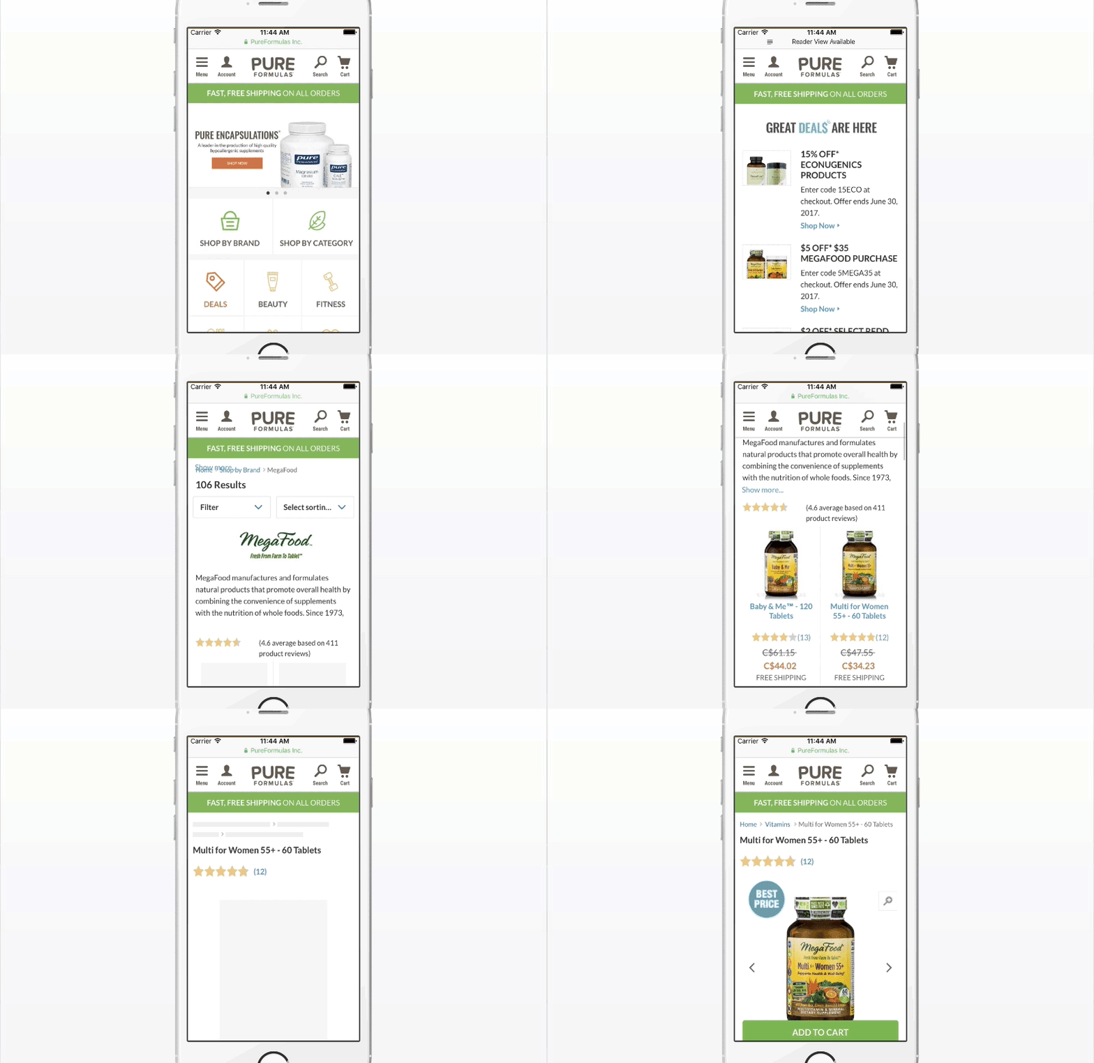
Users expect to be able to get in and around an app quickly, without waiting for new content to load after each interaction.
Solved With PWA
For a PWA to pass the Lighthouse checklist, it must follow certain performance-enhancing guidelines. Content must be cached behind the scenes, and new pages must load so quickly that it feels like there was no loading event.
Perceived Performance
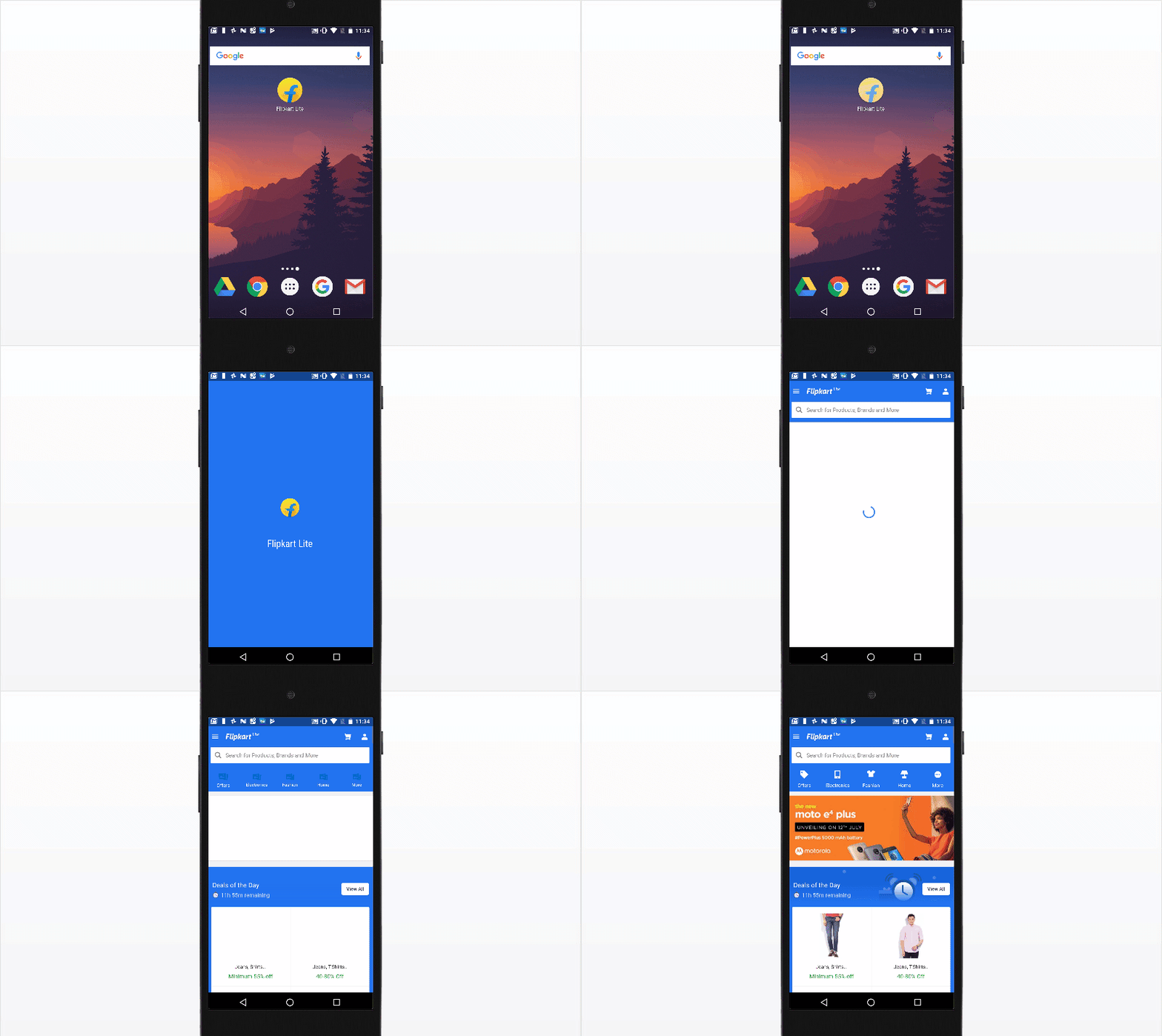
Amazingly, the level of stress caused by mobile delays is comparable to that of watching a horror movie! Users who download an app do not expect to have to wait for their content. Nor are they willing to suffer a disjointed experience caused by elements appearing asynchronously as they load.
Solved With PWA
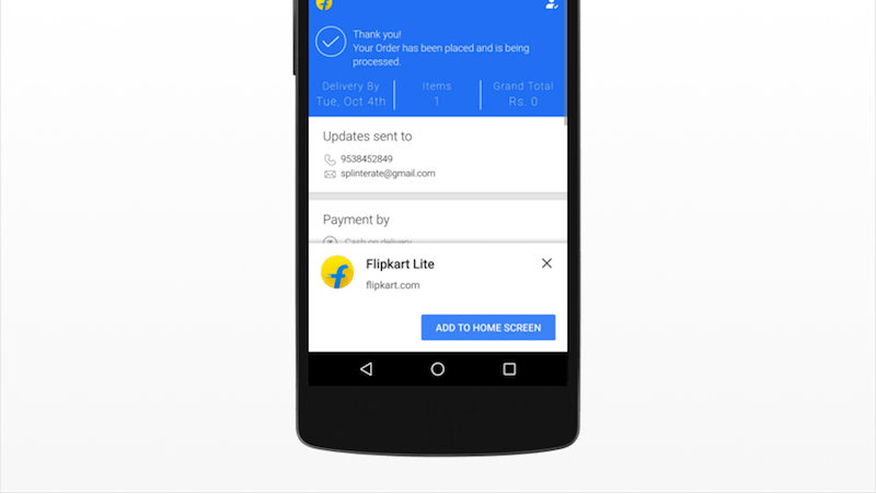
The "Add to Homescreen" PWA launch transition (see Flipkart example below) provides a visual bridge between loading and loaded content. This is an example of how "preloaded states" can enhance the perception of speed and seamlessness. A well-designed PWA will build on this idea by using placeholders (skeletons) that mimic the end state of the page and by using lazy-loading to deprioritize elements that are out of view, making the initial loading seem faster.
Works Offline
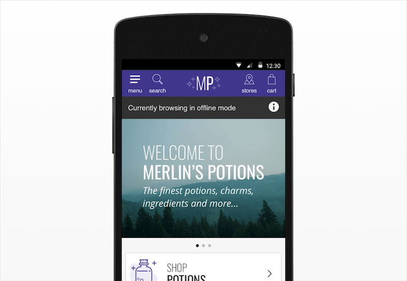
Users who download native apps do not expect to have to rely on an Internet connection in order for the apps to function properly.
Solved With PWA
Service workers (a technology that improves the offline experience) can be used to instantly display online content in areas of low or no connectivity. Page content is cached behind the scenes, allowing it to be accessed where there would otherwise be a lag in the browsing experience, such as when entering a tunnel on a train.
Full Device Integration
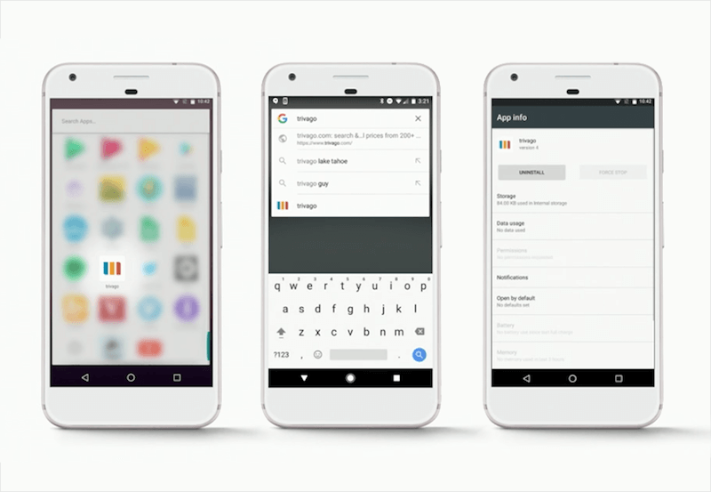
There are certain locations on a device where users expect to find and manage their apps.
PWA Solution
PWAs added to the home screen now show up anywhere you’d expect an Android app to show up. This includes the app launcher, task switcher and system settings. This also ensures that any other app that links to a page on the PWA, such as a Google search or social media link, will open the app and not the browser. Push notifications even appear as if they come from a native app.
App-Style Navigation
Apps share a common approach to navigation. The header bar typically shows the title of the current section in the center; the back button is in the top left; and any contextual actions (favoriting, sharing, etc.) are in the top right.
No PWA Solution, Yet
This pattern is not common on the mobile web. Instead, these actions are found in the browser’s built-in functionality (for example, the browser’s back button). The web works this way for a reason. An app will typically start from the same screen each time, whereas mobile web users are often referred from search or social media — any page can be their landing page. For this reason, the logo and other global actions take center stage in the header bar and remain there throughout the experience.
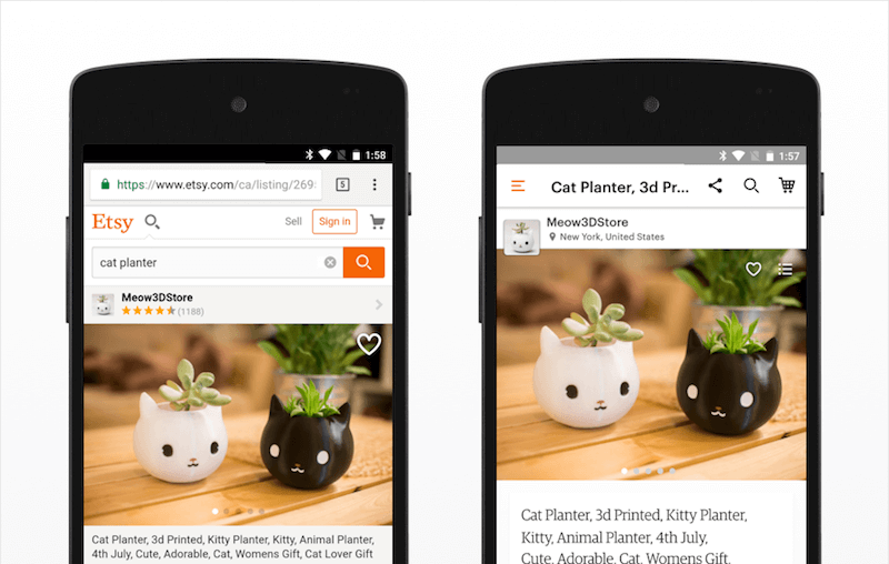
This expectation must be addressed if PWAs with “Add to Homescreen” are to really feel like apps. In order to do this, designers must figure out how to recover key navigation patterns now lost with the browser.
Back Button
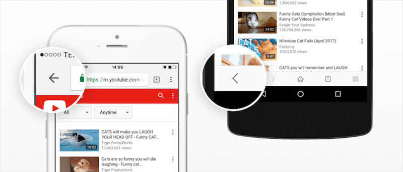
Some might argue that because Android provides a back button through the device itself, then there is no need to replace the browser’s back functionality. In fact, the two interactions do different things. Most apps continue to offer a back button in the header as an "up" action, to navigate within the hierarchical relationship between pages. The system’s back functionality might close a modal window or navigate to a different app entirely.
Solution
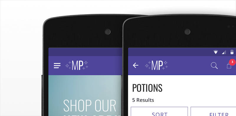
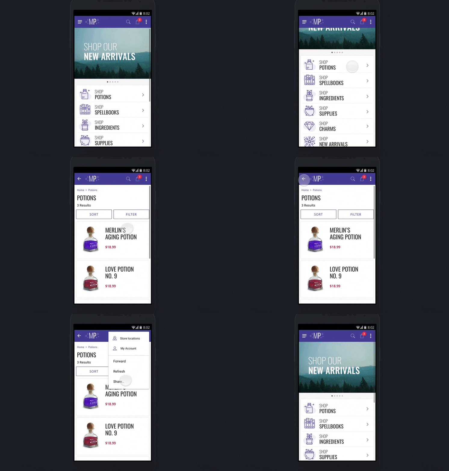
One possible solution is to replace the menu button in the top left with a back button once the user progresses past the initial page. This was validated when we put this pattern in front of users. Once participants had progressed through the initial home page (and a menu icon was no longer visible), we asked them to navigate to a new section. Six out of six intuitively used the back button to navigate to the home page, where they could open the menu.
Sharing Action
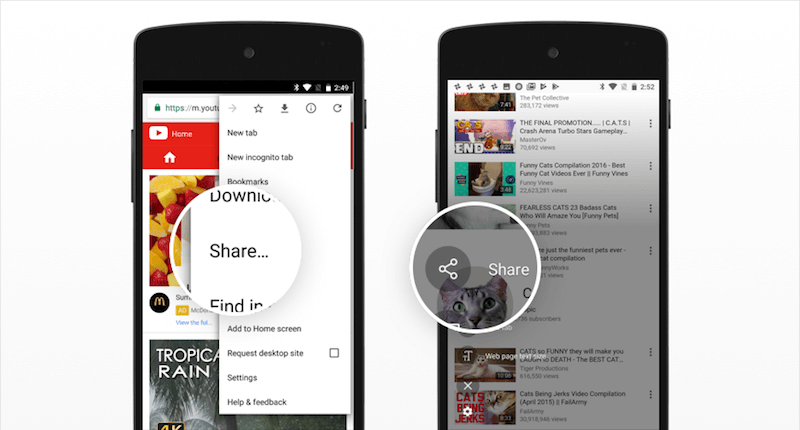
Built into the user interface of any web browser is the ability to share a page on social media and through other apps installed on the device.
Solution
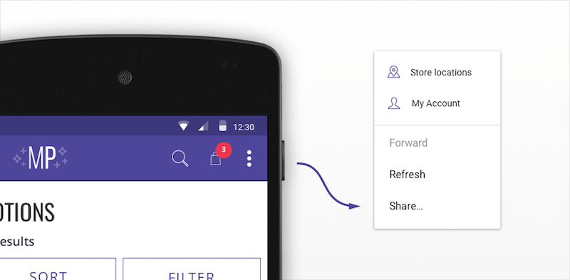
Designers should provide more prompts to share commonly shared content within the page. We found during testing that users will typically look for sharing buttons around the page’s head or product image before opening any menus. If the functionality was not found, participants expected to find a sharing icon in the header bar.
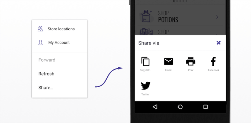
The "More" icon is an Android-esque pattern used to indicate an overflow of options. Try adding the sharing action behind a menu like this. It is even possible to trigger Android’s native sharing dialog using the Web Share API (which, at the time of writing, is a Chrome-only feature and still not standards-tracked).
Copy URL, Print, Go Forward
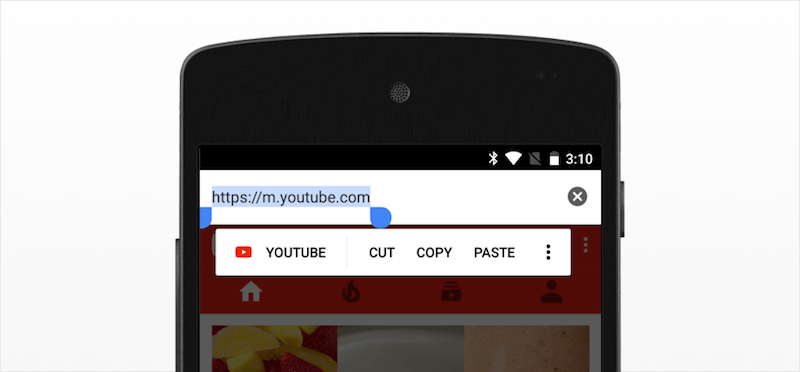
Less common actions, such as copying the URL and printing, are basic functions of a browser and should not be overlooked.
Solution
An easy way to offer copy-URL and print functionality is by using the Web Share API (again, at the time of writing, supported only in Google Chrome). Alternatively, they can be presented as separate options in the overflow menu. This menu can then be extended to include the forward action or anything else that would benefit from a persistent location in the header bar (logging in and out, for example).
How To Make It Work In The Real World
It will take time for "Add to Homescreen" to develop into an accepted group of patterns. Below are some best practices that could help in this development.
Sticky Headers, Persistent Actions
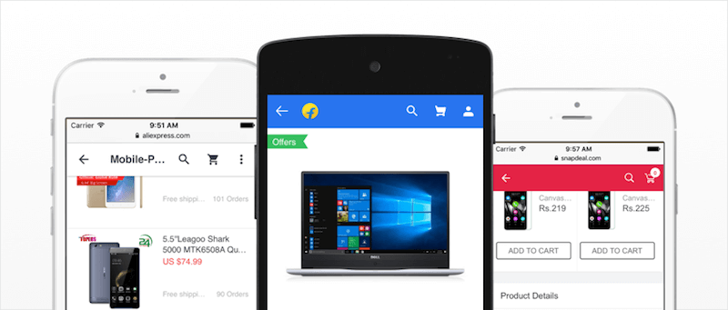
"Add to Homescreen" early adopters Flipkart and AliExpress both recognize the importance of learnability when introducing new patterns. They ensure that users always know where to find crucial global actions (back, cart, search): in a header bar that sticks to the top of the screen.
Prompt Intelligently
Since the Google Chrome team announced that it would be giving PWAs full control of when to prompt users, "Add to Homescreen" installations have increased. Flipkart saw a threefold increase in engagement when prompting users after they had made a purchase.
Stress and Test
Part of the validation process for any new pattern is to stress test it in multiple applications. We found that the pattern stood up well to the edgiest of edge cases. The header bar in Lancome’s PWA contains many calls to action. Lancome identified the overflow menu as a great opportunity to simplify its user interface, while offering exclusives to power users whom it expected to use "Add to Homescreen," exclusives such as a link to its loyalty program.
Where Is "Add To Homescreen" Supported?
Apple has announced it will support service workers, but it has also made a commitment to making the App Store an attractive place for native app developers to spend their time and money. This could be the reason why iOS’ Safari browser has been slow to adopt PWAs and browserless web browsing, despite advances from competitors.
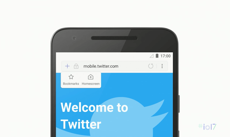
Samsung Internet browser has developed a persistent "Add to Homescreen" prompt within the browser bar, so that users always know where to find it.
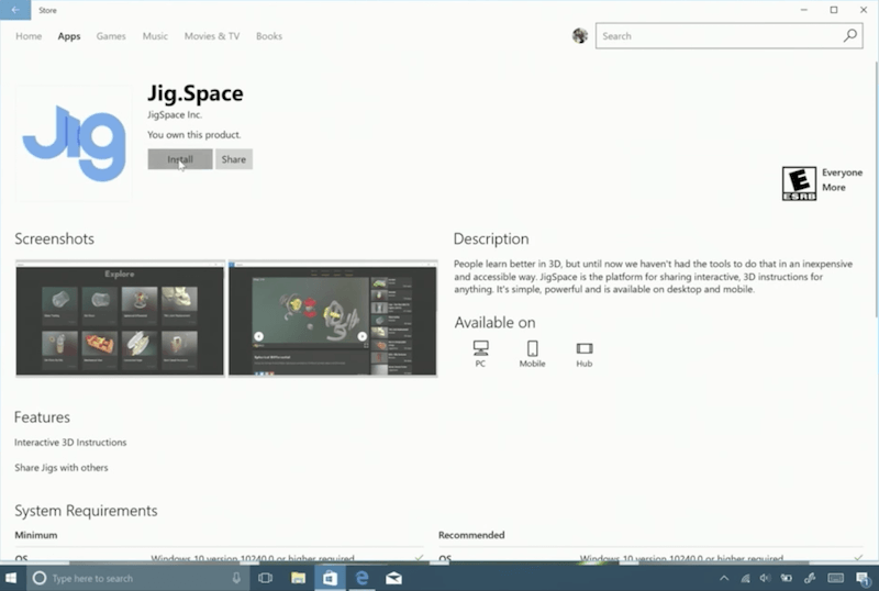
Windows takes “Add to Homescreen” one step further. Any PWA with this ability will now be listed in the Windows Store as a downloadable app. These apps are light and can be installed on desktop and tablet devices quickly, running the websites as convenient, browserless experiences.
Conclusion
"Add to Homescreen" offers an immersive, exclusive experience to the highly engaged, converting user. While adoption grows, both in user base and the devices that support the feature, validation can be found in early success stories, such as Twitter Lite. These stories show how a more modern, app-like web can have a positive effect on engagement when it meets user expectations of performance and design.
These expectations are met by combining PWA performance enhancements with intuitive design patterns in navigation and app-like user experiences. With this, we can pave the way for a new era of browserless web browsing.
 (md, yk, al, ra, il)


