


CSS Grid is the new layout standard for the web, but we still are just getting started with new layout ideas. Many assume that CSS Grid is just a replacement for table layouts, but that’s simply not true. Others might think that we can use CSS Grid to replicate more advanced print layouts, which brings us closer to what’s possible.
One of the main reasons behind the idea of the CSS Grid Challenge was to have some starting points for layouts, and show what can be achieved with CSS Grids today. Well, we received some many great submissions that it was really hard to choose the one winner — there are so many submissions who deserve to win first place.
While the browser support for CSS Grid is really good already, it isn’t supported in the older browser versions. That’s why we challenged you to implement fallbacks for browsers that don’t support CSS Grid just yet, and most of the submissions were doing fine in that regard. Falling back to floats and Flexbox isn’t hard, but still not all submissions were providing fallbacks for browsers that don’t support CSS Grid. We had to deduct some points in these cases, unfortunately.
So without a further ado, let’s look at the submissions which we think are the most impressive ones:
? The Winner Of The CSS Grid Challenge 2017 Is… James Clarke!
James Clarke’s CSS-only The Deck (download the template, ZIP, 1.3MB) is particularly well suited for a linear narrative that you might find in presentations or marketing pages. What we think was particularly interesting is the cross-horizontal way to navigate between the different pages. Also, we like the use of lots of whitespace, so that the focus of each page remains perfectly obvious.
Please keep in mind: This template isn’t keyboard-accessible and we’re working with James to improve it.

On smaller devices, the template turns into a regular layout, and it falls back graciously on browsers that don’t support CSS Grid. Ladies and Gents, a big round of applause for the winner of the CSS Grid challenge!
Insights from James himself:
"As CSS grid layout is new technology and sits atop many other advances that have been built into CSS, I chose to limit myself to see what I could build with HTML and CSS alone. I elected to rebuild an old website from about 10years ago that was built using the then-popular "MooTools" javascript library. That library opened up the ease of cross-browser javascript development at the time, and the advance in CSS's capabilities seemed to offer a similar possibility. The result of my efforts I call "Deck". It is a format that is particularly well suited to the sort of linear narrative that you might find in a power-point presentation, or marketing pages. The standard these days is a long-scrolling page. That format works well of course, but it is undifferentiated, and we've been stuck with it for years now. I wanted to explore something a bit different, in hopes of finding a new way." Features: CSS only, no javascript. All interactions flow from native browser functions and CSS pseudo-selectors like :checked, :target. CSS Grid Layout: horizontal and vertical positioning, source re-ordering, adaptation to different viewports. Progressive-enhancement, responsive layouts: Smaller screen devices and older browsers receive a format catered to their needs and technologies. Touch friendly: All UI functions play well with touch-screen laptops/tablets/phones. Back/Forward button navigation: Back and forward buttons remain functional where browser support exists (current issues with MS Edge repainting when not initiated by javascript 'hash-change' event).
But Wait… There’s More!
We received a number of really impressive submissions and so we decided to give out a silver as well as a bronze medal, too!
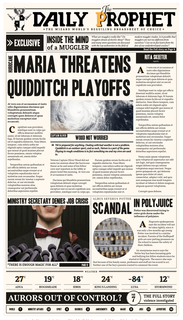
? Second Place: Frida Nyvall
The second place goes to The Daily Prophet, a fictional newspaper for wizards built with Grid. It’s a great example for multi-column layouts that respond to smaller screen sizes. You can tell that the creator put a lot of effort into building this page with its subtle animations, using CSS Shapes, and a very thoughtful transformation of layout throughout all the different screen sizes. The only downside here is that the submission is not working in browsers that don’t support CSS Grid.

The winners have already been contacted. For those who didn’t receive an email from us — please stay tuned! We’ll be launching another challenge very soon!
Other Submissions
Again, we’re sorry that we only had to choose a limited amount of winners, and want to thank everyone who participated in this challenge — we sincerely appreciate your time and efforts! Another round of applause for the rest of the talented participants and their submissions:
Sam Beckham
Sam Beckham is a fan of Penguin Books and their marber grid. His CSS take on the subject lets you change the colors, font sizes, and everything else you fancy on individual books using BEM notation. You can also view a version that works in IE8 (apart from the SVGs) here.

Ren Aysha
A thumbnail presentation with CSS Grid, inspired by Polygon.com’s bevel treatment on some of their thumbnails. Older browsers get a fallback with a conservative thumbnail look instead. Apart from her contest submission, you’ll find more CSS Grid experiments on Ren’s CodePen.

Trang B. Nguyen
This layout features some lovely sea creatures, a bottom navigation, as well as an different way to navigate through the various sections of the site. Also, it falls back really good in browsers that don’t support CSS Grid.
See the Pen CSS Grid Layout by Trang B. Nguyen (@Trangbnguyen) on CodePen.

Dannie Vinther
A Marvel poster made with CSS and Clip-path. A sprinkle of JavaScript helps avoid layout reflow when images are fully loaded.

Erik Davidsson
A great one for football fans! A layout featuring the upcoming football game between FC Barcelona and Real Madrid. Erik brought it to life with many different techniques with fallbacks to make the website usable in older browsers such as IE8 and IE9.


Resources and References
Ever thought of building an interactive cookbook with CSS Grid? Marissa Douglass did.
Melissa Bogemanns
A photo showcase made with CSS Grid. Available as .zip (6MB)
Tyler Argo
Tyler Argo re-built the Google Play Store layout from scratch using CSS Grid with fallbacks. It works all the way back to IE9 and is even more responsive than the original site.
Mauricio Mantilla
This layout is based on a website that was designed by the company where Mauricio works at. He took part of the layout, which is based on Packery (Masonry) and port it to grid with just a few lines of CSS Grid.
Katherine Kato
A portfolio website layout made with CSS Grid and Flexbox as a fallback.
Donny Truong
A minimalistic blog layout comes from Donny Truong.
Anenth Vishnu
A responsive app layout based on Grid.
Amy Carney
A basic layout (with IE fallbacks and web accessibility in mind) that may be useful for getting projects started or migrated.
Nurçin Özer
Nurçin Özer submitted a basic blog layout.
Remy Oleszczuk
Inspired by the BBC SPORT landing page.
Patryk Kalwas
Jesús Olazagoitia
Dóra Pölöskei
Vivek Singh
Pranjal Nadhani
Mathias Herrebaut
Noel Tekiri
Aurélie Deschacht
Jonathan Harrell
Getting Started With CSS Grid
Last but not least, before you dive right into the challenge, here are some helpful resources to kick-start your CSS Grid adventure.
Resources and References
- Grid Garden: A game for learning CSS Grid
- GridBugs: A community-curated list of bugs, incomplete implementations and interop issues
- Awesome CSS Grid: A manually curated list of CSS resources
- Grid by Example: Examples, videos and other information to help you learn CSS Grid Layout
- Rachel Andrew’s Grid Guide: the complete guide to Box Alignment, Flexbox, and Grid
- CSS Grid Layout: Examples, references and guides by the Mozilla team
- Chrome CSS Grid Highlighter: a little Chrome extension that highlights CSS grids.
Demos
- Jen Simmons’ CSS Grid Demos: Demos and examples of how Grid works
- CSS Grid Layout on CodePen: A collection of layouts built with CSS Grid
Tutorials
- Building Production-Ready CSS Grid Layouts Today by Morten Rand-Hendriksen
- Progressively Enhancing CSS Layout by Manuel Matuzović
- Getting Started With CSS Grid by Chris Brandrick
Talks
Inspiration
Finally, to get your ideas flowing, some inspiring CodePen experiments that illustrate the magic of CSS Grid:


Are You Ready For The Next Challenge?
That’s right! There will be more challenges coming up very soon, and even more prizes to win! Keep an eye on the magazine or follow us on Twitter so you don’t miss out next time.
 (ms, vf, il)