(This is a sponsored post). Color is one of the most powerful tools in a designer’s toolkit. Color can draw attention, set a mood, and influence the user’s emotion, perception and actions. When it comes to the web and mobile app design, this is definitely a time of vibrant colors. Designers use vibrant colors to focus people’s attention on important elements and to make their designs memorable.
In this article, I’ll summarize a few popular techniques of using vibrant colors in web and mobile design. Also, if you’d like to get started designing and prototyping your own web and mobile experiences, download Adobe XD.
Make Or Break A User’s Experience
All kinds of visual communication in your designs leave at least some kind of cumulative impression on users. Nevertheless, you still need to be careful not to exaggerate. Read a related article →
Monotone
One of the most popular ways to use vibrant colors is with a monotone color palette. A monotone palette has a single color with a mixture of tints and tones. Such color palettes are visually stimulating. Paired with attention-grabbing typography, a monotone color scheme is able to create a really memorable experience.


Tip: Monotone is great for mobile apps. Using a single color with black and white accents is a great way to create visual interest on a small screen.

Duotone
As the name suggests, a duotone is made up of two colors. It could be two shades of the same color or two contrasting colors. This technique, once a print staple, has found new life online. Thanks to Spotify, duotones are growing in popularity every day.

Create Emotions
Duotones enable you to inject any image with the emotional attributes of any color. Different colors evoke different emotions:
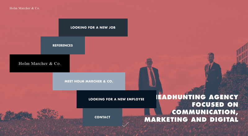
- Soft and modest combinations of colors create a serious atmosphere. In Holm Marcher & Co, shown below, every detail contributes to the businesslike atmosphere, and the background image is no exception.

The soft duotone effect sets a businesslike atmosphere. (Image: Holm Marcher & Co) - A combination of bright colors creates a sense of happiness. The main visual for New Deal Design is striking, thanks to the bold color choice. It creates a friendly atmosphere and sets a positive mood.

Improve Readability
A duotone can give text plenty of contrast. The color variation in an image is adjusted so that text can be shown in a single color almost anywhere on the image.


Translates Well on Mobile
Last but not least, while the duotone effect lends itself to large desktop images, it can work on mobile screens as well.

Tip: If you want to use a duotone for a hero image, select a simple high-quality photo with a single, clear subject. A busy photograph with a lot of detail might be harder to interpret.
Gradient
Gradients have made their way back into modern user interfaces, this time as high-contrast complementary colors. Modern gradients can include multiple colors, can radiate from the center, and can come from a corner or fall horizontally.
They serve the following functions in user interfaces.
Create a Modern Look
Gradients have made a comeback and breathed new life into flat design. Paired with flat color palette, they can evoke a feeling of modernism.

Improve Content Comprehension
Gradients can improve visual communication. The transition from orange to pink in Symodd’s example below gives depth and contrast to the interface, and it creates some eye-catching visual effects. The shift from light to dark follows the natural scanning patterns of the human eye, moving from the top left of the page to the bottom right.

Create a Pseudo 3D Effect
While the flat aesthetic is sleek and easy to look at, one potential shortcoming is that it lacks an element of realism. To compensate, designers often use gradients to give depth to their backgrounds. This will likely continue to grow as designers try to incorporate more realism and 3D elements into web design.

Try a Gradient Accent
While gradients are often used as backgrounds for pages, they can work in smaller places as well. Consider using a gradient as an accent in navigation, for a secondary image or for specific types of content. Smaller areas of gradient give you more freedom to play with this technique. For example, you could create visually interesting pairs of multicolor, as Bloomberg does:

Overlay
A color overlay is probably the most self-explanatory effect. And it is one of the most useful and commonly used effects in popular design. If you want to incorporate it in your design, all you need to do is cover an image or video with a semi-transparent colored box.
Trendy Look
By using one of the bright, saturated colors associated with material design, you can evoke a feeling of modernism.

Strongest Clickability Signifier
Consider using an image overlay for interactive card-style elements, for video content and for call-to-action buttons.

Focus User Attention
Overlay effects can focus users on certain design elements. However, when using a single color as an overlay, think about the degree of saturation and transparency of the color:
- Heavy color combinations (i.e. less transparency and more saturation) put more focus on the color itself.

- Light combinations put more focus on the image.

Conclusion
Few design elements are more fun to play with than color. Color effects can be dramatic, impressive and even serene. You the designer really get to experiment when using color effects. Whether you are a fan of bright, bold hues or prefer a more minimalist black and white, the one thing to remember is that there are no wrong colors. What matters most is how you use them.
This article is part of the UX design series sponsored by Adobe. Adobe Experience Design CC (Beta) tool is made for a fast and fluid UX design process, as it lets you go from idea to prototype faster. Design, prototype and share — all in one app. You can check out more inspiring projects created with Adobe XD on Behance, and also visit the Adobe XD blog to stay updated and informed.
 (ms, vf, yk, al, il)


