Welcome back to the second part of this tutorial on Gravit Designer. In the first part we took a general look at Gravit and set everything up, created the background image in the weather app and the status bar, and then started to make the initial elements of the design’s content.
Let’s continue where we left off.
Sunny With A Chance Of Rain
Having created the main text layers of the content area in part one of this tutorial, let’s continue with the weather conditions for the different times of day.
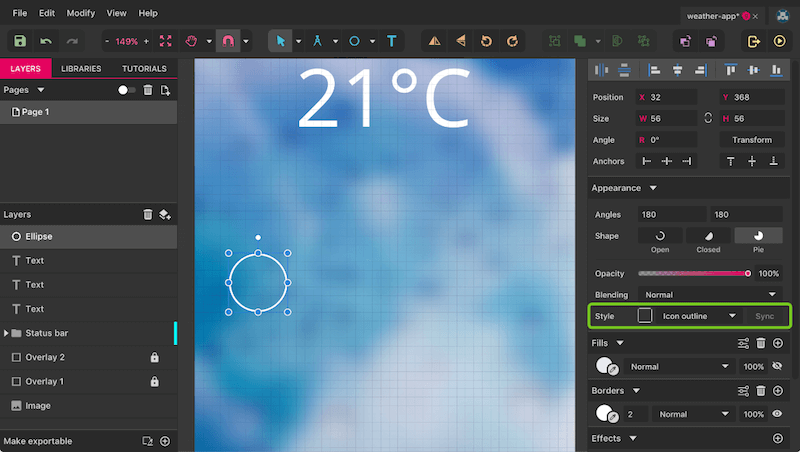
Start with a simple circle of 56 pixels in diameter (remember to hold Shift), with a white 2-pixel inside border, with no fill outside of the “Status bar” group (figure 1a). Move it to “32” (X) and “368” (Y) in the “Position” fields in the Inspector.
Because we want to reuse this style for other shapes, we will create a new “Shared Style.” This allows you to sync all styling properties between various layers and to update changes with a click. To create a shared style, click on the dropdown field for “Style” in the Inspector that says “No shared style” and select “Create New Shared Style.” Now you can define which properties you want to take over — let’s keep everything checked. For the name, use “Icon outline.”
Let’s turn to the icon itself now, a sun partly covered by a cloud. It consists of various shapes combined into a single form, and a few paths (for the rays).
First, the cloud (figure 2). Draw a rectangle (R) with a size of 28 × 14 pixels, with fully rounded corners (“7” — drag the slider all the way to the right) inside the circle. Because aligning the various parts of the icon to the grid wouldn’t make sense, switch it off for now with Alt + Command + G (on Windows and Linux, Alt + Control + G). Before we continue, use the zoom function with Z to zoom into the rectangle so that it’s easier to work on the following steps. If you intend to zoom in with Command + + instead, then select the shape beforehand so that Gravit Designer takes it as a reference when zooming and zooms to its center.
Note: Before drawing the rectangle, make sure that the circle isn’t selected or else it will take over all of the properties, including the shared style. This is important for when we add new shapes later: If another element is already selected, then all of its properties will be taken over; if nothing is selected, then the new element will be drawn with a default gray fill and no border. That’s also the style you can use for the rectangle for now.
Now add an ellipse (E) above the rectangle that is 15 × 15 pixels in size, that is away 3 pixels from the left edge of the rectangle and that juts out 7 pixels at the top. Clone it with Shift + Command + D (or, on Windows and Linux, Shift + Control + D), resize it to 12 × 12 in the Inspector, and offset it 10 pixels to the right and 3 pixels to the bottom. Looks like a cloud already!
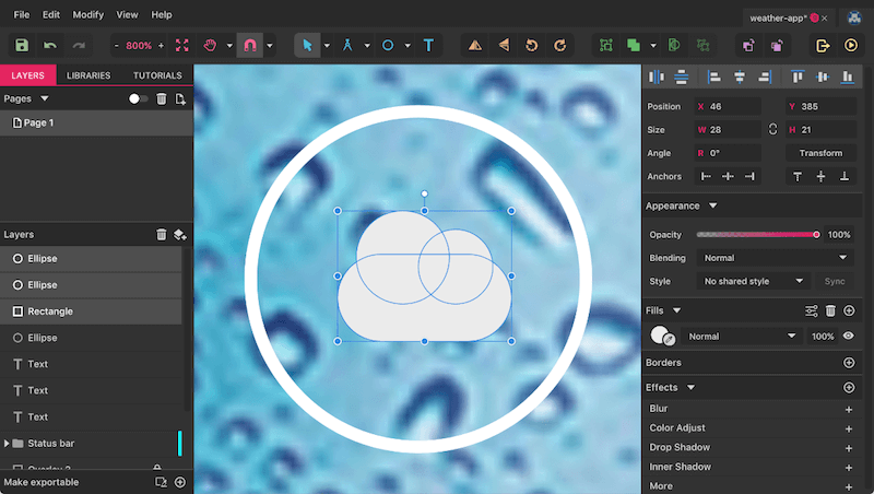
However, we want an outline instead of a solid fill, so we’ll need to bring the “Merge” function into play (also called Boolean operations in other applications, such as Sketch). Select the three shapes and click on “Merge” in the toolbar; this will combine everything into a single form and allow us to assign a border in its entirety later on (figure 3). The advantage here is that you can expand the “Compound Shape” group in the Layers panel and still move the elements individually. It’s even possible to adapt the type of merge function — for example, if you want to cut the right-most circle from the other shapes (“Subtract,” the third option). Have a look at “Boolean” in the Inspector to perform this change. The lesser used types here are “Intersect” and “Difference,” which just show the part where the shapes overlay or the exact opposite, respectively.
With the “Compound Shape” group selected, change from a fill to a white inside border with 1.5 pixel thickness. Remember that you can alter the position of the border in the “Advanced stroke settings.” Now it will become immediately apparent what the Merge function has done to the shapes.
Complete the cloud by giving it a proper name.
On to the sun now. Create another circle with a 12-pixel diameter outside of the other big circle. With the cloud still selected, this will take over the styling. This time, however, we need a centered border (you will see why later). Switch to the Line tool with L and draw a vertical one 3 pixels in length above the circle. Make sure that the circle is already selected (to take over the styling yet again), and hold Shift while drawing to constrain the movement. The line should be centered to the circle horizontally and have a gap of 4 pixels in the vertical direction.
Note: To directly transfer the styling from one element to another, proceed as follows: Select the root element, press Command + C (on Windows and Linux, Control + C), click on the layer (object) that you want to take the styling over to, and hit F4. Done! Try it — it’s a nice little time-saver!
A Ray Of Light
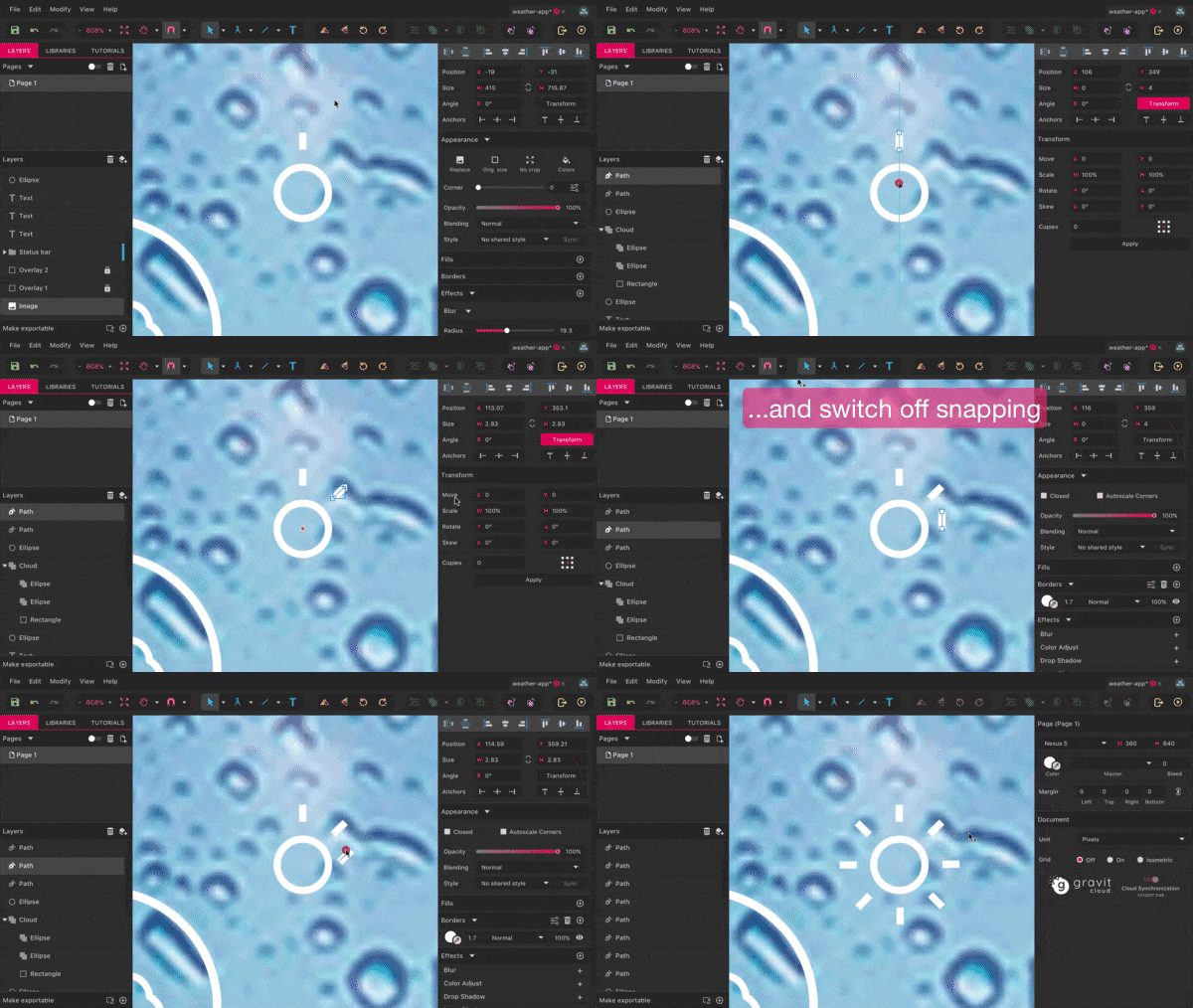
How do we do the other rays now? We need to combine two techniques here (figure 4). An integral part is the “Transform” function in the top section of the Inspector, which is quite a handy tool to apply transformations to objects. It allows you not only to move, rotate and skew objects by a certain amount, but also to resize a layer relatively with percentages.
The thing that interests us most with the Transform feature at the moment, however, is the ability to adapt the rotation point of a shape — the orange rhombus at the center of the line. It defines the point around which a shape is rotated. To continue, perform the following steps:
- Clone the line (Mac:
Shift + Command + D, Windows and Linux:Shift + Control + D) while it is selected. - Switch to the Transform tool with a click on the button in the Inspector.
- Drag the rotation point (the orange rhombus) down so that it is at the center of the circle.
- Hold
Shiftto trigger the rotation mode, and drag the line until the “Angle” field in the Inspector says “-45°.” You might need to releaseShiftagain to catch this exact value.
This rotated line will be the reference for the other rays. First, select and duplicate the initial unrotated line again, but this time with Command + D (on Windows and Linux, Control + D). Then, bring this duplicate to the exact same position and rotation as the other line we just adapted with the Transform function: Drag it there, and rotate it with the “Angle” field in the Inspector. (You might also need to switch off “Snap” in the toolbar for this to work.)
Now press Command + D again until all remaining six rays appear. You might need to align them individually afterward, so that all have the same distance and alignment. Also, delete the duplicate of the second ray.
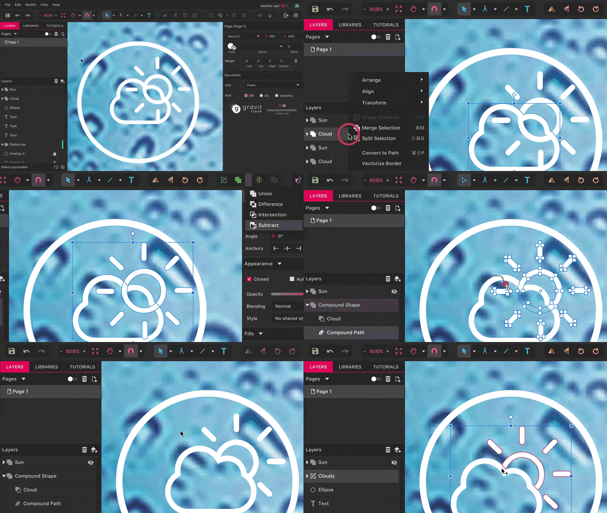
As with the cloud, we want to combine all of the elements of the sun into a single shape so that we are able to style it as a whole. Select everything (ideally in the Layers panel), and click on “Merge” again in the toolbar. Alternatively, you can press Command + M (on Windows and Linux, Control + M). Rename this group to “Sun.”
Note: Please make sure that the lines (i.e. the rays) are above the circle in the layer hierarchy. The styling of the bottom-most layer is always applied to the other layers when you use the “Merge” function.
One final touch is left for the sun: rounded ends for the rays. Open “Advanced stroke setting” in the Inspector again, and select the second option (“Round”) in “Ends.” Looks great!
The individual parts of the icon (the sun and cloud) are ready now, so let’s bring them together somehow. Be sure to switch on the snapping again in the toolbar. First, bring the sun to the top-right corner of the cloud, then move it about 9 pixels to the top and 8 pixels to the right with the arrow keys on the keyboard.
Now, clone both weather symbols so that we have a backup for later (Mac: Shift + Command + D, Windows and Linux: Shift + Control + D). Note: When selecting two groups, you might want to press Command (on Windows and Linux, Control) instead of Shift, to have everything working correctly. While the second sun can be hidden (use the eye symbol in the Layers panel), we will need to manipulate the copy of the cloud for the further steps. (see figure 5 for all of the steps.)
Right-click on the cloud shape and select “Convert to Path,” which will create a path with individual points instead of the compound shape. We also need to do something similar for the sun, but instead of converting the shape itself, we want to transform its border to a path. This is also possible with a right-click on the shape, but with “Vectorize Border.”
Now you can combine these two elements again to create the partly covered sun: Select both, click on the arrow next to the “Merge” icon in the toolbar, and pick “Subtract.” Just make sure that the sun is behind the cloud in the layer hierarchy.
Name this new icon “Sun” again, and delete the rays that overlap with the cloud. The easiest way is to use the Lasso tool. It can be used to draw a selection of multiple vector points — which is quite different to how a Lasso tool will perform in other applications (like Photoshop, for example, where it serves to select parts of a bitmap image).
To use it for the removal of the rays, pick the “Compound Path” within the sun group, switch to the Lasso tool with O, and drag a selection around the redundant rays. Then, delete them with Backspace (on Windows and Linux, Delete).
Finally, combine this glimpse of the sun with the copy of the cloud into a group named “Cloudy,” and align it with the bigger circle. Group them again into an overarching “Icon” group.
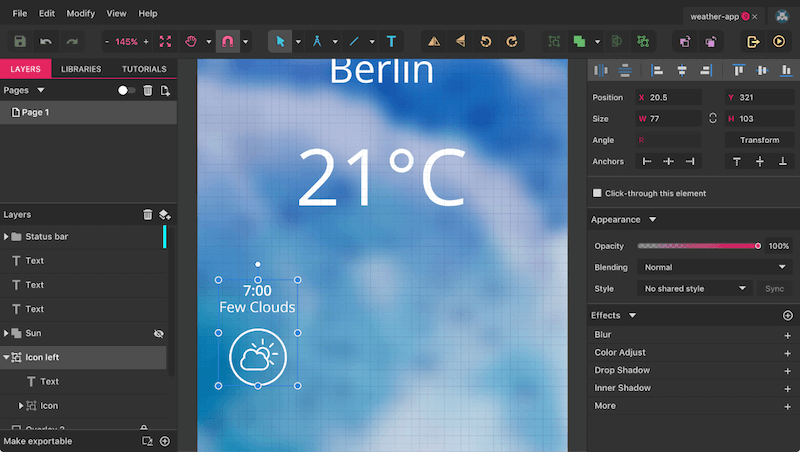
Once we have added a description of the weather condition, we will have finished our first daytime view (figure 6). Add a text layer above the icon (press T), with the following properties in the Inspector:
- Color: white
- Size: 14 pixels
- Weight: Regular
- Line spacing: 16 px (click on the “%” label to switch to pixels)
- Content: “7:00” followed by a break, followed by “Few Clouds.”
- Alignment: center (the second icon).
After that, select the time within the text layer, and give it a “Semi-Bold” weight. Make sure that it is horizontally centered to the icon, with a vertical distance of about 12 pixels. Show the grid again with Alt + Command + G (on Windows and Linux, Alt + Control + G) so that you can align everything properly. Create one last group from the text and the “Icon” group, named “Icon left,” and we will be ready.
Before continuing, let’s bring some order to the Layers panel. Drag the “Status bar” group to the very top (or press Shift + Command + up arrow key on the Mac (on Windows and Linux, Shift + Control + up), followed by the three text layers, the copy of the sun and the “Icon left” group.
From Bad To Worse
It’s easy to get the other weather symbols from here. Duplicate the current one (“Icon left”), center it to the page and move it to a Y position of “297,” which should align everything neatly to the grid. The group’s name of this new symbol should be “Icon middle”; for the text, use “14:00 Light rain.” Be sure that everything is centered again.
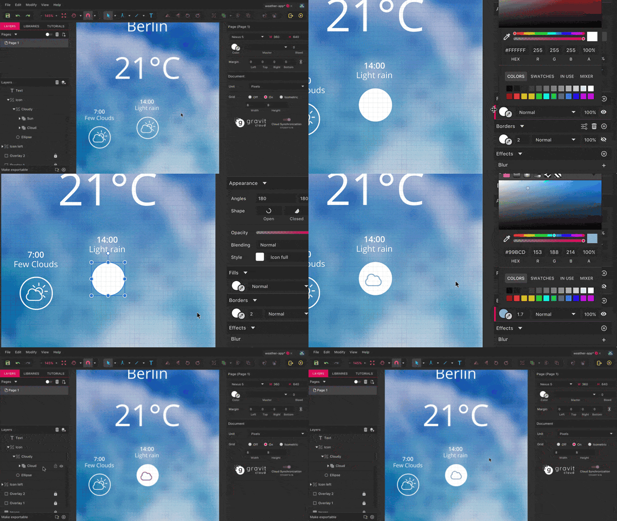
Because this one will represent the current weather condition, select the circle with a Command-click (on Windows and Linux, Control-click) to change from the border to a white fill. Create a new shared style named “Icon full.”
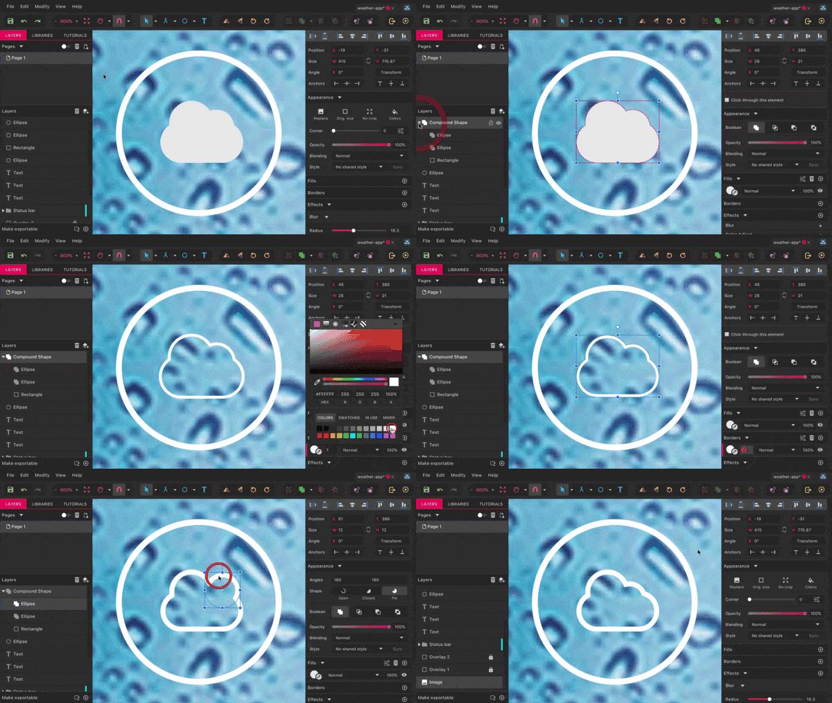
Now go to the Layers panel, where you will select the “Cloud” group within “Icon” → “Cloudy.” Enter the color dialog and use the color-picker symbol to pick a light-blue color for the surrounding of the icon. Now employ the “Mix” area at the bottom of the dialog to change to a darker shade, so that the icon comes to the fore against the white background. Align it to the center of the surrounding circle with the alignment icons, remove the “Cloudy” group with Shift + Command + G (on Windows and Linux, Shift + Control + G), and delete the redundant “Sun” group in the layers panel. See figure 7 for the entire process.
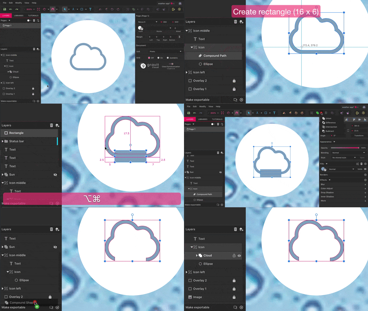
The first steps for the rain symbol are accomplished, but one vital part remains: the raindrops. Just like for the sun in the other icon, we need to convert the cloud to outlines first for the subsequent steps (figure 8). Right-click and select “Vectorize border” like before (which converts to a “Compound Path” group). Now we can create a rectangle of 16 × 6 pixels at the bottom, which will act as the hole for the raindrops. It should be 5 pixels away from the left edge of the cloud and overlap its bottom line. You might want to zoom (press Z) to have a better view and switch off the grid again.
Select the rectangle together with the “Compound Path” group, and create another “Subtract” operation from “Merge” in the toolbar. For it to work correctly, make sure that the rectangle is on top. After that, drag it into the “Icon middle” → “Icon” group again, and also reset its name to “Cloud.”
Next task: the raindrops (figure 9). They consist of three vertical lines — two 10 pixels long and one 15. The distance from the first to the second should be 5 pixels, and from the second to the third 4 pixels. Start with the first one of 10 pixels in length: Switch to the Line tool with L and hold Shift to constrain the movement to the vertical axis. Assign a centered border with 1.5 pixel thickness and rounded ends (from “Advanced stroke settings”) and that has the same color as the cloud (either take it over with the color picker or use the “In use” area in the color dialog.)
Now follow these steps:
- Clone the line.
- Move it 4 pixels to the right with the arrow key.
- Switch to the Subselect tool with
D, and move the bottom point down by 5 pixels with the arrow key. - Select the first line again.
- Make a second copy and move it 9 pixels to the right.
- Now select and merge all of the lines (Mac:
Command + M, Windows and Linux:Control + M), which will let you transform them all together with the Transform tool in the Inspector. - Enter “-30°” for “Skew” and click on “Apply.” Make sure that all other fields are set to “0” or “100%.”
- Leave the tool with another click on “Transform,” so that you are able to align the skewed lines to the cloud, with a distance of 7 pixels to the left edge and 12 pixels to the top edge.
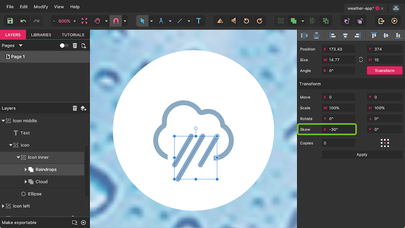
For the correct measurement to show up, you might need to press Command + Alt (on Windows and Linux, Control + Alt) to drill into the group. To finish the icon, rename the “Compound Shape” group to “Raindrops” and create a new “Icon inner” container with the “Cloud” group. When selecting the two groups, make sure to use Command (on Windows and Linux, Control) instead of Shift. Also, drag it into the “Icon middle” → “Icon” group and align it properly to the circle again. With this, we have finished the second weather symbol. On to the third and last one!
Still No Improvement
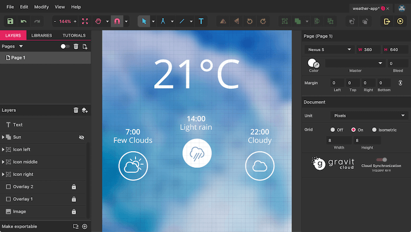
To start, zoom out to 100% (Mac: Command + 0, Windows and Linux: Control + 0) for a better view. Select the first symbol — the “Icon left” group — and clone it to an “Icon right” group. Move it to the right of the page with the fifth alignment icon (“Align Right”), and select the “Icon” group within. It should have a gap of 32 pixels from the right edge — the grid will definitely help you here. The text of this symbol should read “22:00 Cloudy.” Like before, make sure that it is centered to the icon. Because we have cloudy weather now, we don’t need the sun anymore. Select its group in the Layers panel and delete it. As well, center the cloud to the circle again in both dimensions. That’s it! We’ve just completed all of the daytimes (figure 10).
Full View
The last element of the weather app (actually, its center part) is the enlarged display of the current weather condition at the bottom of the screen, surrounded by some elegant half circles.
Create the first half circle with a diameter of 464 pixels (figure 11) — switching off the grid might help. Proceed here as follows:
- Switch to the Ellipse tool with
E. - Move the cursor to the bottom center of the page until the smart guides show this spot.
- Hold
Shiftto create a circle andAltto start from the middle. - Move this shape down by 16 pixels (add “+16” to the “Position” → “Y” field).
- Assign
#708AB5as the fill color. - Set the “Blending” to “Soft light.”
- Rename it to “Ellipse 1.”
To set it off from the background image, assign an Inner Shadow at the bottom of the Inspector with a click on the “+” icon on the right. Use the following properties:
- X: 0
- Y: 1
- Blur: 1
- Opacity: 70%
- Color: black
As with the other styling properties, multiple shadows can be stacked on top of each other. Create another inner shadow in the same way as above: It should share all values with its sibling, except for the “Blur” — set this one to “20.” Before you continue, create a new layer in the Layers panel (in the top-right), name it “Bottom,” drag it right above the “Overlay” layers, and move this first circle in. If you’d like, you can also assign a different color to this layer so that it differs from the status bar.
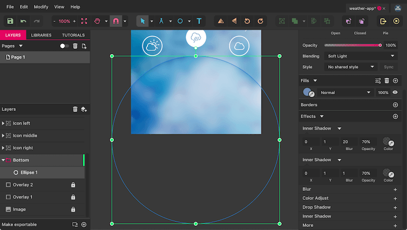
We need three more circles (figure 12). Clone the first circle with Shift + Command + D (on Windows and Linux, Shift + Control + D), and resize it to 416 pixels from the center (hold Shift + Alt and drag the bottom-right handle). Style the second circle as follows:
- Fill: #809AC6
- First inner shadow: 0/1/1/50% (X/Y/blur/opacity)
- Second inner shadow: 0/1/12/60%
- Name: “Ellipse 2”
Create a copy from this second circle, this one with the following properties:
- Size: 392 pixels in diameter
- Fill: #CCE0FF
- First inner shadow: 0/1/1/50%
- Second inner shadow: 0/1/8/100%
- Name: “Ellipse 3”
For the fourth and last circle, use these settings:
- Size: 370 pixels in diameter
- No fill
- Blending: Normal
- Just one inner shadow: 0/1/3/25%
- Name: “Ellipse with image”
The reason why this last circle has no fill is that it will contain another image of a cloudy sky, alongside some dark overlays. Grab the image and bring it into Gravit Designer. Now move it so that it fully covers the last circle, and drag the image into it in the Layers panel, which will clip it automatically to the shape. Another way to create such a mask would be to select both — the shape and image — and pick “Mask with Shape” from the right-click menu. Just make sure that the mask (i.e. the circle) is above the to-be-masked content (the bitmap image) in the layer hierarchy.
After that, create a rectangle within this new mask group (drag it in after it has been created), which will also cover the circle, and give it a black fill with a “Soft light” blending. This will make the image darker; but we need more, so create a clone of this rectangle.
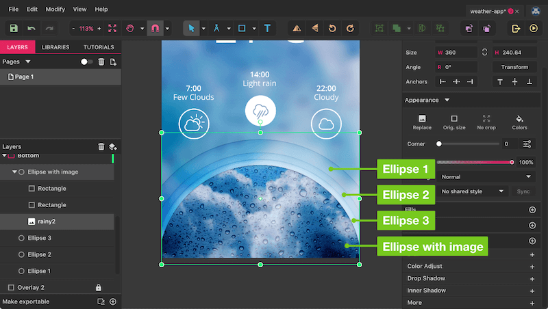
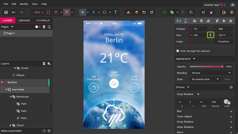
The last element here is an enlarged version of the rain symbol above (figure 13). Proceed as follows:
- Select it (“Icon inner” in “Icon middle” → “Icon”).
- Duplicate it and move the icon into the “Bottom” Layer group, in the top position.
- After that, drag it to the bottom of the page on the canvas (with the Pointer tool —
V). - To make it visible in front of the background image, select the “Raindrops” group and change the border color to white, as well as the fill color of the “Cloud” group.
- The final move is to enlarge the icon massively to 128 pixels in width and center it to the semi-circle. Make sure that “Keep Ratio” is switched on between the width and height fields in the Inspector and that “Autoscale Borders” is selected in the “Advanced stroke settings” of the raindrops. Otherwise, they will remain at the original border thickness.
To make the icon stand out from the background even more, we could also apply a drop shadow with the properties “-3/3/0/15%.” The same goes for the text layers, but with the values “-1/2/0/10%,” except for the temperature, which harmonizes better with “-2/3/0/5%.”
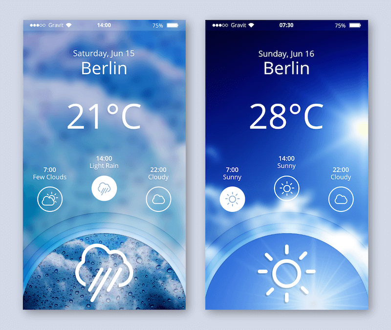
After so much work, we have finally finished the first screen of the app. Press Command + 0 (on Windows and Linux, Control + 0) to set it in its full glory.
But we want more. In a second iteration, we want to show it with some friendlier conditions.
Finally Sunny
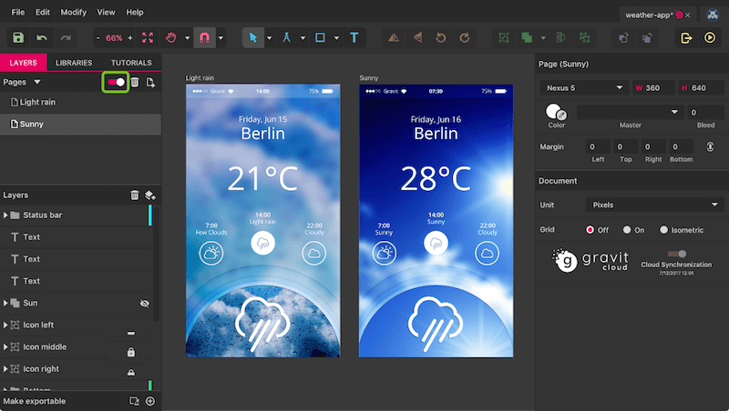
Up until now, we’ve worked exclusively in single-page mode, meaning that we’ve had only a single page on the canvas. For the iteration, we need another one (see figure 15 for the result). To enable multi-page mode, click on the toggle next to the “Pages” label (figure 14). Now you can select the current page on the canvas with a click on the title, and press Command + D (on Windows and Linux, Control + D) to duplicate it and keep working there. Rename the first one to “Light rain” with a double-click in the page list and the second to “Sunny” so that there is no ambiguity.
Pages are ideal if you want to create different versions of a screen, to try out variations or just to fiddle around and see all iterations next to each other.
The first task for the new page is to change the time in the status bar to “07:30,” to indicate that we are at another time of day now. Also, modify the day (“Saturday, Jun 16”), as well as the temperature (“28 °C”). Furthermore, we want to display other weather conditions: The left-most and middle should be “Sunny,” the right one “Cloudy.” Ensure that all text layers are centered again. Because we have sunny weather now, this should be reflected in the background image. Unlock the current one, delete it and drag in the new image. Ensure that it is at the bottom of the layer hierarchy again.
The easiest way to move it there is to press Shift + Command + down arrow on the keyboard (on Windows and Linux, Shift + Control + down arrow). Then, bring it back to the original size with the respective button in the Inspector (“Original size”), and center it to the page in both dimensions with the fourth and seventh alignment icons from the left in the Inspector. This time, the blur should have a slightly smaller radius of “15”; be sure to lock the image again. In addition to dark overlays, we will create a third one, with the full size of the page, a black fill and a “Soft light” blending. Name it “Overlay 3,” and put it right above the image in the layer hierarchy (also locked).
We also need an updated image for the semi-circle at the bottom, within the “Bottom” → “Ellipse with image” groups. Delete the old one and drag in a new bitmap. It should be clipped and horizontally centered to the circle again and also be displayed at the original size. Drag it vertically until it shows a view that appeals to you. The two overlays are too dark now, so we need to adapt them. Change one to a fill color of #000560 and a “Screen” blending, and the other to #033572 with “Hard light” and an opacity of 12%.
Fixer Of Icons
The only thing left to do is to fix the icons so that they match the text. You can switch to single-page mode again if you like. Because the left icon says “Sunny,” we just need the sun symbol — good that we saved it before tearing it apart earlier. Look for the hidden “Sun” group in the Layers panel and show it again. Delete the old “Cloudy” icon within “Icon left” → “Icon,” and drag the sunny pendant to its place (in the Layers panel and on the canvas). The icon could be a bit bigger, though, about 30 pixels. Continue as follows:
- Fully zoom into the icon with “View” → “Fit Selection” from the menu bar.
- Zoom out two steps again with
Command + -(on Windows and Linux,Control + -). - Grab the bottom handle, hold
ShiftandAlt, and drag until the width in the Inspector says about 30 pixels. Make sure that “Autoscale Borders” is selected in the “Advanced stroke settings” of the icon.
We also need to give the icon a selected state, because the current time is 7:30. First, change the border color of the sun to the same as for 14:00 — the easiest way is to use the color picker in the color dialog. Now, select the outer circle and change it from the “Icon outline” shared style to “Icon full” in the Inspector. Do the same for the middle weather condition, but in reverse. You also need to replace the rainy icon (“Icon inner”) with the sun there, but with a white outline.
The third place where the sun should appear is within the half circle at the bottom, but at a much larger size. Copy the white version and paste it right above the “Ellipse with image” group. Follow the steps above to resize it to a width of 120 pixels. Finally, use the same shadow as before (-3/3/0/15%) to give it a stronger appearance against the background image.
Export It
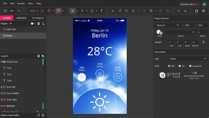
We now have two versions of the app, showing different times of day and weather conditions (figure 16). Let’s export them in the final step, which is quite a snap in Gravit Designer. Either click on the export icon to the right of the toolbar or press Shift + Command + E (on Windows and Linux, Shift + Control + E) to enter the Export dialog. There, in the “Canvas” tab, you can already see the two pages, ready for exporting.
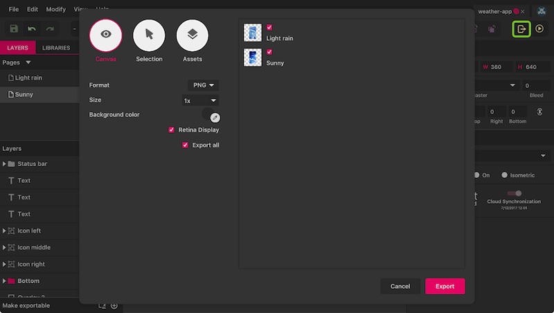
While the default settings should work just fine, you have many different options here to tweak the output to your liking. The “Format” should be pretty self-explanatory, but the “Size” holds a few hidden values: “2x” lets you export at double size for high-resolution displays (“3x” and “4x” work, too), and you can define a fixed width or height (append “w” or “h”) or both dimensions. Lastly, it’s also possible to set the DPI resolution for print designs.
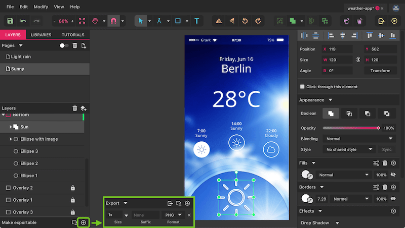
Besides exporting entire pages, you can also get individual layers (objects) out of Gravit Designer. If you select a layer before entering the export dialog, it will show up in the “Selection” tab; “Assets” can be defined when you click on the “+” icon in “Make exportable” in the bottom-left in the main window. There, you have similar options like in the export dialog and can also define multiple types at the same time.
I hope you have enjoyed this tutorial and that it has given you valuable insight into Gravit Designer. It was just a small glimpse into the application and its features, because Gravit is capable of creating many different types of designs. Go to designer.io to use it online or to download the desktop application.
If you have questions, feel free to ask in the comments below.
You can always reach out to the Gravit team on Twitter and Facebook, and there is also the very friendly discussion board where you can post your questions and ideas.
 (mb, al)


