Not all products are created equal. While we repeatedly buy some products almost mindlessly, for others, we take a lot of time to make a purchasing decision. For a price tag that meets a certain threshold or if we are particularly invested in the quality of a product, we want to be absolutely certain that we are making the right choice and are getting a good product for a good price. That’s where a feature comparison table makes all the difference.
Feature comparison tables are helpful not only in their primary function, though. When designed properly, they can aid in decision-making way beyond placing product specifications side by side. They can also add meaning to an otherwise too technical product specification sheet, explaining why a certain feature is relevant to the customer or how a certain product is better than the others.
After our close examination of accordions, time and date pickers and sliders, in this article we’ll look into all of the fine details that make a perfect, accessible and helpful feature comparison table. Please note that this article isn’t necessarily about pricing plans, nor is it about data visualization methods. Rather, it’s tailored specifically for the case where a customer wants to confirm their purchasing choice or can’t choose between one of multiple preselected items.
Before diving into design decisions, we need to properly understand the user’s goals, intentions and behavioral patterns.
Reducing Abandoned Shopping Carts
Many customers visit a website, browse around, add one or more products to their cart and then leave without completing their purchase. We can easily reduce abandonment rates with a couple of simple techniques. Read a related article →
When Is A Feature Comparison Useful?
In observing customers in a few e-commerce projects, I found it quite revealing to notice how seemingly irrelevant a comparison feature appears to be to many customers. Quite often users will say that it clutters the interface, and that they never use the feature. The reason for it is simple: While we tend to purchase small low-priced items quite often, we tend to buy large high-priced items not so frequently. In fact, there are just not that many situations where we actually need a feature comparison.
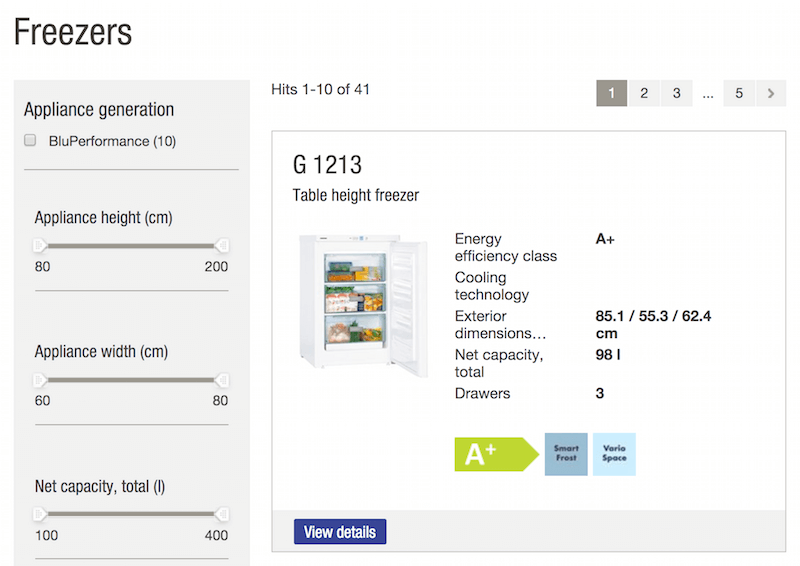
Not many customers would even think of comparing a few books or pairs of socks. However, relatively few customers would purchase a coffee machine or refrigerator without exploring their options thoroughly. A feature comparison is indeed irrelevant for “small” purchases, but it becomes important for “large” purchases. In fact, when customers are committed to making a large purchase but can’t choose which product to buy, they are likely to end up not buying altogether, getting locked up in the choice paralysis. As a retailer, we obviously want to avoid these deadlock situations, and that’s where a feature comparison element can be very useful, simplifying the decision-making process and filtering out items that don’t meet relevant criteria.

The latter can apply to very different settings: We could be comparing locations, venues, glasses, cars, luggage, watches, TV sets or even chemicals. However, for the scope of this article, we’ll be focusing on a very specific feature comparison among e-commerce retailers. The lessons we’ll learn here can be applied to any kind of comparison context, although the fine details might vary.
One way or another, in the end, it all boils down to what kind of purchase the customer is about to make. As Joe Leech states in his brilliant webinar on purchasing decisions, when shopping online, users have either a “non-considered” or a “considered” purchase in mind.
Non-Considered Purchases
Non-considered purchases are quick, low-effort purchases that we tend to make when we need a quick solution, or run errands. Whenever we need a pack of batteries, ordinary stationery, a “good-enough” dryer or a quick weekend getaway, what we’re actually doing is checking a box off our to-do list and moving on. Few people get excited about selecting batteries or pencils, and so we are unlikely to explore different websites a few times just to buy that perfect pack. Instead, we tend to purchase such items quickly, often on the go, skimming over vendor reviews and shopping by price, shipping speed and convenience.
Considered Purchases
Considered purchases, on the other hand, are slow, high-effort purchases, purchases that need time and consideration. When we buy a bicycle, a watch, a refrigerator or health insurance, we explore our options thoroughly, making sure we don’t end up with something that isn’t good enough or that doesn’t fit or that would need to be replaced soon after. In such cases, we tend to keep exploring a possible purchase for quite a long time, often browsing many different retailers, comparing prices, reading reviews and examining pictures. We might even ask the opinion of our friends, colleagues and loved ones. Eventually, a final decision is made based on the expected quality and service, rather than convenience and speed, and it’s not necessarily influenced by price point alone.
Of course, the more expensive an item, the more consideration it requires. But considered purchases aren’t necessarily expensive: Any item with a certain attribute, such as longevity, speed or quality, has to be thoroughly considered as well. This includes gifts, flowers, wine and spirits, clothing, mortgages and health insurance. The reason for it is obvious: it’s very hard to be very disappointed about a pack of batteries, but an uncomfortable gift, or wrong flowers sending a wrong message, or even an ill-fitting shirt that has to be returned, can be quite a frustrating experience.
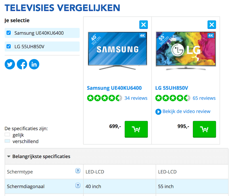
Not many people know exactly what they want or need up front, unless they receive a trusted recommendation. So, every considered purchase requires a lot of thinking and consideration, comparing different options and filtering for that perfect one. The problem is that comparison isn’t a particularly fun activity on the web. Details are often missing, prices are not transparent (how often do you add an item to the shopping cart and go through the entire checkout up to payment, only to see the real final price?) and model numbers (such as for appliances) are not consistent.
That’s where a well-designed feature comparison can increase sales and improve user satisfaction. If we manage to pick up an indecisive customer in a moment of doubt — before they leave the website or start looking around — and guide them skillfully to a sound decision, then we are striving for a better customer experience, while also accounting for a larger profit and a more loyal customer base for the business. After all, customers don’t have to shop around on other websites when purchasing (often) expensive items. That’s something that might bear fruit for the business for years to come.
At this point, it’s probably no big revelation that feature comparison is relevant mostly for considered purchases. They are particularly useful in cases where a product is relatively complex — potentially including details that might be confusing or ambiguous. Good examples of this are digital cameras and TVs — for an informed comparison of choices, one often needs an understanding of the technical capabilities of these devices. Another example would be a vacation or business trip — anything that requires many small decisions, such as availability, pricing, convenient departure and arrival times, budget, and a thorough planning of activities up front.
What exactly makes a comparison relevant for the customer? Well, it’s relevant if it helps users make a good, informed choice. A feature comparison could be designed to drive more customers towards “high-profit” margin sales, but if they aren’t a good fit or if the customer feels they are overpaying, then the retailer will have to deal with either a high volume of returns or users abandoning them altogether in the long term.
When we observed and interviewed users to find out how a feature comparison might be relevant to them, we found that it essentially boils down to one single thing: seeing the difference between options, or filtering out unnecessary details quickly so that the differences become more obvious. Unfortunately (and surprisingly), many feature comparisons out there aren’t particularly good at that.
The Building Blocks Of Feature Comparison
If we wanted to compare two or more items against each other to find the better fit, what would be the most obvious way to do that? With clothes, we would try them on and pick the one that feels right. But what if trying things on isn’t an option? When purchasing products online, we can rely on our past experiences, ratings, expert reviews, customer reviews and trustworthy recommendations to reduce the scope of options to just a few candidates.
Still, at some point, you might be left with a few too similar items — maybe one a bit too expensive, the other missing an important quality, and the third a recommendation from a friend’s friend. So, what do you do? You list all options, examine their attributes side by side, and eliminate options until you have a winner. (Well, at least most people do that.)
Translated to common interface patterns, this naturally calls for a structured layout that aids in the quick scanning of options — probably a good ol’ comparison table, with columns for products, and rows for their attributes. Once the user has selected products and prompted the comparison view, we can just extract all attributes from all selected products and list them as rows in the table. Should be easy enough, right? Yes, but that’s not necessarily the best approach for meaningful comparison.
Not All Attributes Are Created Equal
Ideally, we’d love to display only meaningful, comparable attributes that the customer cares about. Rather than extracting and lining up all product specs, we could determine and highlight all relevant product attributes, while keeping all other attributes accessible. This requires us to (1) find out what the user is interested in and (2) have consistent, well-structured data about our products.
While the first requirement is just a matter of framing the question properly in the UI, the second requirement is a tough nut to crack. In practice, having well-structured meta data often turns out to be remarkably difficult, not because of technical or design limitations, but because of content limitations.
Unless a retailer is using a specialized, actively maintained system that gathers, organizes and cleans up meta data about all products in their inventory, getting well-structured, complete and consistent attribute details — at least about products merely in the same category — turns out to be a major undertaking. You can surely manage meta data for a relative small clothing store, but if you as retailer rely on specs coming from third-party vendors, a meaningful comparison will require quite an effort.
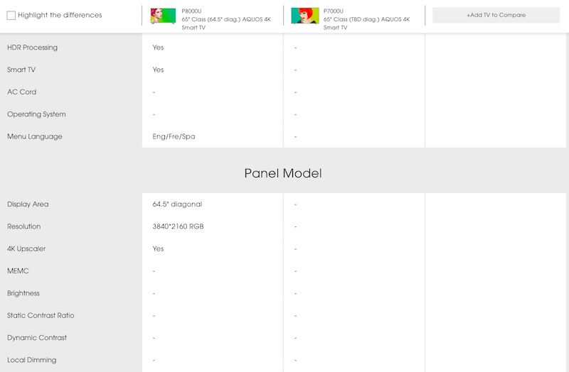
Houston, We’ve Got A (Content) Problem
This raises a question: How would you display a comparison table for two digital cameras if critical attributes were missing in one of them? In that case, meaningful comparison would be impossible, making it also impossible for the customer to make an informed decision. When faced with such a situation, rather than picking one of the options blindly, most customers will abandon the purchase altogether, because the worry about purchasing a wrong product outweighs the desire for a product at all.
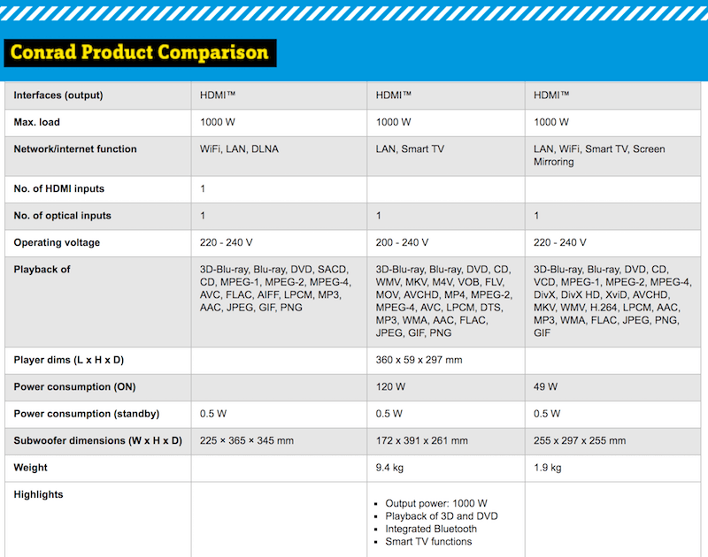
Conrad lists all products in a table, with every other row alternating in background color. Like in many other retail stores, meta data is often incomplete and inconsistent, leaving users in the dark. In the example above, the number of HDMI inputs, the weight, the highlights and player dimensions aren’t available for two of the three compared products.
The same happens when items are difficult to compare — for instance when noisy ill-formatted data appears next to well-structured data for many attributes. It might be possible to spot the differences between products with enough time investment, but it requires just too much work. In usability sessions, you can see this pattern manifest itself when customers prompt for a comparison view and scan the rows for a second or two, only to abandon the page a few seconds later. Moreover, once they’ve had this experience on the website, they will perceive the feature comparison on the website to be “broken” in general and ignore it altogether in future sessions.
So, what do we do if some information is missing, incomplete or inconsistent? Rather than display the comparison table as is, it would be better to inform the user that comparison isn’t possible because some data about a particular product is missing, and then guide them to relevant pages (perhaps standalone reviews of the compared products) or ask them questions about attributes that are relevant to them, and suggest the “best” option instead.
Those Attributes Aren’t The End Of The World
Comparing by attributes matters, but extracting and reorganizing data from a specification sheet alone might not be particularly useful for a not-so-savvy customer. In fact, it might be helpful to extend or even replace some attributes with data that the user would find more understandable — for example, replacing technical jargon with practical examples from the user’s daily routine? Or extracting advantages and disadvantages of products?
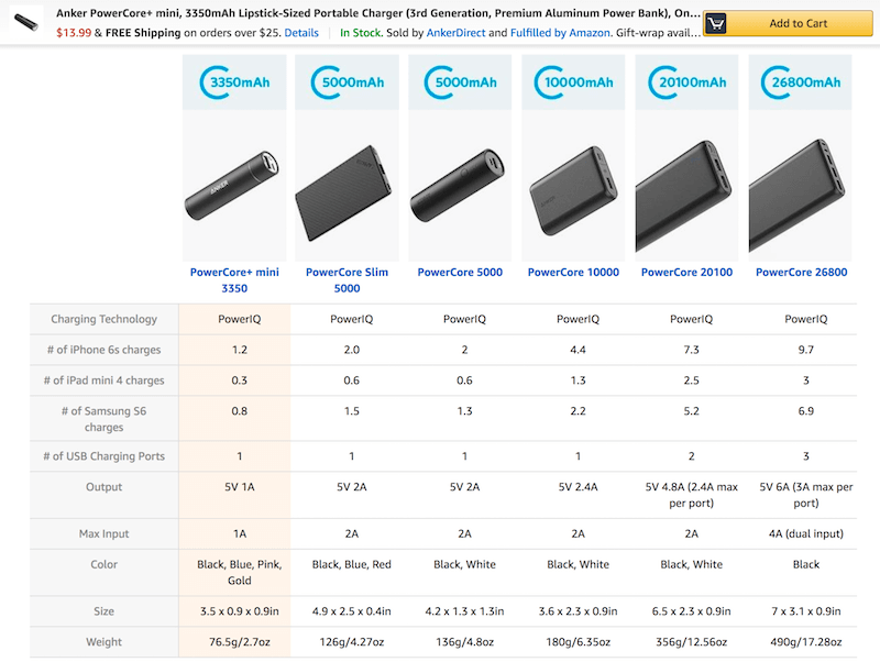
As noted by Nielsen Norman Group, on Amazon, technical details aren’t displayed as is. Instead, the comparison table translates technical attributes into language that is understandable by the average consumer. Interface copy matters: this goes for attributes as much as for wording on buttons, labels and thumbnails.
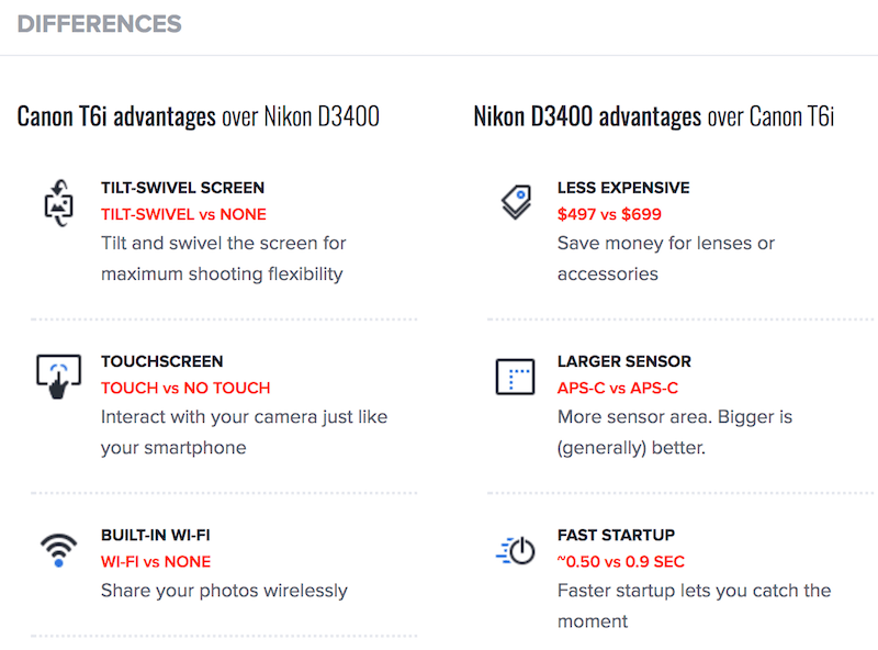
For every two compared items, Imaging Resource extracts the advantages and disadvantages of the products, as well as the respective strengths and weaknesses, in a list. This might not be the fastest way to compare attributes, but it nicely separates qualities by default, prominently highlighting critical differences between options. The website also provides extracts from reviews and suggests other relevant comparisons.
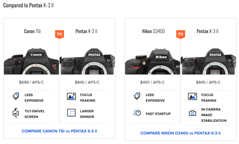
Versus goes one step further, highlighting how the features of the selected products compare against other products on average in a bar chart. Rather than only displaying all attributes as a table, they are also shown in a list view, with a detailed explanation of each attribute. Even better, the website puts every attribute into context by highlighting how much better the best product in that category is performing. The bonus is that members of the community can upvote every single attribute if they find it relevant. That’s way more helpful for customers than single attribute values in a table.
Cool Blue has a fine feature comparison: Everything is just right. Not only does it display similar and different features prominently by default, it also highlights the pros and cons of each product and the pros and cons of each feature. The interface also granularly breaks down the rating for specific groups of features and customer reviews.
Flipkart provides feature comparison on most category pages and most product pages, with advantages, disadvantages and highlights extracted from reviews. That makes the feature comparison infinitely more relevant, and it might make it slightly easier to jump to a purchasing decision.
More often than not, a detailed spec sheet alone might not be good enough for meaningful comparison. Extending the comparison with further details, such as relevant reviews, helpful rewording, as well as advantages and disadvantages in direct comparison can go a long way in helping the customer make that tough decision.
Cleaning Up The Mess By Grouping Attributes
All of the options above provide a quick, scannable view of advantages and disadvantages, but depending on the complexity of a product, you might end up with 70 to 80 attributes lined up in a list. Going through all of them to find the ones that a customer cares about most would require quite some work.
One way to improve the scannability of attributes would be by grouping attributes in sections and then showing and collapsing them upon a click or tap. That’s where accordion guidelines come into play: In too many intefaces only icon acts as a toggle; of course, the entire bar should open or collapse the group of attributes. Additionally, an autocomplete search box or filter could allow customers to either jump to sections or to select and unselect categories for comparison.
Rather than just list all attributes, Home Depot groups them into “Dimensions,” “Details” and “Warranty / Certifications.” It also highlights differences between products and has a fancy print view (accessible via a tiny print icon — let’s see if you can find it!).
Sharp allows customers to select a category of interest from a list, or even to use autosuggest to quickly jump to a specific category. A checkbox on the right allows users to highlight the differences, too — although the highlight isn’t always visually clear.
For its feature comparison, Otto, a German retail store, not only groups all attributes but also turns each group into collapsible and extendable sections. Some sections additionally contain detailed information about an attribute, provided upon a tap or click.
Garmin goes even further. Rather than just displaying a dropdown at the top of the page, it floats it alongside the products as the user scrolls the page. That’s slightly better.
Rtings.com extends a dropdown with filtering functionality for the entire table. If a customer is interested in a particular group of attributes, they can select the exact values that interest them. That’s a level of granularity that a feature comparison table usually doesn’t provide, and it’s especially useful for lengthy comparison views.
Ultimately, a floating dropdown with a selection of the attribute section would be just enough for any comparison. In general, a slightly better organization of the attributes would help users navigate towards points of interest, but being able to easily see differences or similarities within those points of interest would also be useful.
Highlight Differences Or Similarities… Or Both?
Because being able to easily see differences is one of the central purposes of a comparison, it makes sense to consider adding a toggle — like in Sharp’s example above — to allow users to switch between seeing only differences, seeing only similarities and seeing all available attributes.
In fact, when users access a comparison table and notice the “show differences” button, they often first scroll down past the entire table just to see how time-consuming the comparison will be, only then returning back to that shiny button, pressing it and exploring the updated view.
In fact, that feature seems to be used quite heavily, and it’s understandable why: Seeing the differences is exactly why customers actually prompt for a comparison view in the first place. That means that the option to highlight differences should be quite prominent. But then how exactly would you design it, and what options would you include, and what would the interaction look like?
On MediaMarkt, for example, customers can choose to see all attributes or only attributes by which products differ. The button for “showing only differences” is located in the left upper corner, next to product thumbnails. Keeping it closer to the table might make it more difficult to overlook it. The German retail store uses alternate background colors for product rows, but not for headings. Many products have 10 to 15 groups of attributes, and each of them can be shown and collapsed. Also, each product has a link to the full specification sheet.
The problem with highlighting differences is that it’s enough for just one character in one table cell in the row to be slightly different, and the entire row will not disappear — even if all the other columns have the same, identical value. However, rather than just displaying the row as is, it would be infinitely more useful to actually highlight the difference — perhaps collapsing all “same” cells into one and highlighting that one cell that is different.
And then the question comes up: once “showing the differences” is selected, should identical attributes disappear altogether, or should they stay in the table with only different attributes being highlighted? It’s probably a matter of personal preference. If there are 60–80 attributes to compare, we’d probably remove similar rows for easier scanning. If the table is smaller, removing rows might not be necessary.
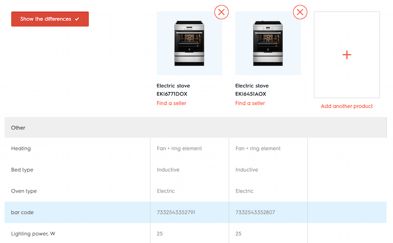
Electrolux, for instance, contains a button in the left upper corner, acting as a toggle. The state is indicated with a checkmark which can be on or off. Rows with identical data aren’t removed from the table — instead, differences are highlighted with a light blue background.
BestBuy contains a lot of exact numerical data, such as height “69.88 inches” and “69.9 inches”. Most rows will never be omitted because of such minimal differences, making the comparison a bit more difficult.
BestBuy with "Show only differences". Grouping attributes and perhaps even repeating the button for every section would be helpful here.
Seeing only differences is useful, but would users also benefit from seeing only similarities? In fact, providing this option is not very common, but there are some good use cases for it. As it turns out, one important scenario is when selected products have too many differences to scan through easily.
Here’s an example. Let’s imagine the customer has selected four digital cameras to compare, with each product having 60–80 attributes. Before embarking on a long journey through dozens of attributes, some customers will attempt to eliminate the options based on “simple” criteria, such as price or release date, “too weak” or “too expensive” or “not up to date” qualities. Obviously, while eliminating those items, they will want to make sure they aren’t removing the wrong ones. In that particualr case, seeing similarities gives users validation that they are “still” looking at products that are “worth comparing” or “worth investing time into.”
The main use case when it happens is when a customer is comparing a few strong, similar candidates. They might vary in a dozen attributes, yet the list of all 80 attributes is too lengthy to easily compare. With an option to see only similarities or only differences, the customer can break down the complexity into two parts. What you notice in such cases is that customers tend to take care of the “easier” task first: they will look into similarities first (just to be sure all options are “solid”), and then look specifically into the differences.
You might be wondering if it’s necessary to provide the overview of all attributes? After all, the customers check both similarities and differences. The answer is “yes.” Customers don’t want to miss out on important details, and because they want to be certain about all available attributes, they will seek and examine the “all attributes” option as well, scanning it at least once during the session.
In terms of design, an obvious solution would be to use a group of mutually exclusive buttons or just one button or link that changes the contents and basically acts as a toggle.
Samsung allows customers not only to see all attributes, only similarities and only differences, but also to select what attributes are relevant and compare only by them, removing everything else. All attributes are grouped into accordions, which all can be expanded or collapsed with one click.
LG’s interface is similar to Samsung’s, but the “compare” links are a bit too small, and because different views remain clickable all the time, it’s not always clear what you are looking at. Also, I’ve still yet to figure out what “locking” an item above the product thumbnails in the comparison view means — it probably means displaying the item first.
In practice, when encountering a feature to switch views, customers tend to alternate between all available options quite a lot. Seeing the differences and all attributes matters the most, but being able to see all similarities, while not necessary, might be reaffirming and supportive.
Color-Coding For Easier Comparison
To highlight differences, we can remove similar or identical rows, but we could also use color-coding to indicate how different the compared items are, and which of them performs better. An obvious way to do this would be to use some kind of colors or patterns on table cells. Zipso, for instance, colors fragments of each row for each selected attribute. While it’s helpful for a few attributes, when many of them are selected, the presentation quickly becomes too difficult to compare.
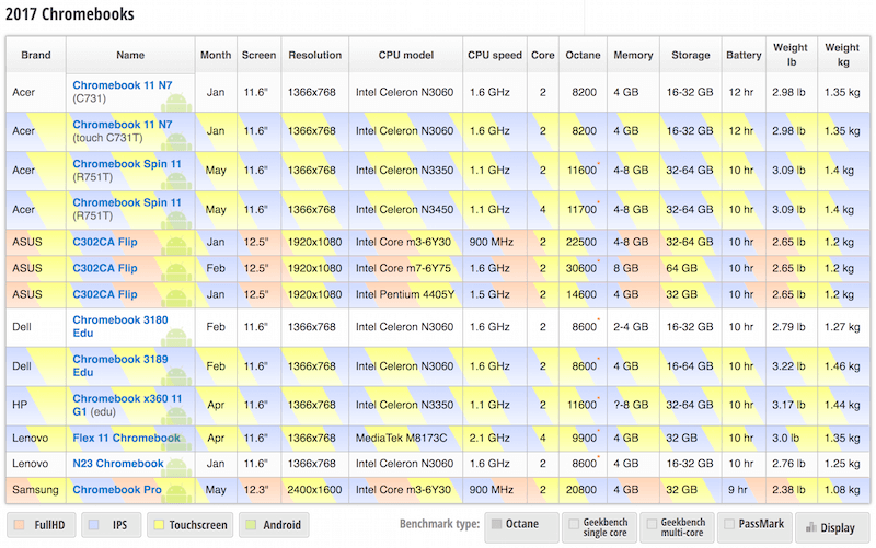
Prisjakt uses color-coding of table cells to highlight differences by default. Also, customers can highlight relevant rows by tapping or clicking on them (although, on tap, the differences aren’t clear visually any longer). Every comparison also has a unique, shareable URL.
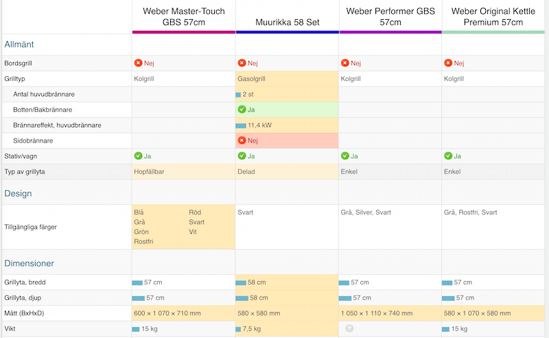
ProductChart uses background bars to indicate which of the candidates performs better for a certain attribute. The length of the bar indicate how much better one of the options performs. Slightly highlighting the winner, or providing an overall score and suggesting a winner, might be helpful here.
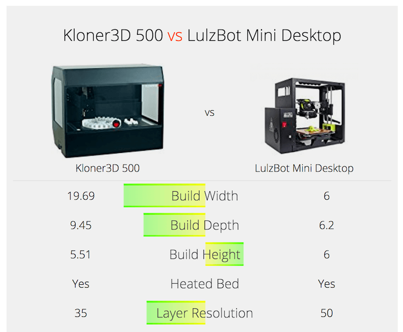
Digital Camera Database displays the differences between products with filled colored rectangles, to indicate the dimensions of difference. That’s useful for highly technical and detailed comparisons, but not necessarily so for every kind of feature comparison.
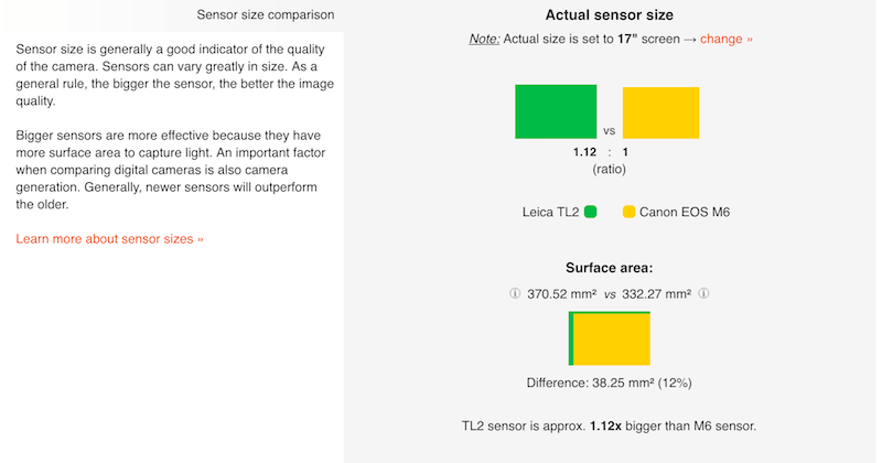
If your feature comparison table is likely to contain a lot of numerical data, it might be useful to highlight both the row and the column upon a tap or click, so that the user always knows they are looking at the right data point.
Color-coding is a simple way to highlight differences, but we also need to provide an accessible alternative, perhaps elaborating on the difference between products in a summary above the table.
The Thing That Never Goes Away: Floating Header
You’ve probably been in this situation before. If you have three obscurely labelled products to compare, with over 50 attributes being compared against, you might have a very difficult time remembering exactly which product a column represents. To double-check, you’ll need to scroll all the way back up to the headings, and then scroll back all the way down to continue exploring the attributes.
One obvious way to make mapping less strained is by having sticky column headers, following the customer as they scroll down the comparison table. We don’t necessarily need to keep all of the details in the header, but providing a product model’s name, with its rating and a small thumbnail might be good enough.
Sony keeps product labels and thumbnails floating above the comparison table as the user compares products. This gives customers a very clear mapping between attributes and a product. To compare, a quick look at the header is enough — no extra scrolling necessary!
Indesit solves the same problem in a slightly different way. The interface keeps thumbnails in a floating bar at the bottom of the screen, rather than at the top. As the items are added, they are displayed in the bar at the bottom. To add the items though users need to hit the comparison icon tucked in the upper-right corner of the product — it might not be easy to identify. Ah, also the entire “Compare models” bar should act as a toggle — in the implementation, only the chevron icon triggers expansion and collapsing.
So, if a floating bar is in use, should it float above or below the table — or does it even matter? Keeping headings above the content seems slightly more natural, especially when the thumb is hovering over the contents of the comparison view on narrow screens. Users need to be more careful when scrolling the page on narrow screens — which is why the bar in the Indesit example disappears entirely on mobile. Keeping the bar above the table just seems a bit more reliable.
Obviously, it’s going to be very difficult to display all selected products as columns at all times. A table view works well if you have two to three products to compare, but probably not so well if there are five products in the table. In that case, a common way to conduct the comparison would be by sliding horizontally.
Growing And Shrinking Those Tables
No conversation about tables can omit a close look into their responsive behavior across screens. A discussion of tables deserves a separate post, but there are a few common tricks to keep a table meaningful on narrow screens. Quite often, each table row will become a collapsed card, or headings will jump all over the place, or the table will be restructured to expose the data better, or the user can select which columns they want to see.
Problem solved? Not so fast. The feature comparison table is a beast of a special kind. The main purpose of the element is comparison: Keeping both attribute headings and product headings visible is important — after all, the customer wants to see the products they are comparing and the features they are comparing against. This means that for easy comparison on narrow screens, we need to float product headings, while keeping the attribute column locked as the user scrolls down the page. That doesn’t leave us with a lot of space to display actual product details.
Sadly, almost every other retail website makes feature comparison unavailable on narrow screens. Selected products will often disappear altogether, the comparison feature will be hidden, and loading a shared comparison link will appear to broken. In fact, it proved to be quite a challenge to find even a handful of examples out there.
Some interfaces try to make the best of what they have. Crutchfield’s interface, for example, is responsive, but that doesn’t mean it’s useful. On narrow views, items are displayed in a 2 × 2 grid, and so are product attributes. Because there is no visual relation to the actual product, it makes it very difficult to compare features.
ProductReportCard displays products in sets of three at a time. The attributes of each products are squeezed into a 33% column on narrow screens, making reading quite tiring, and comparison quite difficult.
Urban Ladder allows its customers to shortlist and compare items in the product grid. Once the user hits the “Compare” button, they’re presnted with a quick overview of similar products which are auto-suggested. On narrow screens, users can compare only two items at a time.
One way to manage this problem would be to avoid a table view altogether. Instead, we could highlight similarities and differences in a list by default, allowing customers to switch between these views.
Alternatively, we could ask the user to choose the attributes that they care about most, and once the input is done, we could highlight relevant features, and perhaps even pull some data from reviews, displaying both of them in a list. Every relevant attribute row could become an expanded card, while all less relevant attributes could be displayed as collapsed cards below.
As always, limited space requires a more focused view and since differences are usually what matter the most, highlighting them and removing everything else seems quite reasonable.
Admittedly, with all of these options, we are losing the big-picture view that a table can provide. If you’d like to keep a table, usually you’ll have at most one column to fill in with actual content — as another column has to be reserved for attribute headings. To make it work, you could provide a stepper navigation between products, so that the user is able to switch between products predictably. In the same way, sometimes floating arrows are used left and right, similar to a slider.
OBI allows customers to add as many products as they wish for comparison. In a comparison view, the navigation between products in the table happens via a stepper in the left upper corner. Unfortunately, the feature comparison isn’t available on narrow views.
Alternatively, you could also extend the table with a segmented control or multi-combination selector at the top, allowing users to choose two or more products out of the product comparison list — and display them side by side. With two products, the user would end up with a beautifully readable, responsive comparison table, and with more selected items, they would get either a scrollable area or a summary of differences and similarities. The user could then choose what they’d rather see.
What to choose then? If the feature comparison table contains mostly numerical data, then it might be easier just to explain differences in products up front. If that’s not the case or if the contents of the table is unpredictable, an option with stepper navigation, or a multi-combination selector, might work well. And if the product is complex and so attribute descriptions would be numerous and lengthy, then extracting relevant data and highlighting it, rather than sending the user on a journey through dozens of attributes, might be a better option.
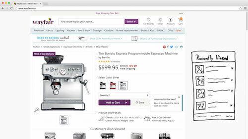
When talking about responsive behavior of components, we tend to focus on “regular” and “narrow” screens, but we could be exploring adjustments for “wide” screens as well. If we do have enough space to display a feature comparison prominently on wide screens, why not make the best use of it? As the user navigates the category page, for example, we could display the feature comparison as a floating pane on the right, while the left area could be dedicated to products highlighted in that category. As the customer adds an item for comparison, it could appear in the side-by-side comparison right away. In his article on “Responsive Upscaling,” Christian Holst mentions a good number of techniques applicable to e-commerce UX on large screens. They can be quite relevant for feature comparison as well.
Moving Things Around Until They Stick
What exactly happens before the comparison table appears? The customer will probably land on a category page, selecting a few items to compare, only to discover a button to prompt for the comparison. At this point, the customer might (or might not) know details about some of the selected items. In the same way, the order of selection for comparison might (or might not) be random. When displaying comparison results, a safe bet then is to display columns in the order of selection, because any different order might cause confusion.
As they are in the process of comparing, the customer will (hopefully) start to see things a bit more clearly, filtering out products that are clearly outperformed by selected competitors. To clear up the comparison view, we will allow the customer to remove a product from the comparison, of course, often indicated with an “x” in the upper-right corner of the column (or the floating header).
As it turns out, sometimes users will quickly dismiss one of the options, for example because it’s too expensive anyway, but they would want to keep that option in the comparison view for reference — just to put other candidates in context. That “reference” option might end up being stuck in the middle of the table, getting in the way of the comparison between two or more “real” candidates.
Obviously, the best arrangement for these options would be to display the main candidates first, side by side, followed by the “reference” candidates. In fact, you could even go as far as to allow the customer to downgrade or downvote some candidates and push them a bit to the side, displayed in a less prominent gray color.
A slightly more robust option would be to allow users to drag columns as they wish. That would help in the beginning when the customer has added quite a few items to the list but then, for instance, realized that the price difference was too high and so wanted to rearrange the products. It would also help in the case with “reference” candidates. In fact, in interviews, users sometimes compared product columns with cards or brochures or sticky notes that they could move around to group important ones against less important ones. A digital equivalent of the same experience in a feature comparison table would be draggable columns.
On Digital Photography Review, for example, users can move selected items left and right. That’s a nice accessible alternative to drag-and-drop.
The nature of SocialCompare requires users to be able to drag columns and rows as they wish. However, moving columns around like cards might be helpful for customers of retail websites as well.
It’s important to note that drag-and-drop is (obviously) not accessible, so screen reader users would need to have access to navigation within the column headings. For example, you could have a select dropdown or a group of radio buttons as a fallback in that case.
But what if, after a detailed comparison, a customer is dissatisfied with all the options presented in the comparison view? In addition to being able to remove items from the list, it’s important to be able to add relevant items to the comparison view — and “relevant” is important here. In most cases, the “add” button will simply return customers to the category page, where they would be asked to add more items for comparison. Instead, we could suggest products that are likely to fit the bill, perhaps by showing ones similar to the items selected.
On Car Showroom, customers can add new items by typing in the model reference and using autosuggest. Also notice that the interface provides navigation within the comparison — comfortable for quick jumps to relevant features.
Second Opinions Matter, As Do Shareable URLs
Because feature comparison is relevant mostly for purchases that take time, the more important the purchase, the more likely the customer is to explore the idea of buying an item over a long period of time. One thing we've noticed by observing shoppers is that, every now and again, in a moment of doubt, they will take a screenshot (or a series of screenshots) of the comparison table, and store it "for future reference," until they've made a decision. Well, that's not the full truth because one of the main reasons for storing that screenshot is to send it over to friends and colleagues who have a better understanding of technical details and to ask for their second opinion.
Indeed, second opinions matter for many people — even from a close friend who isn’t that knowledgeable in whatever category the product belongs to. That precious screenshot will end up wandering through Facebook chats and Skype chats, email attachments and WhatsApp groups. If your data tells you that many of your customers need a second opinion before purchasing items (and that will surely be the case for electronics or appliances), make it possible to “save the comparison for later or share it,” enhanced with friendly and encouraging copy. This means that the every comparison should have a unique URL, featuring all or selected attributes, the expanded and collapsed groups of attributes and the order of products.
Don't Lose That Selection
It's no secret that many customers misuse their shopping cart or wish lists to keep a selection of products intact for when they visit the website next time (often shortly afterwards). In the same way, storing the comparison table persistently (perhaps in localStorage or in a Service Worker) for some time is a good idea. In fact, no customer would be pleased if compared products were to disappear after they accidentally closed the tab.
Eventually, once the user visits the page a few days (or weeks) later, you could open a little message bar stating that their recently viewed items and compared items are still available, with an option to "dismiss" it. Should the user choose to explore that comparison, they could do it from the message bar. Should they browse a category and choose other products for comparison, obviously the comparison view should be overwritten with the newly selected products.
Those Tiny Interaction Details
Interaction with a feature comparison table might appear to be quite self-explanatory, but many tiny decisions have to be made before the user even gets to see the comparison.
Where Should Comparison Be Possible?
For one, the comparison feature obviously has to be indicated, promoted or featured somehow — but where exactly? There are many options. It could appear on the home page, in the category list or on the product page. It could also be available on the shopping cart page or on search results pages. On most e-commerce websites, the option to compare is visible only on the category page, often for the obvious reason of not distracting the customer from the purchasing funnel. Is it always the best solution, though?
Well, we should ask ourselves first, when would a customer want to compare items in the first place? One common use case is when they are looking at similar options but can't decide which one to choose. This usually isn't the case on the home page (too early) or on the shopping cart page (too late), but it definitely is the case on a category page and (often) on the product page.
On top of that, one can spot an interesting behavioral pattern when observing customers navigate category pages. When exploring options for purchase, a good number of users will open every potential product candidate in a separate tab and examine each thoroughly one by one first, closing tabs only if the candidate is clearly not good enough. Now, these customers might find a strong candidate and head straight to the checkout, or (more commonly) they might lean towards a few options.
In the latter case, being able to add items for comparison on a product page would obviously save those annoying roundtrips between product pages and category pages. However, we would save not just clicks or taps — more importantly, we would avoid deadlocks, those situations where a customer is indecisive and can't proceed to check out, abandoning the purchase altogether. If the customer is undecided about the options, they will definitely end up not checking out; and if they do, you can expect the risk of high refund costs. In a way, feature comparison is an easy, helpful way to keep customers on the website by helping them making the right decision.
Another common use case is when a customer comes to a website with strong options in mind already but is looking for more detailed specifics of each option. In that situation, the customer is likely to search for these products right in the search field, often typing in obscure model numbers that they wrote down in a physical retail store. If the appliance can't be found using search, some customers will still try to find it on the category page, but if their first attempts don't bring the expected results, they will abandon the website altogether. Similar to the previous case, here we can guide potential customers by suggesting the products they might have meant and making it easier for them to make a decision. Perhaps we could even provide more competitive price and delivery options than a physical store can. Again, adding the comparison selection right in the search results might be a good option to consider as well.
There is another option, though. We could also highlight feature comparison as part of the global navigation. If you have a very limited range of products, each of them targeting a specific audience, it might be useful to clearly communicate what groups of customers each product is designed for.
For example, Konica Minolta provides a separate feature comparison link in the main navigation. Unfortunately, it's nothing but a list of all specifications for all products in a side-by-side view. Perhaps explaining the advantages of each product and whom it's best for would be more helpful. Still, customers can export and print out results for easy scanning and reading.
Vizio prominently integrates feature comparison in the main navigation. All products can be chosen for comparison, but every navigation section also contains a “Compare Sizes / Models” link, which features the entire spectrum of products, all broken down into groups, with filters for choosing the relevant ones. The attributes are broken down in groups, too, and displayed as accordions in a tabular view, while the products always remain visible in a floating bar.
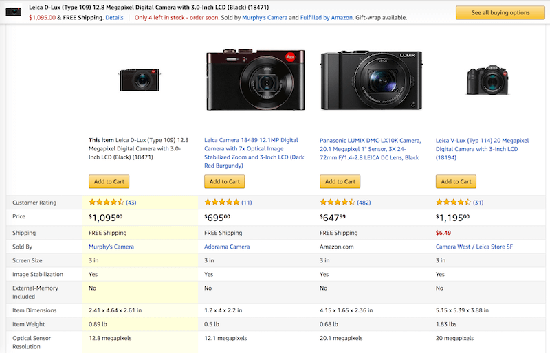
Quite surprisingly, Amazon doesn’t display feature comparison as an option on the category page. In fact, it is quite difficult to notice on the product page as well. But rather than allowing customers to select the products they’d like to compare, Amazon allows them to only “Compare with similar products.” Only six attributes are displayed on mobile by default: the product’s title and its thumbnail, the customer rating, the price, shipping info and the retailer. The attributes are disclosed progressively, upon a tap or click.
Don’t get me wrong: of course the main goal of the website isn’t to bring as many people as possible to a comparison view, but rather to bring them to the checkout — with an item that will actually meet their needs. Because a comparison can help avoid deadlock, try enabling “adding to comparison” for product pages, category pages and search results, and then monitor conversion. If you have just a few products in the inventory, clearly labelling and targeting each group of customers might be a better (and simpler) option.
The Life Of A Lonely Checkbox, Or How To Indicate Comparison
Once we know which pages a feature comparison will appear on, we should ask ourselves how users will actually add items for comparison. This requires us to look very closely into the microscopic details of how the feature is indicated and how the user would interact with it.
While some designers choose to use a link or button with a label (for example, "Add to compare"), others use iconography (a plus sign or a custom "compare" icon) to indicate comparison. A more common option, though, seems to be a good ol' checkbox with a label. A checkbox naturally communicates that and how an item can be selected and unselected, and with a proper label in place, it conveys the functionality unambiguously.
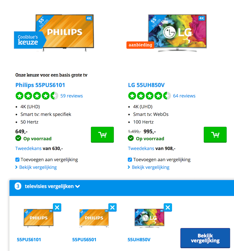
Now, where would you place that checkbox, you might ask? Frankly, if you look around e-commerce websites, you’ll find it pretty much everywhere — sometimes residing on top above headings, sometimes below thumbnails, sometimes in the bottom-right corner next to reviews, and quite often just above the price, where it’s difficult to miss. Admittedly, we couldn’t spot any significant difference; however, one thing was noticeable: The options with a checkbox seemed to consistently make feature comparison slightly more obvious and easy to find than plain text links.
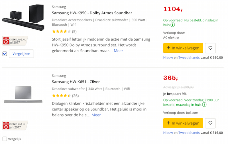
Once the user has selected an item for comparison, it’s important to confirm the selection — a checkbox does a good job of that, but we could also change the wording (for example, from “Add to compare” to “Remove from comparison”) or change the background color (slightly highlighted) or fade in a label or a flag (“Shortlisted”) or a popover. We also have to indicate the change of state for screen readers.
Every selection should be easy to unselect with one tap as well, without resetting the entire selection. Unfortunately, the latter isn't that uncommon, as some websites choose to disable the checkbox to prevent double-selection, effectively making it impossible to remove the product from comparison without prompting a comparison view.
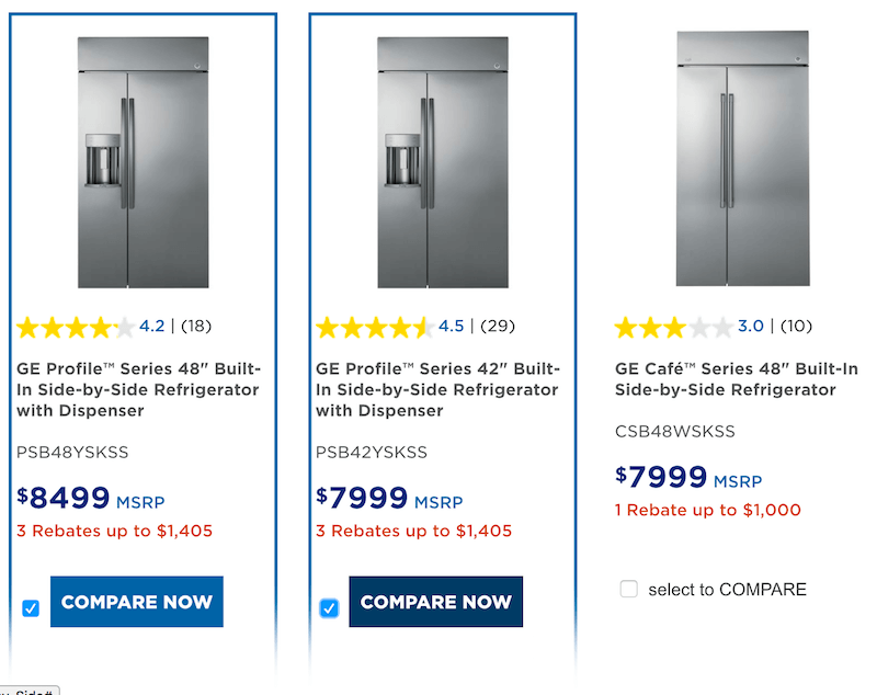
Obviously, we also need to place a “compare” button somewhere, so that customers can easily proceed over to the comparison view. Now, that view wouldn’t make sense if there is no or only one item shortlisted for comparison. So, rather than displaying a disabled, grayed-out “comparison” button when there aren’t enough items to compare, we could display it only if there are at least two items in the list — perhaps inlined next to those “Add to compare” checkboxes or links of all of the candidates that the customer has selected.
Sony, for example, uses the text label "Select to compare" for all products in a category first, and if one item is selected, it changes the checkbox label on that item to "Select two or more to compare." When one more item is added for comparison, the label changes to "Selected," with a "Compare now" link appearing inline on all selected products.
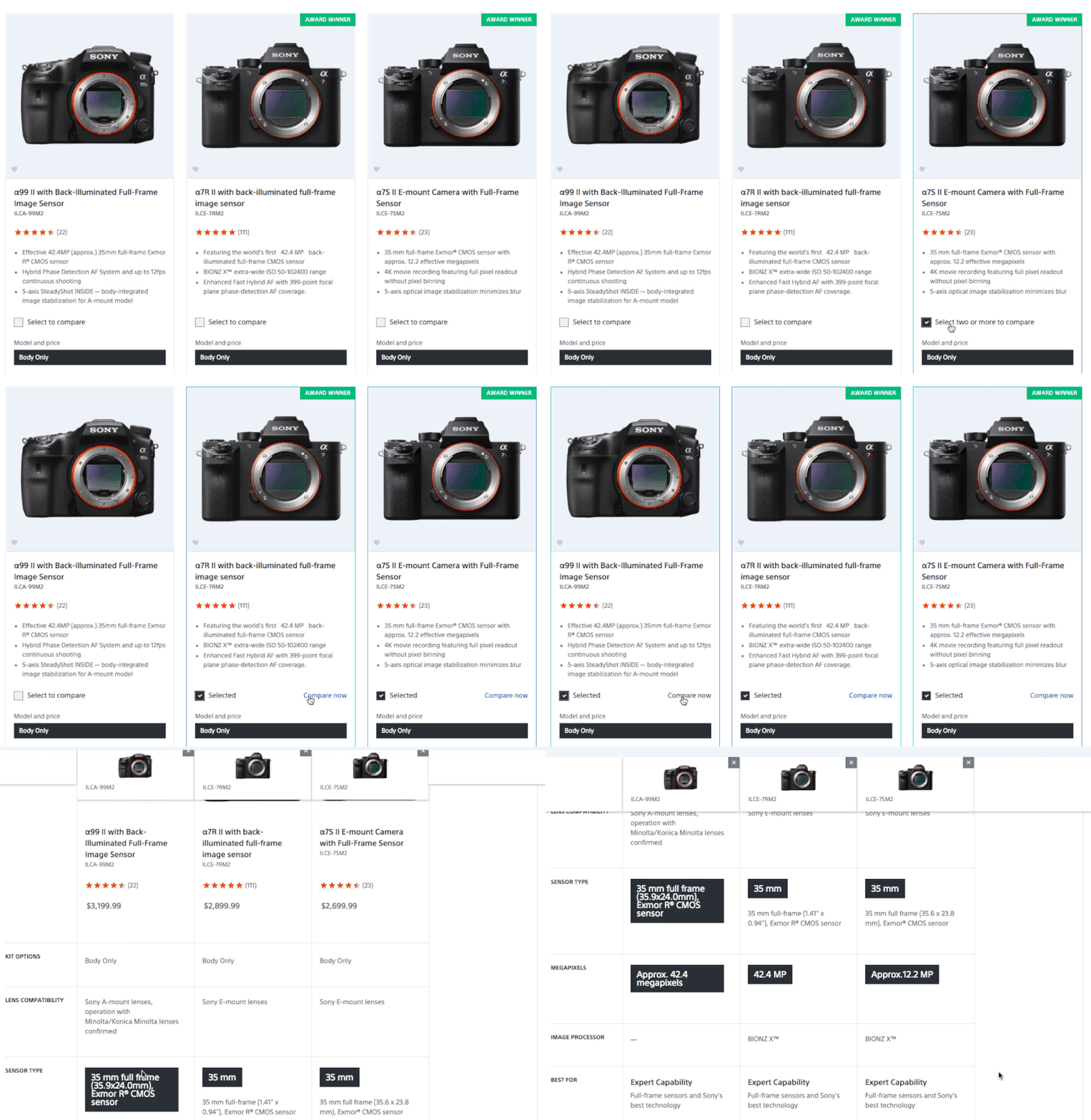
In fact, in practice, that “fancy” comparison button is unlikely to be very fancy, otherwise it would fight for attention with the primary buttons, such as “Add to cart.” Therefore, more often than not, it’s a subtle tertiary button that doesn’t fight for attention but is noticeable, close to the comparison checkboxes. Still, we could gently highlight it for a blink of a second with a subtle transition or animation once a new item has been added for comparison.
Wait a second! You might be thinking: well, if the feature comparison is so important, why not display a confirmation in a lightbox, prompting the customer to choose to go straight to the comparison or to continue browsing on the website? Well, the problem with this option is that it massively interrupts the flow. Rather than keeping the focus on the products, it directs the customer's attention to a confirmation message that has to be responded to with every new added item.
Of course, we don't know if the customer will add two or four or more items for comparison, but having to get rid of the lightbox to continue browsing products seems excessive and just plain unnecessary. With an inlined "comparison" button, we get the best of both options: Should the user want to continue browsing, they would do so seamlessly. Should they want to compare, they can compare easily as well. And the focus always stays on what matters the most: the products.
However, it's not the best we can do. One issue we kept noticing in usability sessions is that as customers explore their options and add items for comparison, eventually they are ready to prompt the comparison view, but often can't find the button to prompt it. In fact, they end up having to refind the products they've selected because that's where "compare now" buttons are located. That's especially difficult in a paginated category with a long list of scattered products.
We can solve this problem by displaying a semi-transparent comparison overlay at the bottom of the page. The overlay could appear when a customer adds the very first item for comparison and could fade away when the selection is cleared. By dedicating a portion of the screen to comparison, we regain just enough space to subtly confirm the user's actions and to inform them about their next steps, without interrupting the flow.
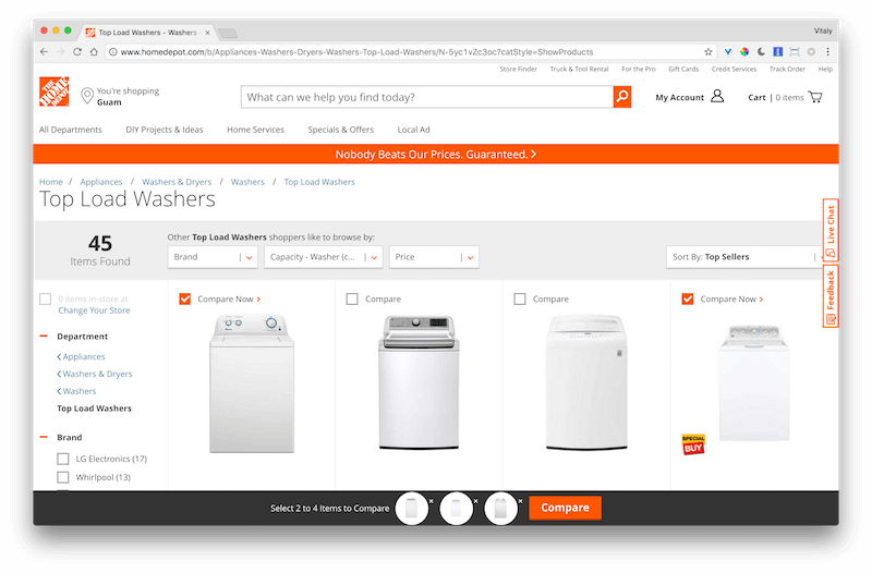
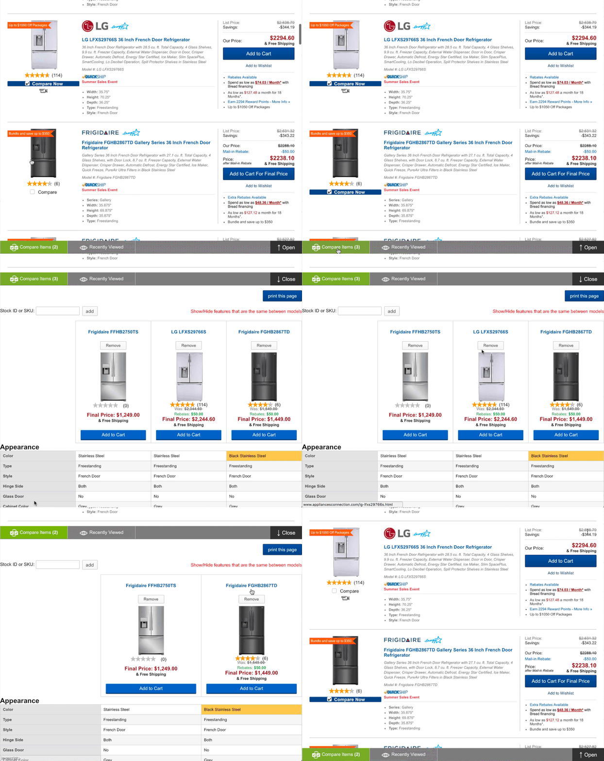
Home Depot uses a 60px tall comparison overlay at the bottom to highlight thumbnails of the selected products. The overlay us used to guide users through the selection — for example, by explaining how many items are required for comparison. Customers don't have to search for the selected items on a category page, but they can unselect options right from the overlay. That's also where an omnipresent "Compare" button resides.
Electrolux displays notifications about selected items in the 75px tall bottom bar. It might be a bit too subtle to understand quickly. Rather than changing the text for “showing the differences” or “displaying all attributes,” it uses a pseudo-checkbox that users can toggle on and off.
Appliances Connection uses a slightly less subtle 40px tall bar at the bottom, with a clear link indicating comparison and access to recently viewed items. The comparison view is sliding from top to bottom, and users can switch to recently viewed items as well.
The design of showing and hiding similar features is slightly off, tucked in the upper-right corner. Also, customers can add "Stock ID or SKU" for comparison — but not many customers will know what that means.
Abcam implements the bottom bar slightly differently, as an accordion with items lined up in a vertical list. Unfortunately, once the user is in the comparison mode, it’s impossible to remove items or clear the selection.
Delta displays “Add to compare” only on hover, along with other important details, such as price. Unlike in previous examples, “Add to comparison” prompts an overlay at the top of the screen, where the customer can add more items for comparison.
In fact, overlay seems to be a quite common solution, and in fact, it can be helpful in quite many ways. For instance, if only one item is shortlisted, we could use the space to suggest similar comparable items, or even items that other customers often check out as well (“Suggest similar or better options”).
We could also group similar items and complement a comparison list with a shortlisted selection of products. What's the difference? Instead of prompting the customer to pick one type of products, then select specific items of that type and compare them, we could enable customers to add products of different kinds, group them in the background and keep them accessible for any time later — not necessarily only for comparison. Think of it as a sort of extended list of favorites, or wishlist, with each selection getting a label and perhaps even a shareable URL.
Digital Photography Review does just that. The user can "mark" any item for shortlist and then compare items in a particular category later. That's a good example of resilient, forgiving design: Even if a customer selects batteries and laptops for comparison, they would never appear in a side-by-side comparison because they would be grouped separately. Each item can be removed individually, or the customer can remove an entire group, too.
While slightly more complex to implement, that’s pretty much an absolute solutions that seems to be working fairly well. Alternatively, just having a “comparison” bar docked at the bottom of the page is surely a reliable solution as well.
How Many Items Can Be Added For Comparison?
While some interfaces are very restrictive, allowing exactly 2 items to be compared at a time, it's more common to allow up to 4–5 items for comparison — usually because of space limitations in the comparison view. Admittedly, the comparison becomes very complex with more than 5 items in the list, with columns getting hidden and "showing differences" getting less useful. But what if the customer chooses to compare more items after all?
Well, not many customers are likely to do that, except for one specific exception. Some customers tend to misuse the shopping cart and feature comparison as wishlist, "saving items for later" as reference. If they choose to save a large number of items, we could of course let them navigate through products using a stepper, but perhaps by default we could reshape the table and extract highlights, advantages and disadvantages instead. That might be slightly less annoying than being disallowed to add an item for comparison altogether.
The Fleeting Life Of Side-By-Side Comparison
Eventually, after tapping on those checkboxes or links, the customer hopefully will choose to see a comparison of the shortlisted options side by side. This comparison is usually a short-lived species: It's used as long as it serves its purpose, potentially getting shared with friends and colleagues, only to disappear into oblivion a short while after. Now, the comparison could appear in different ways:
- on the same page, as a full-page overlay;
- on a separate new page, integrated in the website's layout;
- on a separate new page, standalone;
- in a separate tab or window opened in addition to the tab that the user is currently on.
What’s best? In most situations, the second option might be difficult to pull off meaningfully, just because of the amount of space that a feature comparison needs to enable quick comparison of attributes. Both the first and the third options are usually easier to implement, but the first one might appear slightly faster because no navigation between pages is involved. However, it will also require proper implementation of the URL change based on the state of the comparison. With a standalone page, this problem would be slightly easier to solve. As an alternative, you could suggest to “save the comparison” and generate a link that can be shared.
The fourth option depends on your stake in the never-ending discussion of whether links should be opened in new tabs by default. That's probably a matter of preference, but usually we must have a very good reason to open a window in addition to the existing one. While it might make sense for PDF files or any pages that might cause a loss of inputted data, it might not be critical enough for a comparison view.
Ideally, you could provide both options — the link could lead directly to the comparison view in the same tab, and a Wikipedia-like external-link icon could be used to indicate a view to be opened in a separate tab.
A Slightly Different Feature Comparison, Or Asking The Right Question In A Right Way
In the end, we just want to help users find relevant comparable attributes quickly. What better way to find them than by first asking the user to select the attributes that matter most to them?
Match Score Comparison
For instance, we could extract some of those attributes automatically by looking into the qualities that appear in reviews for selected products, and suggest them in a small panel above the side-by-side comparison — pretty much like tags that the user can confirm or add.
Once the relevant attributes are defined, we could calculate the match score for all selected products (based on reviews and specifications), and if their average is way below expectations, suggest alternative products with a higher score instead.
The option with the highest score could be suggested as the “recommended purchase” or as the winner, with the percentage of customers who have ended up buying that product in the category and maybe even scores from external professional reviews. There, we could show options to purchase the item or pick it up in a store nearby more prominently. To round up, we could even complement the comparison with a lovely “battle” loading indicator to convey that we are “working hard” to find the best option.
Top Ten Reviews manages to display 10 products in a side-by-side comparison. Each product has a rating broken down by specific groups of features, but also an overall score. The winner is highlighted with a "Gold Award," and on narrow screens its column is fixed, while other products are compared against it. That's a slightly more opinionated design, but perhaps it's also slightly easier to detect the winning candidate from the user's perspective.
Matrix Comparison View
When looking into comparisons, we naturally think about feature comparison tables, but perhaps a filtered view or a visual view would be a better option for comparisons — especially for complex ones. Product Chart, for example, uses a matrix presentation of products, with price mapped against screen size for monitors. Features and attributes can be adjusted as filters on the left, and the fewer the candidates, the larger the thumbnails. That's not an option for every website, but it's interesting to see a comparison outside the scope of a tabular layout.
Integrating Comparison Seamlessly
But what if we drop the idea of having a dedicated feature comparison altogether — and use a slightly more integrated approach instead? Customer's experiences reflected in reviews are often more valuable than product specs, so what if we let customers explore suggestions based on keywords extracted from reviews?
In his article on UX Breakdown of Customer Reviews, Raviteja Govindaraju suggested a couple of options of how it could look.
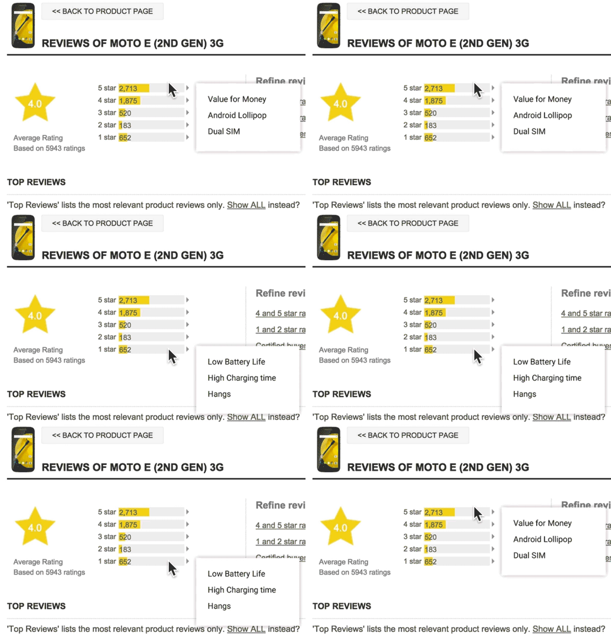
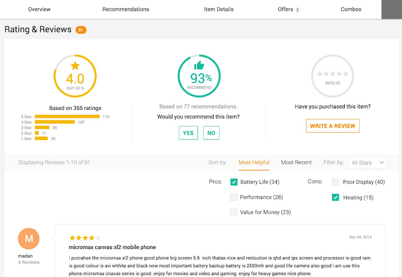
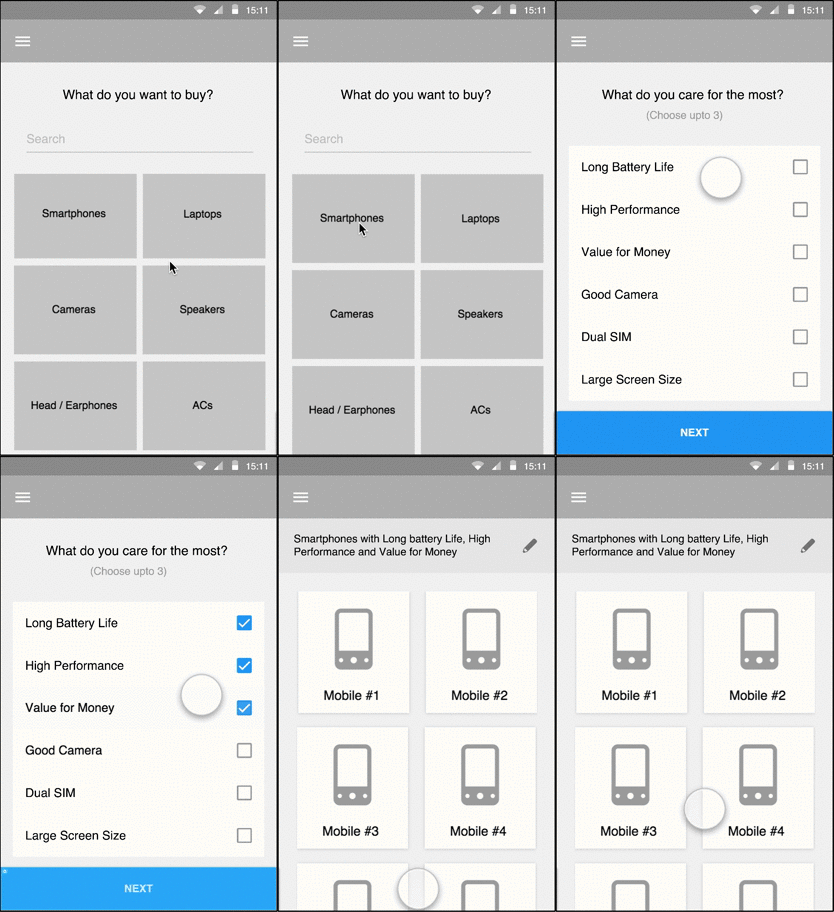
A product page could display extracted review keywords upon tap or click. On a category page, a product comparison would extend “common” filters with sorting by these keywords. Finally, instead of a feature comparison table, the customer could select the features they care about most and the overview would provide a list of “best” options for them.
In the same way, if a customer is looking for a set of products rather than just one standalone product, we could provide “recommended” options in a contextual preview. Based on measurements of an apartment, for example, we could suggest electronics and furniture that might work well. The feature might be particularly useful for the fashion industry as well.
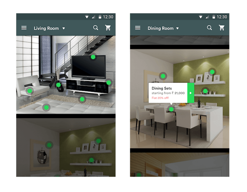
These solutions basically provide a slightly extended filtering option, but it shows how a feature comparison can go beyond a “traditional” side-by-side comparison. The better and smarter the filtering options, the less critical a side-by-side feature comparison could be.
Accessible Markup
While many of us would consider the table element to mark up a comparison table, in accessibility terms, sometimes that might not be the best idea. The comparison could be just an unordered list (li) with headings — for instance, an h2 for the title of each product and h3 subheadings for the features of each product. Screen readers provide shortcuts for navigating between list items and headings, making it easier to jump back and forth to compare.
That way, we could basically create cards, collapsed or not by default, and then progressively enhance the list towards a tabular view for easier visual scanning. Highlghting differences would then mean just rearranging cards based on customer's preferences. Still, with labels and headings, a table might be a good option as well.
As Léonie Watson, an accessibility engineer and W3C Web Platform WG co-chair, put it, "casting your eyes between two data sources is relatively easy to do, but a screen reader doesn't have any really good way to emulate that behavior". According to Léonie, "if there is a single comparison table (where the data to be compared is in different columns/rows), then the most important thing is that the table has proper markup. Without properly marked up row/column headers, it is hard to understand the context for the data in an individual table cell.
Screen readers have keys for moving up/down through columns, and left/right through rows. When a screen reader moves focus left/right into a table cell, the column header is automatically announced before the content of the cell. Similarly, when screen reader focus moves up/down into a cell, the row header is announced before the cell content.
If the data sources for comparison are in different places/tables, then things get a bit harder. You have to remember the data from one source long enough to be able to navigate to the data source for comparison, and frankly that's a cognitive burden most people will struggle with.
A more general purpose solution is to offer customers choices of how the data is presented — for example, to choose to view all data in a single table, or to select certain objects for comparison."
Feature Comparison Design Checklist
Phew! That was quite a journey. Below you'll find all of the design considerations one has to keep in mind when designing a feature comparison table. You thought it was easy? Think again.
Now, below is a list of features that a good comparison is likely to have. We covered most of them in the beginning of this article, but they are worth having in one place after all:
- Every column contains the price (or price graph), a link to the standalone product page, ratings, the number of reviews, a thumbnail, the product's model name, and a price-matching tooltip.
- For every product, useful reviews, with major advantages and disadvantages as keywords, are extracted and highlighted above the comparison.
- Attributes are consistent and have comparable meta data; they are grouped, and some of them are collapsed by default.
- If there isn't enough meaningful meta data to compare against, explain that to the customer and suggest third-party reviews instead. Irrelevant tables are frustrating.
- The customer can switch to seeing only differences, only similarities or all attributes.
- The customer can reset their selection and return back to the products (perhaps with breadcrumb navigation at the top).
- The customer can add new products to the comparison (for example, if they are unsatisfied with the results of a comparison).
- Columns and rows are highlighted upon hover or tap.
- The customer can rearrange columns by dragging or moving them left and right.
- Every action provides confirmation or feedback.
- Customers can generate a shareable link for comparison (for example, "Save comparison as…").
- If the user spends too much time in the comparison view, a window with information for hotline support or chat is displayed.
- Items are stored persistently after page refresh or abandonment.
- The feature comparison is responsive, bringing focus to the differences and the advantages and disadvantages of products.
Questions and Considerations
And here are the questions the team will have to consider when designing and implementing a comparison table.
- How do you indicate that comparison is possible?
- What happens when the first item is added for comparison?
- Have you disabled the option to compare when only one item has been selected?
- Once an item has been selected, do you change the link or highlight the selected product, or display a comparison bar, or display a lightbox?
- How do users unselect a selected option?
- If only one item has been added for comparison, should we suggest products to compare or enable users to "find similar products"?
- When an item has been selected, do you provide visual feedback to reaffirm and reassure users about their choice. (For example, "Good choice! That's one of the top-10 rated cameras in the category!")
- How many items may a customer add for comparison (usually three to five)? What happens to the comparison if no or one item has been selected. What about more than five items?
- As items are being compared, do we use animation or transitions to indicate comparison (such as a battle animation)?
- Do we display the price (or price development), a link to the individual product page, ratings, reviews, a thumbnail, the product's model name, and price-matching tooltip?
- Can users switch to see only differences, only similarities or all attributes?
- Do we group and collapse attributes by default?
- Do we track whether attributes are consistent and have comparable meta data? Otherwise, seeing differences would be meaningless.
- Do we highlight columns and rows upon hover or tap?
- Can the user move columns left and right?
- What if the user compares items in unrelated categories (for example, a laptop against batteries)?
- How do we allow users to add more items for comparison?
- How do we allow users to remove items from comparison?
- Should we dynamically track how many items are in the comparison list, and prompt a message if there are none ("Oh, nothing to compare! Here are some suggestions.") or one ("Boo-yah! You've got a winner!") or two ("So, you have just two candidates now.")?
- Should we ask customers to choose what they care about most?
- Do we suggest a "winner" among the products selected for comparison, perhaps based on the user's most relevant attributes?
- Does every action have visual and/or aural feedback to indicate change?
- Have we provided a shareable link for comparison (for example, "Save comparison as…")?
- If the user spends too much time in the comparison view, should we prompt a window with information for hotline support or chat?
- Are compared items stored persistently after the page is refreshed or abandoned?
- Do we include a "Notify about price drop" option for email subscription?
- Is the feature comparison accessible, coded as an unordered list?
- How do we make the feature comparison behave responsively?
Further Resources
- "Comparison Tables," Nielsen Norman Group,
- Feature comparison implementations in HD on Vimeo.
Stay Tuned!
This article is a part of the new ongoing series about design patterns here, on your truly Smashing Magazine. We'll be publishing an article in this series every two–three weeks. Don't miss the next one, on builders and configurators. Ah, interested in a (printed) book covering all of the patterns, including the one above? Let us know in the comments, too — perhaps we can look into combining all of these patterns into one single book and publish it on Smashing Magazine. Keep rockin'!
Huge thanks to Heydon Pickering, Léonie Watson, Simon Minter, Penny Kirby, Marta Moskwa, Sumit Paul for providing feedback for this article before publication.
 (al, yk, il)


