Earlier this year, support for CSS grid layout landed in most major desktop browsers. Naturally, the specification is one of the hot topics at meet-ups and conferences. After having some conversations about grid and progressive enhancement, I believe that there’s a good amount of uncertainty about using it. I heard some quite interesting questions and statements, which I want to address in this post.
Statements And Questions I’ve Heard In The Last Few Weeks
- “When can I start using CSS grid layout?”
- “Too bad that it’ll take some more years before we can use grid in production.”
- “Do I need Modernizr in order to make websites with CSS grid layout?”
- “If I wanted to use grid today, I’d have to build two to three versions of my website.”
- “Progressive enhancement sounds great in theory, but I don’t think it’s possible to implement in real projects.”
- “How much does progressive enhancement cost?”
These are all good questions, and not all of them are easy to answer, but I’m happy to share my approach. The CSS grid layout module is one of the most exciting developments since responsive design. We should try to get the best out of it as soon as possible, if it makes sense for us and our projects.
Demo: Progressively Enhanced Layout
Before going into detail and expounding my thoughts on the questions and statements above, I want to present a little demo I’ve made.
Disclaimer: It would be best to open the demo on a device with a large screen. You won’t see anything of significance on a smartphone.
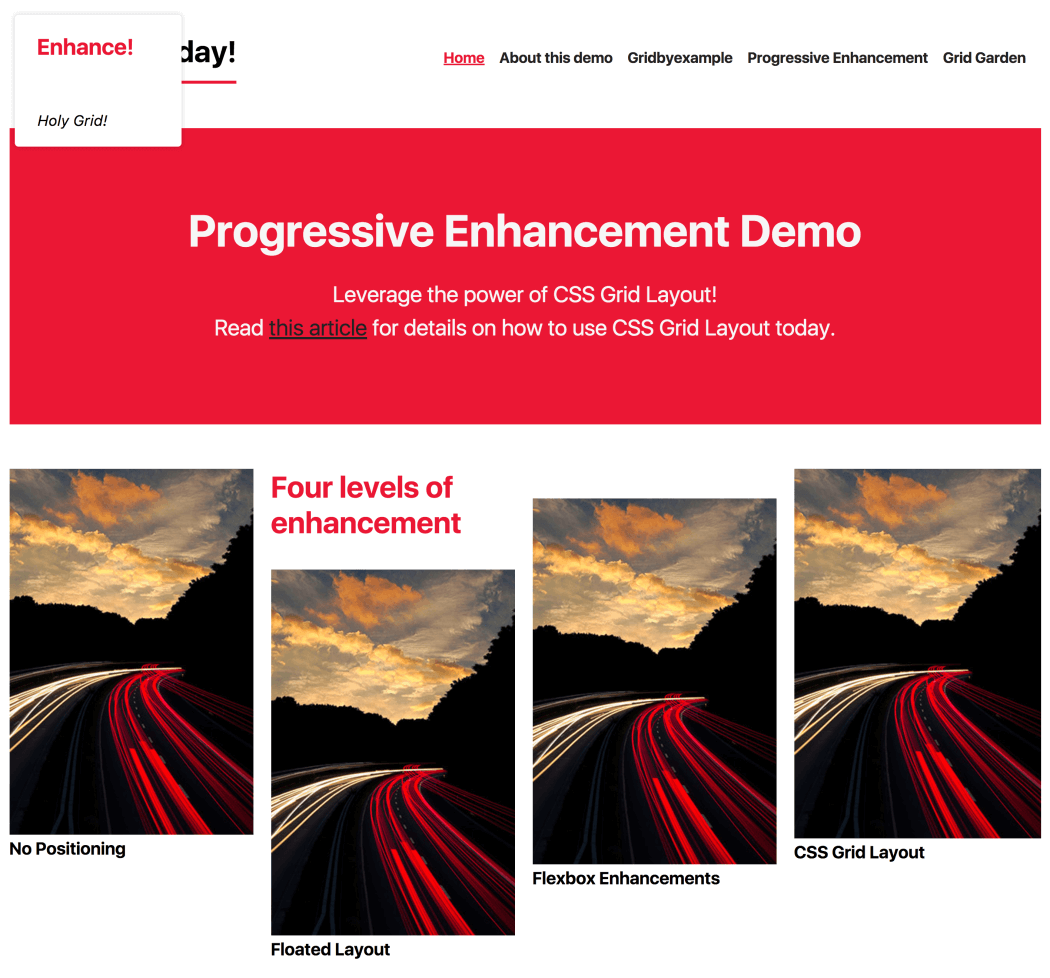
When you open the demo, you’ll find yourself on the home page of a website with a very basic layout. You can adjust the slider in the top left to enhance the experience. The layout switches from being very basic to being a float-based layout to being a flexbox layout and, finally, to being one that uses grid.
It’s not the most beautiful or complex design, but it’s good enough to demonstrate which shapes a website can take based on a browser’s capabilities.
This demo page is built with CSS grid layout and doesn’t use any prefixed properties or polyfills. It’s accessible and usable for users in Internet Explorer (IE) 8, Opera Mini in Extreme mode, UC Browser and, of course, the most popular modern browsers. You can perfectly use CSS grid layout today if you don’t expect exactly the same appearance in every single browser, which isn’t possible to achieve nowadays anyway. I’m well aware that this decision isn’t always up to us developers, but I believe that our clients are willing to accept those differences if they understand the benefits (future-proof design, better accessibility and better performance). On top of that, I believe that our clients and users have — thanks to responsive design — already learned that websites don’t look the same in every device and browser.
In the following sections, I’m going to show you how I built parts of the demo and why some things just work out of the box.
Quick side note: I had to add a few lines of JavaScript and CSS (an HTML5 shim) in order to make the page work in IE 8. I couldn’t resist, because IE 8+ just sounds more impressive than IE 9+.
CSS Grid Layout And Progressive Enhancement
Let’s take a deeper look at how I built the “four levels of enhancement” component in the center of the page.
HTML
I started off by putting all items into a section in a logical order. The first item in the section is the heading, followed by four subsections. Assuming that they represent separate blog posts, I wrapped each of them in an article tag. Each article consists of a heading (h3) and a linked image. I used the picture element here because I want to serve users with a different image if the viewport is wide enough. Here, we already have the first example of good ol’ progressive enhancement in action. If the browser doesn’t understand picture and source, it will still show the img, which is also a child of the picture element.
<section>
  <h2>Four levels of enhancement</h2>
  <article><h3>No Positioning</h3><a href="#">  <picture>    <source srcset="320_480.jpg" media="(min-width: 600px)">    <img src="480_320.jpg" alt="image description">  </picture></a>
  </article>
</section>
Float Enhancements
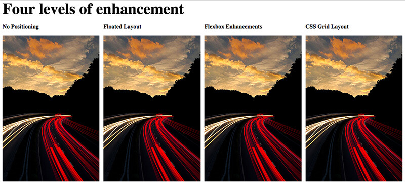
On larger screens, this component works best if all items are laid out next to each other. In order to achieve that for browsers that don’t understand flexbox or grid, I float them, give them a size and some margin, and clear the floating after the last floated item.
article {
  float: left;
  width: 24.25%;
}

article:not(:last-child) {
  margin-right: 1%;
}

section:after {
  clear: both;
  content: "";
  display: table;
}
Flexbox Enhancements
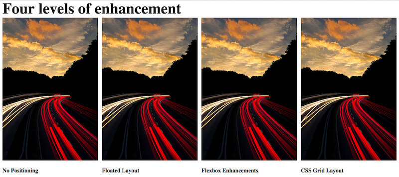
In this example, I actually don’t need to enhance the general layout of the component with flexbox, because floating already does what I need. In the design, the headings are below the images, which is something that’s achievable with flexbox.
article {
  display: flex;
  flex-direction: column;
}

h3 {
  order: 1;
}
We have to be very cautious when reordering items with flexbox. We should use it only for visual changes, and make sure that reordering doesn’t change the user experience for keyboard or screen-reader users for the worse.
Grid Enhancements
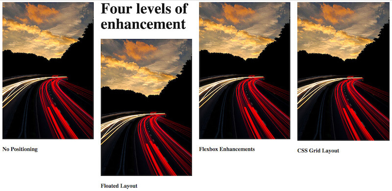
Everything looks pretty good now, but the heading still needs some positioning. There are many ways to position the heading right above the second item. The easiest and most flexible way I found is to use CSS grid layout.
First, I drew a four-column grid, with a 20-pixel gutter on the parent container.
section {
  display: grid;
  grid-template-columns: repeat(4, 1fr);
  grid-gap: 20px;
}
Because all articles still have a width of 24.25%, I reset this property for browsers that understand grid.
@supports(display: grid) {
  article {width: auto;
  }
}
Then, I put the heading in the first row and second column.
h2 {
  grid-row: 1;
  grid-column: 2;
}
To work against grid’s auto-placement, I also put the second article explicitly in the second row and second column (below the heading).
article:nth-of-type(2) {
  grid-column: 2;
  grid-row: 2 / span 2;
}
Finally, in order for the gap between the heading and the second item to be removed, all the other items have to span two rows.
article {
  grid-row: span 2;
}
That’s it. You can see the final layout on Codepen.
If I extract the extra lines that I need to make this thing work in IE 9+, then we’ll get a total of eight lines (three of which are actually for the clearfix and are reusable). Compare that to the overhead you get when you use prefixes.
article {
  float: left;
  width: 24.25%;
}

@supports(display: grid) {
  article {width: auto;
  }
}

section:after {
  clear: both;
  content: "";
  display: table;
}
I know that that’s just a simple example and not a complete project, and I know that a website has way more complex components. However, imagine how much more time it would take to build a layout that would look pixel-perfectly the same across all the various browsers.
You Don’t Have To Overwrite Everything
In the preceding example, width was the only property that had to be reset. One of the great things about grid (and flexbox, too, by the way) is that certain properties lose their power if they’re applied to a flex or grid item. float, for example, has no effect if the element it’s applied to is within a grid container. That’s the same for some other properties:
display: inline-blockdisplay: table-cellvertical-aligncolumn-*properties
Check “Grid ‘Fallbacks’ and Overrides” by amazing Rachel Andrew for more details.
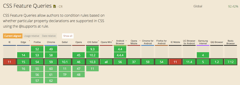
If you do have to overwrite properties, use feature queries. In most cases, you’ll only need them to overwrite properties such as width or margin. Support for feature queries is really good, and the best part is that they’re supported by every browser that understands grid as well. You don’t need Modernizr for that.
Also, you don’t have to put all grid properties in a feature query, because older browsers will simply ignore properties and values they don’t understand.
The only time when it got a little tricky for me while working on the demo was when there was a flex or grid container with a clearfix applied to it. Pseudo-elements with content become flex or grid items as well. It may or may not affect you; just be aware of it. As an alternative, you can clear the parent with overflow: hidden, if that works for you.
Measuring The Costs Of Progressive Enhancement
Browsers already do a lot of progressive enhancement for us. I already mentioned the picture element, which falls back to the img element. Another example is the email input field, which falls back to a simple text input field if the browser doesn’t understand it. Another example is the range slider that I’m using in the demo. In most browsers, it’s rendered as an adjustable slider. The input type range isn’t supported in IE 9, for example, but it’s still usable because it falls back to a simple input field. The user has to enter the correct values manually, which isn’t as convenient, but it works.
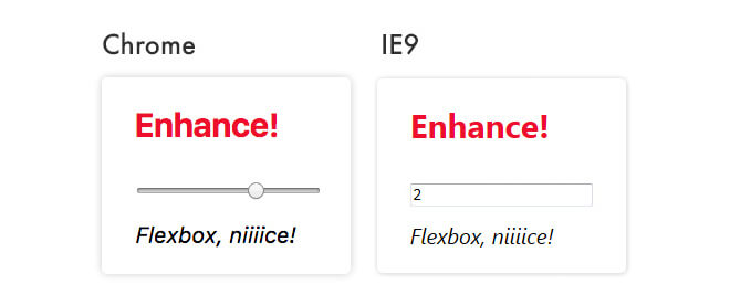
range input type is rendered in Chrome and IE 9Some Things Are Taken Care of by the Browser, Others by Us
While preparing the demo, I came to the realization that it’s incredibly helpful to really understand CSS, instead of just throwing properties at the browser and hoping for the best. The better you understand how floating, flexbox and grid work and the more you know about browsers, the easier it’ll be for you to progressively enhance.
Becoming someone who understands CSS, rather than someone who just uses CSS, will give you a huge advantage in your work.
Also, if progressive enhancement is already deeply integrated into your process of making websites, then it would be difficult to say how much extra it costs, because, well, that’s just how you make websites. Aaron Gustafson shares a few stories of some projects he has worked on in his post “The True Cost of Progressive Enhancement” and on the Relative Paths podcast. I highly recommend that you listen to and read about his experiences.
Resilient Web Development
Your website’s only as strong as the weakest device you’ve tested it on.
Progressive enhancement might involve some work in the beginning, but it can save you time and money in the long run. We don’t know which devices, operating systems or browsers our users will be using next to access our websites. If we provide an accessible and usable experience for less capable browsers, then we’re building products that are resilient and better prepared for new and unexpected developments.
Building Production-Ready CSS Grid Layouts Today
CSS Grid is the new layout standard for the web. Let's start using CSS Grids and Flexbox in production websites today! Read a related article →
Summary
I have the feeling that some of us forget what our job is all about and maybe even forget that what we’re actually doing is “just” a job. We’re not rock stars, ninjas, artisans or gurus, and what we do is ultimately about putting content online for people to consume as easily as possible.
Content is the reason we create websites.
That sounds boring, I know, but it doesn’t have to be. We can use the hottest cutting-edge technologies and fancy techniques, as long as we don’t forget who we are making websites for: users. Our users aren’t all the same, nor do they use the same device, OS, browser, Internet provider or input device. By providing a basic experience to begin with, we can get the best out of the modern web without compromising accessibility.
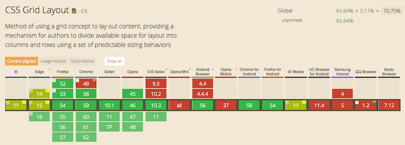
Grid, for example, is available in almost every major browser, and we shouldn’t wait more years still until coverage is 100% in order to use it in production, because it’ll never be there. That’s just not how the web works.
Grid is awesome. Use it now!
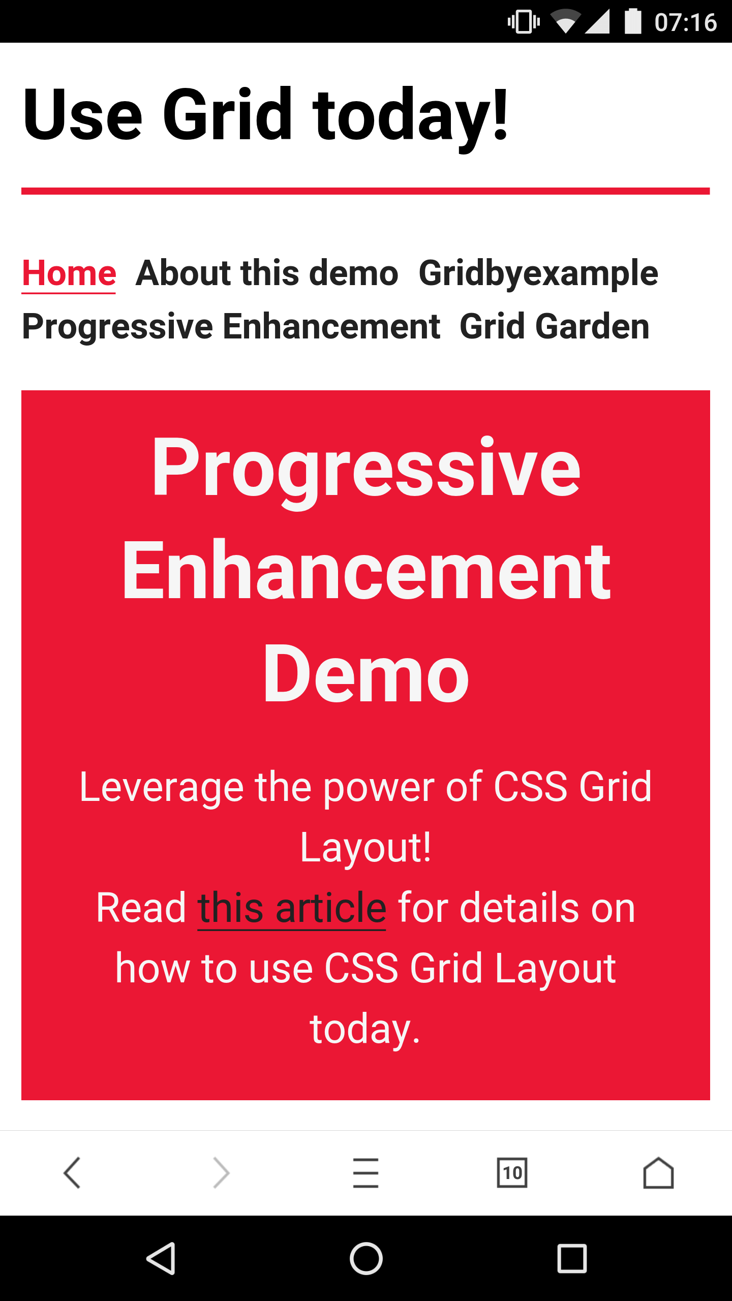
Screenshots
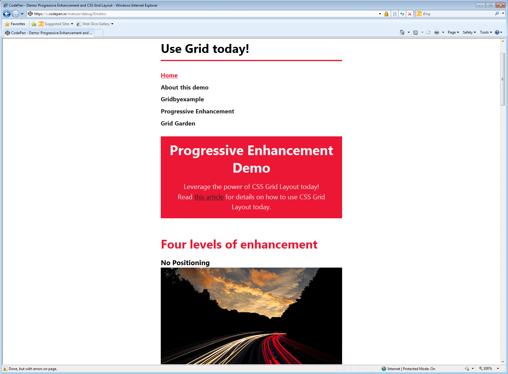
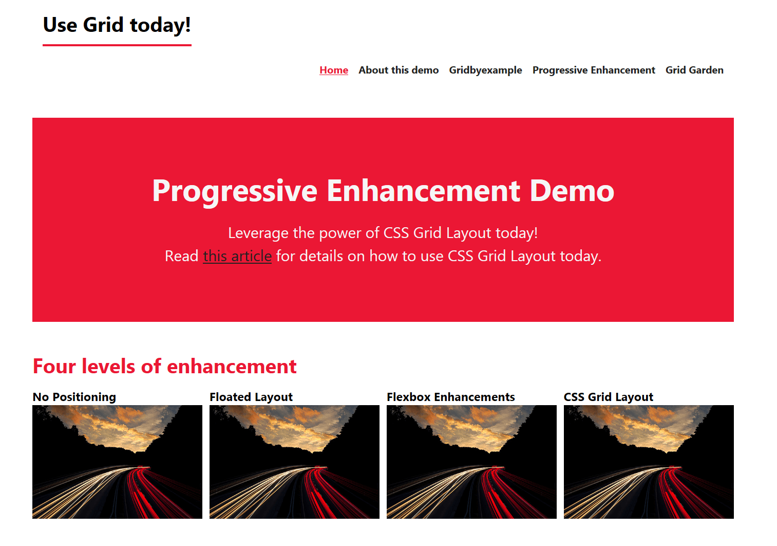
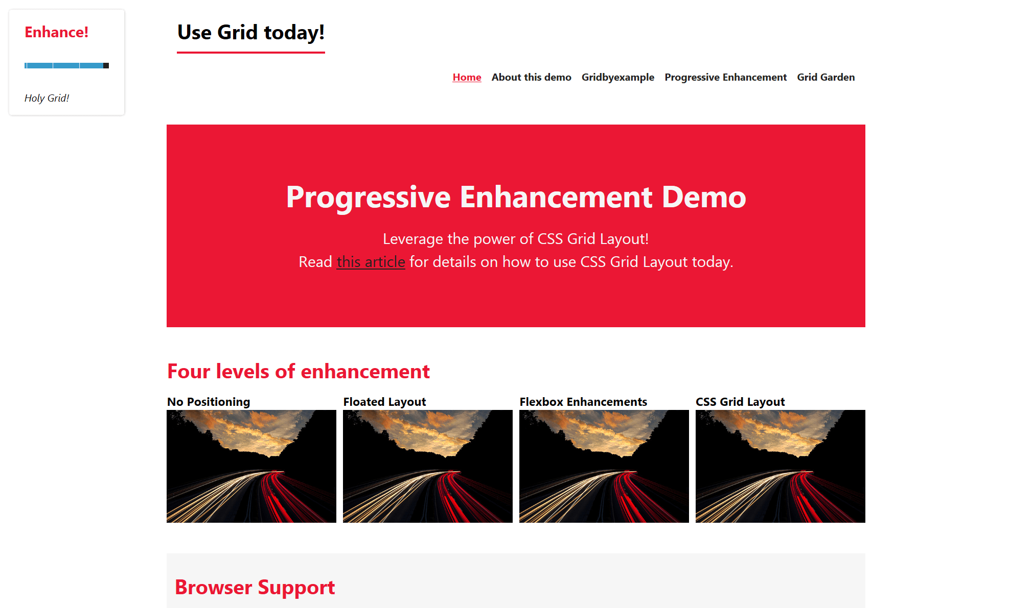
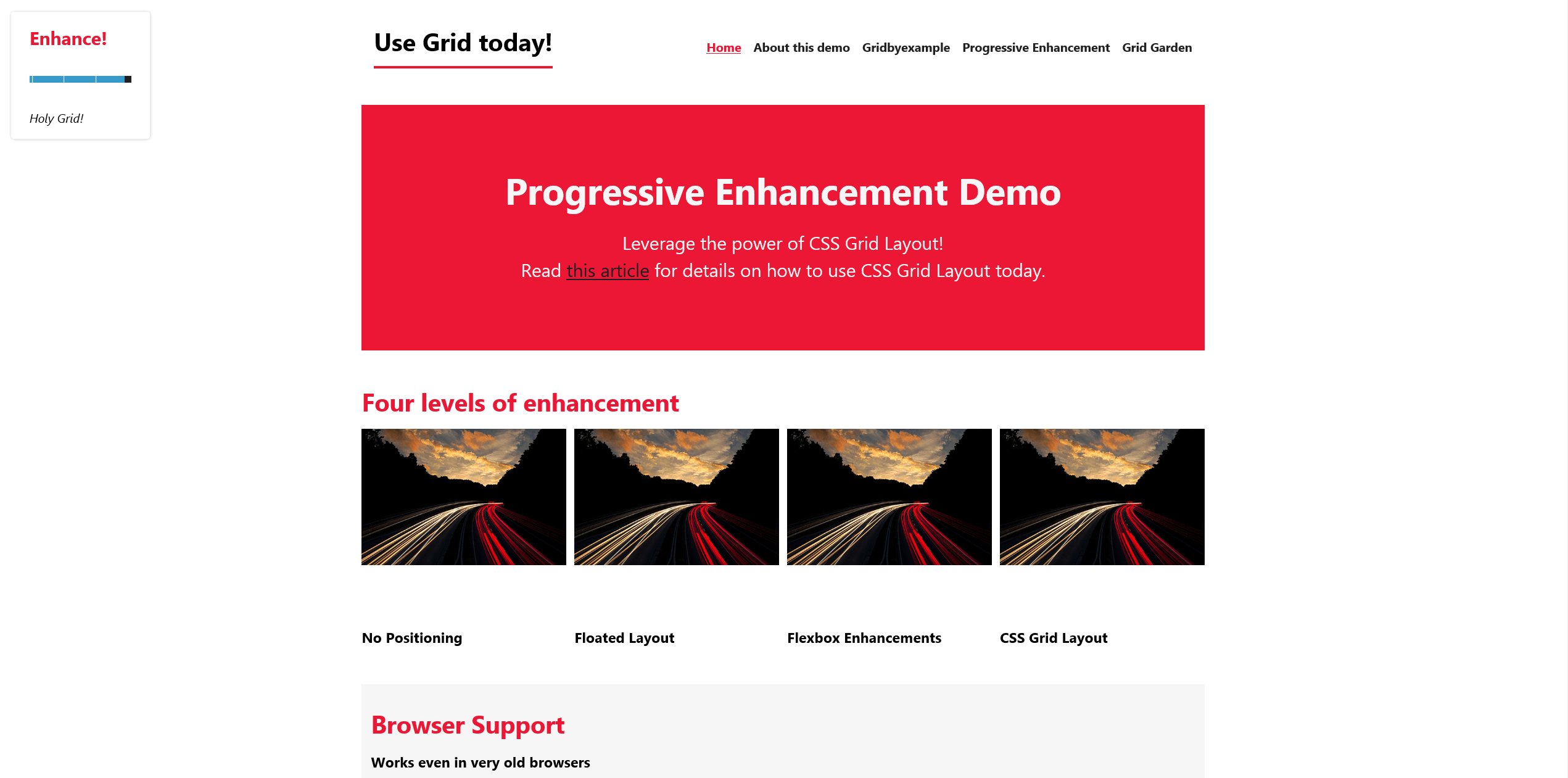
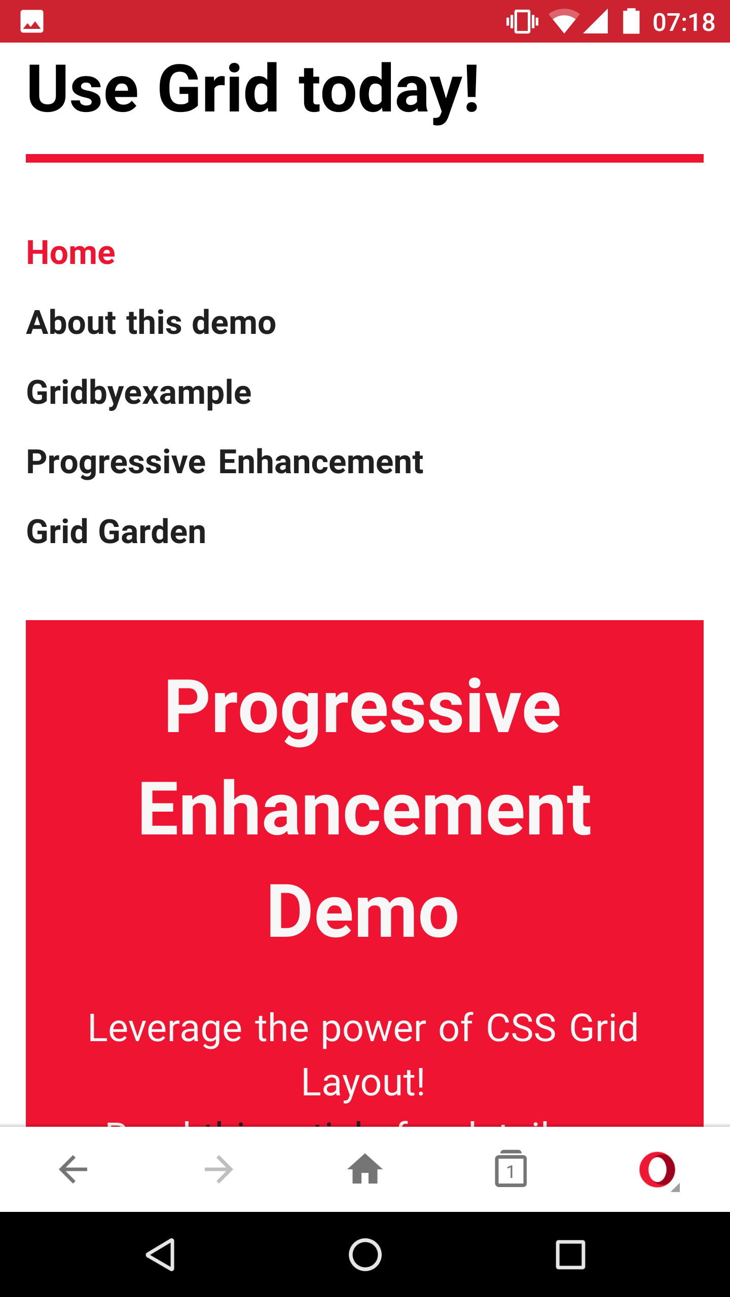
Here are some screenshots of the demo page in various browsers:
Resources and Further Reading
- “Crippling the Web,” Tim Kadlec
- “Browser Support for Evergreen Websites,” Rachel Andrew
- The Experimental Layout Lab of Jen Simmons (demos), Jen Simmons
- “World Wide Web, Not Wealthy Western Web, Part 1, Bruce Lawson
- “Resilience” (video), Jeremy Keith, View Source conference 2016
Thanks to my mentor Aaron Gustafson for helping me with this article, to Eva Lettner for proofreading and to Rachel Andrew for her countless posts, demos and talks.
 (al)
(al)


