Creating a clock in Sketch might not sound exciting at first, but we’ll discover how easy it is to recreate real-world objects in a very accurate way. You’ll learn how to apply multiple layers of borders and shadows, you’ll take a deeper look at gradients and you will see how objects can be rotated and duplicated in special ways. To help you along the way you can also download the Sketch editable file (139 KB).
This is a rather advanced tutorial, so if you are not that savvy with Sketch yet and need some help, I would recommend to first read “Design a Responsive Music Player in Sketch” (Part One | Part Two) that cover a few key aspects in detail when working with Sketch. You can also have a look at my personal project sketchtips.info where I regularly provide tips and tricks about Sketch.
Further Reading on SmashingMag: Link
- Using Sketch For Responsive Web Design
- Sketch Vs. Figma: The Showdown
- Designing With Real Data In Sketch Using The Craft Plugin
- Sketch With Material Design
The first step is to create a new document, named “clock.” Now, set up a new artboard with the same name, 600 pixels in both dimensions and positioned “0” (X) and “0” (Y). For the background color, choose a toned-down blue; I picked the one from the Global Colors in the color dialog (#4A90E2). Center the artboard to the canvas with Cmd + 3, and let’s get started.
Shadows and Borders
The base of the clock is a simple white circle with a diameter of “480px.” Drag it to this size after you have pressed O on the keyboard. Align it to the center of the artboard, and name it “Face.” For the bezel, add a first Inside border with a Thickness of “16.” With just a single solid color, it would look quite dull; to give it a metallic appearance, we will add an angular gradient instead (Fig. 2). After you have picked this fill type for the border in the color dialog (last icon), click on the first color stop on the left of this dialog. Move it a bit to the right with the arrow key (press it about four times). Jump to the other color stop with Tab, and use the arrow key again to slightly move its position, but this time to the left (about six times). Change the color to “#BFBEAC”; I’ve mixed in a small amount of yellow to give it a more natural look, which also applies to some of the other light colors in the gradient. Now go back to the first stop again and change this one to a color of “#484848”.
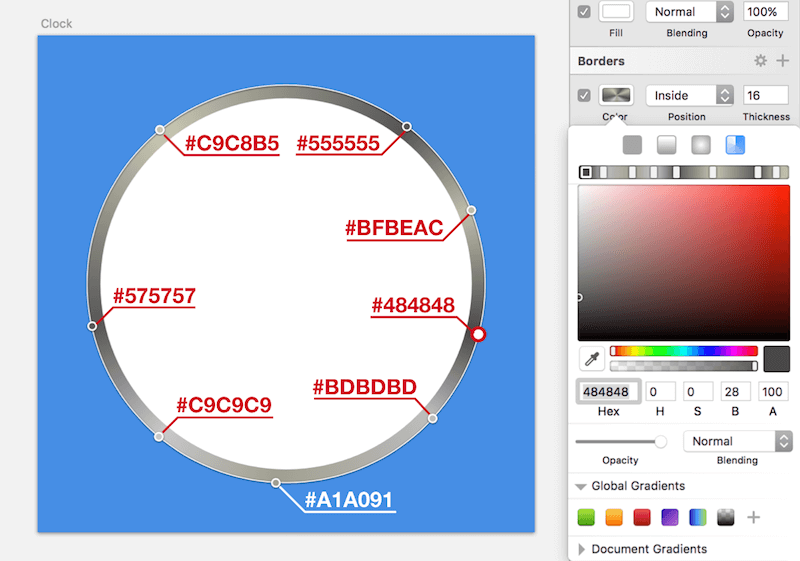
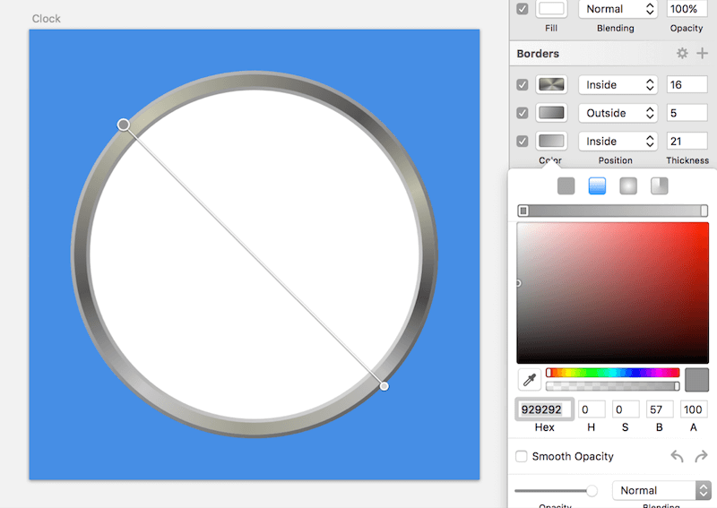
After that add six more color stops with a double-click each, their colors being (from left to right): “#BDBDBD”, “#A1A091”, “#C9C9C9”, “#575757”, “#C9C8B5”, “#555555”. For the positions, please refer to the Fig. 2. It looks way better now, but it is still not the result I had in mind. I also want the frame to have a 3D feeling, which is achieved with two additional borders: one below (add it with a click on the “+” button), with an Inside position and a thickness of “21.” Because it is placed below, it will be covered partly, but due to its increased size, it can still be seen a little. Keep this in mind when you stack borders.
Assign the second border a linear gradient (the second icon in the color dialog), going from the top-left of the clock face to the bottom-right. For the start color at the top, choose “#929292”; for the one at the bottom, “#D6D6D6” (Fig. 3). This alone gives the clock much more depth, but another border should give us the final look. This time, add one with an Outside border, stacked between the other two and with a thickness of 5 pixels. This one also needs a linear gradient in the same direction, but from light to dark, with a color of “#BDBDBD” at the beginning and “#676767” at the end.
Now that we have taken care of the frame itself, we also want it to look slightly raised from the clock face. This is accomplished with a light Inner Shadow. Because the borders already cover a certain part of the clock, the shadow needs to be quite big so that it can be seen. To counteract this, increase the Spread of the shadow to a relatively large value of “26,” which will pull the shadow in. Setting the Blur to “10” now gives us a nice centered shadow; however, that doesn’t respect the lightning of the scene. The light is supposed to come from the top-left, so we need to correct both the X and Y positions to “3.” To echo the theme of the artboard’s background, I have chosen a darker shade of the blue, with “#162A40” at “23%” alpha. Save this color to the Document Colors for later reference.
This is not the only shadow we will use. Another one on the outside will make sure that the clock contrasts with the background and looks as if it would hang on a wall. The shadow should be black, with an alpha value of “23%” and the remaining properties “6/6/14.” This time, we don’t need to increase the Spread because we’ve only set a slight outside border for the circle. The raised effect is even reinforced with a slight gradient on the background itself. Because we have set it directly on the artboard, we need to overlay a rectangle (press R) for this purpose.
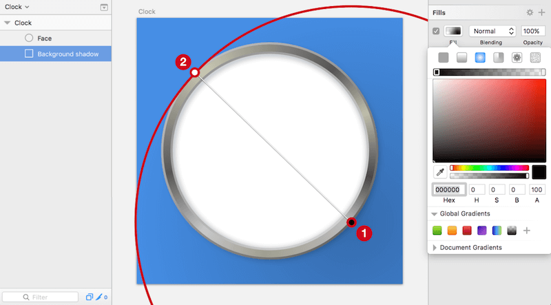
Add one that covers the whole artboard (name it “Background shadow”) but that is behind the clock face, and change the fill to a radial gradient. Move its center to the bottom-right third of the artboard (Fig. 4, 1); to change the size, drag the indicator on the circle line to the top-left third of the artboard (Fig. 4, 2). Be sure to use the point that is connected to the center with a line (the other point would change the gradient’s shape to an ellipse). Set both color stops to black in the inspector: the one at the center should have full opacity (100%), and the one on the outside none at all (0%). The shadow would be way too strong like this, so decrease the general opacity of this layer to 24% (close the color dialog and press 2, rapidly followed by 4).
The Clock Face
With the last step we finished the casing of the clock, so let’s take care of the clock face itself now. To make the alignment for all of the elements easier, let’s add some custom guides first: show the rulers with Ctrl + R, and make sure that the circle is selected. Now, add a vertical guide at its center with a click on the upper ruler. As a guide hover over the ruler until the red line is directly above the middle handles of the shape on the canvas. Do the same for the horizontal guide on the left ruler. For the correct placement, you could also have a look at the positions of the guides when you hover over the rulers: with an artboard size of 600 pixels, this would be 300 pixels for both.
To break the ground, we’ll add the scale for the hours. Create a rectangle at the top of the clock face, above the circle, for the mark of the twelfth hour. The easiest way is to add a rectangle with a random size first and then change it in the inspector. It should have the dimensions “6” (width) and “18” (height), with a black fill. Move it “31px” away from the outer edge of the circle: Hold Alt to show the smart guides, including the distance; point to the circle with the mouse; leave it there; and use the arrow keys to reposition the shape until the spacing is correct (while still holding Alt). Also, center it to the clock face horizontally after selecting both layers, making a right-click and selecting Align Horizontally. But what about the remaining hour marks? It would be quite tedious to create and rotate them by hand.
From Hours To Minutes
Luckily, Sketch offers a handy feature that can do both at the same time: Rotate Copies. Select it from Layer → Paths in the menu bar. The following dialog lets you define how many additional copies of the selected element to make. With a total of twelve hours, we require eleven more marks. After you have entered this value and confirmed the dialog, you will be presented with all of the lines and a circular indicator in the middle. You can drag this circle around at will; based on the position, it gives you a wealth of different patterns. Try to move it around! Also, give some other shapes (instead of a rectangle) a shot as a starting point to see what can be done with this option.
However, for the correct placement of the hour marks, move the indicator down until it is at the intersection of the guides that we added earlier (Fig. 5). That was easy! Please note that you won’t be able to alter this position anymore as soon as you click anywhere else on the canvas. But you will still be able to change the individual elements after accessing the related Boolean group with a double-click on the canvas. Rename it to “Hour marks.”
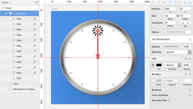
For the minutes, we can take a similar approach, but instead of lines, we will create circles for these marks. To make that easier, set the hours to “20%” opacity first with 2. Now, draw a circle with a diameter of “8px” at the same position as the current mark on the twelfth hour, which you should move “40px” from the top edge of the clock. Also, set its color to black.
The Rotate Copies option comes into play again. This time we need “59” additional copies. Like before, align the circular indicator to the intersection of the guides. At once, we’ve added all of the marks for the minutes. Rename the new Boolean group to “Minute marks,” and access it with a double-click. However, we don’t need the marks at the same positions as the hours, so we will delete them now: Click on the mark at “12” on the canvas, hold Shift, click on the other round marks that overlap, and delete all twelve of them. You can now set the hours to full opacity again.
From One To Twelve
This brings us a huge step closer to the final clock face. However, we have still some work to do. First, the digits. To give the clock a modern appearance I have chosen the futuristic Exo 2 family from Google. Unfortunately, you can’t use Rotate Copies to distribute text layers, but we would need to align them manually anyway due to the different shapes of the numbers, so let’s go for it.
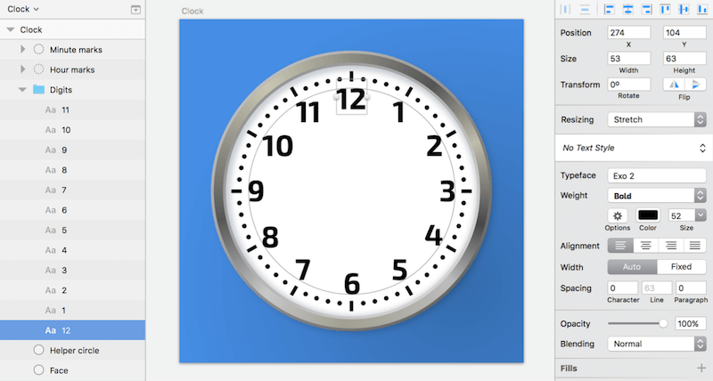
To make the alignment easier, create a circle with a diameter of “360” at the center of the clock, and assign it a thin gray border (no fill). Add the “12” at the top, with a font size of “52,” a “Bold” weight and a black fill: Align it with the arrow keys, so that its topside touches the helper circle (Fig. 6). The number should also be centered to the corresponding hour mark. Continue in the same manner for the remaining hours. Always make sure that they touch the circle on the inside. The easiest way is to drag the preceding number out while holding Alt, move it to the new place, change the content, and set the final position with the arrow keys. When you are finished, delete this helper shape. Also, create a “Digits” group for all of the numbers.
Tick-Tock
The remaining elements to take care of are the watch hands. Zoom in a bit to start with the second hand. It’s made of a simple red (#DF321E) rectangle with dimensions of “4” (width) and “200” (height), and whose lower two vector points are moved in “1px” each to form a slight trapezoid. To achieve this, press Enter to go into vector point mode, hit Tab two times to go to the lower-right point, and press the left arrow key on the keyboard to move it 1 pixel to the left. Hit Tab again to continue to the lower-left point, which you’ll move in with the right arrow key. Leave this mode again by pressing Esc two times, zoom back to 100% with Cmd + 0, and center the hand to the artboard horizontally. On the Y axis, it should be “192px” away from the top of the watch. Because it is supposed to point to the “6,” we don’t need to rotate it, but make sure that it is above the “Digits” group in the layers list. Finally, name it “Second,” but hide it for now.
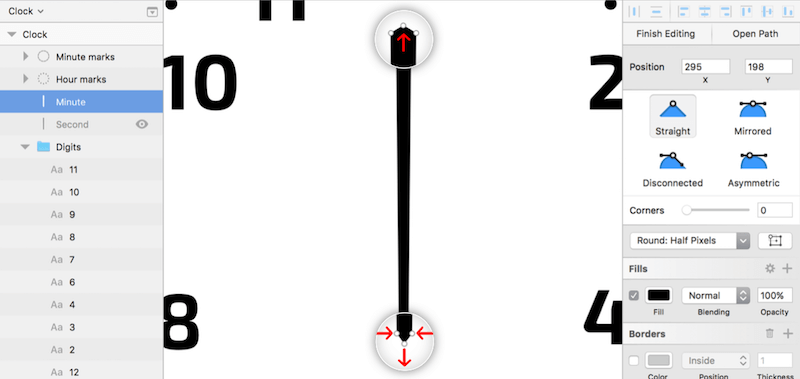
You can create the minute hand in the same fashion: Add a black rectangle with the dimensions “10” (width) and “210” (height), and zoom into it with Cmd + 2. For this shape, we’ll add some points at the top and bottom. Like before, enter vector point mode, but move the lower points in “2px” each. Now hold Cmd and click on the top segment to add a point in the exact middle. Push this point up by 3 pixels. Do the same for the lower segment, but move it down by 4 pixels (Fig. 7).
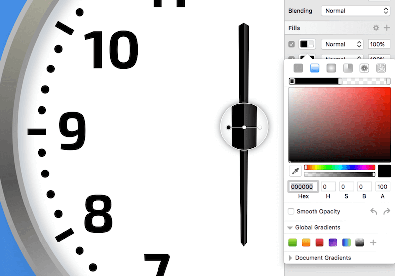
Finally, give the pointer a three-dimensional appearance with a crest (Fig. 8). One way to achieve this is to add a gradient with a hard stop in the middle, consisting of two stops at the same position. Add a gradient fill on top of the existing fill, assigned black with “100%” alpha for the first color stop and white with “0%” for the last stop. Bring the gradient to a horizontal position with the left-pointing arrow in the color dialog.
Now add another point with a double-click on the gradient axis in the color dialog, moved to the exact middle with 5 on the keyboard. Give it 100% alpha, and make sure it is black. Add another one to the right, and also move it to the center with 5, but then press the right arrow key once to offset it slightly to the right. After you have changed it to white with “30%” alpha, you’ll see that this has resulted in a hard edge, thanks to the same position of the color stops. To conclude, leave the color dialog by clicking anywhere on the canvas, and name this shape “Minute.” Place it 188 pixels away from the top of the clock, centered horizontally on the artboard.
It’s quite an easy task to get to the hour hand from here. Duplicate its minute counterpart, but hide the original layer, name the new one “Hour,” and change the dimensions to “12” (width) and “162” (height). That already gives us the final shape. However we need to mirror it horizontally to bring the gradient to the opposite side: Right-click on the shape, and select Flip Horizontal from the Transform menu. After that, position it “202px” from the top of the clock face, and center it. Be sure that the order of the hands is second, hour, minute in the layers list, and combine all of them into the new group, “Hands.” It should be above the “Digits” group.
Go Around The Circle
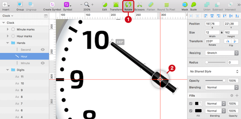
Time to set the clock. The second hand, which you can show again now, already points in the right direction, but the other two hands should read 10:07. Rotating the hour pointer in the default way doesn’t give us the correct result because it alters the position we’ve already set. You may remember that it’s possible to adjust the point around which an element rotates. For this to work, we need to use the Rotate icon in the toolbar (Fig. 9, 1), which gives us a little indicator at the center of the object (Fig. 9, 2).
Drag it to the intersection of the custom guides defined earlier, and try to perform the rotation now: The hand will move like on a real clock. Take this opportunity to set the hour hand to a little after 10:00, at about “233” degrees. Show the minute hand again, and proceed in the same manner, but rotate it until it is at the seventh minute of the hour (“–137” degrees). Please note that you need to perform the rotation on the canvas; the input field in the inspector won’t respect the altered rotation point.
For the final touch and to further strengthen the 3D effect of the watch, add some shadows to the hands. Start with the second hand: To respect that the light comes from the top-left, we need to set the properties to “2/5/4/0” with the dark blue that we saved to the Document Colors (#162A40), but at “30%” opacity. The same blur and color can be used for the shadow of the hour hand, but the X and Y positions need to be changed to “–3” and “–2.” The same goes for the minute hand, but with values of “–4” and “–2.”
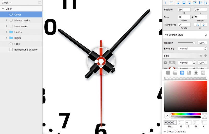
To top everything off, we will add one last element: a small red circle with a diameter of 12 pixels at the center of the clock that will hold all of the hands at their positions, and named “Cover” (Fig. 10). Take over the color from the second hand with the color picker and add a second fill on top of it: a radial gradient that has the same size and position as the circle, starting with 0% black at the center and going to 20% black on the outline. Also, add a shadow to raise it slightly from the hands. Give it the properties “0/0/5/0” with 50% black.
Conclusion
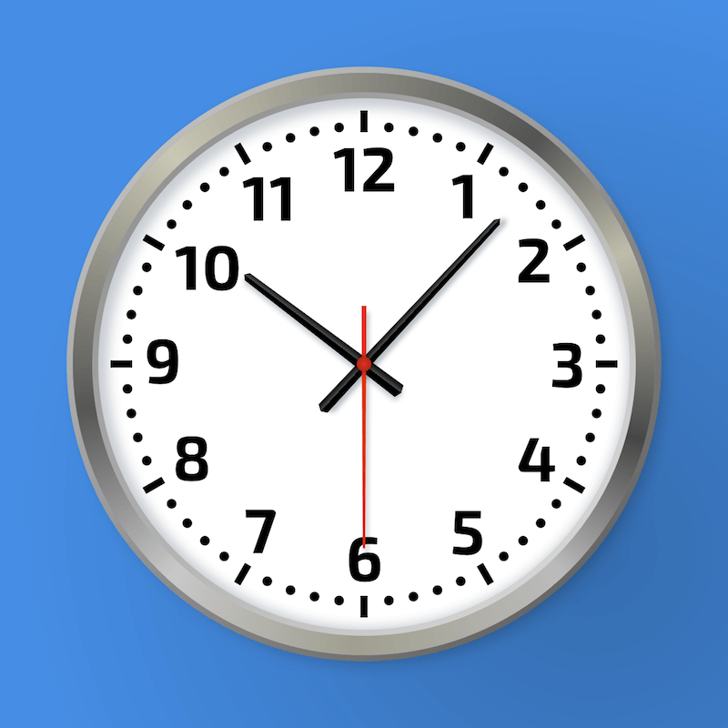
The result is a realistic wall clock. You’ve learned not only how to stack multiple borders, but also how to apply gradients to create distinctive effects. You’ve also learned more about rotations and how to use the Rotate Copies function to add multiple copies of the same object in a very special way.
Did you find it useful? It’s just a small glimpse into The Sketch Handbook, written by Christian, and published by Smashing Magazine. The full book (which features many more topics) should help you become a proficient user of Sketch in (almost) no time. No guarantees though! ;-) Happy reading!
 (mb, il)
This article is an excerpt from Christian's The Sketch Handbook, available in print and as eBook, published by yours truly. The book contains twelve jam-packed chapters within 376 pages. Among other things, it will teach you how to design a multi-screen mobile app, a responsive article layout as well as icons and interfaces. You'll also learn about the most recommended plugins for Sketch and a few useful tips, tricks and best practices.


