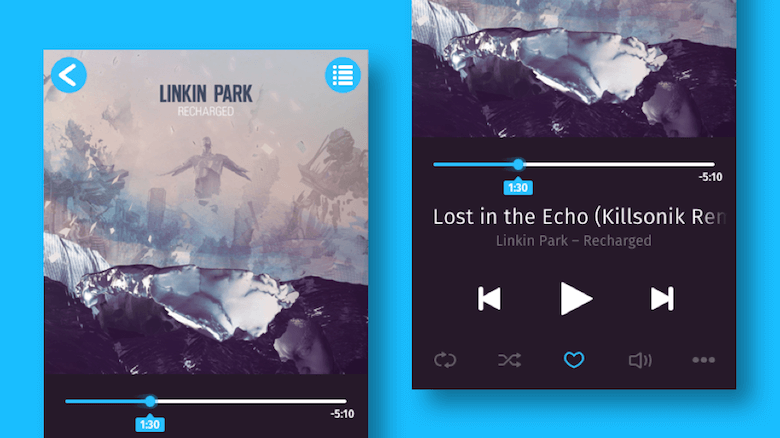
Welcome to the second part of this tutorial, in which we will finish designing the music player that we started in part one. This includes creating the icons at the bottom, as well as making the music player responsive, so that all elements adapt to the width of the artboard and, thus, can be used for different device widths.
Our premise in creating all of the icons is to use basic shapes as often as possible, instead of custom vector elements. Shapes are much easier to set up and modify, and we will still be able to combine them into more complex forms using Boolean operations.
Further Reading on SmashingMag:
- Using Sketch For Responsive Web Design
- Sketch Vs. Figma: The Showdown
- Designing With Real Data In Sketch Using The Craft Plugin
- Sketch With Material Design
The grid would hinder more than help in the creation of the icons, so you can hide it with Ctrl + G.
Let’s begin with the repeat icon in the bottom-left corner.
Repeat After Me
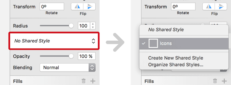
The repeat icon is based on a simple rectangle, with dimensions of 22 × 12 pixels and fully rounded corners. Change from the fill to a border again, so that you can set the position to “center” and the thickness to “2.” For the color, choose white; the “Ends” need to be set to the middle icon in the border options. There’s also a chance we’ll want to use the same properties for the other icons, so set up a shared style: Click on the dropdown menu in the Inspector that says “No Shared Style,” select “Create New Shared Style,” and name it “Icons.”
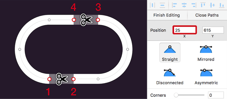
After you have zoomed into the rectangle with Cmd + 2, enter vector point mode with Enter. Add a first point to the straight segment in the bottom left, where it meets with the curve. Copy its X position in the Inspector; add another point to the right, and paste this value but add “+5”. Do the same for the straight top segment, but on the right side: Add a point where it meets with the curve, copy the X position, add a point to the left, paste this value, and subtract “-5px”. Now, use the Scissors tool again to cut the segments between the points: first at the bottom left, then at the top right.
For the arrows, we can use the “Arrow” symbol again: Insert it, detach it, remove the group, set the border thickness to “2,” and resize it to a height of 3 pixels on the canvas while holding Shift (so that the ratio is maintained). Finally, align it to the bottom segment of the base shape.
Note: This might require you to change the Y position in 0.1 pixel increments. The easiest way is to focus this input field, hold the Alt key, and increase or decrease the value with the up or down arrow key.
Finally, duplicate the arrow, flip it horizontally, and align it to the top segment. Move all elements into a “Repeat” group to finish this first icon.

At Random
Whereas we started with a rectangle for the repeat icon, the shuffle icon is based on a freeform vector shape.
Pan the canvas a bit to the right, away from the first icon, and press V for the Vector tool. But before you start drawing, set the “Round” dropdown menu (below the corners slider in the Inspector panel) to “Round to full pixel edges,” which will prevent points from being created with decimal numbers.
Now, click to add a point, then hold Shift (to constrain the movement to the horizontal axis), go slightly to the right, and make another click. Pressing Escape will stop the drawing process and let you focus the first point again with a click. As with the repeat icon, copy its X position in the Inspector, press Escape again, select the second point, focus its X field, and insert the value there, but add “+5”. Pressing Enter will move the point 5 pixels to the right of the other point.
Continue making the vector shape: Insert a third point at the top right with a click. Press Escape, focus the second point again, copy its “X” position, insert it at the third point, but add “+10.” Also copy the Y position — but in contrast, subtract 10 pixels here, to move the point up. For the last point, you need to constrain the movement to the horizontal axis again with Shift and a click to the right. Offset this one by 7 pixels on the X axis from the third point. Press Escape twice when you are finished.
You could also insert all of the points by instinct first and match their coordinates to each other later.
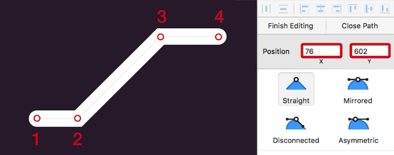
X (and Y) positions from one point to the other again for the correct placement. (Large preview)Give this line the same appearance as the repeat icon; the shared style we set up earlier makes this possible. Open the “No Shared Style” dropdown menu in the Inspector, and select “Icons.”
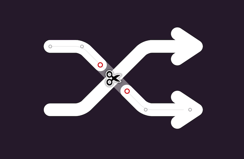
In addition to the round ends, the two points in the middle also need to be slightly rounded. Select all points with Cmd + A while still in vector point mode, and change the corners to “1.” Copy the right-pointing arrowhead from the repeat icon, and align it to the vector in the top right. Put them in a group, and duplicate and flip it vertically to create the second arrow. Be sure that the straight segments are at the same height.
We need to modify the second arrow slightly, so that it breaks where it meets the other one. For this, enter vector point mode for the line again, add a point before and after the intersection, and cut it with the Scissors. Trust your sense of proportion here. Finally, put these two groups into an overarching “Shuffle” group, and rejoice that you’ve finished the second icon.
My Absolute Favorite
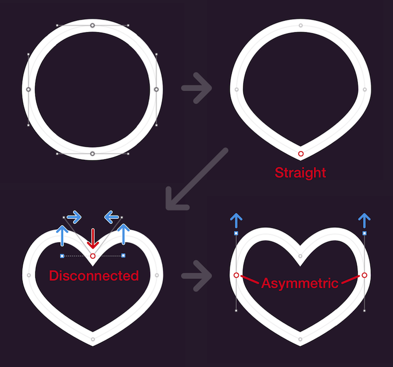
The third icon, which lets you favorite a song, is rather simple. You might not realize it, but it’s a heart made from a simple circle. We just need to adapt its points a bit and change the point types. Create it next to the shuffle icon with a diameter of 20 pixels, and give it the same shared style “Icons” as the previous icons.
Now, to the points: Go into vector point mode, and change the point type of the bottommost point (it should already be selected) to “Straight” with 1 on the keyboard or by selecting the relevant option in the Inspector. That’s it! Cycle to the top point by pressing Tab twice, move it about 7 pixels down with the arrow key, and change the point type to “Disconnected” with 3, which lets you adapt the vector control points (the handles that stick out of the point) separately. Select the left one, move it up by 6 pixels, as well as 1 pixel to the right. Do the same for the right control point, but move it 1 pixel to the left instead.
The circle already resembles a heart; we just need to adjust the remaining points on the left and right slightly. Cycle to the left one with another press of Tab. This requires an “Asymmetric” point; press 4 to change to this type. With this adjustment, we are able to move the upper control point just a notch up, independent of its counterpart. This makes the heart a bit more curved at the top. Repeat the same for the vector point on the right (press Tab two more times to select it), and we are almost finished. All we need to do is to rename the shape to “Favorite.” That was a breeze!
Turn Up The Volume
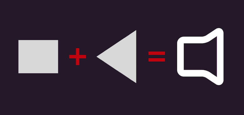
Good that we were able to relax a bit with the favorite icon, because the volume icon needs more attention. It consists of two rectangles for the speaker shape — one modified to a triangle — and some circles for the sound waves, which will be removed for the most part.
Create the first rectangle with dimensions of 12 × 10 pixels. Duplicate it, hold Alt (to resize it from the center), grab the middle handle of the bottom side on the canvas, and drag it down until it has a height of 16 pixels. Modify it to a left-pointing triangle, like we did for the back icon: Enter vector point mode, and insert a point in the middle of the left side while holding Cmd. Then, pick the points above and below, and delete them.
After you have left vector point mode of the triangle, select it together with the rectangle and apply a Union Boolean operation (with Alt + Cmd + U). This will create the speaker shape, which you can set to the well-known layer style “Icons.” Flattening it with “Layer” → “Paths” → “Flatten” from the menu bar will convert it to a single shape and allow you to change the corners of all points in vector point mode to “1.” However, this will remove the Boolean operation and, with it, the ability to modify the individual shapes, so create a backup first and hide it. While this is generally a good idea before flattening any shape, we will also need this backup later on for another purpose.
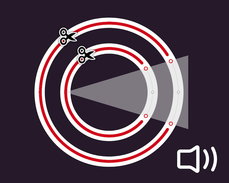
Next, the sound waves: Add a first circle with a diameter of 18 pixels, and use the same layer style as for the speaker shape. Select it together with the speaker shape and center them on both axes, but move the circle 3 pixels to the right in succession. Duplicate it for the second sound wave, hold Shift and Alt, grab a corner handle, and drag it out from the center until the shape has a diameter of 28 pixels.
Now we need a stencil to add some points to the circles. It can be based on the triangle from the speaker shape, a copy of which we backed up earlier: Copy, paste and move it out of the hidden group to show it; also, place it at the top of the layers list with Ctrl + Alt + Cmd + up arrow. Before we move on, hide the flattened speaker shape with Shift + Cmd + H, because we need an undistracted view of the circles for the next steps. Now, change the width of the new triangle to 25px in the Inspector panel; the height can be left as is. Setting the opacity to 50% will make the circles shine through.
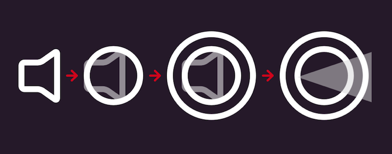
This allows us to enter vector point mode for both circles at the same time and to add points where they overlap with the triangle. Just make sure that it is left-aligned to the inner circle. The rest can be cut with the Scissors tool once you have left vector point mode. Unfortunately, you need to do that for each circle separately. You can remove the triangle after that, but show the speaker shape again. Finish the icon by putting all of its parts into a new “Volume” group.
Show Me More
After so much work, we deserve a break again. Luckily for us, the remaining “more” icon is made up of not more than three dots.
One way would be to create three circles with an offset, but we will take a slightly different approach and employ the border options instead. This has just a minor downside: The dots will not be 100% circular, but you will hardly notice that at the actual (zoomed-out) size of the icon.
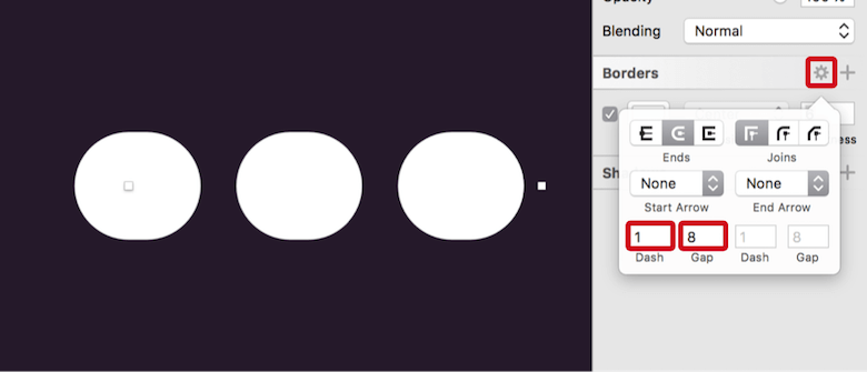
Start with a horizontal line (press L) that is 23 pixels long and has a 6-pixel border applied to it. For the color, use white again. Open the border options, and bring your attention to the “Dash” and “Gap” fields. They allow you to create dashed or dotted lines, which we will take advantage of. For the dash, insert “1,” for the gap “8”. Voilà, this will give you three dots after you have set the ends to rounded! Just change the name to “More” and we have finished all five icons.
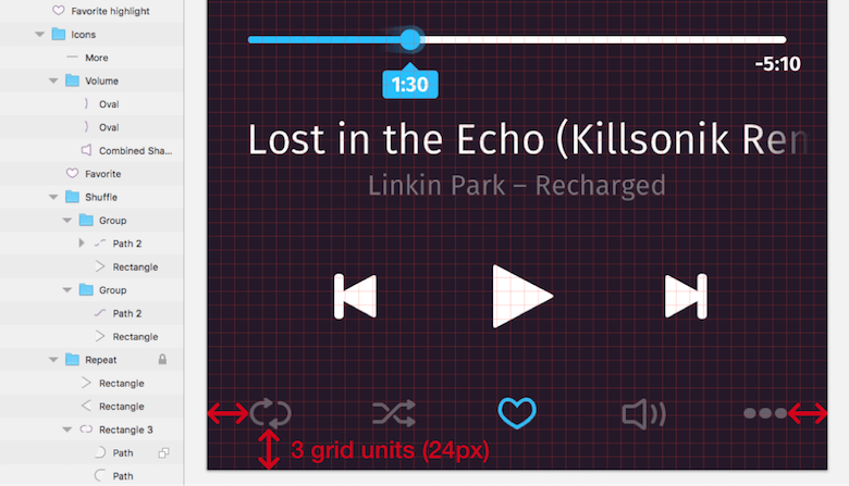
Unfortunately, when you go back to full view with Cmd + 1, you’ll see that the icons are scattered around the bottom of the music player. Let’s bring some order to this mess.
Show the grid again (with Ctrl + G), and use it to align the “repeat” icon 3 grid units away from both the left and bottom edges. Lock it with Shift + Cmd + L. Proceed to the “more” icon and also give it a spacing of 3 units from the right artboard edge. The vertical alignment doesn’t matter at the moment. Now, select all icons (or their groups) in the layers list, including the locked one; select “Align Middle” from a right-click to align them all to the locked element, and click on “Distribute Horizontally” from the same menu to space them equally from each other. Be sure to keep the icons selected for the next step.
Things are looking much better with the distribution of the icons; however, they are still pretty prominent. To remedy this, put all of them into an “Icons” group (and move it to the bottom of the layers list), and set the opacity to 30% with 3. Nice! We have one last thing to do for the icons: The favorite icon should represent the selected state and, thus, have the same bright color as the progress indicator. Duplicate and move it out of the group, rename it to “Favorite highlight” and assign the corresponding color from the “Document Colors.”
With this last action finished, the music player is complete. You have done a great job so far, but what if we want to use the player for different device sizes or widths?
Let me show you how to make the design responsive with the help of the “Group resizing” feature of Sketch.
From Fixed To Fluid
The requirement for this feature is to have a parent group that contains all of the elements created so far. Select them with Cmd + A, make an overarching group with Cmd + G, and rename it to “Container.”
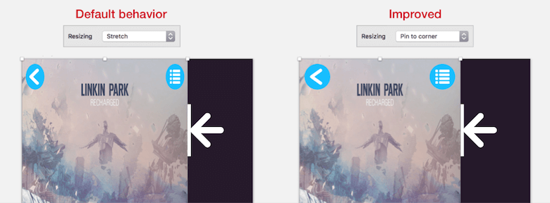
If you try to resize this group now, the result will be far from pleasing, because all layers will simply stretch. With the default setting for the “Resizing” dropdown menu in the Inspector panel, both the size and spacing of an element will be relative to the parent group.
If we change this setting for some objects, we will start to see some initial results. Select the “Back button” group, for example, and set it to “Pin to corner”; this will stop the elements from being resized but will maintain the same distance from the closest edge of the parent group. Do the same for the “List button” group, and try to resize the “Container” group now. These two elements will show improved behavior.
Let’s continue with the cover. Because Sketch can’t resize a layer and keep its aspect ratio at the same time, we will simply center the element. There are two ways to achieve this:
- The first is to “Float in place.” This maintains the size of the object, but sets the spacing relative to the parent group. This makes it also suitable to center an element.
- The second way is the “Pin to corner” property, which we already know.
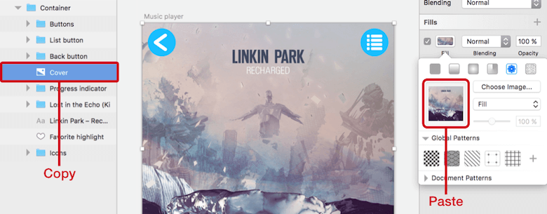
Note: There’s one caveat for both options of image layers. The element can’t be smaller than the container; otherwise, it will be squished. Luckily for us, there’s a way to fix this: Change to a pattern fill. To do so, copy the image layer with Cmd + C, add a fill to the layer, enter its options, go to the second-to-last fill type (“Pattern Fill”), click on the preview area at the left of the dialog, and paste the image with Cmd + V. Now, the image will clip when the container shrinks.
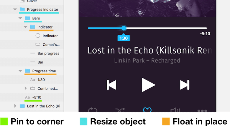
The next big task is the progress indicator. It needs some more consideration; however, with a few cleverly placed subgroups, it won’t be a problem at all. In its current state, we can’t achieve what we have in mind — the bars should resize with the parent group but keep their original spacing from it. Also, the circular indicator and the current playtime need to follow the position of the colored bar. The total time, however, should be pinned to the right edge.
Before we start adding the required subgroups, we can set the “Progress indicator” group itself to “Resize object”; this will retain the spacing of the element but change the width relative to the parent group. Now, select the two bars (“Bar” and “Bar progress”), create a new “Bars” group from them, and set it to “Resize object.” It should also include the “Indicator” group (containing the circular indicator and the comet tail); change it to “Float in place” in turn. This setting makes sure that the indicator follows the colored bar. The same goes for the “Progress time” group. To conclude, pin the total time to the right edge with “Pin to corner.” Give it another try: Resize the container and see the magic unfold before your eyes.
Over The Hill
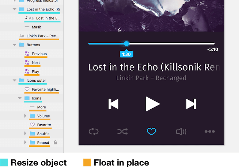
In comparison, the adaptation of the following text layers is rather simple. The group of the song title, as well as the text layer contained within, can be set to the “Resize object” property. This will ensure that the spacing is retained and that more and more of the text will be revealed as you enlarge the parent, but the gradient will keep covering the right part. The second text layer can be centered with “Float in place” again.
This setting also plays a big role for the remaining elements, because both the controls and the icons at the bottom should keep their relative spacing from the edges of the container (respective to each other), but their size should be left untouched. Apply “Float in place” to all of the mentioned elements (or their symbols or groups). For the icons, we need to make some additional changes: We want to pin the outer two icons to the outer edges of the container. The easiest way is to set the “Icons” group to “Resize object.” This will keep the distance to the edges of the artboard but will resize the group relative to the artboard’s width.
The highlighted “Favorite” icon requires some special treatment. Currently, it isn’t tied to the “Icons” group; and moving it into this group would give it a 30% opacity. The solution is to create a new “Icon outer” group that contains both this highlighted icon and the “Icons” group. Set it to “Resize object.”
Now, we have a fully responsive music player!
In case you want to switch to a completely different device type — say, the iPhone SE — select the artboard, and select “Scale…” from “Edit” in the menu bar (or press Cmd + K): Entering “320px” for the “Width” will scale all elements proportionally. From there, the width of an iPhone 6 is just a simple step away: Set the artboard’s width to 375 pixels, select the “Container” group, and enter 100% for the width in the Inspector panel. You’ll see all of the elements respond correctly.
Conclusion
I hope you’ve enjoyed the second part of the tutorial and learned more about using Sketch effectively for mobile app design. In the comments below, feel free to post your questions or mention alternative approaches to making a certain part of the music player. You can also contact me on Twitter (@SketchTips) or visit my little side project, SketchTips, where I provide more great tips on using Sketch.
Editor’s note: _Christian Krammer is a web designer and Sketch app pro who has written The Sketch Handbook, our brand new Smashing book. If you want to master all the tricky, advanced facets of Sketch, we recommend you get the book. It’s filled with practical examples and tutorials over 12 chapters and is available both in print and as an e-book._
 (mb, al)


