Many people find it difficult to get their minds back into work after a holiday season filled with love, food, and friends. May 2017 bring you a healthy and inspiring adventure. As for that kick-start inspiration, I hope this article will help get you back in the creative mindset.
Let’s begin!
Further Reading on SmashingMag:
- Inspiring Illustrations With Plenty Of Bright Colors
- Colorful Inspiration For Gray Days
- How To Create A Water Lily In Illustrator
Anglepoise
This is just genius! So smart to work with the light and shadow. Just look at that pose, and the usage of beautiful contrasting colors.

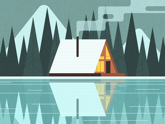
Snowy Cabin
That smoke! A cozy winter getaway with great textures. The reflection on the water is so perfectly done, too.
Authentic Assets
Inspiring editorial illustration about millennial housing. Jealous about the gorgeous texture layer.

Figure Study
Great style and colors. Admiring the wood surface and subtle textures.

Faces - James Gilleard
I’m admiring this piece of personal work from James Gilleard. Analyzing the complexity of how these faces are created is super inspiring to learn from.

Honeymoon Petra Villas
A view from an upscale hotel carved into the cliffs overlooking the Santorini Caldera. You sure would want to escape winter after seeing this.

Google Play | Script & Seal
Drilled down to just the basics with lovely textures.

Todd Terje - Preben
A great example that there are no boundaries to how a face should look if you are an illustrator.

Vanity Fair France
Cover illustration for the Collection supplement of Vanity Fair France. The flow in Malika’s work is just so inspiring.

Illustration by David Holt
This is Beautiful! Great colors, very vivid and wonderful repetition of shapes.

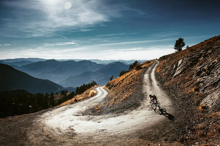
Saint-Martin-Vesubie
Another breathtaking shot from my friends Jered and Ashley Gruber. It’s somewhere in the French Pyrenees’ and shot for Craft Sportswear.
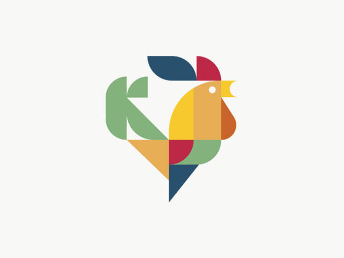
Kitchen
Nice idea and beautiful usage of shapes to create a roaster. Thumbs up!
Maker & Match Candle Co.
Love the way those matches connect and create the flame in the middle. I’m also a big fan of knights. Never had the opportunity to use them. Well, not yet!

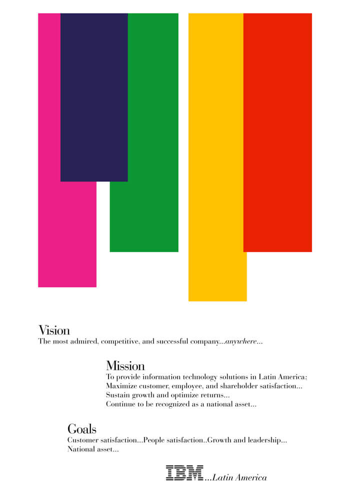
IBM Latin America
A piece from the iconic work Paul Rand has done for IBM.
Desert Nights
Some super beautiful gradients and wonderful line work. Available as a wallpaper, too.

Pool Without Water
I’m loving the continuation of these series by Maria Svarbova. This time the central theme is a pool without water.

Classic:specs
I’ve always been a fan of custom lettering, and I’m sure I’m not the only one. Just beautiful!

Esteban Fallone
Esteban Fallone is an award winning Architect based in Buenos Aires, Argentina. The idea behind this visualization was to take a variety of his house projects and translate them into a different language.

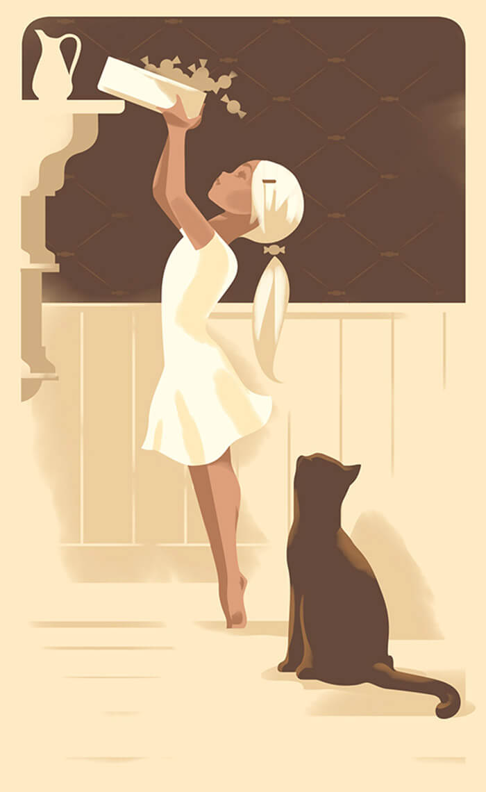
Karamel
Pretty sweet what can be accomplished with just a few colors. I like the simplicity and the monochromatic colorway.
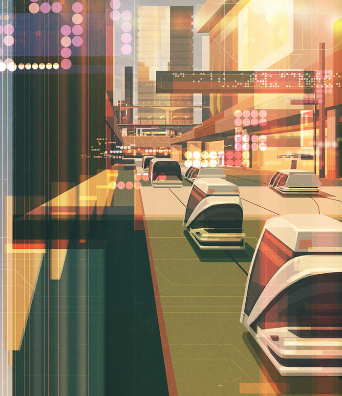
Toyota Magazine - Future Tech Article
The complexity of this illustration makes it a perfect fit for an article about future technology.
The Guardian Review Books
Cover for The Guardian Review books. Love the concept of a huge book pile in front of a giant moon. Nice contrast of the figure in front of the moon.

Sheffield Hallam University’s Events Calendar
Since January still qualifies as being festive it seems only appropriate to add something that fits that spirit.

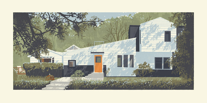
Laurel Canyon
In awe when I see how all the shadowing is done in this illustration of a house in Laurel Canyon.
Treehouse
A thing of beauty. I dig the green color palette, too.

Skiing Magazine - Salomon Skis
Enjoying the mood in this illustration. The sweater on the deer is such a nice detail that drives it all home.

We All Love Stories
So true! We all love stories, especially when it’s about something we are passionate about. Beautifully illustrated. Love the curvy lines and soft tones.

Georges
Part of a bigger illustration piece that you can see here. Strong texture work and I love how the figures are drawn.
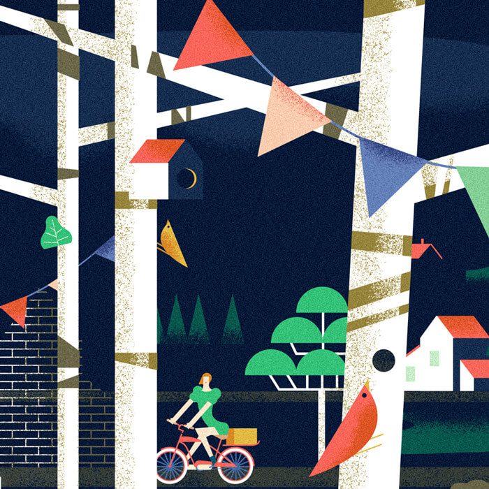
28 Days of Peace
Beautiful new work from the queen of lettering. It’s for an ambitious project, illustrating a countdown for Advent in which each number is unique and related to a daily reflection or action leading up to Christmas Day.

Maligne Lake
There are worst places to do a nap. Beautiful Canada, the Rockies.

Nomad Hill Brand Board
This is looking really great. Loving the patterns.

The New Yorker - Double Solitude
Detailed and an atmospheric mood that sometimes allude to something darker, that’s how I would describe the work of French illustrator Antoine Maillard.

Official Rogue One Magazine Cover
The intricate details of the illustration are just amazing! Those are some mad skills. One can only dream.

Jamie Oliver Magazine
Admiring how certain elements are set to another perspective. Makes for an interesting collage.

Patagonia Dreaming I
Such beautiful light effect! Only one image out of a beautiful collection of Patagonia, Chile. The rest can be seen here.

Styletest
A style that I truly love. Such wonderful colors, too.

Amsterdam Skyline
Awesome illustration, so many fine details if you look closer. Interesting combination of colors.

Th world
“Architecture’s great problem is the gap between the visionary and the grubby compromise of reality.” A very interesting combination of objects. Such perfect tones on the shapes to create the depth and shadow and light effect.

Russian Post
Love how the lady looks casual chic. The floor pattern is also a eye catcher. Everything is just perfect in this one.

A Guide To Being Human
Rich colors and well executed linework. That fingerprint mark at the end finishes it off.

Techo Key Visual
I like the flow that is going within this illustration.

Queen
This is quite lovely. Digging all the elements and admiring the style of her face.

Drown In Her Madly
Apparently I’m not the only person who mostly uses a mouse to draw. This one is completely created with mouse in Illustrator and Photoshop. Be sure to view the entire piece here. Beautiful job.

Gerhard Richter
Part of a series of illustrations of houses based on famous artist. Be sure to go look at the others.

Sleeping Beauty
Wonderful book cover for Sleeping Beauty, a mid-century fairy tale. Original pattern on the background, and who doesn’t love robots.

Artipelag
Those colors and super pastel gradients are so beautiful! Taken in Artipelag, Värmdö, Sweden.

Vintage Colnago
Makes me want to illustrate a vintage bicycle, too. A real Italian vintage Colnago.

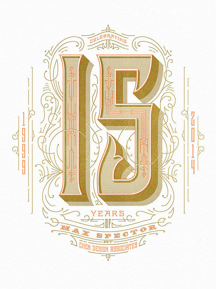
Chen Design Associates
Lovely letter-pressed poster in a special color palette.
Dario Flaccovio Editore
The illustration looks so “simple”, but the longer you look at it, the deeper you get into the design.

The World’s Best Street Food
Illustrated cover for a Lonely Planet guide. The grunginess is inspiring and the colors work well with the hand lettering feel.

SOS Fire In The Sky
No words needed.

 (il)
(il)


