Apple taught us, “There’s an app for that.” And we believed it. Why wouldn’t we? But time has passed since 2009. Our mobile users have gotten more mature and are starting to weigh having space for new photos against installing your big fat e-commerce app. Meanwhile, mobile browsers have also improved. New APIs are being supported, and they will bring native app-like functionality to the mobile browser.
We can now access video and audio and use WebRTC to build a live video-chat web apps directly in the browser, no native app or plugin required. We can build progressive web apps that bring users an almost native app experience, with a launch icon, notifications, offline support and more. Using geolocation, battery status, ambient light detection, Bluetooth and the physical web, we can even go beyond responsive web design and build websites that will automagically adapt to users’ needs and context.
Further Reading on SmashingMag:
- Testing Mobile: Emulators, Simulators And Remote Debugging
- What Every App Developer Should Know About Android
- What’s The Deal With The Samsung Internet Browser?
- The Mobile Web Handbook
To help us dig into this world of new (and not so new) functionality and to guide us through this journey in the world of “Everything is possible in a mobile browser,” I will illustrate this article with some fictional but plausible use cases. Dear reader, meet Zoe, my user. She’s around 30 and works as a developer in our industry in the very near future. She works all day long on a computer, so she doesn’t want to have one at home, and she uses her smartphone as a primary device to navigate the web.
Part 1: Accessing And Handling Images, Video And Audio Directly In The Browser
Video and Audio Conference in the Browser (With WebRTC)
Zoe is invited to speak at a conference. Instead of adding her on Skype, like people usually do, the conference organizers send Zoe a link to an online video and audio conference web app, AppRTC.
Zoe simply enters the correct room number. The browser asks her permission to access her camera and microphone, and that’s it: She gets connected with the other person. Zoe doesn’t need to install or update any additional plugin or app. Everything happens directly in the browser, no extra steps, no friction.
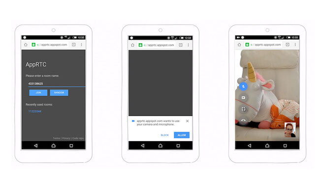
With a native app (especially on Android), you can ask users for a lot of permissions up front when they download your app. In the browser, users have to grant you access one API (i.e. one piece of functionality) at a time.
Using WebRTC, you can open a direct real-time communication channel between two clients. You can then share sound, video and any other data directly between them.
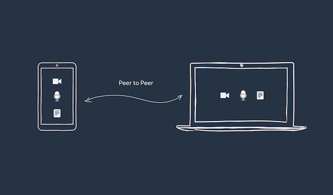
This is powerful, but it’s supported only in Firefox and Chrome, and it’s under development for Edge and Safari. You will also need to access the video and audio streams. This can be done using the getUserMedia and Media Stream API (which is not supported in Internet Explorer or Safari).
Using this technology, we could imagine recreating a Google Hangouts or Facebook Messenger web app directly in the browser. The only thing missing would be access to the phone’s contacts. This is not currently possible from the browser with any kind of API.
Uploading a Picture From the Camera to the Browser
Zoe is asked by the conference’s organizers to fill her online bio for the conference. She logs into the website, goes to her account and finds the place to do so. When she taps on the “Update my picture” button, she can choose between taking a new picture with her camera or selecting a picture already taken. She chooses the first option and fills in her profile.
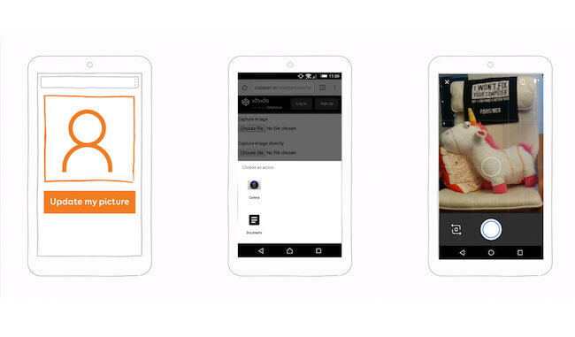
The HTML5 file input type has gotten a new attribute, named accept.
You can pass a comma-separated list of types of content files. On mobile, this would trigger a dialog in which users can chose between different content sources or direct access to the camera:
<input type="file" id="image" name="image" accept="image/*">
If you want the user to skip the selection dialog and directly access their camera to take a picture, you can add the capture attribute:
<input type="file" id="capture" name="capture" accept="image/*" capture="camera">
This would also work if you want to capture video or audio:
<input type="file" id = "video" name="video" accept="video/*" capture="camcorder">
<input type="file" id="audio" name="audio" accept="audio/*" capture="microphone">
If you want to have fun on your phone, I’ve put together a little demo with all of these inputs.
Now that we can directly access media (videos, images and audio) in the browser, a whole new world of possibilities has opened up. You could change your avatar right on the responsive website of any of your social media accounts, and you could take and upload photos and videos to your timeline instantly. If you want to sell your car or bike on Craigslist, you don’t need to take pictures of it and then upload them to your computer; you can create your ad and add the images right in your mobile browser.
Having Fun With Inputs
If we want to go one step further, we could imagine recreating an Instagram-type app directly in the browser using CSS3 filters and input type files.
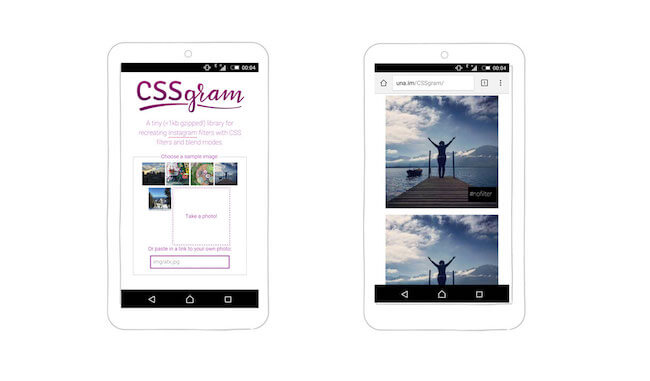
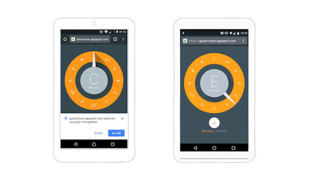
There’s also a really fun guitar tuner web app that uses your microphone to make sure your guitar (or voice) is perfectly tuned. Pretty handy, isn’t it? Again, you don’t need to install anything.
Part 2: Enhancing A Conference Website Into A Web App
In this second part, I want to show you how we can enhance the user experience on a conference website. You might be familiar with the concept of progressive enhancement on the web. I encourage you to apply it to the techniques that follow: Make sure that all of the main functionality on your website is accessible and works on a wide range of mobile browsers, and then progressively enhance the website with launch icons, notifications and offline support to build a better experience on mobile devices that support it.
Installing And Launching The Website As A Progressive Web App
To access a website, most users either will already have it bookmarked and hidden in a sea of bookmark folders or will simply look for it on their favorite search engine. One of the main arguments in favor of apps is the launch icon: It’s already there, ready on the user’s home screen.
Favicon for the Home Screen
Now, imagine that you could do the same for a website and launch it from the home screen, like you would do for any native app. Most modern browsers have this option available in a menu.
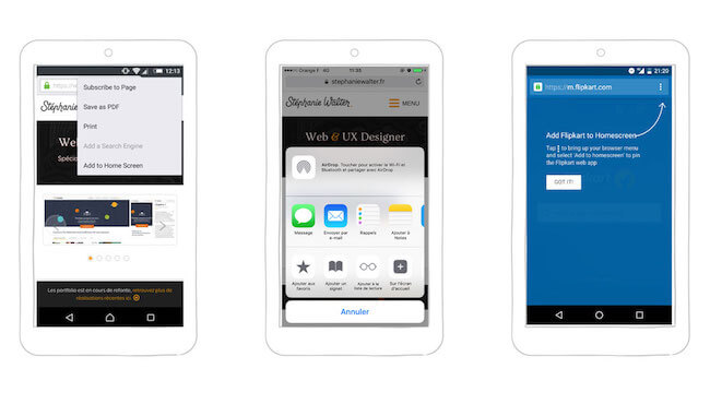
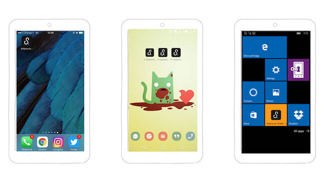
You’ll need some extra files and size to satisfy the range of browsers out there on the market, but this will work on iOS, Android (Chrome, Opera and Firefox) and Edge for mobile.
Chrome’s App Install Banner
Not a lot of users know that they can add a website directly to their home screen. To make this functionality more discoverable, Chrome 42+ introduced the App Install Banner. For the moment, the banner appears when users have visited a website at least twice, with at least five minutes having elapsed between visits.
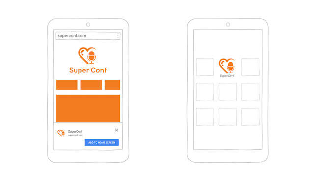
Your website also has to meet a few technical criteria to trigger this banner, including having a service worker, being served over HTTPS (which we’ll get to later) and having a valid web app manifest file.
The Web App Manifest File
Specified by the W3C, a web app manifest is a simple JSON file that enables a developer to control a lot of things about their web app, including its name, icon, launch screen and theme colors, as well as how they want it to launch. Web Manifest Validator is a little online tool that will help you to validate the file. Once it’s created, you will need to link it to your website.
{
  "short_name" : "SuperConf",
  "name": "SuperConf, an amazing conference",
  // Defines a default URL to launch
  "start_url": "/index.html",
  "icons": [
    {
      "src": "launchicon.png",
      "sizes": "96x96",
      "type": "image/png"
    }
     // Other icons go here
  ],
  // Launches the website without a URL bar
  "display": "standalone",
  // Provides a site-wide theme color
  "theme_color": "#fa9c00",
  // Provides a background color for the launch screen
  "background_color":"#ffffff"
}
It’s currently supported in Android WebView, Opera Mobile, Chrome for Android and apparently Firefox as well.
Splash Screen
Starting in Chrome 47+, browsers use the manifest’s theme_color, background_color, name and icons to automatically generate a launch screen while a website loads.
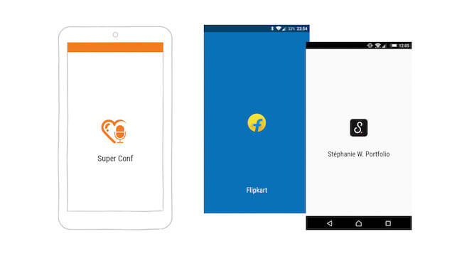
Customizing the Display Mode
With the display property in the manifest file, a developer can choose how they want the website to launch once it has been added to the home screen:
"display": "standalone"launches the website in full-screen mode, without any URL bar (currently supported in Chrome and Opera)."display": "browser"launches the website in the conventional mode, with the URL bar visible.
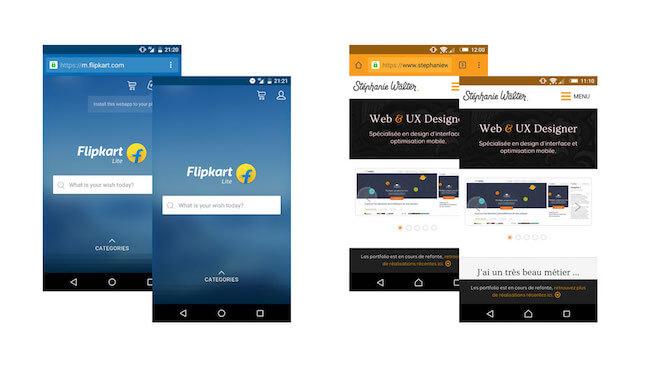
"display": "browser" is on the left and "display": "standalone" is on the right for two different websites. (View large version)The W3C also specifies fullscreen mode, which launches a website using the entirety of the available display area on a mobile device, and minimal-ui mode, which gives the user access to a minimal set of UI elements. Neither seems to be supported anywhere yet.
Developers can also force an orientation with “orientation”: “landscape” or “orientation”: “portrait”, but unless you are building a video game, you might not want to use it.
Be Careful With meta name="apple-mobile-web-app-capable" on iOS
Display mode isn’t supported on iOS. The <meta name=“apple-mobile-web-app-capable”> tag might look like it does the same thing, but it doesn’t. It will work on a web app with no links (AJAX-loaded content, for instance), but as soon as you use this on a traditional website, things get ugly. When the user launches the website from the launch icon, it will open full screen, but as soon as they tap on a link, it will open in a new tab in Safari. To prevent this, you will need some JavaScript to override the click event (which does not sound ideal).
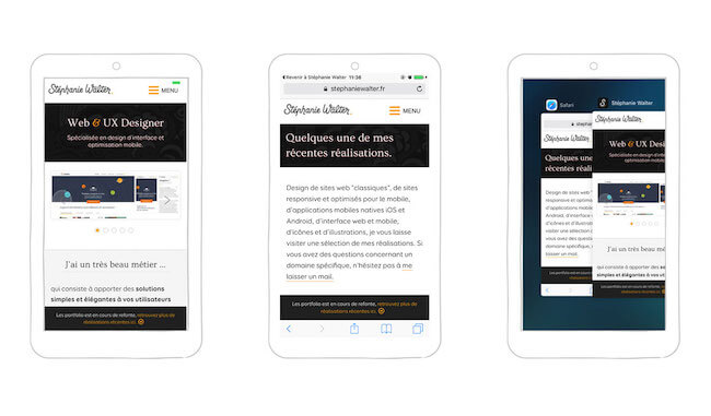
Changing the Color of the URL Bar
Another fun thing you can do to delight users is to change the color of the URL bar. To change it for every page, you can use the HTML meta tag:
<meta name="theme-color" content="#db5945">
Here in France, we have a nice website that sells socks… only socks — but it does it quite well. Part of its success is due to the wide range of sock colors. And the color of the URL bar on every page matches the color of the displayed socks. This is one of those little details that can delight users and contribute to a fun overall experience.
Using the manifest.json file, you can also provide a site-wide theme color: “theme_color”: “#133742”.
Users will see this color in the URL bar as well as in the Android bar at the top when the website is in browser mode. It will also be used for the top bar of the splash screen, as seen before, and when the tab is displayed in a stack of many other tabs in multitasking mode.
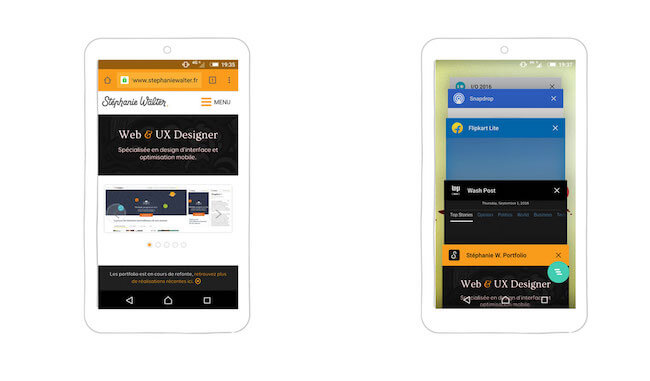
"theme_color": "#133742" gives a nice orange color theme to my website. (View large version)One Tool to Generate Them All
If you want to provide a nice experience, there’s a lot to do and to think about, including making a lot of different sizes of icons for different operating systems. Some nice person has built a cool little tool named RealFaviconGenerator. Feed it your favicon, and you’ll get a nice interface to play with and to tweak all of the things just mentioned. Grab the ZIP file, and voilà!
Notification Access
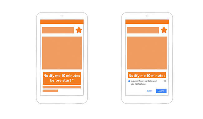
Zoe checks the program before the conference. From the little icon next to each talk, she understands that she can add a talk that she wants to attend to her schedule. A subscription button appears under each talk’s description, with short text explaining that users who have subscribed to the talk will get a notification 10 minutes before the talk starts, even if their browser is closed. Users must allow access through a browser dialog.
Being Smart When Asking Permissions on Mobile Browsers
The Chromium team put out an interesting document titled “Best Practices for Push Notifications Permissions UX.” Users need to understand what they will gain from giving you access to their notifications. Explain why you need this access, and put it in context. I’m seeing more and more websites and blogs asking to send notifications the first time a user arrives on the home page. As a user, I might have arrived on a blog by following a link on Twitter and might not know what the blog is about, so I’m going to need more context before accepting notifications (if I ever do accept them). In the browser, when a user denies access, the website will not be able to ask for it again (unless the user goes into the website settings). So, be smart about when and where you ask. This is a general rule for all permissions, by the way (media, notifications, geolocation, etc.).
Integrating Notifications in the OS
The conference day has finally arrived, and Zoe is getting a coffee when her phone vibrates. Even though the website and web app are closed, she has just gotten a notification directly on her locked phone, telling her that the first talk she has subscribed to will be starting in 10 minutes.
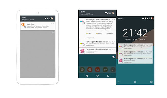
Mobile browser notifications can compete with native notifications because they get integrated directly in the notification center of the operating system. This means that they will get displayed outside of the browser or web app, even if it is closed. It will appear in the operating system’s notification center and will be displayed on the lock screen of the phone as well. Notifications in Chrome can also be shown in the desktop notification center of Windows 10 and Mac OS X.
Meet the Push API and Service Workers
A service worker is JavaScript that runs in the background once installed. It acts as a sort of small proxy, pushing notifications to the browser. The Push API is part of the family of service worker technologies. Once activated on the page, the service worker receives the push message, and then it is up to you how to notify the user (for example, using push messages or one-page notifications). A the time of writing, service workers are supported in Chrome, Firefox, Opera, Android browser and Chrome for Android (it is under consideration for WebKit), and the Push API is supported only in Firefox, Chrome and Chrome for Android 51.
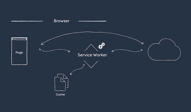
In short, to make notifications work, you will need:
- HTTPS on your server,
- a declaration of a service worker,
- the Push API,
- the user’s acceptance.
That’s as far as my technical skill goes. If you want to go deeper, here are a few resources from people far more qualified on the topic than me:
- Notification Generator, Simple Push Demo and Try Web Push To test notifications.
- “Service Workers: An Introduction,” Matt Gaunt, Google Developers
- “Beyond Offline,” Salva, Mozilla Hacks Discusses other cool things you can do with service workers.
- “Web Push Notifications: Timely, Relevant, and Precise,” Joseph Medley, Google Developers
- “Using the Push API,” Mozilla Developer Network A long but interesting article.
- Is ServiceWorker Ready?, Jake Archibald To check the status of browser support.
Offline Access
Zoe might not have noticed, but the conference’s schedule was cached offline while she was browsing. This means that, even if she doesn’t always have an Internet connection during the conference, she can still visit the website.
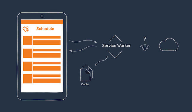
This magic happens again with service workers. A service worker can intercept the user’s request and provide cached files to display the page faster, with or without a connection. The browser will first look for the cached files, instead of requesting the ones on the server. It can then also check whether the files need to be updated by looking for file modifications in the background. You can use this to make your website work offline, but you can also use it to cache part of the website — the user interface, if you like — to make it load faster.
I imagined all kinds of scenarios for Zoe when I was preparing for the ConFoo conference in March 2016. I wanted to create a demo page, but then in June I saw that Google I/O implemented everything I imagined, so I’ll let you play with that demo instead. Open your mobile browser, go to events.google.com/io2016, navigate to the schedule, and add some events to your list (you might need to log in with a Google account first). Then, add the website to your home screen, close Chrome, and launch the website from the home screen icon. Keep on adding things to your list. Switch to airplane mode, and you should see a short explanation that the connection has been lost and that changes will be synchronized with the server once you are back online. Add some more talks to the list, go back online, and voilà!
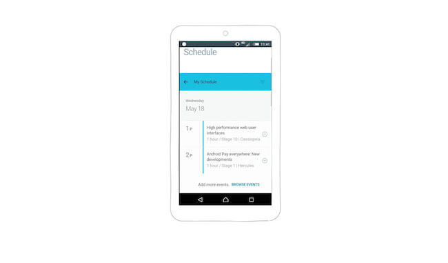
There are two other demos I really like:
- Pokedex.org An online index of Pokemon characters (predating PokemonGo!).
- 2048 A fun game that has saved me from boredom during hours of air travel.
Again, open the website, load it to your home screen, switch to airplane mode, and then come back.
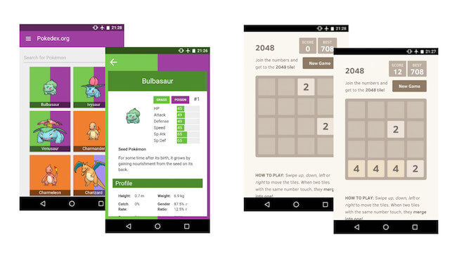
If you want to go deeper in the code, I would recommend the following reading:
- “Create a Really, Really Simple Offline Page Using Service Workers,” Dean Hume
- “Offline Storage for Progressive Web Apps,” Addy Osmani
- “Making a Simple Site Work Offline With ServiceWorker,” Nicolas Bevacqua, CSS-Tricks
Going Full Steam: Progressive Web App
I’ve described how to enhance a website to add some native-like functionality. You could go one step further with a full-on progressive web app. In their article “Instant Loading Web Apps With an Application Shell Architecture,” Addy Osmani and Matt Gaunt refer to a progressive web app as a web app that “can progressively change with use and user consent to give the user a more native-app-like experience.” They cite an article in which Alex Russell describes progressive web apps as “websites that took all the rights vitamins.”
According to Google’s documentation, progressive web apps are:
- Progressive. They work for every user, regardless of browser choice, because they’re built with progressive enhancement as a core tenet. This bring us back to what I said at the beginning of this section: Make sure your website works even if all of this fancy new technology is not supported, and treat all of this as progressive enhancement.
- Responsive. They fit any form factor: desktop, mobile, tablet and whatever is next.
- Connectivity-independent. They can be enhanced with service workers to work offline or on a slow network.
- Fresh. They are always up to date, thanks to the service worker updating process.
- Safe. They must be served via HTTPS to prevent snooping and to ensure that content hasn’t been tampered with.
- Discoverable. They are identifiable as “applications” thanks to the manifest file and the service worker
registration.scope, which allows search engines to find them (like any normal old-school website). - Re-engageable. They make re-engagement easy through features such as push notifications. Again, for me, this is not mandatory, and you might want to be careful with it.
- Installable. They allow users to keep the apps they find most useful on their home screen, without the hassle of an app store.
- Linkable. They can easily be shared via a URL and do not require complex installation.
- App-like. They feel like an app to the user, with app-style interactions and navigation, because they’re built on the application shell model.
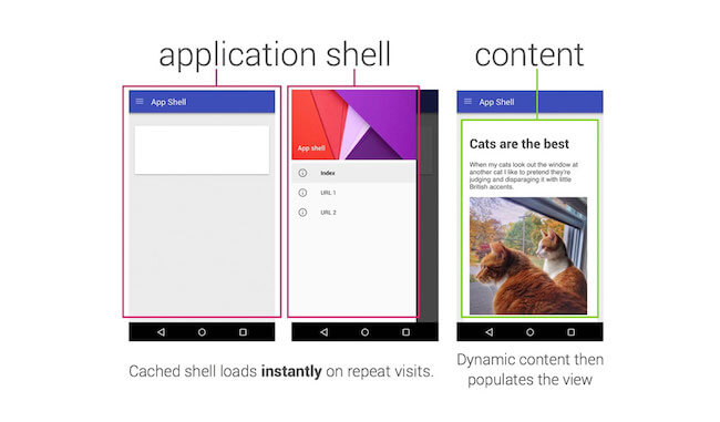
The last point about the application shell is where it gets really interesting and where progressive web apps bridge the gap between classic responsive websites and native apps. If you’ve created a native app, this should ring some bells. In a native app, the user would download the full UI (icons, fonts, etc.) when they install the app. Then, when they launch the app, the content is loaded from the server.
The concept of the application shell is pretty similar: It is the minimum HTML, CSS and JavaScript required to create your UI, the “chrome” of your interface. You would cache this to make the app load quickly. Then, the rest of the content would get dynamically loaded to populate the different views.
Also, the people at Opera have put together a selection of progressive web apps. If you want a taste of what progressive web apps can do, you’ll find demos and inspiration there.
With Great Power…
… comes great responsibility. There’s currently some debate in the community about progressive web apps. Here are a few of the issues people are worrying about:
- Is it really a good idea to hide URLs in a progressive web app? Developers have the choice, but it looked like Chrome was kind of in favor of
standalonemode. And how are you supposed to share content? (Those awful share buttons might make a big comeback.) - A lot of current implementations seem to concentrate on the app part and forget the web part. Are we going to revert to dedicated mobile websites and desktop websites? I’m really looking forward to seeing more responsive and progressively enhanced demos.
- Loading the application shell is like loading the chrome before the content, whereas many people want a “content-first” approach. Will users have to wait for your content to load even once the interface is already displayed?
If you ask me, not every website should be a progressive web app. For instance, transforming my portfolio into a progressive web app was pretty silly, but I did it for a demo; like many people in the industry, my portfolio is also a little playground. In truth, nobody (except maybe my mum) would install my portfolio as an app on their phone. And that’s totally fine, because let’s face it: My portfolio isn’t really app-ish.
So, I guess a progressive web app would be a great idea for websites that users visit on a regular basis, such as news websites and blogs (which is the criterion Chrome uses in determining whether to show the install banner), e-commerce and restaurant-delivery websites (from which users might order regularly), and anything task-oriented (i.e. app-ish). I would add social networks such as Facebook to the list, but building a progressive web app is far less interesting to those companies than building a native one — how are they supposed to collect and sell all of their users’ data if users can only access their services in the browser?
The thing about Facebook is that its mobile website works pretty well. But as soon as you try to view your messages, the website tries to open the Messenger app. Fun fact: Facebook has built a really nice responsive website for Messenger that works on desktop. You can shrink it to a mobile-ish size, and it still works. But as soon as you visit it on a mobile device (or with a mobile user agent), you get the mobile version of the website telling you that you need to install the app. So, when it comes to mobile apps versus progressive web apps (or responsive websites), even though we now have the tools and technology to build a lot of things in a mobile browser, there will always be different factors at play in the decisions of how to implement a service. The fact that you can’t access a phone’s address book from the browser is another piece of the puzzle.
To go deeper in this topic, you might want to read the following:
- “A Beginner’s Guide to Progressive Web Apps,” Kevin Farrugia, Smashing Magazine
- “How We Made the RioRun Progressive Web App,” Rich Harris, The Guardian
- “Progressive Web Apps” (conference slides), Nolan Lawson
- “Progressive Web App: A New Way to Experience Mobile,” Amar Nagaram, Flipkart
- “Washington Post Unveils ‘Lightning-Fast’ Mobile Website,” The Wall Street Journal
- “Designing Responsive Progressive Web Apps,” Jason Grigsby, Cloud Four
Part 3: Adapting The Website Or Web App To A User’s Current Needs And Context
In short, to make notifications work, you will need:
- HTTPS on your server,
- a declaration of a service worker,
- the Push API,
- the user’s acceptance.
That’s as far as my technical skill goes. If you want to go deeper, here are a few resources from people far more qualified on the topic than me:
- Notification Generator, Simple Push Demo and Try Web Push To test notifications.
- “Service Workers: An Introduction,” Matt Gaunt, Google Developers
- “Beyond Offline,” Salva, Mozilla Hacks Discusses other cool things you can do with service workers.
- “Web Push Notifications: Timely, Relevant, and Precise,” Joseph Medley, Google Developers
- “Using the Push API,” Mozilla Developer Network A long but interesting article.
- Is ServiceWorker Ready?, Jake Archibald To check the status of browser support.
Offline Access
Zoe might not have noticed, but the conference’s schedule was cached offline while she was browsing. This means that, even if she doesn’t always have an Internet connection during the conference, she can still visit the website.

This magic happens again with service workers. A service worker can intercept the user’s request and provide cached files to display the page faster, with or without a connection. The browser will first look for the cached files, instead of requesting the ones on the server. It can then also check whether the files need to be updated by looking for file modifications in the background. You can use this to make your website work offline, but you can also use it to cache part of the website — the user interface, if you like — to make it load faster.
I imagined all kinds of scenarios for Zoe when I was preparing for the ConFoo conference in March 2016. I wanted to create a demo page, but then in June I saw that Google I/O implemented everything I imagined, so I’ll let you play with that demo instead. Open your mobile browser, go to events.google.com/io2016, navigate to the schedule, and add some events to your list (you might need to log in with a Google account first). Then, add the website to your home screen, close Chrome, and launch the website from the home screen icon. Keep on adding things to your list. Switch to airplane mode, and you should see a short explanation that the connection has been lost and that changes will be synchronized with the server once you are back online. Add some more talks to the list, go back online, and voilà!

There are two other demos I really like:
- Pokedex.org An online index of Pokemon characters (predating PokemonGo!).
- 2048 A fun game that has saved me from boredom during hours of air travel.
Again, open the website, load it to your home screen, switch to airplane mode, and then come back.

If you want to go deeper in the code, I would recommend the following reading:
- “Create a Really, Really Simple Offline Page Using Service Workers,” Dean Hume
- “Offline Storage for Progressive Web Apps,” Addy Osmani
- “Making a Simple Site Work Offline With ServiceWorker,” Nicolas Bevacqua, CSS-Tricks
Going Full Steam: Progressive Web App
I’ve described how to enhance a website to add some native-like functionality. You could go one step further with a full-on progressive web app. In their article “Instant Loading Web Apps With an Application Shell Architecture,” Addy Osmani and Matt Gaunt refer to a progressive web app as a web app that “can progressively change with use and user consent to give the user a more native-app-like experience.” They cite an article in which Alex Russell describes progressive web apps as “websites that took all the rights vitamins.”
According to Google’s documentation, progressive web apps are:
- Progressive. They work for every user, regardless of browser choice, because they’re built with progressive enhancement as a core tenet. This bring us back to what I said at the beginning of this section: Make sure your website works even if all of this fancy new technology is not supported, and treat all of this as progressive enhancement.
- Responsive. They fit any form factor: desktop, mobile, tablet and whatever is next.
- Connectivity-independent. They can be enhanced with service workers to work offline or on a slow network.
- Fresh. They are always up to date, thanks to the service worker updating process.
- Safe. They must be served via HTTPS to prevent snooping and to ensure that content hasn’t been tampered with.
- Discoverable. They are identifiable as “applications” thanks to the manifest file and the service worker
registration.scope, which allows search engines to find them (like any normal old-school website). - Re-engageable. They make re-engagement easy through features such as push notifications. Again, for me, this is not mandatory, and you might want to be careful with it.
- Installable. They allow users to keep the apps they find most useful on their home screen, without the hassle of an app store.
- Linkable. They can easily be shared via a URL and do not require complex installation.
- App-like. They feel like an app to the user, with app-style interactions and navigation, because they’re built on the application shell model.
The last point about the application shell is where it gets really interesting and where progressive web apps bridge the gap between classic responsive websites and native apps. If you’ve created a native app, this should ring some bells. In a native app, the user would download the full UI (icons, fonts, etc.) when they install the app. Then, when they launch the app, the content is loaded from the server.
The concept of the application shell is pretty similar: It is the minimum HTML, CSS and JavaScript required to create your UI, the “chrome” of your interface. You would cache this to make the app load quickly. Then, the rest of the content would get dynamically loaded to populate the different views.

Also, the people at Opera have put together a selection of progressive web apps. If you want a taste of what progressive web apps can do, you’ll find demos and inspiration there.
With Great Power…
… comes great responsibility. There’s currently some debate in the community about progressive web apps. Here are a few of the issues people are worrying about:
- Is it really a good idea to hide URLs in a progressive web app? Developers have the choice, but it looked like Chrome was kind of in favor of
standalonemode. And how are you supposed to share content? (Those awful share buttons might make a big comeback.) - A lot of current implementations seem to concentrate on the app part and forget the web part. Are we going to revert to dedicated mobile websites and desktop websites? I’m really looking forward to seeing more responsive and progressively enhanced demos.
- Loading the application shell is like loading the chrome before the content, whereas many people want a “content-first” approach. Will users have to wait for your content to load even once the interface is already displayed?
If you ask me, not every website should be a progressive web app. For instance, transforming my portfolio into a progressive web app was pretty silly, but I did it for a demo; like many people in the industry, my portfolio is also a little playground. In truth, nobody (except maybe my mum) would install my portfolio as an app on their phone. And that’s totally fine, because let’s face it: My portfolio isn’t really app-ish.
So, I guess a progressive web app would be a great idea for websites that users visit on a regular basis, such as news websites and blogs (which is the criterion Chrome uses in determining whether to show the install banner), e-commerce and restaurant-delivery websites (from which users might order regularly), and anything task-oriented (i.e. app-ish). I would add social networks such as Facebook to the list, but building a progressive web app is far less interesting to those companies than building a native one — how are they supposed to collect and sell all of their users’ data if users can only access their services in the browser?
The thing about Facebook is that its mobile website works pretty well. But as soon as you try to view your messages, the website tries to open the Messenger app. Fun fact: Facebook has built a really nice responsive website for Messenger that works on desktop. You can shrink it to a mobile-ish size, and it still works. But as soon as you visit it on a mobile device (or with a mobile user agent), you get the mobile version of the website telling you that you need to install the app. So, when it comes to mobile apps versus progressive web apps (or responsive websites), even though we now have the tools and technology to build a lot of things in a mobile browser, there will always be different factors at play in the decisions of how to implement a service. The fact that you can’t access a phone’s address book from the browser is another piece of the puzzle.
To go deeper in this topic, you might want to read the following:
- “A Beginner’s Guide to Progressive Web Apps,” Kevin Farrugia, Smashing Magazine
- “How We Made the RioRun Progressive Web App,” Rich Harris, The Guardian
- “Progressive Web Apps” (conference slides), Nolan Lawson
- “Progressive Web App: A New Way to Experience Mobile,” Amar Nagaram, Flipkart
- “Washington Post Unveils ‘Lightning-Fast’ Mobile Website,” The Wall Street Journal
- “Designing Responsive Progressive Web Apps,” Jason Grigsby, Cloud Four
Part 3: Adapting The Website Or Web App To A User’s Current Needs And Context
Mobile devices are now equipped with a lot of different sensors that can get us a lot of information about our users (for best or worse). In this last part of the article, we will focus on how to enhance a website or web app for the user’s current needs, situation and context.
Ambient Light Detection
Back to Zoe for a moment. Thanks to the notification that popped up on her phone, she gets to the first talk in her schedule on time. She sits down in one of those comfortable theater chairs, and the room gets dark as the talk is about to start. She visits the conference website one last time before putting her phone away.
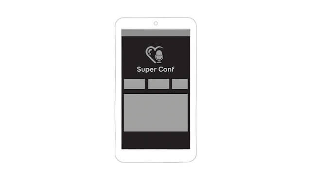
Using the light sensors on the device, we can adapt the luminosity or contrast of a website to the ambient light. Apart from making a website darker when the user is in a dark room, this could have a lot of practical applications. Many of the websites that my company builds get used in a private room (or on a couch), but that’s not the case for a lot of the professional products and interfaces I build. Those need to be used “in the field” — outside, inside, on rainy days, on sunny days, anything you can imagine.
For example, I was working on a crane-monitoring interface. The interface works in a Chrome browser on both desktop and tablet. The operator needs to see alerts when the wind is blowing too fast in order to change the cranes’ mode so that they don’t fall or collide with each other. The mobile device could be used in a really dark environment, or a lot of light might shine through the window directly onto the operator’s desk. Using ambient light sensors, we could maintain the contrast of the interface when there is too much light in the room, so that people monitoring the cranes will always be able to see alerts if something goes wrong.
In theory, there are two ways to do this. You could use the Ambient Light Sensor API to access the intensity level measured by the device’s light sensors. At the time of writing, this is supported only in Edge and Firefox for the desktop. A light-level query was expected in the “Media Queries Level 4” specification, but it seems to have been deferred to “Media Queries Level 5,” so this is not for us today.


