If you’re a visual designer, you probably spend a majority of your time making small adjustments to multiple visual elements. Maybe your client has decided they need a few more pixels of padding between each of your elements, or perhaps they’ve decided that all of their avatars needed to have rounded corners. Any which way, you might find yourself making the same adjustment in your design over and over… and over again.
In Adobe Experience Design CC (Beta), we’ve introduced the Repeat Grid feature to address this tedious aspect of a designer’s workflow. In this article, we’ll dig deep to uncover the true power of this time-saving feature. We’ll create and adjust a Repeat Grid, add content to it, and wire it up in Adobe XD’s simple and powerful Prototype Mode. If you’d like to follow along, you can download and test Adobe XD for free.
Further Reading on SmashingMag:
- Quick UX Prototyping With Adobe XD Shortcuts
- How To Create Icons With Adobe XD
- How We Use Prototyping, And How It Made Us More Efficient
Creating And Adjusting A Repeat Grid
At its core, a Repeat Grid is a special type of group. Just like we group objects, we’ll create our Repeat Grid by selecting an object or a group of objects and convert them to a Repeat Grid. In this exercise, we’ll make a simple phone contact list with an image and a name.
Step 1: Create Our Initial Objects
- From the welcome screen, select an artboard type to start a new file.
- Draw a rectangle using the Rectangle tool (
R). - To the right of your rectangle, use the Text tool (
T) to type in some placeholder text. - Using the Selection tool (
V), select both objects, either by marquee selecting (drawing a box around both objects), or by selecting one object and Shift-selecting the other.
Note that we do not need precision at this point, as we can adjust the elements later.
Step 2: Create And Resize Your Repeat Grid
Convert the selection to a Repeat Grid by clicking on the button in the Property Inspector or by using the shortcut key Cmd + R.
Our group is now a Repeat Grid. You can see that it now has two handles, one on the right and one on the bottom, and the box around your group is a green, dotted line.
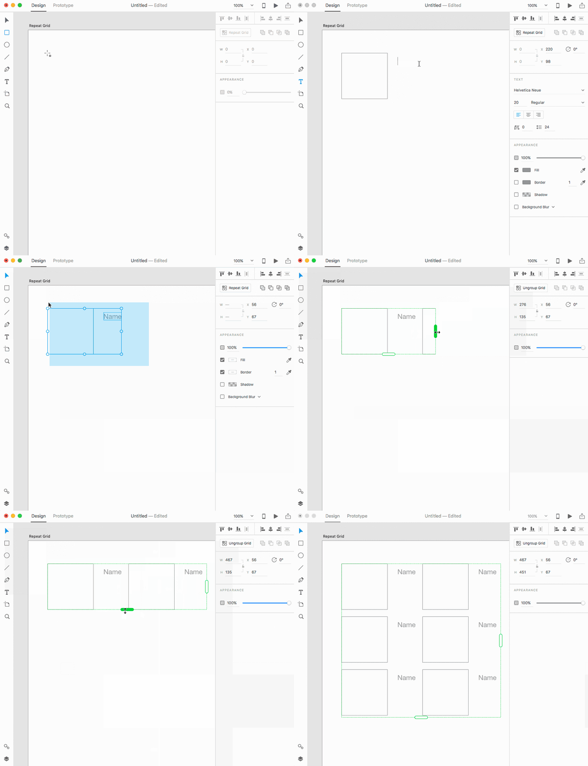
Click and drag the right handle to the right, expanding the Repeat Grid. To expand the Repeat Grid down, drag the bottom handle down.
We now have repeated elements in our Repeat Grid. All of the styles we apply to any object will be to all repeated versions of it.
Step 3: Adjust Any Elements Within Your Repeat Grid
Like any group, we can access the Repeat Grid’s component elements by double clicking into the group. Once we’ve made our changes, we can exit the edit context by pressing the Escape key. However, there are other ways to access the component elements. For instance, we can drill down into the element in the Layers panel (Cmd + Y) or by direct selecting it (Cmd + Click).
- Using the Selection tool (
V), double click on any rectangle in the Repeat Grid. You should now see a light blue box around the cell you’re editing. Select and drag your text so that it’s aligned to your rectangle. - Click on the Text object and change the typeface and size in the Property Inspector on the right. All of your text objects share the same style.
- Press Escape to exit the edit context and move the Repeat Grid so that it’s aligned to the artboard.
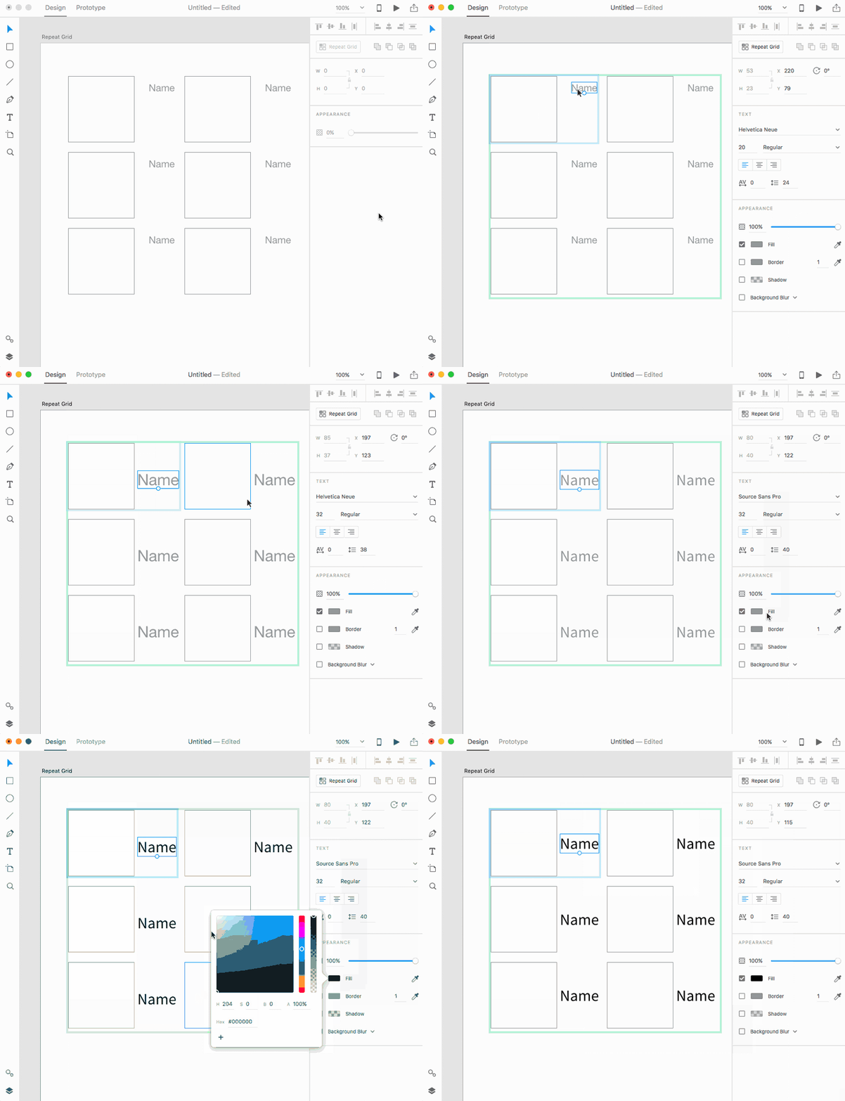
Step 4: Adjust The Row And Column Padding In Your Repeat Grid
Now that we have our Repeat Grid, we can begin to adjust the space between each row and column. By hovering over the gap between elements, we can activate the column and row indicators and change them to our liking.
- Place your cursor between the right side of a text element and the left side of a rectangle, directly in the column gutter. Once the pink column indicator is displayed, drag the right side of the gutter left and right until it’s set to 30.
- Place your cursor between rectangles, directly in the row gutter. Once the pink row indicator displays, drag the bottom of the gutter up and down until it’s set to 30.
- Continue to adjust the spacing between cells and the size of the Repeat Grid until you have the right number of elements to fit your artboard.
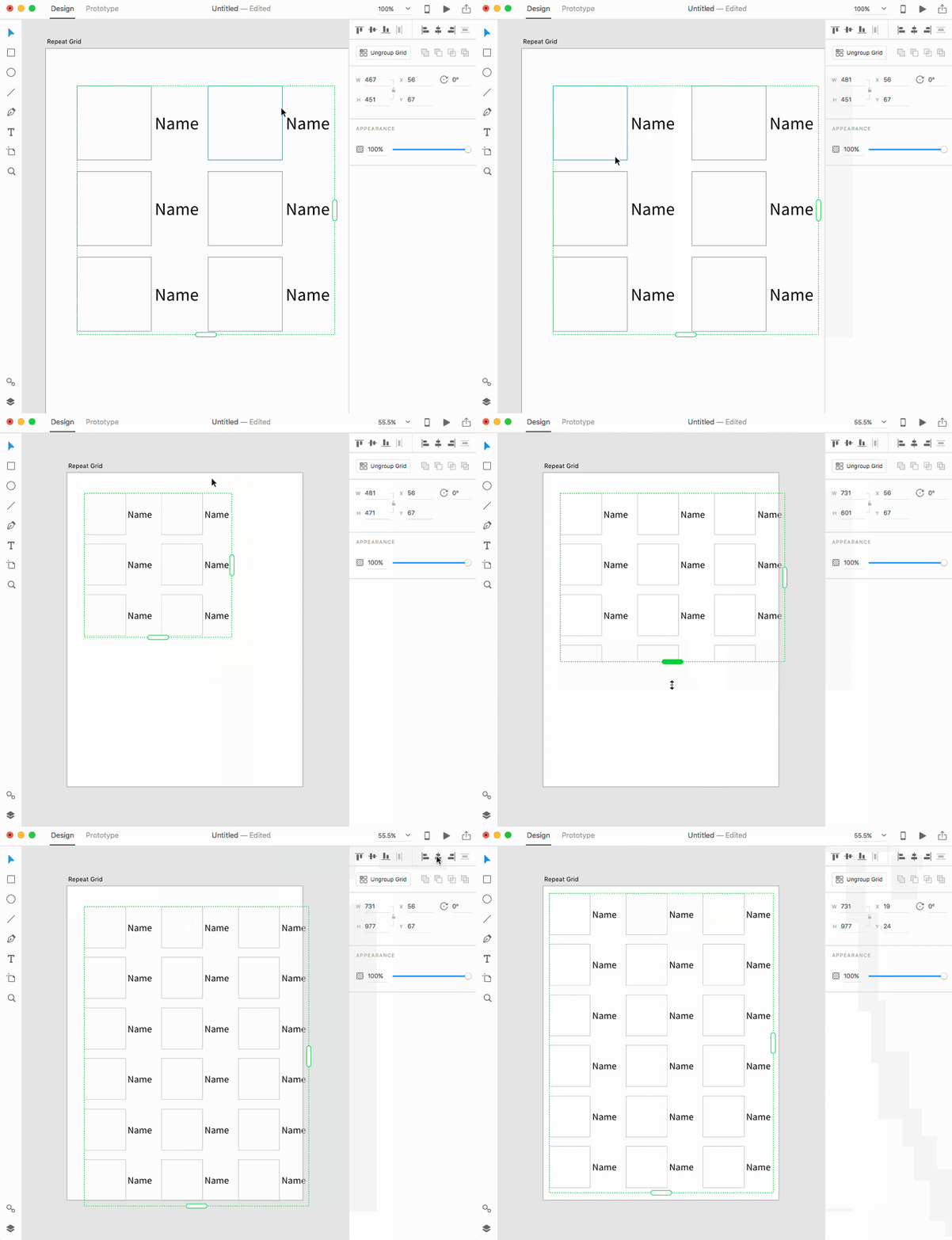
You can convert any set of objects into a Repeat Grid. Those objects become a cell in the Repeat Grid. You can then edit the cell and adjust the gap between rows and columns.
Using Data In A Repeat Grid
Now that we have the overall shape of our contacts list, we can populate it with content. The simplest way to populate is to change each element separately.
Step 1: Update Individual Text Elements
Cmd + Clicka text object in your Repeat Grid to select it. You’re now in the Repeat Grid’s edit context mode.- Double click the text element to edit it and change the text to a name. Note that the content isn’t applied to all of the other text objects in the Repeat Grid. However, any style applied to the text object applies to all text objects.
Step 2: Create An Image Fill Pattern
- Drag an image into one of the rectangles to import it. Your image will be applied as the fill for the rectangle, and automatically resizes to fill the shape. We call this feature auto-masking.
- Drag a second image into the second rectangle. We define order in the Repeat Grid in left-to-right reading order (left to right, then top to bottom). Note that the Repeat Grid now alternates between the first photo and the second photo. We’ve now created a 2-photo pattern.
- Drag a third image into the fourth rectangle. Now that you’ve dragged an item into the fourth rectangle, we have a 4-photo pattern, with the first and third being identical images.
- Drag a fourth image into the first rectangle. This replaces the first element in your 4-photo pattern, so you should now have four unique photos in your pattern.
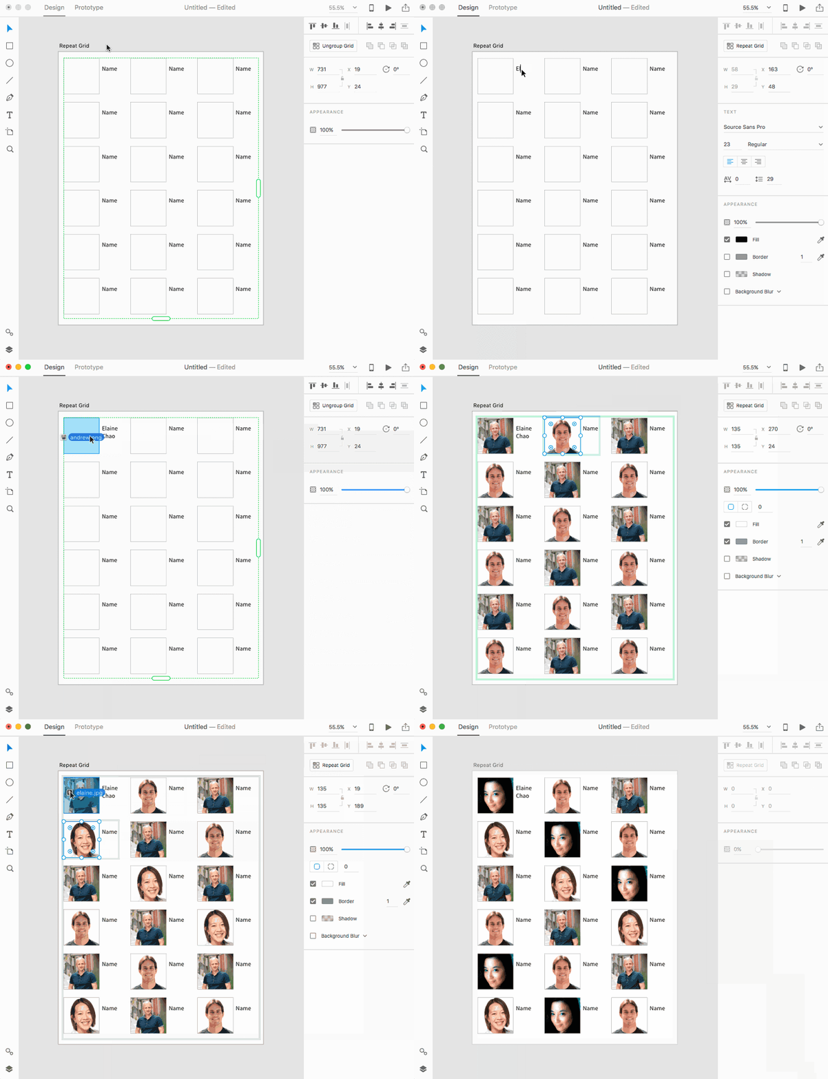
Text works on the concept of overrides; we can override the content of a text object itself, but the styles remain applied to all repetitions of the object. However, we can build out the concept of repeated patterns with auto-masked objects, where the image fill of an object is repeated in a pattern that you define. For instance, if you dragged your third image into the third rectangle, you would have created a 3-photo pattern. Similarly, if you had dragged an image into the fifth rectangle, you would have created a 5-photo pattern.
However, that can get really tedious. Instead, what we’ll do is use content that we’ve prepared ahead of time.
Step 3: Drag A Return-Separated Text File To Your Text Object
- Create a text file with the extension .txt. You can create this using Mac’s TextEdit (select Format > Make Plain Text) or any text editor you prefer. Separate each piece of data with a return.
- Once you’ve saved the file, drag it from Finder and onto your Repeat Grid’s text object in Adobe XD to import the data.
Now our object repeats based on the number of lines in our text file. If our text file has four lines, it’ll place a line per text object and repeat after placing the first four.
Step 4: Drag a selection of image files into your rectangle.
- In Finder, select a number of images.
- Drag this selection from Finder and onto your Repeat Grid’s rectangle to import the images as fills for the repeated rectangle.
- Select the rectangle and change the corner radius by dragging one of the radius controls. All of your style changes are reflected on each repetition.
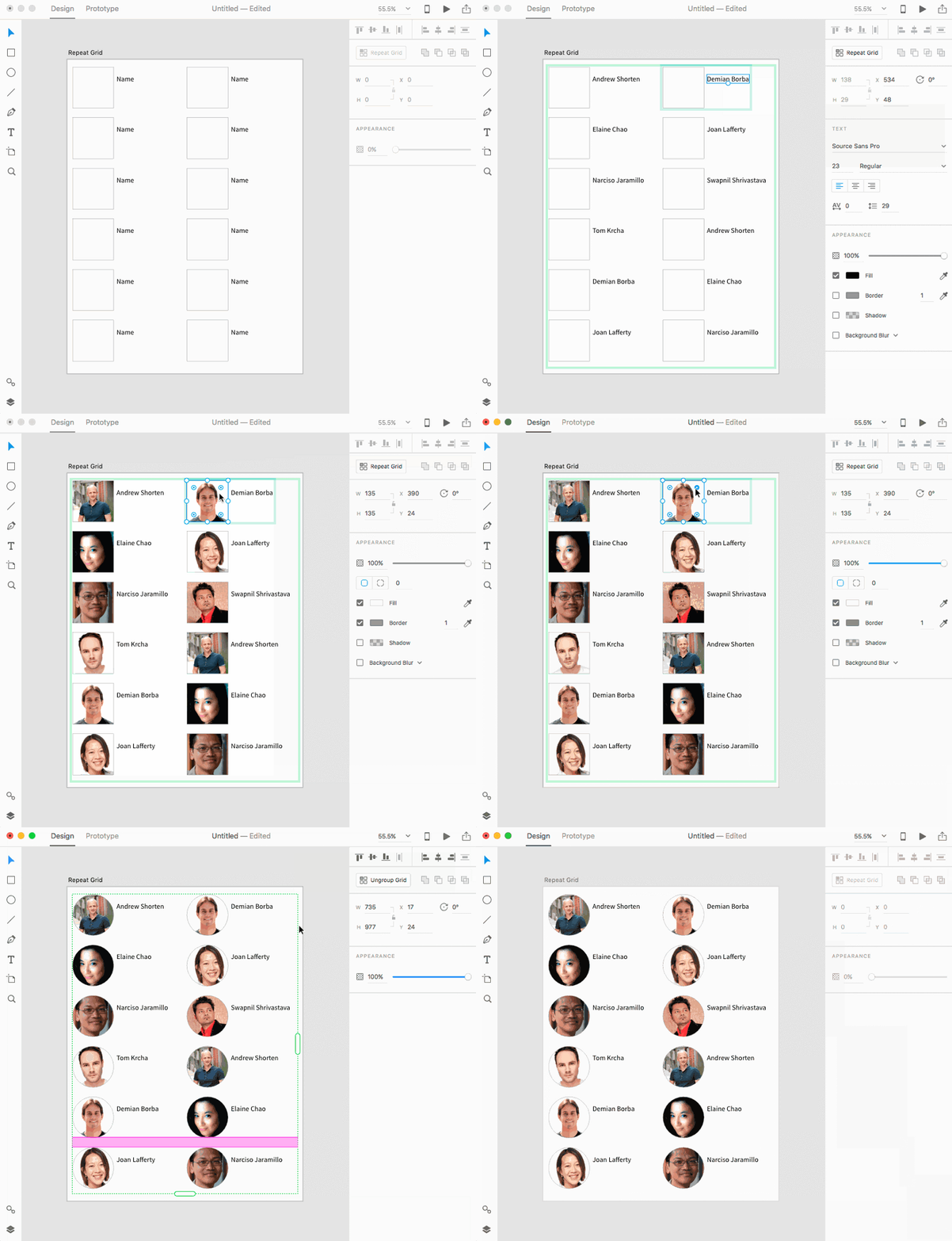
Similar to dragging images in one at a time, you’re creating a repeating pattern for your object’s fill. And, just like text, any change to the container is propagated to all of the repetitions of the object in the Repeat Grid.
Note that you can easily change the content of a Repeat Grid, either by changing an individual object or by dragging in data sources. Note that the data is imported and not linked, so any changes you make to the source file won’t affect the data you’ve already placed in your XD file. All of your styles and the size and shape of any container is reflected in all repetitions of an element.
Adding Content To A Repeat Grid
Now that we have a fairly fleshed out contacts list, we can continue our design process, iterating as we receive feedback from our colleagues and stakeholders. In this case, we might need to add elements after the fact. Repeat Grid makes this easy by allowing us to add elements to a cell.
In our example, we’ll add a horizontal line to separate the cells vertically.
Step 1: Draw While In Edit Context
- Enter the Repeat Grid’s edit context.
- Draw a horizontal line over the cell below by selecting the Line tool (
L) and holding down the Shift key while dragging across. - Using the Selection tool, adjust the line’s location until it’s aligned to the left of the rectangle.
- Press Escape to exit edit context.
We can draw any element or add text within the Repeat Grid’s edit context, even after you’ve created it. Since Repeat Grid automatically repeats every element, this allows us the flexibility to play with design in a new way.
We’ve just added a line, but now the cells are overlapping one another, leaving us with a visual mess. We’ll need to add vertical space between cells. When something like this happens, Repeat Grid recalculates the gutter between the row or column (from the bottom of one to the top of the next, or from the right of one to the left of the next) and sets it to a negative number if they overlap.
Step 2: Readjust Negative Padding
- Hover in the overlap space. Grab either the top or bottom of the rectangle and pull it down, so the overlap no longer exists, then a little further.
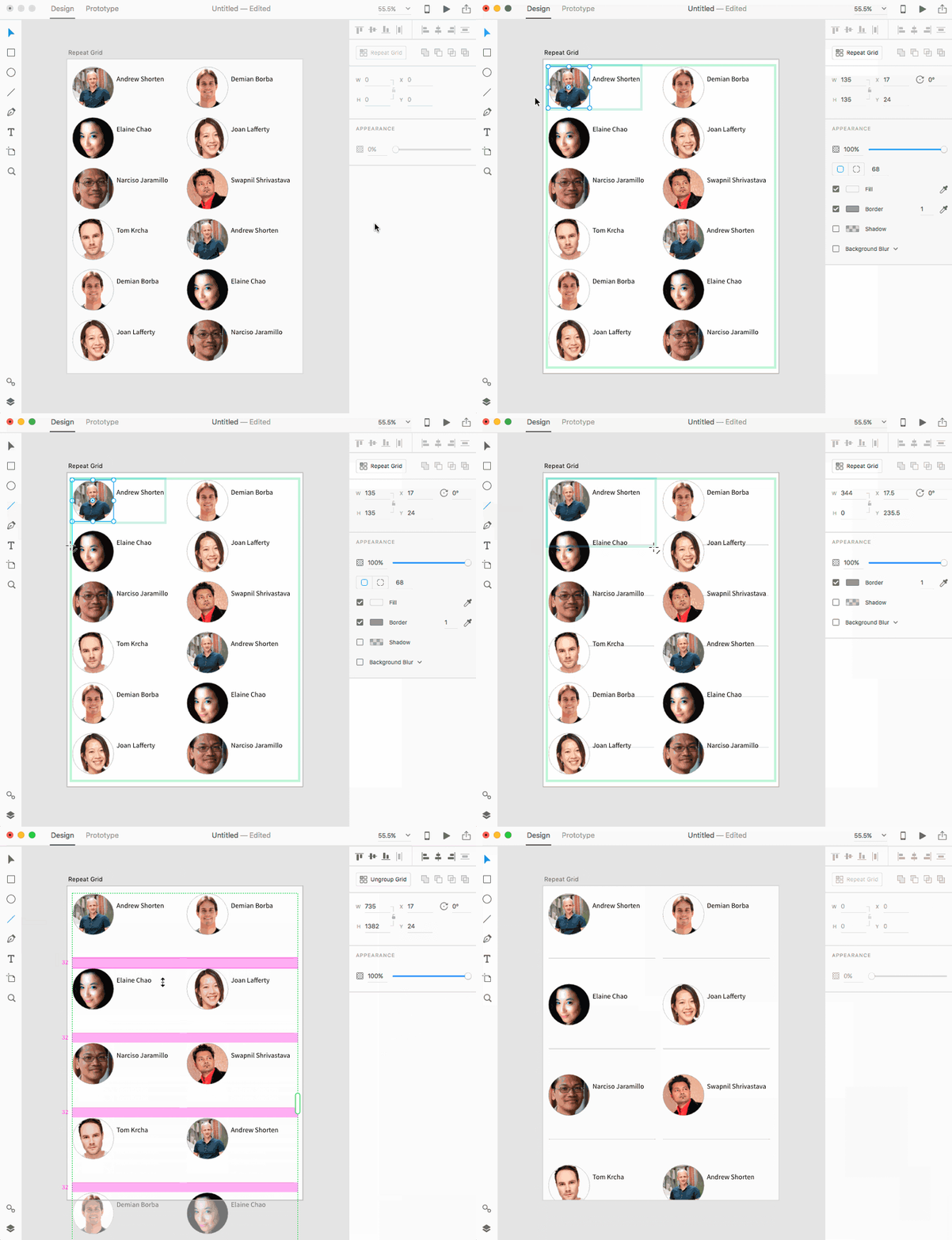
We’ve solved this problem, but what about adding artwork that we’ve already created? We can cut from one context and paste into another.
Step 3: Cut And Paste Into The Repeat Grid’s Edit Context
- Download the star.svg file and drag it onto the pasteboard, outside of your current artboard. This imports the star.svg file into your project.
- Convert your imported path into a Repeat Grid and drag the right handle to the right until you have a total of four stars. Adjust the padding to bring the stars closer together.
- Cut the Repeat Grid with the stars (
Cmd + X), then double click on any cell of your contact list in order to enter its edit context. - Paste (
Cmd + V). Your Repeat Grid of stars will paste into the center of the cell. Move the stars so that it’s underneath the text.
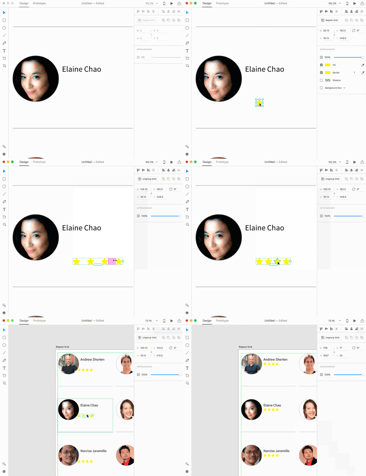
Sometimes, though, we’ll want to break apart the Repeat Grid; sometimes you just want independent objects after you’ve lined them up. In order to do this, we’ll ungroup the Repeat Grid and make our changes.
Step 4: Ungroup The Inner Repeat Grid And Edit As Necessary
- Since you’re already in the contact list’s edit context, click on the Repeat Grid of stars to select it.
- Ungroup the Repeat Grid by selecting the Ungroup button in the Property Inspector, selecting Ungroup Grid from the context menu (Ctrl-click or right mouse button), or using the keyboard shortcut
Cmd + Shift + G. - Select two of the stars and uncheck the fill.
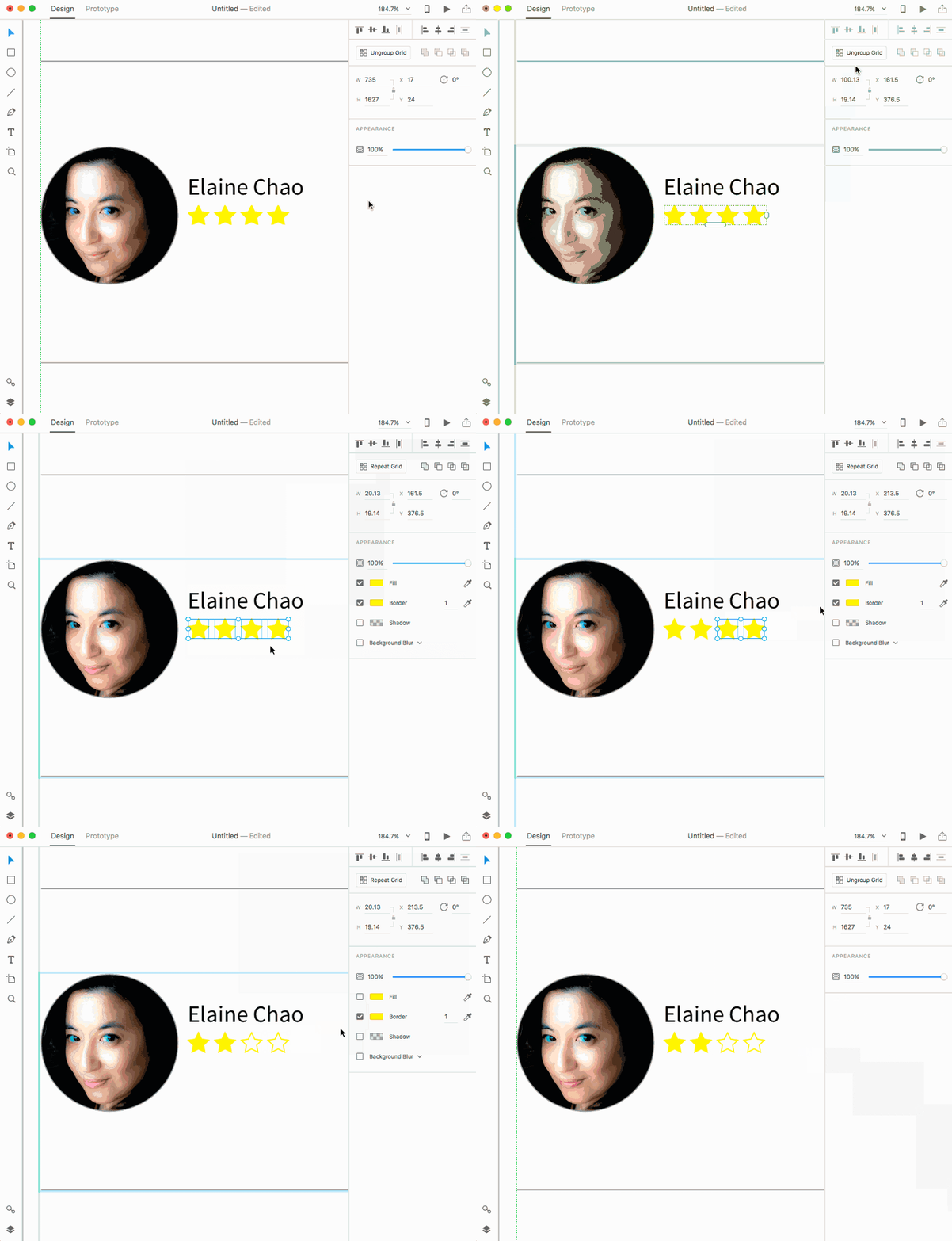
You can even add objects to the Repeat Grid after you create it, either by drawing or pasting into the edit context. If you have negative padding, you can adjust it easily by hovering over the overlap area. You can use Repeat Grid as an easy alignment tool between elements and decouple the repeated elements by ungrouping.
Prototyping From A Repeat Grid
Now that we have a Repeat Grid, we’re going to wire it to another artboard in Prototype Mode. Using Adobe XD, we can switch back and forth between Design and Prototype Modes quickly, which allows us to edit both the UI and interactions at the same time.
In this case, we’re just going to create a second artboard and wire from our Repeat Grid in three different scenarios.
Option 1: Wire The Entire Repeat Grid For A Single Interaction
- Create a second artboard in your file by using the Artboard tool (
A). Click to the right of your existing artboard to create another artboard next to your first. - Switch to Prototype mode by clicking on the tab at the top of the application frame or by using the keyboard shortcut
Cmd + Tab. - Select the Repeat Grid in your first artboard. A connector with an arrow will appear on the right side of the object at its midpoint.
- Drag this connector to the next artboard. Select your transition options in the pop-up, then press Escape or click outside to dismiss it.
- Preview by either pressing the Play button in the upper right-hand corner of the application frame or by using the keyboard shortcut
Cmd + Enter. Click anywhere over the Repeat Grid to play the interaction.

What we’ve done at this point is wire the entire object, including its padding, as a hit point for the interaction.
Option 2: Wire A Single Element Of A Repeat Grid For An Interaction
- Undo your last wire by using the keyboard shortcut
Cmd + Z. - Cmd-click a rectangle in your Repeat Grid to direct select it.
- Drag the connector on the right of the rectangle and drag it to the second artboard. Select your transition options in the pop-up as before, then dismiss it.
- If your Preview window isn’t still open, launch it again and click the target.

At this point, we have a single element, but what happens if we want to select the entire cell? We can create a group within the Repeat Grid in order to make this a valid hit point.
Option 3: Create a group of elements within the Repeat Grid and create an interaction from the group.
- Undo your last wire by using the keyboard shortcut
Cmd + Z. - Switch back to Design mode by clicking on the tab or using the keyboard shortcut
Cmd + Tab. Cmd + Clicka rectangle in your Repeat Grid to direct select it. Shift-click the text object next to it to add it to your selection.- Group the two objects by using the context menu selection or the keyboard shortcut
Cmd + G. - Switch back to Prototyping mode. Note that your selection remains the same as while in Design mode.
- Drag the connector from the group to the second artboard. You’ve now wired the entire group area as a hit point for the interaction.

You can even create an interaction by setting the hit point to the entire Repeat Grid, an individual element from inside it, or a group created inside of it.
That’s It!
I hope that this brief tutorial has helped you explore the power of Repeat Grid. This simple and powerful feature has been quite popular in the beta version, and it’s evolving as we get more feedback from users. If you have an idea for improvements, please do share them in the comments section below.
This article is part of the UX design series sponsored by Adobe. The newly introduced Experience Design app is made for a fast and fluid UX design process, creating interactive navigation prototypes, as well as testing and sharing them — all in one place.You can check out more inspiring projects created with Adobe XD on Behance, and also visit the Adobe XD blog to stay updated and informed. Adobe XD is being updated with new features frequently, and since it’s in public Beta, you can download and test it for free.
 (ms, aa, il)


