Almost five years ago, I had the honor of writing a post on Smashing Magazine about my Photoshop panel GuideGuide. Since then it has seen wild success as the most installed third-party Photoshop extension, an achievement I’m quite proud. In that time, I’ve added some powerful features and, most recently, expanded it to Illustrator. This post will give you a taste of how GuideGuide can change the way you use guides in Photoshop and Illustrator.
If you’re one of the many people who already use GuideGuide, please read on. You may discover some unconventional uses that are not immediately apparent. I’ll provide a overview of the major features, and then give some examples of advanced and unusual ways it can be used to make you a more efficient designer.
Further Reading on SmashingMag:
- 40 Excellent Adobe Illustrator Tutorials
- Illustrator’s Live Trace: Sketch To Vector
- A Better Way To Design For Retina In Photoshop
- Photoshop Etiquette For Responsive Web Design
While I’m going to focus this post on Illustrator, nearly everything is applicable to Photoshop as well.
Please note that at the time of the original Smashing Magazine post, GuideGuide was a free extension. It now costs $10 (you can read about why I chose to do this), and it supports Photoshop and Illustrator CC+. To try it for yourself, you can download a special Smashing Magazine edition of the GuideGuide trial. It is fully featured for the first 90 times you use it to add guides.
System Requirements
This tutorial uses GuideGuide 4, which supports Photoshop and Illustrator CC and later. If you have Photoshop CS5 or CS6, you can still download GuideGuide 3 for free, which works but lacks some of the features mentioned in this article. Older versions of Illustrator are not supported.
Installation of Adobe extensions is notoriously unpredictable. I’ve done my best to make the process smooth with the included installer and documentation, but if you have issues, you’re always welcome to contact me for support.
The Basics
Grids are one of the fundamentals of design, regardless of the tools you use. Chris Brauckmuller’s article, while a bit dated, is a great quick overview to grids on the web, and Making and Breaking the Grid deserves a place on every design bookshelf. Many artists and designers have lamented that Photoshop and Illustrator suffer from a lack of grid features. GuideGuide fills this void by automatically doing the complicated math necessary to produce grids, making your design life easier.
I’ve written this post using inches for measurement, but GuideGuide works with all measurement types supported by Illustrator and Photoshop.
A Basic Grid
Imagine you are preparing an 11 × 8.5-inch document for a trifold brochure, with 0.5-inch margins, a 0.125-inch bleed and a baseline grid. Once you’re a GuideGuide expert, it will be possible to create this grid in a single action; however, I’m going to break it down into steps to illustrate some of GuideGuide’s features.
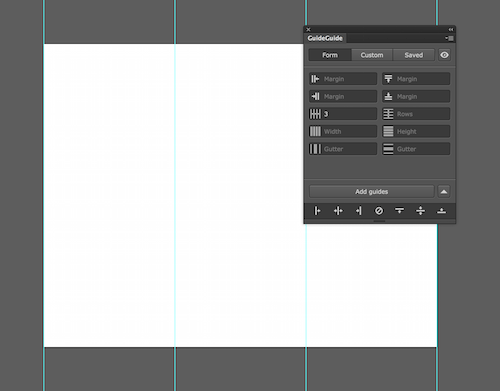
With a freshly created document open, the first thing to do is add columns. By default, GuideGuide will use the selected artboard as its reference. Enter 3 in the column-count field, and hit “Add guides.”
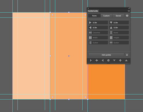
Next, we’ll add margins to each column. GuideGuide can use a selected object as its reference; so, create a rectangle that is the size of one of the columns, select it, add .5in in each of the margin fields, and then click “Add guides.” Repeat this process for each column, and leave the shapes in the document for now.
I mentioned earlier that we’re going to add bleed guides to the document. In this example, we don’t want to use the built-in bleed setting. GuideGuide supports negative values in the form fields, which will allow you to create guides outside of the context. Deselect any shapes you have selected, then put -0.125in in the margin fields, and click “Add guides.”
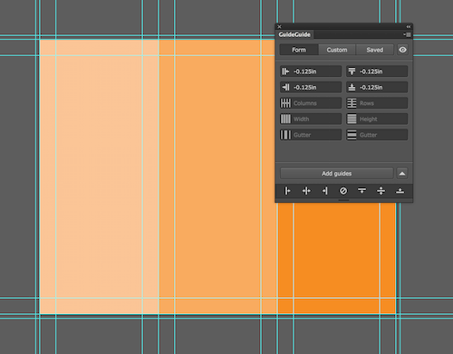
Now that we have our bleed guides, we can expand the artboard to fit them.
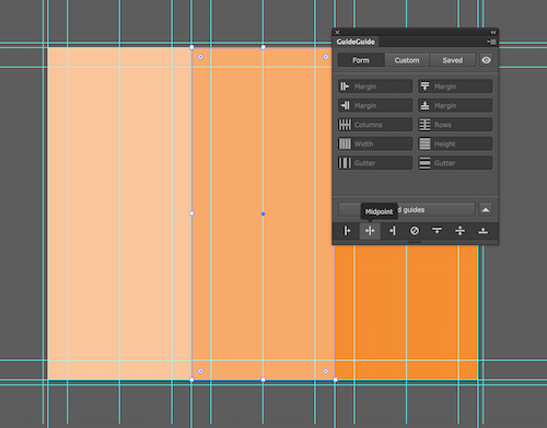
Next, we will add a midpoint guide to each column. If you left the column shapes in the document like I suggested, then select the first shape, and use the vertical “Midpoint” quick-guide button at the bottom of the panel. Repeat this for each column.
If you like to keep things clean and organized, it’s worth noting that GuideGuide adds guides to the active layer (only Illustrator supports layer-specific guides). If you plan ahead, you can create different parts of your grid on separate layers, so that you can turn them on and off independently as needed.
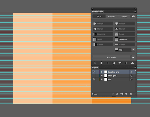
For example, let’s add a baseline grid. Create a new layer named “Baseline grid” and select it. Type 16pts into the row height field. When you leave the row count field blank, GuideGuide will automatically fill the screen with rows until it runs out of space. By adding the guides to the selected “Baseline grid” layer, you can turn them on and off separately from your main grid by toggling the layer visibility.
Getting Down To Business
Now that we’ve covered the easy on-the-fly features, let’s dig into some uses of GuideGuide that are super-powerful but require a little thinking ahead.
Grid Notation
If you fill out some values in the “Form” tab and then click the “Custom” tab, you will find something that looks a little like a programming language. This is grid notation, a language you can use in the “Custom” tab (and in the “Form” tab to a certain extent) to tell GuideGuide about your grids. In fact, every feature works by using grid notation under the hood.
Here is a quick introduction. The most important part of grid notation is the pipe character, |. It tells GuideGuide to “put a guide here.” Next is a command, that says “move over this much.” If you put a bunch of these together, GuideGuide will read it from left to right, interpreting it as “Add a guide, move over, add a guide, move over, add a guide.” You can read all about grid notation in the documentation, including about the commands that help with computation, such as variables and fills.
For now, I will show you one of the most important grid notation commands, the wildcard ~. GuideGuide equally divides whatever space isn’t accounted for in the grid between each wildcard. Practically speaking, this is how GuideGuide calculates the width of columns and rows. For example, | ~ | ~ | ~ | would be a three-column grid.
You may be wondering, if the GuideGuide form can already do all of this, why bother? Consider the common web design pattern of pairing icons with paragraphs.

Visualize this pattern across the x-axis. There is a bit of space for the page’s margin, the width of the icon, another margin, the width of the paragraph, and then the margin before the next instance of this pattern.
If you are designing a responsive website this way, then you probably know the width of the icon but not of the paragraph. This is where the wildcard is useful. In this example, the document’s margins and gutters are 40 pixels, the icon’s width is 60 pixels, the space between the paragraph is 10 pixels, and the column’s widths are unknown but should be equal to one another. This can be expressed in grid notation like so:
| 40px | 60px | 10px | ~ | 40px | 60px | 10px | ~ | 40px | 60px | 10px | ~ | 40px |GuideGuide adds up the commands that have an explicit value and subtracts that from the width of the available space. It then splits the remaining area between the wildcards. The result will look like this:

Grid Notation in Fields
Grid notation in its raw form is powerful, but you’ll often want the convenience of the grid form with just a little bit of that power. For example, what if you want your gutters to have a midpoint? Easy! Just use grid notation. To create a 40-pixel gutter with a midpoint, add 20px | 20px to the gutter-width field.
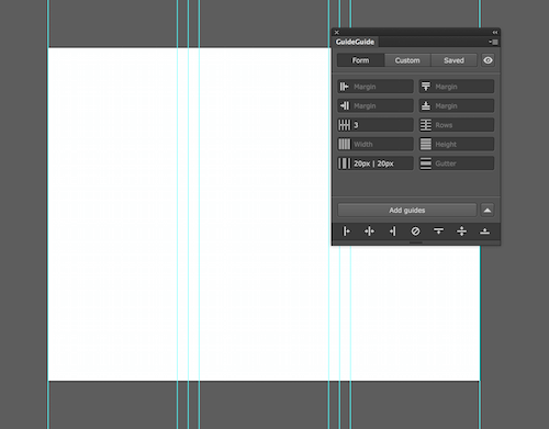
GuideGuide supports basic notation in any field that allows for a measurement input. Going back to the example from earlier, you can create the same effect with the form and a grid notation:

Grid notation is super-useful and is a great way to create and share complicated grids, like the preset grids based on Bootstrap created by Christophor Wilson.
Getting Weird Guides
With a combination of the form and grid notation, GuideGuide can do almost anything. Going back to our original example of a trifold brochure, the entire grid that I created in multiple steps can actually be done with one.
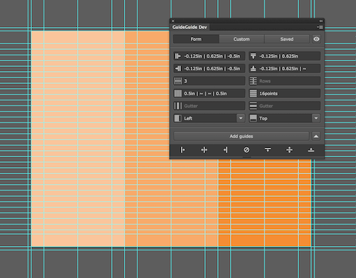
It’s even possible to save a grid as a preset to reuse or share with someone.
The Golden Ratio
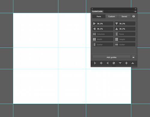
While GuideGuide is meant to spare you from doing calculations, some grids benefit from a little math, like a 3 × 3 grid whose guides in the center indicate the golden ratio. I avoid doing math whenever I can, so a quick search tells me that the golden ratio expressed as percentages is 38.2% and 61.8%. I also know that subtracting one value from 100% will give me the other; so, if I type 38.2% for each margin, voila! A golden-ratio grid.
The Fibonacci Sequence
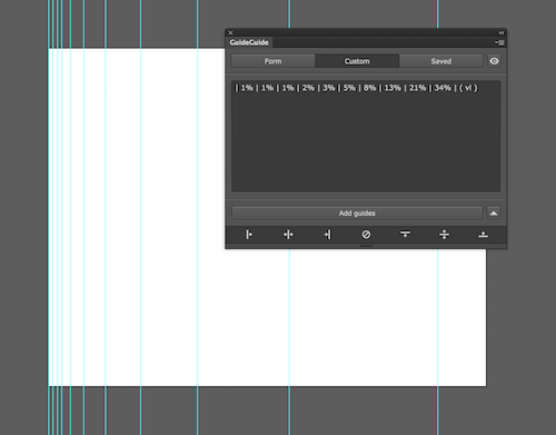
To drive home my point that you can do almost anything, how about a grid based on the Fibonacci sequence? I’m going to base the grid on percentages, and the Fibonacci values under 100% are 1%, 1%, 2%, 3%, 5%, 8%, 13%, 21%, 34%, 55%, 89%. We don’t need two guides at 1%; we can leave off the second 1%.
While this seems pretty straightforward, we have to make an adjustment in order for the grid to be accurate. Each command tells GuideGuide to move over; so, each guide’s coordinates are the sum of all commands given up to that point. For example, to express 8% in the sequence, you’d use 3%, which is 8% minus the sum of all values before it. Confused? That’s OK. If you try it a few times, you’ll get the hang of it.
Once all of the adjustments have been made, this grid notation string will give you a Fibonacci grid:
| 1% | 1% | 1% | 2% | 3% | 5% | 8% | 13% | 21% | 34% | ( vl )You can paste that in the “Custom” form, or, if you look at the presets in the “Saved” tab, you’ll see that it’s one of the defaults.
Getting Excited?
I hope you’ve found this GuideGuide guide guide helpful. As I mentioned at the beginning of this post, you can download a special Smashing Magazine edition of the GuideGuide trial, which lasts three times longer than the standard trial.
 (il, al)


