Icons are an essential part of many user interfaces, visually expressing objects, actions and ideas. When done correctly, they communicate the core idea and intent of a product or action, and they bring a lot of nice benefits to user interfaces, such as saving screen real estate and enhancing aesthetic appeal. Last but not least, most apps and websites have icons. It’s a design pattern that is familiar to users.
Despite these advantages, icons can cause usability problems when designers hide functionality behind icons that are hard to recognize. An icon’s first job is to guide users to where they need to go, and in this article we’ll see what it takes to make that possible. If you want to take a go at creating your own icons, you can download and test Adobe’s Experience Design CC for free and get started right away.
Further Reading on SmashingMag:
- How To Create Icons In Adobe XD
- Easy Steps To Better Icon Design
- How To Use Icons To Support Content In Web Design
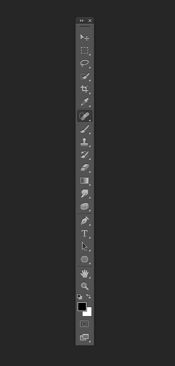
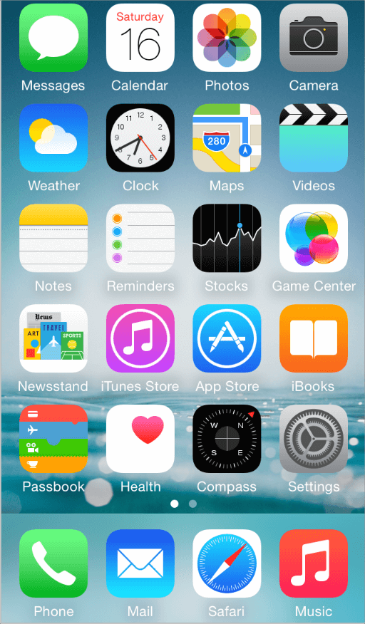
Types Of Icons
As mentioned, an icon is a visual representation of an object, action or idea. If that object, action or idea is not immediately clear to users, the icon will be reduced to visual noise, which will hinder users from completing their task.
There are three types of icons: “universal,” “conflicting” and unique icons. Let’s focus on each type and its impact on the user experience.
Universal Icons
A few icons enjoy nearly universal recognition among users. The symbols for home, printing, searching and the shopping cart are such icons.

There is only one problem: Universal icons are rare. Beyond the examples cited above, most icons are ambiguous. They can have different meanings depending on the interface.
Icons With Conflicting Meaning
Trouble comes when you implement a commonly used pictogram that has contradictory meanings. The heart and the star are excellent examples. Not only does the functionality associated with these icons vary from app to app, but these two icons compete with each other.
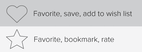
As a result, these icons are hard to interpret precisely. Even in the context of an individual app, these symbols can be very confusing when the user expects one outcome and gets another. This impedes the user’s understanding of these icons and discourages them from relying on them in future experiences.
Consider other popular icons that have multiple meanings:
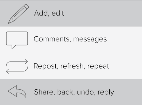
Unique Icons
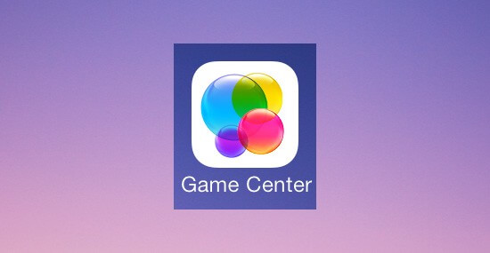
Icons are especially bad for anything abstract because they generally are not strong visual representations. How do you describe a unique object or action? Apple’s icon for its Game Center app, for example, is a group of colorful circles. What does the Game Center icon mean? How does it relate to gaming?
As another example, when Google decided to simplify its Gmail interface and move everything behind an abstract icon, it apparently got a stream of support requests like, “Where is my Google Calendar?”

An icon might make complete sense once you know what it’s supposed to represent, but it can take some time for first-time users to figure things out. Another problem is that first-time users tend to avoid interface elements that they don’t understand. It’s human nature to distrust the unknown.
Practical Recommendations For Designing With Icons
Let’s take a look at some simple techniques and strategies for choosing a proper icon for a given context. Obviously, picking an icon often is a long story, and whatever the choice is, testing icons in interfaces with real users is crucial.
Use Labels to Clarify Abstract or Unfamiliar Icons
Icons can save space by reducing text, but at the price of recognition. An icon can represent a thousand different words, and that is exactly the problem. It would be a serious misconception to assume that users either would be familiar with your abstract pictograms or would be willing to spend the extra time discovering what each means.

Users are often intimidated by unfamiliar interfaces. What they really want is a clear idea of what will happen before they perform an action in an unfamiliar app. That’s why your icons need to set clear expectations for users before they click or tap on them.
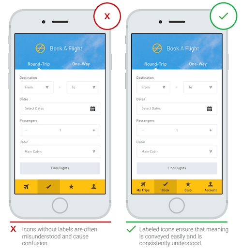
A good user experience can be measured in many ways, one of which is how much it frees the user from having to think. Clarity is the most important characteristic of a great interface. To avoid the ambiguity that plague most icons, we can include a text label to clarify an icon’s meaning in a particular context, especially for complex actions and abstract functions.
UserTesting conducted a series of tests, comparing labelled icons to unlabelled icons. It found that:
- users were able to correctly predict what would happen when they tapped a labelled icon 88% of the time;
- that number dropped to 60% for unlabelled icons. For unlabeled icons that were unique to the app, users correctly predicted what would happen when they tapped an icon only 34% of the time.
Even for universal icons, including a label is usually safer.
When Icons Alone Are Adequate
So, not all users are familiar with conventional icons, which makes an icon-only interface potentially harder for them to use. On the other hand, experienced users might regard an interface with text labels everywhere to be cluttered. How do we make everyone happy? As Michael Zuschlag mentions, icons alone will suffice when at least two of the following three conditions are met:
- space is very limited (i.e. too small for text alone);
- the icons are standardized (e.g. they are universal);
- the icons represent objects with strong physical analogs or visual attributes (e.g. a red rectangle to set the page’s background as red).
Beware of Tooltips and Popovers for Icons
Some designers believe labels defeat the purpose of icons and clutter the interface. To avoid using labels, they use tooltips. However, tooltips are a poor substitute for text labels. The fact that text labels never need graphic tooltips is a pretty good clue that text is better than icons. Another major disadvantage is that tooltips fail to translate well to touchscreens.
Another common technique is to use tutorials or coach marks or popover hints. However, users might simply rush through the tutorial or forget everything they’ve learned when they next launch your app. Like tooltips, tutorials are no substitute for intuitive design; rather, the opposite. As Matthew at CocoaLove says, “Your app’s tutorial screen is just a list of ways you’ve failed.”

Icons and Button Labels
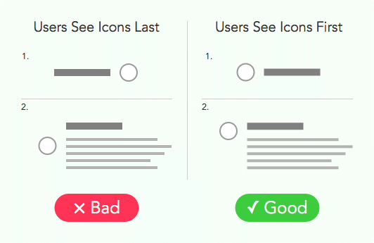
Icons accompanied by labels make information easier to find and scan, as long as they’re placed in the right spot. Place icons according to the natural reading order. As argued by UX Movement, there are two important factors in an icon’s location:
- In order for icons to serve as a visual scanning aid, users need to see them before they see the accompanying label. Place icons to the left of their labels so that users see them first.
- Align the icon with the label’s heading, instead of centering it with the heading and body. Seeing the icon first will help users to scan the page more easily.
Icons in Data Tables
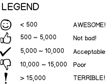
Let’s imagine that you have a table with numbers in rows, and you need icons as supporting elements to indicate whether a value is good, mediocre or bad. What is the proper placement for icons next to numbers — to the right or left? As Don Nickel explains, icons to the left of a number usually indicate the intent of the data, whereas icons to the right usually indicate the quality of the data. As with icons with button labels, the placement of icons should follow the natural reading order. There are two possibilities for icon placement:
- Status icons would appear at the end of the line. As seen in the example below, the user will see the subject first, then the value associated with the subject and, finally, the status of the value.

(Image: Stack Exchange) - If the icons themselves are the subject, then they would appear at the start of the line, and everything else would follow thereafter.
(Image: Stack Exchange)
Icons For Accordion Menu
The accordion menu is a UI pattern that collapses long lists into manageable groups. It is useful for navigation menus and particularly for search filters.
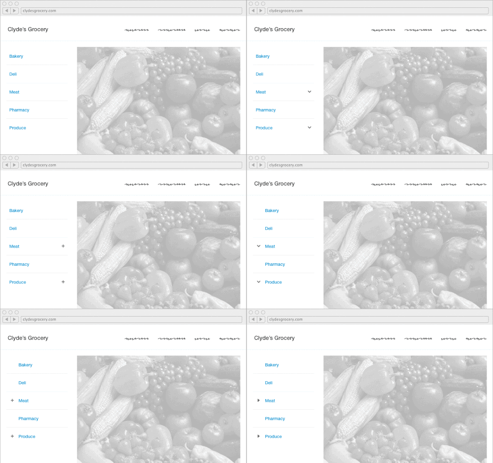
Beyond the decision of whether to use an accordion menu, designers often wrestle with the specifics of designing one. The most common questions are:
- What icon should I use? In terms of usability, is an icon really necessary at all?
- Should the icon go on the left or right of the menu item?
Lance Gutin conducted an experiment with different type of icons (chevrons, plus and minus signs, and triangles) and locations (to the left and right). With three icon choices in two locations and a control group with no icon at all, he identified seven total designs to investigate.
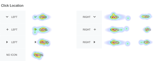
Analyzing the results, he mentioned two important findings:
- The most convincing data involved icon location. Presented with an icon to the right of the menu item, many users preferred to click the icon rather than the text label. It’s quite possible that some users believed the icon and the label functioned differently; the icon’s small size and distance from the label increased the recorded task times, resulting in slower task times for accordions with icons to the right.
- In terms of icon choice, the accordion menu with a plus placed on the left measured the fastest, with 90% of participants predicting that the menu would change. However, most of the task times did not differ statistically, and none of them differed practically.
Please notice that the study doesn’t mean that we all should use the icon with a “plus” icon placed on the left in accordion menus. However, if we put the icon on the right side, it’s safer to make sure that this icon is of a big enough size (at least 44×44px), so it’s easy to hit with a finger or a mouse.
Be Careful With Hamburger Icon
Three horizontal lines (i.e. the “hamburger” icon) has become a convention for the main menu button, especially on mobile websites:
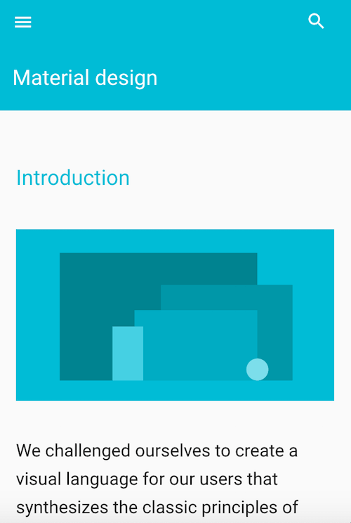
However, take into account two important factors when deciding whether to use a hamburger icon:
- A/B testing based on Jon Rundle's article shows a correlation between correct identification of the hamburger icon's function and the age of users. This icon isn't familiar to elderly users. Hence, from a usability perspective, ask who the majority of your users are.

(Image: Edgar Anzaldúa) (View large version) - Research from the Nielsen Norman Group found that the hamburger icon still requires labels for clarity. Other research by James Foster clearly shows that the hamburger icon is not as clear as the simple word "Menu." Thus, using the word "Menu" (and making it look like a button) could be more helpful to visitors.

Original (baseline); variation 1 ("Menu" + border); variation 2 ("Menu" + hamburger icon + border); variation 3 ("Menu" without border). (Image: Sites for Profit) (View large version) 
(Image: Sites for Profit) (View large version)
Designing Icons For Maximum Affordance
When designing user interface elements, consider the principles of usability (consistency, affordance, etc.). Affordance, an important concept, essentially means that elements such as icons should be intuitive:
- Keep icons simple and schematic.
In most cases, icons aren't the place to be creative. If you design a new icon, minimize visual detail and avoid a highly realistic image by focusing on the basic characteristics of the object. Fewer graphic details aid recognition.
If you have two options for an icon, choose the simpler one. (View large version) - Choose familiar icons.
A user's understanding of an icon is based on previous experience. If you decide to include icons in your interface, research first. Familiarize yourself with icons used by your competitors and with icons commonly used on the platforms you're targeting (i.e. system icons), because those will be most recognizable to your users. - Don't port platform-specific icons.
As you build your app for Android or iOS, don't carry over themed UI elements from other platforms. Platforms typically provide sets of icons for common functionality, such as sharing, creating a document and deleting. When you migrate your app to another platform, swap out the old platform-specific icons with the target platform's counterparts.
Icons for common functionality in Android (top) and iOS (bottom)
Make Icons Good Touch Targets for Mobile Apps
People interact with touch-based interfaces using their fingers. UI controls have to be big enough to capture fingertip actions without frustrating users with unintended actions and tiny targets. The image below shows that the width of the average adult finger is about 11 millimeters (mm) wide, while a baby’s is 8 mm; some basketball players have fingers wider than 19 mm!
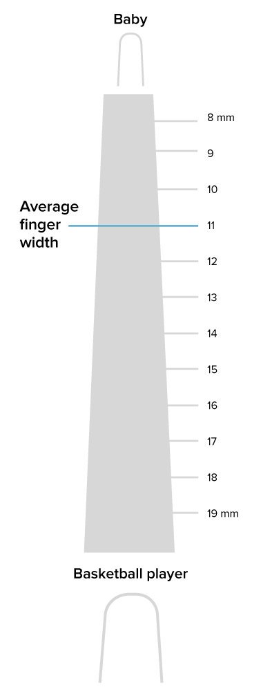
The recommended target size for touchscreen objects is 7 to 10 mm. Below are Apple and Google’ recommendations for their platforms (see “iOS Human Interface Guidelines” and Material Design):
- Apple recommends a minimum target size of 44 × 44 pixels. Because physical pixel size varies by screen density, Apple’s pixel specifications apply best to the iPhone’s 320 × 480-pixel 3.5-inch display.
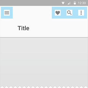
- Google recommends that touch targets be at least 48 × 48 density-independent pixels (DP). A touch target of 48 × 48 DP results in a physical size of about 9 mm, regardless of screen size. In most cases, icons should be separated by 8 DP or more of space to ensure balanced information-density and usability.

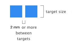
But not only is target size important; sufficient space between touch targets matters, too. The main reason to maintain a minimum distance between touch targets is to prevent users from touching the wrong icon and invoking the wrong action. This becomes extremely important when icons such as “Save” and “Cancel” are right next to each other. At least 2 mm of padding between targets is extremely important in such cases.
Test Your Icons
Icons need to be handled with care. Always test them for usability. Watch how a real first-time user interacts with your UI, which will help you to determine whether the icons are clear enough:
- Test the icons for recognizability.
Ask people what they think the icons represent. They shouldn’t have to wonder what they do, because they won’t bother trying to find out. - Test the icons for memorability.
Icons that are hard to remember are usually inefficient. Bring back a set of test users and ask whether they remember an icon’s meaning after having been told a couple weeks earlier.
Conclusion
Iconography lies at the heart of UI design. It can make or break the usability of an interface. Every icon should serve a purpose. It should help the user do what they need to do without requiring additional effort. When designed correctly, icons guide users intuitively through a workflow, without relying much on copy. Don’t make your users think. Make clarity in the app a priority!
Recommended Reading
- “On Icons,” iA
- “Myth #13: Icons Enhance Usability,” Zoltán Gócza, UX Myths
This article is part of the UX design series sponsored by Adobe. The newly introduced Experience Design app is made for a fast and fluid UX design process, as it lets you sketch out ideas, create interactive prototypes, test and share them all in one place.
You can check out more inspiring projects created with Adobe XD on Behance, and also visit the Adobe XD blog to stay updated and informed. Adobe XD is being updated with new features frequently, and since it's in public Beta, you can download and test it for free.
 (ms, yk, al, il)


