Are home page carousels actually helpful to users? Or are they simply popular because they are an easy tool for solving internal discussions in large organizations about who gets to put their banner on the home page?
The short answer is that home page carousels can work, but in practice the vast majority of implementations perform poorly with end users.
Further Reading on SmashingMag:
- An Exploration Of Carousel Usage On Mobile E-Commerce Websites
- Dropbox’s Carousel Design Deconstructed
- A Definitive Guide To The Android Carousel Design Pattern
- How To Poison The Mobile User
At the Baymard Institute, we’ve conducted large-scale usability tests for the past seven years of both desktop and mobile e-commerce websites. The tests show that home page carousels can perform decently with end users if they adhere to 10 implementation requirements. As importantly, implementation should differ from desktop to mobile.
Note that these findings deviate slightly from the more black-and-white answer of “never use a carousel” that you’ll often get on websites such as Should I Use A Carousel?

Now, let me underscore that user testing has not shown that even a perfectly implemented carousel is a “home page savior” that will positively disrupt performance like no other design. There are alternatives to a home page carousel that both perform well and are vastly easier to implement (we’ll present the best one at the end of the article). Considering that most carousel implementations (including ones created by several plugins) lack many of these 10 usability details (making them downright harmful to the UX), one can understand why strong wording is often used in discussions about carousels. But saying that home page carousels should never be used doesn’t fully align with our seven years of large-scale usability testing — at least in an e-commerce context.
In this article, then, we’ll go over the 10 implementation details we’ve found that are required to make home page carousels perform acceptably with end users. We’ll outline how and why mobile and desktop implementations should differ and, lastly, suggest a simpler, problem-free alternative to home page carousels.
(If you don’t have the resources to implement all 10 requirements, then our recommendation would align with that of most others: Don’t use a home page carousel, but rather use the alternative design suggested at the end.)
Home Page Carousels In Practice
Carousels are hugely popular on e-commerce websites — especially on the home page. In fact, the “Homepage & Category” benchmark we conducted of 50 top-grossing US e-commerce websites reveals that 52% of e-commerce websites have a carousel on their desktop home page. Our “Mobile E-Commerce” usability benchmark reveals that carousels are equally popular on mobile websites: 56% of mobile e-commerce websites have one on the home page.

I should stress that the focus of this article is not on carousel content itself, but rather on how to make a home page carousel more user-friendly through design and interactive features. If the content of a carousel isn’t relevant, well curated and of high quality, then the user experience will be bad, regardless of how optimized the interface and logic are. And if the content looks like advertising, our testing and eye-tracking studies reveal that most users will simply ignore the content due to banner blindness, regardless of how relevant it might be to them.
One of the main upsides observed with home page carousels is that they are an easy way to include large and bespoke imagery. We saw during testing that large and custom images on the home page give users a good first impression of the website — increasing the time spent after landing on a new website, before they make their initial snap judgement of whether to stay or leave. In other words, we see that large bespoke imagery often reduces home page bounce rates while also reflecting positively on the website and brand.
With that being said, we also observed how implementation details can quickly turn a carousel into a frustrating and potentially harmful user experience. In this article, we’ve divided the 10 implementation requirements into 4 groups:
- Slide sequence and destinations
- Auto-rotation logic on desktop
- Two functions of carousel controls
- The differences on touch devices
1. Slide Sequence And Destinations
Most users won’t see all of the slides in a home page carousel, even one that auto-rotates. They simply don’t stick around the home page long enough, and certainly not at the top of the page.
During testing, our subjects would typically move on to another page or scroll past the carousel long before the carousel had cycled through all of the slides. And that was in the case of auto-rotating carousels — obviously, fully manual carousels revealed only the first slide, until test subjects actively changed slides.
This means that the sequence of slides is important because the initial slide will get vastly more exposure than later ones. In an auto-rotating carousel, it’s not uncommon for the first slide to get more than 50% of clicks (see “Site 2” section of Erik Runyon’s “Carousel Interaction Stats”). Another crucial implication is that one cannot assume that users will see any particular slide.

None of this is a problem in and of itself — a user not seeing all of the carousel slides isn’t an issue as long as the carousel isn’t the only way to access the website’s features and isn’t relied on to indicate the website’s diversity of products. However, many of the test websites in our “Homepage & Category” and “Mobile E-Commerce” usability studies promoted only certain offers and website features in their carousel slides (product wizards, gift finders, etc.), which proved highly problematic because most subjects never saw those slides (having already moved on from the home page); therefore, subjects never learned about these otherwise helpful tools, despite several of them having actively looked for them. So, while promoting such features in carousel slides can be a great idea, this shouldn’t be the only way to access them.
Takeaways
- Choose the sequence of slides carefully, putting the most important content on the first slide.
- Use the carousel as an additional highlight of important website features and information, never as the only path to important content.
2. Auto-Rotation Logic On Desktop
Auto-rotating a carousel spreads exposure of content across the slides and underscores that this is indeed a carousel. In fact, while manual carousels have measly click rates of 1 to 2% (the only statistic cited on Should I Use A Carousel?), Erik Runyon found that auto-rotating carousels can be decent, with 8 to 10% click rates (see his section “Site 2”). A word of caution, though: Like any animating graphics, auto-rotation takes attention away from static content, thus setting the bar even higher for the quality and curation of the carousel’s content.
If, based on these considerations, you decide that auto-rotation is appropriate, three details have proven to be crucial to performance, so much so that if you cannot adhere to them, then don’t implement auto-rotation or a carousel at all:
- Slides shouldn’t rotate too quickly.
- Auto-rotation should pause on hover.
- Auto-rotation should permanently stop after any active user interaction.
Slides Shouldn’t Rotate Too Quickly
If a carousel rotates too quickly, users will not have enough time to investigate slides of interest. This can make users feel uneasy, as they try to rush through a slide’s text before it rotates. Of course, auto-rotating too slowly will have the opposite effect, boring users with slides that are of little interest to them.

The amount of text in a slide should largely determine the duration of a slide’s visibility. If it’s just a short heading, 5 to 7 seconds proved to be appropriate in our tests, whereas longer durations were needed for more text-heavy slides. (Nielsen Norman Group recommends 1 second per 3 words for auto-rotating slides.) One consequence of this is that you might need to assign unique durations to individual slides, showing some slides longer than others.
Auto-Rotation Must Always Pause on Hover (42% Don’t)
There’s often a corelation between a user’s mouse position and their focus on the page (see page 29 of “Web Information Seeking and Interaction,” PDF). Therefore, a slide being hovered over is certainly an indicator that the user might be interested in reading it, and the carousel should pause.
An even more important reason to pause auto-rotation when the user’s mouse hovers over a slide is to prevent the carousel from rotating to the next slide just as the user clicks to open the one they want. During usability testing, we frequently observed subjects try to click on a slide, only for the carousel to auto-rotate a few milliseconds before the click, causing them to end up on an entirely different page.

If the user notices that they’ve landed on the wrong page, they’ll usually find it “a little annoying”, forcing them to go back to the home page and find the slide they wanted to open and click again. However, we’ve also seen instances where a subject didn’t realize what had happened and began browsing the unintended landing page, obviously finding it of extremely low relevance.
Pausing auto-rotation on hover is crucial, therefore, to avoid sending users on detours or potentially even misleading them. Unfortunately, in our home page benchmarking, we found that, of the desktop e-commerce websites that have a home page carousel, 42% currently do not pause auto-rotation when the user hovers with their mouse.
Auto-rotation may resume once the user’s mouse leaves the slide (i.e. is no longer hovering over the carousel), assuming that the user hasn’t otherwise interacted with the carousel.
Auto-Rotation Should Permanently Stop After Any Active User Interaction
If the user has interacted with the carousel beyond hovering over it (for example, by actively changing a slide using the carousel’s controls), then auto-rotation should permanently stop — even when the user isn’t hovering.
When a user actively changes a slide by clicking the carousel’s next or previous button or slide indicator, the selection is likely to be intentional and should not be changed if the user decides to check out other parts of the home page, before (potentially) returning to their selected slide.
A click is fundamentally different from a hover, which at best can be used to gauge user focus. A click is an active user request and is a strong indicator of interest and intent. Therefore, permanently stop auto-rotation once the user actively interacts with the carousel, because they might have intentionally set the carousel to a particular slide.
3. Carousel Controls Need To Perform Two Functions
Clear controls help users to contextualize a carousel’s content and stay in control. During testing, we saw that slider controls must perform two functions: indicate the current slide among the set, and allow users to navigate back and forth. A surprisingly large number of slider designs do only one of these.

Indicating the current slide among the set was observed to serve several purposes:
- It indicates that there are additional slides beyond the current one, helping to communicate that this is a carousel with more content. This supports the user’s exploration of subsequent slides.
- It indicates how many slider the carousel contains. We’ve seen that users are more likely to look through an entire carousel when they are told up front how much content there is.
- It indicates that the carousel has hit the last slide and is cycling back to the beginning.
The conventional way to indicate slides is with a series of dots. A word of caution on the design and placement of the dots: Laying small dots over top a large colorful image will usually cause discoverability issues. Placing the dots outside of the image slides is the easiest way to avoid contrast issues.
The second component of slider controls enables users to go back and forth between slides. The conventional design is simple arrows. However, we’ve observed that arrow controls are overlooked by users, due to a combination of being too small and not contrasting well enough when laid over a colorful image. Therefore, ensure that next and previous controls are of a decent size and that contrast is sharp enough.

If you want to experiment with arrows, consider a design that clarifies their function by showing a slice of the following slide, as seen on Amazon below.

A great way to ensure contrast is to detect the brightness of the area of the image where the controls are to appear, and then change the controls’ colors accordingly. Kenneth Cachia at Google even made a free script for this very purpose, called BackgroundCheck. (But don’t copy the rest of his carousel because it violates several of our other 10 requirements.)

While the conventional design pattern for carousel controls is a series of dots to indicate the current slide among the set, and arrows for moving back and forth, other designs will achieve the same goals. One design worth highlighting is the “table of contents” seen in Amazon’s carousel below.
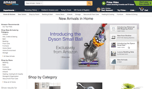
The table of contents is a particularly interesting pattern because it addresses two of the biggest weaknesses of conventional dots and arrows. First, it combines the indication of the current slide and the manual slide controller into a single UI component. Secondly, it provides information scent, showing users a snippet of what’s coming up next, thereby allowing users to jump between slides in a meaningful way. Luke Wroblewski shares that Amazon has found that this pattern performs well.
4. Everything Is Different On Touch Devices
During our years-long usability study of mobile e-commerce websites, we’ve seen that home page carousels have vastly different requirement on touch devices than on desktop devices — so different that all of the interaction logic outlined for desktop (in section 2 above) is invalidated on mobile. Moreover, new requirements apply. We particularly observed the following three implementation details to be important on touch devices:
- The lack of hover invalidates the use of auto-rotation.
- Always support swipe gestures.
- Optimize the carousel’s artwork for mobile screens.
Lack of Hover Invalidates the Use of Auto-Rotation (31% Get It Wrong)
First, auto-rotating slides is only a good idea if the user’s device supports the hover state. This is crucial because the hover state enables us to infer a user’s potential interest in a given slide.
We can use the hover state as an indication that the user is interested in a slide’s content and might want to open the slide after reading its text. Thus, auto-rotation should be temporarily paused to allow the user to finish reading the text and avoid accidentally clicking on the wrong slide.
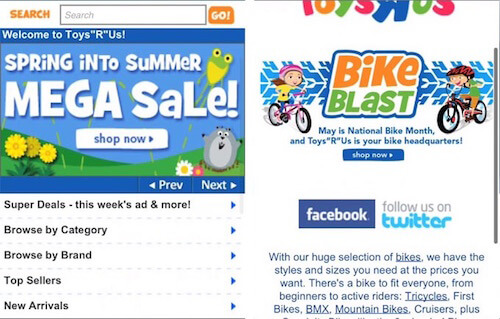
In practice, this means that auto-rotation isn’t appropriate for mobile websites or touch devices simply because it lacks a hover state to invoke the critical pause in rotation. Without a way to infer the user’s focus on the page, it is impossible to know whether the user is reading a particular slide or is about to click on the current slide. Auto-rotation could invoke a slide change just milliseconds before the user clicks the carousel, causing them to open the wrong page — as observed numerous times in our mobile usability study.
The mobile e-commerce usability benchmark we conducted revealed that, while 56% of mobile e-commerce websites have a home page carousel, 31% of mobile websites have one that auto-rotate, and 25% have a manual home page carousel. In other words, close to half of mobile websites with a carousel have the beginnings of an acceptable implementation because their mobile carousels don’t auto-rotate.
Always Support Swipe Gestures (12% Don’t)
Secondly, support key touch gestures — particularly swiping, because users have come to expect that this is how “galleries” are navigated on touch devices. This doesn’t mean you shouldn’t implement traditional carousel interface controls, such as next and previous buttons and slide indicators; however, we found that carousel controls should be provided in addition to swipe gesture support. Our mobile e-commerce benchmark revealed that 12% of mobile websites don’t support swipe gestures for their image galleries in general (although compliance is higher than for image zoom gestures on product pages, which 40% don’t fully support).
Side note: Don’t rely exclusively on swipe gestures on the desktop either, because they are not obvious. Desktop websites need clickable carousel controls as well.
Optimize Artwork for Mobile
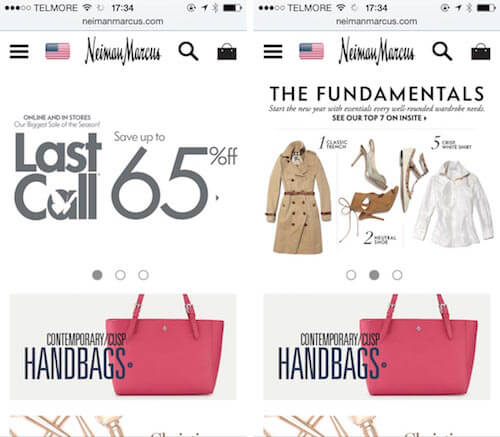
One thing we frequently observed when reviewing mobile websites with a home page carousel is that artwork from the desktop website is reused. This isn’t a problem so long as one ensures that any text in the slides remains legible when scaled down to a tiny mobile screen held in portrait mode. Occasionally, when benchmarking and auditing mobile websites (in particular, responsive websites), even the mobile websites of companies beyond the $100-million online sales mark, we see that artwork created for desktop is simply scaled down and reused on mobile.
Finally, mobile users seem to have less patience for slow-loading carousels. This is likely because they usually can’t see anything other than the carousel on their screen, as opposed to the desktop, where the user can typically scan navigation menus and other content while they wait 1 to 5 seconds for the carousel’s content to load. So, along with ensuring legibility, ensure that the weight of the slide images is optimized for a mobile device’s bandwidth.
The 10 Carousel Requirements
Beyond quality and relevance of content, the design and logic of a home page carousel would have to meet all 10 of the following requirements to avoid serious usability issues:
- All platforms: Sequence the slides carefully, because the first slide will get multiple times the exposure as subsequent slides.
- All platforms: The carousel should never be the only way to access a website’s features and content.
- Desktop: Only use auto-rotation when the diversion of attention away from other home page elements caused by the animated graphics is acceptable.
- Desktop: Rotate slides at a moderate pace — 5 to 7 seconds usually suffices for a slide with just a heading. If the amount of textual information differs between slides, a unique rotation time for each slide is usually called for (a detail almost never adhered to).
- Desktop: Pause auto-rotation on hover to avoid changing a slide that the user is likely reading or about to click.
- Desktop: Permanently stop auto-rotation after the user has clicked on the carousel’s interface controls.
- All platforms: Always indicate the current slide among the set, and allow users to navigate back and forth. Conventionally, this means using dots and arrows that are big enough and that contrast with the underlying image. On the desktop at least, this can be achieved in other ways, such as by using the “table of contents” design.
- Touch devices: Due to the lack of a hover state (and, therefore, a way to pause auto-rotation), never auto-rotate on mobile websites or for touch devices.
- Touch devices: Support swipe gestures, in addition to any other UI controls.
- Mobile devices: Ensure that the text in slides is still readable if you are scaling down artwork from the desktop.
We can see now, with this long list of pitfalls, that most home page carousels perform poorly simply because they are implemented inadequately. For example, 42% of auto-rotating desktop carousels don’t pause on hover. Also, if we consider the most compelling example from Should I Use A Carousel?, borrowed from the Nielsen Norman Group, the carousel tested violates (at least) two of the most important rules: It’s the only way to access that content (violating rule 2), and it doesn’t pause auto-rotation on hover (rule 5) — in addition, the carousel is placed above the main navigation and header. (In a subsequent article, the Nielsen Norman Group offers a more nuanced perspective on carousels.)
If all 10 requirements would be too much work for you or simply would not be worth the investment, then we’d recommend what most others advise: Don’t use a carousel at all. Instead, rely on the alternative presented below.
An Alternative To Carousels
During our usability testing, we saw that a generally well-performing alternative to home page carousels is to simply display static “slides” as distinct sections on the home page.
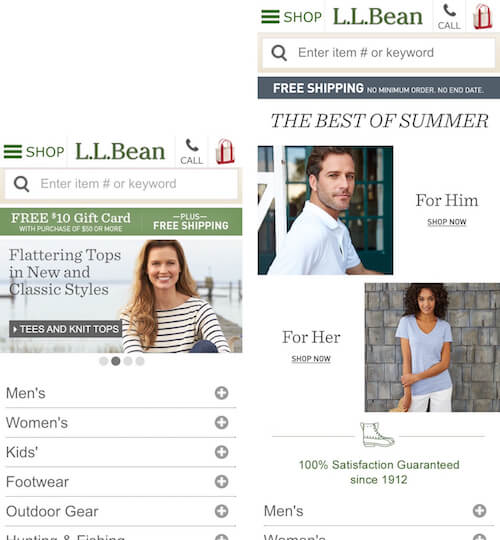
Repurposing slides as static content sections scattered throughout the home page (according to importance) has a number of benefits:
- It gets rid of auto-rotation and the carousel controls for changing slides, making it particularly well suited to mobile websites.
- It aligns extremely well with how users interact with home pages. We observed during testing that 70% of mobile users perform an initial scroll and scan of the home page to figure out the type of website they’ve landed on. Promoting a handful of key paths, each with bespoke imagery, makes for a much more more scannable home page than a carousel slider (either manual or auto-rotated).
- It is significantly cheaper to implement than a carousel that adheres to all 10 requirements. Granted, depending on the organization, updating the home page content might prove to be more expensive than replacing a carousel slide.
- The organization will much more readily recognize the need for tight curation of content (as opposed to throwing a lot of content into a carousel simply because it can accommodate it).
 (al)
(al)


