When designing a graphical user interface, there is always an open question: How do we automate testing for it? And how do we make sure the website layout stays responsive and displays correctly on all kinds of devices with various resolutions? Add to this the complications arising from dynamic content, requirements for internationalization and localization, and it becomes a real challenge.
In this article, I will guide you through an interesting new layout testing technique. Using Galen Framework, I will provide a detailed tutorial for writing meaningful generalized layout tests, which can be executed in any browser and on any device and at the same time used as a single source of truth in your design documentation.
Further Reading on SmashingMag:
- Visual Test-Driven Development For Responsive Interface Design
- The Basics Of Test Automation For Apps, Games And The Mobile Web
- Diverse Test-Automation Frameworks For React Native Apps
I will also demonstrate how I came up with an optimized test for a messaging page on our classifieds website, Marktplaats. We will learn how to extend Galen’s syntax with our own language, how to improve the test code and how to turn a layout testing routine into art.
Introduction To Galen Framework
Galen Framework was covered a year ago in “Visual Test-Driven Development for Responsive Interface Design.” At the time, its syntax was limited. It has improved a lot since and gotten many new features, which we will look at here.
In case you are unfamiliar with Galen Framework, it is a tool for responsive and cross-browser layout testing and functional testing, with its own testing language, named Galen Specs. It is based on Selenium WebDriver and also has a rich JavaScript API that lets you work with WebDriver directly. Because you have control over WebDriver, you can run tests in any browser, in the cloud (SauceLabs, BrowserStack, PerfectoMobile, etc.) or on real mobile devices using Appium.
Installing and Executing
Setting up Galen Framework is easy. Simply execute the following command to get it installed via npm:
npm install -g galenframework-cliIf you don’t use npm, just download the latest Galen Framework archive, extract the package and follow the installation instructions.
Once installed, Galen Framework can be launched in various ways. For instance, you can use the check command to launch a quick test of a single page. For this command, you need to provide a .gspec file with your layout validations, and then you can invoke it like this:
galen check loginPage.gspec --url http://example.com --size 1024x768 --include desktop --htmlreport reports
This command will launch a browser, open the specified URL, resize the browser window to 1024 × 768 pixels and execute all validations declared in the loginPage.gspec file. As a result, you will get a detailed HTML report.
Managing Test Suites
In the real world, an actual web application does not consist purely of static pages. Quite often you will have to perform some actions to get to the place you want to check. In this case, Galen offers JavaScript test suites and the GalenPages JavaScript API for implementing the page object model. Here is a simple example of a JavaScript Galen test:
test("Home page", function() {
    var driver = createDriver("http://galenframework.com",
    "1024x768");
    checkLayout(driver, "homePage.gspec", ["desktop"]);
});
And here is an implementation of the page object model for a log-in page, taken from a real project.
WelcomePage = $page("Welcome page", {
    loginButton: "#welcome-page .button-login"
});

LoginPage = $page("Login page", {
    username: "input[name='login.username']",
    password: "input[name='login.password']",
    loginButton: "button.button-login"

    loginAs: loggedFunction ("Log in as ${_1.username} with password ${_1.password}", function(user) {
        this.username.typeText(user.username);
        this.password.typeText(user.password);
        this.loginButton.click();
    })
});

test("Login page", function() {
    var driver = createDriver("http://testapp.galenframework.com",
    "1024x768");

    var welcomePage = new WelcomePage(driver).waitForIt();
    welcomePage.loginButton.click();
    new LoginPage(driver).waitForIt();

    checkLayout(driver, "loginPage.gspec", ["desktop"]);
});
For advanced usage, I advise you to look at the Galen Bootstrap project. It is a JavaScript extension built specifically for Galen. It provides some extra functionality for UI testing and an easier way to configure browsers and execute complex test suites.
Simple Layout Test
Let me start by introducing a simple layout test in Galen Framework. Then, I will move on to advanced use cases and demonstrate how to extend the Galen Specs syntax. For this, we will look at a header with an icon and caption:
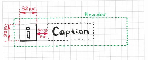
In HTML code, it might look something like this:
<body>
    <!-- … -->
    <div id="header">
        <img class="header-logo" src="/imgs/header-logo.png"/>
        <h1>My Blog</h1>
    </div>
    <!-- … -->
</body>
The simplest form of a Galen layout test would look something like the following. First, we have to declare objects with CSS selectors.
@objects
    header          #header
    icon            #header img
    caption         #header h1
Then, we declare a test section with a meaningful name and put all of our validations below it.
= Icon and Caption =
    icon:
        left-of caption 10 to 15px
        width 32px
        height 32px
        inside header 10px top

    caption:
        aligned horizontally all header
        inside header
Here we’ve tested two header elements: the icon and caption. All validations listed under the icon and caption elements are actually standard Galen Specs. Those specs are the fundamental building blocks with which you can assemble your own layout testing solution. Each spec verifies a single property (such as width, height, text), relative positioning (such as inside, left of, above) or pixels in the screenshot (such as color scheme, image).
Testing Multiple Elements Using forEach Loops
The previous example demonstrates a simple scenario. Let’s see how we can deal with a more complicated situation: a horizontal menu. First, let’s try a straightforward layout testing technique.

Begin by matching multiple elements on the page. With the following code, we’re telling Galen to search for elements that match the #menu ul li CSS selector.
@objects
    menu            #menu
        item-*          ul li
Later, we can refer to these items with names like menu.item-1 and menu.item-2 and iterate over all menu items using a @forEach loop.
= Menu =
    menu.item-1:
        inside menu 0px top left bottom

    @forEach [menu.item-*] as menuItem, next as nextItem
        ${menuItem}:
            left-of ${nextItem} 0px
            aligned horizontally all ${nextItem}
As you can see, even though the actual check is not that complex, the code has already become less intuitive. Imagine if we had more similar code in our tests. At some point, it would become an unmaintainable mess. There should be a way to improve it.
Rethinking Layout Testing
If you think about the previous example, it seems we could express the layout in just one or two sentences. For instance, we could say something like, “All menu items should be aligned horizontally, with no margin in between. The first menu item should be located on the left side of the menu, with no margin.” Because we’ve formulated sentences to explain the layout we want, why can’t we just use them in our code? Imagine if we could write the code like this:
= Menu =
    |first menu.item-* is in top left corner of menu
    |menu.item-* are aligned horizontally next to each other
In fact, that is real working code, copied from my project. In those last two lines (starting with the pipe, |), we’re invoking custom functions that collect their arguments by parsing those two statements. Of course, the example above will not work as is. In order for it to compile, we need to implement the handlers for those two statements. We will get back to this implementation later.
The key point with the example above is that layout testing has shifted from object-driven to expression-driven testing. It might not be obvious from such a minor example, but it is definitely noticeable at a larger scale. So, why is this significant? The short answer is that this changes our mindset and affects the way we design our software and write tests for it.
Using this technique, we don’t treat our page as a bunch of objects with specific relationships between them. We don’t test the CSS properties of individual elements. And we avoid writing complicated non-trivial code. Instead, we are trying to think of common layout patterns and meaningful statements. Rather than testing menu item 1, menu item 2 and so on separately, we apply generic statements that:
- are reproducible on other elements;
- don’t contain hardcoded pixel values;
- are applied to abstractions and not to concrete objects;
- and, last but not least, actually make sense when we read them.
How It Works
Let me explain the mechanism of custom layout expressions using this simple example:
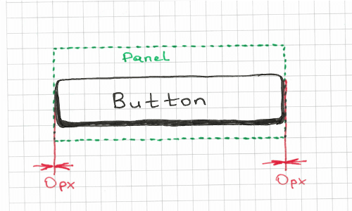
In this example, we are supposed to check that the button stretches to the panel, with no margin on the left or right side. Without custom rules, we can approach it in different ways, but I prefer the following solution:
button:
    inside some_panel 0px left right
The code above gives us the flexibility to declare custom margin on the sides, and it also implicitly tests that the button is contained completely within the panel. The downside is that it is not very readable, which is why I am going to put this validation behind the expression button stretches to some_panel. In order for that to work, we need to write a custom rule like this:
@rule %{elementName} stretches to %{parentName}
    ${elementName}:
        inside ${parentName} 0px left right
That’s it. Now we can put it in our test in just one line:
| button stretches to some_panelAs you can see, this rule takes two arguments: elementName and parentName. This allows us to apply it to other elements as well. Just replace the names of those two objects.
| login_panel stretches to main_container
| header stretches to screen
| footer stretches to screen
# etc.
Implementing Your Own Testing Language
Let’s get back to the initial examples of layout expressions for the horizontal menu.
= Menu =
    | first menu.item-* is in top left corner of menu
    | menu.item-* are aligned horizontally next to each other
We can implement the first rule in the following way:
@rule first %{itemPattern} is in %{cornerSides} corner of %{parentElement}
    @if ${count(itemPattern) > 0}
        ${first(itemPattern).name}:
            inside ${parentElement} 0px ${cornerSides}
When used in our example, it would parse the arguments as follows:
itemPattern=menu.item-*cornerSides=top leftparentElement=menu
Because we are done with our first expression, we can move to the next one. In the second expression, we are supposed to test the horizontal alignment of all menu items. I propose three simple steps:
- Find all menu items.
- Iterate over all of them until the penultimate element.
- Check that the element
nis located to the left of elementn+1and that their top and bottom edges align.
To get it working, we need to take a @forEach loop and specs left-of and aligned. Fortunately, in Galen you can refer to the previous or next item in a loop. In case you’ve declared a reference to the next element, it will iterate only until the penultimate element, which is exactly what we need.
@rule %{itemPattern} are aligned horizontally next to each other
    @forEach [${itemPattern}] as item, next as nextItem
        ${item}:
            left-of ${nextItem} 0px
            aligned horizontally all ${nextItem}
You might ask, What if we have to specify a margin in our test (such as ~ 20px or 10 to 20px)? Then, I suggest either implementing a separate rule or extending the existing one to support an %{margin} argument.
@rule %{itemPattern} are aligned horizontally next to each other with %{margin} margin
    @forEach [${itemPattern}] as item, next as nextItem
        ${item}:
            left-of ${nextItem} ${margin}
            aligned horizontally all ${nextItem}
That’s it! We have created a generic expression that helps us validate the horizontal menu. However, because of its flexibility, we can do much more than that. We can use it to test any other elements on the page. We can even use it to test the alignment of two buttons:
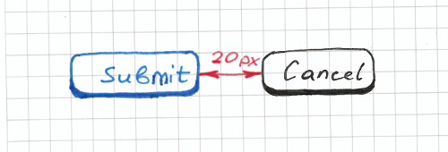
| menu.item-* are aligned horizontally next to each other with 0px margin
| submit_button, cancel_button are aligned horizontally next to each other with 20px margin
You might notice in these two examples that we’ve declared the first argument in two different ways. In the first expression, the first argument is “menu.item-*”, and in the second expression it is declared as “submit_button, cancel_button”. That is possible because the @forEach loop allows us to use a comma-separated list of objects together with the star operator. But we are still not done with refactoring. We could improve the code further and make it more readable. If we create groups for the menu items and the log-in form buttons, we could accomplish something like this:
@groups
    menu_items              menu_item-*
    login_form_buttons      submit_button, cancel_button

= Testing login page =
    | &menu_items are aligned horizontally next to each other with 0px margin
    | &login_form_buttons are aligned horizontally next to each other with 20px margin
In this case, we have to use the & symbol, which stands for a group declaration. That is already a good test. First, it just works, and we are able to test what we need. Also, the code is clear and readable. If another person were to ask you what the log-in page should look like and what the design requirements are, you could tell them to look at the test.
As you can see, implementing custom expressions for complex layout patterns is not really a big deal. It might be challenging in the beginning, but it still resembles something of a creative activity.
Dynamic Margins
Let’s look at another rare layout pattern that you might find sometimes on various websites. What if we wanted to test that elements have an equal distance between each other? Let’s try to implement another rule for that, but this time using a JavaScript implementation. I propose such a statement: “box_item-* are aligned horizontally next to each other with equal distance”. This is going to be a little tricky because we don’t know the margin between elements and we can’t just hardcode pixel values. Therefore, the first thing we have to do is to retrieve the actual margin between the first and last elements.
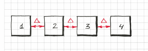
Once we obtain that margin, we can declare it in a @forEach loop similar to how we did before. I propose implementing this rule using the JavaScript API because the logic required is a bit more complex than in all of our previous examples. Let’s create a file named my-rules.js and type in this code:
rule("%{objectPattern} are aligned horizontally next to each other with equal margin", function (objectName, parameters) {
  var allItems = findAll(parameters.objectPattern),
    distance = Math.round(Math.abs(allItems[1].left() - allItems[0].right())),
    expectedMargin = (distance - 1) + " to " + (distance + 1) + "px";

  if (allItems.length > 0) {
    for (var i = 0; i < allItems.length - 1; i += 1) {
      var nextElementName = allItems[i + 1].name;
      this.addObjectSpecs(allItems[i].name, [
        "aligned horizontally all " + nextElementName,
        "left-of " + nextElementName + " " + expectedMargin
      ]);
    }
  }
});
In our test code, we will use it like this:
@script my-rules.js

# …

= Boxes =
    | box_item-* are aligned horizontally next to each other with equal distance
As you can see, in Galen Framework we can choose between two languages when implementing rules: Galen Specs and JavaScript. For simple expressions, Galen Specs is easier to use, but for complex ones I always choose JavaScript. If you want to learn more about JavaScript rules, refer to the documentation.
Galen Extras
Having played enough with various layout patterns, I realized that all of these Galen rules could be easily applied in any other test project. That gave me an idea to compile the most common layout expressions into their own library. That’s how I came to create the Galen Extras project. Below are some examples of what this library is capable of:
| header.icon should be squared

| amount of &menu_items should be > 3

| &menu_items are aligned horizontally next to each other

| &list_items are aligned vertically above each other with equal distance

| every &menu_item is inside menu 0px top and has width > 50px

| first &menu_item is inside menu 0px top left

| &menu_items are rendered in 2 column table

| &menu_items are rendered in 2 column table, with 0 to 1px vertical and 10px horizontal margin

| &login_form_elements sides are vertically inside content_container with 20px margin

login_panel:
    | located on the left side of panel and takes 70 % of its width

# etc …
The Galen Extras library contains many of the layout patterns you would commonly find on websites, and I keep updating it as soon as I discover a useful pattern. Once this library was set up, I decided to try it on a real test project.
Testing The Messaging App
Currently, I work as a software engineer at Marktplaats. At some point, I decided to apply all of the experience I had gained to a real project. I needed to test the messaging page on our website. Here is what it looks like:
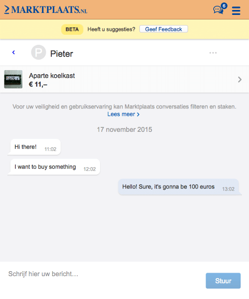
To be honest, implementing tests for such pages has always seemed a bit scary to me, especially layout tests. But with the Galen Extras library in place, it actually went pretty smoothly, and soon I was able to come up with this code:
@import ../selected-conversation.gspec
@groups
  (message, messages)                           messenger.message-*
  first_two_messages                            messenger.message-1,messenger.message-2
  first_message                                 messenger.message-1
  second_message                                messenger.message-2
  third_message                                 messenger.message-3
  (message_date_label, message_date_labels)     messenger.date_label-*
  first_date_label                              messenger.date_label-1
  second_date_label                             messenger.date_label-2

= Messages panel =
  = Messages and Date labels =
    |amount of visible &message_date_labels should be 1
    |first &message_date_label has text is "17 november 2015"

    |amount of visible &messages should be 3
    |&first_two_messages should be located at the left inside messenger with ~ 20px margin
    |&third_message should be located at the right inside messenger with ~ 20px margin
    |&messages are placed above each other with 10 to 15px margin

    |text of all &messages should be ["Hi there!", "I want to buy something", "Hello! Sure, it's gonna be 100 euros"]

  = Styling =
    |&first_two_messages should be styled as others message
    |&third_message should be styled as own message
Extracting Pixel Ranges
The test looked OK: It was compact and readable but still far from perfect. I didn’t really like all of those margin definitions (~ 20px, 10 to 15px). Some of them were repeated, and it was hard to understand what each of them stood for. That is why I decided to hide every margin behind a meaningful variable.
# ...
@set
    messages_side_margin        ~ 20px
    messages_vertical_margin    10 to 15px

= Messages panel =
  = Messages and Date labels =
    |amount of visible &message_date_labels should be 1
    |first &message_date_label has text is "17 november 2015"

    |amount of visible &messages should be 3
    |&first_two_messages should be located at the left inside messenger with ${messages_side_margin} margin
    |&third_message should be located at the right inside messenger with ${messages_side_margin} margin
    |&messages are placed above each other with ${messages_vertical_margin} margin

# ...
As you can see, I’ve moved the margins to messages_vertical_margin and messages_side_margin. I’ve also declared a minimal margin, which is a range between 0 and 1 pixel.
# ...
@set
    minimal     0 to 1px

= Conversations Panel =
    | &conversations are aligned above each other with ${minimal} margin

# ...
Image-Based Validation and Custom Expressions
Having covered the positioning of all main elements on the page, I decided also to test styling. I wanted to validate that each message has a background colour specific to the user’s role. When users are logged in, messages would have a light-blue background. Messages for other users would have a white background. In case a message has not been sent, the error alert would have a pink background. Here is the rule that helped me validate these styles:
@set
    OWN_MESSAGE_COLOR             #E1E8F5
    OTHERS_MESSAGE_COLOR          white
    ERROR_MESSAGE_COLOR           #FFE6E6
@rule %{item} should be styled as %{style} message
    ${item}:
        @if ${style === "own"}
            color-scheme > 60% ${OWN_MESSAGE_COLOR}, 0.2 to 20 % ${MAJOR_TEXT_MESSAGE_COLOR}
        @elseif ${style === "error"}
            color-scheme > 60% ${ERROR_MESSAGE_COLOR}, 0.2 to 20 % ${MAJOR_TEXT_MESSAGE_COLOR}
        @else
            color-scheme > 60% ${OTHERS_MESSAGE_COLOR}, 0.2 to 20 % ${MAJOR_TEXT_MESSAGE_COLOR}
The color-scheme spec verifies the proportional distribution of colors within an element. It crops a screenshot of the page and analyzes the color distribution. So, to check the background color of an element, we just check that its distribution is greater than 60% of the total color range. In the test, this rule is invoked like so:
  = Styling =
    |&first_two_messages should be styled as others message
    |&third_message should be styled as own message
Configuring Test Suites
The messaging app is a dynamic application that works together with the RESTful Messaging API. Therefore, to test its layouts in all different states, we have to prepare test data. I decided to mock up the Messaging API so that I would be able to configure all of my test messages in the test suite. Here is a fragment of my test suite that shows how our tests are structured.
// ...
testOnAllDevices("Unselected 2 conversations", "/", function (driver, device) {
  mock.onGetMyConversationsReturn(sampleConversations);
  refresh(driver);

  new MessageAppPage(driver).waitForIt();
  checkLayout(driver, "specs/tests/unselected-conversations.gspec", device.tags);
});

testOnAllDevices("When clicking a conversation it should reveal messages", "/", function (driver, device) {
  mock.onGetMyConversationsReturn(sampleConversations);
  mock.onGetSingleConversationReturn(sampleMessages);
  refresh(driver);

  var page = new MessageAppPage(driver).waitForIt();
  page.clickFirstConversation();

  checkLayout({
    driver: driver,
    spec: "specs/tests/three-simple-messages-test.gspec",
    tags: device.tags,
    vars: {
      expectedTextProvider: textProvider({
        "messenger.message-1": "Hi there!\n11:02",
        "messenger.message-2": "I want to buy something\n12:02",
        "messenger.message-3": "Hello! Sure, it's gonna be 100 euros\n13:02"
      })
    }
  });
});
// ...
Catching Bugs
Implementing those simple expressions pays off quite quickly. Let’s go over what kind of bugs we can catch with our test suite.
Styling Issue
Here is an example of when something goes wrong in our CSS code base and, as a result, all messages are rendered with the same background.
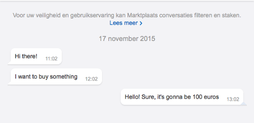
If you compare this screenshot with the original, you will notice that the last message has a white background, whereas it is supposed to be light blue. Let’s see how Galen reports this issue:
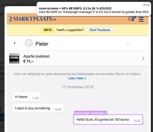
For the highlighted object, it displays the error color #e1e8f5 on “messenger.message-3” is 0% but it should be greater than 60%. To be honest, this error message doesn’t look all that clear, but because this check was generated from a custom rule, we can always look up its original name in a report branch:
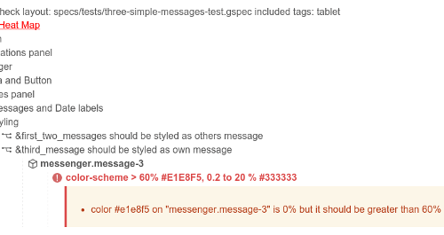
If you scroll up, you’ll see that the original statement is &third_message should be styled as own message. That is another benefit of using custom expressions: They help you understand the failure and nicely describe all of those generated validations.
Positioning Issue
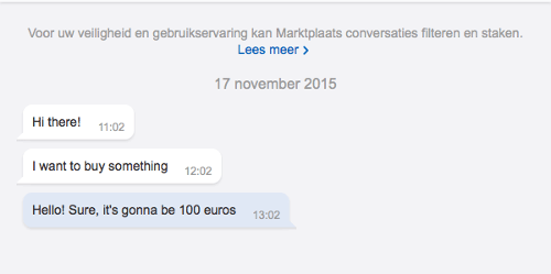
Here is another example of when the layout goes wrong due to incorrect alignment of an element. In the following screenshot, you can see that the last message is positioned to the left side of the messaging viewport, instead of the right.
Let’s look again at the screenshot with the error message:
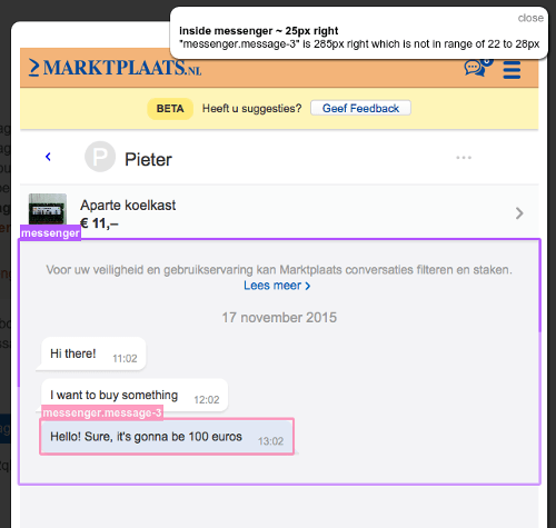
The screenshot highlights the messaging container and the last message element. Together with that, it shows the following error message: “messenger.message-3” is 285px right which is not in range of 22 to 28px. It might not be clear to a web developer why a margin of 22 to 28 pixels is expected on the right side. Again, you’d have to look for a validation statement in the report branch:
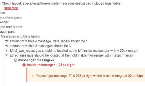
The original statement for that check is &third_message should be located at the right inside messenger with ~ 25px margin. That makes much more sense. Moreover, other front-end engineers will understand this test report, even if they haven’t written the tests.
Layout Testing Guidelines
With all of these different experiments in mind, I decided to formalize all of the learning into general layout testing guidelines. Here is a quick checklist of steps to follow to ease your testing routine.
- Identify layout patterns in the design.
- Generalize validation statements. Try to condense most validations into single sentences.
- Componentize! It’s always better to move tests of repeated elements into dedicated components.
- Use meaningful names for sections, rules and objects.
- Avoid pixels. Try to replace pixel values (whether exact values or ranges) with meaningful variables.
- Adjust your website’s code to make it easier to test. This will help you structure and maintain both your production and test code.
Acceptance Criteria To The Rescue
Often I get questions like, “So how detailed should a layout test be? And what should we be testing specifically?” A general answer is hard to give. The problem is that when the test’s coverage is small, you miss bugs. On the other hand, if you have too detailed tests, you might get a lot of false positives, and in future you might get lost in test maintenance. So, there is a trade-off. But I did figure out a general guideline for myself. If you split the work into smaller user stories, then it becomes easier to structure a page’s design in the form of acceptance criteria. In the end, you might put this very acceptance criteria right in your test code. For instance, some of these statements could be defined in the form of custom rules, as shown in all of the previous code examples. A good example of acceptance criteria would be something like this:
- Popups should be centered vertically and horizontally on the screen.
- They should be 400 pixels wide.
- Buttons should be aligned horizontally.
- And so on
Once you describe the design in simple sentences, it becomes easier to convert them into reusable statements and to organize your test code.
Conclusion
As you can see, such an exercise helps you to structure a design and discover general layout patterns that can be shared across multiple page components. Even if the page is complex and consists of a lot of elements, you can always find a way to group them in your layout expressions. With this approach, layout testing becomes more of a tool for test-driven development, helping you to design, implement and deliver software incrementally, which is especially useful in an agile environment.
Resources
- Galen Framework (official website)
- Galen Framework, GitHub
- Galen Extras (library), GitHub
- Galen Bootstrap, GitHub
- “Galen Framework Tutorials,” YouTube
 (da, ml, al, il)


