A large metropolitan underground train network might as well be a teleportation device: People don’t care how it gets them from A to B, just that it does. In London, Paris and Moscow, the map of the metro does not show surface geography, because there is not much empty space on the sheet.
Designing a city’s metro map is quite a challenging task, even when there is just one line. Last year, my colleague Pasha Omelekhin and I were thrilled to work on the redesign of the metro map for Ekaterinburg, Russia. We had fun (he designed, I directed). In this article, we’ll cover our design process. It’s going to be detailed, so, depending on your interests, this might be very boring or very exciting. Still, we’ve left out so much. We hope this helps in case you have to work on a similar project.
Further Reading on SmashingMag:
- Paris Metro Map – The Redesign
- The Joy Of Illustrated Maps In The Era Of Google Earth
- A Guide To Building SVG Maps From Natural Earth Data
- Entering The Wonderful World of Geo Location
Let’s dive in!
The Approach
This is the final map we created:

Just for comparison, here’s what the previous version of map looked like:

The solid-green line above is the only existing subway line; the other two are merely “planned” lines, for which construction has not even started. Displaying all three would not make sense. So, our first sketch was a simple one-line diagram:

Usually in a multi-line metro network, on each metro line they have a separate one-line diagram displayed above train doors. But here, one diagram could be used as both the full-network diagram and the line diagram. Small refinements would need to be made, and we did make them, but we wanted to rethink how such a diagram would be designed in general.
As mentioned, metropolitan centers with large underground networks, such as London, Paris and Moscow, do not show surface geography in their subway maps. There is simply not enough room to do so. Not so for small metros. Simplicity and lack of surface detail are only required when a rich map would get in the way of people finding their route. Ekaterinburg does not have this problem.
When there is just one subway line, you can’t afford to portray the system like a teleportation device. People have to use multiple modes of transportation to get to where they want to go. So, we wanted to show how the metro was connected to everything else.
A long time ago, the map of Paris’s underground was simply laid over top a city map:
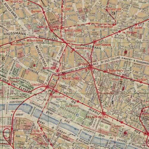
We figured that the two approaches could be combined: surface information could be laid over top the linear diagram, making the map both richly informative and suitable for use on trains. This would require us to bend the city in strange ways to fit important landmarks, but this has been known to work, as in the case of New York City’s underground map.
The Linear Diagram
Next, we added some streets to the map:

The river seemed too dark here. Also, Ekaterinburg is not a popular tourist destination, so the Russian language is far more important than English; therefore, we decided to position the Russian names on the inside and the English translations on the outside relative to the line.
We wanted to experiment with style. We started with an unofficial M logo and cut the station “ticks” at angles to echo it. Later, we replaced the logo with the official one:

The gradient didn’t look right. And the logo was too large. So, instead of one large logo, we tried grouping several logos: the metro’s logo, the city’s coat of arms and an emblem of the transportation authority. This kind of thing usually looks cool.
In the end, though, we found that two logos work fine (the city’s logo being one of them):

Notice how the river and streets have started morphing to better communicate their relationship with the line. We continued adding more surface geography:

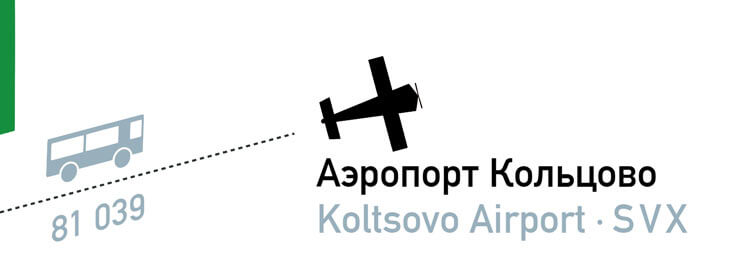
Now we had a compass (the left-pointing arrow indicating north), the city’s TV tower and the circus. The line of the airport shuttle from Botanicheskaya was aligned with the angle of the ticks — a modification that would not survive as we made the geography feel more real, but it had its charm. Maybe it would work somewhere else.
We experimented more with the ticks:


We even played with long shadows:

Some of these were nice, but still not special in any way.
Ekaterinburg is characterized by constructivist architecture. What could we use to hint at this in the map? We sought inspiration from the art of Malevich and Kandinsky.
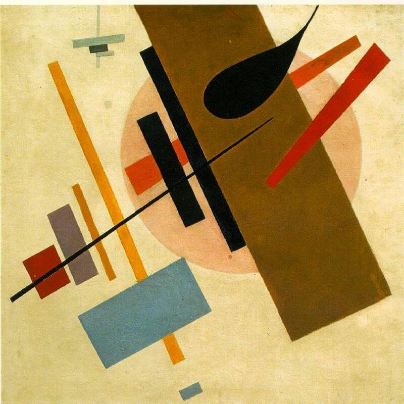

It might work!
We tried to add to the semblance of reality by laying the streets over top the metro line:

But this looked like a mistake. Undo!
Bending The Line
Drawing the metro line straight would be ideal, but it would distort the city too much. So, we introduced bends to hint at the line’s true form:

This looked broken. We wanted the line to be smoother. Bye-bye, angled ticks!

Having gotten a taste of the geography influencing the form of the line, we wanted more of it, much more — roads, squares, parks, plants, the whole city. We started imagining how to add parks with nice trees and how to give the river a wavy texture.
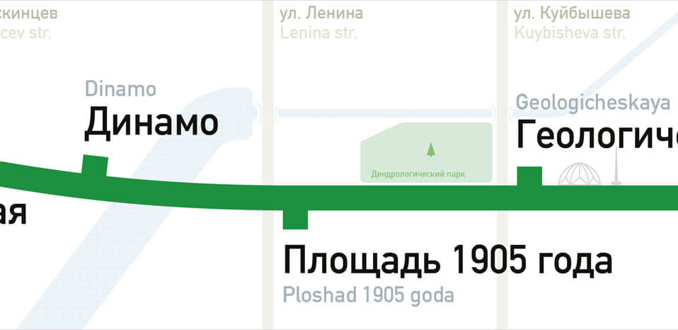
Now that we were getting more into the geography, the ticks were becoming a problem. They looked like they were pointing in the direction of the station exits, rather than the station names, which might confuse people. A new indicator was needed.


Did the circles have to be on the line? What if we put them closer to the station’s name?

Wait a minute! What if we did indicate the location of station exits?


These exits were too small for the line and would be not visible from a distance. We needed a solution that screams “Here’s a station!” while subtly indicating the exits.


More Surface Features
Meanwhile, other work was progressing. The pictogram of the circus became more recognizable:

The abandoned TV tower got more detail:

The pictograms of the other modes of transportation got more attention, too:

Oh, and we threw in the surface railway network, as well as a design attribution to ourselves (nestled along the right):

The river’s pattern didn’t look good. We tried thin lines reminiscent of the classic London tube map designed by Harry Beck:

Too thin, almost invisible.
And we continued exploring representations of the station exits on paper:

One idea was to lay a detailed scheme of exits over top a semi-transparent metro line:

Cleaning Up
At this point, the map was looking quite busy. We decided to show English translations for only the station names. And we removed the circus. We also tried moving the indicators of rail and bus terminals to the corresponding metro stations:

The font changed from DIN to PT Sans Metro (a custom version of PT Sans with lowered capital letters).
Here’s an experiment to list surface transportation routes:

The street names were the noisiest element at this point. We tried setting them in all-caps:
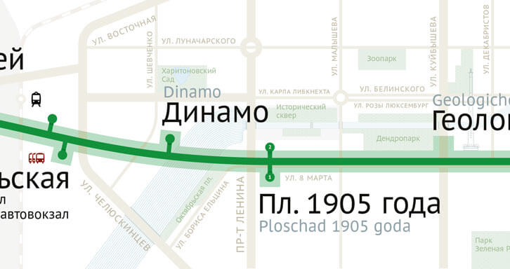
Usually all-caps are inappropriate, particularly in wayfinding: The letters resemble rectangles, making them harder to distinguish. But we wanted the words to look quieter and simpler, so it worked.
We continued experimenting with station exits:


We thought the semi-transparent circles were needed to make the stations big enough to be seen from a distance.

But having drawn in all of the exits, we realized they were not needed:

The fatter semi-transparent line also proved unnecessary:

This was not the end of our work with the station exits, but it was an accomplishment.
Trolley And Bus Icons
The work on listing surface transportation routes carried on:

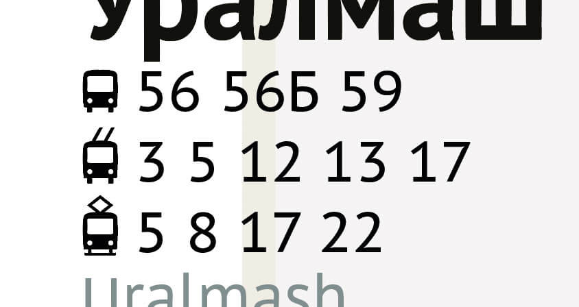
The parks got a nice pattern, and the TV tower and river were simplified:

Getting Serious About The Stations
We were still concerned about the visibility of stations from a distance. The exits alone were not enough to make the stations stand out. So, we tried other things:


We even tried making the metro line dotted:
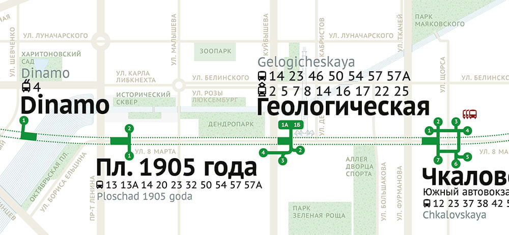

Notice another key improvement here: Street names have been moved inside the streets themselves where space allowed. All-caps were very handy for this, contributing significantly to clarity.

We kept on with the stations:
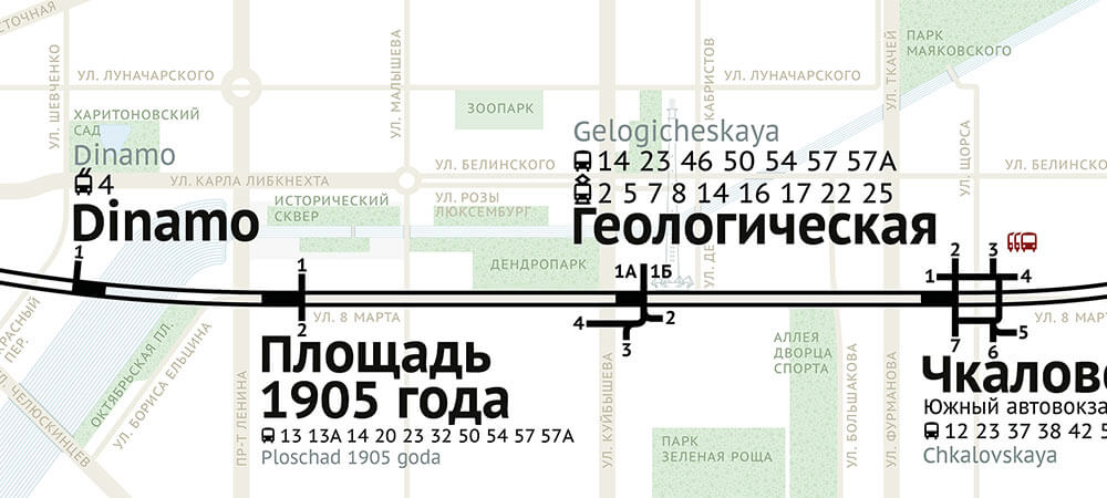

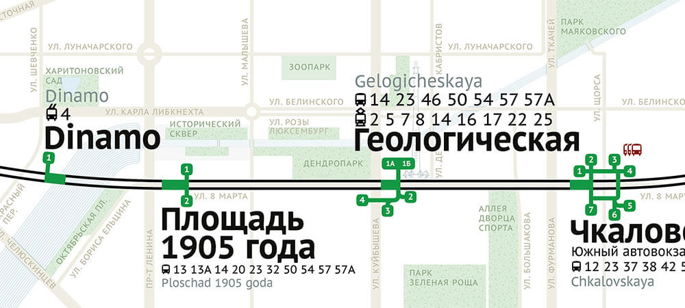


We didn’t like that the river consisted of very thin lines, which aren’t used anywhere else in the map, so that changed:


We are skipping many other attempts here, but the one below is worth pointing out. We thought this one had promise.

Everything Is Coming Together
Turning back to the streets, the thin ones looked odd. So, we tried giving all streets the same width:

Because there were no more thin lines anywhere, we gave the TV tower a fill instead of a contour:

Then we swapped the colors of the background and the streets, and we made the river look like it’s flowing:

We also tried making the river wavy on the outside as well as inside:

But this felt like a step back. It looked more like pasta than water.
Our compass was too simple as well:

We took inspiration from Yuri Gordon’s arrows:
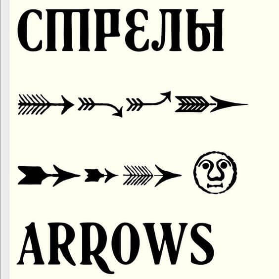
Here’s the one we made:

Final Touches
We kept returning to the metro line and stations again and again — obviously, because they are the most important elements.


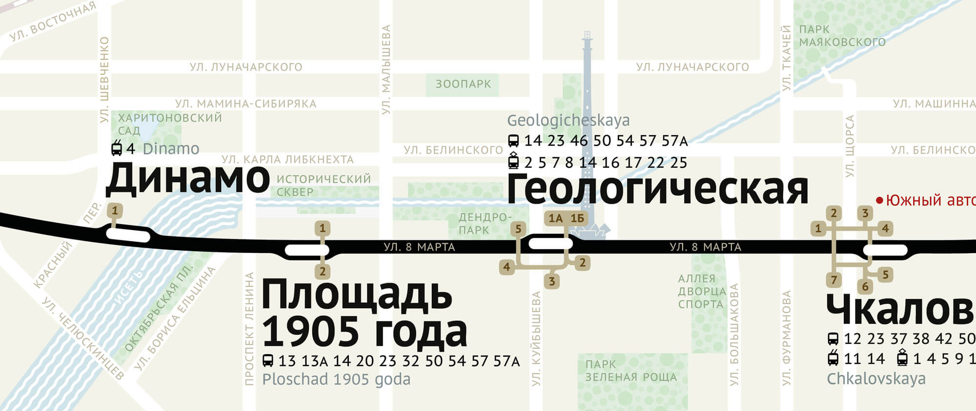
What’s the ugliest thing now? The parks. The way they bump up against the roads and each other is not nice. Particularly unpleasant are the parks surrounding the river. We’ve removed the background leaving only the trees while also tuning their color, and it became much nicer:

The TV tower improved as well:

The PT Sans font was dispensed in favor of ALS Direct:
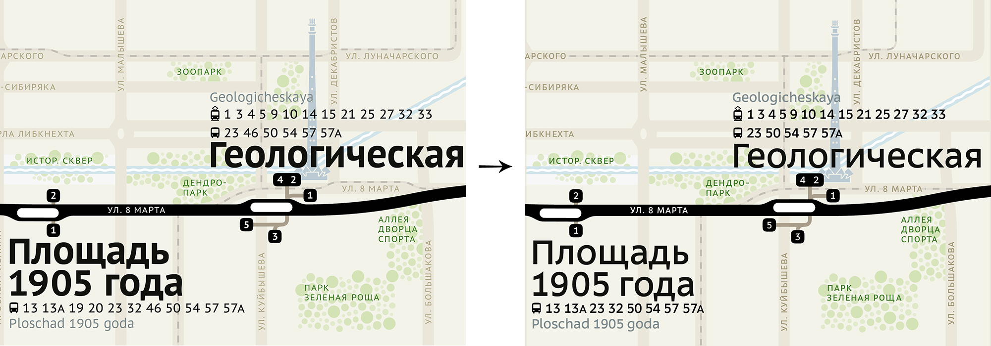
We added tram lines because they are prominent features on the street and would help with wayfinding.
Also, we tried aligning the text to a grid:

And we added some shadows:

That’s about it! Pasha built all of it in Adobe Illustrator, directed by me, Ilya, via email.
In no way is this meant to be a comprehensive guide to designing a map. Each city presents its own set of problems and peculiarities. But hopefully this gives you an idea of what to look for and what to try if you take on such an assignment. What seemed at first like a small project turned out to be a rigorous exercise spanning several months.
 (vf, il, al)


