If you’ve dreamed of the day when you could design more than one thing at once in Photoshop, the wait is over. You can now have multiple designs right next to each other. Design mobile layouts alongside your tablet and desktop layouts. And in this article, we’ll design an entire set of assets all at once.
What many Photoshop users have been hoping for — with a push from Sketch, no doubt — finally arrives in the form of artboards. No longer are you constrained to one canvas. Turning layer groups on and off, be gone. Create as many canvases as you like in one PSD.
Further Reading on SmashingMag:
- Create Pixel-Perfect Assets For Multiple Scale Factors
- A Better Way To Design For Retina In Photoshop
- Photoshop Etiquette For Responsive Web Design
- Retinize It: Free Photoshop Action For Slicing Graphics For HD Screens
Combine artboards with the Generate feature and you get the workflow you’ve always wanted. Slicing and “Save for Web,” step aside. Automatically export @1x to @3x Retina assets just by renaming layers.
Let me walk you through the basics of artboards and Generate. Then we’ll look at a real project in which I used these techniques together, making for a major time-saver. First up, artboards.
Artboards
While layer comps were an attempt to address the goal of working on multiple pages in a PSD, they were a bit clunky and restricted you to the same canvas dimensions. Artboards free you from these contraints and let you get on with design. At first, it might not sound like a big deal, but trust me, it is. Once you go artboards, you never go back.
In the past, working on Photoshop files needed some file-management skills. You would name your pages something like 01_home.psd, 02_products.psd, 03_contact.psd, etc. For complex websites, your files would quickly reach into the tens or even hundreds (especially counting versions). With artboards, you can consolidate all of these individual PSDs into a single website.psd. Think of all the time wasted opening and closing PSDs.
Not to mention duplication. Take a humble header as an example. It could be duplicated through tens or hundreds of PSDs. What a waste of file size and memory. Think how the same goes for the footer and many other components.
OK, enough of me preaching about how great artboards are. Let’s get into it.
Artboard Tool
Hidden behind the Move tool is the new Artboard tool, introduced in Photoshop CC (2015). Select the tool in the menu, or hit Shift + V to switch between the Move and Artboard tools. You are now ready to create your first artboard.

Creating and Duplicating Artboards
Simply click and drag an area to create an artboard. The default names are Artboard 1, Artboard 2 and so on. You will see your new artboard in the Layers panel. Any layers will be neatly nested below, just like a layer group.
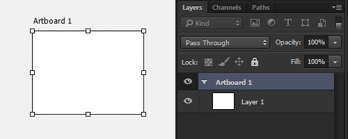
To create another artboard, simply drag an area again in the empty background space. You can create as many artboards as you like.
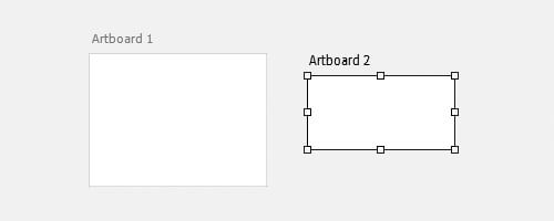
You can also duplicate an artboard in the contextual menu. In the Layers panel, right-click on Artboard 1 and select “Duplicate Artboard.” This will create another artboard of the exact same size and position.

Duplicating artboards is probably the feature I use the most. Normally, when creating assets, I need a full set of exactly the same layer structure. In the example project I’ll discuss later, once I set up my first artboard, I duplicate all of the rest. Then, with the layers, icon and type in the correct positions, all I need to do is swap these assets out. It’s a very quick way to keep everything pixel-perfect.
Resizing and Moving Artboards
There are a few ways to resize and move artboards. You have probably already noticed the first way: When an artboard is selected, you can resize using the transform handles that appear. This is very handy for resizing on the fly and seeing the layers beneath an artboard while resizing.
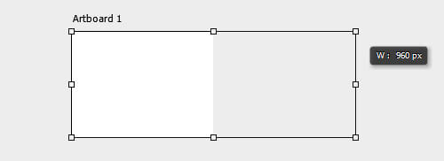
While an artboard is selected, you can also use the Options panel just below the “File” menu. There are options to choose preset sizes, set custom widths and heights, and perform common tasks like switching to portrait or landscape.

If those aren’t enough options for you, there is also the Properties panel when an artboard is selected. This gives you the option to change the size and position and to access the preset sizes.
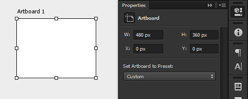
Moving an artboard can also be done with your keyboard, just like a regular layer or object. While the artboard is selected, use an arrow key for a 1-pixel nudge, or hold Shift for 10 pixels.
The last way to move an artboard is by clicking the name of the artboard so that it is selected, and then clicking and dragging to any position. This is particularly useful because it is smart-guide-enabled, which means you can align all of your artboards by, say, 50 pixels and their positions will lock according to your previous spacing. Now that you’ve got the hang of artboards, let’s check out the Generate feature.
You can also check out the “Artboards” section of Photoshop Help if you want to learn more.
Generate
This is another Photoshop feature that you might not have delved into yet; it is well worth your while. Generate lets you export layers and groups by using a special naming convention in your layer names. Think of it as a “Save for Web” shortcut just by renaming a layer. In most cases, it will completely replace having to go through the “Save for Web” dialog, which will save you precious time and keep you focused on what matters: the design. Let’s take a look.
Turn on Generate
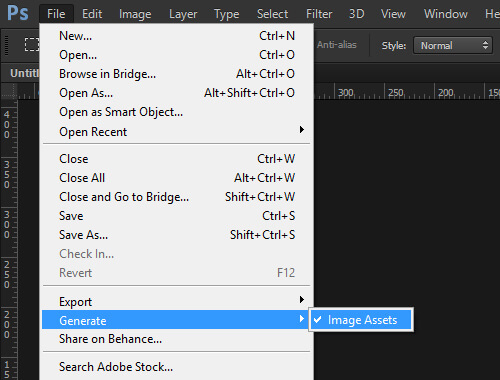
Generate can be turned on and off for each PSD. When it’s active, any layers with the special naming syntax will automatically be exported. Make sure you have it checked by going to “File” → “Generate” → “Image Assets.”
What Can Be Generated?
Basically, any layer in the Layers panel can be used with Generate, be it a bitmap layer, shape layer, layer group, smart object, etc. Even layers within layer groups can be exported. As long as the layer name has the correct syntax, it’s good to go. We will discuss later how this can be applied to artboards, but let’s not get ahead of ourselves. Let’s start with the basics.
Generate Basics
Now that we are all set up to generate images assets, having checked the menu item, let’s try out some of the options. Just by adding an extension — -opt.jpg, .gif or .png — to your layer or group name, you can save out an opt.jpg, GIF or PNG. These are the three image options currently supported by Generate. When image assets are created, they are saved in a new folder alongside your PSD. And they have the same name, but with an -assets suffix:
[ end1a-opt.jpg ][ end1b.gif ][ end1c.png ]
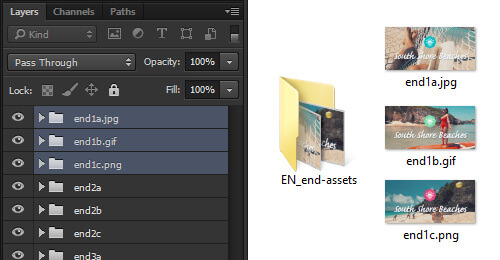
Notice from the screenshot that only the layers with -opt.jpg, .gif or .png have generated image assets. The layer groups end2a, end2b, end2c didn’t export. Any layers that don’t include extensions are not exported.
There are also compression options for opt.jpg and PNG. For opt.jpg, I would recommend using the percentage syntax, which is 1 to 100%. For PNG, the options are simply 8, 24 or 32, which correlate to their bit formats. Just add the compression options directly to the layer name after the extension of -opt.jpg or .png, as shown here:
[ end1a-opt.jpg100% ][ end1b-opt.jpg40% ][ end1c-opt.jpg10% ]
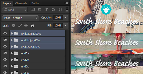
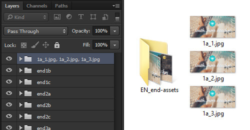
opt.jpg compression.You can also export multiple images from the same layer. Use a comma (,) or plus (+) separator between image names, as shown below. Just make sure that each name is unique (a requirement of Generate).
[ 1a_1-opt.jpg, 1a_2-opt.jpg, 1a_3-opt.jpg ] or [ 1a_1-opt.jpg + 1a_2-opt.jpg + 1a_3-opt.jpg ]
You can also set the scale of the output as a percentage or in pixels. This goes in the layer name before the image name. The percentage is easy to figure out, and pixels is simply the standard width by height. Here is an example:
[ 50% end1a-opt.jpg ][ 75% end1b-opt.jpg ][ 100% end1c-opt.jpg ] or [ 100x50 end1a-opt.jpg ][ 200x100 end1b-opt.jpg ][ 300x150 end1c-opt.jpg ]
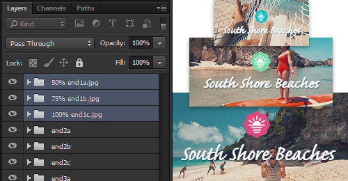
All of these custom syntaxes can be combined with each other to form complex image assets from your layers. Here is an example of scale, compression and image types all on one layer:
[ 150% layername-opt.jpg80% + 50% layername.png8 ]
As I’m sure you can see, the combination of scale, compression and image types is a powerful way to consistently export image assets.
Advanced Generate
If those aren’t enough options for you, there is also the default setting that gets applied to all Generate layers in your document. The default is created by making an empty layer in your document. I use the very top layer of my PSD so that I can always find it. Let’s look at an example.
[ default 150% large/_large + 50% small/_small ]

The default keyword defines this layer as the default setting. Do not change this. The 150%, which is next, defines the scale. After that is something new. The large/ and small/ set the folders where these will be saved. And then _large and _small add suffixes to your file names. All you need to do to activate the output is to add an extension to the layer, such as -opt.jpg or .png. Now, all of the images with Generate layer names will be exported with these settings. Awesome, right?
Not convinced? Let me illustrate how this saves time. Below is Generate on individual layers.
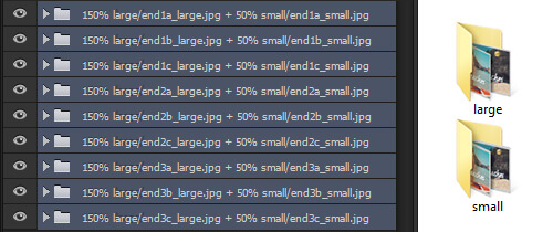
And here is the same but using the default:
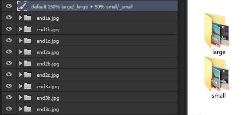
As you can see, this will save you from repetitively naming layers. It also adds some very advanced options for folder outputting and default settings across all of your generated output. It is a massive time-saver for sure. Once you give this a try, I doubt you will ever go back to the traditional “Save for Web” dialog and layers.
Still excited and want more on Generate and its syntax? Then check out “Generate Image Assets From Layers” by Chris Converse, posted in Photoshop Help.
The Perfect Combo
As I hinted at the beginning of this article, these techniques really shine when used together: the combination of artboards to visualize multiple canvases at once, and Generate to export multiple image resolutions.
I put this into practice in a recent project while being contracted by BIG. This project occurred in conjunction with Bermuda Tourism and Expedia. You can view the result on the Explore Bermuda website. Basically, the experience lets you see Bermuda through first-person video by picking your own path. Cool, right?
What we will focus on here are the final images, for which I used the combined technique of artboards and Generate. During the experience, you can choose A, B or C at five decision points, which then builds an itinerary based on your choices. Here are screenshots of the itinerary:

Image Assets
To support phones, tablets and desktop, the final images needed to be exported at @1x, @2x and @3x. There were also wide and tall versions to better fit on phones. The PSD used as an example here is for the tall version. So, the 15 images quickly became 45 for each tall and wide version to support Retina displays!
If you are not familiar with the terms @1x, @2x and so on, then I’d suggest having a quick read of my article, “A Better Way to Design for Retina in Photoshop.” It explains why I think this is the best technique when working with Retina assets and also why I design @1x.
Great! So, now you know what I needed to produce. Let’s walk through how I got there.
Layers to Artboards
The first improvement to my regular workflow was to change from layers to artboards. This is really powerful from a design perspective. You can now compare all of your assets that need to work together. I could make sure that all of the color options were correct and that all of the images work together as a set.
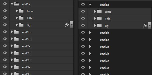
Look at the comparison of layer groups and artboards above. As you can see, there isn’t much change here, nothing to scare you off: layers on the left and artboards on the right of the image. Instead of having top-level layer groups for each image, they now become an artboard. Sublevel folders and assets are kept neatly nested below the Artboard layer. Business as usual really.
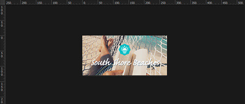
Let’s see the biggest advantage. Here’s what you see with layers when working in a traditional Photoshop workspace:
And here’s what you get when working with artboards:
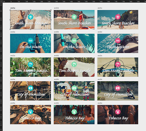
As you can see from the traditional layer setup, you get only one canvas. This allows you to work on only one image at a time, with no easy way to compare with others. To view another image, you must turn off the visibility on all other layer groups and turn on the layer group you want to see. A bit painful, really.
With artboards, you can see the full set of images at once. I have also arranged the images in rows and columns to keep them neat. Much better.
It doesn’t stop there. Let’s see how Generate works on top of this artboard setup.
Artboards Combined With Generate
As if artboards aren’t great enough already, let’s see them in action with Generate. My previous workflow with layers would be very different at this point. I would either use “Save for Web” if it was just a few layers, or use a script to export the layers I wanted if there were many layers. The difficulty arises when you need three images at different resolutions and with the correct naming to support Retina. Thankfully, Generate solves this for us.
I do need to give a quick shout out to Martin Pitt for his comment on my previous article. He mentioned that you could use Generate on layer comps, which got me thinking: Maybe Generate would work on artboards. To my surprise, it does!
OK, from what we walked through earlier in the article, Generate with the defaults will be the most efficient setup for the multiple images I need. Here is the default layer name I used:
[ default 100% end/@1x, 200% end/@2x, 300% end/@3x ]

Generate will automatically create a tidy folder named end. In this folder, the 15 artboards will get outputted to 45 images, all scaled and neatly suffixed. Could you ask for anything better than that? Here are the image assets that are generated:
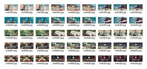
end folder. (View large version)The combined technique of artboards and Generate greatly sped up my workflow with these image assets and kept everything neat and tidy. Working on images as a set and producing Retina assets became much easier.
You might have noticed that I used the comma separator (,). I prefer it to using the plus sign (+) simply to keep my layer names a bit shorter. When working with artboards, you need all the real estate you can get. The last thing you need is a wide Layers panel cluttering up the workspace.
Wrapping Up
I hope you’ve enjoyed looking at artboards and Generate. Both are great features that are definitely worth a look, and they work well together when you need to export multiple image assets for Retina, as my example should have highlighted. Don’t be shy — give them a try! Thanks for reading.
Say “Hi” on Twitter, and feel free to comment below.
Performance Tip
Unfortunately, not everyone has the latest and greatest high-spec machine. For those who don’t, artboards and Generate can be a bit taxing. To save a bit of CPU, you can just turn on Generate when you need to create new image assets.
I use this technique when working on a mobile or desktop page design, because working through extensive layers and groups every time I edit something can get a bit heavy! Again, the menu option is “File” → “Generate” → “Image Assets.” Keep it in mind.

Further Resources
- Retinize It “The best Photoshop actions for preparing designs for iOS or optimized for Retina-display websites.”
- “Design Resources,” Bjango
- Slicy, MacRabbit “Slice PSDs in a whole new way.”
 (da, jb, ml, al)


