If you’ve ever had to move your iPad from one hand to the other just to tap a button you couldn’t reach, then you may have already guessed why we began this study in our UX lab.
Our Mail.Ru Group’s UX lab team carries out many usability studies of our apps for smartphones and tablets. We address users’ needs by introducing features in our products. We carefully test all of the functions to ensure users notice and understand them well. Nevertheless, this was the first time we had looked at the physiological aspect of our app’s usage.
Further Reading on SmashingMag:
- Ten Things To Think About When Designing Your iPad App
- Web Development For The iPhone And iPad: Getting Started
- A Dad’s Plea To Developers Of iPad Apps For Children
We came across several studies dedicated to the physiology of using iPads, but they were all scientific, rather than practical, and quite far from business needs. Moreover, such studies were performed on smartphones alone, excluding tablets.
So, we decided to analyze the physiology of using the interface of Mail.Ru’s Email app; for example, how comfortable is it to use an iPad app in typical positions? The behaviors we studied included tapping buttons while lying down, browsing photos while sitting, swiping, and writing text. Our results revealed a number of purely ergonomic problems that should be taken into account when developing any iPad app.
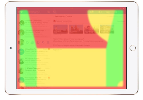
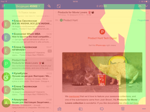
Our results are shown here on an iPad layout using a three-color schema. Controls located in the green zone are easily reachable by the average person; the yellow zone is still reachable but not as easily; and the red zone is the most inconvenient location for controls.
(The images in this article always follow the relevant paragraphs.)
Description Of Study
Goals
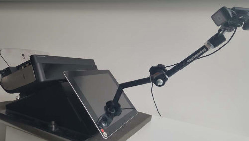
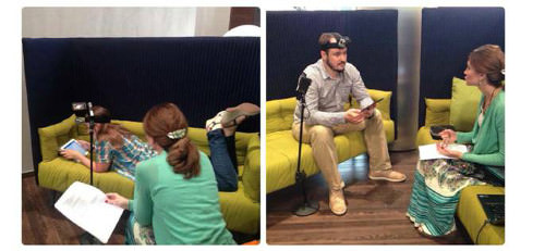
In terms of user experience, an iPad is interesting as a replacement for a notebook at home (when the user is lying on a couch) or on journeys (when the user is sitting on an airplane or in a hotel room). Such conditions differ greatly from the environment in which we first tested iPad apps. The majority of our previous studies were carried out in a laboratory with an iPad fixed to a bench and using an eye-tracking device. However, we soon learned that this wasn’t suitable for our study because we needed to observe how people use iPads in their everyday environment. So, instead, we had our respondents sit or lie down on a couch to simulate natural conditions.
Audience
Our audience consisted of the following:
- eight Mail.Ru Group employees who aren’t designers or involved in any way in the email product’s development;
- five males and three females, 25 to 35 years of age.
All respondents use an iPad, in particular, to check their Mail.Ru email.
Research Methodology
Step 1
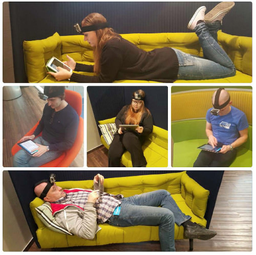
Every user would lie or sit on a couch in the pose that is the most natural for them when using their iPad:
- supine position (i.e. lying flat, face up);
- prone position (i.e. lying flat, face down);
- sitting with legs crossed;
- sitting with one foot on the couch.
This study dealt only with usage in landscape orientation because a number of studies show the majority of iPad users prefer it. Some research shows that it accounts for 35% of usage and is used mostly for specific passive tasks that don’t involve tapping buttons, such as reading a book.
Step 2
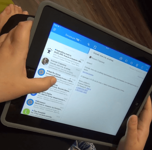
Users performed their usual actions with the email app in scenarios such as the following:
- replying to a message and downloading three photos;
- setting a push notification for 8:00 am to 11:00 pm;
- looking for all flagged emails.
Step 3
All activities were recorded with a GoPro camer (worn by the respondents) and an external camera.
Key Results
Typical Physiology-Related Interface Problems
Analysis of the video showed that some difficulties in using iPad apps were purely physiological — for example, a user seeing all buttons and understanding which one to push and when, but not being able to do so comfortably.
We discovered the following difficulties:
- having to change how the iPad is held in order to reach a button;
- having to change the position of one’s fingers in order to press a button;
- having to change the position of one’s hands in order to press a button.
- having to bend a hand or finger unnaturally.
- having to cover the screen with one’s hand in order to reach a button.
Examples of each difficulty are listed below.
Changing How iPad Is Held to Reach Button
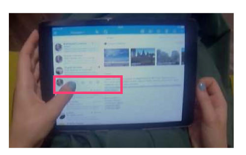
Extra features in an app are often available via swiping. For instance, users of Mail.Ru’s Email app swipe to interact with the message list. Respondents mentioned that the outer buttons (“Spam” and “Trash”) were positioned too far away. This particularly affected those sitting on a couch. As they held the iPad with their left hand, keeping hold of it to reach those buttons proved to be uncomfortable, and so they had to stretch their thumb to reach.
Changing Finger Position to Press Button
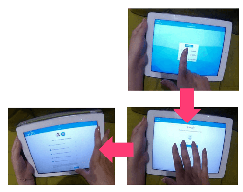
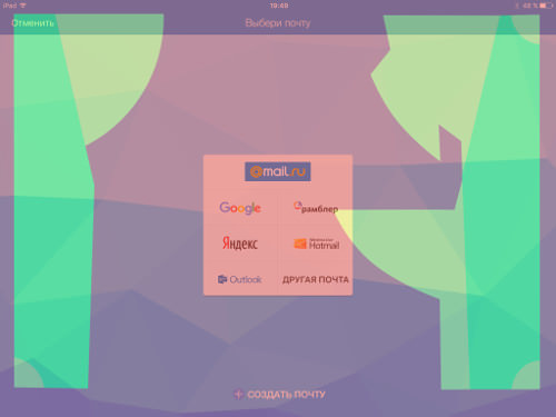
Respondents sometimes had to change their finger position when performing a step-by-step operation. For instance, the first two steps for adding a second account to the email app is performed in the center of the screen, but the button for the third step is at the bottom of the screen. To press it, respondents had to change their finger position.
Changing Hand Position to Press Button
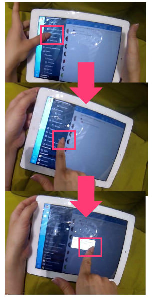
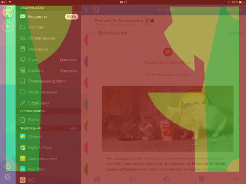
Sometimes, our respondents changed hands while performing step-by-step operations; for example, when using the app’s menu. Seven out of eight respondents browsed the menu with their left thumb. All of them found it easy to tap the menu options, but they found it difficult to empty the “Trash” folder. That button was too far away to be easily reached (note that four out of eight respondents had to do it with their right hand instead of their left, which was normally used to access the menu). Moreover, this task required two steps: emptying the folder and then confirming the operation. The second step was difficult for respondents who managed to tap the “Trash” folder with their left thumb, because the second step had to be performed with the right hand.
Bending Hand or Finger Unnaturally
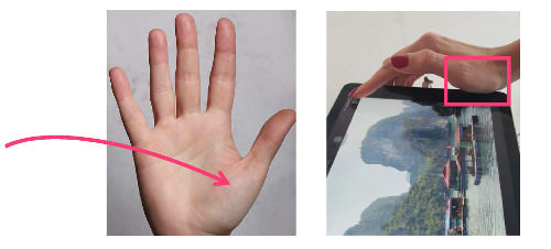
Due to the size and shape of the device, some areas of the screen were difficult to tap. A hand would be pressed against the iPad and have to be bent unnaturally to tap a button.
Let’s take the location of the “Save Image” button as an example. The respondents sitting on the couch found it difficult to tap this button. The icon is located in the upper part of the screen, at the edge of the viewport. Therefore, using the index or middle finger, as is usually done, wasn’t quite comfortable because the metacarpophalangeal joint of the thumb was pressed against the device.
Covering Screen When Reaching for Button
Buttons in apps are traditionally located in the upper part of the screen, following the common practice on websites. But this location has turned out to be inconvenient, both for smartphones and tablets. When tapping a button in the upper part of the screen, the hand will end up covering most of the screen. Also, the part of the screen where changes caused by tapping certain buttons appear is also covered. This will sometimes confuse the user, who might need a couple of seconds to understand what has occurred as a result of their selection.
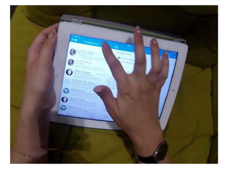
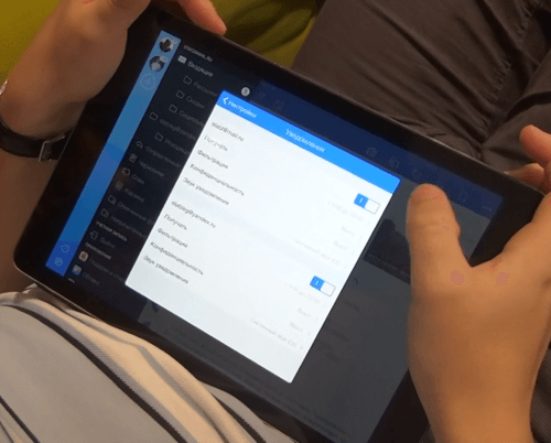
I can illustrate this point using our email app’s “Compose” button. One of the respondents used their left hand to tap it. Reaching the center of the screen this way isn’t very comfortable but still possible.
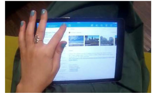
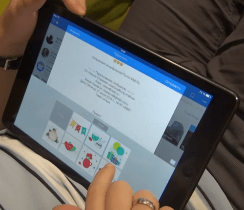
However, the other seven respondents used their right hand, covering more than half of the screen:
Safe Zone Map
An iPad’s physiology-friendly zones for various body positions are shown below. The calculation was performed based on the average length of a finger (the average length being 5.8 cm for males and 5.3 cm for females for 95% of the US population). According to research, male and female iPad users are essentially equally represented (as of June 2012, males accounted for 51.9% of all iPad users, but we’ll consider usage to be equal for the sake of convenience). Therefore, we’ve used the average length for both male and female fingers. And because all of our respondents, as well as most (85%) people in general, are right-handed, these safe zones were determined for right-handed people. For left-handed users, the safe zones would need to be inverted.
The results below take into account the dimensions of an iPad’s frame, being 2 × 1 cm.
Because our respondents used controls located in various parts of the screen, the safe zones we determined could be applied to any iPad app.
Sitting on Couch (Illustration)
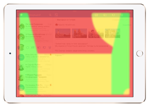
Refer to the layout below for physiology-friendly locations of iPad app controls. The diagram applies to a user sitting on a couch with an iPad on their knees.
The controls in the green zone are the easiest to reach for the average person. The yellow zone is still reachable but not as easily. The red zone is the most inconvenient location for controls; a user will encounter several of the difficulties mentioned above; for example, they would have to move their hand to tap a button and end up covering most of the screen.
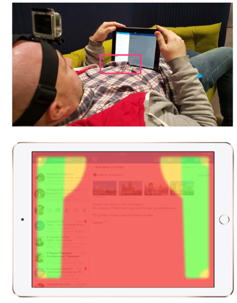
Lying Supine On Couch (Illustration)
This safe zone layout applies to a user lying supine; in other words, lying down, face up, with the iPad resting on their stomach and being held with both hands. Note that the red zone in the lower part of the screen is larger than in all other layouts. An iPad supported by your abdomen in this way over an extended period of time will create a ridge in one’s clothes. This ridge would be about 1 to 2 centimeters high and would cover the controls in the lower part of the screen.
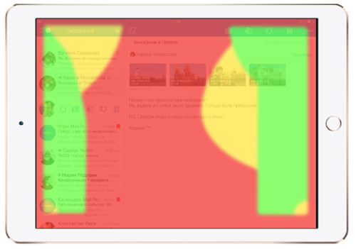
Lying Prone on Couch (Illustration)
The third layout applies to a user lying prone; that is to say, lying face down on the couch. In this position, the person has to rest on their forearms, which significantly limits the mobility of their hands, making use of both thumbs the most comfortable way to navigate.
However, because the left hand of right-handed users is holding the device, there are more green zones for the right hand.
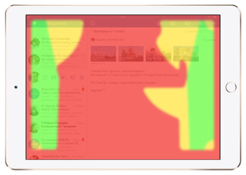
All Positions
The illustration below combines all of the zones for the different body positions into one layout. The areas where green and yellow zones overlap are shown in yellow, while the ones where the green and red zones overlap are shown in red. This enabled us to develop the layout of absolutely safe green zones for all of the body positions of iPad users.
All of the layouts were developed according to the dimensions of the iPad’s bezel, which is 2 centimeters on the left and right sides and 1 centimeter on the upper and lower edges, assuming it is held horizontally. If your app is designed for iPad mini users, you should measure the edges of that device to determine your own safe zones.
We hope the results of this study will assist all developers to improve the usability of their apps during the creation process. We are certain that the results of our study would be relevant to the design of any app, because it was in no way affected by the design of our own app. Respondents were familiar with all of the controls, and our findings were based solely on physiological observations. In addition, note that the Mail.Ru Email app has controls on every side of the screen, so we’re sure that the device’s entire surface was tested.
If, in a few months (and after having absorbed the recommendations derived from our research here), you find yourself having to change hands less often while using an iPad and you are able to hit controls and menu items more easily and frequently, then you’ll know we’ve addressed the problem effectively.
Recommendations For Designing iPad Apps For Physiology
- Put controls within easy reach on the iPad, however the user is positioned (see our safe zone map).
- If an action consists of two steps (controls, fields, etc.), all steps should be located in the same part of the screen.
- With any step-by-step functions, putting the second step a little higher than the first would be advisable, since the user’s hand would be covering the first step’s controls.
- The center of the iPad screen is not the best place for controls, because the largest portion of the screen would be covered by the hand that is interacting with the controls. A user lying prone or supine on a couch would have to remove their hand from the device in order to tap the center. We recommend using our safe zone map, where the green shows the optimal location for controls.
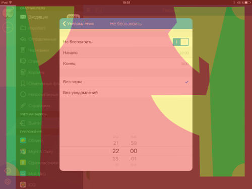
- Controls should be located away from the edge of the viewport; that is, 2 centimeters from the left and right sides and 1 centimeter from the upper and lower sides. Bear in mind that users have to aim for buttons while trying to remain within the screen. Also, they have to bend or stretch their fingers to reach the edge of the screen.
- Other factors not addressed in our experiment can influence the physiological aspects of iPad app design; we’ve focused on the positions that we consider to be the most common. However, you may need to consider factors such as button size, button spacing and long pressing, as well as occasions when an iPad is lying on a table or held in a magnetic cover.
 (cc, jb, al, ml)


