Having spent over two years making it, we just pressed the “Ship” button on the new Hawaiian Airlines website. It has been the biggest project of my career, and I’ve worked with the most talented team I’ve ever worked with. Everything was rebuilt from the ground up: hardware, features, back-end APIs, front end, and UX and design. It was a rollercoaster ride like no other, but we have prevailed and built what I believe to be one of the best airline-booking experiences on the web. Yes, humble, I know!
Join me while I reflect on some of the mistakes we made, the tools we used, the workflows and guidelines we followed, and even some of the custom tools we built, all while growing a UI development team from one (yours truly) to over ten people to get the job done.
Further Reading on SmashingMag: Link
- The State Of Airline Websites 2015: Lessons Learned
- How To Design Style Guides For Brands And Websites
- How To Make An Effective Style Guide
- Transforming Lufthansa’s Brand Strategy: A Case Study
Full disclosure: Our company, User Kind, is a vendor for Hawaiian Airlines, and all opinions expressed here are my own. This article and the information herein has been shared with the explicit permission and generosity of Hawaiian Airlines.
Humble Beginnings
When I came aboard this project as a UI developer, Hawaiian Airlines had already hired another agency to rethink the UX and design of the existing 10-year-old website. That agency delivered a 500+ pages wireframe document, a handful of beautiful annotated Photoshop mockups and a front-end style guide. Seeing these deliverables immediately got me excited about the project and some of the fun UI development challenges that lay ahead.
Flight Hop

Travel Goals

Price Chart

The Front-End Sandbox
Around the time I was getting started, a large back-end team of 40 or so developers were ramping up on rebuilding all of their service APIs. Knowing that there was a tsunami of UI work to do, no back-end APIs for the front end to consume yet, and a hard deadline staked in the ground, we got to work.
Because the back-end stack was still being defined and built behind a private network, we started with a lightweight front-end sandbox to begin building UI components.
Here’s what the stack of tools and workflow looked like:

Dynamic Templates Fed by Static Data
While working in the sandbox environment, we used AngularJS to create dynamic templates based on a static JSON, which would eventually be replaced with live endpoints once we delivered the code. Sometimes the back-end folks would send us a JSON file generated from real flight data, and other times we would just define it ourselves if the data didn’t exist yet.
Using static JSON data worked OK for a while, but once we started building some of the more complex UI components, we quickly ran into a problem: multiple data states.
Take flight results, for example. You have one-way, round-trip and multi-city flight results, each with up to four layovers, overnight flights and multiple airlines. You can even travel back in time if you fly across the right time zones at the right time!
Given the thousand-line JSON files, hand-tweaking the JSON to test other states was a chore and prone to human error.
We needed a better way to build and test all of these different states in the sandbox. So, Nathan set out to solve this problem and came up with what we call the “data inspector”:
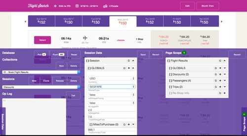

Armed with the data inspector, we were able to prepare the front-end code so that it was production-ready when we delivered it to be hooked up to live data. As a bonus, designers and product owners could use this tool on the demo Heroku website to ensure that everything looked as intended across states.
Tossing Code Over the Fence
Spoiler alert: Don’t ever do this!
When it came time to integrate the front-end code with back-end services, we had to toss it over the fence to the folks who were integrating it in a totally different environment (.NET) with completely different tools (Visual Studio and Team Foundation Server), tucked securely behind a private network in Hawaii.
While this worked OK initially, it quickly became a nightmare. Product folks would request changes to the UI; we would make those changes in the sandbox, then toss it back over. Code changes would then have to be hand-merged because we had Git on one side and Team Foundation Server on the other. With different file and folder structures, these two repositories didn’t play nice together.
We quickly put an end to this and worked with the IT team to get access into the walled paradise. However, this process set us back months of productivity, as we switched to a completely different development stack, got VPN access, learned a different toolset and set up our virtual machines to match what the back-end team was using.
From then on, we’ve worked directly with the back-end teams to build and integrate the UI code, using the scrum process in two-week sprints, and things have gone a lot smoother since.
In the short term, the sandbox gave us a huge head start. We got to use a bunch of modern tools and workflows that we were all familiar with. It made us really efficient. Given the circumstances, it might have been the right move, but we waited way too long to rip off the bandage and hop over the fence once it was ready.
Sandbox Learnings
- If you’re using Git, choose a branching model carefully on day one, and ensure that it fits your team, project and workflow.
- If your Git branching strategy is done right, then reverting or cherry-picking features over the timeline of your project should be a cheap and easy task.
- If building the front end of an app with real data and endpoints isn’t possible, then figure out a way to make it possible. (Mocked-up endpoints would have been better.)
- Avoid multiple teams working across multiple environments at all costs, even if it causes delays up front.
- Establish your tools, workflows and environment early on, and ensure that everyone on the team uses them.
- Had we taken a more forward-thinking approach, it would have given us a big leg up in the long run, and we would’ve avoided the mid-project slump altogether.
CSS And LESS
In the beginning of this project, we adopted the methodology that keeping the HTML light, with very few CSS classes, while using LESS’ :extend heavily was the way to go.
It’s nice because when your design changes in the future, your HTML won’t be full of a lot of CSS classes, and you shouldn’t have to touch it. Simply update your LESS styles, and change your :extends.
Most elements in the HTML had either no class or a single defining class:
<section class="my-section">
   <h1>Title</h1>
   <p>Some Text</p>
</section>
Then, in our LESS, we’d have styles like this:
.my-section {
   h1:extend(.header-uppercase-1){};
   p:extend(.bodycopy-sans-3){};
}
The net result of this method is a lot of selectors in the CSS output. After a year of coding, our CSS output got unwieldy, with thousands of lines of this:
.ha-modal .help-template h2,
.ha-modal .help-template h3,
.ha-modal .help-template h3:first-child,
.ha-help.collapsable-block h4,
.tooltip-block h4,
.traveler-lg .name,
address h4,
.ha-cms-teaser-sidebar .heading,
[ha-calendar] .ha-calendar-month,
.ha-modal#locationModal .destinations-container .standard-location .heading,
[ha-alert] .alert .alert-content .alert-content-primary,
[ha-avatar] .avatar .name,
[ha-avatar] .avatar.small .name,
[ha-tooltip] .ha-tooltip h4,
[ha-global-alert] .global-alert .alert-content .alert-content-primary,
[ha-promo-tile-other-small] .promo-tile.tile-small .headline,
[ha-promo-tile-other-large] .promo-tile .headline,
[ha-child-nav-tile] .child-nav-tile .page-title,
.navtray-content-inner--stackedlistwrap .stackedlist-li-title,
.lte-ie7 .navtray-content-inner--stackedlistwrap .stackedlist-li-title,
.ha-flight-hop .departure-city,
.ha-flight-hop .arrival-city,
.ha-receipt .trip,
.ha-my-trip-itinerary .trip-header span.segment-city,
.ha-my-trip-itinerary .segment .check-in .status,
.ha-my-trip-itinerary .segment .check-in .status:before,
.ha-my-trip-itinerary .segment .check-in .status.green:before,
.ha-my-trip-itinerary .segment .check-in .status.red:before,
.ha-my-trip-itinerary .segment .check-in .status.yellow:before,
.ha-flight-status .flight-info .flight-number,
.ha-flight-status .flight-info .flight-route,
.ha-print-confirmation .reservation-code-title,
.ha-my-trips-itinerary-details .trip-header span.segment-city,
.ha-my-trips-eticket-receipt .trip-header span.segment-city,
.ha-my-trips-itinerary-details .segment .segment-header .col,
.ha-my-trips-eticket-receipt .segment .segment-header .col,
.ha-my-trips-itinerary-details .segment .leg .leg-details .status,
.ha-my-trips-eticket-receipt .segment .leg .leg-details .status,
.ha-my-trips-itinerary-details .segment .leg .leg-details .status:before,
.ha-my-trips-eticket-receipt .segment .leg .leg-details .status:before,
.ha-my-trips-itinerary-details .left-heading .trip-locations,
.ha-my-trips-eticket-receipt .left-heading .trip-locations,
.ha-book-flight-results .segment .selected-flight-info,
.select-class-wrapper a,
.ha-book-flight-results .discount-applied .credit-applied {
  font-style: normal;
  font-size: 0.9375em;
  font-family: "helvetica-neue", "HelveticaNeueLT Std", "HelveticaNeue", "Helvetica Neue", Helvetica, Arial, sans-serif;
  font-weight: bold;
  text-transform: none;
  line-height: 1.4;
  letter-spacing: 0.02em;
}
Fun fact: Did you know that Internet Explorer 9 and below will stop processing a given CSS file once it reaches 4095 selectors? Heavy use of :extend put us way over that limit early on. Figuring out why the website looked totally messed up in Internet Explorer 8 and 9 took a bit of debugging and research. We ended up using a Gulp task to break up the CSS files for old versions of the browser.
This ended up being really bad. It bloated our CSS with an output that made it difficult to debug styles in the inspector.
Mixins vs. Extend
When our CSS output started exceeding 100 KB in size, a question arose. What would output a smaller style sheet: more styles (using @mixin) or more selectors (using :extend)?.
I’ll let Jake explain:
“After testing it out, we discovered that, despite:extendoutputting significantly less CSS, Gzip compression of the redundant mixin styles could actually translate into a similar if not smaller file size. What puts this idea over the top is that transitioning to mixins would make the DOM inspector CSS much more legible. We would no longer have 200 unrelated selectors grayed out for thath1you’re trying to debug (which can make the inspector lag and reduce legibility). We did a small Gzip test comparing a small-scale mixin-ed style sheet versus an:extend-ed style sheet, and the mixin version actually came out on top.”
So, we did a big overhaul to change all :extends to @mixins. (We covered 80% with a simple script, the rest by hand.)
Thus, this…
.my-section {
   h1:extend(.header-uppercase-1){};
   p:extend(.bodycopy-sans-3){};
}
… became this:
.my-section {
   h1 {.header-uppercase-1}
   p {.bodycopy-sans-3}
}
This discovery was an improvement, but the bloated CSS could have been avoided altogether if we had adopted an entirely different framework…
OOCSS and BEM
Looking back on all of this, our CSS would have reduced in size and our development productivity would have increased if we had established a pattern with more defining classes in the markup (OOCSS and/or BEM).
Here are the pros of OOCSS and BEM:
- Style sheets are smaller, flatter and easier to maintain.
- Troubleshooting and development of styles are more efficient:
- Source maps can tell you where to find the source LESS code.
- Modifying styles in the browser (for experimenting) is easier because they will appear as different syles.
- The DOM will tell you what the custom class is versus what the global classes are.
- You can more easily break out specific style sheets to serve only what a page or section needs (rather than a lot of classes being downloaded that the page doesn’t refer to).
And here are the cons of OOCSS and BEM:
- The HTML is more wieldy, with a lot of CSS classes.
- You’ll have less flexibility to make CSS-only changes down the road.
- When the design changes, you’ll likely need to modify the HTML classes.
In hindsight, OOCSS and BEM clearly would have been ideal frameworks to approach a project of this size.
CSS Learnings
- Agree on a general approach across the team, or adopt an OOCSS-esque approach, like BEM.
- Use a linter like Jacob Gable’s LESS Lint Grunt plugin to keep your LESS and CSS inline with your patterns.
- Stay away from using
:extends as much as possible on a big project. The way it works is smart, but the output is confusing and difficult to debug. - Use classes that are flat and reusable throughout the project, and continually analyze existing classes when creating new ones.
AngularJS
When I came aboard this project, I had a lot of experience with jQuery, jQuery Mobile and vanilla JavaScript, but I hadn’t touched AngularJS or similar JavaScript frameworks. The paradigm shift to AngularJS was a struggle for me at first; but, as many others have experienced, once I got over the learning curve, I fell in love.
Custom UI Components
What makes AngularJS a great solution for a big project like the Hawaiian Airlines website is the amount of flexibility it gives you to create custom UI components.
All of that flexibility means that there are a lot of ways to skin the AngularJS cat. In the beginning, we skinned it in ways that made our code difficult to test and difficult to reuse in different contexts. We’d have a directive that depended on some parent scope variable, and when that didn’t exist, the directive would break. We learned pretty quickly that if you don’t have an isolate scope in your directive, you’re asking for trouble.
Over the course of the project, we learned to think about AngularJS directives more as self-contained web components with an API.
AngularJS directives should be very self-centered. They shouldn’t know or care about the world they live in, so long as their basic needs are met, as defined by an API in the form of element attributes:
<custom-component-thing
   type="type1"
   data="{object}"
   default-airport-code="HNL"
   excluded-airport-codes="['OGG', 'DEN']"
   show-partner-airlines="true"
   on-departure-airport-select="select(departureAirportCode)"
   on-return-airport-select="select(returnAirportCode)">
</custom-component-thing>
In the example above, the data you feed this directive via the attributes tells it how to behave and exposes a way to pull data back out of it, yet completely isolates its inner workings and template that renders to the DOM.
AngularJS Performance
While AngularJS magically data-binds everything defined on $scope two ways, this magic doesn’t come for free. For every item on $scope, a listener is created that detects changes to it. When changes are detected, it goes through and updates everywhere else it is used. Each time AngularJS loops through all of the items on $scope, we call that a digest cycle. The more stuff you have attached to $scope, the harder it has to work and the slower your digest cycle becomes.
In a big application such as Hawaiian Airline’s flight results, we started noticing laggy performance on tablets and slow desktop computers. Upon investigation, we realized that the page had over 5,000 watchers, and the digest cycle was taking several hundred milliseconds!
With a new problem and awareness of AngularJS’ performance, Nathan and Scott set out and built a handy tool to monitor AngularJS performance, and they open-sourced it.
This tool ended up being key in troubleshooting and taming AngularJS performance across the website. Check it out: You can see AngularJS performance data on the live website by adding ?performance=true to any page’s URL.

In conjunction with the performance tool, we used AngularJS’ bind-once directive to ensure that we have watchers only on data that needed to change.
As a result, we brought our watchers from over 5,000 down to under 500, and we saw a nice bump in responsiveness on tablets and slow devices.
AngularJS Learnings
- With great power comes great responsibility. Make sure you understand the inner workings of your chosen framework so that you harness it for good and not evil.
- AngularJS has taught me an entirely different way to think about constructing a UI, such as breaking components down to their bare reusable essence, and avoiding DOM manipulation via jQuery altogether.
- Think of directives as web components that expose an API into them, and keep your scope isolated from the outside world to avoid bugs and headaches.
Custom Form Controls
Booking travel online basically consists of a complex set of forms. So, designing beautiful custom form controls seemed obvious, and everyone (me included) was excited about it.
Looking back, if I had to pick the single most painful thing we did on this project, it would be the custom form controls.
You might not realize it, but those form controls that come out of the box in your browser do a lot of heavy lifting:
- They ensure that people with accessibility challenges can still use them.
- They keep track of
focus,blur,active,inactivestates. - They allow the user to cycle through all fields using the “Tab” key.
- They figure out how and where to place dropdown menus based on the page’s scroll position.
- They allow the user to type up to several letters to jump to an item in a dropdown menu.
- They auto-scroll dropdown menu items for long lists.
When we decided to roll our own form controls, we took on the burden of reinventing the wheel and supporting all of the requirements above.
We ended up with a solution that uses AngularJS to hide the native HTML of select dropdowns, checkboxes and radio buttons, and replaces them with alternate markup for which we had full control over styling.
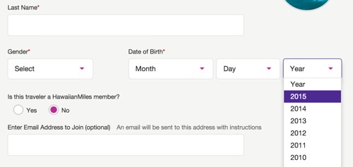
While this approach gave us OCD-level control over every pixel, it ended up causing all kinds of obscure bugs and accessibility issues in complex situations, which we spent countless hours patching.
In the end, we decided to scrap these custom form controls in favor of their native counterparts. We realized that, while we couldn’t achieve the pixel perfection of a pure custom solution, we could get 99% of the way there just by using background images and pseudo-selectors on the native input HTML. In the case of <select> dropdown menus, we just styled the default look of the select menu and let the browser handle the look and feel of the actual dropdown of the select menu. For checkboxes and radios, we hid the default control off screen and then styled the label via pseudo-selectors.
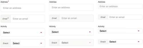
Jamie made a Codepen of these new form fields as a proof of concept.
Custom Form Controls Learnings
- Rolling your own form controls, especially for dropdown menus, on a project of this size and complexity is not worth the hassle. The only thing you’ll gain is shiny controls.
- Do what you can with native form code, and avoid replacing it with custom markup.
- Try using background images, SVGs and pseudo-selectors to achieve the look you want.
Pattern Consistency
With a code base this big, pattern consistency becomes really important. Big code bases should look as though a single person developed it. In practice, this is easier said than done.
Anytime we developers code something, we can look back almost immediately and realize how we could have done it better. That’s just human nature. There’s always this temptation to change and improve one’s patterns. It’s a healthy but dangerous instinct.
I would argue that pattern consistency across a big code base is more important than doing something different in one place, even if you know the solution is five times better.
Think of it like the user experience of your code. Once you learn one pattern, you would expect it to look and work the same way everywhere else. If it doesn’t, then you’ll get bogged down in a costly spiral of troubleshooting and debugging in order to learn how the foreign pattern works — and you’ll then have to keep track of more than one pattern in your head.
When patterns are all over the map, you end up with steep learning curves and unproductive developers across the team or, even worse, individual developers who hold all of the knowledge of the patterns they’ve worked on.
UI Docs
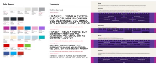
One of our most valuable assets on the front end that helped us maintain pattern consistency (and, as a bonus, prevented my instant messenger from blowing up with questions all day long) was the UI documentation that we built and maintained throughout the project.
We used Yeoman to generate the scaffolding of new AngularJS directives, which in turn generated a demo page for that directive that we could build from. So, most of our documentation was created during the development of the component; it practically built and maintained itself.
We built the documentation directly into the local and development environments, so that anyone working on the project could access and maintain it anytime.
Code Reviews
This project moved so fast that each person barely had time to get their own work done, let alone pay attention to what their peers were doing. Our pattern consistency degraded over time as a result.
To combat this later in the project, we started doing peer code reviews. Before merging code into the main repository, a developer would request a review from a handful of peers, and they would not check in or merge their code until at least one team member had reviewed and approved it. At first, this workflow slowed things down a bit, but the result was that our patterns aligned, we caught bugs, and knowledge of the code was better disseminated.
Guidelines
While JSHint helps with enforcing some JavaScript standards and the UI documentation helped as a general reference, a higher level of consistency is still missing in the front-end code base. Looking back, it would have been helpful to establish some detailed guidelines for the JavaScript, HTML and CSS that could be referenced and followed throughout the project, and to enforce as much as possible via Grunt tasks.
Pattern Consistency Learnings
- Changing patterns for the better is a good thing, but only if it can be done across the entire code base in one fell swoop and clearly communicated to the team.
- Code reviews help to align patterns, catch bugs and spread learning.
- UI documentation is a great reference for everyone involved. The next time around, I would look into creating a living style guide — self-generated and self-maintained from the source code, via a tool like KSS.
- Document and enforce detailed JavaScript, HTML and CSS style guides, similar to Airbnb’s for JavaScript, Google’s for JavaScript, GitHub’s for CSS and Google’s for CSS and HTML.
Use Grunt or Gulp tools wherever possible to automate the enforcement of patterns.
Style sheets are smaller, flatter and easier to maintain.
Troubleshooting and development of styles are more efficient:
- Source maps can tell you where to find the source LESS code.
- Modifying styles in the browser (for experimenting) is easier because they will appear as different syles.
- The DOM will tell you what the custom class is versus what the global classes are.
- You can more easily break out specific style sheets to serve only what a page or section needs (rather than a lot of classes being downloaded that the page doesn’t refer to).
And here are the cons of OOCSS and BEM:
- The HTML is more wieldy, with a lot of CSS classes.
- You’ll have less flexibility to make CSS-only changes down the road.
- When the design changes, you’ll likely need to modify the HTML classes.
In hindsight, OOCSS and BEM clearly would have been ideal frameworks to approach a project of this size.
CSS Learnings
- Agree on a general approach across the team, or adopt an OOCSS-esque approach, like BEM.
- Use a linter like Jacob Gable’s LESS Lint Grunt plugin to keep your LESS and CSS inline with your patterns.
- Stay away from using
:extends as much as possible on a big project. The way it works is smart, but the output is confusing and difficult to debug. - Use classes that are flat and reusable throughout the project, and continually analyze existing classes when creating new ones.
AngularJS
When I came aboard this project, I had a lot of experience with jQuery, jQuery Mobile and vanilla JavaScript, but I hadn’t touched AngularJS or similar JavaScript frameworks. The paradigm shift to AngularJS was a struggle for me at first; but, as many others have experienced, once I got over the learning curve, I fell in love.
Custom UI Components
What makes AngularJS a great solution for a big project like the Hawaiian Airlines website is the amount of flexibility it gives you to create custom UI components.
All of that flexibility means that there are a lot of ways to skin the AngularJS cat. In the beginning, we skinned it in ways that made our code difficult to test and difficult to reuse in different contexts. We’d have a directive that depended on some parent scope variable, and when that didn’t exist, the directive would break. We learned pretty quickly that if you don’t have an isolate scope in your directive, you’re asking for trouble.
Over the course of the project, we learned to think about AngularJS directives more as self-contained web components with an API.
AngularJS directives should be very self-centered. They shouldn’t know or care about the world they live in, so long as their basic needs are met, as defined by an API in the form of element attributes:
<custom-component-thing
   type="type1"
   data="{object}"
   default-airport-code="HNL"
   excluded-airport-codes="['OGG', 'DEN']"
   show-partner-airlines="true"
   on-departure-airport-select="select(departureAirportCode)"
   on-return-airport-select="select(returnAirportCode)">
</custom-component-thing>
In the example above, the data you feed this directive via the attributes tells it how to behave and exposes a way to pull data back out of it, yet completely isolates its inner workings and template that renders to the DOM.
AngularJS Performance
While AngularJS magically data-binds everything defined on $scope two ways, this magic doesn’t come for free. For every item on $scope, a listener is created that detects changes to it. When changes are detected, it goes through and updates everywhere else it is used. Each time AngularJS loops through all of the items on $scope, we call that a digest cycle. The more stuff you have attached to $scope, the harder it has to work and the slower your digest cycle becomes.
In a big application such as Hawaiian Airline’s flight results, we started noticing laggy performance on tablets and slow desktop computers. Upon investigation, we realized that the page had over 5,000 watchers, and the digest cycle was taking several hundred milliseconds!
With a new problem and awareness of AngularJS’ performance, Nathan and Scott set out and built a handy tool to monitor AngularJS performance, and they open-sourced it.
This tool ended up being key in troubleshooting and taming AngularJS performance across the website. Check it out: You can see AngularJS performance data on the live website by adding ?performance=true to any page’s URL.

In conjunction with the performance tool, we used AngularJS’ bind-once directive to ensure that we have watchers only on data that needed to change.
As a result, we brought our watchers from over 5,000 down to under 500, and we saw a nice bump in responsiveness on tablets and slow devices.
AngularJS Learnings
- With great power comes great responsibility. Make sure you understand the inner workings of your chosen framework so that you harness it for good and not evil.
- AngularJS has taught me an entirely different way to think about constructing a UI, such as breaking components down to their bare reusable essence, and avoiding DOM manipulation via jQuery altogether.
- Think of directives as web components that expose an API into them, and keep your scope isolated from the outside world to avoid bugs and headaches.
Custom Form Controls
Booking travel online basically consists of a complex set of forms. So, designing beautiful custom form controls seemed obvious, and everyone (me included) was excited about it.
Looking back, if I had to pick the single most painful thing we did on this project, it would be the custom form controls.
You might not realize it, but those form controls that come out of the box in your browser do a lot of heavy lifting:
- They ensure that people with accessibility challenges can still use them.
- They keep track of
focus,blur,active,inactivestates. - They allow the user to cycle through all fields using the “Tab” key.
- They figure out how and where to place dropdown menus based on the page’s scroll position.
- They allow the user to type up to several letters to jump to an item in a dropdown menu.
- They auto-scroll dropdown menu items for long lists.
When we decided to roll our own form controls, we took on the burden of reinventing the wheel and supporting all of the requirements above.
We ended up with a solution that uses AngularJS to hide the native HTML of select dropdowns, checkboxes and radio buttons, and replaces them with alternate markup for which we had full control over styling.

While this approach gave us OCD-level control over every pixel, it ended up causing all kinds of obscure bugs and accessibility issues in complex situations, which we spent countless hours patching.
In the end, we decided to scrap these custom form controls in favor of their native counterparts. We realized that, while we couldn’t achieve the pixel perfection of a pure custom solution, we could get 99% of the way there just by using background images and pseudo-selectors on the native input HTML. In the case of <select> dropdown menus, we just styled the default look of the select menu and let the browser handle the look and feel of the actual dropdown of the select menu. For checkboxes and radios, we hid the default control off screen and then styled the label via pseudo-selectors.

Jamie made a Codepen of these new form fields as a proof of concept.
Custom Form Controls Learnings
- Rolling your own form controls, especially for dropdown menus, on a project of this size and complexity is not worth the hassle. The only thing you’ll gain is shiny controls.
- Do what you can with native form code, and avoid replacing it with custom markup.
- Try using background images, SVGs and pseudo-selectors to achieve the look you want.
Pattern Consistency
With a code base this big, pattern consistency becomes really important. Big code bases should look as though a single person developed it. In practice, this is easier said than done.
Anytime we developers code something, we can look back almost immediately and realize how we could have done it better. That’s just human nature. There’s always this temptation to change and improve one’s patterns. It’s a healthy but dangerous instinct.
I would argue that pattern consistency across a big code base is more important than doing something different in one place, even if you know the solution is five times better.
Think of it like the user experience of your code. Once you learn one pattern, you would expect it to look and work the same way everywhere else. If it doesn’t, then you’ll get bogged down in a costly spiral of troubleshooting and debugging in order to learn how the foreign pattern works — and you’ll then have to keep track of more than one pattern in your head.
When patterns are all over the map, you end up with steep learning curves and unproductive developers across the team or, even worse, individual developers who hold all of the knowledge of the patterns they’ve worked on.
UI Docs

One of our most valuable assets on the front end that helped us maintain pattern consistency (and, as a bonus, prevented my instant messenger from blowing up with questions all day long) was the UI documentation that we built and maintained throughout the project.
We used Yeoman to generate the scaffolding of new AngularJS directives, which in turn generated a demo page for that directive that we could build from. So, most of our documentation was created during the development of the component; it practically built and maintained itself.
We built the documentation directly into the local and development environments, so that anyone working on the project could access and maintain it anytime.
Code Reviews
This project moved so fast that each person barely had time to get their own work done, let alone pay attention to what their peers were doing. Our pattern consistency degraded over time as a result.
To combat this later in the project, we started doing peer code reviews. Before merging code into the main repository, a developer would request a review from a handful of peers, and they would not check in or merge their code until at least one team member had reviewed and approved it. At first, this workflow slowed things down a bit, but the result was that our patterns aligned, we caught bugs, and knowledge of the code was better disseminated.
Guidelines
While JSHint helps with enforcing some JavaScript standards and the UI documentation helped as a general reference, a higher level of consistency is still missing in the front-end code base. Looking back, it would have been helpful to establish some detailed guidelines for the JavaScript, HTML and CSS that could be referenced and followed throughout the project, and to enforce as much as possible via Grunt tasks.
Pattern Consistency Learnings
- Changing patterns for the better is a good thing, but only if it can be done across the entire code base in one fell swoop and clearly communicated to the team.
- Code reviews help to align patterns, catch bugs and spread learning.
- UI documentation is a great reference for everyone involved. The next time around, I would look into creating a living style guide — self-generated and self-maintained from the source code, via a tool like KSS.
- Document and enforce detailed JavaScript, HTML and CSS style guides, similar to Airbnb’s for JavaScript, Google’s for JavaScript, GitHub’s for CSS and Google’s for CSS and HTML.
- Use Grunt or Gulp tools wherever possible to automate the enforcement of patterns.
Conclusion
On a project of this size and scale, it was really hard to see the forest for the trees until we looked back from the other side. We made plenty of mistakes throughout the project. Some we recovered from gracefully; with others, our efforts were too little too late, and we have to live with them.
A wise person once said that making mistakes is a rite of passage to success. It makes us better. More importantly, learning from each other is how we get better as a community, so that history doesn’t repeat itself.
What really matters in the end is how well a website works and the experience people have while using it. And we’ve ended up with something we’re all really proud of, an experience that makes you want to sink your toes in the sand, sip on a Mai Tai and get lobstered by the sun.
I hope this story helps you start your next big project and arms you with the foresight to go forth and conquer.
 (vf, ml, al, jb)


