Transitions can be painful. It is in our nature to resist change, even when the possibility of doing something new and different may be exciting. Changing your workflow can be a real challenge if you don’t know where to start or understand how to embark on the change.
I’ve met with many designers (graphic, interaction, UI, etc.) who stick to old software because they are familiar and in their comfort zone, or because they are too scared to take the “leap of faith” and try something new (even when they know their old software does not allow them to work efficiently and effectively enough).
You might be interested in the following related posts:
- Getting The Sketch Workflow Right: Meet “The Sketch Handbook”
- Sketch With Material Design
- Using Sketch For Responsive Web Design (A Case Study)
- Prototyping iOS And Android Apps With Sketch (With A Freebie!)
I clearly remember when Macromedia Freehand was discontinued. I know a lot of designers, art directors and creative directors who needed many years to make the leap to Illustrator, because their workflows and techniques were stuck so deep in Freehand that learning another tool was too painful. However, let’s be honest: If you think about it, is switching to new software really that hard?
The answer is no. Change, as scary as it may be, most of the time is a good thing — first, because you learn how to do new things and, secondly, because feeling challenged and getting out of our comfort zone every once in a while is beneficial.
Fireworks: Frozen?
Fireworks was discontinued by Adobe a couple of years ago. (Adobe called this move “freezing development” and promised to release only minor patches from time to time.) Despite the fact that many designers still use it as their primary tool for design work, it’s time to look forward. Yes, you read that right: It’s time to move on. And I write this as a huge fan of Fireworks! Nevertheless, I think that designers need to be able to adapt, constantly learn new skills and master new tools in order to be competitive in the industry. Don’t get me wrong: I am not saying “Ditch Fireworks already,” but rather am asking all of you to be pragmatic and get your hands dirty with a very good alternative.
No doubt, Fireworks is a great app for designing screens. Yet, not being supported by Adobe will, regrettably, make it outdated very soon. And it pains me; I still use it for many projects because many of its features are evergreen, sleek and easy to use. To be fair, if you open it today, it won’t look outdated. (Hey, I even wrote a rather lengthy tutorial on icon design in Fireworks not long ago because I believe Fireworks is still a great tool for icon design, illustration and many other tasks.)
Yet, I think it is time to find one or more substitutes for Fireworks, because — exactly as in the case of Freehand a few years ago — you don’t need to live in the past!
What Next? Any Alternatives?
Quite a few options are on the market, the most obvious being Photoshop. We all know that it is great and packed with features. However, if you are used to the simplicity of certain tools that do something quickly and intuitively, then Photoshop might not be the best fit for you.
Because of its long history, Photoshop is filled with legacy features. It was originally built for bitmap (i.e. photo) manipulation and has expanded over the years to include vector editing, UI and web design, animation, video and even 3D! But Photoshop was never intended to be a UI design tool — that was just one of the many uses for which features were squeezed in over the decades, making the tool tougher to learn. Take Photoshop’s modal view: It has been like that for decades! There are many ways to pick colors, set gradients and apply layer styles. I love Photoshop for its ability to produce great artwork and for being clever in handling very big images, among other things. Nevertheless, some of its features are stuck in the past and haven’t been updated in ages.
The industry has set new standards. UI design and icon design are stronger than ever, and screen design apps need to adapt more quickly to meet the demands of today’s complex workflows. The modern design world also demands new technologies that work with much more than simple static bitmaps: scalable vectors (SVG and HTML5’s canvas), high-DPI versions for multiple resolutions, design with code (modern CSS), and motion graphics, not to mention the need to rapidly produce complex, interactive prototypes.
Among these apps, Sketch is a very good alternative, especially if you are a UI, web or icon designer.
I should probably also mention Adobe Illustrator. But while Illustrator is an awesome graphic design program (I use it myself, and a lot!), it has way too many options, and its primary purpose has always been vector illustration and print tasks, not user interface design. As a quick example, with Illustrator’s “Export for web,” it’s still difficult to produce crisp, optimized graphics and icons, even with its recent improvements for working with pixels.
Sketch tries to combine the vector power of Illustrator with the simplicity of Fireworks, while staying focused on screen design. So, for me, it is the most obvious choice for those who wish to transition from Fireworks and explore new tools.
Diamonds are made under pressure.
Sketch came out at the right time as an affordable and solid alternative for web designers — it’s relatively cheap and easy to learn. However, Sketch is the underdog in the world of graphics applications (a world inhabited by some big names, including Adobe), and it still needs to prove itself in some ways.
No doubt, its developer, Bohemian Coding, feels the pressure from other companies, and it’s definitely not easy to come up with a completely new tool for screen and web design and to be recognized as a leader. But we all know that diamonds are made under pressure! And that diamond icon, which appears in the dock when Sketch is installed, is doing a great job so far.
(On a related note, just a week or so ago and more than two years after having stopped development of its only dedicated UI design tool, Fireworks, Adobe announced that it has started work on a new tool, Project Comet. From the looks of it, it might be a competitor to Sketch, but it might be too early to say. The first version of Comet is to be released in 2016.)
Before talking about transitioning to Sketch, I would like to mention one more alternative to Fireworks: Gravit. It’s a free web app and was built in the spirit of Fireworks and Freehand. Some of the tools you are used to in Fireworks are not yet present in it, but the app is being updated frequently, and I hope it becomes a serious competitor in the near future.
Note: Sketch is a Mac-only program. If you are in the creative industry, then there is a good chance you are a Mac user already, so that’s good news. However, if you use another operating system (Windows or Linux), I’m afraid you won’t be able to try it anytime soon.
Making The Transition From Fireworks To Sketch
So, you have used Adobe Fireworks for ages and have now decided to give Sketch a spin. Where do you start? How do you make the transition?
My advice is to start with a small project. It may be an icon design project, a landing page or some simple artwork that you have to deliver in a short span of time. This will allow you to try the software and will improve your problem-solving skills.
If you get stuck on something, don’t retreat to your comfort zone. Instead, try to solve the issue in Sketch. It might be more difficult in the beginning, but the effort will pay off. After a few small projects, you will be able to take on bigger ones and will start to master the app.
Another approach is to recreate something you’ve already done. You could use some existing work as a model and then use Sketch to draw it again. This way, you will more easily find the equivalents in Sketch for the things you do often in Fireworks.
So, let’s begin with a few practical tips!
Tip 1: Make It Scalable!
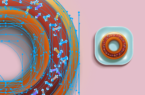
Fireworks and Sketch are mainly vector editors, both very powerful and quite easy to use. Fireworks also handles bitmap-modification operations pretty well (you can do a lot of the stuff you would normally do in Photoshop, like crop images, clone and retouch photos). Sketch has recently improved its image-editing tools, but they remain pretty basic (for example, it has a tool for selecting objects, a magic wand, a cropping tool and a few more).
UI and icon designers love scalable assets, and for good reason: When working with user interfaces, they often need to scale assets for different screen resolutions. With the introduction of high-resolution displays, all buttons, headers and components need to be adjusted for different sizes and devices. Fireworks handles the scaling of vectors very well (although its own GUI never got updated for Retina Macs). Being vector-based, Sketch does vector scaling perfectly as well (and it gets a few bonus points because its GUI looks gorgeous on a Mac, crisp and polished).
Compatibility With Adobe Illustrator
Until Illustrator version CS5.1, you could copy and paste vector shapes from Illustrator to Fireworks directly. That was an awesome feature. For example, you could craft a logo design in Illustrator and then paste it in Fireworks, with no hassle and with all of the vectors being editable. Unfortunately, this feature did not make it to Illustrator versions CS6 and CC. If you want to import a file from Illustrator CS6 or later into Fireworks (or copy a vector object from it), first save the file in Illustrator as *.ai (version 8). Then, you’ll be able to open the .ai file in Fireworks, and the imported vectors will be intact and ready. A bit convoluted, but still a helpful workflow.
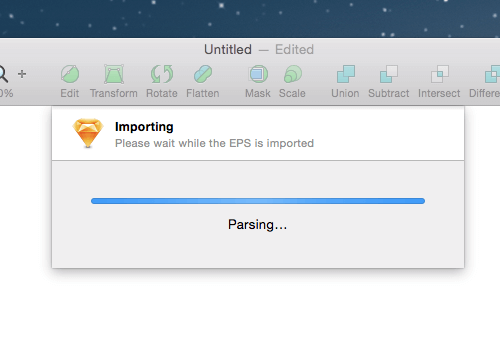
Luckily, Sketch offers this great feature out of the box, and it handles it pretty well. If you love working in Illustrator, you can easily share assets between the two tools with a simple copy and paste.
Tip 2: Canvas Vs. Artboards Vs. Pages
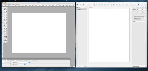
This is a dealbreaker for some, especially people who have never touched a tool like Adobe Illustrator, because they might not be familiar with artboards.
Fireworks works with pixels. You set up a fixed-size canvas when you start working, measuring the space exactly. This fixed-size canvas is called a “page,” and you can create as many pages as you need in a Fireworks-opt.png file.
When you open Sketch, you don’t have to enter any measurements for the canvas’ size. The space where you design is infinitely large. This puts some people off at first, but here’s a trick: Define an artboard instead.
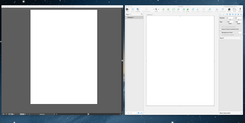
An artboard defines boundaries. So, if you used to love working with a canvas, you can set an artboard to whatever size you like. To define an artboard in Sketch, simply press A and drag the cursor until you reach the desired dimensions. You can also modify the size of an artboard from the Inspector panel on the right.
The beauty of this is that you can have multiple artboards in the same document, which is pretty handy if you are working on a project that needs multiple views — for example, for desktop, laptop and mobile devices with various screen sizes. (The same can be achieved in Fireworks by using multiple pages, each with its own canvas size — see the note just below.)
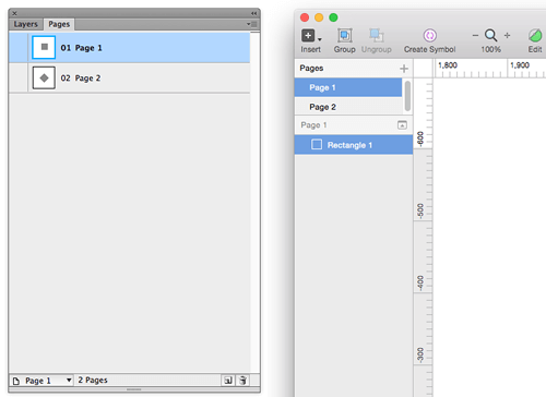
Note: Both Fireworks and Sketch have pages, which could lead to some confusion. In Fireworks, you can create multiple pages, and each page may have its own canvas size and may contain layers, objects and states. In Sketch, you can create multiple pages, and each page may have several artboards. An artboard in Sketch is often used as the equivalent of a page (or a screen) in Fireworks; the term “canvas” refers to the drawing space. In Fireworks, only things that are on the canvas (i.e. on the page) are visible, but in Sketch and Illustrator, things off the artboard are still visible; hence, the term “canvas” being used for the drawing space. Whereas Fireworks can display only one page at a time, Sketch is more like Illustrator in that it can display multiple artboards at once, because all artboards exist on one larger canvas. Pages in Sketch are often used as a way to keep designs organized.
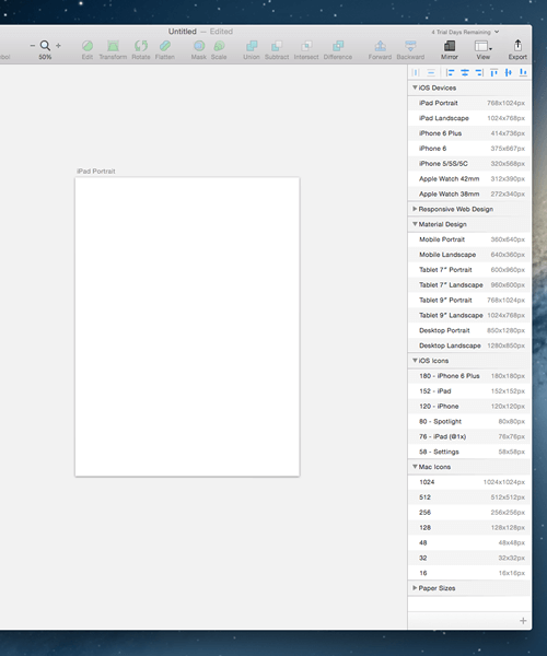
Artboard Presets in Sketch
As soon as you press A on the keyboard or click “Insert Artboard,” you will see several preset artboards in Sketch’s Inspector panel, and you can choose one or more of them simply by clicking on their names. This is extremely useful and saves time in projects. (Fireworks does not offer a similar feature and has no page presets. However, when you create a document, you can select one from a set of document templates, and you can create, save and reuse your own document templates. The templates you create may be multiple pages, and you can give each page a custom name and size in pixels.)
Tip 3: Compound Shapes And Gradients Are Easier Than You Think
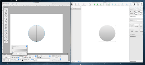
The more you use Sketch, the easier the transition will be. Let’s put this into practice with some gradients.
Gradients
One of my favorite features in Fireworks has always been gradients. We talked extensively about gradients in my previous article “Designing a Rocket Icon in Adobe Fireworks” — specifically, in the section titled “Understanding How Gradients (and the Gradient Tool) Work in Fireworks.”
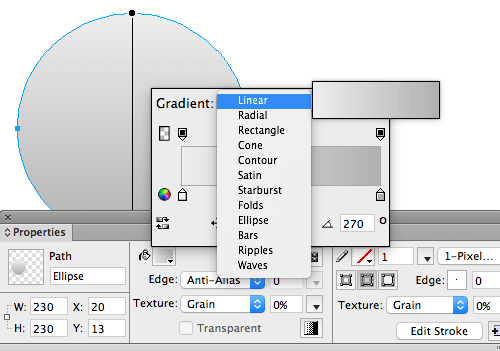
Fireworks still handles gradients a bit better than Sketch, allowing you to choose many more gradient types (radial, linear, ellipse, rectangle, cone, contour, bars, etc.). But even if the interface for editing a gradient in Sketch is slightly more minimalist, it is extremely simple to use. Forget about modal windows: In Sketch, you get a live preview of the gradient, and you can make quick changes, choosing a linear, radial or angular gradient type. I would have preferred more choices here, but the way gradients are created on the screen is flawless. They look awesome, without any banding problems, probably even better than ones created with Fireworks or Illustrator.
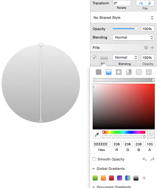
Note: Sketch has only three types of gradients, which map closely to CSS gradients, making it easy to recreate the gradients in code later. Several of the gradient types in Fireworks may be pretty and original, but they have no CSS equivalents and can only be used for exported bitmaps, not in CSS.
Compound Shapes
Compound shapes are one of Fireworks’ best features (you will notice a similarity with Illustrator’s Pathfinder tool). Using compound shapes in Sketch is very similar — so, great for us! You will be using compound shapes in all of your major UI, icon design, web design and illustration projects, so knowing how this feature works will be handy.
If you combine two vector shapes in Fireworks’ Properties panel, the changes will not be made permanent until you press the “Combine” button. Basically, you will now have one shape, but the two shapes it was made from can still be edited individually.
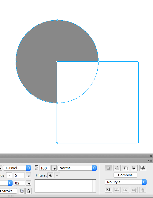
The original shapes will remain editable until you decide to combine them. If you do not use the “Combine” button to permanently combine the path action, you can tweak the individual shapes as you like.
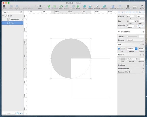
Sketch acts in the same way. When you combine two shapes, they are put together in a sort of layer group. You can still modify and change each shape individually before pressing the “Flatten” button in the top menu bar.
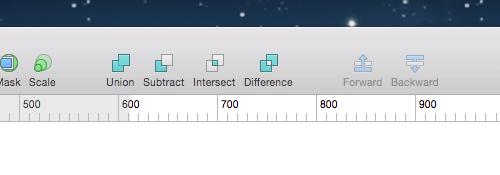
Sketch offers four main options for dealing with shapes: “Union,” “Subtract,” “Intersect” and “Difference.” These are actually very similar (if not identical) to Fireworks’ options. Union in Sketch corresponds to Add and Union in Fireworks; Subtract in Sketch corresponds to Subtract and Punch in Fireworks; Intersect in Sketch is the same as Intersect in Fireworks; Difference in Sketch is more of a unique function, basically the opposite of an intersect operation.
Tip 4: Wacom Tablet? Great!
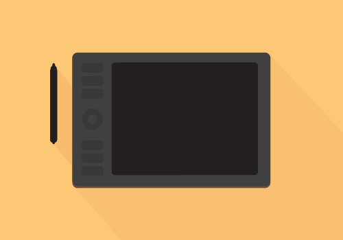
I love Wacom and was always frustrated that it worked so sloppily with Fireworks. The issue seemed to be more the way Fireworks handles the tablet interface than a problem with Wacom itself. If you are using Fireworks, you’ll know that most of the time you are forced to design with a mouse. That’s not a big deal — for some precision jobs, I prefer the way you can move pixels around with a mouse. Having said that, I must say that Sketch works perfectly smoothly with Wacom tablets, and I love that.
Tip 5: Keyboard Shortcuts
Shortcuts are essential to increasing the productivity of your workflow. Fireworks has some awesome built-in shortcuts, like Control/Command + Shift + T for numeric transformations, Control/Command + Shift + R to export an image, Control/Command + Shift + X to export and preview an image, and Control/Command + C and Control/Command + Alt + Shift + V to copy and paste object attributes.
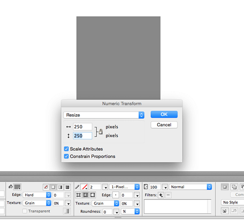
Shift + Control/Command + T, the useful shortcut for numeric transformations in Fireworks. (View large version)I can say that the shortcuts for Sketch will make your life much easier.
In Fireworks, you can customize shortcuts easily — in the menu on a Mac, go to “Fireworks” → “Keyboard Shortcuts.” On Windows, go to “Edit” → “Keyboard Shortcuts.” You can create custom shortcut sets in Fireworks, export them and save them; they are stored in the simple XML file format.
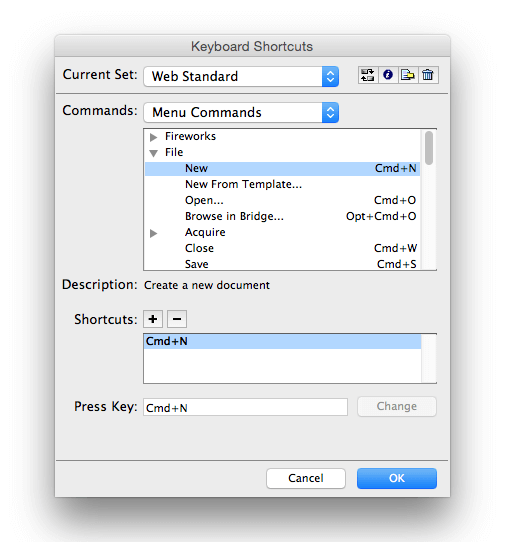
In Sketch, the process is not that straightforward but definitely worth the effort. On your Mac, go to “System Preferences,” then “Keyboard.”
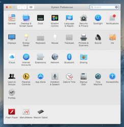
From the segmented control at the top, select “Shortcuts.” In the left-hand menu, select “Apps Shortcuts” and press [+] to add sketch to the list.
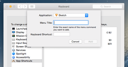
Customize shortcuts as much as you like with this simple method.
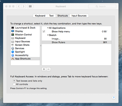
You’ll need to match the menu option of the software (in this case, “Show Rulers”) and then assign your preferred shortcut, Command + R.
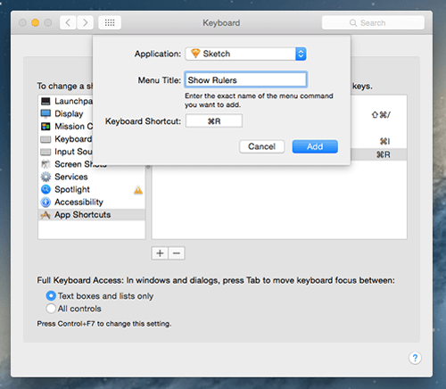
This will be a life-changing process if you set the shortcuts right. You could customize Sketch to work exactly as the application you are most familiar with, such as Fireworks or Illustrator. (You can also learn more about some basic Sketch shortcuts in the official documentation.)
Tip 6: Masks
One of Fireworks’ strongest selling points for me has always been the vector masks. You can easily get bitmap images to interact with vector objects, which is super-useful when you need to crop pictures. I have been using this feature for years, mainly because of its sheer simplicity. Simply copy a picture (in JPEG,-opt.png or any other format) and paste it in a vector shape (a circle, rectangle, polygon, star, etc.) and voilà! The mask is applied. In this way, it’s incredibly easy to create round avatars, website headers, placeholders and images for online stores, to name just a few elements.

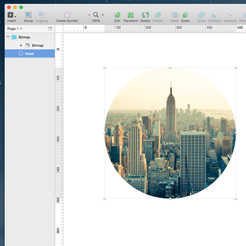
Sketch acts slightly differently with vector masks but equally efficiently. If you are transitioning to Sketch, you will find this pretty straightforward. Imagine you are drawing a circular shape in Sketch (say, a O) and then pasting a picture; you can select both items (the shape and the picture) and hit “Mask” in the menu bar at the top. Job done! The picture will be masked in the vector shape, and the two items will be grouped in a folder so that you can tweak them individually.
Tip 7: Symbols
Symbols in Fireworks are basically reusable graphic elements. They can dramatically reduce your working time. As a quick example, if you are using the same button over and over in a design, convert it to a symbol. Then, all instances of that button will reflect the changes you make to it, saving you hundreds of mouse clicks. (Fireworks also has a “rich symbols” feature, where each instance of a symbol may have unique variations, but these are a bit more difficult to create.)
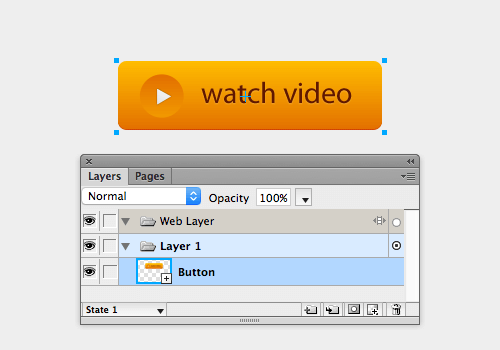
Symbols were introduced in Sketch version 3. When you use symbols in Sketch, you can even exclude text from some elements, such as buttons and headers, which makes them really flexible (and similar to how rich symbols work in Fireworks).
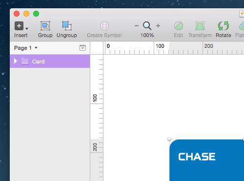
A symbol in Sketch is basically a special kind of group, and it is displayed as a group, in a purple shade instead of blue.
Tip 8: Styles
Fireworks pioneered the use of styles for a long time, and styles are a fundamental aspect of the program. Styles in Fireworks work like CSS for HTML files: Create a style once, update it, and the changes will be applied to all pages in the Fireworks-opt.png document. Over the years, styles in Fireworks were enhanced: You could create shareable style libraries, create global styles and convert styles to CSS code.
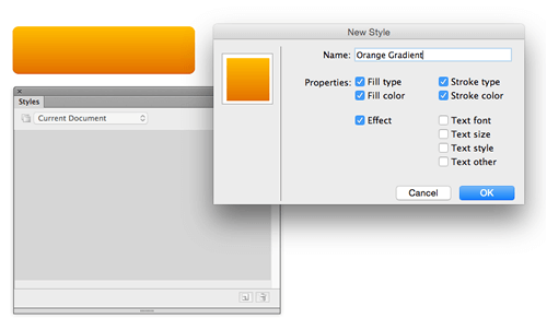
You can find styles in Sketch, too, which is wonderful! Note that the Styles panel in Sketch is not as great as the Styles panel in Fireworks. On the positive side, Sketch’s styles were built from the ground up with CSS in mind (as were all features relating to the appearance of objects), which makes them more flexible.
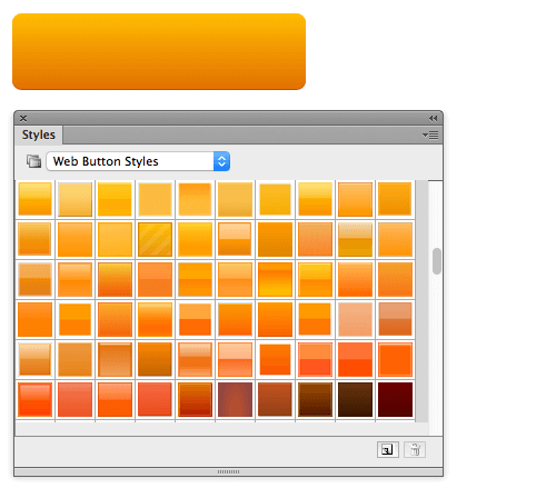
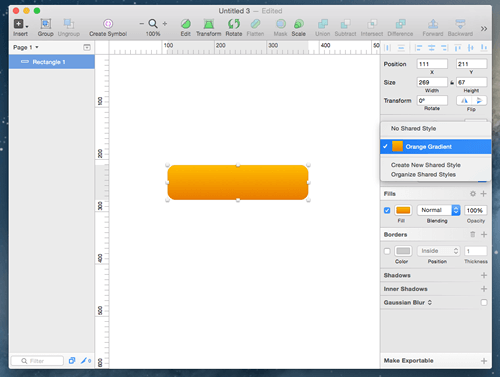
To create a style in Sketch, go to the Inspector panel and, from the dropdown menu, select “No Shared Styles,” then “Create New Shared Style,” and name your style (the new style will now appear in the dropdown menu). When you are working on a UI project and you create a particular style for a button or a popup window, add it as a style so that you can replicate its features with a click or two.
Tip 9: Exporting
Quite a few people have used Fireworks just to export transparent-opt.pngs because it is quicker and more effective than other tools, including Photoshop. (Did you know that Fireworks was one of the very few tools that could export-opt.png8 with 4-bit alpha transparency? That is still a rare feature!)
While Fireworks offers quick exporting functionality with the shortcut Control/Command + Shift + R, Sketch has a dedicated icon for it.
Exporting slices in Fireworks is also very simple (and in Sketch, probably even easier). In Fireworks, use the Slice tool (K) in the Tools panel and draw the area you wish to export. Then, set up your exporting settings in the “Optimize” box.
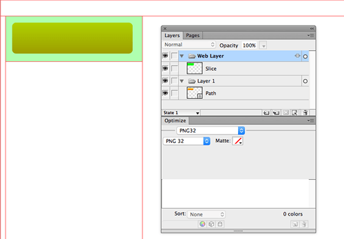
Sketch has a pretty good exporting panel, too, allowing you to export layers, objects and slices.
Note: In Sketch, you can also export artboards. Just select the artboard you would like to export and click “Export” in the Inspector panel. You can include the background color or leave it transparent.
Export an Object or Layer
One of Fireworks’ strongest selling points for me has always been the vector masks. You can easily get bitmap images to interact with vector objects, which is super-useful when you need to crop pictures. I have been using this feature for years, mainly because of its sheer simplicity. Simply copy a picture (in JPEG,-opt.png or any other format) and paste it in a vector shape (a circle, rectangle, polygon, star, etc.) and voilà! The mask is applied. In this way, it’s incredibly easy to create round avatars, website headers, placeholders and images for online stores, to name just a few elements.

Sketch acts slightly differently with vector masks but equally efficiently. If you are transitioning to Sketch, you will find this pretty straightforward. Imagine you are drawing a circular shape in Sketch (say, a O) and then pasting a picture; you can select both items (the shape and the picture) and hit “Mask” in the menu bar at the top. Job done! The picture will be masked in the vector shape, and the two items will be grouped in a folder so that you can tweak them individually.

Tip 7: Symbols
Symbols in Fireworks are basically reusable graphic elements. They can dramatically reduce your working time. As a quick example, if you are using the same button over and over in a design, convert it to a symbol. Then, all instances of that button will reflect the changes you make to it, saving you hundreds of mouse clicks. (Fireworks also has a “rich symbols” feature, where each instance of a symbol may have unique variations, but these are a bit more difficult to create.)

Symbols were introduced in Sketch version 3. When you use symbols in Sketch, you can even exclude text from some elements, such as buttons and headers, which makes them really flexible (and similar to how rich symbols work in Fireworks).
A symbol in Sketch is basically a special kind of group, and it is displayed as a group, in a purple shade instead of blue.

Tip 8: Styles
Fireworks pioneered the use of styles for a long time, and styles are a fundamental aspect of the program. Styles in Fireworks work like CSS for HTML files: Create a style once, update it, and the changes will be applied to all pages in the Fireworks-opt.png document. Over the years, styles in Fireworks were enhanced: You could create shareable style libraries, create global styles and convert styles to CSS code.

You can find styles in Sketch, too, which is wonderful! Note that the Styles panel in Sketch is not as great as the Styles panel in Fireworks. On the positive side, Sketch’s styles were built from the ground up with CSS in mind (as were all features relating to the appearance of objects), which makes them more flexible.

To create a style in Sketch, go to the Inspector panel and, from the dropdown menu, select “No Shared Styles,” then “Create New Shared Style,” and name your style (the new style will now appear in the dropdown menu). When you are working on a UI project and you create a particular style for a button or a popup window, add it as a style so that you can replicate its features with a click or two.

Tip 9: Exporting
Quite a few people have used Fireworks just to export transparent-opt.pngs because it is quicker and more effective than other tools, including Photoshop. (Did you know that Fireworks was one of the very few tools that could export-opt.png8 with 4-bit alpha transparency? That is still a rare feature!)
While Fireworks offers quick exporting functionality with the shortcut Control/Command + Shift + R, Sketch has a dedicated icon for it.
Exporting slices in Fireworks is also very simple (and in Sketch, probably even easier). In Fireworks, use the Slice tool (K) in the Tools panel and draw the area you wish to export. Then, set up your exporting settings in the “Optimize” box.

Sketch has a pretty good exporting panel, too, allowing you to export layers, objects and slices.
Note: In Sketch, you can also export artboards. Just select the artboard you would like to export and click “Export” in the Inspector panel. You can include the background color or leave it transparent.
Export an Object or Layer
In Sketch, if you need to export a single layer, you can select the object and use the “Make Exportable” function at the bottom of the Inspector panel. This is a really handy function because it lets you export assets at 0.5, 1, 2 and 3 times the size. The function exports only the object you’ve selected. The same thing happens if you select two layers and then export them; the layers are individually saved in a folder as separate files.
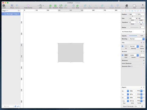
Exporting a Slice
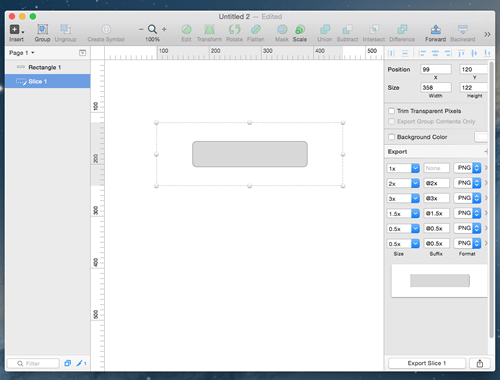
Exporting a slice is also very intuitive. Select the Slice tool (S) from the “Insert” button at the top, and draw the area you wish to export. Then, click “Export Slice” in the Inspector panel. The slice will export all visible pixels within the area of that slice.
Tip 10: Things Only Sketch Can Do
Because this article is mostly about the transition from Fireworks to Sketch and how most of their features compare, I will not go into depth on some of the unique features of Sketch. These may well be covered in a future article.
One thing I would like to mention, though, is Sketch Mirror, which is nothing short of amazing. If you are designing for iOS, then you’ll definitely want this feature in your toolbox. Sketch Mirror shows a live preview of the file you are working on right on your iOS device.
Of course, other screen-mirroring options are available, such as Skala Preview and LiveView, to name but a couple. But Sketch Mirror is the most obvious because it works seamlessly with Sketch.
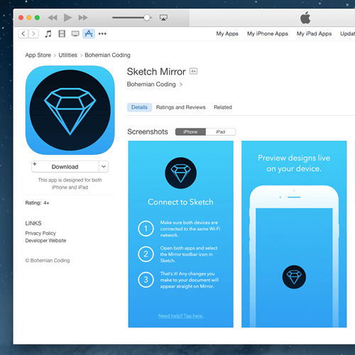
You will have to download Sketch Mirror separately from Apple’s App Store to your iOS device, but it is totally worth it. You can see a design directly on your mobile device, and you can even see live changes while you work on Sketch on your desktop machine or laptop. This gives a whole new dimension to Sketch and makes it rather unique. Mirroring the design gives you a great perspective on whether things are working well. You can take care of dimensions, spaces for mobile devices and even typography (always tricky to nail down when going from desktop to mobile). This feature sorts all of that out exceedingly well.
Bohemian Coding is also pretty good at updating the Sketch software. Clearly, the company cares about its product and the people who use it.
Final Thoughts
Sketch is now the real deal. Further improvements could be made, of course; some features could be expanded and refined. But overall, the software is starting to look really solid and easy to use. If you haven’t tried it yet, it’s definitely worth a look. Enjoy!
Further Reading
If you want to learn more about Sketch, here’s a quick list of links:
- “Using Sketch for Responsive Web Design (A Case Study),” Ashley Bennett, Smashing Magazine
- “Prototyping iOS and Android Apps With Sketch (With a Freebie!),” Joshua Mauldin, Smashing Magazine
- “The A to Z of Sketch,” Armando Sotoca, Tuts+
- “How to Create an Icon Design Workflow in Sketch App 3,” Daniel Schwarz, Designmodo
 (mb, al, jb)


