Since we started plodding around on this rock in space, human beings have always been dissatisfied with their environment — which is (mostly) a good thing. Otherwise we might still live in caves, fearful of the weather and worshipping the sun. It’s dissatisfaction and curiosity which drive us to fix things that ain’t broken.
Back in spring 2013, Smashing Magazine sported a <select> menu as its mobile navigation. It wasn’t considered an anti-pattern back then and I still think it’s a viable solution to the complex problem of how to build accessible and functional cross-device navigation. Brad Frost wrote a few words about the pros and cons of this pattern on his blog and I couldn’t agree more.
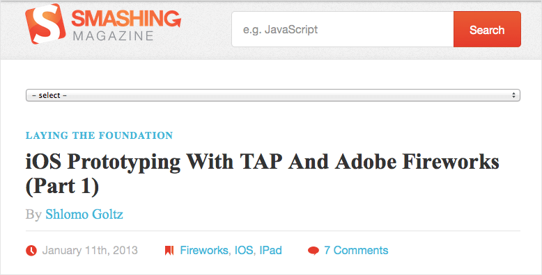
While it worked nicely, it also had a few problems. Mostly, it wasn’t the most beautiful piece of UI on the web and we had to throw some JavaScript on it to make the experience somehow worthwhile. Rebuilding this mobile navigation was one of the early tasks given to me after I started working here in January 2013.
Further Reading on SmashingMag:
- Improving Smashing Magazine’s Performance
- Creating A Living Style Guide: A Case Study
- World Wide Web, Not Wealthy Western Web
Replace All The Things
My first move towards a new and shiny mobile navigation was to kick the <select> menu in the bin and look around the web for options and best practices. Some articles about responsive design and a whole lot of round-ups, code examples and Git repos later I came to this conclusion:
Write down the underlying HTML to have a solid base, then take care of the styling, and when that's done you might look for possible JS additions, if needed. And finally: testing, testing, testing!
Still progressive enhancement running the game.
For this article, I went as far as to rebuild one of the prototypes from back then with simplified HTML and CSS in CodePen (no media queries, no reset, just code from the top of my head). The jQuery part came in later on, after we realized that some people were confused when the toggle buttons didn’t become inactive and weren’t replaced after clicking/tapping them. After a short but intense phase of tests and adjustments, we decided to deploy it to the live blog in the middle of June 2013.
See the Pen BNrxLZ by Marco (@Nice2MeatU) on CodePen.
Note: Feel free to take the code and tinker with it. You can also use it as a starting point for a project of your own or commercially or whatever. There is no license or copyright to it. That being said: No guarantees or support! I wouldn’t recommend copying and pasting the code into a project and simply leaving it there as is.
When Good Is Not Good Enough
You might recognize the feeling, creeping up your spine over days or weeks, that some of your work just doesn’t feel 100% right – may be 97% or 98% but definitely not the whole cake. This is what happened to me after some time passed by and I kept interacting with our new navigation. The closing buttons felt out of place and the jQuery part kept bothering me, since while it served its purpose well, it should not have been part of the experience, but just an enhancement. Without JavaScript enabled, the user experience I envisioned crumbled to bits. So I started over, tweaking and adjusting and rewriting and trying out different solutions to the same problem over and over again, whenever I found the time.
While it has been a really time-consuming task, it’s also been a lot of fun to try out so many different solutions to the same problem. It was also worthwhile as now we had options to choose from – options we could test for performance, usability and the overall experience. Just to make this clear: building prototypes early on in a project can save you a whole lot of time later on. Sometimes it’s the slightest change from one version to the next that makes all the difference.
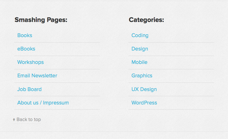
In December 2013, just after Christmas and while I was on holiday, Vitaly made a decision and went for a CSS-only solution by following the footer anchor pattern. He moved the navigation and the mobile search to the footer of the website but kept the buttons on top. That way it wouldn’t be an issue if the buttons looked the same after the click/tap because they would be out of view. As we’d had the “Back to top” links in the Magazine since day one, there already was a solution to the problem that people might want to jump back to the header of the page.
Yes But No But Yes But No
This time we received some emails with feedback on our decision to change the navigation pattern. When I returned to my desk in January 2014, a few users had filed bug reports about feeling completely lost after jumping down a whole page of the Magazine. Other users told us that while the buttons had already rendered on their mobile phone, they tapped them but didn’t go anywhere as the footer hadn’t loaded owing to their slow connection.
Another issue raised was that some users didn’t find the “Back to top” link. They landed in the mobile menu and there was no option visible to simply return to the header: the link was out of view, above the navigation. Again, we had ended up at the point where we had something that wasn’t exactly broken, but it wasn’t the complete solution as well. Two steps forward, one step back.
So Little Time, So Much To Do
During the period between June 2013 and Fall 2014, I was completely occupied with many different tasks. I don’t want this to sound like an excuse, but being the only developer at Smashing Magazine means I work on a lot of different projects at the same time. I have to stay up to date with external developers and have at least one eye on Trello, one on Basecamp and one in my email inbox, while I always need both my remaining eyes for Skype and Slack (our constant meeting rooms). I think you understand by now that there’s an anatomy-related problem.
That being said, I worked on the Smashing Magazine site and our Conference websites. We had a redesign for the shop behind the scenes, where I had been involved from time to time, and we also had a few projects that never saw the light of day. A few landing pages needed to be designed and developed, and other sites needed a complete revamp.
Long story short: the prototypes for the navigation were left lying around untouched for one and a half years until I was finally able to return to them.
April Showers Bring May Flowers
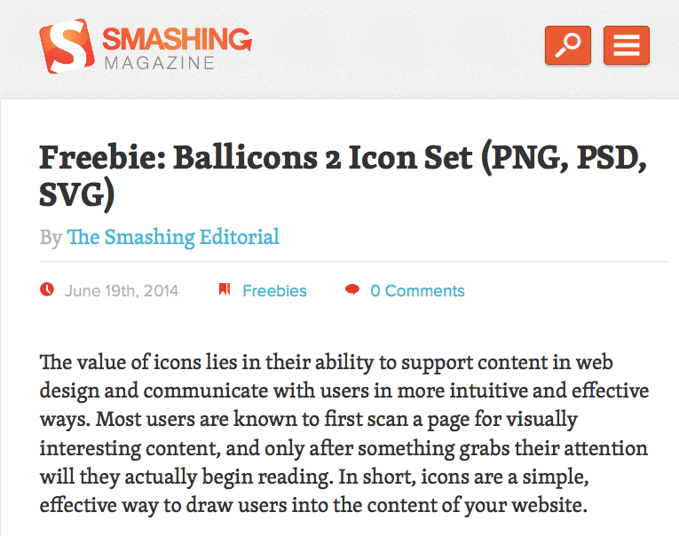
In April this year, Vitaly opened a request on our Trello board to replace the infamous hamburger icon with the word “Menu.” This sounded like an excellent opportunity to finally get my hands on the mobile navigation again.
The first thing I did was the task at hand. The hamburger icon went into the same bin the <select> menu once did and now we had “Menu” displayed as text.
The next step was to think of possible improvements and a solution to the closing mechanism. The goal set was: no JavaScript – an easy enough task but having a CSS-only solution is rarely seen as the sexiest one. The last solution built had the closing buttons inside the elements I made visible with the :target technique. For more information on the :target pseudo-selector, I recommend you to read Chris Coyier’s thoughts on the dos, don’ts and possible use cases. In case you wondered, support for this selector is perfect in the mobile landscape.
If you’ve never heard of the :target selector before, here is the most basic example I could think of:
See the Pen ZGRXGw by Marco (@Nice2MeatU) on CodePen.
Web Development Is Never Easy
That looks too easy to be true, right? And yes, it is. The technique is simple and effective but there are two issues with it:
- You need a second anchor to hide what you revealed.
- You add to the browser history with every click.
While the first one might not look like a big deal, I can assure you it is. Let me explain what happens when you click on the “Menu” button in the Magazine. I’ll spare you most of the CSS related to our mobile search, as that follows the same pattern, and show you the parts that differ. I also added a few comments to the CSS to explain my thoughts behind those values.
What I wanted to achieve is a congruent closing button on top of the “Menu” button, covering it when the navigation is visible. The look and feel should be just as if you had a JavaScript toggle in place. The same goes for the search and its related closing button, which has a different size and position.
Here are the inline styles from our <head> section (slightly altered for easier understanding), the so-called critical CSS part:
header {
  width: 38.2%;
  margin-left: 5.5%;
  padding: 1.25em 0;

  /* To make the logo clickable when the navigation or the
     search are overlaid */
  z-index: 3;
}

.mobile-toggle-buttons-container {
  position: absolute;
  top: 1.5em;
  right: 1.5em;

  /* Again, to keep the buttons clickable when the closing
     button is overlaid. That way you can either just
     close the nav or switch to the search or click the logo. */
  z-index: 4;
}

.navigation-toggle-button,
.search-toggle-button {

  /* This makes it easier to match the width and height with
     the closing buttons */
  box-sizing: border-box;

  float: right;

  border: .08em solid #C73A11;

  border-radius: .25em;
  box-shadow: 0 .08em .08em rgba(0,0,0,0.25);
}

.search-toggle-button {
  /* If you wanted to hide the text but keep it accessible */
  text-indent: 150%;
  overflow: hidden;
  white-space: nowrap;

  /* Sweet technique to serve SVG to all capable browsers
     and leave the rest with PNG */
  background:
    url(search-icon.png) no-repeat 50% 50%,
    #e95c33);
  background:
    url(search-icon.svg) no-repeat 50% 50%,
    -webkit-linear-gradient(to bottom, #e95c33, #e95c33);
  background:
    url(search-icon.svg) no-repeat 50% 50%,
    linear-gradient(to bottom, #e95c33, #e95c33);

  /* You need to declare the background-size for WebKit
     otherwise it will do funny things to your SVG image */
  background-size: 1.875em auto;
  -webkit-background-size: 1.875em;

  padding: .4em;
  width: 2.9375em;
}

/* Nothing special from here on */
.navigation-toggle-button {
  text-transform: uppercase;

  margin-left: 1em;
  padding: .4em;

  color: #fff;
  background: #e95c33;
}

.mobile-navigation,
.mobile-search {
  width: 100%;
  height: 0;
  max-height: 0;
  padding-top: 0;
  opacity: 0;
  transition: none;
}

.mobile-navigation ul,
.mobile-search form,
.mobile-nav-closing-button,
.mobile-search-closing-button {
  display: none;
}
I don’t think any of the CSS needs a lot of explanation apart from what I gave away in the comments. If you still have trouble with one or a few selectors, attributes or values, hit the comment section and fire those questions!
If you want to get a deeper insight into the gradient-svg-png technique, I will gladly send you over to Pau Giner’s blog, where I found his article on the subject. The text replacement technique for the search button by Scott Kellum is one of many ways to come to such a result. In case you’re wondering why I am working with such an odd value of .08em, there is a very good reason for that: browsers are very bad at rounding – they just don’t get it right. Here’s a very basic CodePen example of the issue.
Overwriting The Critical CSS Part
Now for the part that overwrites what we declared in the above-the-fold styles after a button has been clicked or tapped. All the following CSS is in the main style sheet (again, this is not the actual code but optimized for this context):
.mobile-navigation-closing-button,
.mobile-search-closing-button {
  /* Again, this is for a bit of ease when we want
     to match the height and width of the "show" buttons */
  box-sizing: border-box;

  /* Here we already have the closing button for the nav in
     position */
  top: 1.5em;
  right: 1.5em;

  text-align: center;
  padding: .4em;
  width: 2.9375em;
  background: #e95c33;
  border: .08em solid #C73A11;

  border-radius: .25em;
  box-shadow: 0 .08em .08em rgba(0,0,0,0.25);
}

/* Width needs to match the nav button */
.mobile-navigation-closing-button {
  width: 3.8em;
}

/* Position needs to match with the search button */
.mobile-search-closing-button {
  right: 6.3em;
}

/* If one of the containers becomes targeted */
.mobile-navigation:target,
.mobile-search:target {
  /* The z-index is lower than anything in the header */
  z-index: 2;

  /* To prevent the browser window from scrolling
     down so the buttons in the header would become un-
     clickable without scrolling back up, we have to use
     this not so beautiful hack */
  top: -10em;
  padding-top: 10em;
  margin-bottom: -8em;

  /* This transition ensures a nice animation when
     opening the navigation or search */
  transition:
    opacity .4s ease-out,
    max-height .4s ease-out;

  height: 100%;
  max-height: 62.5em;
  opacity: 1;
}

/* By using the adjacent sibling combinator (only works with a
   certain markup, of course) I have full control over my closing
   buttons */
.mobile-navigation:target + .mobile-navigation-closing-button,
.mobile-search:target + .mobile-search-closing-button {
  /* Closing buttons have the highest z-index as they have to
     sit on top of the "show" buttons */
  z-index: 5;

  display: block;
}
Again, I tried to use the comments to explain my way of thinking. I hope it all makes sense to you.
Finally, here is the underlying markup, the basis of our mobile navigation:
<body id="top">
  <div class="mobile-nav-buttons">
    <a href="#mobile-navigation" role="button" title="Jump to the main navigation">Menu</a>
    <a href="#mobile-search" role="button" title="Jump to the search">Search</a>
  </div>
  <a href="#content">Jump to the content</a>
  <header role="banner">
    <h1><a href="/">
      <span>Smashing Magazine</span>
      <img src="logo.png" alt="The logo of Smashing Magazine" /></a></h1>
  </header>
  <nav class="mobile-navigation" id="mobile-navigation" role="navigation">
    <ul class="mobile-nav-ul">
      <li>Smashing Pages</li>
      <li><a href="#">Nav Item One</a></li>
      <li><a href="#">Nav Item Two</a></li>
      <li><a href="#">Nav Item Three</a></li>
      <li><a href="#">Nav Item Four</a></li>
    </ul>
    <ul class="mobile-nav-ul">
      <li>Smashing Categories</li>
      <li><a href="#">Nav Item Five</a></li>
      <li><a href="#">Nav Item Six</a></li>
      <li><a href="#">Nav Item Seven</a></li>
      <li><a href="#">Nav Item Eight</a></li>
    </ul>
  </nav>
  <a class="mobile-nav-closing-button" role="button" href="#top" title="close the navigation">X</a>
  <div class="mobile-search" id="mobile-search">
    <form>
      <label for="mobile-search-input">Search on Smashing Magazine</label>
      <input id="mobile-search-input" type="text" />
      <button type="submit">Search</button>
    </form>
  </div>
  <a class="mobile-search-closing-button" role="button" href="#top" title="Close the Search">X</a>
By using the adjacent sibling combinator to hide and show the closing buttons, the markup needs to be exactly as it is in the example HTML here, with the link for closing the navigation directly following the nav container. As I am currently working my way through the W3C accessibility tutorials to learn more on best practices with accessibility, the jump links to the navigation, search and content had to come first in the DOM tree. That way, people with a screen reader have a few options to skip content they don’t need or want to read over and over again.
Takeaway For You
Now that you’ve come this far I want to give you something practical. I reduced the code to its bare bones and made a CodePen out of it. Take it, play with it, use it for any project and improve it where possible. There is no license, no copyright, no warranty, no guarantee and no support for the code provided. Handle with care!
See the Pen Bare Bones CSS Only Toggle Navigation by Marco (@Nice2MeatU) on CodePen.
I also put together a little ZIP package for you. You can download it right away.
Finishing Touches
Currently, Christian Brückner from Inpsyde and I are trying to progressively enhance the experience a little further. We are looking into ways to work against the second issue. You remember? Every time you click the nav button or the closing button, you’re adding an entry to your browser history. To prevent this we are looking at the HTML5 History API and other possible solutions like using window.location.hash.
In terms of accessibility we will switch from <li> to <label> for the navigation headlines Smashing Pages and Smashing Categories.
All of the above being said, I think the way we built this is very personal and works for us. I don’t want to proclaim anything like this is it, and I still think we could do better, too. We have ongoing discussions about different ways to integrate the search on mobile which could render the current solution obsolete. Another issue I have with this build is the positioning of the closing buttons not being right on all mobile devices out there because browsers are pretty bad at math!
 (og)
(og)


