Relaunching a large-scale website is always quite an undertaking, especially if the task involves a huge political entity with content accumulated over a dozen years. In this article, we look behind the scenes of the responsive redesign of Kremlin.ru, Russia’s most prominent government website. We had an opportunity to talk with Artyom Geller, one of the creative minds responsible for the design and UX of the project. We talked about the design process, the challenges and constraints, creative front-end solutions, as well as unusual budgets and stakeholders. —Ed.
Further reading on Smashing:
- Infinite Scrolling: Let’s Get To The Bottom Of This
- Get the Scrolling Right
- Reapplying Hick’s Law of Narrowing Decision Architecture
- Takeaways From Mobile Web Behavior
- How I Built The One Page Scroll Plugin
“We Tried To Keep The Big Picture Consistent”
Q: Artyom, let’s cut to the chase: working on a project of the scale of Kremlin.ru must be quite challenging and almost overwhelming. Could you shed some light into how you ended up working on the project?
Working with a government entity isn’t that different from working with a commercial client. In fact, sometimes it’s more convenient. The stakeholders have trusted project managers and designers, and try their best to make the final result as good as possible.
Work on the project started many years ago. Around 2008, the press office of the Russian administration sent out a brief to companies working on information design on the web, requesting designs for the president’s website. I had a lot of time back then, so I came up with a design and submitted it. The design concept was quite thorough and comprehensive.
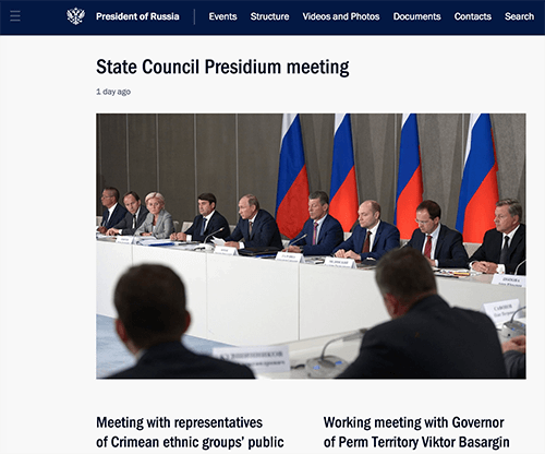
Every now and then, I received a phone call in which I was informed that we were short-listed, first into a selection of 20 companies, then of 10 companies. Finally, I was told to come for a meeting in the Kremlin. From the three companies that got invited, in the end the administration chose our agency. It might sound like it was a very tedious process, but in my experience that’s pretty much normal for any country; and again, it’s not very different from commercial projects.
I was responsible for the events section and the reference material on Kremlin.ru, which was launched in 2009. It was the first official government website (although I really don’t like the term “government website”) to receive good feedback from the professional community, including habrahabr.ru [a well-known, well-respected network of Russian-speaking IT blogs —Ed.]. Afterwards, I was invited to work on the government’s website and it turned out to be the second well-received project for Russian e-government.
In fact, for over 80% of all projects within the e-government we used a similar approach and vision, which is why when government.ru was launched, we started thinking about the strategy of standardizing and unifying the experience across all government websites that we were working on. We never thought about a new website being a standalone project; it was always part of a bigger picture which we tried to keep as consistent as possible.
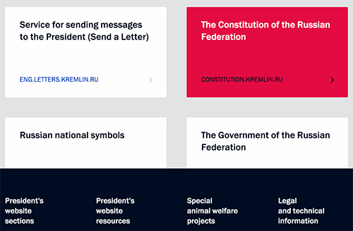
The previous version of the site had served its purpose for six to seven years. Over this time we kept discovering new problems and coming up with new solutions. The problems came from user requests and the press office’s requirements; we kept restructuring the content, too. It all gave us enough time to understand the priorities of the site’s changing audience. We kept writing down ideas that would radically improve UX for all groups of visitors, and we discovered challenges which prompted us to modify our CMS — and it wasn’t straightforward, since the CMS is a major backbone of the site.
We learned that the technologies and interests of the audience changed relatively quickly. It’s quite reasonable, then, that the president’s website keeps up to date with these changes and challenges. All of it prompted us to create an entirely new website from scratch. In fact, I wouldn’t even call it a redesign – it was much more than that.
Q: What was it like working with the stakeholders on this project? Thinking about government institutions, it must have been a quite tiring process?
A substantial part of the work on the site was done remotely, but we worked actively with stakeholders by having a direct line of communication with the press office of the president. We ended up working late on Fridays after 10pm with officials who discussed with us how to make the site better – from the very start of the project to the very end. They trusted our opinions. When studying the problems with the previous version of the site, we tested and retested every single issue and conducted user interviews to gather valuable feedback. Nothing was left to chance.
“Quality of The State’s Services Will Be Perceived Through The Lens Of Design”
Q: It sounds like a major part of the redesign involved research and user feedback. Is it common for government projects in Russia?
It might sound surprising, but yes. Today, many officials in Russia formulate tasks very differently than in the past: they dismiss form in favor of function. In the past, designers raised these issues; now it’s primarily the e-government that emphasizes this view, which is a bit surprising and very convenient, of course.
In our experience, the state understands the problems it generates; already we’ve reached the turning point in mindsets, so it’s easier now – there is a general appreciation of a product that matches quality requirements in all aspects of user experience. It’s not easy. And yes, there are problems of bureaucracy and people not understanding processes we established. In the past, many Russian websites were created by designers and developers who couldn’t or didn’t want to prove the importance and rightfulness of content- and user-driven design decisions, and didn’t lead the client towards user-centric design.
I believe that in the near future, the quality of the state’s services will be perceived through the lens of design. Loyalty towards government organizations will be built on the very same principle: if it’s easy and quick to work with an online service to get things done, then it will be perceived as a good institution; if the site is incomprehensible and unsightly, then it will be seen as bad. And this fact will come to define the development of government’s online projects. The website reflects the transformation into a more open and transparent government.
The president’s administration itself has introduced a very complex metric, a key performance indicator (KPI): the level of user satisfaction with its online presence, with the goal being 90% by December 2015, rising to 95% by December 2020. To measure this KPI, we have scheduled data collection and evaluation based on user feedback and our own interface tests. It’s very difficult to see how these results can be achieved, but what’s really important is the notion of a KPI, a clearly established goal with a profound impact on the entire design process – and it’s both our and the government’s job to reach it.
Q: User-centric approach requires a lot of research and data. How exactly was it embedded into the design process?
As mentioned above, for almost six years we organized our ideas for improving the site. We collected data on the site visitors using popular tools. In addition, we accumulated the statistics collected from our front-end tests and interface experiments. We conducted these tests on the live website, introducing changes and measuring results. Unfortunately, I can’t reveal more details for security reasons.
We kept conducting regular interviews and analysis of our target audience. I have to admit that secretly we followed an informal motto borrowed from the GOV.UK team: “User needs, not government needs.” We constantly monitor front-end and UX practices on international and Russian government websites.
Q: And the visitors of the site are mostly journalists reporting on news from Russia?
Well, our largest user group is Russian citizens and the foreign audience (50%). Another important segment is journalists seeking specific information such as press releases, archives and news (40%). The third professional segment is officials, with their own specific needs and requirements (10%).
As you guessed, the website is the primary, most cited source of important information related to all presidential activities, so indeed that’s what journalists are looking for on the site. We’ve thoroughly optimized the user experience specifically for this audience. To name one of a hundred examples: for every piece of content, we provide a link to that content without any styles, so journalists can easily copy and paste the data and use it right away. It’s very useful because often when copying and pasting content you end up carrying over the formatting styles (sure, they could just use Cmd+Shift+V to match styles, but usually they don’t). To get around that, we just put the content in a textarea.
Officials are mostly concerned with the availability of content on the site. All legal documents, instructions, key tasks and assignments by the president and his administration should be accessible on the site nearly instantly.
Q: Could you provide the specifics of the budget to give us the scale of the project?
Building an average or poor quality website wasn’t an option. However, if we ended up with a remarkably well-made website, then the obvious question from the professional community and media would be “How much money did they spend on it?” We aren’t afraid of such questions, because we can say exactly how every rouble was spent.
The total cost of the new presidential website was 20 million Russian roubles (around $330,000). The budget covered the new version of the site as well as the maintenance of the old one, plus all costs involved in security measures for the site. In addition, a share of the budget was dedicated to the English version of the site and another version especially for young kids.
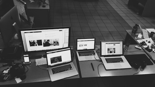
“We Thought About The Content Modules Strategically”
Q: You mentioned that restructuring the content was one of the main challenges. How did you deal with the sheer amount of content?
We did not set ourselves a goal to revamp the information structure of the previous version of the site (we had already created and maintained it). We wanted to entirely rethink the way we presented different types of content on the site, by taking into account the potential context of how and where this content was used.
We combined several large presidential resources into one in the simplest way possible. For example, earlier there was a separate site, “State,” which stored the content about the institution of the presidency and information on the activities of government agencies, as well as consultative and advisory bodies to the president. This content can now be found on Kremlin.ru in the section “Structure.” We removed a separate “Archives” section, too. Now all the information published since January 2000 is available in a unified form on the site – and in a much more convenient way, we hope!
We thought about the content modules strategically. It was very important for us to clearly separate static components, such as navigation, from actual informational data on the site. We also wanted to keep what we call the “presentation linearity” – a straightforward way of presenting and consuming the content – while keeping the information noise minimal.
For example, we provide a hint about available official reference material only if necessary, when the context calls for it, and never otherwise. Kremlin.ru is not traditional media, at least not in a modern sense of how it’s seen and perceived, so it has its own unique specifics. In particular, you do not have to “unscrew” advertising or third-party scripts, which is a given in most projects. The same holds true for metrics such as “visit depth” or “on site time”; for us, increasing value in these metrics are usually warnings that something isn’t quite right, that users aren’t able to find the information they need quickly and efficiently, as they should.

Q: Kremlin.ru is subject to political activity in the country and worldwide. Is publishing a time-consuming process or can you get content out very quickly?
Our CMS has been designed specifically to enable editors to publish content rapidly and easily. A typical scenario looks like this: an editor logs into the admin interface, uploads videos, photos (they can also create a photo stream/gallery by selecting a set of images to be uploaded), adds attributes, pastes in the content from DOC/DOCX/RTF, etc. (usually copy and paste because we clean up the formatted text anyway), positions media elements in the text, generates a preview and finally clicks on the “Publish” button. Nothing too fancy, really.
Many documents are written in stages. During important events a transcript is published and updated almost immediately after an event starts, and it’s updated live until the very end of the event. An important detail to mention here is that editors always have a concept of two-version editing in mind. There is a working version and a published version of the document. Editors can introduce any changes into the working version without worrying about breaking something live. Once they’re confident that everything is right, they transfer all the changes into the published version as simply as by clicking a button.
As far as the content structure goes, we had a file with the structure of the site that had been updated, overwritten, and overwritten again, all the way up to the launch of the project. In particular, we needed to find the most accurate and concise wording for every section in the navigation. We can’t afford ambiguity or the chance of misinterpretation of texts published on a government website of such political and informational importance.
Q: When it comes to content, semantics and metadata are crucial. Karen McGrane has been talking a lot about adaptive content, based upon content fragments pulled together dynamically. But it all boils down to how smart the CMS is. How smart is your CMS?
Well, as mentioned above, the major segment of site visitors is the employees of news agencies, various Russian and international media. According to reviews, they love the website because we’ve always provided structured content, which makes it easier for them to use it.
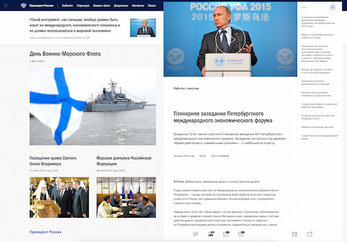
We have finally wrapped up the concept of “working with text” which we introduced six years ago; it serves as a convenient tool for navigating through long transcripts. We “semi-automatically” mark out single content units (such as videos, news, events, locations and characters) in articles, speeding up information retrieval many times. Instead of just dumping a chunk of content down the page, we structure it properly, identify singular content units and mark them up appropriately. It makes the text more interactive and easier to understand, consume and search. (View an example in use – just make sure to keep the screen width relatively large).
A few days after a political event, visitors should be able to watch videos with subtitles. They are available not only for English-speaking users, but also for people with disabilities.
Q: In fact, the website has many news stories and articles, but almost every single news item has media elements in it. Did you run into specific challenges related to embedding media?
From a technical perspective, we did not reinvent the wheel, but chose the most pragmatic solution: only one format for video – MP4 – and one format for audio – MP3. Obviously, we had to make our site work effectively for the maximum number of browsers and devices, so we immediately decided to work with HTML5 <audio> and <video>, which, in combination with MP4 and MP3, would work in most modern browsers; as a fallback for legacy browsers we use a Flash player.

Developing our own player would have meant repeating mistakes already made, so instead we decided to go with a reliable, bulletproof MediaElement.js library. This provides custom Flash and Silverlight players that mimic the HTML5 MediaElement API for older browsers, and supports accessibility standards such as WebVTT. At the same time, we developed a few plugins that can be installed by users on their local machines, such as QuickTime, Windows Media Player or VLC plugins.
We had to consider several major issues of displaying media without using JavaScript, and we also experimented with customization of the built-in WebKit/Blink players. We display only a static image for the video if a browser doesn’t support HTML video; in that case, we don’t display the big “Play” button. And we don’t show it if JavaScript is deactivated or doesn’t work properly, because otherwise it would block interaction with the video.
In WebKit/Blink-based browsers, we ended up with very decent results by applying styles to the shadow DOM (video::-webkit-media-controls), very similar to the JavaScript media player. Of course, we keep an eye on new developments in this area and will adjust our implementation accordingly once new technology is available.
To improve navigation when media elements are being played, we developed a tool to mark up specific areas of the media and accompanying text and allow users to jump between the marked areas quickly and effortlessly.
“All Content Is Accessible On All Devices”
Q: How did you deal with the challenges of cross-device experiences? Was responsive design an obvious choice or did you consider building separate experiences for different types of devices?
A government website should be accessible to as many citizens as possible. This is one of the core principles of the site. For a resource of this size, it just doesn’t make any sense to chase short-lived trends. We are designing for the future, with the foundation of the site having to withstand the test of time for at least five to six years.
We did not start from the mobile-first methodology. We had enough time to thoroughly craft the user experience for smaller and larger screens. We spent significant amounts of time and resources on each common use case to ensure that the site works well and looks good everywhere. On all types of device with various interaction modes, technical characteristics and ecosystem requirements. We tried as hard as possible to keep the codebase and design conveniently flexible. Internally, we embraced the notion of content parity, with all the content and functionality of a big desktop version being available across the spectrum of user experiences — on mobile, tablets, notebooks, and so on.
It’s a bit more difficult to track whether the functionality is consistently supported everywhere, but we did everything we could to ensure that it just works. If we get a bug report, we look into the issue and try to fix it right away.
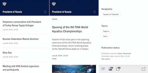
Q: Indeed, content parity seems to be an established paradigm in responsive design these days, but does it always work across all pages on a site?
Well, not quite. For mobile experiences we did remove some interface components which were simply impossible to use on a mobile phone (like advanced topics/person navigation within meeting protocols or reports), but all these features are available to their full extent from tablets on. It doesn’t affect content though: all content is accessible on all devices, though sometimes in different ways.
“Just Invite Good Engineers And Give Them Time”
Q: What’s the front-end and back-end architecture of the site, and how exactly did you architect it? Yandex’s BEM has gained significant traction in Russia and beyond, and it looks like BEM is used on the site, too.
Yes, I believe that modularity and a component-based approach are the right path in web development, which is why we see React and web components being actively developed now. During the development phase we created our own variant of BEM, a kind of variation of the concept. We separated the JavaScript and CSS components into separate modules and files. When prototyping HTML templates we just kept reusing them (a DRY approach) without having them tightly coupled with specific functional elements.
We’ve written a request handler and a view manager which are tailored specifically to our needs, as well as a system for placing and managing anchors in the right places in the DOM. The view manager deals with clicks on anchors; for example, <a href="#id"> chooses the right block, decides to load it or not, and also whether it should trigger scrolling to another section – it’s used for smoother and slicker animations.
All of these libraries provide support for a responsive grid with two independent columns and a multilevel menu in the header, footer and sidebar. There are many edge cases for different viewports, and they must be considered individually: processing and animation of transitions between pages, window resize events, displaying and hiding the mobile menu, and so on.
We also used modern methods of pre- and postprocessing CSS and JavaScript. To be more specific, we’re using Sass with Compass, which simplifies the management of media queries and CSS animations immensely compared to regular CSS. For JavaScript, we don’t use preprocessors like CoffeeScript or TypeScript, we just automate the compilation of scripts and compression, and package everything up in one file with Grunt. We test JavaScript with JSHint, minify with UglifyJS, and optimize SVG with SVGO. The compilation uses the repo’s hooks and we always have an up-to-date version of all generated files during the deployment. Manual work isn’t involved in the process at all. All of this helps us keep the codebase sane and lean.
The important rule is to just invite good engineers and give them time – it’s really not so difficult.

Q: Was performance a concern or requirement in the design process? Did you run into performance issues and how did you deal with them?
We haven’t limited ourselves to specific performance metrics. We always considered the functionality first and then approached performance issues, trying to make everything as fast as possible. Initially we had quite a lot of HTML, and therefore many DOM nodes – in refactoring, we’ve worked hard to make the code leaner and reduce the number of nodes, and we still keep doing it now.
We also ended up with a huge number of styles in CSS, and the codebase grew rapidly with continual refinement and adjustment. We built a major chunk of functional components based on UCSS, to test only necessary styling. This way we kept cutting out dead code.
We treat JavaScript as an additional level of interactivity. We tried to support as many browsers as possible through the same codebase. And as you certainly know yourself, it isn’t an easy task. Our goal was to provide core functionality to browsers such as IE6 and Opera 9, and it worked really well. We had to keep the codebase robust and focus on smart browsers, so we didn’t try extra ways to provide exactly the same level of functionality in older browsers.
We use simple fallbacks for legacy browsers: simple href links instead of advanced History API, and PNG instead of SVG, and we use a media query shim. Sometimes legacy browsers only receive an image instead of advanced interactive features. We never compromised user experience in modern browsers in favor of older browsers. Somewhere in a branch there is a special version for browsers that support only tables, but not CSS – hardcore! But let’s not go this route.
Q: There are plenty of animations and transitions, pretty much everywhere, and navigation through the site appears to be very smooth, almost seamless. How did you design and test them?
Site navigation is snappy because loading JavaScript and CSS occurs only once, and then everything – and I mean _everything_ – is cached. Additionally, we use the History API. The slickness of the animation is achieved mainly through CSS alone, but not only that. We also optimized for painting and rendering performance. We used the translateZ and transform3d workarounds (see “On translate3d and layer creation hacks” from Aerotwist) to move navigation, subnavigation, fixed positioned components and main content blocks on a separate rendering layer, and used hardware accelleration via GPU, so the page doesn’t have to be repainted over and over again. Most animated blocks were moved to a separate layer as well. We used Web Inspector’s “Show paint rectangles” and “Show composited layer borders” to track rendering performance.
We also measured and tested the response time in animation with “Animation Inspection”; obviously it’s critical for a smooth experience. We had many problems in older, but still heavily used browsers.
Before bringing the new site online, we identified the weakest spots in the client and server code, optimized them and enabled caching wherever possible. We did have some issues with the History API, though. Every now and again the code just didn’t work as it was supposed to. The only option was to fully automate regression testing with Selenium and run tests via continuous integration. Once the tests were written and run (around 50 test cases), it turned out that half were failing. We had to go through each of those failures, refactor the code and test again. We recommend that everybody pays a lot of attention to such details; these little things make the site really easy and enjoyable to use.
Q: Since there are many dynamic changes going on, do you preload and cache CSS and JavaScript that aren’t used yet?
No, we don’t preload and cache CSS and JavaScript that aren’t used yet, but we load all the JavaScript and CSS at once, concatenated and compressed. If a page can have different states, obviously we need to make sure that the entire CSS and JavaScript code should be fully downloaded and executed once.
Q: When it comes to the codebase, how did you develop it? What browser versions did you have to actively support?
Strategically, we followed the principles of graceful degradation. We pushed ourselves to use the most sophisticated and advanced technologies for modern browsers, and from there did our best to provide the best level of support to legacy browsers. In many cases we used vendor prefixes for CSS. We made a conscious decision to use nothing but CSS for animation, although we did try alternatives. In the end, we decided to use pretty much everything we could with -webkit, -moz, -ms and -o prefixes. While we are using graceful degradation for development, we use progressive enhancement when dealing with maintenance issues.
Again, we developed test scripts to measure the rendering speed of animations and spot errors. We learned soon enough that different browsers (more specifically, different versions of various browsers) manage animationstart and animationend events very differently, and much the same goes for transitions. A sizeable number of tests had to be conducted manually, visually.
Having a clear picture of our users’ browsers was really helpful, though:
- Google Chrome 30.4%
- Firefox 15.9%
- Internet Explorer 12.5%
- Opera 11.2%
- Mobile Safari 8.34%
- Yandex.Browser 7.59%
- Chrome Mobile 5.06%
- Android Browser 2.95%
- Safari 1.67%
- Opera Mini 1%
- Internet Explorer 6–7 aren’t an issue any more (0.033% and 0.21%, respectively)
- Internet Explorer 8–9 partly are (2.83% and 2.18%, respectively)
- The newer IEs 10–11 are quite popular, too: 1.41% and 5.74%, respectively
Most visitors come from:
- Russia (77.9%)
- Ukraine (7.12%)
- Germany (1.29%)
- USA (1.29%)
- Belarus (1.12%)
- Kazakhstan (1.04%)
- China (0.58%)
- United Kingdom (0.57%)
- Moldovia (0.42%)
- Uzbekistan (0.39%)
The geography of users looks quite different on the
“Two Independent Columns Generate A Lot Of Interesting New Ways To Interact With The Content”
Q: There are major layout changes between breakpoints, and the experience is quite different on small and very large screens. Did you stumble into any challenges related specifically to responsive design?
In this stage of site evolution we formed a foundational understanding of adaptivity in our design process. To understand the final result, we need to look into a few important inputs that we considered before starting designing the experience. Proportions vary. For quite some time now, the old 4:3 screen ratio has been pushed aside by the dominant 16:9 screen ratio. Once that became clear to us, we started thinking about what it meant for our final designs and layouts. There are many more devices. Many developers of responsive websites tend to focus on mobile and desktop use cases, but we identified four basic display formats which were important for Kremlin.ru:
- mobile phone
- tablet (vertical and horizontal)
- average notebook or 15–17″ screen
- large 17–27″ desktop
These four use cases, and the corresponding popular browser window sizes have formed the foundation of the adaptive experience on the site.

According to our statistics, 22% of users come to the site from mobile devices and see a one-column mobile-optimized experience; 54% have a small desktop resolution and they see the content in the middle of the page, perhaps with a bit of whitespace on the right edge; another 24% of users have large horizontal resolution and they usually see the content distributed in two columns.
We thought about all groups of users with various devices and we designed a convenient, separate experience for each group. As a result, we ended up working simultaneously on up to nine breakpoints. In the beginning we had three major breakpoints in mind: mobile, tablet and desktop. That’s why we defined them in Sass to modify and extend the codebase. Based on the changes in mock-ups we added new styles in the codebase, for prototypes to match the mock-ups.
To illustrate this point, we could look into one of the most interesting ideas we implemented for navigation and layout starting from 1,580px. If we think about user behavior, it’s probably safe to assume that on most modern websites many users search for specific content, landing on the site via external links, be they from search engines or social media. When this happens on Kremlin.ru, and users have at least 1,580px viewport width, they immediately see two independent columns. We don’t display a mix of content and navigation, but have a clear separation between the two.
The left column provides fully fledged, advanced navigation related to the content. The right column is dedicated to content and doesn’t contain any navigation elements or unnecessary interface components. According to our calculations, the speed of navigation in this mode increased by 1.5 times, which made our regular users (and our editors) quite happy. Besides, having a two-column experience makes it possible for visitors to learn additional information on the left side of the site without navigating away from the content page.
Here’s an example of how the new interface works: a user is reading an article, and it mentions a certain person. The user clicks on the person and they see a new column on the right fading in; this extra column has all the details about this person’s current occupation, biography and other details. This functionality helps us boost the navigation and keeps the reader focused on the content by providing extra content on demand. In a similar fashion, users can open another section or read additional content, or send a message or find contact information, without closing the actual content area.
We can’t infer browser viewport from the resolution alone, but still, according to our statistics, the percentage of users with browser viewports (not screen resolution!) over 1,580px is circling around 24% of the total number of visitors. We could potentially push pixels around and start showing the two-column display on smaller screens, but our data showed us that we wouldn’t reach significantly more audience this way. We’ve decided to stop at 1,580px for now.
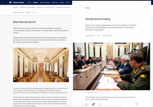
Two independent columns generate a lot of interesting new ways to interact with the content. Would you expect this in Finder? Do you remember Norton Commander? Have you got used to your email applications and news aggregators? We explore all of these new ways to design an entirely new interface experience at the new Kremlin.ru.
In one of the next releases we will launch what we call stacks of content items: the right column will feature both read and unread content items which users can get back to or learn something new, very much like in email applications. There are many similar ideas floating in the agency, and it’s important to keep everything balanced and not allow the interface to become cluttered with features – we just need to understand the tasks and polish the solutions.
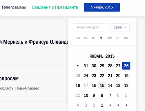
Q: The responsive behavior of some components is very interesting, e.g. the smart and responsive calendar module. Can you highlight a few other unusual solutions you came up with?
Absolutely! As I mentioned earlier, the front-end is basically flooded with small delightful ideas from the project designer, designer and web developer. Let me list a few of the tasty details:
SVG map of Russia and the world
On mobile, there's the problem of fat fingers, when input is imprecise because of the high level of detail displayed on screen. This problem is very common when users interact with maps, resulting in the wrong areas being selected accidentally. On Kremlin.ru, when you click on a small region surrounded by many neighbouring countries, we zoom in the map automatically to this location and prompt a list view from which users can select all the nearest countries or regions from the list.
Smart, adaptive, responsive map in use on Kremlin.ru. (View large version) Icons with data
In our news feeds and regular content pages, we show not only the length of videos and audio, and the number of photos available, but also the size of the content item, calculating the number of characters in advance. This helps journalists solve two professional issues without clicking through all of the available content. First, users don't need to check the actual news item if they know that it’s still work in progress or is incomplete, and the full text will appear later. Second, users can decide up front if they are willing to invest time in reading a large piece of text or not.
Icons with the data. (View large version) Notifications
We also added a smart trigger for new updates, so if you don’t close the tab with Kremlin.ru, news is updated in the feed automatically. We also highlight the unread news items and how many there are, so you can jump to unread items right away. We want to make the content available nearly instantly, so we have different grades of content: once an event has taken place, we publish a short news lead instantly; afterwards we publish a full transcript and photos (or a detailed report); and then finally we post the video. Again, if you have the site open, you would see all of these updates as notifications visible at the "New Kremlin" tab.
Show notifications. (View large version) Appearance of the close icon when displaying news
We mentioned the two-column view for articles earlier. Now, in smaller views, we keep the right content column as an overlay above the navigation column. We provide a close icon in the upper-right corner of the content column, so a user can always close it – both in wide and narrow screens – and either focus on the navigation in a large view, or jump back to the navigation column on narrow screens.When users are inside a content piece and scroll down the page, we hide the icon, but when they scroll up, it reappears. Also we start showing it when a user’s mouse pointer is heading towards the upper-right corner of the page (or we detected a tap nearby) because we anticipate that a person wants to close the news item. In addition, the item can be closed simply by clicking on the free space in the right area of the column.
Animation when you click or tap
On touch devices, we use animation to provide visual feedback; it tells the user whether the interaction took place or not. It’s quite important because of the specifics of our dynamically loading content.
We use animation to provide visual feedback on tap – on touch devices, of course. (View large version) Web font loading
It’s important to keep content accessible for users with slow connections, too. They should be able to immediately start reading the content without waiting for custom web fonts. Our solution helped us to relieve users of an agonizing wait, but we ended up with small jumps between fallback fonts and web fonts that we tried to compensate for with clever fallback and usage of system fonts.Fonts require special attention: as you know, in browsers we can either have a flash of invisible text (FOIT), meaning that content won’t be rendered until fonts have been loaded; or a flash of unstyled text (FOUT), meaning that the content will be displayed in the fallback fonts first, and then once web fonts have downloaded, there will be a switch to the web fonts. We chose to go with FOUT to enable readers to access the content as quickly as possible, independent of web fonts. We defined base fonts in CSS and special classes to activate loaded fonts (via Typekit’s Web Font Loader). So once the browser has HTML and CSS, it can start to render. If web fonts have downloaded too, then the reading experience will be even better.
Newsfeed refresh
When displaying the list of events and news, we use an incremental loading mechanism when scrolling pages. We don’t use the infinite scrolling pattern in its common implementations. It was important for us to allow users to view and use the footer (which is usually not available in the infinite scrolling pattern). We ended up using so-called “upload and display zones”. These zones exist within the layout whenever a list is presented, and when a user gets into one of them, we either display the next page, or we prompt a page preload, or a content block gets updated with more content. We display a button that allows users to retrieve more list items on demand, and we also display navigation buttons to the next or previous page of the list.What it means is that if users want to explore the footer, they are very unlikely to land in the display zone, and will reach the footer without any issues. However, if they explore the list of news for a little while, we detect it and then preload more news items first and fade them in smoothly and automatically.
Context-sensitive calendar
If you open the calendar on the events page and start scrolling the news, you’ll discover that the calendar automatically adjusts the current value as you scroll down the timeline.Smart zoom
In the mobile view, when you double tap on the main body copy, we increase the font size of the text automatically and remain at the same position. Readers doesn’t get interrupted or distracted by a sudden layout change.Adaptive headlines
The font size of the headlines changes depending on the amount of space required – headlines always fit the grid perfectly.
Adaptive headlines in use. Headlines always occupy the same amount of space. We also have four kinds of cards which grow or shrink together based on the amount of text and media data. (View large version) Responsive images
One of our goals was to provide a comprehensive level of support for a large variety of devices with different pixel densities (Retina, Ultra HD, and so on), so we integrated a responsive images technique with thesrcsetattribute, which is, as you know, supported by smart modern browsers. For the oldies we provided a JavaScript implementation (we use Boris Smus’ srcset-polyfill).Once we had that, we developed a similar implementation for
<video>posters — we just replace the value from 1× image source to 2× image source once theDOMReadyevent has fired. If users are on slow connections, they will see a background gradient first – this gradient is calculated based on the prevailing image tints. We pretty much use it as a preloader to keep the user interaction smooth and seamless.
Image error (left), preloader and image. (View large version) Smart icons
Again, sometimes we open an article over the current user view, and sometimes in the right column. For each of these situations we make some calculations behind the scenes and show an icon suitable for the given context. We either indicate that the content will appear in full view, or that it will appear on the right. Try changing the browser window from a narrow to a wide screen and hover over images.
We switch icons displayed on hover once we know whether we have enough space to show the content item on the right or not. (View large version) Font rendering
Great effort has been devoted to high-quality font rendering on all possible OSes and browsers. In different situations we have applied different solutions, and sometimes we even changed the color of the text for a particular browser. Take Franklin Gothic, for example. We use the typeface pretty much throughout the site. We tried a few different ways of rendering, and in the end we went fortext-rendering: optimizeLegibilityand-webkit-font-smoothing: subpixel-antialiasedwhich worked best in most browsers and operating systems. [Please note thattext-renderingcan dramatically slow down page loads if applied to longer texts, especially on less capable devices. —Ed.]For whatever reason, in Chrome the text color in the footer looked grayish, and in Safari blueish. We decided to pick a different hue which would work well in both and still fit our guidelines. We also went through a number of iterations on color schemes to get an optimal result on most devices, both with high-density screens and older, low-quality screens.
Transcripts, video markup
We developed our own modules to mark up the text and add structure to it. You can define a topic and person for every paragraph, and they are set as markers. The list of all these markers is displayed on the page next to the transcript, so users can jump to specific areas quickly. Also, we added navigation to be able to jump through different occurrences of a topic or a person. In addition, each paragraph is marked with a time stamp, so when video is being played the transcript automatically moves to match the position in the video.With that, transcript navigation and video navigation can be done simultaneously. On these pages, creating a user-friendly interface for editors was one of the main challenges. Basically, we developed an extension for the admin interface; the output is an assignment of classes and HTML5
data-attributes (such asdata-time-start– view the source of a video page to see them), which are then read out and used via JavaScript. We generate an index of all marked regions on the page by traversing through each class of markers, which is how navigation works.Aesthetics in details
To create a truly smooth experience, we thoroughly considered the use case when users try to go either beyond the header or the footer of a page. We use different backgrounds, and the choice of background isn’t random: it always matches the context in which users find themselves in.
Background coors are not chosen arbitrarily. (View large version) Adjusting the national crest
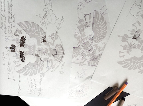
The icon of the national crest wasn’t created specifically for screen, and it had never been optimized for digital. We redesigned the national crest; it matches all legislation requirements and looks pretty good. We had to give it a simple shape first and add some detail later on to make the appearance closer to the original design. From the very beginning we knew that we wanted to give the icon away to everybody working on a government website, so we open-sourced all files and illustrations and released them under Creative Commons.
New (left) and old national crests. Mark and share
We also integrated a library which allows users to mark page content fragments and get a unique URL to the page with marked fragments. Anybody can select pieces of content (paragraphs, sentences or words) and share this selection with others.Users can highlight interesting fragments of text and share a unique URL to the page with the highlights.

Highlighting text and linking to a custom URL containing the selection. (View large version)
It seems that this list can be endless!
Q: That’s a very impressive list! But with all of those adjustments and little details, did you run into any localization and internationalization issues because you had to build components that would support both English and Russian?
Yes, we did. The entire design process was accompanied by regular tests of English wording for basic interface components. There are quite a few elements which are different between these versions. For example, we show a map of the world on the main page of the English version, and a map of Russia on the Russian version. The same holds for phone numbers: we display the international dialling code +7 instead of the Russian one 8 (495).
Also, we use GNU gettext with an automatic assembly of *.po language files from the source code: server-side, templates, JavaScript. When you build the project, prewritten translations are compiled back into JavaScript, and our templates and code use these translations when generating the page. It’s a pretty standard solution.
“We Created 40 To 80 Versions Of Every Single Mock-Up Or Layout”
Q: Could you provide some insights into the tooling and the design process itself? How did you start?
We started with simple paper prototypes and Photoshop mock-ups, but quickly moved to Sketch prototypes. Later they evolved into more refined, detailed prototypes, and we tested stylistic elements individually: colors, fonts, interface solutions. We had built up a comprehensive system, or library of colors, fonts and components, which had been partly changed in the process. Also, at this stage we built a prototype of our Sketch designs in HTML and CSS to understand what pitfalls we should expect. For example, it was in the HTML/CSS prototype where the client really got the idea how convenient our two-column view with a clear separation of content and navigation was.
We did have quite a few issues with Sketch, though, because it crashed a lot and its SVG export options were a bit mysterious. But in light of Sketch’s current development, now we’ve moved toward Sketch we definitely won’t be going back to Photoshop. We just experimented a bit with Sketch and our front-end developers were able to adapt their workflow immediately: we loved the web-feeling of the tool.
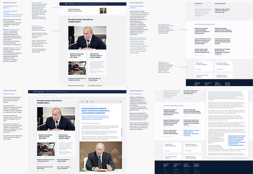
Engineering, design and development were simultaneous processes, and had been running up until the launch of the new Kremlin.ru. If we count all the work required including first theoretical considerations, the entire process from the very first draft meeting to the relaunch of the site lasted more than a year.
In terms of tooling, we used JetBrains apps, such as IntelliJ IDEA and WebStorm, and their integration with Trello; also, we used DVCS for version control, and an internal chat with handy code markers via TODO, XXX and NOTE comments in code, so we could jump right into code. For continuous integration, we used Jenkins. In addition, we used Grunt, Karma and Selenium. In terms of testing, we had many browsers on many virtual machines, and used VirtualBox and Parallels Desktop, and sometimes (but rarely) Floobits.
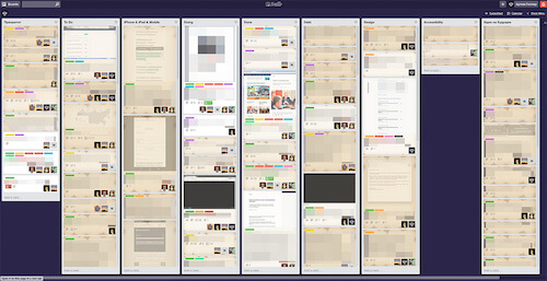
Early on we decided to move a significant part of the front-end tasks to Trello. We closed more than 2,500 cards within a year. This number doesn’t include tasks and task lists which had been archived or deleted. We permanently add new tasks to the list taking into consideration our own ideas and constructive user feedback. Currently, there are 72 cards to be closed.
During the project we created 40 to 80 versions of every single mock-up or layout. The level of complexity in these layouts varies a lot. Versioning was guided by our internal numbering system: major iterations were numbered with full integer increments (1, 2, 3…); and minor adjustments (e.g. modification of styles, spacing, etc.) had intermediate increments (1.1, 1.2, 1.3…). Some mock-ups had full names, such as “74.9 - President of Russia - Material, Big.sketch”.
As for the team, we all work in one large room, and we do our best to be self-organized and stay away from bloated bureaucratic structures. On the project, we had two UX designers (me and Mikhail Zhashkov), five front-end engineers and a significant number of back-end developers.
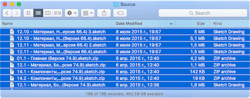
Q: 40 to 80 versions of every single mock-up sounds pretty frightening. How did you match Sketch mock-ups and HTML/CSS prototypes?
We presented things live to our clients. They always had access to different versions of the site. Once we had our Sketch mock-ups, we built an initial static HTML/CSS prototype to present the idea in browsers. So there was a kind of live site but it wasn’t populated with actual data (links weren’t working, for example). Once we had that, we relatively quickly transitioned it into a dynamic prototype.
Afterwards, we just kept adding and modifying every section or page, matching the changes in Sketch mock-ups. At this stage, every developer had their own version locally, so they could introduce any changes without breaking anything. All mock-up changes were applied directly to the prototype that everybody was working on, which eventually turned into an actual, working website.
Obviously, all local changes and implementations were merged into one master version for quality review and testing. To keep track of it all, often different views – mobile, desktop, tablet – were located in one Sketch file but on different artboards.
In a perfect world you’d get 15 smart people in a room and they decide right away how the site should look and function. But in reality, that’s not how it works. The fundamental sketches and ideas behind the site haven’t changed throughout the development, but we must have had 2,000 passes on the structure, plus all the bugs and potential issues to get to the stage where we eventually wanted to be.
We then prepared a short overview of the main guiding principles which we wanted to deeply integrate throughout the online presence. We didn’t use any fancy dynamic applications for that – we just put all the main pages of the new site, including descriptions of how, what and why, on A3 paper sheets. Somebody coming into the office could understand what we were doing within five minutes. We wrote down the principles, prepared visuals as examples, and added hints and notes to visualize exactly how a principle was applied.
The President’s administration saw everything from the very first sketches with illustrated guiding principles, to all permanently accessible versions of all prototypes.
Q: Right, but when it comes to prototyping, is it correct to say that you built the desktop version first and then optimized it for mobile?
- Google Chrome 30.4%
- Firefox 15.9%
- Internet Explorer 12.5%
- Opera 11.2%
- Mobile Safari 8.34%
- Yandex.Browser 7.59%
- Chrome Mobile 5.06%
- Android Browser 2.95%
- Safari 1.67%
- Opera Mini 1%
- Internet Explorer 6–7 aren’t an issue any more (0.033% and 0.21%, respectively)
- Internet Explorer 8–9 partly are (2.83% and 2.18%, respectively)
- The newer IEs 10–11 are quite popular, too: 1.41% and 5.74%, respectively
Most visitors come from:
- Russia (77.9%)
- Ukraine (7.12%)
- Germany (1.29%)
- USA (1.29%)
- Belarus (1.12%)
- Kazakhstan (1.04%)
- China (0.58%)
- United Kingdom (0.57%)
- Moldovia (0.42%)
- Uzbekistan (0.39%)
The geography of users looks quite different on the
“Two Independent Columns Generate A Lot Of Interesting New Ways To Interact With The Content”
Q: There are major layout changes between breakpoints, and the experience is quite different on small and very large screens. Did you stumble into any challenges related specifically to responsive design?
In this stage of site evolution we formed a foundational understanding of adaptivity in our design process. To understand the final result, we need to look into a few important inputs that we considered before starting designing the experience. Proportions vary. For quite some time now, the old 4:3 screen ratio has been pushed aside by the dominant 16:9 screen ratio. Once that became clear to us, we started thinking about what it meant for our final designs and layouts. There are many more devices. Many developers of responsive websites tend to focus on mobile and desktop use cases, but we identified four basic display formats which were important for Kremlin.ru:
- mobile phone
- tablet (vertical and horizontal)
- average notebook or 15–17″ screen
- large 17–27″ desktop
These four use cases, and the corresponding popular browser window sizes have formed the foundation of the adaptive experience on the site.

According to our statistics, 22% of users come to the site from mobile devices and see a one-column mobile-optimized experience; 54% have a small desktop resolution and they see the content in the middle of the page, perhaps with a bit of whitespace on the right edge; another 24% of users have large horizontal resolution and they usually see the content distributed in two columns.
We thought about all groups of users with various devices and we designed a convenient, separate experience for each group. As a result, we ended up working simultaneously on up to nine breakpoints. In the beginning we had three major breakpoints in mind: mobile, tablet and desktop. That’s why we defined them in Sass to modify and extend the codebase. Based on the changes in mock-ups we added new styles in the codebase, for prototypes to match the mock-ups.
To illustrate this point, we could look into one of the most interesting ideas we implemented for navigation and layout starting from 1,580px. If we think about user behavior, it’s probably safe to assume that on most modern websites many users search for specific content, landing on the site via external links, be they from search engines or social media. When this happens on Kremlin.ru, and users have at least 1,580px viewport width, they immediately see two independent columns. We don’t display a mix of content and navigation, but have a clear separation between the two.
The left column provides fully fledged, advanced navigation related to the content. The right column is dedicated to content and doesn’t contain any navigation elements or unnecessary interface components. According to our calculations, the speed of navigation in this mode increased by 1.5 times, which made our regular users (and our editors) quite happy. Besides, having a two-column experience makes it possible for visitors to learn additional information on the left side of the site without navigating away from the content page.
Here’s an example of how the new interface works: a user is reading an article, and it mentions a certain person. The user clicks on the person and they see a new column on the right fading in; this extra column has all the details about this person’s current occupation, biography and other details. This functionality helps us boost the navigation and keeps the reader focused on the content by providing extra content on demand. In a similar fashion, users can open another section or read additional content, or send a message or find contact information, without closing the actual content area.
We can’t infer browser viewport from the resolution alone, but still, according to our statistics, the percentage of users with browser viewports (not screen resolution!) over 1,580px is circling around 24% of the total number of visitors. We could potentially push pixels around and start showing the two-column display on smaller screens, but our data showed us that we wouldn’t reach significantly more audience this way. We’ve decided to stop at 1,580px for now.

Two independent columns generate a lot of interesting new ways to interact with the content. Would you expect this in Finder? Do you remember Norton Commander? Have you got used to your email applications and news aggregators? We explore all of these new ways to design an entirely new interface experience at the new Kremlin.ru.
In one of the next releases we will launch what we call stacks of content items: the right column will feature both read and unread content items which users can get back to or learn something new, very much like in email applications. There are many similar ideas floating in the agency, and it’s important to keep everything balanced and not allow the interface to become cluttered with features – we just need to understand the tasks and polish the solutions.
Q: The responsive behavior of some components is very interesting, e.g. the smart and responsive calendar module. Can you highlight a few other unusual solutions you came up with?
Absolutely! As I mentioned earlier, the front-end is basically flooded with small delightful ideas from the project designer, designer and web developer. Let me list a few of the tasty details:
SVG map of Russia and the world
On mobile, there's the problem of fat fingers, when input is imprecise because of the high level of detail displayed on screen. This problem is very common when users interact with maps, resulting in the wrong areas being selected accidentally. On Kremlin.ru, when you click on a small region surrounded by many neighbouring countries, we zoom in the map automatically to this location and prompt a list view from which users can select all the nearest countries or regions from the list.
Smart, adaptive, responsive map in use on Kremlin.ru. (View large version) Icons with data
In our news feeds and regular content pages, we show not only the length of videos and audio, and the number of photos available, but also the size of the content item, calculating the number of characters in advance. This helps journalists solve two professional issues without clicking through all of the available content. First, users don't need to check the actual news item if they know that it’s still work in progress or is incomplete, and the full text will appear later. Second, users can decide up front if they are willing to invest time in reading a large piece of text or not.
Icons with the data. (View large version) Notifications
We also added a smart trigger for new updates, so if you don’t close the tab with Kremlin.ru, news is updated in the feed automatically. We also highlight the unread news items and how many there are, so you can jump to unread items right away. We want to make the content available nearly instantly, so we have different grades of content: once an event has taken place, we publish a short news lead instantly; afterwards we publish a full transcript and photos (or a detailed report); and then finally we post the video. Again, if you have the site open, you would see all of these updates as notifications visible at the "New Kremlin" tab.
Show notifications. (View large version) Appearance of the close icon when displaying news
We mentioned the two-column view for articles earlier. Now, in smaller views, we keep the right content column as an overlay above the navigation column. We provide a close icon in the upper-right corner of the content column, so a user can always close it – both in wide and narrow screens – and either focus on the navigation in a large view, or jump back to the navigation column on narrow screens.When users are inside a content piece and scroll down the page, we hide the icon, but when they scroll up, it reappears. Also we start showing it when a user’s mouse pointer is heading towards the upper-right corner of the page (or we detected a tap nearby) because we anticipate that a person wants to close the news item. In addition, the item can be closed simply by clicking on the free space in the right area of the column.
Animation when you click or tap
On touch devices, we use animation to provide visual feedback; it tells the user whether the interaction took place or not. It’s quite important because of the specifics of our dynamically loading content.
We use animation to provide visual feedback on tap – on touch devices, of course. (View large version) Web font loading
It’s important to keep content accessible for users with slow connections, too. They should be able to immediately start reading the content without waiting for custom web fonts. Our solution helped us to relieve users of an agonizing wait, but we ended up with small jumps between fallback fonts and web fonts that we tried to compensate for with clever fallback and usage of system fonts.Fonts require special attention: as you know, in browsers we can either have a flash of invisible text (FOIT), meaning that content won’t be rendered until fonts have been loaded; or a flash of unstyled text (FOUT), meaning that the content will be displayed in the fallback fonts first, and then once web fonts have downloaded, there will be a switch to the web fonts. We chose to go with FOUT to enable readers to access the content as quickly as possible, independent of web fonts. We defined base fonts in CSS and special classes to activate loaded fonts (via Typekit’s Web Font Loader). So once the browser has HTML and CSS, it can start to render. If web fonts have downloaded too, then the reading experience will be even better.
Newsfeed refresh
When displaying the list of events and news, we use an incremental loading mechanism when scrolling pages. We don’t use the infinite scrolling pattern in its common implementations. It was important for us to allow users to view and use the footer (which is usually not available in the infinite scrolling pattern). We ended up using so-called “upload and display zones”. These zones exist within the layout whenever a list is presented, and when a user gets into one of them, we either display the next page, or we prompt a page preload, or a content block gets updated with more content. We display a button that allows users to retrieve more list items on demand, and we also display navigation buttons to the next or previous page of the list.What it means is that if users want to explore the footer, they are very unlikely to land in the display zone, and will reach the footer without any issues. However, if they explore the list of news for a little while, we detect it and then preload more news items first and fade them in smoothly and automatically.
Context-sensitive calendar
If you open the calendar on the events page and start scrolling the news, you’ll discover that the calendar automatically adjusts the current value as you scroll down the timeline.Smart zoom
In the mobile view, when you double tap on the main body copy, we increase the font size of the text automatically and remain at the same position. Readers doesn’t get interrupted or distracted by a sudden layout change.Adaptive headlines
The font size of the headlines changes depending on the amount of space required – headlines always fit the grid perfectly.
Adaptive headlines in use. Headlines always occupy the same amount of space. We also have four kinds of cards which grow or shrink together based on the amount of text and media data. (View large version) Responsive images
One of our goals was to provide a comprehensive level of support for a large variety of devices with different pixel densities (Retina, Ultra HD, and so on), so we integrated a responsive images technique with thesrcsetattribute, which is, as you know, supported by smart modern browsers. For the oldies we provided a JavaScript implementation (we use Boris Smus’ srcset-polyfill).Once we had that, we developed a similar implementation for
<video>posters — we just replace the value from 1× image source to 2× image source once theDOMReadyevent has fired. If users are on slow connections, they will see a background gradient first – this gradient is calculated based on the prevailing image tints. We pretty much use it as a preloader to keep the user interaction smooth and seamless.
Image error (left), preloader and image. (View large version) Smart icons
Again, sometimes we open an article over the current user view, and sometimes in the right column. For each of these situations we make some calculations behind the scenes and show an icon suitable for the given context. We either indicate that the content will appear in full view, or that it will appear on the right. Try changing the browser window from a narrow to a wide screen and hover over images.
We switch icons displayed on hover once we know whether we have enough space to show the content item on the right or not. (View large version) Font rendering
Great effort has been devoted to high-quality font rendering on all possible OSes and browsers. In different situations we have applied different solutions, and sometimes we even changed the color of the text for a particular browser. Take Franklin Gothic, for example. We use the typeface pretty much throughout the site. We tried a few different ways of rendering, and in the end we went fortext-rendering: optimizeLegibilityand-webkit-font-smoothing: subpixel-antialiasedwhich worked best in most browsers and operating systems. [Please note thattext-renderingcan dramatically slow down page loads if applied to longer texts, especially on less capable devices. —Ed.]For whatever reason, in Chrome the text color in the footer looked grayish, and in Safari blueish. We decided to pick a different hue which would work well in both and still fit our guidelines. We also went through a number of iterations on color schemes to get an optimal result on most devices, both with high-density screens and older, low-quality screens.
Transcripts, video markup
We developed our own modules to mark up the text and add structure to it. You can define a topic and person for every paragraph, and they are set as markers. The list of all these markers is displayed on the page next to the transcript, so users can jump to specific areas quickly. Also, we added navigation to be able to jump through different occurrences of a topic or a person. In addition, each paragraph is marked with a time stamp, so when video is being played the transcript automatically moves to match the position in the video.With that, transcript navigation and video navigation can be done simultaneously. On these pages, creating a user-friendly interface for editors was one of the main challenges. Basically, we developed an extension for the admin interface; the output is an assignment of classes and HTML5
data-attributes (such asdata-time-start– view the source of a video page to see them), which are then read out and used via JavaScript. We generate an index of all marked regions on the page by traversing through each class of markers, which is how navigation works.Aesthetics in details
To create a truly smooth experience, we thoroughly considered the use case when users try to go either beyond the header or the footer of a page. We use different backgrounds, and the choice of background isn’t random: it always matches the context in which users find themselves in.
Background coors are not chosen arbitrarily. (View large version) Adjusting the national crest
The icon of the national crest wasn’t created specifically for screen, and it had never been optimized for digital. We redesigned the national crest; it matches all legislation requirements and looks pretty good. We had to give it a simple shape first and add some detail later on to make the appearance closer to the original design. From the very beginning we knew that we wanted to give the icon away to everybody working on a government website, so we open-sourced all files and illustrations and released them under Creative Commons.
New (left) and old national crests. Mark and share
We also integrated a library which allows users to mark page content fragments and get a unique URL to the page with marked fragments. Anybody can select pieces of content (paragraphs, sentences or words) and share this selection with others.Users can highlight interesting fragments of text and share a unique URL to the page with the highlights.

Highlighting text and linking to a custom URL containing the selection. (View large version)
It seems that this list can be endless!
Q: That’s a very impressive list! But with all of those adjustments and little details, did you run into any localization and internationalization issues because you had to build components that would support both English and Russian?
Yes, we did. The entire design process was accompanied by regular tests of English wording for basic interface components. There are quite a few elements which are different between these versions. For example, we show a map of the world on the main page of the English version, and a map of Russia on the Russian version. The same holds for phone numbers: we display the international dialling code +7 instead of the Russian one 8 (495).
Also, we use GNU gettext with an automatic assembly of *.po language files from the source code: server-side, templates, JavaScript. When you build the project, prewritten translations are compiled back into JavaScript, and our templates and code use these translations when generating the page. It’s a pretty standard solution.
“We Created 40 To 80 Versions Of Every Single Mock-Up Or Layout”
Q: Could you provide some insights into the tooling and the design process itself? How did you start?
We started with simple paper prototypes and Photoshop mock-ups, but quickly moved to Sketch prototypes. Later they evolved into more refined, detailed prototypes, and we tested stylistic elements individually: colors, fonts, interface solutions. We had built up a comprehensive system, or library of colors, fonts and components, which had been partly changed in the process. Also, at this stage we built a prototype of our Sketch designs in HTML and CSS to understand what pitfalls we should expect. For example, it was in the HTML/CSS prototype where the client really got the idea how convenient our two-column view with a clear separation of content and navigation was.
We did have quite a few issues with Sketch, though, because it crashed a lot and its SVG export options were a bit mysterious. But in light of Sketch’s current development, now we’ve moved toward Sketch we definitely won’t be going back to Photoshop. We just experimented a bit with Sketch and our front-end developers were able to adapt their workflow immediately: we loved the web-feeling of the tool.

Engineering, design and development were simultaneous processes, and had been running up until the launch of the new Kremlin.ru. If we count all the work required including first theoretical considerations, the entire process from the very first draft meeting to the relaunch of the site lasted more than a year.
In terms of tooling, we used JetBrains apps, such as IntelliJ IDEA and WebStorm, and their integration with Trello; also, we used DVCS for version control, and an internal chat with handy code markers via TODO, XXX and NOTE comments in code, so we could jump right into code. For continuous integration, we used Jenkins. In addition, we used Grunt, Karma and Selenium. In terms of testing, we had many browsers on many virtual machines, and used VirtualBox and Parallels Desktop, and sometimes (but rarely) Floobits.
Early on we decided to move a significant part of the front-end tasks to Trello. We closed more than 2,500 cards within a year. This number doesn’t include tasks and task lists which had been archived or deleted. We permanently add new tasks to the list taking into consideration our own ideas and constructive user feedback. Currently, there are 72 cards to be closed.

During the project we created 40 to 80 versions of every single mock-up or layout. The level of complexity in these layouts varies a lot. Versioning was guided by our internal numbering system: major iterations were numbered with full integer increments (1, 2, 3…); and minor adjustments (e.g. modification of styles, spacing, etc.) had intermediate increments (1.1, 1.2, 1.3…). Some mock-ups had full names, such as “74.9 - President of Russia - Material, Big.sketch”.
As for the team, we all work in one large room, and we do our best to be self-organized and stay away from bloated bureaucratic structures. On the project, we had two UX designers (me and Mikhail Zhashkov), five front-end engineers and a significant number of back-end developers.

Q: 40 to 80 versions of every single mock-up sounds pretty frightening. How did you match Sketch mock-ups and HTML/CSS prototypes?
We presented things live to our clients. They always had access to different versions of the site. Once we had our Sketch mock-ups, we built an initial static HTML/CSS prototype to present the idea in browsers. So there was a kind of live site but it wasn’t populated with actual data (links weren’t working, for example). Once we had that, we relatively quickly transitioned it into a dynamic prototype.
Afterwards, we just kept adding and modifying every section or page, matching the changes in Sketch mock-ups. At this stage, every developer had their own version locally, so they could introduce any changes without breaking anything. All mock-up changes were applied directly to the prototype that everybody was working on, which eventually turned into an actual, working website.
Obviously, all local changes and implementations were merged into one master version for quality review and testing. To keep track of it all, often different views – mobile, desktop, tablet – were located in one Sketch file but on different artboards.
In a perfect world you’d get 15 smart people in a room and they decide right away how the site should look and function. But in reality, that’s not how it works. The fundamental sketches and ideas behind the site haven’t changed throughout the development, but we must have had 2,000 passes on the structure, plus all the bugs and potential issues to get to the stage where we eventually wanted to be.
We then prepared a short overview of the main guiding principles which we wanted to deeply integrate throughout the online presence. We didn’t use any fancy dynamic applications for that – we just put all the main pages of the new site, including descriptions of how, what and why, on A3 paper sheets. Somebody coming into the office could understand what we were doing within five minutes. We wrote down the principles, prepared visuals as examples, and added hints and notes to visualize exactly how a principle was applied.
The President’s administration saw everything from the very first sketches with illustrated guiding principles, to all permanently accessible versions of all prototypes.
Q: Right, but when it comes to prototyping, is it correct to say that you built the desktop version first and then optimized it for mobile?
Well, this is one of those situations where I wouldn’t make a distinction between desktop and mobile. On content-heavy resources, we always start prototyping with a specific separate page, and already at this point we establish a shared understanding on how it’s supposed to work and appear on mobile devices or tablets.
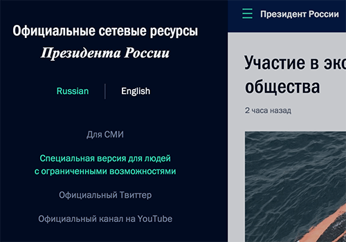
Q: It’s one thing to launch (or relaunch) a huge responsive site, but how do you maintain it consistently, both in terms of content and CSS/JavaScript? Have you built a pattern library or style guide?
Well, we have our own set of libraries that we either have already shared or will be sharing after tidying up. Earlier this year we released our back-end framework iktomi, as well as a set of tools for front-end, with the most popular being SVG maps and MaShaJS (MaSha = “mark and share”).
We don’t have a pattern library yet, but we are about to. In fact, we are working on a larger collection of components and recommendations; you can think of it as Bootstrap for Russian government websites. There you’ll find pretty much everything from guiding design principles to security and protection measures and hosting issues. Obviously we will share it with the entire community, too.
It will be a site where we’ll also collect hand-picked components and libraries that can be reused. Later it will grow into a place where standards will be born, patterns produced with perfectionism, and where the best people in the design industry will create assets collectively. It will also be a place where problems will be discussed and solved, and eventually transferred to pretty much any resource, including the government ones.
We hope this website will bring together best practices and techniques, that we can shape one shared style and vocabulary. And at some point we hope to achieve a level of quality necessary for other online government resources, too. We’ll be very happy to receive updates and feedback from other teams and their projects.
Q: Good stuff, Artyom. Thank you for your valuable insights, and for your commitment to sharing. I hope that the feedback you’ll receive once the site is launched, will be as helpful as you expect it to be.
Thank you. I’d like to kindly thank everybody who was involved in the design and development process behind Kremlin.ru. I’ll do my best to mention everybody: Mikhail Zhashkov (UX, design), Sergey Shapiro (Russian crest), Katrin Shapiro (Russian crest), Arthur Chafonov, Olga Romanova, Eugene Zhernoklev and the back-end guys. This work wouldn’t be possible without your hard work.
 (og)
(og)


