Visual elements are a huge part of online publishing. Whether you are creating social media updates, blog posts, eBooks or slide decks on SlideShare, if your post contains images, then you’ll get exponentially better engagement. So, having a streamlined process for creating eye-catching images is imperative. This article will walk you through how to do just that, as well as provide you with a starter kit of tools to kickstart your foray into the exciting world of quick-and-dirty (yet still super-cool) image creation!
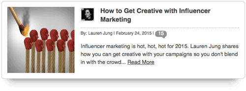
When I began dabbling with blog posts a few months ago, I quickly realized how important it is to turn in good imagery with each post. The second post that I published really drove this concept home for me because I was a little surprised to see the stock photo that the publisher had selected to pair with my post. I don’t want to say that it’s bad — it just wouldn’t have been my choice. I found it a little unsettling.
Around the same time, we relaunched our own blog and made some changes to our website, which forced us to revisit the issue of image creation. According to Alexandra Skey of Get Spokal, people remember photos six times more easily than text. What’s more, Blogpros’ study states that the 100 most popular blog posts average one image for every 350 words. Images are huge for sharing on social media as well. According to Citrix, nearly half of all Internet users have reposted a photo or video they’ve found online.
Further Reading on SmashingMag:
- How To Use Icons To Support Content In Web Design
- Icons As Part Of A Great User Experience
- 6 Easy Steps To Better Icon Design
- Easy Steps To Better Icon Design
With this in mind, I found that my content (whether blog posts, guest posts or eBooks) had an average of 10 images. As you can imagine, that ends up requiring a lot of time commitment. I’m probably not alone when I say that, for me as a designer, time management can be an issue. We designers often get something in our head that takes forever to execute, or we might not have enough in our head to get started, which inevitably leads us to the abyss that is Pinterest, looking for some bit of divine inspiration.
Each week, I do around four to five blog posts. So, knowing that I tend to get carried away with the design part, I started working on a process to streamline images management. In fact, my blog is what propelled me to come up with a system, but now I use it for all of our online publishing — and you can, too. Whether it be for website graphics, white papers or anything in between, my process has consistently made for fast, iterative production.
Now, three months later, I feel as though a super-efficient system is in place. Anyone can use the system, not just those of you who have mad Illustrator skills.
Get In The Right Mindset
Uncertainty and indecisiveness are efficiency killers, so do the following:
- Set your expectations.. You’re not designing a billboard for highways all over the world. This is online publishing. So, dial back your expectations a little. The images don’t have to be works of art; they need to be eye-catching and punchy. They need to add visual interest to your work so that readers aren’t forced to read through a 10-page essay sans pictures.
- Think in pictures.. I actually love this part of creating images because it’s almost like Pictionary. How do you translate the various portions of your work into images? The images need not replace the text altogether, but rather enhance the overall look, drive home the important points and provide enough visual interest to keep readers moving through the content. Your primary goal is to create something eye-catching and with enough relevance to make sense in the context.
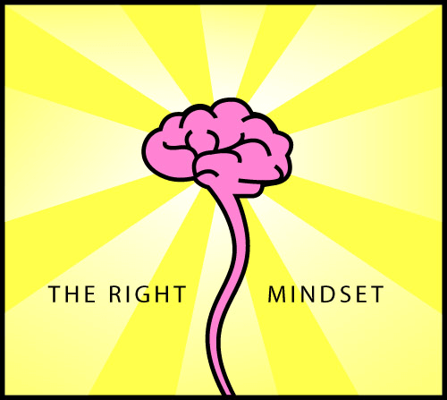
- Set time limits.. Time limits are super-helpful. Often the idea I think of first would take forever to execute, so keep a 5 to 10 minute limit on each image. Quickly analyze your options and select the one that is most doable in that timeframe. Challenge yourself to stick to the time constraints no matter what. For example, I wanted an image to sit above this very section illustrating how to get in the right mindset. Initially, I was thinking of a drawn person’s head with the brain visible, along with a lightning strike… or something. But that would be a huge pain, and in the end might not even make sense. So, brain + radiant beams of light. Done!
What You’ll Need
Start With an Enormous File of Icons
This is the most important part because it will set you up for a copy-and-paste workflow later on. Putting this together might be a day’s work if you want to do a thorough job, but it will be worth it.
The bulk of the icons may be general, while some will need to be specific to your business. I’ve been compiling an Illustrator file full of icons over the last few years. I created most of them myself and bought a few.
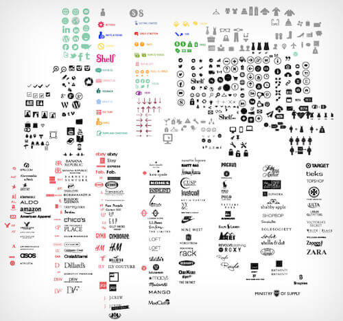
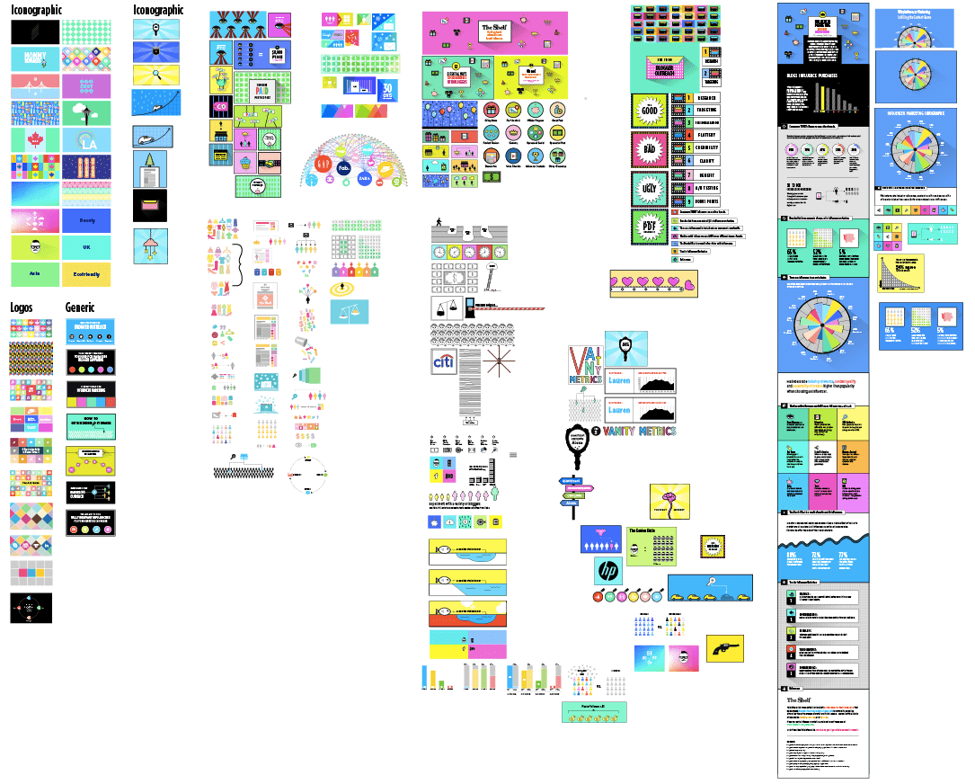
If you’ve been designing for a while, then you might have icons scattered across various projects. Now is the time to grab those and put them in one big file, like the one shown above. Regardless of the amount that you start with, you can fill in the blanks with open-source bundles. Frankly, Smashing Magazine has always been my go-to source for this:
- Freebie: Dashel Icon Set (45 Icons, SVG, PSD, PNG)
- Freebie: Swifticons Icon Set (92×3 Icons, AI, Sketch, PNG, SVG, EPS, PDF)”
- Freebie: Roundicons Icon Set (60 Icons, PNG, SVG, EPS, AI)
- Freebie: Responsive and Mobile Icon Set (100 Icons, PNG, PSD)
- Freebie: Tourism and Travel Icon Set (100 Icons, PNG, SVG)
- Polaris UI Kit + Linecons Icon Set (AI, PDF, PNG, PSD, SVG)
- Freebie: Boldons Icon Set (45 Icons, PNG, AI)”
While you’re pulling together your icons, consider grabbing some logos, too. We often write articles highlighting brands; and it doesn’t get much easier than using logos for blog post images. If you’re looking for brand logos, you can find almost any one in vector format just by doing a Google search for “[BRAND NAME] vector icon download.” Brands of the World is another good website for finding brand logos.
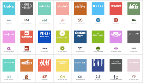
Really, you can find vector icons just about anywhere, so amassing a huge file of icons (even if you’re starting with nothing) is much easier than you might think. Just check the various licenses to make sure you have the right to reuse them, and then you’ll be all set.
Once you’re satisfied with the icons you’ve found, combine them all into one file. I’ve found that organizing them into groups to be useful, because I’ve wasted a lot of time searching for some icon that I vaguely remember having created in the past. Now, I know exactly where to look.
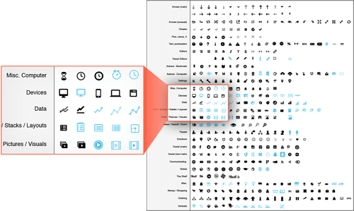
When you pull together your icon sets, you’ll need figure out which ones are relevant to your content. Many of the generic ones will be useful for just about anyone, so listed below are the generic groups included in my own set.


Recently, I’ve started creating several variations of the same icon. When creating images, I like to experiment with different styles and colors. So, when you’re creating an icon, go ahead and break it out into a few other styles: solid, outlined, textured, etc.

Once you’re finished with the icon file, you’ll find you will be using it all of the time, for many different purposes. Besides using them for blog posts, I’ve turned my entire collection into a web font, which has been worth its weight in gold! (Obviously, you’ll need to remove what you don’t need for a specific project to avoid performance issues!)
Inspiration Collection
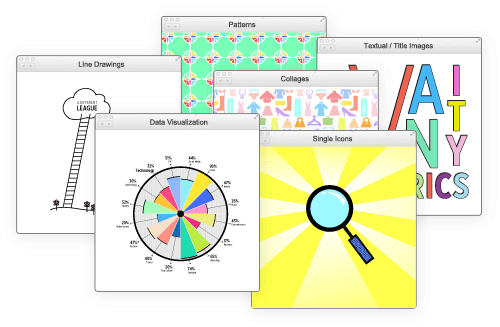
The second thing I’ve found really helpful is to compile a folder of style inspiration, which many people do. Grab images that would be good for your particular type of content. I really love the styles used by CoSchedule, Quick Sprout and Refinery29, and I often refer to them for my blog. Keep track of your inspirational images on Pinterest or in a desktop folder.
Because I’m neurotic about organization, I divide mine according to style (icons, patterns, pictograms, infographics, outlines, collages, etc.). Playing with a bunch of different stylistic approaches is fun when you’re creating images.
Swatches
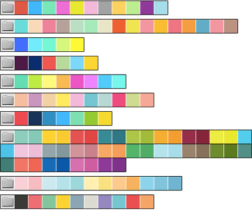
The final element that I find very useful in my process is putting together a variety of swatch sets. I’m partial to loud and mildly obnoxious color combinations, but that’s just me.
The simplest way to put them together is to find images whose colors you already like and just sample their color schemes. Take the image below (which I’ve blurred to focus on the colors). This image has an awesome selection of swatches that pair really nicely together.
Again, organization is always super-helpful! I separate my swatches into sets in order to keep track of which colors work well together, rather than deciding every time I work on a new project. That way, I go in and grab a set and I don’t need to think any further about color schemes, because I already know that the colors will work well together.
Now It’s Time To Create The Images
As mentioned, the goal with the above components (the icon, style and swatch collections) is to have a copy-and-paste workflow. That way, you can seamlessly mix and match the components for your content and be far more efficient in your creation process.
To begin the process, decide on an illustration style and swatch palette. From there, it’s just a matter of selecting the icons that best represent the various pieces of content in your post and then translating them into a predetermined style and color scheme.
I’ll walk you through some of my own examples and the exact process.
The Process
The first time we used this approach was for an article highlighting 12 items. For this, I wanted an illustration for each item in the list, so I started by grabbing simple icons from my collection. Finding imagery for 12 items wound up taking around 10 minutes. You’ll notice that some icons in this set are more targeted than others, but each was vaguely representative of the corresponding list item. When you’re creating images, this is all you’re shooting for because you want to keep the process as simple as possible.
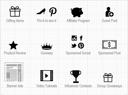
Prior to selecting icons, I figured out a style to emulate and a swatch palette (both chosen from predetermined collections). Style-wise, I landed on simple icons with solid colors, bright backgrounds and heavy outlines.

For a color palette, I knew that I needed something with at least 12 colors because I wanted a different background color for each list item. I ended up choosing a swatch group that contains a lot of fun, bright colors.

With my style and swatches picked out, the last thing to do was combine all of it together: the icons, style and color scheme. This part took maybe 30 or 40 minutes, and you can see the finished result below.
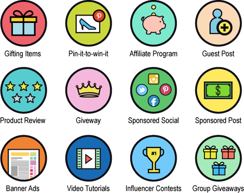
The last thing I needed was a cover image. For this, I recycled all of the graphics that I used and incorporated the post’s title. This added another 15 minutes.
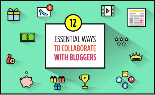
When everything was all said and done, I had a set of 12 blog post images plus a cover image, and the entire process took me around an hour to complete. Sweet!
Extending The Process
The beauty of the process outlined above is that I was able to create a series of images using one illustration style, and extending that style to other posts was more than easy. In the example below, you’ll see that the illustration style is quite similar to my first set. The compositions are more complex, though, and I introduced text to add a bit of fun to an otherwise dry topic. The blog post was about the US Federal Trade Commission, which is about as dry as it gets.
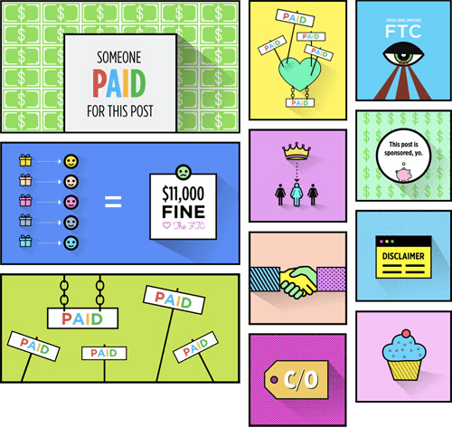
If you want a lot of variety, you can let your illustration styles evolve across your content. Prior to this, I was pairing bold outlines with bright colors. Once I felt good with that, I tried a set of images that remove most of the color and focus more on lines and texture. This transition was easy enough, and it added some nice variety to my content.
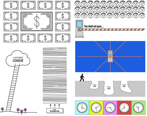
The beauty of this process is that it’s really flexible. You can spend more time creating detailed imagery (like the line drawings above), or you can totally slack off and still wind up with decent-looking images. Sometimes, when I’m in a big hurry, I’ll make images that consist of nothing more than simple icons dropped on top of colored backgrounds. Normally, this would feel like a copout, but it gets the job done and makes the post visually interesting.

Once you get good at banging out images at a rapid clip, kick it up a notch, with infographics.
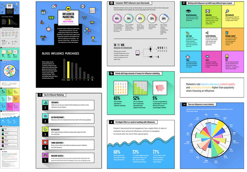
When I started creating infographics, I was pleasantly surprised that my process for generating images applies to them as well. I selected a color scheme and went with an illustration style that I was comfortable with. Most sections had icons from my icon collection, so that saved a lot of time. Start to finish, it wound up taking only about a day.
It’s all about reusing and recycling and mixing and matching to your heart’s desire.
Streamlining Further With Even More Recycling
Aggregate New Images Into One Big File
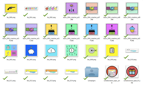
Once you’ve created images for more than a few pieces of content, you’ll actually have a fourth resource to draw from: a handy little repository of all of the images you’ve created to date. Whenever you start a piece of content, rather than starting with your base icon collection, you can recycle components of previously created images.
When I’m in a hurry, I slap together images in 10 minutes by mixing and matching and altering colors a bit.
Here’s one thing I often do. I’ll start with a graphic that I’ve created for my own blog.

Then, I’ll stick it on a background color and add some text and shadows. Bam! You’ve got yourself a header for your next article.

Knock Out Social While You’re At It
While you’re creating images for a piece of content, save time by taking care of social media images as well. We keep copies of all of our images in a big Google Drive folder, along with various color options for many of them. That way, anyone working on social media can access images whenever they need them, and they’ll have a nice set to choose from and experiment with. Having punchy visuals on social media is important; otherwise, you risk being lost in a feed of boring tweets and posts that no one even sees. According to Business 2 Community, tweets with images receive 18% more clicks, 89% more favorites and 150% more retweets than plain text.
Generic Header Images
Finally, having a bunch of generic header images that you can quickly repurpose is highly valuable. Yes, they can be a little lame, but they get the job done. Swap out colors, icons and text, and throw together new images at a moment’s notice. The headers will be punchy enough to be eye-catching but generic enough to be paired with just about any text!

Wrapping Up
If you’re publishing a lot of content, then high-quality images are vital to keeping readers engaged and coming back for more. But contrary to popular belief, you don’t need to resort to cheesy stock photos (like the one with the matchstick metaphor that jumpstarted my quest for a better process). Instead, easily create your very own images in-house with the process outlined above. Streamlining the process is imperative to online publishing because, if done right, it will speed up your efforts by far.
Free Download
So, in the spirit of speed, efficiency and fun, we’re providing a downloadable Illustrator file to jumpstart your efforts. Included in the file are several image types: simple icons, fancy subheaders, combination icons, header image templates, plus a bunch of tried-and-true swatch sets! Happy designing!
- Download the set for free (480 Kb, ZIP)
 (cc, ml, al)


