Whether it’s playful refresh states, subtle icon movements or complex transitions, beautiful animation is all around us.
Once considered an aesthetic luxury, animation is now used so commonly in modern web and mobile applications that entire websites are dedicated to UI animation patterns.
Further reading on Smashing:
- UI Animation Guidelines and Examples
- How To Integrate Motion Design In The UX Workflow
- Smart Transitions In User Experience Design
- Designing Navigation On Mobile: Prototyping With Keynote
While animations may have great visual appeal, they also make app experiences more intuitive and engaging. Animation can make an app feel more fluid and responsive by providing feedback on user interaction. This means that, for designers, creating authentic animations is increasingly becoming a part of the job description.
The Right Tool For The Job
Traditionally, designers have had to learn complex animation tools from scratch to produce even the simplest of motion graphics. In recent years, a slew of software has come out vying for the attention of prototypers and motion designers, such as Framer, Origami and Pixate, not to mention the old classics such as Adobe After Effects.
However, I found them all to be a bit of overkill for what I was trying to achieve. As a UI designer, I needed a rapid, easy-to-learn, familiar tool to animate my static designs. I needed to produce animations quickly, since my team was iterating quickly on a product we were working on. I also didn’t want to learn an entirely new software paradigm. A bonus would be a tool that integrates nicely in my existing static design workflow (I generally use Sketch and Photoshop).
In my quest to find a tool that is more suitable to these needs, I stumbled upon one that has been on my computer all along — Apple’s Keynote.
Keynote?
Most people know Apple’s Keynote as the PowerPoint equivalent on Mac OS X — presentation software. That is true, but it can also be used to produce surprisingly high-fidelity animations and prototypes. In fact, many employees at companies such as Google and Apple use Keynote on a daily basis for UI design, animation and prototyping.
Last year, Andrew Haskin, interaction designer at Frog, showed us just how powerful Keynote could be when he recreated Google’s material design animations entirely in Keynote.
Learning Keynote
Andrew’s video really piqued my interest in Keynote, and in the past year I’ve used the software to recreate many interactions seen in major apps, including Facebook Paper, Uber, Tinder, Snapchat and more. You can see a reel of that below.
Keynote is fairly easy to pick up, because most people have used some sort of presentation software in their life. It is very much like PowerPoint if you’re familiar with it, so the interface is recognizable and you will immediately understand how to create and edit slides.
One of my favorite aspects of animating in Keynote is that it is straight to the point — there is no code, complicated timelines with keyframes or unnecessary functionality for designers.
The major legwork of the animation is done with Keynote’s “Magic Move” transition effect. With Magic Move, all you need is a beginning and end slide, and you can edit any number of properties between them (scale, position, rotation, etc). Keynote takes care of the rest by intelligently filling in the gaps, creating a seamless transition from one slide to the next.
Magic Move saves a ton of time, and complex animations that would have taken much longer in other tools take seconds with Keynote.
Overall Workflow
To demonstrate how to use Keynote, I’ll recreate a very simple interaction model popularized by Tinder: the left and right swipe animation. Download the assets for this project (link fixed!) (ZIP, 360 KB).
The basic idea is to create the first screen of the animation (beginning) and the last screen of the animation (end). Keynote will intelligently take care of the rest with the Magic Move transition.
Set Up the Document
Open a blank white presentation. By default, Keynote will create a presentation-sized document (1024×768px). Let’s change that to more of an iPhone-sized document.
Go to the “Document” tab in the top right. Under the section “Slide Size,” go to “Custom Slide Size,” and make the size 350 (width) × 667 (height) pixels.
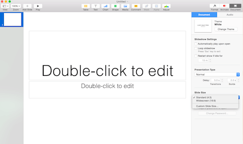
Now, let’s import the images. This step is as simple as dragging the image files from your folder onto Keynote’s canvas.
First Slide
Once you’ve dragged your assets over, you can position them visually. Keynote has useful guidelines that appear contextually, helping you to align the design.
Keynote will assign a z-index to each asset according to when it was imported — it doesn’t have a layers panel. In case you need to change the ordering of the stack, all you have to do is select the asset and right-click (Cmd + click) to bring up the menu, then select “Bring to Front.”
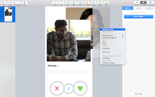
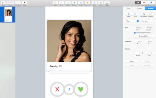
If you want to lay out assets with pixel-perfect values, rather than by eye, go to the “Format” → “Align” section and input exact numerical values.
End Slide
The second screen will be the last frame of the animation. Rotate the top image and position it off screen — this will be the end position.
The first thing to do is duplicate the first slide we’ve been working with. In the left-hand panel, right-click and select “Duplicate” in the menu.
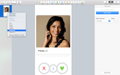
Let’s begin by rotating the top asset. To rotate, hold down Cmd, and a rotated-arrow icon will appear in the corner of the selected asset. Then, click and drag to rotate.
Now, position the tile off screen.
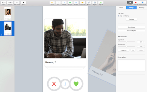
Magic Move
Now that we have the start and end positions, let’s animate this.
Select the first slide, and go to the “Animate” tab on the left. Under “Transitions,” select “Add an Effect” and choose “Magic Move” in the dropdown.
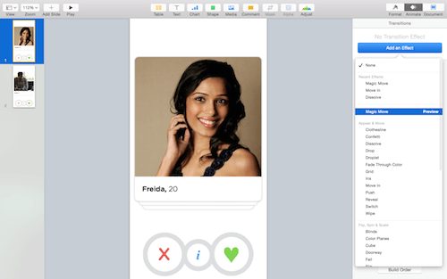
Magic Move is a transition effect that moves an object from a position on one slide to a new position on the next slide. It intelligently fills the gaps between the slides by moving, fading and scaling the object.
Timing and Acceleration
Magic Move has only two settings, duration and acceleration, which really help your animation look the best it can.
Duration is self-explanatory — it refers to timing, and the correct value is determined case by case. I find that the sweet spot for UI animation is usually somewhere between 0.7 and 1.5 seconds.
The acceleration section has four options:
- “none”: Same speed throughout the animation
- “ease out”: Starts slow, then speeds up
- “ease out”: Starts fast, then slows down
- “ease out and ease in”: Starts slow, speeds up, then slows down again
For our example, I am using 0.90 seconds for the duration, and “ease in and ease out” for the acceleration setting.
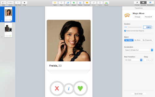
Our Animation
Below is the final animation, with some added effects. You can download the Keynote file (ZIP) to see how the rest was done.
What Else Is Possible?
Obviously it’s a very, very simple example. We’ve just scratched the surface of what can be done in Keynote. Magic Move is the simplest of techniques. For more finesse, you can use Keynote’s build ins and build outs.
Build Ins and Build Outs
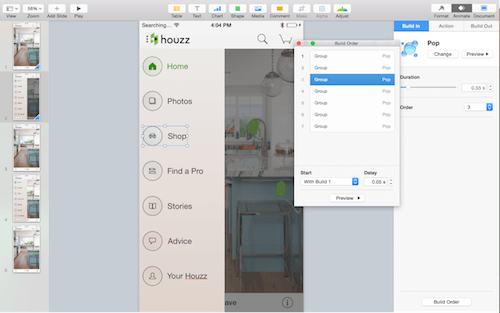
Build in refers to how an object appears for the first time, and build out refers to how an animation leaves the screen. These are both object-based animations, rather than slide-based (like Magic Move). In other words, every asset can have its own independent animation.
For example, if you want an animation to scale in and bounce a bit, you would use a build-in effect called “Pop.” If you want the object to fade out, you would use the build-out effect “Dissolve.”
To apply a build-in or build-out effect, select any object on the screen and go to the “Animate” tab. There should be three sections: “Build In,” “Actions” and “Build Out.”
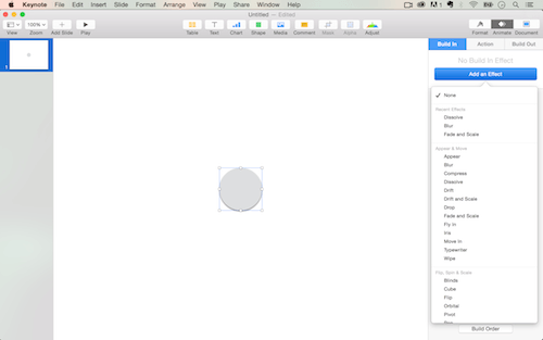
Build-in animations have a number of options. I use only a handful for UI design most of the time:
Complicated animations can have many build ins and build outs, and timing when each one appears is important. To do this, open the “Build Order” menu at the bottom of the “Animate” tab, and adjust the timing in the menu.
Sketch and Photoshop Integration
Keynote integrates in my design workflow nicely. Importing from Photoshop, Sketch or Illustrator is as simple as copying and pasting into Keynote. I often design in Sketch and copy and paste over to Keynote to quickly infuse some motion into my static mockups.
A few tips. Copy and paste layer by layer, or else Keynote will combine them, which you don’t want in most cases, especially if you’re animating individual pieces.
Also, if you copy and paste text, it will not retain its text properties, and you will not be able to edit it anymore. When dealing with text, make sure that your copy has been finalized or that you are able to recreate the text in Keynote.
Prototypes on Device
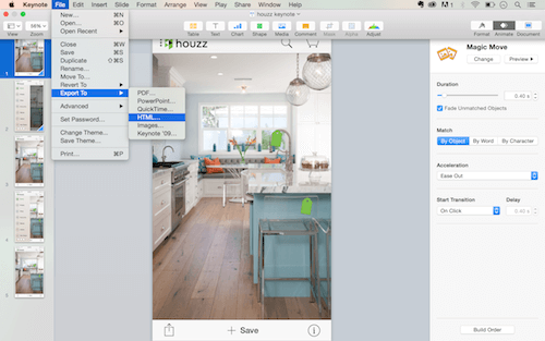
You can also create a prototype and put it on your device using the Keynote app for iOS. It’s as simple as using the “Adding Links” tool to link to different slides in a presentation. Below is an example of an app designed, animated and prototyped in Keynote.
When sharing prototypes with clients and stakeholders, you can export them as HTML and they will be clickable in a browser. Note that the code will not be production-ready; the design will have to be recreated for the final product.
Conclusion
Whether you’re a designer, product manager, developer or anyone else working on a product, Keynote is a great way to communicate ideas quickly. The speed, gentle learning curve and quality of output all make it an ideal tool for your arsenal.
To recap, Magic Move is the simplest and quickest of animation types in Keynote; it is used between slides to animate from a beginning state to an end state. Build ins, actions and build outs are used on individual objects in a slide; they control how things are presented for the first time and how they leave the screen.
With enough practice, you can do virtually any type of animation in Keynote. Many other examples show Keynote being used to create high-fidelity animations.
Keynote comes free with Mac OS X Yosemite and above. Give it a try, and happy animating!
 (da, ml, al)


