The lowly form input. It’s been a part of HTML for as long as HTML has had a formal specification; but before HTML5, developers were hamstrung by its limited types and attributes. As the use of smartphones and their on-screen keyboards has flourished, however, inputs have taken on a new and incredibly important role — but they’re also riddled with browser and device inconsistencies.
The eight original input types were brilliant in their simplicity. (Well, OK, maybe <input type=“image”> hasn’t aged very well.)
Further Reading on SmashingMag:
- The Problem Of CSS Form Elements
- Auto-Save User’s Input In Your Forms
- How I Ended Up With Element Queries
- Forms On Mobile Devices: Modern Solutions
Think about it: By inserting a single element in your markup, you can tell any web browser to render an interaction control, and you can completely modify that interaction – from a text field to a checkbox to a radio button – by simply changing a keyword. Now imagine a world where creating these interactions means also creating custom interaction controls, and you begin to realize how taken for granted inputs really are.
Unfortunately, even Tim Berners-Lee and Co. couldn’t have anticipated the strain that mobile devices and interaction-hungry web applications would place on these original concepts for user input.
That’s what the HTML 5.0 specification was intended to solve, by expanding the concept of the text input to allow for specific data types, such as numbers and email addresses, as well as rich interactions, such as task-specific on-screen keyboards and date- and color-pickers. Most were designed with graceful degradation at their core, adding enhancements to supported browsers while falling back nicely to basic text inputs in older ones.
Or at least that was the intention. In the real world, many of these new inputs and attributes — even seemingly innocuous types like <input type=“number”> — don’t always behave as you might expect.
Identifying The Problem
While not as fierce as battles of yore, input types are the cause of a new small-scale browser war. Despite the existence of standards, browser and device manufacturers have cherry-picked input feature support and taken different approaches to implementing these enhanced interactions.
Take date. Using <input type=“date”> is a godsend to any front-end developer who has ever had to add a JavaScript-based date-picker to a website… or at least it would be if all browsers supported it. Desktop versions of Chrome and most mobile browsers display a native date-picker:
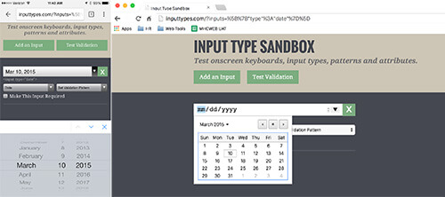
date input type in Chrome for iOS and Mac (View large version)However, as of Firefox 36 and Internet Explorer (IE) 11, that same input type defaults to a plain ol’ text field, forcing developers to use polyfills or to continue building JavaScript-based date-picker solutions instead.
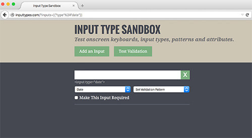
date input type defaults to a plain text field in Firefox 36. (View large version)The lack of date input support in Firefox seems at odds with the vendor’s overall support for these more visually and functionally advanced input types. For example, the range input type (<input type=“range”>), which emerged from the same crop of proposed features as date, has been supported since Firefox 23 and IE 10.
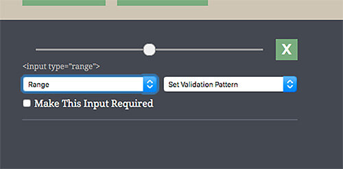
range input type since version 23. (View large version)In fact, IE’s implementation, although not the most visually attractive, has some added utility, allowing you to see incremental divisions within the range, as well as its current numeric value on mouse drag.
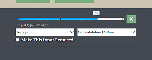
range input type shows incremental divisions and its current numeric value on mouse drag. (View large version)We’re used to dealing with mixed browser support for emerging features. But when it comes to inputs, there’s a bigger problem: Even when an input feature is supported, it’s not always implemented in the same way across browsers or mobile platforms. Developers now have to take all of the following aspects of an input into account:
- type. Does the input’s type reflect the data that’s being entered (for semantic and validation purposes), and does it also trigger the correct keyboard in Android?
- validation pattern. Does your pattern allow for the correct characters to be entered, and does it also trigger the correct keyboard in iOS?
stepattribute In certain browsers, do the small up and down arrows associated with a number input allow the user to increment or decrement their input in the correct steps?requiredattribute If an input is required, do itstype,patternandstepvalues all contribute to the format you’re expecting, and is this true across all browsers on mobile and desktop?
Imagine a situation in which you need to add a required input field for currency, and you want to display the best possible keyboard experience across all devices. “Simple,” you think, adding <input type=“number” required> to your form. This works great for Android:
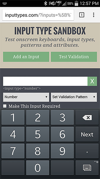
number input type. (View large version)In iOS, your keyboard would be improved (the top row will show numbers):
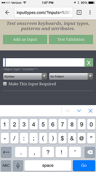
number input type contains the number keys. (View large version)But that’s still not the fancy 10-key keyboard Android gives you. To achieve something similar in iOS, you need to set a pattern attribute with a value of [0-9]*:
<input type="number" pattern="[0-9]*" required>
In iOS, this combination gives us this:
![Setting the pattern attribute to [0-9]* prompts iOS to display a number pad.](https://cloud.netlifyusercontent.com/assets/344dbf88-fdf9-42bb-adb4-46f01eedd629/58274a75-7e49-4a4f-836c-65631abe1d61/05-number-pattern-ios-example-opt-small.jpg)
pattern attribute to [0-9]* prompts iOS to display a number pad. (View large version)I believe this implementation to be a fundamentally shortsighted decision on Apple’s part. Not only does it ignore the input’s type altogether, it’s also based on a pattern that’s hardcoded into the OS, which means that if you alter that pattern in any way, you will lose the keyboard enhancement entirely in iOS.
In our currency example, this creates a problem, but not where you might expect. A required input with a number type and a pattern of [0-9]* will give us great results across mobile, but it’s easy to forget that these decisions also affect desktop browsers. On desktop, we can’t control the user’s keyboard, and if they enter a special character (such as a comma or dollar sign, which are both plausible for currency), both the type and the pattern will cause it to fail client-side validation. (In older versions of Chrome, decimals also cause validation errors, although adding step=“any” solves this issue.) You can see the problem here:
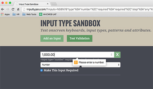
This leaves developers in a bit of a lurch. We can choose to enhance one mobile OS experience at the expense of the other, enhance both of our mobile experiences at the expense of desktop, or enhance our desktop experience at the expense of mobile. And none of these options would make our stakeholders very happy.
Zip It Up
Although currency is one of the most illustrative examples, almost any input that needs to allow for alphanumeric content with special characters can cause some of the heartburn that comes with using these new input types and patterns. This includes social security numbers, phone numbers or any number that could be entered in an unknown format, such as a bank account number. For this next example, let’s examine one that’s often overlooked: US ZIP codes.
Without giving them much thought, ZIP codes seem relatively simple: most people immediately think of them as a five-digit number. So, we can just use <input type=“number”>, right? Wrong, for two reasons.
The more obvious reason is the extended US ZIP code format (i.e. 12345-6789). Although it may be less common, allowing our users to enter it this way is still important. And we also need to keep non-US users in mind, because several countries (including Canada and the UK) use letters and other special symbols in their postal code formats. Semantically, ZIP codes aren’t numbers: They’re numerical codes — you’d never refer to a certain ’90s teen television drama as “Beverly Hills Ninety Thousand Two Hundred Ten.”
The second reason is a little subtler: some ZIP codes on the far east coast of the US begin with a zero.
If you’re validating these fields, special characters will immediately cause a validation issue, and in many browsers (including old versions of Chrome), so will that leading zero. That means not being able to use a number input type and, therefore, no enhanced keyboard for Android.
Android users may be out of luck, but can we still enhance for iOS? If you want to validate the field, the answer again is no, caused in large part by Apple’s decision to base its enhanced keyboard on a single hardcoded validation pattern. If we want to use <input type=“text” pattern=”[0-9]*”> (the hardcoded pattern that triggers iOS’s 10-key keypad), our users won’t be able to enter special characters or letters. Even if you disregard non-US users and use a pattern that allows for extended ZIP codes, such as <input type=“text” pattern=“(\d{5}([-]\d{4})?)”>, you’re still not going to get back that enhanced iOS experience that would benefit users.
These currency and postal code examples also don’t take into account support for other attributes that can be slapped on form inputs, such as autocapitalize, autocomplete and autocorrect. Autocapitalize and autocorrect are features created by Apple that work in iOS and Safari but aren’t officially part of the HTML specification and will fail W3C validation. Autocomplete, on the other hand, is part of the official specification, but as of version 34, Chrome ignores and overrides this attribute by default to support its built-in form autofill functionality.
It probably goes without saying, but also very little can be done to support users who install third-party keyboards on their devices. After all, if your user’s on-screen keyboard looks like two video-game joysticks or a rotary telephone, then you will very likely be unable to reliably control how it responds to advanced input types and attributes.
Send In The Hacks
As with most standards issues, there are workarounds, and there are problems with the workarounds. The one I’ve seen advocated most frequently for dealing with numbers and currency is the use of <input type=“tel”>, which creates the closest thing we’ve got to a cross-platform 10-key keyboard solution:
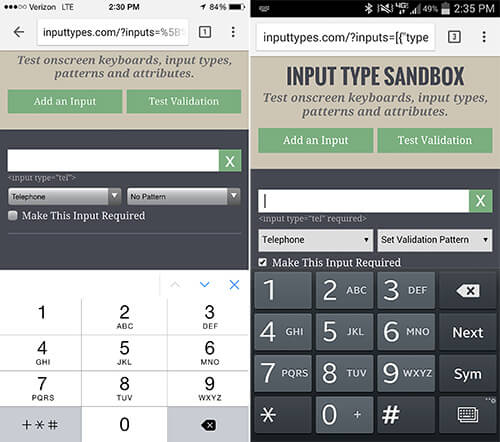
tel will display a 10-key keypad on both iOS and Android. (View large version)This does produce a 10-key keypad on Android and iOS, without enforcing a pattern on desktop. But as you can see by this keyboard’s secondary screen, it’s also clearly not a best practice:
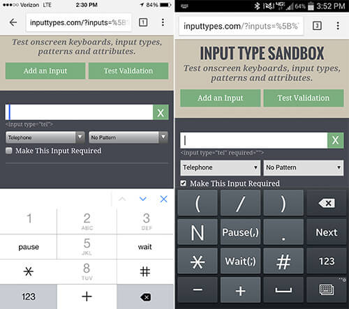
tel input type’s secondary keyboard is telephone-specific. (View large version)Do we really want to present users with a phone keypad that includes keys for “pause” and “wait” when they aren’t actually entering a phone number? And what happens to our websites if mobile platforms and browsers change the way telephone inputs are handled?
The second most common solution I’ve seen is to use JavaScript to strip special characters from inputs as our users enter content into them. This will get the job done, but it’s arguably not a good user experience. Users might be confused when the text they enter doesn’t appear on screen, or appears momentarily and then disappears.
Common Sense And Communication Are Key
Both of these solutions hark back to the days of using star and underscore CSS hacks to sidestep odd behaviors in old browsers (especially IE 6) — and we shouldn’t go there again. These hacks are a conscious decision to sidestep standards and best practices to complete the task at hand, without giving much thought to what will happen to our code base as browser support matures and feature implementations evolve.
Another solution may be on the horizon in the form of the WHATWG’s proposed inputmode attribute. By using this attribute, developers could declare a specific state that hints at which input mechanism would be most helpful, with a predefined fallback state. For example, <input inputmode=“tel”> would fall back to a numeric state if a device’s keyboard doesn’t support telephone input, and <input inputmode=“numeric”> would display a number keyboard but also allow for negative numbers and a thousands separator. Unfortunately, support for this proposed attribute is still extremely limited, and just like input types and patterns, we’ll have to wait and see if it’s implemented consistently across all browsers and devices.
For now, adhere to each input type’s intended purpose if you want to future-proof as much as possible. Assume that the rules for what triggers specific keyboards and behaviors on all platforms and browsers can — and will — change.
If you do use these newfangled input types and patterns, then test, test and test again, on as many devices as you can get your hands on. I created Input Type Sandbox, a utility for trying out different combinations of types, patterns and attributes, for exactly this purpose.
Not shying away from discussing this up front with stakeholders is also important. It’s willful ignorance to think they’ve never used an enhanced keyboard on their mobile device and that they wouldn’t want the same experience on their own website. I can say from personal experience that if your website’s forms are lengthy, you’ll save hours of explanation and rework if stakeholders are made aware of the possibilities and limitations of form inputs from the beginning.
A Call To Action For Platforms And Browsers
The real issue here has nothing to do with the wonderful new abilities that HTML5 inputs give to us developers; the patchwork of support and implementation are the problem.
The only true solution is for all browser vendors and device manufacturers to operate from the same playbook. Specifically, we need to demand the following:
- Browser vendors need to support all standards-based input types as soon as possible. A powerful new feature on one platform isn’t truly powerful until it’s commonplace enough for us to confidently use in the real world.
- All mobile platforms should follow the same rules for what invokes a particular on-screen keyboard. Personally, I think Android has the right idea in using
typeand not the validation pattern, as iOS does. But what matters is not the method, but consistency. - Client-side validation needs to work consistently across all browsers and platforms, and soon.
Tracking every browser vendor and device manufacturer’s plans for supporting this patchwork of types and patterns is tricky, although we can glean some information from their bug-tracking and support websites. For example, Microsoft says <input type=“date”> will be supported in its upcoming Spartan browser. This leaves Firefox as the lone holdout, despite a Bugzilla ticket that’s been open since 2012. I can’t find any official comment on whether Mozilla plans to add support anytime soon.
I also wasn’t able to find any information on Apple’s plan to enhance or alter its keyboard inputs for iOS, although its “Text Programming Guide for iOS” still recommends (inaccurately, I believe) using its notorious hardcoded <[0-9]*> pattern for ZIP codes.
In the near future, I expect most of these inconsistencies will be resolved, and we can once again start taking these glorious form inputs for granted all over again. But until that happens, let’s all agree to stick to the standards and best practices that have gotten us so far in the first place.
 (og, al, ml, il)


