The navigation system is often the most important and complex user interface component of modern websites. In recent years, small screens, responsive website techniques and ever-evolving hardware and software have only added to this complexity.
A quick query of “mobile navigation” returns thousands of opinions on navigation patterns, including the “hamburger” menu, front-end plugins, frameworks and plenty of other tools. Despite this changing landscape of tools and design trends, a successful navigation system sends users on the path to the exact content they need at the right time.
In this article, we’ll explore the beginnings of the design process, as well as techniques specific to mobile ideation, and a unique idea for building a prototype navigation system in Keynote (yes, Keynote).
Establish A Foundation
A designer probably wouldn’t be able to know what a navigation could or should look like without first understanding who will be using it and why. Having a foundation of research to draw upon when defining a website’s information architecture will help you make better decisions and gain consensus among stakeholders more quickly.
Navigation is such a critical component of a website that when it’s poorly designed, the entirety of the website suffers. The process of crafting a navigation system that works well across many form factors, screen sizes and types of users will likely look very different from one project to the next. It’s a balancing act involving stakeholder opinions, business goals, technical constraints, content strategy and user behaviors. Research can guide us through this process by helping to inform our priorities (both of users and of the business), our key tasks and goals, and how success is measured.
Where to Start
The obvious place to start when thinking about crafting effective navigation for any screen size is the website’s content. If the website is big enough or has a lot of legacy content, this might mean conducting an audit. If a website has less structure, then an inventory of general content groups and audiences might suffice. Audit, inventory or otherwise, ignoring content until you’re well into the design is risky, as Sara Wachter-Boettcher reminds us:
“You’re sure to end up with problems, like a navigation system that only works for two levels of content when you actually have four levels to contend with, making all of that deeper information accessible only with hard to manage (and find) text links — or, worse, making it completely inaccessible except through search.”
Understanding a website’s content doesn’t necessarily mean knowing every sentence that will be on every page. Some content probably won’t even exist when you’re designing the navigation. That’s OK. Think about the higher-level questions, such as:
- What content groups exist?
- What does their taxonomy look like?
- What audience(s) do they serve?
- What relationships exist between these groups?
- What is their priority (from the perspectives of both the business and users)?
These will directly shape how users find their way around your website. On small screens, even greater prioritization is needed to make sure that real estate is used most effectively. Knowing the content well is one piece to this puzzle — how people perceive and use the content is another.
Talk to People
The collective knowledge that is gained from talking to users and stakeholders will inform more than just the navigation on small screens. It will pay dividends throughout the design process and well into development.
Talking with users and stakeholders doesn’t have to be a formal interview process. Candid conversations could yield more honest and helpful results. Stay focused on what you need to get out of each interview, and try to get the subject to talk without prodding them with too many questions.
Before conducting an interview, list the things you want to get out it. For example, to get your subject to talk about things that you need in order to design better navigation, you could focus on the following:
- What different types of people will be visiting this website?
- Do they expect different things?
- What is their purpose in coming here?
- What are the priorities of the business?
- Does this conflict with its users?
- How does use of the device affect expectations?
- What are the current navigation’s strengths and weaknesses?
- What are the landing pages or means of entering the website?
- Through which channels do users enter the website?
- At which points do users exit the website?
- What other websites accomplish similar tasks?
- How are they successful or unsuccessful?
Primary research with users and stakeholders provides personal perspectives and can give you a sense of the priority of content. If you have access to the website’s analytics, they could add depth to your findings from interviews and vice versa. Looking at popular landing pages, user navigation flows, bounce rates and drop-off pages tells a story of what is working with the navigation and what is not — especially on mobile devices.
Get Messy
Sketching is often the first step in synthesizing insights gained from research into actualized designs. More than anything else, sketching provides an easy format to quickly prove ideas to yourself, peers, stakeholders and sometimes even users. By their nature, sketches lack detail, which frees their viewers to have uninhibited conversations about how details could emerge.
Sketching different solutions could spark a dialogue, highlighting the strengths and weaknesses of each approach, while further defining the problem to be solved. One of the goals of sketching is to get as many ideas on paper as possible. To get this process started, you could create a framework for collecting many different ways to solve the problem, and then further define the details of each. In one such framework, you would fold a letter-sized sheet of paper in half twice, giving you four quarters (sized almost perfectly for mobile), and then you would sketch a distinct navigation approach in each quadrant. When the page is filled, you will have the beginnings of four different ways to realize the website’s navigation.
At this point, you probably don’t have enough detail to determine each design’s strengths and weaknesses, and more definition is likely required. To further explore each idea, take four more sheets of paper and dedicate one entire sheet to sketching the different states and details of each approach (for example, opened, closed, selected).
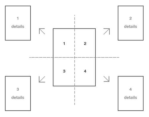
While sketching, think about how various navigation elements could work together as part of a larger system to help users find their way around the website. A website with a deep content structure, including many different page levels, would probably need multiple way-finding components. On small screens especially, spreading some of the responsibility of the navigation across these components is effective. For example, these elements might include a combination of a multilevel primary navigation, a contextual section-level navigation, and interactive breadcrumbs. In this case, the user probably doesn’t need to see every navigational component at the same time on every page.
Working this out by sketching pages at different levels within the website’s architecture is a good way to start making decisions and setting expectations with peers and stakeholders. Consider what type of navigation elements should be displayed on each page level and how these element would affect each other.
Showing exactly the right amount of navigation at the right time takes a lot of thought and planning. As ideas are discussed and as consensus forms around a sketch, it might be necessary to develop these ideas into an artifact that is closer to the actual design. While sketches document high-level thinking, articulating components such as motion design, interaction design and content in more detail could be crucial to determining how well you actually execute the navigation system.
Get Real
One can create a robust user experience prototype in a lot of ways today. You could use a web-based app like InVision or build pages in HTML and CSS or create a paper prototype, to name a few. These methods all have different strengths and weaknesses, and each would fit a given team’s design processes to varying degrees of success.
The most successful artifacts communicate the right amount of detail at the right time during a project. The most efficient designers focus less on the tool being used and more on what needs to be communicated at a certain point in time. In a talk given last year, designer Chris Cashdollar urges designers to create artifacts that “find the highest amount of consent with the least amount of time spent,” calling this the “minimum effective artifact.”
Creating efficient artifacts could mean jumping right into the code for some, or using another medium to further define and test the design’s details for others. This next step largely depends on the size and skills of the team responsible for it, the intended audience of this artifact, and the project’s timeline. Further describing the intent of a design might not require learning a new tool or skill at all. Some of the most basic methods are already a part of the team’s toolkit and can be creatively adapted to this purpose.
Use What You Know
I wasn’t keen on the idea of using a “non-design” tool like Keynote to create an animated prototype at first. What sold my team was that our project had a very tight turnaround time, a limited number of people and a need for a certain level of animation fidelity. Although Keynote is not a tool specifically for designing interfaces, as others have pointed out and as I can attest after having tried it for myself, it works remarkably well.
We looked into other popular tools, including InVision, Framer and Apple’s Quartz Composer. However, the combination of time constraints, cost, fidelity and flexibility made this particular project well suited to Keynote. We found that the investment of time up front to learn this tool was very little, and because Keynote has a low learning curve, almost any team member could quickly understand how to use it. Additionally, there was no cost for my team to use this software because Keynote is free on Mac OS X 10.8 (Mavericks) and higher.
Keynote limits its documents to a relatively small canvas area, so it is not well suited to designing large or long pages. Its value lies in describing the interaction and motion design of particular UI components. This size constraint does work well for mocking up mobile navigation patterns, and it can even be used to define some aesthetic elements.
You need to understand a few fundamental pieces of the software in order to get started with Keynote for UI design:
- working with basic shapes, text and color;
- importing other types of media (vector graphics, PNGs, JPGs, etc.);
- layering groups of shapes together;
- using the “Magic Move” transition to animate between slides;
- animating components within a single slide.
When beginning a mobile design in Keynote, set up the document to the size of a realistic viewport. This will help to hide things such as off-canvas navigation, parts of the page outside of the current view (i.e. parts that require scrolling to see) and any non-visible states of the UI that will need to be shown as part of the artifact. To generate this viewport, start with a new blank Keynote presentation. In the first slide, create four rectangles on each side of the slide, leaving an empty space in the middle.
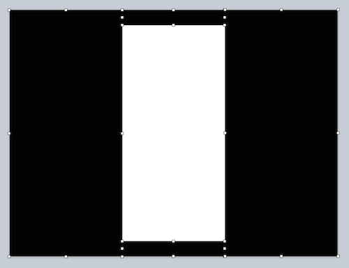
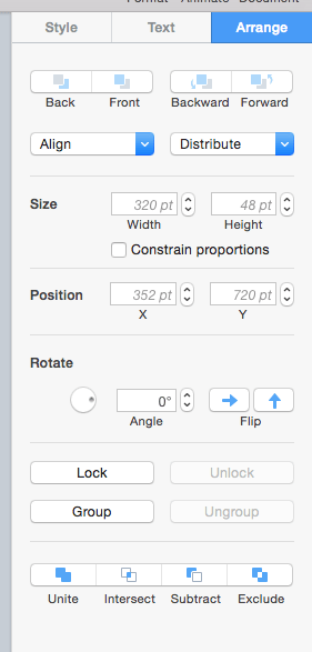
These rectangles will not be edited at any time later, so locking them will make sure they aren’t accidentally selected or moved around.
Next, we can begin to give shape to the default state of the primary navigation, using shapes, text and other assets to represent this UI. Following the decisions made during sketching, our research findings and the information architecture of the website, we can create the beginnings of this navigation in Keynote. After the navigation has been mocked up, select all of the elements and then click the “Send to back” option, which will move the navigation bar off canvas behind the black rectangles.
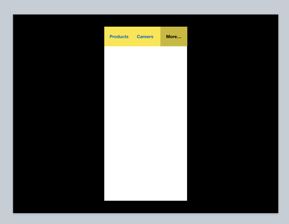
The next step is to think about how the other states of this navigation will come together to form a system. In the example above, what happens when someone taps on the “More” item? We can mock this up by duplicating our original slide and creating this new state. In this case, we slide the primary navigation to the left, exposing the “More” item. The navigation bar is moved behind the rectangles that we originally created to frame the viewport. We can also create a new panel showing the additional navigation elements.
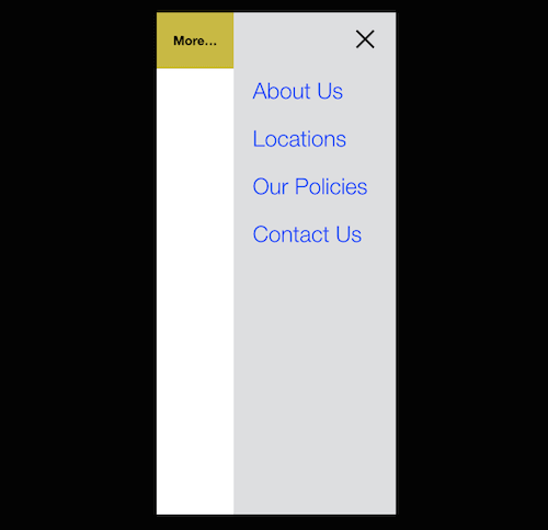
Now we have two slides in this presentation, each representing a different state of the navigation. To accurately depict how to get from the first default state to the open state, we can use a Keynote transition named “Magic Move.” Magic Move automatically generates the animations needed to send shapes in one slide to different positions in the next slide (similar to tweening in Flash). Notice that our second slide has new elements (the additional navigation panel that we created), and Magic Move won’t know how to treat them, so it will fade them in by default. Because we want this panel to slide in, we will need to copy and paste it to our first slide and put it in its original position beyond the viewport (behind the black rectangles).
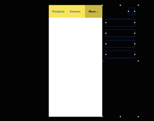
We can now let Magic Move do its magic by selecting the first slide and going to the “Animate” tab in the inspector and clicking “Add an Effect.” Once the transition is created, we can use the “Preview” function and adjust the timing to represent how fast or slow this panel should slide in.
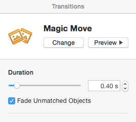
Success! This menu now slides open in an animation. Let’s add the reverse animation, making it slide closed. To do this, we simply duplicate our first slide and order it as slide number three. Then, we add the same exact Magic Move transition to the second slide, which will create the animation of the menu sliding back to its default position. In the end, it will look something like this:
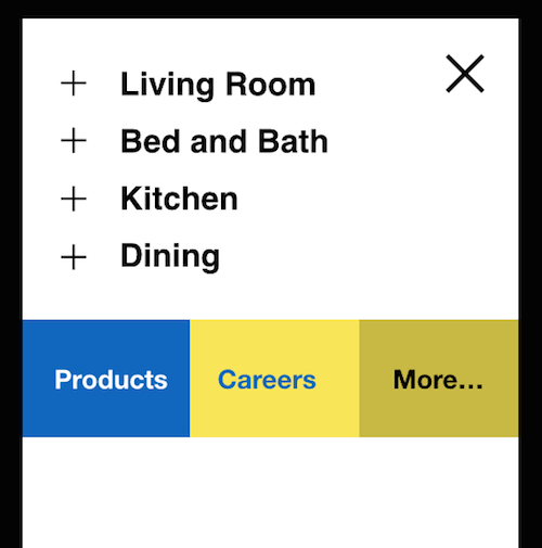
One of the great things about Magic Move is that it works not only for positioning elements, but also for color changes, opacity and rotation. For example, in the screenshot above, I have set the color of the “Products” text to go from blue to white. Magic Move handles this transition the same way it handles the positioning of the navigation bar. In the expanded state of the menu, we can see the plus sign rotate into an “X,” allowing the user to close that grouping. Putting this entire transition together, we now have this:


