There are many options available for prototyping mobile user experiences, but if you need to prototype native apps for mobile devices you should take a look at Proto.io when evaluating potential choices. This solution has many features for designing and prototyping mobile apps, including built-in component libraries for specific devices, great support for gestures and transitions, and an app that allows for easy viewing on actual hardware.
But the first thing to know is that unlike most prototyping tools, Proto.io is a web application, so you’ll need an internet connection to do your work. This is a drawback compared to other options likes Axure RP, Blueprint, Justinmind, or iRise. It can have an impact if you plan to work somewhere where Wi-Fi connections don’t always live up to their promise, like on a flight, in an airport, or in a hotel.
Further Reading on SmashingMag:
- Optimizing Your Design For Rapid Prototype Testing
- Building Clickthrough Prototypes To Support Participatory Design
- Content Prototyping In Responsive Web Design
- Resurrecting User Interface Prototypes
But assuming you’ll have access when you need it, Proto.io offers a lot for mobile designers to love, built right into the app.
The Pros
- Built-in widget libraries for iOS 7 and 8, Android 4 (KitKat), and Windows 8 devices. It’s nice to not have to load third-party libraries to get started, although you can add your own assets to your library if Proto.io doesn’t have the control you need. You can also create prototypes for 280×280px Android Wear devices or at custom screen sizes for web apps. Justinmind also has an excellent set of widget libraries available as separate downloads.
- Player app for iOS and Android.. This allows you to access a prototype you have published just by opening the app without having to access the URL as you have to with AxShare, the free cloud-based hosting service from Axure. You can, however, open Axure prototypes in fullscreen mode from your desktop on iOS devices if you’ve already added them to your home screen.
- Support for Windows 8 prototypes (although it lacks a Windows player app, so you have to access a URL). Windows 8 use is growing, but it is not supported by every prototyping tool. Justinmind also has built-in support for Windows 8 devices.
- Support for many mobile gestures and transitions (more on that below). Justinmind also has great support for a variety of mobile gestures and transitions.
- Variables that can be stored and used to alter the display of content based on conditions and user interactions. This is a characteristic shared by Axure, Justinmind, and iRise.
- Starter projects for common interface models like sliding menus and tabbed apps. This can be a real time-saver if you know you’ll use these in your prototype. Axure also make sample projects available through the Axure forums.
The Cons
- No way to create functional specifications.. Although there is support for comments and conversations in Proto.io, you cannot generate detailed requirements documents like you can with Justinmind, Axure, or iRise. If this is a necessary feature in your workflow, it’s a serious drawback.
- Limited version control.. If robust version management on a page or screen level is something you need for your team, Axure, Justinmind, or iRise are better suited for that. Proto.io does back up each saved version of the entire project, but not at a page or screen level like the Team Projects feature in Axure. The lack of page-level versioning can be a serious problem in settings where several designers are working on large prototypes with lots of pages.
- It’s a web app. Being web-based means internal network conditions or internet latency can affect your work. In some highly controlled corporate or government workplaces, you may not be able to reach the Proto.io site, and may have to work with your security team to get access.
Creating A Simple Email Prototype
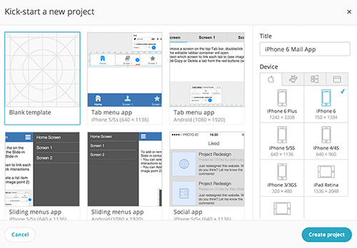
Now I’ll walk you through the steps to create a very simple email prototype targeted for the iPhone 6 using Proto.io’s library of iOS 7 and iOS 8 components. Creating a prototype in Proto.io is drop-dead simple. Once you create your account (free for the first 15 days before you have to choose a paid plan) you can set up your initial project with just a few clicks.
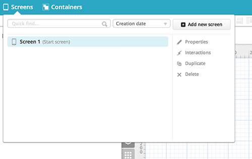
Once you create a project, it’s time to start adding some screens. In the Screens panel, you’ll find a list of the screens in your prototype. To change the names of screens (which you definitely want to do), their orientation, or their background color, select Properties from the right side of the panel.
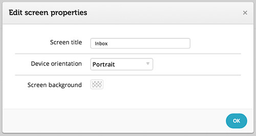
In the Edit screen properties dialog you can rename the screen. For my prototype I’ll leave it with the default portrait orientation.
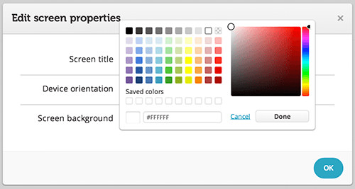
You can also change the background color from the Edit screen properties dialog by selecting a color or adding your own HTML hex code.
If you want to add a background image instead of using a color, you can use the image component to upload one to your project library. You should make sure the image is sized correctly for the device you’ll be displaying it on.
Now that I’ve set up the first screen, it’s time to start adding some components to it.
The UI Components Library
Use the components library on the right-hand side of the workspace to add UI elements to a prototype. You can choose from a list of mobile UI and other libraries to get the components that match your needs. The available libraries also include icons and common ad banner sizes if those are part of your design. You can also upload your own images to a project gallery.
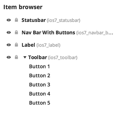
Once you add components to your prototype, they will appear in the Item browser on the left side of the workspace.
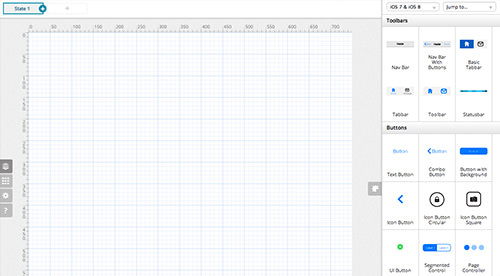
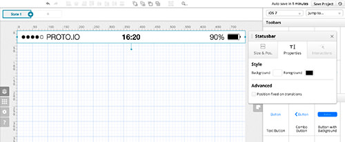
The first component I’ll add to the prototype is the iOS status bar, one of the many components in the iOS 7 library. The status bar has a default appearance of a black background with white text, but that can be changed in the editor’s Properties pane. The Properties pane is the floating panel that appears whenever you select an component, and is where you manage settings for size and position, interactions, and other properties of a component.
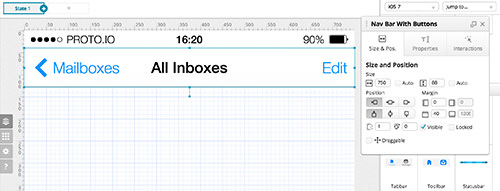
The next component I’ll add is a navigation bar with buttons that appear right under the status bar. This control is located in the toolbars section of the iOS 7 library.
Now I’ll add a toolbar to the bottom of the screen for the update messages for the inbox. To do this I’ll add a toolbar component, a text label, and set the correct icon to compose new messages.
After dragging the toolbar to the canvas, position it at the bottom of the screen. I’ll have to change the default icons and add a text label next.

Now I’ll have to remove the first four buttons and change the fifth to the iOS compose message icon. To remove an icon, you click on it and then click the X icon in the Properties tab. When you remove a button icon from a toolbar, a reference to the button remains in the component. But because it has no icon or interactions associated it, it is effectively empty space.
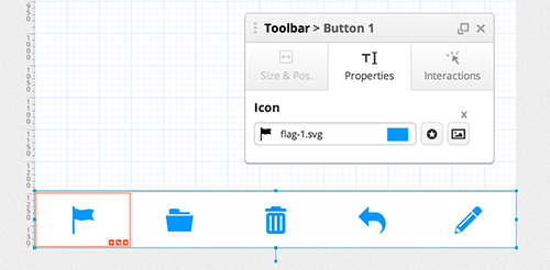
To change an icon, you select the button to expose the Properties tab. To change the pencil icon to the compose messages icon I’ll have to either filter the icon gallery to UI components and scroll through the icons, or search the entire gallery using the word “edit”.
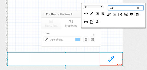
Now I just need to add a text label to complete the default state of the inbox toolbar. Later I’ll add two states for when the inbox is being updated.

Before I add any other components, let’s take a look at the Item browser. The Item browser is the area of the editor that lists all the widgets on a screen. You can drag items up and down in the list to organize them, but be aware that items closer to the top of the list are stacked on top of the items beneath them. In the toolbar I created I want the label component to be placed above the toolbar. As you drop components on top of others on the canvas, Proto.io organizes them in the correct order in the Item browser.
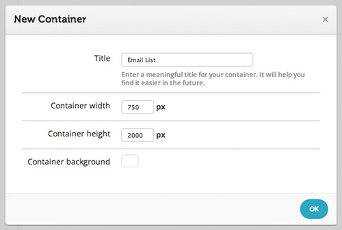
Now I just need to create an email list and the default view of the inbox will be complete. To create the email list I’ll use a container so I can make it scrollable within my prototype when it’s viewed on a device. Containers in Proto.io can be used to create scrollable areas of the screen or carousels.
To create my email list I will use a set of text components. I also want to add some interactivity to the prototype by linking the email item in the list to an email message screen. To do that I’ll add a new screen called Email Message.
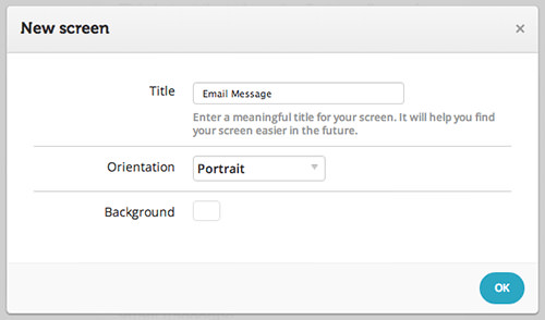
Now that I have a page to link to, I’ll build my email list item and will link the name of the sender to the Email Message screen.

I will title my interaction “Link to Email Message” so it’s easier to remember what it does. I’ll also set the trigger to be a simple tap.
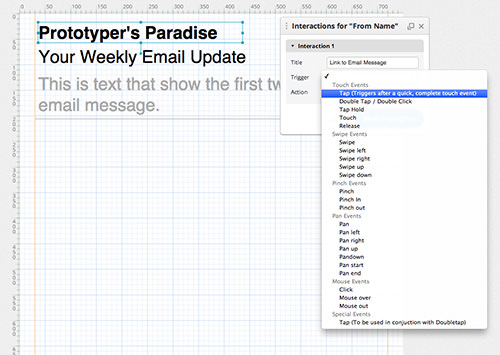
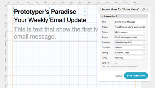
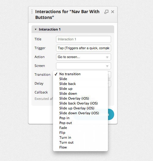
Once I set the title and trigger for an interaction, I just need to finish the interaction by selecting the screen I want to display, the transition to use, and its duration. Once this is complete my screens are connected.
After I have created one email entry I will select them all and group them by right-clicking and choosing the Group option from the contextual menu. When items are grouped you’ll see the link icon to the right of them in the Item browser. To make my components easier to work with I will rename them, which you can do by double-clicking on the name in the Item browser or clicking on the name in the Properties pane.

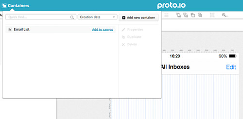
I’ll select the grouped email list and just copy and paste until the same components fill the entire container. Now I just need to add the container to my canvas. Containers are added to screens by opening the screen in the canvas and selecting the Add to canvas option from the Containers menu.
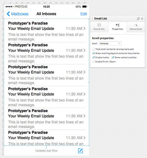
Using the Properties pane for the Email List Container I will set options to allow vertical scrolling, enable inertia to have a more realistic behavior when the list is flicked, and to show the vertical scrollbar. I’ve also resized the container to fit between the nav bar and the toolbar, but this has no impact on the content inside the container itself.
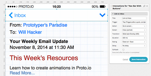
Now I need to link the email message screen back to the inbox. To do that, I’ll build a screen with status bar and nav bar with buttons components. For the nav bar component, each section can have its own interactions. For my simple prototype I just want to have the message screen link back to the inbox when the nav bar’s left button is tapped.

Gestures and Transitions
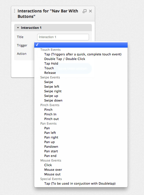
Although my prototype uses simple tap gestures, Proto.io supports many gestures and transitions for various mobile platforms. Below are the available gestures, called Triggers in Proto.io.
Handling Device Orientation Changes
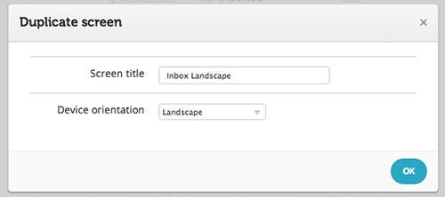
To handle changes in device orientation you have to create a second screen designed for the new width and height of the device. I will do this for the inbox screen by duplicating it and setting its orientation to landscape. I include “Landscape” in the name, even though it is indicated by the icon in the Screens panel, because it’s easier for me to find the correct screen when scanning a long list of names.
Once you have created the landscape version of your screen you need to add an interaction to the portrait version of it that will be triggered when the prototype detects a change in device orientation and causes the landscape version to display.
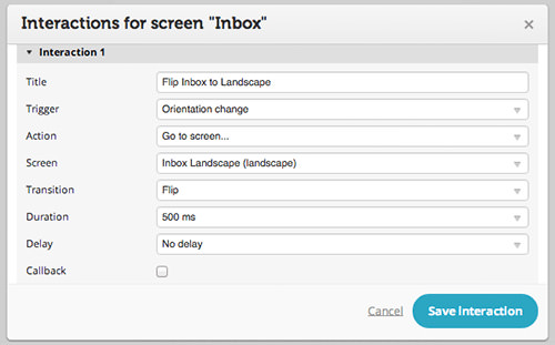
You’ll also have to create a duplicate interaction for the landscape version of the screen for when the user flips their device back to portrait orientation.
One thing to consider is the default orientation of your prototype. In my example, the inbox in portrait mode was the default screen. If your prototype is meant to be viewed in landscape orientation, you can set one of your landscape screens as the start screen for when the application first loads in the Proto.io player app (more on that below).
One disadvantage Proto.io has over a tool like Axure is that changes on a screen for one orientation are not reflected on another screen for a different orientation. This is a feature Axure calls “inheritance” that is part of its Adaptive Views. In Proto.io, both screens have to be changed if the content needs to be updated.
This is an example of where the combination of HTML and CSS is better than both tools because you can code displays that can handle a variety of screen sizes using media queries. However, you have to be a proficient coder to go that route, so it may not be an option.
Managing States
The last feature I want to explore in this prototype is using and managing different states for screens and containers. States allow a screen or container to have different views that can be triggered by interactions. This allows for more realistic and robust prototypes.
For my sample project, I want to make two areas of the inbox screen a little more dynamic by using states. Specifically, I want to update the text message at the bottom of the inbox screen twice when checking for mail. I also want to display a spinner graphic in the Email List container when the prototype is checking email and then display another state for the container that includes two new messages. Both of these state transitions will be triggered when a user swipes down on the scrollable email list.
Below are the second and third states created for the Email List container. You can create as many states as you need by click the “+” button to the right of the existing states at the top of the canvas area.
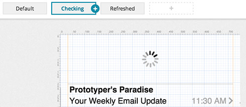
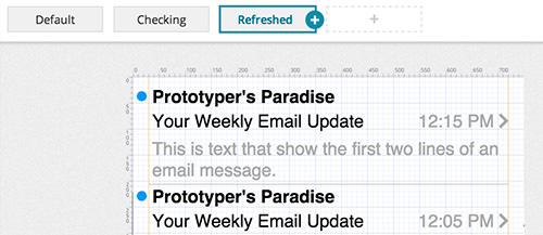
By using Proto.io’s callback feature I can chain these state changes together. Callback allows you to trigger another action at the end of the current one. In the example below I use a swipe down gesture on the Email List container to trigger five connected state changes. For the inbox label, the prototype will cycle through two states with different messages before returning to the default state. The Email List container will change state to the second one with the spinner before changing to the third state, in which the email box is now refreshed with two new messages. For each of the actions, you set a delay to give your prototype a more realistic pause.
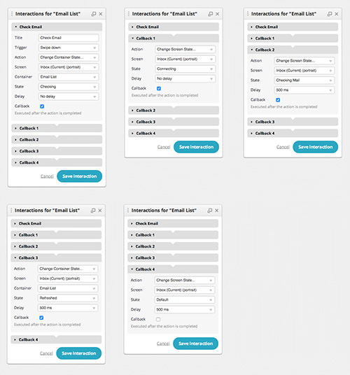
With these actions completed, the prototype is ready to test and publish.
Previewing And Publishing
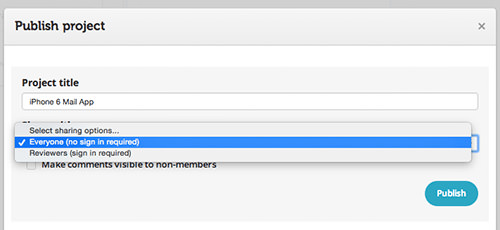
Your can preview your prototype in a new web browser tab by clicking the Preview button at the top-right of the editor. When the new tab opens, your prototype will be shown in a container that represents the mobile device you are targeting. This is a quick way to test interactions and check the correct elements of your prototype are visible on the screen without scrolling.
When you publish your prototype it is available for display on real devices that have the free Proto.io player app for iOS or Android. You can also decide when publishing if you want anyone who knows the URL to be able to see the prototype or if you want to restrict viewing to other Proto.io users who are invited by email and must sign in to view your work.
Online Training
Because this article looked at a simple prototype using some basic features, you should explore Proto.io’s wide selection of videos, documentation, forums, and webinars to learn more. See the section with further resources below for links to training materials and demonstrations of popular apps like Instagram and Swarm that have been prototyped in Proto.io.
Conclusion
Proto.io is powerful solution for prototyping native and web apps for use on a variety of devices. The learning curve is a bit steeper than with Axure, the tool with which I’m most familiar, but it can be mastered with a little time and practice. Proto.io’s real strength is its built-in support for many device types and native app libraries, and its support for gestures and transitions. If you are prototyping Android, Windows, or iOS native apps, Proto.io is a good option. But it may not be right for you if you need a tool that supports robust versioning or have to generate detailed functional specifications for your prototype.
Further Resources
- Editor interface introduction
- Demonstration prototypes of popular apps
- Video, documentation, and forums
- Webinars
- iOS Player app
- Android Player app
 (da, il, og)


