The list of charting libraries for the web is already quite long, and you might ask yourself why we would need to make it any longer. Whenever you need to develop an application’s dashboard, embed some usage statistics or simply visualize some data, you will find yourself looking for a charting library that fits your needs.
Chartist was developed for a very particular need: to create simple responsive charts. While other charting libraries do a great job of visualizing data, something is always missing to satisfy this simple yet demanding need.
Further Reading on SmashingMag:
- Designing Flexible, Maintainable Pie Charts With CSS And SVG
- The Do’s And Don’ts Of Infographic Design
- Create An Animated Bar Graph With HTML, CSS And jQuery
- Fun With Physics In Data Visualization
In this article, we’ll show you how to use Chartist to create your own beautiful responsive charts. You’ll learn some key concepts of Chartist, how to easily extend it and also some advanced features, like responsive configuration overrides and the animation API.

Your Individual Setup
You can integrate the Chartist library in your project in many ways. It’s available from Bower and NPM but also directly from a content delivery network (CDN). It’s also exposed as a CommonJS module, as an AMD module or just in the global window object. You can decide on the best way to integrate the library according to your project’s setup.
Chartist currently uses a Universal Module Definition wrapper, to satisfy a broad range of use cases. Instead of using Chartist directly from the Chartist namespace in the window object, you could use module loaders, like RequireJS, or bundle your charts into your application with Browserify or webpack.
Bower
To install Chartist as a front-end dependency using Bower, simply execute the following command in your project’s folder:
bower install chartist --save
NPM
If you prefer NPM as a repository or if you’re using a CommonJS browser bundler like Browserify or webpack, then you’ll want to install Chartist using NPM:
npm install chartist --save
CDN
Another quick way to get started with Chartist is to use a CDN. The folks at jsDelivr do a fantastic job of keeping a huge number of libraries up to date with their custom load balancing, and they do it all for free. To use Chartist’s resources from a CDN, include the following in your HTML:
<script src="//cdn.jsdelivr.net/chartist.js/latest/chartist.min.js"></script>
<link href="//cdn.jsdelivr.net/chartist.js/latest/chartist.min.css" rel="stylesheet" type="text/css" />
Create Your First Chart
Once you have chosen the method that fits your needs, you can start crafting your first chart. Over the course of this article, we’ll use JSBin to create our charts. JSBin is a great collaborative web development debugging tool, and Chartist is available directly in the “Add library” menu. If you’d like to try out Chartist quickly, I’d recommend using JSBin.
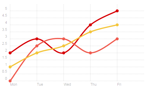
Let’s start with a simple line chart. For this, we’ll first add a container element to our body with the class ct-chart.
<!DOCTYPE html>
<html>
<head>
  <script src="//cdn.jsdelivr.net/chartist.js/latest/chartist.min.js"></script>
  <link href="//cdn.jsdelivr.net/chartist.js/latest/chartist.min.css" rel="stylesheet" type="text/css" />
  <meta charset="utf-8">
  <title>Chartist | Simple line chart</title>
</head>
<body>
  <div class="ct-chart"></div>
</body>
</html>
Now we can initialize a line chart on the container with only a few lines of JavaScript. Let’s create three series, with five values each. We’ll also set a list of labels for the x-axis. As a second argument, the Chartist.Line constructor accepts an options object. Here, we can specify a fixed width and height for our chart.
new Chartist.Line('.ct-chart', {
  labels: ['Mon', 'Tue', 'Wed', 'Thu', 'Fri'],
  series: [
    [2, 3, 2, 4, 5],
    [0, 2.5, 3, 2, 3],
    [1, 2, 2.5, 3.5, 4]
  ]
}, {
  width: 320,
  height: 240
});
Responsive Containers With Intrinsic Ratios
In the example above, we used a fixed width and height for the chart. This is not always desired, and in responsive design we should keep our elements fluid and not think in fixed dimensions.
Chartist uses its own classes to set containers with fixed aspect ratios (intrinsic ratios). Usually, this is a technique applied to responsive videos and iframes, and it uses the intrinsic ratio CSS trick to establish a fixed ratio container. With the implementation in Chartist, you can even set the width of a container while preserving the aspect ratio.
Let’s use one of the generated responsive container classes in Chartist to size our chart. I’ve picked ct-golden-section, but you can choose any from the list of generated container classes. When using the Sass version of Chartist, you can also generate your own fixed-aspect-ratio containers easily.
<body>
  <div class="ct-chart ct-golden-section"></div>
</body>
Because we are now specifying a container with a fixed aspect ratio on our chart, we no longer need to rely on fixed dimensions when initializing our chart. Let’s remove the width and height in our configuration.
new Chartist.Line('.ct-chart', {
  labels: ['Mon', 'Tue', 'Wed', 'Thu', 'Fri'],
  series: [
    [2, 3, 2, 4, 5],
    [0, 2.5, 3, 2, 3],
    [1, 2, 2.5, 3.5, 4]
  ]
});
Now we have a chart that responds to changes in media. Try resizing the output panel on JSBin to see how the chart adapts to changes in window size.
Advanced Configuration
One of Chartist’s core principles is a clean separation of concerns via standard web technologies. This includes applying all appearance-related settings with CSS. Also, a number of settings allow you to control the behavior of your chart. These settings are applied using JavaScript and can be passed to your chart during initialization.
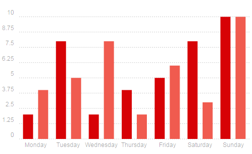
Let’s create a simple bar chart that visualizes some data for weekdays.
new Chartist.Bar('.ct-chart', {
  labels: ['Monday', 'Tuesday', 'Wednesday', 'Thursday', 'Friday', 'Saturday', 'Sunday'],
  series: [
    [2, 8, 2, 4, 5, 8, 10],
    [4, 5, 8, 2, 6, 3, 10]
  ]
}, {
  seriesBarDistance: 30,
  axisX: {
    showGrid: false
  }
});
In the options, we can control the distance of the bars and tell Chartist not to render the grid on the x-axis. For a complete list of options, you can always visit Chartist’s API documentation.
By default, the labels on the x-axis are left-aligned. To make them center-aligned, we need to add a CSS style. We also want to change the bar’s width to 20 pixels.
.ct-chart .ct-bar {
  stroke-width: 20px;
}
.ct-chart .ct-label.ct-horizontal {
  text-align: center;
}
Already, we’ve got a nice-looking bar chart for large screens.
Responsive Configuration Override
The example above works nicely on desktop screens, but not on devices with tight screen resolutions. The bars are too wide, the labels too large and the names of the weekdays are written in full. Also, the distance of the bars needs to be adjusted.
Some of these changes can be done in CSS by modifying the bar’s width in a media query. But how do we go about applying different configurations in JavaScript? Chartist provides a mechanism for this purpose called responsive configuration override.
Let’s look at the previous example and rewrite it with a mobile-first approach. We’ll optimize our media queries for the content we’re working with, introducing a breakpoint at 300 pixels and another at 600 pixels.
.ct-chart .ct-label.ct-horizontal {
  text-align: center;
}
.ct-chart .ct-bar {
  stroke-width: 5px;
}
@media screen and (min-width: 300px) {
  .ct-chart .ct-bar {
    stroke-width: 10px;
  }
}
@media screen and (min-width: 600px) {
  .ct-chart .ct-bar {
    stroke-width: 20px;
  }
}
If we’d like to tailor our chart to a particular medium, we can use the responsive configuration overrides. We simply tell Chartist to inherit and override our configuration based on the same media queries in our CSS. Chartist uses window.matchMedia to implement an inheritance in our settings similar to what CSS does with our styles.
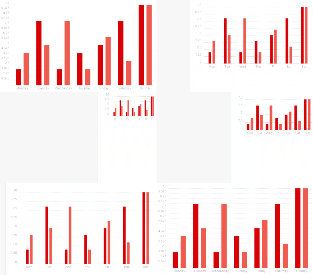
The following example uses labelInterpolationFnc to pass a function that enables us to interpolate or even replace the label’s original value for the given axis. This means we can control how the weekdays’ names are displayed on the x-axis.
new Chartist.Bar('.ct-chart', {
  labels: ['Monday', 'Tuesday', 'Wednesday', 'Thursday', 'Friday', 'Saturday', 'Sunday'],
  series: [
    [2, 8, 2, 4, 5, 8, 10],
    [4, 5, 8, 2, 6, 3, 10]
  ]
}, {
  seriesBarDistance: 6,
  axisX: {
    showGrid: false,
    // Only return first letter of weekday names
    labelInterpolationFnc: function(value) {
      return value[0];
    }
  }
}, [
  // Over 300px, we change the bar distance and show the first three letters of the weekdays
  ['screen and (min-width: 300px)', {
    seriesBarDistance: 15,
    axisX: {
      labelInterpolationFnc: function(value) {
        return value.slice(0, 3);
      }
    }
  }],
  // Over 600px, we increase the bar distance one more time and show the full weekdays
  ['screen and (min-width: 600px)', {
    seriesBarDistance: 30,
    axisX: {
      labelInterpolationFnc: function(value) { return value; }
    }
  }]
]);
In the example above, you can see how easy it is to create a chart that works on both mobile and desktop, while maintaining a clean separation of concerns.
Styling SVG With CSS
Styling inline SVG with CSS is easy and efficient because you’re able to reuse styles for different charts. You can include CSS classes that define the look and feel of your charts and that keep the logic separated from the appearance.
Here are some of the most useful CSS properties for styling inline SVG:
fillSets the color of a shape’s fill. You may use RGBa.strokeSets the color of the outline around your shape.stroke-widthSets the width of an outline.stroke-dasharraySpecifies a dashed stroke for an outline.stroke-linecapSets the line-cap stroke for the outline of a shape. This can be set toround,buttorsquare.
Check the SVG 1.1 specification for a complete list of SVG styling properties.
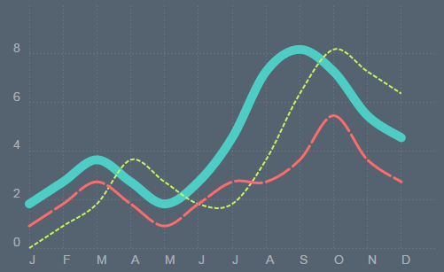
Let’s apply our new styling skills and create a line chart with three different looking series. We’ll use all of the above styling properties to give our chart a unique look.
.ct-chart .ct-label.ct-vertical,
.ct-chart .ct-label.ct-horizontal {
  color: rgba(255, 255, 255, 0.5);
}
.ct-chart .ct-grid.ct-vertical,
.ct-chart .ct-grid.ct-horizontal {
  stroke: rgba(255, 255, 255, 0.1);
  shape-rendering: crispEdges;
}
.ct-chart .ct-series.ct-series-a .ct-line {
  stroke: #4ECDC4;
  stroke-width: 10px;
  stroke-linecap: round;
}
.ct-chart .ct-series.ct-series-b .ct-line {
  stroke: #C7F464;
  stroke-width: 2px;
  stroke-dasharray: 5px 2px;
}
.ct-chart .ct-series.ct-series-c .ct-line {
  stroke: #FF6B6B;
  stroke-width: 3px;
  stroke-linecap: round;
  stroke-dasharray: 30px 5px;
}
If you play around with this example a bit, you’ll quickly see how easy it is to style SVG with CSS. Also, you might have noticed the shape-rendering: crispEdges style on the grid lines. While I haven’t included the shape-rendering property in the list of useful styling properties, you’ll find it quite handy in some situations. It allows you to give the browser some hints on how to render SVG. The values auto, optimizeSpeed, crispEdges and geometricPrecision are supported by the specification. Intended for performance control, this property is also handy for rendering certain shapes without anti-aliasing. In some charts, including the example above, making the grid lines look very crisp with the crispEdges value has a very nice effect.
CSS Animation Craziness
I’m a huge fan of animation… well, as long as it supports the content and conveys information to the user. It can mean the difference between a UX playing nicely and not. Google’s material design is a great example of functional animation design. However, for this article, we will not focus on functional animation, but instead go a bit crazy with the possibilities at our disposal. Browser support for animation of SVG properties is pretty stable now, and you can even animate the stroke-dasharray and stroke-dashoffset properties. Let’s enhance the previous example with some meaningful animation.
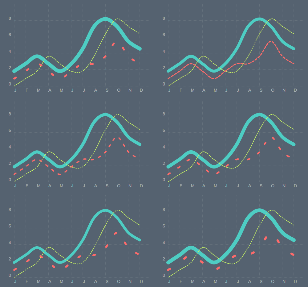
Simply by using some CSS3, we are able to create some crazy animations in our chart.
@keyframes width-pulse {
  0% {
    stroke-width: 6px
  }
  50% {
    stroke-width: 14px;
  }
  100% {
    stroke-width: 6px;
  }
}
@keyframes dashoffset-seven {
  0% {
    stroke-dashoffset: 7px;
  }
  100% {
    stroke-dashoffset: 0px;
  }
}
@keyframes dasharray-craziness {
  0% {
    stroke-dasharray: 7px 2px;
  }
  80% {
    stroke-dasharray: 7px 100px;
    stroke-width: 10px
  }
  100% {
    stroke-dasharray: 7px 2px;
  }
}
.ct-chart .ct-label.ct-vertical,
.ct-chart .ct-label.ct-horizontal {
  color: rgba(255, 255, 255, 0.5);
}
.ct-chart .ct-grid.ct-vertical,
.ct-chart .ct-grid.ct-horizontal {
  stroke: rgba(255, 255, 255, 0.1);
  stroke-dasharray: 2px;
  shape-rendering: crispEdges;
}
.ct-chart .ct-series.ct-series-a .ct-line {
  stroke: #4ECDC4;
  stroke-width: 10px;
  stroke-linecap: round;
  animation: width-pulse 2s infinite;
}
.ct-chart .ct-series.ct-series-b .ct-line {
  stroke: #C7F464;
  stroke-width: 2px;
  stroke-dasharray: 5px 2px;
  animation: dashoffset-seven 200ms infinite linear;
}
.ct-chart .ct-series.ct-series-c .ct-line {
  stroke: #FF6B6B;
  stroke-width: 3px;
  stroke-linecap: round;
  stroke-dasharray: 30px 5px;
  animation: dasharray-craziness 10s infinite linear;
}
As you can see, styling and animating SVG using CSS is a lot of fun. If you’d like more information, I recommend the article by Sara Soueidan “Styling and Animating SVGs With CSS.”
Animating With SMIL
CSS animation is a great way to inject some life into a chart. There are some things you can’t animate with CSS, though. If you want to animate individual parameters of an SVG element to morph a shape, then you would use the Chartist.Svg APIs to conveniently create SMIL animations.
SMIL is powerful, but the declarative API, which uses <animate> elements, can be confusing in its complexity. Chartist offers a high-level API that enables you to easily take advantage of SMIL animations in your charts.
The goal of Chartist is to simplify the handling of SMIL while preserving the semantics specified by the W3C. Chartist uses its own SVG manipulation library, which is accessible through Chartist.Svg. Similar to jQuery, it provides a wrapper object around real SVG DOM nodes, giving you some convenient methods to manipulate the underlying SVG. You can get a complete overview by browsing the Chartist.Svg API documentation.
To animate an SVG element, you first need to obtain a wrapper object by passing an SVG node to the Chartist.Svg constructor.
var element = new Chartist.Svg(document.querySelector('#my-specific-svg-element'));
You can then call the animate function on your wrapped element with an animation definition object:
element.animate({
  opacity: {
    dur: 1000,
    from: 0,
    to: 1
  },
  x1: {
    dur: '1000ms',
    from: 100,
    to: 200,
    easing: 'easeOutQuart'
  },
  y1: {
    begin: 1000,
    dur: '2s',
    from: 0,
    to: 100
  }
});
This will create three SMIL <animate> elements, each of which contains the SMIL animation attributes specified in the definition objects. The Chartist animation API has a few particularities. The begin and dur (i.e. duration) properties may be specified as unitless numbers; Chartist will convert the numbers to milliseconds automatically. Chartist also supports an easing property in the animation definition object that is not directly supported by SMIL. The easing property allows you to specify an easing function from Chartist.Svg.Easing, which will be translated to a SMIL interpolation function.
Chartist handles SMIL animations in a special guided mode by default. The guided mode includes the following behavior, which makes handling and optimization easier for immediately triggered animations:
- Before the animation starts (even when delayed with
begin), the animated attribute will already be set to thefromvalue of the animation. beginis explicitly set toindefiniteso that it can be started manually without relying on the document’s begin time (i.e. creation).- The
animateelement is forced to usefill="freeze". - The animation is triggered with
beginElement()in a timeout, where the beginning of the definition object is interpreted in milliseconds. If no beginning is specified, then the timeout is triggered immediately. - After the animation, the element’s attribute value is set to the
tovalue of the animation. - The
animateelement is then deleted from the DOM.
You can also disable guided mode by passing false as the second argument to the animate function.
Animating Chart Elements Using the Event API
Chartist provides a few events that you can use to intercept the creation process of charts. The draw events of Chartist get triggered each time a chart element is created in the DOM. Since we have the Chartist.Svg wrapper and all relevant data available in the event callback, this makes it a perfect spot to add our animations.

This example looks more like a confetti party than a chart, but it should illustrate how easy it is to create custom animations. The example makes use of the Chartist event API and adds animations to points in a line chart.
var seq = 0;

chart.on('created', function() {
  seq = 0;
});

chart.on('draw', function(data) {
  if(data.type === 'point') {
    seq++;

    data.element.animate({
      x1: {
        from: data.x - 50,
        to: data.x,
        begin: seq * 80,
        dur: 800,
        easing: Chartist.Svg.Easing.easeOutQuint
      },
      opacity: {
        from: 0,
        to: 1,
        begin: seq * 80,
        dur: 300,
      }
    });
  }
});
Extensibility
Because Chartist uses inline SVG in the DOM, extending the core functionality is very easy. While SVG elements in the DOM have the same events as regular DOM elements, you can easily use the DOM library of your choice and add custom functionality to your chart’s elements.
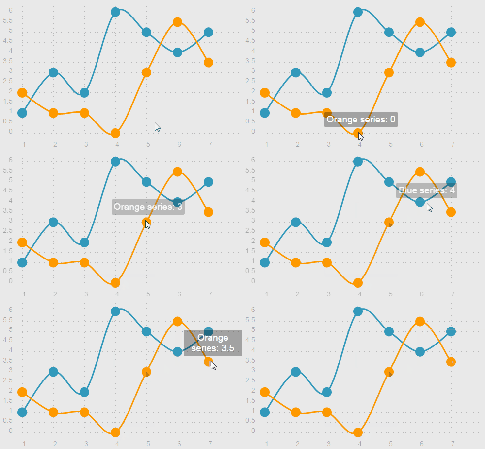
This example shows you how to add a simple tooltip to a chart using jQuery. When the user hovers over a data point, the tooltip should become visible and display the data value.
var $tooltip = $('<div class="tooltip tooltip-hidden"></div>').appendTo($('.ct-chart'));

$(document).on('mouseenter', '.ct-point', function() {
  var seriesName = $(this).closest('.ct-series').attr('ct:series-name'),
      value = $(this).attr('ct:value');

  $tooltip.text(seriesName + ': ' + value);
  $tooltip.removeClass('tooltip-hidden');
});

$(document).on('mouseleave', '.ct-point', function() {
  $tooltip.addClass('tooltip-hidden');
});

$(document).on('mousemove', '.ct-point', function(event) {
  $tooltip.css({
    left: event.offsetX - $tooltip.width() / 2,
    top: event.offsetY - $tooltip.height() - 20
  });
});
The example above uses regular DOM events to add a simple tooltip. You might have noticed the use of the ct:value attribute from the line chart’s point element and the ct:series-name attribute from the series group. Chartist has its own XML namespace, which it uses to expose some meta data to the SVG. This makes it easy to extract information from the DOM and use it for custom functionality.
Extending the Drawing Pipeline
The event system of Chartist is powerful and is a great tool to extend your chart with custom features. The following example uses the draw event of the line chart to replace the boring point elements with something smashing.
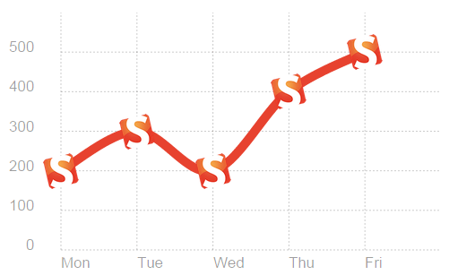
var smashingImgTag = '<img src="https://www.smashingmagazine.com/wp-content/themes/smashing-magazine/images/smashing-windows-icon-70-70.png" style="width: 40px; height: 40px" alt="Smashing Logo" />';

chart.on('draw', function(data) {
  if(data.type === 'point') {
    var smashingFoob = data.element.parent().foreignObject(smashingImgTag, {
      width: 40,
      height: 40,
      x: data.x - 20,
      y: data.y - 20
    });

    data.element.replace(smashingFoob);
  }
});
In the example above, we’ve replaced each point element just after it has been drawn (inserted in the DOM tree) with a foreignObject that contains an image. A foreignObject allows you to embed HTML elements in an SVG. The Chartist.Svg API provides an easy and convenient way to create foreignObjects. For details on the Chartist.Svg API, visit the API documentation.
Resources
- “API Documentation,” Chartist More information on how to use the library
- “Examples,” Chartist Provides some example charts where you can instantly code on them online.
- “Scalable Vector Graphics 1.1 (Second Edition),” W3C The SVG specification
- “SMIL 3.0 Animation,” W3C The SMIL specification
- “foreignObject,” Mozilla Developer Network
Contribute
We are constantly looking for people to get involved. If you have some spare time and are interested in contributing, please grab an issue to work on or open a new one.
 (vf, al, il)


