Sliders are cool. When they’re done well, customers love to interact with them. When they’re not done well, they can cause a lot of frustration (not to mention lost sales) by standing between your customers and what they want. And getting them wrong is surprisingly easy.
In this article, we will present a solution, including the design and code, for a new type of Android slider to address common problems, along with a downloadable Android mini-app for you to try out. It’s a deep dive into sliders based on a chapter in Android Design Patterns. The experimental inventory-based slider we will look at would be at home in any application that asks for a price, a size, or any other faceted input within a widely distributed range.
Further Reading on SmashingMag: Link
- C-Swipe: A Solution To Navigation Fragmentation On Android
- An Exploration Of Carousel Usage On Mobile E-Commerce Websites
- A Guide To The Android Carousel Design Pattern
- How To Design For Android Tablets
Why Sliders?
Sliders are intuitive. They provide affordance, a quality that makes a control right for a particular task. They just feel right for dialing a value within a range. Sliders translate well from the physical world to touchscreens, where they look great and are easy to manipulate, without taking up a lot of space. Dual sliders in particular are great for limiting search filters and form values to a set range.
In the physical world, sliders serve a function similar to twist knobs. However, knobs are hard to “turn” on touchscreens, and they usually take up more space than sliders. For touchscreens, sliders are better.
Types Of Sliders
Sliders come in two types: single and double. Single sliders are best for entering one value. Dual sliders are great for searching within a range of values.
There are also two kinds of adjustments: continuous and discrete. Continuous adjustments are for indeterminate values in a range, such as a price or temperature. Discrete adjustments are for predefined values (such as clothing sizes). Both single sliders and dual sliders can take either kind of adjustment. Let’s look at some examples.
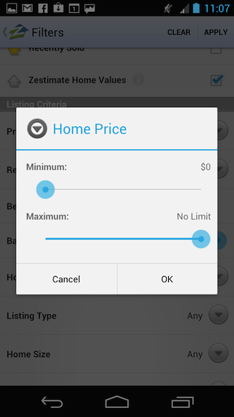
Zillow has customers use two single sliders with continuous adjustment to set a price range.
This real-estate app Trulia uses two dual sliders with continuous adjustments:
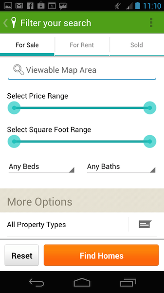
Continuous adjustments for prices make sense. Why? Because price ranges are continuous. But they do allow for more precision than most shoppers care about. (A price difference of one cent is unlikely to make a customer reconsider a purchase.)
Discrete adjustments are different. They let you choose values, but only within predefined (i.e. discrete) increments. Facets like shoe size consist of discrete values; in the US and Western Europe, shoes are typically incremented in half-sizes: 6, 6.5, 7 and so on. You can’t buy shoes in a size of 6.25, so providing a control for this level of precision would not make sense.
One way to understand the difference is that single sliders with a low count of discrete values are similar to stepper controls: You can dial the value you want, but only from a predefined set.

Experimental Slider Patterns
Sliders with histograms and sliders based on inventory counts are two great experimental patterns that are variations on the standard slider. It’s unfortunate that they are not more common because they solve many of the problems that sliders can cause for users. We explain the problems with regular sliders in the “Caution” section below and detail the experimental solution in the “Super-Sliders” section (right after “Caution”).
So, at this point, you might be thinking, “Sliders sound great. What’s the downside?” Glad you asked.
Caution
Even the best patterns can go bad. Like Harvey Dent, the once loyal ally of Batman and Gotham City’s impeccably ethical district attorney, most things have a dark side. There’s a slippery slope between delight and dismay, and much like the Two-Face character who Dent becomes, sliders can be helpful or hateful. It all depends on how they’re implemented.
Here’s how to sidestep slider problems and keep your customers happy.
Make Sure Reasonable Values Can Be Entered Easily
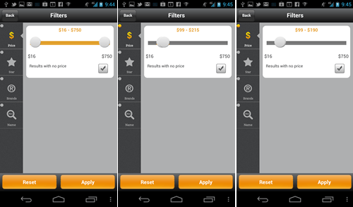
Kayak has a continuous dual slider for filtering hotel prices (see screenshots below). To get a hotel in Los Angeles that you can afford on a humble mobile UX design consultant’s salary, you must place the pegs right on top of one another. This adjustment is anything but precise. For wide ranges, consider using a slider based on inventory counts, as explained in the “Super-Sliders” section coming up.
Show the Range
Speaking of range, showing the actual range of prices available in an entire collection is a great idea, as shown in the Kayak screenshots above ($38 to $587), instead of using arbitrary numbers such as $0 and max. Neither Zillow nor Trulia show the true maximum and minimum associated with their local home inventory.
Imagine how useful these sliders would be if they stated from the beginning that they ranged between $476,000 and $3,234,700. Showing the range also helps to avoid dead zones, such as when you’re looking for a home in San Francisco priced below $476,000, which would yield zero results. Be aware of how filtering affects the inventory; setting the range for the overall collection without applying the filters is best.
Don’t Cover the Numbers
As the customer adjusts the slider, the values should appear above the pegs, where the user’s fingers would not cover them. Placing the numbers below or to the side of the slider is not as useful. Kayak’s slider (shown above) is good in this regard: The range is covered while the customer adjusts the slider, but the filter’s actual value is not, which is about the best you can do on a mobile device.
Opt for a Slider With Discrete Positions
Continuous sliders are sexy in principle, because you can dial an exact number and get just the inventory you want. But the reality is that sliders are hard to adjust precisely — both in the physical world and on touch devices. That’s why you almost never see a slider for volume adjustment on a stereo. Ironically, the larger the device, the harder that adjusting the slider precisely seems to be. This is Fitts’ law in action: The time required for an action depends on the distance and size of the target. In other words, adjusting a tiny peg in the middle of a large tablet is difficult.
Regardless of the screen’s size, adjusting a continuous slider precisely while being bumped around on a train is hard. (You have permission to refer to this hereafter as Nudelman’s law if you wish.)
Continuous dual sliders also make it easy to over-constrain the range. For example, creating a continuous slider that enables the customer to dial a price of $45.50 to $46.10 might yield zero results and would not serve the customer well. On the other hand, sliders with discrete positions (i.e. stops) are much easier to adjust. The chance of dialing a range that is too small is also less.
Super-Sliders Save The Day
How can you implement a dual slider so that the user is able to input a price range without running into the dreaded problem of zero results mentioned in the “Caution” section above? Here’s where the experimental patterns discussed earlier come in. These are like regular sliders slightly souped up — super-sliders, if you will. Let us explain.
Regular Slider
A slider could use discrete values arranged according to inventory counts. This type of slider is typically arranged in a linear pattern, which means that a certain distance of movement on the slider’s axis represents an equal absolute change in value. For example, in a five-position slider, the price would go from $0 to $100 in $20 increments:

Although this is intuitive, the design makes it easy for customers to come up empty-handed, especially if the range is wide and the inventory is not equally distributed.
As explained in the “Caution” section, a customer shopping for superhero capes might select a range for which the inventory is zero — say, $40 to $60 — not knowing that a whole closetful of capes are available in the $62 to $65 range — literally, For a Few Dollars More. (Apologies to Clint Eastwood and Westerns lovers everywhere.)
Super-Slider (With Zero-Results-Fighting Histogram)
This is where a slider with a histogram (as shown below) is helpful. The idea behind this experimental pattern is simple: The 50 to 100 pixels above the fixed-position slider is a histogram that represents the inventory in a particular section of the linear price range. A high bar represents a large numbers of items, and a proportionally short bar represents a smaller number of items. That’s it.

When using a slider with a histogram, you can still dial the part of the range with low inventory; but making that mistake accidentally is difficult because the inventory counts are clearly shown in the histogram. You can use a slider with a histogram where a standard discrete-position slider would be used; it would take up only a little more vertical space in exchange for a more satisfying customer experience.
No Room for a Histogram?
Another way to implement a slider without using histograms is to arrange the slider’s intervals based on the inventory counts. To do this, divide your entire inventory — say, 100 capes — into five intervals, and you’ll get 20 capes per interval. Now, scan the price range to figure out the price (rounded to the nearest dollar) that corresponds to the approximate inventory count of 20. Suppose the first 19 capes cost between $0 and $60 (remember that we’re assuming no inventory in the $40 to $60 range), the second 21 capes fall in the $61 to $65 range, and so on. Here is what such a slider might look like:
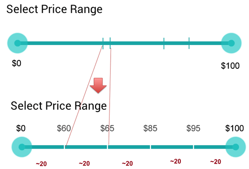
Which implementation should you choose? It depends on the task. Most people don’t mind paying a few dollars outside of their budget, but they absolutely hate getting zero results. An inventory of fewer than 20 items in a given interval is not a satisfying result for most tasks, so use one of the other approaches to provide a better experience. Both a slider with a histogram and a slider based on inventory counts are far superior to the traditional slider. Breaking down the interval according to price is the more flexible approach because it shows the distribution clearly, while never yielding zero results. If the customer’s price range is larger than that of a single 20-item interval, then they can simply select a larger interval using the dual slider.
Both of the experimental sliders out-performed the regular slider in a study we did for a large retailer. Try it yourself. Create a quick prototype and do some “hallway usability.” Ask users to find some items around $70, and compare how they do with the histogram version, the inventory-based version and the regular version.
Tablet Apps
Sliders perform well in tablet apps. Make sure you heed the warnings in the “Caution” section; in particular, opt for a slider with discrete values to ensure accuracy, instead of a continuous slider (adjusting a continuous slider accurately on a large device is harder). Consider device ergonomics and avoid placing sliders in the middle of the screen. Instead, place sliders near the top of the screen, next to the right or left margin, optimized for one-handed operation with the thumb while the fingers hold on to the back of the tablet.
Depending on the design and purpose of your app, experiment by having two sets of sliders on the left and right sides of the screen, to be adjusted by the left and right hands, respectively. This would be especially interesting in apps such as music synthesizers. Finally, experiment with placing sliders vertically along the edge of the tablet (top to bottom), rather than horizontally from left to right, which is the easiest direction to adjust precisely with the thumb, while the fingers hold the back of the tablet.
Try It Out
To see how a slider app feels, a completed slider mini-app is available for you to download and try out. If you’re a developer, you can use it in your own project free of charge (see the “Code” section coming up). To install it, consider using an app installer such as the one made by FunTrigger, which you can get free on the Play market. Here’s how it works. Connect your Android device to your computer. You should see the Android file-transfer window open automatically. If not, you might need to install software on your computer such as Android File Transfer (Mac users, take note). Download the APK source file , and place it in the “App Installer” directory (you might have to create the directory).
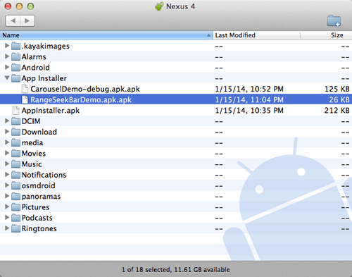
Now, you will be able to launch the app installer on your device. Navigate to the right directory, and tap the icon for the APK file that you want to install.
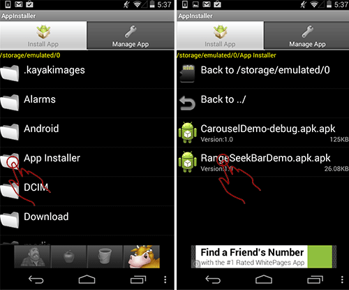
After a few customary Android disclaimers, the app will be installed in the normal app area on your device, and you can launch it from there.
Code
We’re providing you with the Java code and a demo of a simple dual slider with discrete stops.
This demo has five intervals between the minimum and maximum values, which we’ve arbitrarily set to $47 and $302. It’s arranged in a linear pattern, which means that a certain distance of movement on the slider’s axis represents an equal absolute change in value, making the increment value $51. In a real app, the values would most likely be derived from a database.
private static final int RANGE_MIN_VALUE = 47;
private static final int RANGE_MAX_VALUE = 302;
private static final int[] RANGE_STEPS = new int[] {
47, 98, 149, 200, 251, 302
};
While five is a good number in principle, you might want to experiment with intervals of seven or nine, depending on the size of the screen.
We recommend that you use the MOD function to determine how many capes need to be in each interval. Then, walk the interval to determine the price breakdown within each range. Finally, if MOD yields a remainder, you can add it to the last interval, or you could get fancier and loop through it to add one or more “excess” capes to each of the intervals. For example, if you have 103 capes, the intervals would be 21, 21, 21, 20, 20. This would more evenly distribute the inventory.
You could use the app as is for your own projects or as a starting point for something fancier. May we suggest a slider with a histogram or an inventory count?
If you do use the code, we’d love to see what you’ve done with it.
This code is provided free of charge and distributed under the GNU General Public License v3. See the README_LICENSE file for details.
Conclusion
- Say it with us, “Done right, sliders delight.” Sliders turn your customers into empowered explorers and instant item locators. Don’t let a good pattern go bad: Remember these rules, and sidestep slider problems.
- Make sure that reasonable values can be entered easily, and don’t cover the numbers. Say no to fat-fingered fumbling with small increments in large ranges. Speaking of ranges…
- Show the range.. Stamp out unhelpful labels like “$0” and “No limit.” Instead, show the actual minimum and maximum values that the customer can search within.
- Be discrete.. Continuous range sliders aren’t always the best choice. Discrete stops are better for small sets of predefined values, such as shoe sizes (and cape sizes.) And finally…
- Zap zero results.. Fight the frustrating fruitless search. Want to give your customers ninja navigational powers? Add a histogram, or use smart intervals based on your inventory.
That’s all there is to it. Working with sliders is no great mystery. You know the patterns. You’ve nabbed the code. Now there’s nothing to stop you from trying a slider.
Want more patterns? Android Design Patterns: Interaction Design Solutions for Developers has over 70, including a free design mini-course.
 (al, ml)


