A lightbox is one of those tools that work great on the desktop but often fail on small mobile devices. These days, finding a plugin that is responsive and that displays content right away is hard. For this reason, I created Magnific Popup, an open-source lightbox plugin focused on performance.
In this article, I’ll share the techniques I employed in creating this plugin, techniques that can make your lightbox much faster and easier to use, whatever the device being used.
Further Reading on SmashingMag:
- Making Modal Windows Better For Everyone
- Orbit and Reveal: jQuery Plug-Ins For Image Sliders
- Interface Design: Logins, Menus, Toggles And Fancy Modules
1. Speed
We might not be able to speed up the loading time of an image with this lightbox plugin, but we can create the perception of a faster loading time.
Progressive Loading of Images
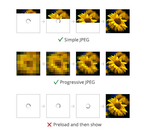
The majority of lightbox plugins will fully preload an image before displaying it. This is done to figure out the original size of the image and to center it with JavaScript. Because Magnific Popup centers the content with CSS, we can avoid preloading and instead display the image right away to take advantage of progressive image loading. It will render and show the image while the data is being received.
You can speed this up even more by progressively rendering the JPEG. It is rendered not from top to bottom, but from low quality to full quality, so the user can discern the image even faster. The type of rendering to use is strictly a matter of preference.

CSS-Based Resizing
The CSS-only approach makes this lightbox extremely flexible. You can specify sizes in relative units such as ems, resize popups in media queries, and update popup content dynamically without having to worry about how it will be resized and centered. Try to avoid, or at least reduce, the number of resizing properties in a window’s resize event, because it will look much slower than resizing with just pure CSS.
Vertically centering an element with unknown dimensions is probably the most horrifying topic in CSS layout. The main goal for me was to prevent the size of the content area from dynamically updating the contents of the lightbox, and to make it work in IE 8 and above.
Following the principle of progressive enhancement, I decided to drop the vertical centering feature in IE 7 completely, because the only way to implement it was to use slow CSS expressions, which kill performance in old browsers. In contrast to modern browsers, the resolution of monitors on which IE 7 is being run is unusually easy to predict. We’d know that the user would be on an old PC, which typically has a resolution of somewhere between 800 × 600 and 1280 × 1024 pixels; so, we can just set a fixed margin from the top: .lightbox-image { margin-top: 10%; }. Alternatively, instead of opening the lightbox, you can just link directly to the content. In Magnific Popup, you can do this like so:
$('.popup-link').magnificPopup(function() {
  disableOn: function() {
    // Detect IE 7 or lower with your preferred method
    // and return false if you want to trigger the default action
    return isIE7 ? false: true;
  }
});
Centering an HTML block
Here are the criteria:
- The size of the block is unknown and could be changed at any time.
- Block should be centered both horizontally and vertically.
- If the height of the popup is bigger than the viewport, then the scrollbar should appear, and the popup should automatically align to the top.
The one reliable technique to vertically center an element of unknown height that I’ve found uses a helper inline-block element with a setting of vertical-align: middle and height: 100%. Chris Coyier has written a superb article covering this technique. It works perfectly and meets all three requirements.
Centering an image with a caption
In addition to the requirements of an HTML block, the image should also meet these requirements:
- It should fit the area both horizontally and vertically.
- Its maximum height should equal the height of the original image.
- The caption should be positioned directly below the image, and the text may flow up to two lines.
Here is the structure of the image’s lightbox:
<div class="container">
  <img src="image.jpg"/>
  <div class="description">Caption</div>
</div>
Implementing this just for an image and with support for IE 8 and above is not hard. The problem comes when you try to position elements near to the image (such as a caption or related icon).
I was not able to find the solution for such a layout without using JavaScript, so I used a technique that applies a max-height to the image. Check the example on CodePen to see how it works.
Centering an iframe
Iframes in Magnific Popup are resized using the popular and effective technique introduced by Thierry Koblentz in his article “Creating Intrinsic Ratios for Video” on A List Apart. All you need to do to force any element’s height to scale according to its width is to put it in a container and apply top padding as a percentage:
.iframe-container {
  width: 100%;
  height: 0;
  overflow: hidden;

  /* element ratio is 4:3 (3/4 * 100) */
  padding-top: 75%;
}

.iframe-container iframe {
  position: absolute;
  width: 100%;
  height: 100%;
  top: 0;
  left: 0;
}
Window height on iPhone
Mobile Safari on iPhone and iPod has a nasty bug: the height of the window is always reduced by the height of the navigation bar, whether the bar is present or not, so the popup won’t center correctly. When researching this issue, I found two ways to fix it:
- Just add 60 pixels to the height of the window. This solution doesn’t work with iOS 6’s full-screen mode, and it’s not future-friendly.
- Use
window.innerHeightinstead ofdocument.documentElement.clientHeight, which returns the correct value, but only when the window is not zoomed in.
But I’ve figured out a third way to implement this (for more details on this technique, check my answer on Stack Overflow):
var getIphoneWindowHeight = function() {
  // Get zoom level of mobile Safari
  // Such zoom detection might not work correctly on other platforms
  //
  var zoomLevel = document.documentElement.clientWidth / window.innerWidth;

  // window.innerHeight returns height of the visible area.
  // We multiply it by zoom and get our real height.
  return window.innerHeight * zoomLevel;
};
If you know of a better way to position elements than what’s suggested here, we’d be hugely grateful to hear!
Preload Adjacent Images in Gallery
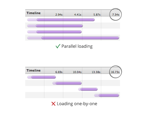
Preloading images in a gallery is essential and vastly increases browsing speed. The average modern browser accepts about six connections per host name, whereas IE 7 accepts only two.
After the lightbox gallery is opened, it should start loading not one, but a group of images (the number of items in a group should depend on the size of the images and on how likely your visitor will navigate to the next one — test it!). Don’t even think about waiting to load the next image until after the current one has completely loaded; otherwise, it will reduce browsing speed significantly.
In Magnific Popup, you can set the number of images to preload before and after the current one, and these two values will automatically switch according to the direction in which the user is navigating.

High-DPI Display Support
Magnific Popup’s default controls are made with pure CSS, without any external resources. Thus, the controls are not only light, but also ready for high-DPI (i.e. Retina) displays. But in this section of the article I’d like to talk about serving images for displays with high pixel density.
It’s not hard to change the path, as the image in lightbox is loaded dynamically. The main problem is that the image should be scaled by half (for 2x device pixel ratio). It rises the question: how to get the image size via JavaScript without waiting until it is completely loaded to keep progressive loading?
While researching, I’ve found that the image naturalWidth is defined exactly after browser gets its size. So we just fire an interval that checks if the image object has defined naturalWidth, after it has it we scale the image by applying max-width that equals image.naturalWidth / window.devicePixelRatio. Here is simplified version of how the image loading is implemented:
var interval,
    hasSize,
    onHasSize = function() {
        if(hasSize) return;

        // we ignore browsers that don't support naturalWidth
        var naturalWidth = img[0].naturalWidth;

        if(window.devicePixelRatio > 1 && naturalWidth > 0) {
            img.css('max-width', naturalWidth / window.devicePixelRatio);
        }

        clearInterval(interval);
        hasSize = true;
    },
    onLoaded = function() {
        onHasSize();
    },
    onError = function() {
        onHasSize();
    },
    checkSize = function() {
        if(img[0].naturalWidth > 0) {
            onHasSize();
        }
    },
    img = $('<img />')
        .on('load', onLoaded)
        .on('error', onError)
        // hd-image.jpg is optimized for the current pixel density
        .attr('src', 'hd-image.jpg')
        .appendTo(someContainer);

interval = setInterval(checkSize, 100);
checkSize();
There is a very common assumption that the image optimized for Retina display weighs two times or more than the normal one, but it’s not always true. As the image will be scaled down, JPEG quality can be reduced without any notable visual difference. From my experience, saving an image for 2x pixel ratio with 25% JPEG quality produces a good-looking result and the file size is only about 1.4x times larger than the regular one. Daan Jobsis has a great article that covers this technique.
What image to serve on what screen size is a topic for another article. I just want to emphasize that for many users mobile is the only way to access the internet. If you serve smaller images for mobile and there is a chance that user will need full-sized ones — provide an alternative way to get it.
Avoid Extra HTTP Requests for Controls
Preload all controls (i.e. the arrows, the closing icon, the preloader) before the popup has opened in order to load the actual content faster. This can be implemented in three ways:
- Create all controls with CSS only (as Magnific Popup does by default).
- Include the control graphics in the main CSS sprite of your website, or preload them with CSS before the popup has opened.
- Use the Data URI scheme to embed base64-encoded images directly in the CSS (supported by IE 8 and above).
2. Accessibility
Content that has opened in the lightbox should be easily zoomable and scrollable, no matter what the device. The contents and controls of the popup should be accessible with the tab key for keyboard users.
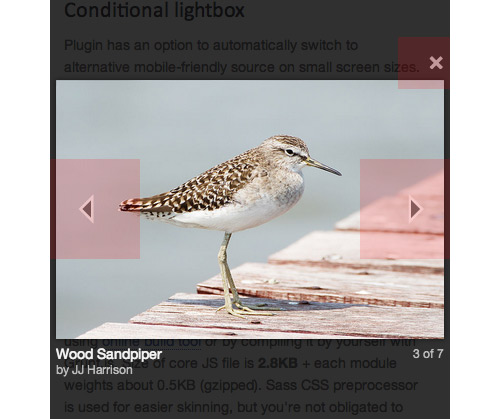
Conditional Lightbox
This relatively new technique, introduced by Brad Frost, disables the lightbox entirely on devices with a small screen, substituting an alternative more appropriate to mobile use. Here are some examples:
- Open maps and videos as a separate page. Many mobile browsers will recognize such links and open a dedicated app that is much easier to use.
- Simply open images in a new page for easier zooming and panning.
Open long text-based popups in a new page. In Magnific Popup, you can do this by adding the source of the popup inside a data attribute and linking to a mobile-friendly page in the
hrefattribute. For example:<a href="separate-mobile-friendly-page.html" data-mfp-src="popup-content.html">Open popup</a>Here is the popup initialization (with an option that disables the popup and just opens the link when the window is narrower than 500 pixels):
$('.popup-link').magnificPopup(function() {
  disableOn: function() {
    // Detect here whether you want to show the popup
    // return true if you want
    if($(window).width() < 500) {
      return false;
    }
    return true;
  }
});
Progressive Enhancement
Build the markup as if there were no JavaScript at all, and make the button that opens the content-oriented lightbox link to the content. Not only is this an enhancement for users without JavaScript, but it allows you to open the content in a new window, and it makes it completely SEO-friendly. Images will be perfectly indexed by search engines, and the anchor text will work as an alt attribute in the img tag.
<!-- Correct: -->
<a href="image.jpg">Description of the image</a>

<!-- Incorrect: -->
<a href="#" data-src="image.jpg">Description of the image</a>

<!-- Correct: -->
<a href="large-image.jpg">
  <img src="thumbail.jpg" alt="Description of the image" />
</a>

<!-- Incorrect: -->
<img src="thumbail.jpg" data-src="large-image.jpg" alt="Description of the image" />
Selectable Image
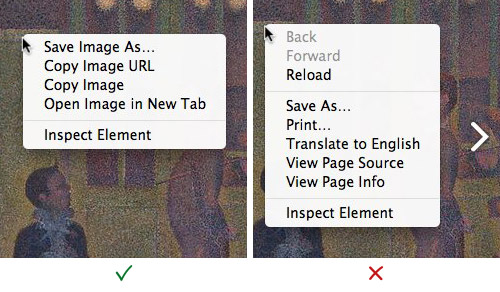
Users should be able to select and copy an image that is opened in a popup. This is one of the few ways to bookmark, save or share it.
Presently, fully overlaying a lightbox image with left and right navigation arrows is very common. The screenshots below show context menus above the image (the one on the right is overlaid with a transparent div, making any kind of interaction with the image virtually impossible).

position: fixed and overflow: scroll
Zooming a fixed-positioned element looks unnatural and confusing in the majority of mobile browsers. I suggest avoiding this property entirely on devices on which content is likely to be zoomed.
Exactly the same problem happens when you apply overflow: scroll to a popup’s wrapper. In this case, the problem is an unnatural scroll:
- Once the user has reached the end of the scroll, the main window starts scrolling behind the popup.
- Scrolling momentum is missing. On iOS 5+, this issue can be fixed with
-webkit-overflow-scrolling: touch, but what about other devices?
Magnific Popup automatically disables these properties on mobile devices. Instead of using a fixed positon, it adds a huge dark overlay to the whole page that equals the height of the document and that positions the content area using position: absolute and with a top that equals the scrollTop of the window.
Keyboard Focus
Upon loading, the focus should be set on the popup itself or on the first input (if it is a form). When tabbing, focus should be confined to the lightbox and its controls. After the popup has closed, focus should return to its original location. This can be implemented very simply:
// Save current focused element
var lastFocusedElement = document.activeElement;

// Set focus on some element in lightbox
$('#input').focus();

// After lightbox is closed, put it back
if(lastFocusedElement)
  $(lastFocusedElement).focus();
Roger Johansson’s great article “Lightboxes and Keyboard Accessibility” discusses this topic and the overall keyboard accessibility of lightboxes.
Touch Swipe Support
The main problem with the swipe gesture on touch devices is that it requires blocking the default behavior of the touchmove event (e.preventDefault()), which blocks the zooming and panning gesture.
There are just two ways to enable swiping and zooming at once:
- Emulate zooming behavior with help of JavaScript touch events by changing the
transformproperty of the content’s container. But this requires recalculating the content’s size, which breaks our CSS-based resizing technique and is not reliable when there are interactive elements such as iframes. Without a doubt, the library that implements such zooming and panning the best is iScroll by Matteo Spinelli. - Don’t inhibit the default behavior of browser zooming when two touch pointers are detected. But finding the difference between panning and swiping is very hard because detection of the browser’s zoom level is unreliable.
By design, the main purpose of a lightbox is to show enlarged versions of images. So, we would conclude that natural zooming is much more important than swiping. That is why Magnific Popup does not have swiping support. Navigation between gallery items is implemented simply by tapping on arrows with a large hit area.
But if you really need swiping, there are some ways to implement it:
- If you don’t need a dragging effect, use something like the TouchSwipe plugin.
- If you need touch navigation with a dragging effect, open in the popup some slideshow plugin with touch support, such as FlexSlider or (mine) RoyalSlider.
- Use a conditional lightbox technique and create a separate mobile-friendly page that has just a list of stacked images.
If we disable the swiping gesture, we should at least make tap navigation faster. Mobile browsers wait about 300 milliseconds before firing a click event in case they detect a double-tap event. This can be fixed with the popular “fast click” technique, which fires a click on touchend. Ryan Fioravanti of Google has a complete guide on it.
3. User Interface
Some devices allow multiple types of input at once (such as touching and mousing). We conclude that we cannot require mouseovers (:hover) for important UI elements, and we cannot neglect mouse events if touch support is present.
Apple’s “Human Interface Guidelines” for iOS state that a comfortable size for a tappable UI element is at least 44 × 44 pixels. Assuming that any device with any screen size may have touch support, we’ll apply as large a hit area as possible by default.

Now let’s talk about actual implementation. First of all, buttons are rendered as <button> elements. Here is why:
- A button can have a title attribute, which we can use to describe what the button does and its keyboard shortcut.
- Buttons, unlike
<a>elements, do not require hacks such ashref="#"andhref="javascript:void()". When the cursor hovers over a link, many browsers will show the contents of thehrefattribute in the bottom-left corner of the browser window; displayingjavascript:void()would look quite illogical. - Buttons are the most semantically correct approach for such controls.
I recommend reading Nicholas Zakas’ article “You Can’t Create a Button,” which offers a few more arguments in favor of using <button> elements.
The Close Button
The closing icon is just a math multiplication sign (×) rendered in Arial. I strongly recommend avoiding specifying multiple fonts (like font-family: ‘Helvetica Neue’, Helvetica, Arial, sans-serif) because the position and size of the multiplication sign is very inconsistent across fonts.

Next and Previous Buttons
The main requirement for default arrow icons is that they should be visible on any background. At first glance, the best option is to use Unicode triangles with shadow, but it turns out that there are no equally sized left and right triangles.
The only remaining option is to use two nested triangles with different colors. Here is how that’s done:
.double-triangle {
  width: 90px;
  height: 110px;
}

.double-triangle:before,
.double-triangle:after {
  display: block;
  width: 0;
  height: 0;
  position: absolute;
  left: 0;
  top: 0;
  margin-top: 35px;
  margin-left: 35px;
}
.double-triangle:after {
  content: '';
  border-top: 12px solid transparent;
  border-bottom: 12px solid transparent;
  border-right: 12px solid black;
  top: 8px;
  left: 5px;
}
.double-triangle:before {
  content: '';
  border-top: 20px solid transparent;
  border-bottom: 20px solid transparent;
  border-right: 20px solid white;
}
Because of pseudo-elements, such an implementation will not work in IE 7. Navigation buttons are an important part of the UI, so I decided to write a small polyfill to make it work in IE 7, too. We just add two elements inside the button and apply the same styles as the :before and :after elements.
var button = $('<button class="double-triangle"></button>');
if(ie7) {
  button.append('<span class="ie-before"></span><span class="ie-after"></span>');
}
Here’s the CSS:
.double-triangle:before,
.dobule-triangle .ie-before {
  /* styles ... */
}
Cursors
I am a big fan of custom cursors; they are a lovely addition to an interface. The zoom-in and zoom-out cursors make very clear that content may be enlarged or reduced, while the progress cursor is an excellent loading indicator of AJAX-based popups. Sadly, zoom cursors are still not supported by IE 10.
.zoom-in-cur {
   cursor: -webkit-zoom-in;
   cursor: -moz-zoom-in;
   cursor: zoom-in;
}
.zoom-out-cur {
   cursor: -webkit-zoom-out;
   cursor: -moz-zoom-out;
   cursor: zoom-out;
}
.progress-cur {
  cursor: progress;
}
Animation
The main rule of in and out animation for a lightbox is make sure you need it. If you do, at least keep it short (shorter than 300 milliseconds). Avoid animation if you anticipate a large image or a huge block of HTML in a lightbox.
Magnific Popup does not use JavaScript animation at all. Instead, it uses light and fast CSS transitions. Browsers that don’t support transitions are most likely slow, and thus JavaScript animation would look choppy in them.
One more important point: As I said before, Magnific Popup automatically disables position: fixed on mobile devices and creates a tall dark overlay on the page. Animating such a block might cause mobile devices to lag, so I suggest forcing position: fixed for the background and keeping position: absolute for the content itself.
And here’s a pro tip: To make your sliding animation a little smoother, Paul Irish suggests animating the translateY property, instead of top or margin-top.
In Summary
A responsive lightbox is not one that scales down proportionally when the screen’s size changes. It’s the one that provides fully accessible content, whatever the device.
No matter what script you use, it should support these standards:
- Escape key to close the popup.
- Left and right arrow keys to navigate the gallery.
- Tab key to navigate the contents of the popup.
- If there is a single image, the lightbox should close when any part of the image is clicked.
- If it is a gallery, clicking on the current image should advance to the next image. Check out the discussion on UX Stack Exchange for more information.
- A gallery should be clearly indicated: “1 of 10” counters, arrows, bullets, thumbnails, or any combination of these.
Useful Related Resources
- “The Usability of ‘Lightbox UIs’,” UX Stack Exchange
- “Should We Keep Image Popup After Page Refresh?” UX Stack Exchange
- “Are Lightboxes Good UX?,” Quora
- Lightbox 2, Lokesh Dhakar - The original lightbox plugin
- “Image Optimization, Part 1: The Importance of Images,” Stoyan Stefanov
- “Improving UX Through Front-End Performance,” Lara Swanson, A List Apart
I hope this article and script will be useful to some. For more techniques, dig into the code of Magnific Popup in the GitHub repository.
(al) (ea)


