There is a prevalent belief amongst developers that design is a skill that can’t be learned — you either have it or you don’t. While much of this can be attributed to the perception that heightened creativity is required to produce good design, the truth is anyone can create attractive applications and good user experience by following common design patterns and applying guidelines for the particular platform being targeted.
So rejoice, Mr. “Not-a-Designer,” this article was written just for you. This article is targeted at the everyday developer looking for practical guidelines and tips to leverage in their Windows Phone application to build compelling Windows Phone UI-compliant apps with solid user experiences. Think of it as a checklist of sorts to ensure that your app avoids the common design problems found in Windows Phone applications.
Further Reading on SmashingMag:
- Testing For And With Windows Phone
- Introduction To Designing For Windows Phone 7 And Metro
- Finger-Friendly Design: Ideal Mobile Touchscreen Target Sizes
- Building An Online Magazine App For Windows 8
Please see the User Experience Design Guidelines for Windows Phone for a complete overview of the platform and user interaction model on Windows Phone.
Panorama Controls
The aptly named Panorama is one of the innovative controls of the Windows Phone platform. Whereas a traditional mobile application is designed to fit within the boundaries of the screen, the Panorama control allows for a long horizontal canvas, to lay out elements that extend beyond the confines of the screen. The Panorama control is composed of a number of Panorama items, which contain the content. When viewing each Panorama item, the user will see a little piece of the item to the right, indicating that additional content is waiting to be discovered. As the user pans horizontally across the Panorama, the control exhibits a parallax behavior — smoothly moving the background, title and items at different speeds.
When creating your panorama, approach it as if you were designing a magazine cover — it should engage the user and entice them to explore more. It should reveal relevant, fresh and compelling content, and it should serve as the entry point to the rest of the application. Panoramas are great for showing a few pieces of content that you want to highlight in your app — the top news from your social network, the last eight songs played, the top six featured recipes. Consider also adding a background image to your Panorama control to provide a more visually appealing and immersive experience.
Given the popularity of the control, you can find inspiration for designing your Panorama in many apps on Windows Phone. Several of the native apps, or “hubs,” on Windows Phone also use the Panorama control, such as those for People, Pictures, Games and Office.
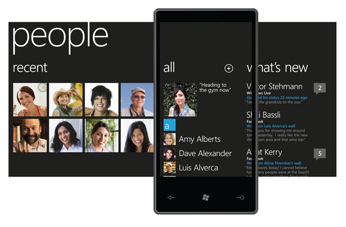
The native People “hub” Panorama without a background image on Windows Phone.

The native Pictures “hub” Panorama with a background image on Windows Phone.
Optimized for Up to Five Items
While fitting a lot of content into your main Panorama might be tempting, really think through what content will provide the best launch experience, and limit the number of items to five or fewer. Any more than five items will cause users to get lost in the Panorama control and will also result in a performance hit.
Don’t Compete With Swipe Gestures
The following controls would compete with swipe gestures in a Panorama:
- Toggle switches,
- Sliders,
- Maps,
- Web browsers.
The Panorama control provides horizontal scrolling to navigate the various items and vertical scrolling for each item. Using a control that accepts gestures for one of these actions in a Panorama would cause it to compete with the native functionality. For example, if a user wants to explore a Panorama control and swipes left in a Map control, then they will pan across the map, rather than move the panorama. For this reason, use only controls that don’t accept swipe gestures. There is one proviso — you could use a Map or Web Browser control in a Panorama as long as it is locked and doesn’t accept touch input.
Scrollable Items
The items on your Panorama control should scroll either horizontally or vertically, but not both.
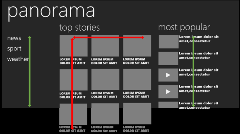
Incorrect layout of Panorama, with items that scroll both horizontally and vertically.
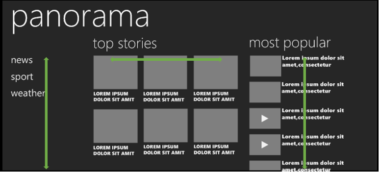
Correctly designed Panorama, with items that distinctly scroll either horizontally or vertically.
Eliminate (or Limit) Interactive Content
The Panorama control is intended to be digested like a magazine cover — it’s a tool to reveal key content for the user and to serve as an entry point to explore the app. The Panorama should not be the application itself, so limit the use of interactive controls in it (forms, search boxes), and put them instead on pages within the app that are designed for those purposes.
Use the Application Bar for Actions
Avoid floating buttons (i.e. buttons placed within content) where possible. Ideally, all buttons should be placed in the Application Bar and should be changed or hidden contextually as the user swipes across the items.
Alignment And Layout
Left-Align Controls, With a 24-Pixel Margin
All pages should respect the 24-pixel margin on the left, which serves as a perimeter for content. Content should be left-aligned to the 24-pixel margin to continue the balance and flow of existing controls. Elements that creep outside or inside the margin create visual imbalance, drawing attention to the inconsistent margin.
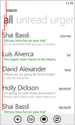
Improper alignment of elements from top to bottom.
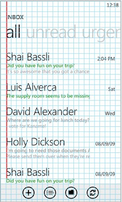
Correct left-alignment of elements
Tip: Check out Jeff Wilcox’s MetroGridHelper for a great little tool to help ensure that your controls are properly aligned, while also debugging your application.
The MetroGridHelper places a semi-transparent grid of 25 × 25-pixel red squares on your application when running in debug mode. These squares are contained within a padding of 24 pixels around the page and are offset by 12 pixels between one another — the magic combo for Windows Phone design. The grid enables you to quickly and easily identify any alignment issues on the page.
Adding MetroGridHelper to your app is very straightforward:
- Use the NuGet package manager to install the MetroGridHelper package, and add a reference in your project.
- Open the
App.xaml.csfile, and addMetroGridHelper.IsVisible = true;to the constructor within the block of code that checks whether the debugger is attached. Your complete constructor should look like this:
 /// Constructor for the Application object. ///
        public App()
        {
            // Global handler for uncaught exceptions.

            UnhandledException += Application_UnhandledException;
            // Standard Silverlight initialization
            InitializeComponent();
            // Phone-specific initialization
            InitializePhoneApplication();
            // Show graphics profiling information while debugging.

            if (System.Diagnostics.Debugger.IsAttached)
            {
                // Display the current frame rate counters.

                Application.Current.Host.Settings.EnableFrameRateCounter = true;
                // Show the MetroGridHelper
                MetroGridHelper.IsVisible = true;
                PhoneApplicationService.Current.UserIdleDetectionMode = IdleDetectionMode.Disabled;
            }
}Lay Out Field/Value Pairs Cleanly
When creating a page with a set of field and value pairs, the textblock elements should be presented either in two columns, both aligned left, or with the titles above the fields.

Incorrect layout makes it difficult to discern where the label ends and the value begins.

A two-column layout produces an interface that is cleaner and easier to read.

Placing the label above the field is the best approach because it creates visual hierarchy and clearly distinguishes between field/value pairs.
Space Elements by a Multiple or Subdivision of 12 Pixels
Spacing between elements should be consistent both horizontally and vertically. A multiple or subdivision of 12 pixels is recommended in order to adhere to the design grid.

Inconsistent horizontal and vertical spacing.

Consistent spacing creates a cleaner layout.
Animation And Visual Feedback
Tip: The Silverlight for Windows Phone Toolkit lets you easily add tilt animations, page transitions and a performance progress bar to your application.
Visual Feedback via Tilt Animations
Buttons, list items and other controls being used as buttons should have a tilt effect to provide visual feedback to the user. Changes in color should not be used for visual feedback.
Visual feedback has the following benefits:
- It helps to distinguish between interactive and static elements,
- It allows the application to communicate back to the user and confirm the user’s actions.

Using color changes to provide visual feedback would be inconsistent with native apps.

Tilt animation provides visual feedback and makes the user experience consistent.
Implementing the tilt effect requires only a couple of lines of code in your XAML page:
- Add a reference to
Microsoft.Phone.Controls.Toolkit.dllin your project. This DLL is installed with the Silverlight for Windows Phone Toolkit. - Add a
namespaceto the XAML that references the DLL:xmlns:toolkit="clr-namespace:Microsoft.Phone.Controls;assembly=Microsoft.Phone.Controls.Toolkit". - Set the
IsTiltEnabledproperty ofTiltEffecttotruein thePhoneApplicationPagetag:toolkit:TiltEffect.IsTiltEnabled="True".
That’s it. The final XAML of your PhoneApplicationPage tag should look something like this:
Use Page Transitions to Add Polish
Page transition animations can add attractive effects to an application and communicate to the user that they are navigating between pages.
Six page transitions are included in the Silverlight for Windows Phone Toolkit:
- Turnstile,
- Swivel,
- Slide,
- Roll,
- Rotate.
Adding page transition animations is similar to adding the tilt effect:
- Add a reference to
Microsoft.Phone.Controls.Toolkit.dllin your project. This DLL is installed as part of the Silverlight for Windows Phone Toolkit installation. - Add a namespace to the XAML that references the DLL:
xmlns:toolkit="clr-namespace:Microsoft.Phone.Controls;assembly=Microsoft.Phone.Controls.Toolkit". - Paste the XAML code below into your page:
Use a Bar to Indicate Progress
Just as you use tilt animation to indicate to the user that their tap has taken effect, progress bars enable you to communicate that a process is being executed. This removes doubt for the user about whether the application is functioning properly. Two types of progress bars can be used: determinate and indeterminate.

Determinate progress bar.
A determinate progress bar is used to communicate the percentage of completion, such as the percentage of bytes copied out of the total number of bytes. An indeterminate progress bar is much more common and is particularly useful when you don’t know the length of the process, such as when calling a Web service and waiting for a response.
Buttons
Place Buttons in the Application Bar
Avoid floating buttons (i.e. buttons placed within content) where possible. Such buttons usually make the experience inconsistent and confusing. The Application Bar serves as a fixed home for buttons on the page, a design paradigm that is consistent with native apps. Another big benefit is that the Application Bar is always visible, even when the software keyboard is shown. This eliminates the common problem of buttons being hidden behind the keyboard, and it allows for instant access to the buttons. Floating buttons might make sense in a few places, though:
- “Settings” pages, where more verbose actions are needed,
- Quick action buttons associated with list entries, such as a “Play” button next to a song item or a “Call” button next to a contact item in a list.
Avoid “Back” and “Close” Buttons
Every Windows Phone has a physical “Back” button. Windows Phone users are used to using the hard “Back” button to navigate back in an application or to end (or cancel) an action, thus eliminating the need for a soft “Back” button. The result is a more consistent experience and less clutter.
Avoid “Home” Buttons
“Home” buttons break the Windows Phone’s navigation model and are strongly discouraged. Users know to use the hard “Back” button to navigate back to the home screen. A “Home” button might make sense in a few scenarios, though:
- Applications with a very deep navigation hierarchy,
- Pages that launch via a deep-linking “secondary tile.”
If you do end up using a “Home” button in your application, make sure that you completely clear out the back stack upon navigating to the home page. This is critical because without clearing the back stack, the user could get stuck in a near infinite loop and would be unable to exit the application via the hard “Back” button. To clear your back stack, override the OnNavigatedTo method on the page that you are navigating to, and add in the code shown here:
protected override void OnNavigatedTo(System.Windows.Navigation.NavigationEventArgs e)
{
    while (NavigationService.CanGoBack)
    {
        NavigationService.RemoveBackEntry();
    }
    base.OnNavigatedTo(e);
}
The above code is a simple loop which checks to see if the application can go back and removes the most recent item off the back stack. Once it can no longer go back, your back stack has been cleared.
Summary
One of the most important factors in delivering the best experience on any mobile platform is to design the app for the platform and its accompanying usage patterns.
The Windows Phone UI represents a fresh approach to the phone experience. The first step in building a compelling Windows Phone UI-compliant application is to spend time using the apps that ship with the OS. This will familiarize you with Windows Phone’s unique set of controls and design paradigms.
A lot of beautifully designed third-party apps can be found in the Windows Phone Marketplace, so plenty of inspiration is available. Some of my favorites have innovated on the Windows Phone design principles to deliver a truly compelling experience, such as the Cocktail Flow app published by Gergely Orosz.
Once you have the basics down and have begun to piece together the visuals for your application, refer to the guidelines in this article. They will help you avoid some of the most common mistakes that I have seen when reviewing designs for my app partners.
 (al)
(al)


