Unless you’re developing completely new products at a startup, you likely work in an organization that has accumulated years of legacy design and development in its products. Even if the product you’re working on is brand spanking new, your organization will eventually need to figure out how to unify the whole product experience, either by bringing the old products up to par with the new or by bringing your new efforts in line with existing ones. A fragmented product portfolio sometimes leads to an overall broken user experience.
Understanding an organization and its users and designing the right interaction and visual system take exceptional effort. You also need to communicate that system to teams that have already produced work that doesn’t align with it.
Further Reading on SmashingMag:
- The S.M.A.R.T. User Experience Strategy
- Designing For A Hierarchy Of Needs
- This Interface Is A (Good) Joke!
- Reducing Cognitive Overload For A Better User Experience
This isn’t easy work. In this article, we’ll introduce you to a strategy for fixing the broken experience that starts with surface improvements, goes progressively deeper into structural issues and ends with a big organizational shift.
The Hierarchy Of Effort
Many large successful companies end up in a situation where they must maintain dozens, if not hundreds, of applications in their product portfolios. These huge suites are the result of mergers, acquisitions, different sets of user needs, legacy services and contracts, and the inefficiencies that naturally develop in huge organizations. Sometimes the reasons for so many different product lines are legitimate; other times, the wide set of offerings doesn’t serve anyone’s needs particularly well. Users will often struggle to learn a suite of related products because of major differences in how they look and operate.
The initiatives to fix these broken experiences are referred to in ambitious and somewhat generic terms, such as “common look and feel,” “unified online experience” and “unified look and feel.” Regardless of the term, the common elements represent a drive to bring consistency to a large set of products in multiple stages of development and spearheaded by a centralized internal group. There’s a sense of urgency; we often meet with some internal resistance; and frequently we’re charged with fixing a previous agency’s failed attempt to deliver design and guidelines that can be metabolized by the client.

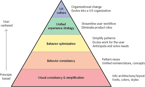
The hierarchy of effort to fix a broken user experience
One effective approach begins with surface improvements, goes progressively deeper into structural issues and ends with big strategic organizational shifts. We start with the low-hanging fruit and at each step reach higher to develop products that will ultimately deliver great experiences. It’s worth noting that this approach was developed to make it possible for a team to make incremental improvements to products already under development, but also to look ahead to future releases, when rewriting code or rethinking interactions won’t be so disruptive.
If your organization is working on its first product, then this approach would be totally backward. But in a large organization with a lot of history and many products, this approach will help you articulate both a short-term and long-term strategy for building a product portfolio that delivers a user experience that is learnable and builds confidence and a portfolio that makes your work easier and more effective.
Visual Consistency and Simplification
The lowest amount of effort required is at the bottom of the pyramid, so we suggest starting there. Sure, it’s lipstick on a pig, but simply taking a consistent visual approach will help to bring many different products under a shared brand experience.
Assuming you’ve done the groundwork to articulate the design of an ideal experience, the simplest and arguably easiest way to start implementing it is to reskin the products currently under development. Finding ways to simplify and excise unnecessary information, unifying the information architecture, and adopting standard fonts, colors and controls are all relatively low-effort ways to improve existing products.
This is the foundation. It won’t improve a poorly designed interaction, but it could dramatically increase the appearance of unity to the end user. Products that have a consistent visual language will clearly convey their membership in a single portfolio. The benefit of improving the visual system first is that changing or adjusting the skin of an application is much easier than changing things such as behavior, which will require rethinking and recoding fundamental aspects of the application.
Behavioral Consistency
If your organization has simplified and unified the visual language, the next step is to make the behavior consistent. This is basic stuff: disciplined reuse of patterns instead of applying patterns ad hoc from a grab bag of widgets, and unifying the nomenclature and conceptual frameworks. Hopefully, any individual product will have internally consistent patterns; it’s when you look at sets of applications that were developed by different groups or obtained through acquisitions that you usually see wide discrepancies.
Assuming that the given design expresses high-level principles and provides a basic set of pattern libraries, the goal at this stage is to evaluate individual products and figure out how much work is required to align them. This work entails at the very least replacing widgets in some applications. It usually also entails a decent amount of coding and testing to ensure that the revisions contribute to a consistent experience. Maintaining a shared approach and understanding will require more coordination between development groups.
Behavioral consistency makes it easier for the end user to learn a tool and then to transfer those skills when picking up related tools. The user has to build only a single mental model of how the applications work. This gives them confidence and enables them to pick up new products without facing a steep learning curve and without being confused about how things are done.
Behavioral Optimization
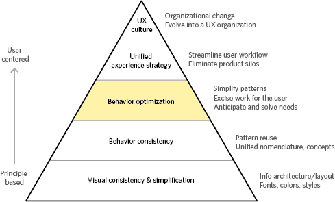
The prior step was done solely to align the behavior of the various products. A deeper level of work is required to optimize the behavior and to make the applications more powerful and easier to use.
This step reworks the products even further. It means evaluating the current products against the user’s needs and goals and looking for ways to eliminate work and to simplify the patterns. This assumes some measure of design effort beforehand to identify the areas where this will make the most difference. It assumes a commitment to user-centered product design, some research, as well as personas and scenarios. Without these, you’ve got no way to decide what patterns to simplify, which work to excise, and what user needs to anticipate and solve for.
An optimized experience enables users to perform their tasks with less or more effective work. Any work that’s performed is captured in such a way that users aren’t asked to perform the same task twice. Smart defaults are captured and leveraged to make tasks flow more quickly. Where possible, shift computing work to computers, and judgements to humans. Mine data to see broader patterns and opportunities that allow the system to anticipate and meet needs before they become issues.
This is where you do everything you can to make each application the best it can be. It takes a lot of work, with new interactions introduced and much code rewritten. A considerable investment of time and effort is required.
Unified Experience Strategy
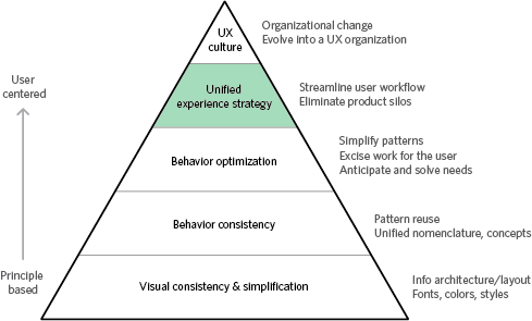
The result of the last iteration is a set of products that do what they do best. The point of this iteration is to rethink how the suite works together. This often means rethinking product strategy.
Designing a unified experience requires looking at the big picture, reevaluating the internal product silos in the organization, and reconsidering the ideal workflow for individuals and between roles. It could lead to collapsing multiple products into one, bridging gaps with new products, eliminating redundancies in capabilities or refocusing the service. This kind of work takes deep organizational commitment and a strong mandate. It takes long-range, instead of short-term, planning. It can’t be done quickly, and doing it well takes organizational honesty and courage.
The real beneficiary of this kind of effort is the end user, because this product strategy is user-centered. The company recognizes that the product exists to help people perform their work and that they might use other tools and services to accomplish their goals. Users don’t exist in isolation; they share work with others. Success isn’t measured by how well they perform a task, but in how competently they traverse a complex and dynamic ecosystem of people, data, devices and services. When a company brings their product line to this stage, both the organization and the product line have been transformed.
UX Culture
All of the prior steps were aimed at fixing a broken user experience. By following them as an iterative path, it becomes possible to greatly improve a severely broken user experience. The way to avoid having to repeat this cycle in a few years is to transform the organization itself. Software and services are conceived and developed in a particular organizational culture, and this has a profound effect on the products. Products coming out of an engineering-oriented organization bear the unmistakable focus on technology; services with a focus on sales deeply communicate this; and products that come out of organizations with a UX bent cannot avoid their focus on a good user experience.
If you want to repeatedly deliver a great user experience, you need to go deeper than applying design to the surface. Your organization needs to understand and commit to making user experience a core priority. Executives have to support or advocate for the unique perspective that design brings; capable designers have to work for a user-centered approach; and a user-centered way of building things has to be integrated into the organization.
A great user experience almost never just happens. Understanding the user and keeping their needs as your priority throughout the design and development stages take deliberate effort. Products and services are created by teams of people who collaborate to bring an idea to life. The output is ultimately shaped by the agreements about what is important, the methods of performing the work and decisions on how to measure things. A shift in organizational culture takes the most effort and the longest time, but it results in the largest, most pervasive and most coherent shift — not just for the organization and its products, but for those who use them.
Isn’t This All Backwards?
“But wait,” you’re thinking. “Isn’t this all backwards? Shouldn’t you design the whole system around the right workflow, optimize the behavior within it, make sure it’s consistent with other products, and finally make sure it’s visually simple and clear?” Yes. Yes, you should, especially if you’re making a brand new product.
But we see again and again that few large companies really have the ability to clear the table, start with a clean slate and build something utterly new and great. Most start with a line of products that cannot be abandoned. They have applications that are supported by various teams around the world, perhaps owned by different subsidiaries and in various states of compliance. While you can design the ideal experience, you can’t just build it. Moving toward something whose design really delivers will take many iterations. This situation isn’t great, but it’s the reality. When you find yourself here, you can’t boil the ocean. You have to start somewhere. In our experience, starting at the bottom is a very practical way to move forward.
(al) (jc)


