If you’re using Google Web Fonts on your websites, then there’s a very good chance that 1 in 5 visitors are seeing faux bold and italic versions of your fonts — even if you correctly selected and used all of the weights and styles. That’s because the implementation method recommended by Google Web Fonts doesn’t work with Internet Explorer 7 or 8.
As an experienced print and Web typographer, I embrace and use the term “font” when talking about Web fonts; it’s the term used in CSS syntax and by a myriad of Web font providers.
Further Reading on SmashingMag:
- Setting Weights And Styles With The @font-face Declaration
- Taking A Second Look At Free Fonts
- The Good, The Bad And The Great Examples Of Web Typography
- Responsive Typography With Sass Maps
Faux Bold And Italic Fonts Are Stretched And Slanted
Any designer who loves type will tell you that faux bold and italic aren’t beautiful. When a browser can’t find the true bold or italic version of a font, it will often “fake it” — creating faux bold and italic by stretching and slanting the original font.
Faux Bold
Faux bold is made by slightly stretching the vertical strokes of the original font. In the image below, I’ve used Droid Sans Bold, which has consistent strokes. Yet in the faux bold, the vertical strokes are a little thicker than the horizontal strokes. This is most noticeable in the letter “e”; the top of the letter, where the stroke is thinnest, looks pointy.
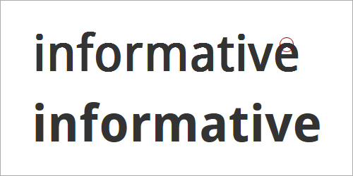
A faux bold (top) slightly stretches the vertical strokes of the original font. This creates odd shapes, like the pointy top of the letter “e.” A true bold (bottom) is more consistent between horizontal and vertical strokes.
Faux Italic
Faux italic is made by slanting the original font at an angle. In the image below, I’ve used Droid Serif italic. The faux italic is missing the tail on the lowercase “f,” while the lowercase “a” continues to have the double-story shape. In a true italic font, the “f” and “a” look more calligraphic — or handwritten — especially in serif fonts. If you’ve chosen a serif font for an older, more traditional feel, then you’ll probably want to preserve these true characteristics of italic.

Faux italic (top) is made by slanting the original font. True italic (bottom) often has traditional calligraphic characteristics, such as the extended stroke on the “f,” the single-story “a” and the rounded “e.”
Faux Bold Italic
Faux bold italic both stretches the vertical strokes and slants the letters at an angle. The resulting letters are clunky compared to the rhythm and texture of a true bold italic.

Faux bold italic (top) is both stretched and slanted. True bold italic (bottom) has a thoughtful rhythm and texture.
Faux bold and italic are not as beautiful as the real thing. But when it comes to text, even more important than beauty is readability.
Faux Bold And Italic Undermine Reading
Faux bold and italic are often less legible, which in turn undermines the readability of text. When letters are stretched and slanted, the strokes and spaces are no longer well balanced.
Well-Balanced Strokes and Spaces Improve Readability
If you’ve ever had to read a bad photocopy (or scan) for a class, conference or meeting, then you already appreciate how important strokes and spaces are for reading complex text.

Reproductions that are too dark or too light are hard to read. Too dark and we lose the spaces in the letters (left); too light and we lose the strokes in the letters (right).
If a photocopy or scan is too dark, we lose the spaces in and around the letterforms. If a photocopy or scan is too light, we lose some of the strokes in the letterforms. In both cases, text is less legible. Reading speed slows as we try to identify the letters and words. We experience brain fatigue as we find ourselves rereading phrases to make out the words, leaving less energy for comprehension.
A good balance between strokes and spaces improves legibility and helps us read more quickly and easily.
Faux Bold, Strokes and Spaces
Because faux bold is created by stretching the vertical strokes of letters, the top and bottom strokes on rounded forms are often too thin. This makes letters like “e,” “c” and “s” start to break on the top and bottom curves. Meanwhile, letters with a diagonal stroke, such as ”w” and “N,” get too heavy and start to pop out of the rhythm of the text.
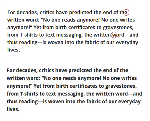
Droid Sans bold. The faux bold (top) is slightly less legible. The tops and bottoms of the rounded letters — like “e,” “c” and “s” — tend to disappear. Diagonal letters, like “w” and “N,” are too bold. True bold text (bottom) is more consistent.
Faux Italic, Strokes and Spaces
Because faux italic is created by slanting the original font at an angle, the spaces in the letters get condensed. This is a particular problem in the lowercase “a,” which continues to have two counterforms. Ironically, while faux italic letters feel more squished and are more difficult to read, they often take up more room, and fewer characters fit on a line.

Droid Serif italic. The faux italic (top) is less legible. Spaces within the letters are more condensed. The text itself feels smaller, even though fewer characters fit on each line. True italic (bottom) is not just more visually pleasing, but more legible and, thus, easier to read.
Fixing Google Web Fonts Bold And Italic In IE 7 And 8
Because real bold and italic fonts are usually more beautiful and more readable than their faux counterparts, we should make them work on as many browsers as possible.
As is usually the case, figuring out how to fix the problem starts by understanding why the proper bold and italic fonts don’t work in the first place.
In “Say No to Faux Bold,” recently published on A List Apart, Alan Stearns reminds us that a good start is to use fonts for which bold and italic styles are available — and to actually include the bold and italic styles that you need when choosing the fonts in the Google Web Fonts interface.
But choosing and using bold and italic styles aren’t enough.
Multiple Weights and Styles Don’t Work in IE 7 and 8
Google Web Fonts instructs us to implement its fonts by checking off all of the font weights and styles that we want to use, then copying the link it provides, and pasting it into the head of our HTML document.
For example, to use Droid Serif regular, italic, bold and bold italic, we would select all four weights and styles, like so:

Droid Serif on Google Web Fonts
In response, Google Web Fonts will create a link to all four styles:
<link href="http://fonts.googleapis.com/css?family=Droid+Serif:400,400italic,700,700italic" rel="stylesheet" type="text/css">This link points each browser to its own browser-specific source. For example, Firefox is taken to a document that returns the @font-face declarations below. Note that the declarations use the same font-family name each time. This would cause a problem in IE 7 and 8, which don’t recognize multiple styles and weights that use the same font-family name.
@font-face {
font-family: 'Droid Serif';
font-style: normal;
font-weight: bold;
src: local('Droid Serif Bold'), local('DroidSerif-Bold'), url('http://themes.googleusercontent.com/static/fonts/droidserif/v3/QQt14e8dY39u-eYBZmppwTqR_3kx9_hJXbbyU8S6IN0.woff') format('woff');
}

@font-face {
font-family: 'Droid Serif';
font-style: italic;
font-weight: normal;
src: local('Droid Serif Italic'), local('DroidSerif-Italic'), url('http://themes.googleusercontent.com/static/fonts/droidserif/v3/cj2hUnSRBhwmSPr9kS5899kZXW4sYc4BjuAIFc1SXII.woff') format('woff');
}

@font-face {
font-family: 'Droid Serif';
font-style: italic;
font-weight: bold;
src: local('Droid Serif Bold Italic'), local('DroidSerif-BoldItalic'), url('http://themes.googleusercontent.com/static/fonts/droidserif/v3/c92rD_x0V1LslSFt3-QEpgRV2F9RPTaqyJ4QibDfkzM.woff') format('woff');
}

@font-face {
font-family: 'Droid Serif';
font-style: normal;
font-weight: normal;
src: local('Droid Serif'), local('DroidSerif'), url('http://themes.googleusercontent.com/static/fonts/droidserif/v3/0AKsP294HTD-nvJgucYTaIbN6UDyHWBl620a-IRfuBk.woff') format('woff');
}
One way around the “single font-family, multiple weights and styles” problem is to send IE 7 and 8 to a different source. Google Web Fonts does this, but unfortunately the @font-face declaration looks like this:
@font-face {
font-family: 'Droid Serif';
font-style: normal;
font-weight: normal;
src: url('http://themes.googleusercontent.com/static/fonts/droidserif/v3/0AKsP294HTD-nvJgucYTaGfQcKutQXcIrRfyR5jdjY8.eot');
src: local('Droid Serif'), local('DroidSerif'), url('http://themes.googleusercontent.com/static/fonts/droidserif/v3/0AKsP294HTD-nvJgucYTaGfQcKutQXcIrRfyR5jdjY8.eot') format('embedded-opentype'), url('http://themes.googleusercontent.com/static/fonts/droidserif/v3/0AKsP294HTD-nvJgucYTaIbN6UDyHWBl620a-IRfuBk.woff') format('woff');
}
This doesn’t help us. The single declaration sets the font-weight to normal and font-style to normal, thus forcing IE 7 and 8 to “fake it” when requested to render bold and italic versions of the font.
The result? Faux bold and italic — even if we had carefully selected a font with bold and italic styles, and even if we had implemented all of the weights and styles as instructed.
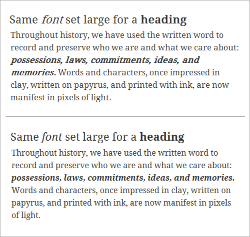
Droid Serif. IE 8 delivers faux bold and italic (top) because it works only with a single @font-face declaration and a single font-family name. Firefox delivers true bold and italic (bottom) because it can handle multiple weights and styles that are assigned to a single font-family.
A Common Fix Causes Problems in Opera (and Android)
A common “fix” for this problem is to insert separate links — one for each of the styles and weights used — into the head of the HTML document. That is, we select each weight and style of the font separately, taking the time to copy and paste each unique link into the head of the HTML document. The syntax for Droid Serif would look like this:
<link href="http://fonts.googleapis.com/css?family=Droid+Serif" rel="stylesheet" type="text/css">
<link href="http://fonts.googleapis.com/css?family=Droid+Serif:400italic" rel="stylesheet" type="text/css">
<link href="http://fonts.googleapis.com/css?family=Droid+Serif:700" rel="stylesheet" type="text/css">
<link href="http://fonts.googleapis.com/css?family=Droid+Serif:700italic" rel="stylesheet" type="text/css">
While this solves the problem in IE 7 and 8, referencing four CSS files for a single font family increases the number of requests that the client makes to the server and contributes to latency. The fix also creates a new typographic problem in Opera (including Opera Mobile on Android). Opera renders text using the last weight and style served; so, if the last weight and style served is bold italic, then the font will come in as bold italic over the entire page.
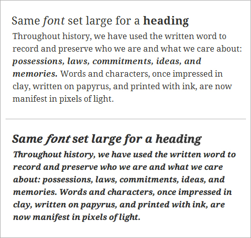
Droid Serif. Using separate links to each weight and style fixes the problem in IE 7 and 8 (top), but it causes problems in Opera (bottom). Opera renders text using the last weight and style served.
Using a Conditional Comment Works Across Browsers
There’s a better solution: adding a conditional comment. IE 7 and 8 are the only browsers that need the fonts to be served separately. And because conditional comments work only in IE, the solution is solid. The new syntax looks like this:
<link href="http://fonts.googleapis.com/css?family=Droid+Serif:400,400italic,700,700italic" rel="stylesheet" type="text/css">
<!--[if IE]>
<link href="http://fonts.googleapis.com/css?family=Droid+Serif" rel="stylesheet" type="text/css">
<link href="http://fonts.googleapis.com/css?family=Droid+Serif:400italic" rel="stylesheet" type="text/css">
<link href="http://fonts.googleapis.com/css?family=Droid+Serif:700" rel="stylesheet" type="text/css">
<link href="http://fonts.googleapis.com/css?family=Droid+Serif:700italic" rel="stylesheet" type="text/css">
<![endif]-->
Notice how all browsers except IE are instructed to use the usual method for accessing Google Web Fonts. This keeps bold and italic fonts loading correctly (and more quickly) in Firefox, Opera, Chrome and Safari. Meanwhile, IE is instructed to access each weight and style separately. This fixes the faux bold and italic problem in IE 7 and 8, and it doesn’t create any new problems in more recent versions of the browser.

Using a conditional comment, we get true bold and italic to load correctly across browsers. Top to bottom: IE 8, IE 9, Firefox 11, Google Chrome 18, Safari 5, Opera 11.62.
Help Visitors Enjoy Their Reading Experience
If people are on your website, they’re probably either skimming quickly looking for something or they’ve found what they’re looking for and want to read it as easily as possible. Either way, keeping the text readable will help them achieve their goal.
Bold and Italic Help Organize Content
From a macro perspective, bold and italic forms of a font are important for people skimming your website. Bold and italic forms add emphasis — both strong and subtle — to text. They can help visitors understand the organization of content before they even start to read it.
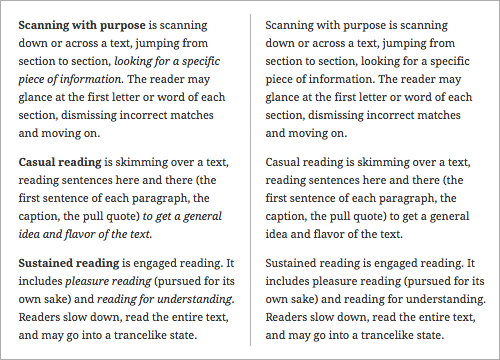
Bold and italic create levels of emphasis, which helps to visually organize text (left). The same text without bold or italic (right) would feel more like a narrative.
True Bold and Italic Are Easier to Read
From a micro perspective, true bold and italic forms are important for people engaged in more sustained reading on your website. A proper balance between strokes and spaces improves legibility and makes text easier to read, thus minimizing brain fatigue and giving visitors a more pleasurable experience of the website. Type designers use their time and talent to create Web font families that are both legible and beautiful; for us, it’s just a matter of getting the true weights and styles to load properly.

True bold and italic text is not just more visually pleasing, but also easier to read.
Waiting until Google fixes this problem might be tempting, but it’s been on Google’s radar since June 2010. Making sure that the bold and italic fonts served up by Google Web Fonts work across browsers is up to us. And it takes only a minute. Don’t let 1 in 5 visitors to your website down.
Further Resources
- “Say No to Faux Bold” Alan Stearns
- “It’s About Legibility” Allan Haley
- “Is the Font Easy to Read? Anatomy and Legibility” (PDF), Laura Franz This excerpt from the book Typographic Web Design is in PDF format. View it in Adobe Acrobat to compare fonts via rollovers.
(al) (il)


