I spend a lot of time buying and testing iPad apps for kids. To be more specific, I lovingly do this for a certain two-year-old girl who is currently on a very successful #OccupyiPad mission in my house. Through extensive observational research, I’ve discovered what works and doesn’t work for my daughter, so I’m going to shamelessly generalize my findings to all children and propose four essential guidelines for developers who work on iPad apps for children.
Further Reading on SmashingMag:
- Ten Things To Think About When Designing Your iPad App
- Designing Web Interfaces For Kids
- Useful Design Tips For Your iPad App
- Designing For Kids Is Not Child’s Play
Affordance Is King
Most apps for children show a bunch of different things on the screen that you can touch to make stuff happen. Cows moo, windows open and close, honey pots need to be collected, etc. But most of these apps give no indication of which elements are interactive and which are not. This usually results in a frantic and frustrating game of whack-a-mole to find the elements that actually do something.
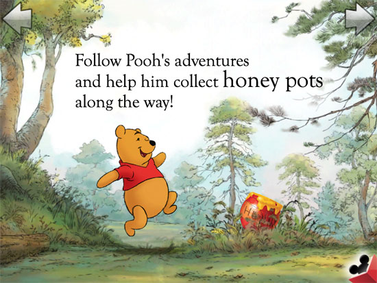
The solution is simple: affordance. Give the elements in question a characteristic that indicates they are touchable. The Disney Puzzle Book apps do this really well. For example, in the Winnie the Pooh Puzzle Book app, the honey pots wiggle around to show the user that they need to touch them in order to collect them.

Pagination Is A Primary Action
Pagination is so important to the enjoyment of most children’s apps, but it is often a quagmire. Almost every app does this differently. The most common methods of pagination are touch-based arrows and swipe-based gestures (indicated by a skeuomorphic curled-up page corner). Both of these interactions are valid solutions, but because swipes can be tricky for tiny fingers and the gestures usually require some precision, the arrow approach is much better for kids.
Also, the entire bottom part of the screen is a hot area and needs to be avoided. Kids constantly touch that part of the tablet by accident, which makes accidental pagination inevitable if the controls are placed there. I like how the Old MacDonald app implements pagination: clearly marked forward and backward arrows at the top of the screen.
The Menu Is A Distant Secondary Action
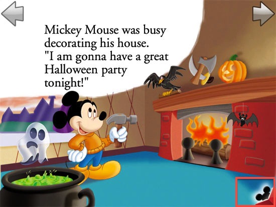
Speaking of the bottom part of the screen: don’t put any interactive elements in the bottom part of the screen — especially menu actions, which are not important anyway once a child gets going with the app. The number of times I’ve had to stop the car to dismiss a random menu brought on by an accidental touch… well, it’s dangerous. The Mickey Mouse Puzzle Book app is a good example of this frustrating practice:

PlayTales has a clever implementation of the menu action in many of its books. First, the menu button is placed in the top-right corner, out of accidental reach (although the top middle would be better, in keeping with the top-left and top-right pagination mentioned in the previous point).
More importantly, it uses a two-touch method to bring up the menu. The menu icon is semi-transparent in its normal state. One tap removes the transparency, and a second tap brings up the menu. Although not foolproof, it’s an excellent way to avoid accidental taps.
If You Try To Trick My Kid Into Buying Stuff, You’re Dead To Me
I’m looking at you, Talking Tom Cat. A lot of apps do this, but Talking Tom Cat is the absolute worst. The screen is a landmine of carefully placed icons that lead to accidental purchases — not to mention the random animated banner ads that are designed to draw attention away from the app itself. GoDaddy’s dark patterns that try to trick users into buying more domains are one thing, but if you try to use persuasive design on my young daughter, all bets are off. Your app will be deleted, and we’ll never do business again.
Conclusion
Designing apps for children is extremely hard. Not only is quality, age-appropriate content hard to create, but designing the flow and interaction of these apps is made more difficult because designers must refrain from implementing advanced gestures, which would only confuse and frustrate kids (and, by extension, their parents). Yet all apps can and should adhere to certain basics. Hopefully, the four guidelines discussed here can become fixtures of all children’s apps.
 (al, fi, il)


